How to Colour Correct and Prepare a Product Photo
by hbridge88 in Circuits > Cameras
662 Views, 10 Favorites, 0 Comments
How to Colour Correct and Prepare a Product Photo
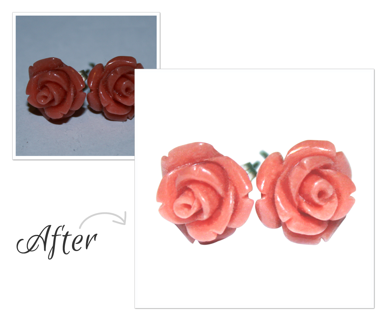
This probably isn’t the sexiest topic, but it is something that comes in handy if you are running an eCommerce site, posting things on Etsy, or even posting your very own Instructable.
Today it’s more important than ever to have a professional looking photo, and you don’t need to be a professional photographer to achieve those results. I’m using Photoshop CS5, but you can use these techniques on all of the latest versions.
Take Your Photo
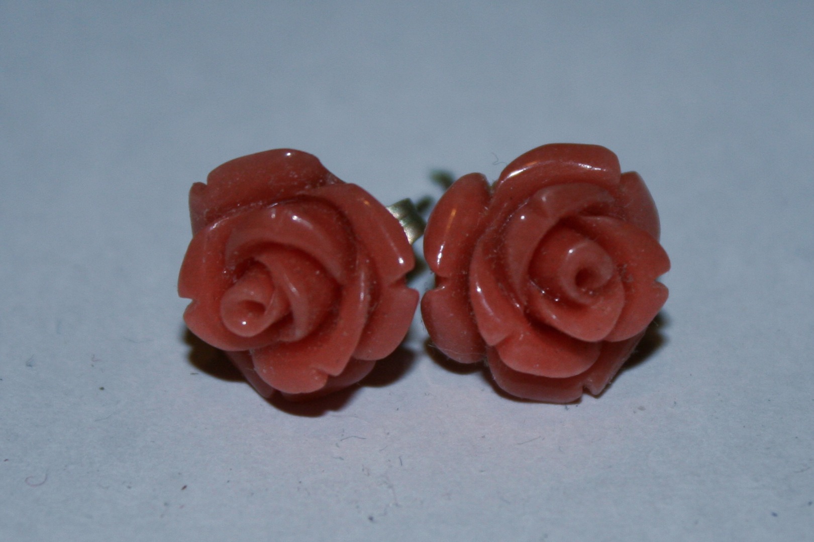
Maximize how much light you have without flooding out your product. You still want dark portions to give it some depth. As much as I love photography, I’m not very good at it (as you can tell from my photo taken on a regular piece of white printer paper).
Ideally your entire product should be in focus.
Open Photoshop and Set Up Workspace
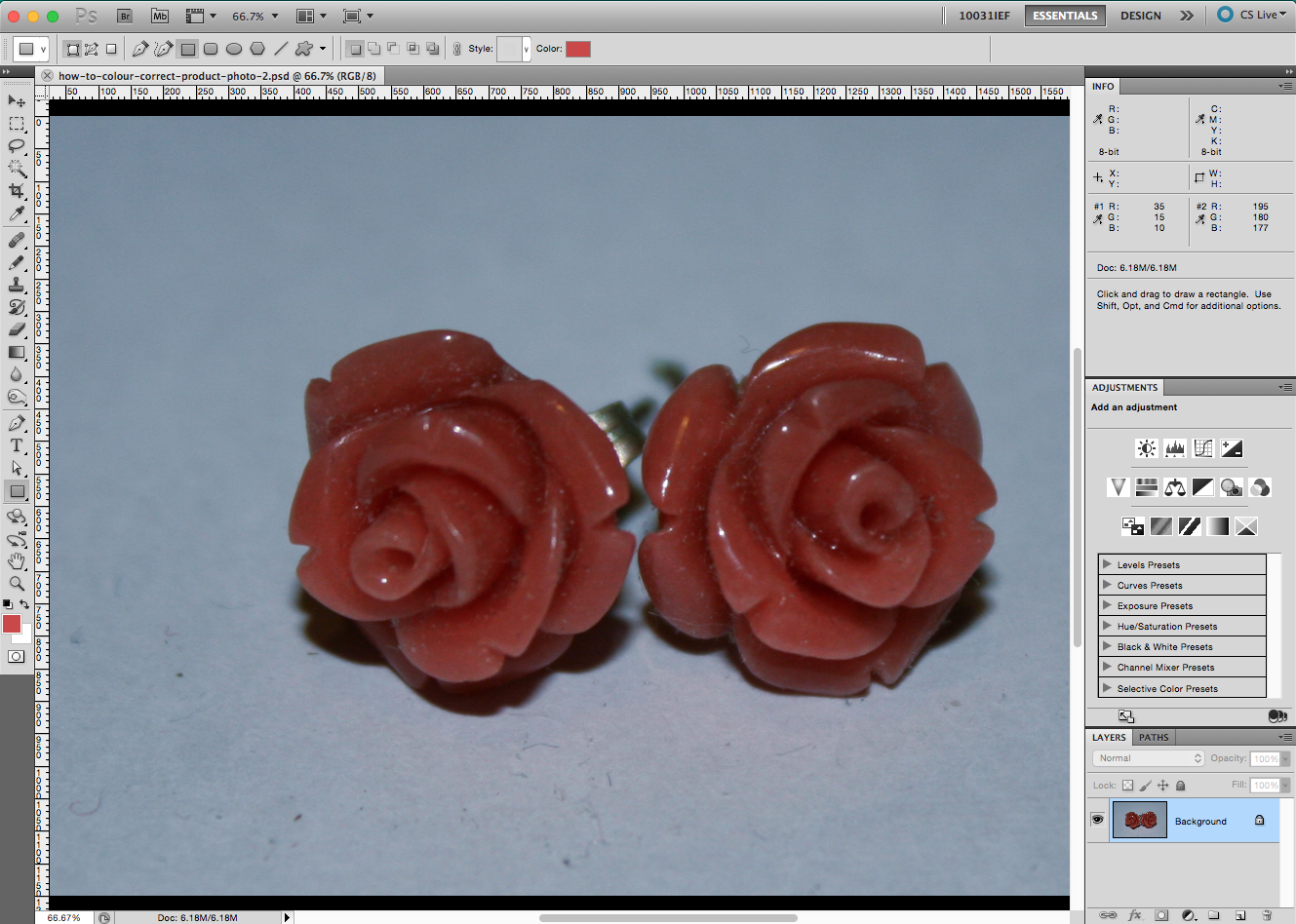
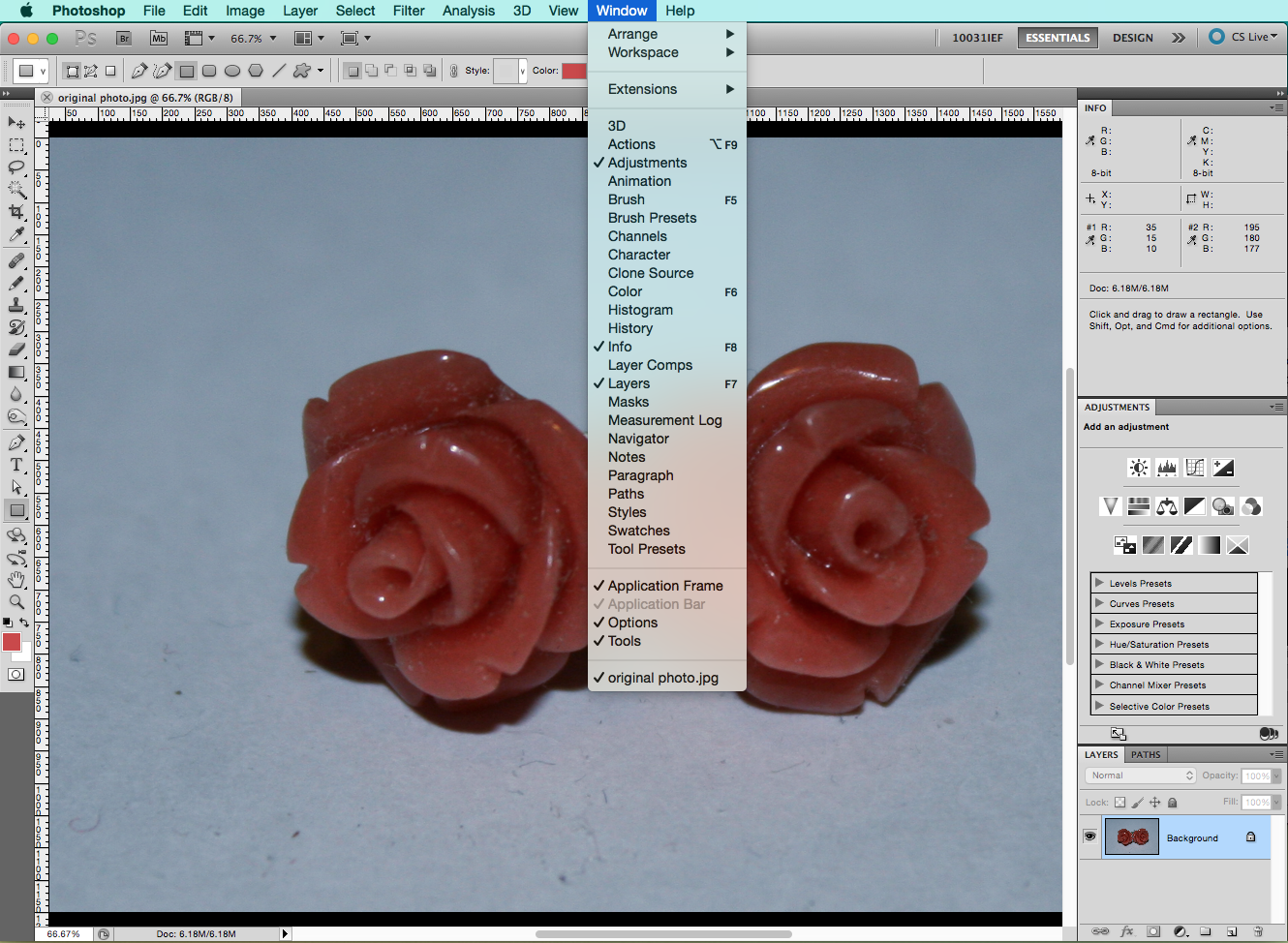
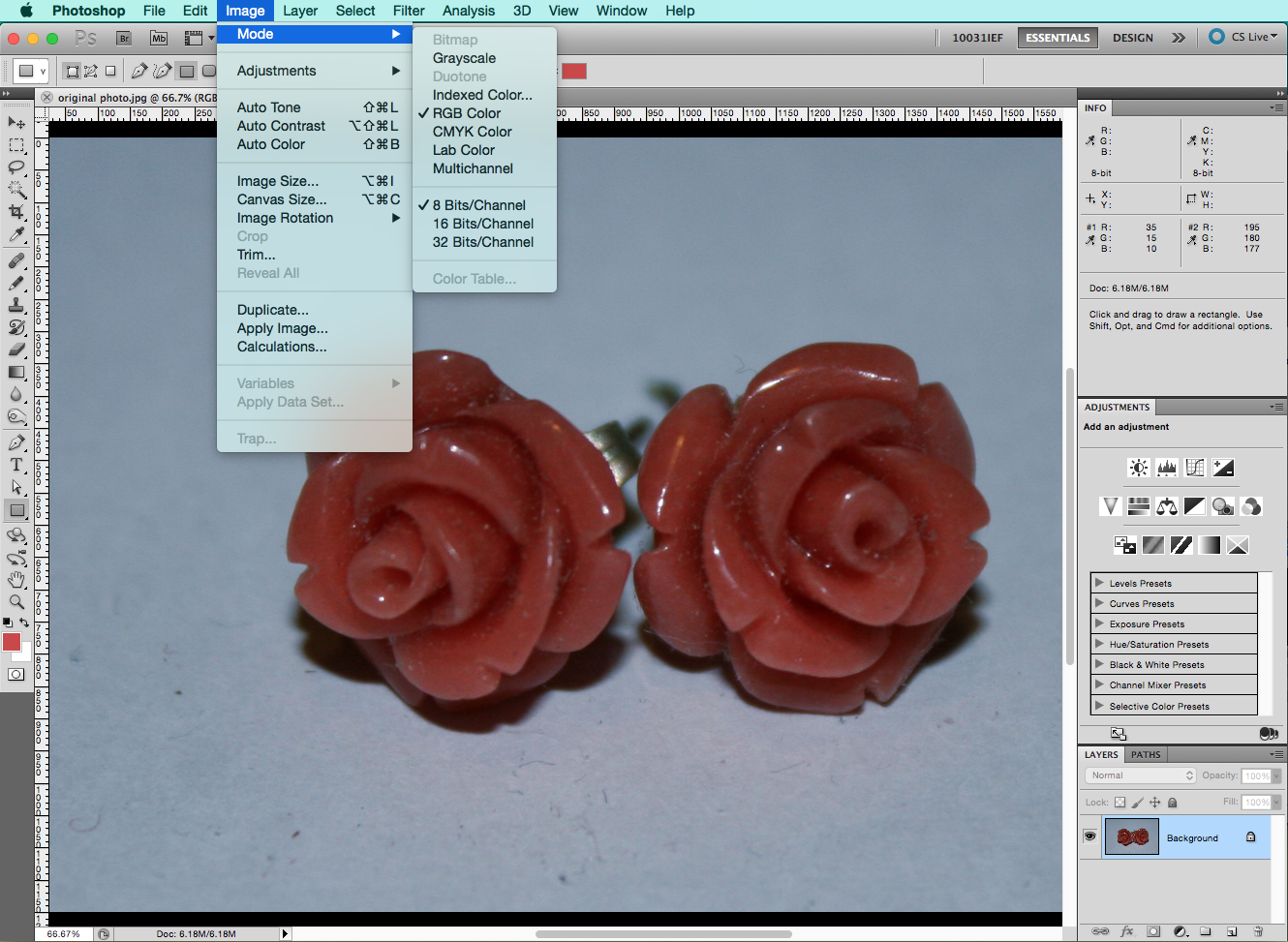
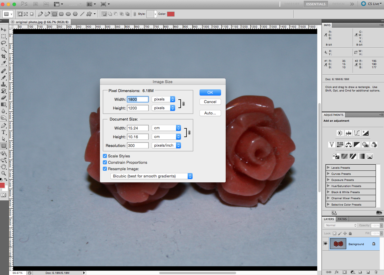
There are 3 things you want to do before starting.
- You want to make sure you have the INFO, ADJUSTMENTS, LAYERS, and the PATHS windows open.
- You also want to make sure that the photo that you’re working on is in RGB (not CMYK). You can check by going into Image > Mode and RGB should be checked. If not, click on RGB. The boring technical reason for this is that RGB has a larger colour gamut, and you want as large of a colour range as possible when working with photographs.
- You want to make sure your image isn’t teeny tiny. There is absolutely nothing worse than a pixelated image. Go to image > Image size. Follow whatever guidelines you are making the image for. For example, for Instructables maybe aim for around 800px x 800px.
Colour Sampling
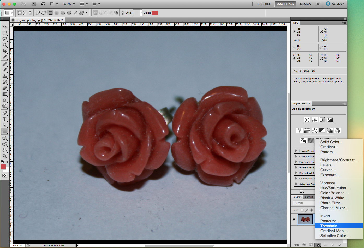
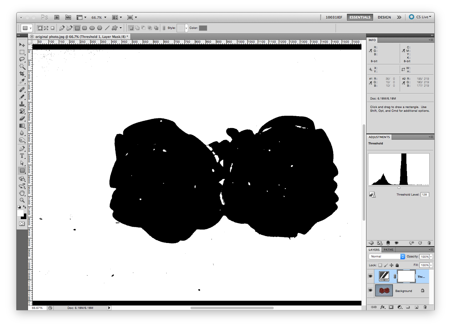
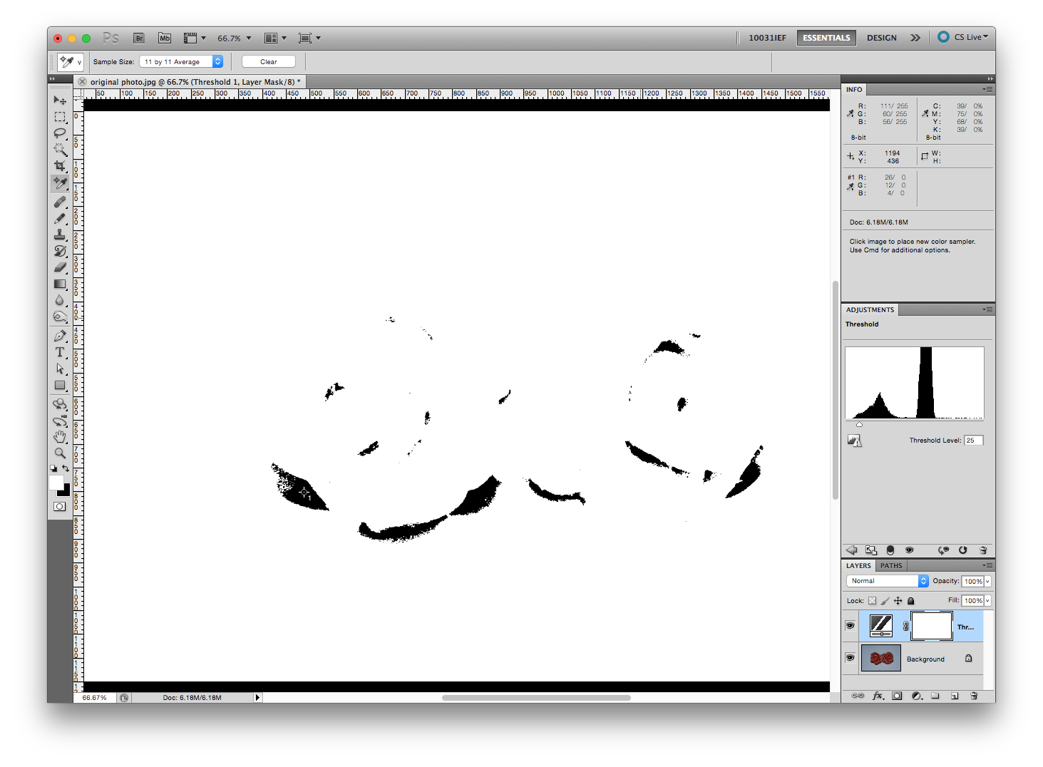
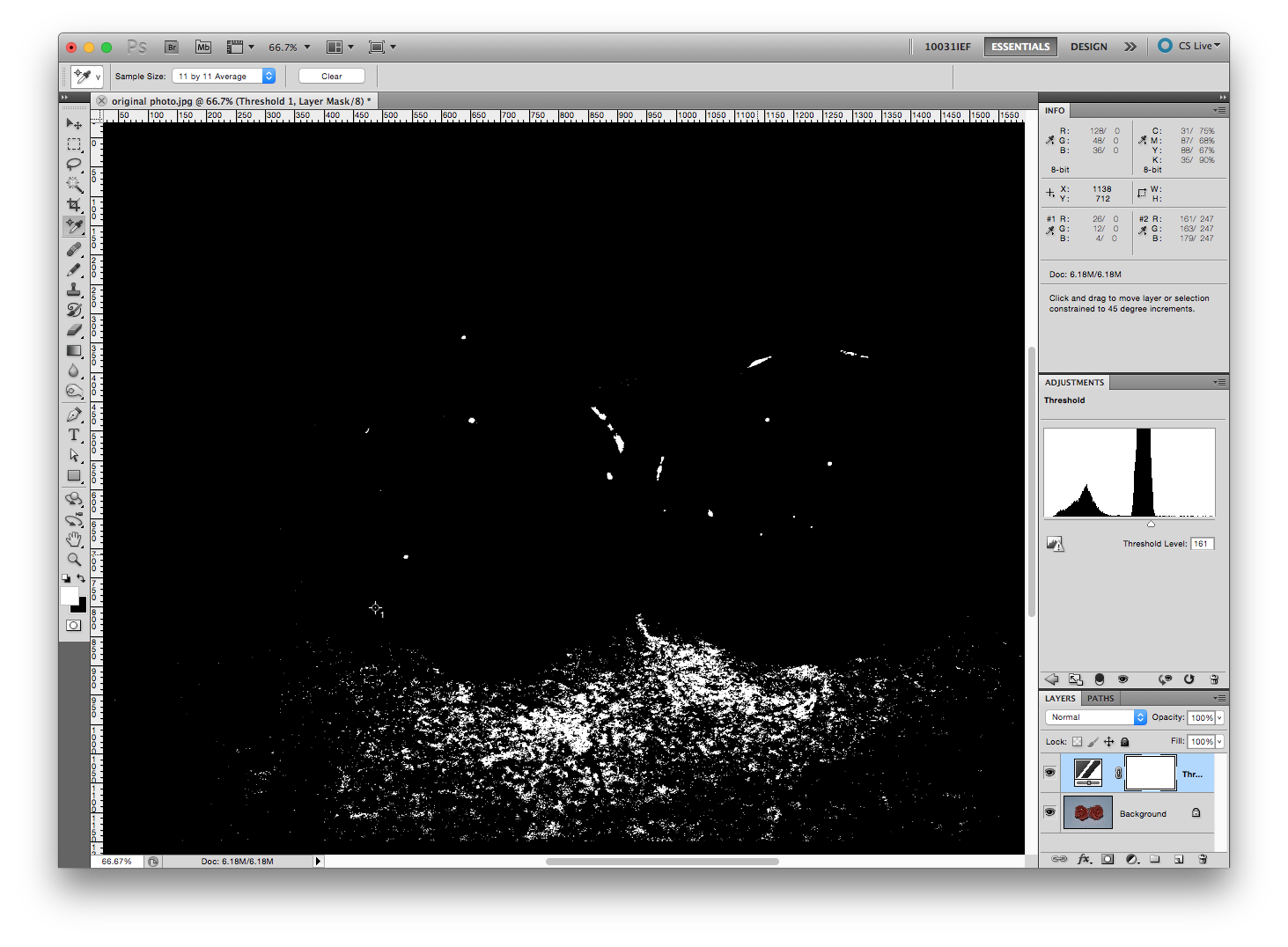
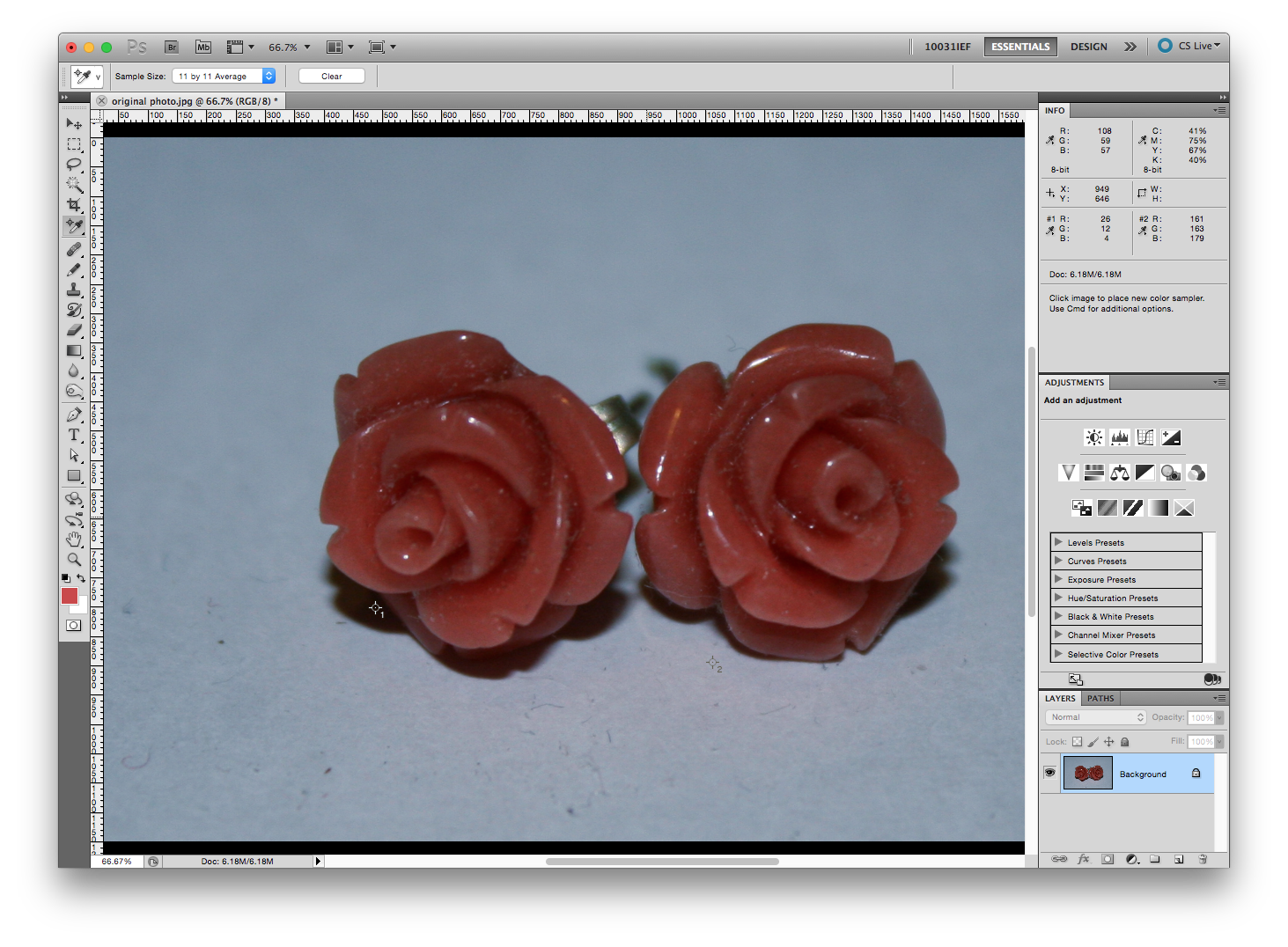
Colour sampling gives you a good idea of what’s going on in the photo. For this step you are only gathering colour information for the INFO window.
There’s a couple ways to do this. Either go to Layer > New Adjustment Layer > Threshold and say “OK”
The other way is to select the little icon on the bottom of the Layers window that looks like a half white half black circle and select “Threshold”. I prefer this method because it’s faster.
Select your Colour Sampler Tool. Also change the Sample size to 11 by 11 Average. Click on one of the areas that is black. RGB values should pop up in your INFO window.
In your Adjustment window a little graph will appear. Slide the arrow down so the Threshold Level is around 10-15. Not every image will have that value just get it around there or until there is only a little bit of black seen. Click on a section of black. Some RGB values will pop up in your info window.
Now you’re going to go back into the Adjustment window and slide the arrow the opposite direction until your Threshold Level is around 240-245. Again, this isn’t always possible, so just slide it until there is only a little bit of white seen. Click on a section of white. Your second RGB values will pop up in your info window.
Now delete the Threshold layer.
My 2 readings (which you can read in the info panel) are:
#1
R: 26
G: 12
B: 4
#2
R: 161
G: 163
B: 179
Colour Correction
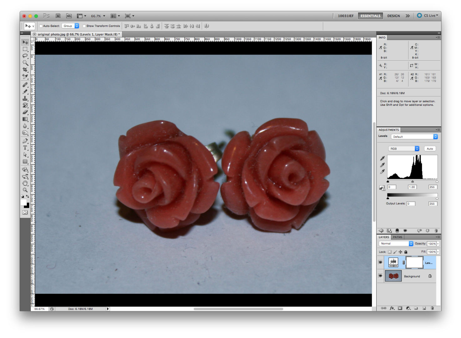
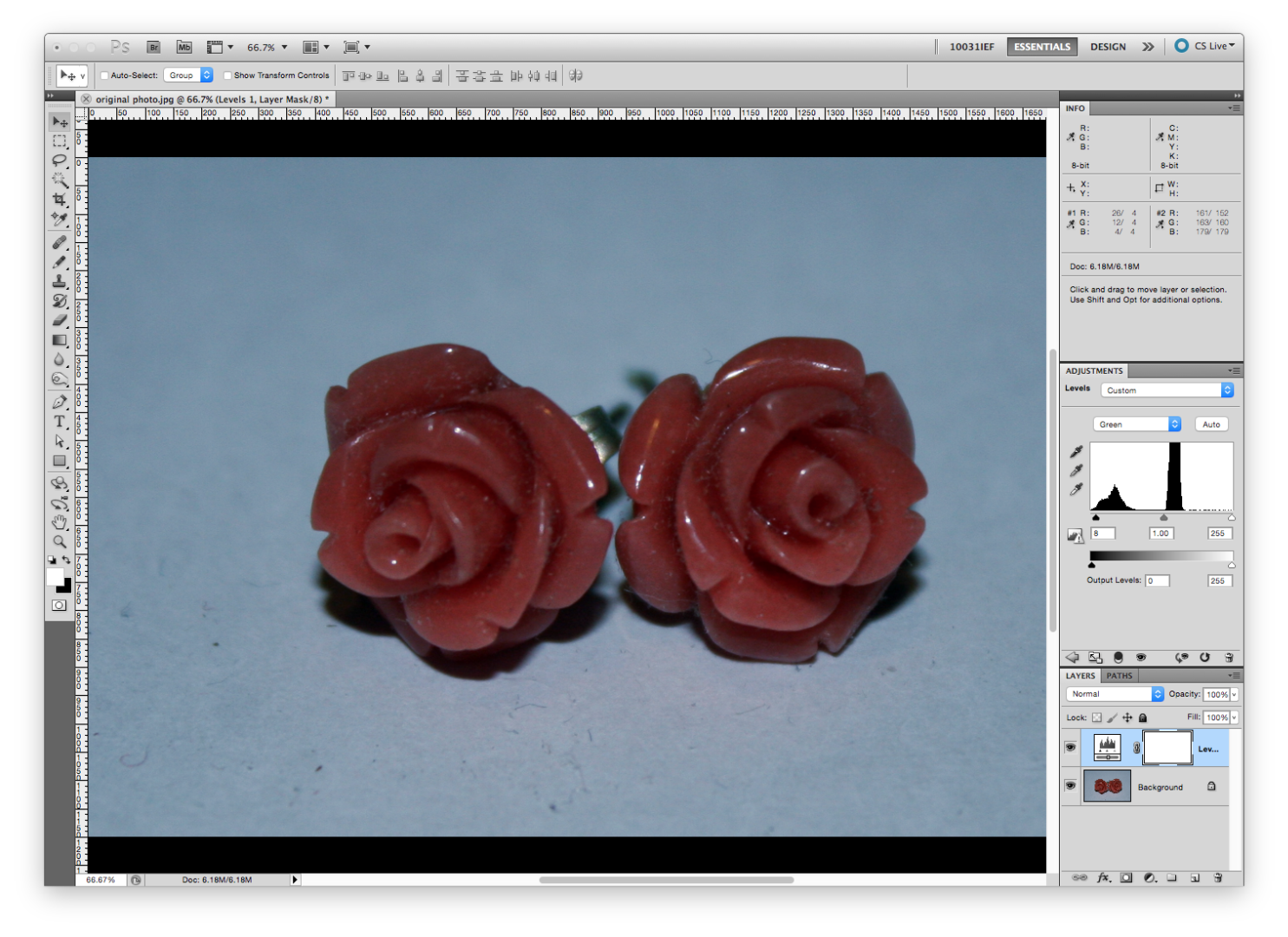
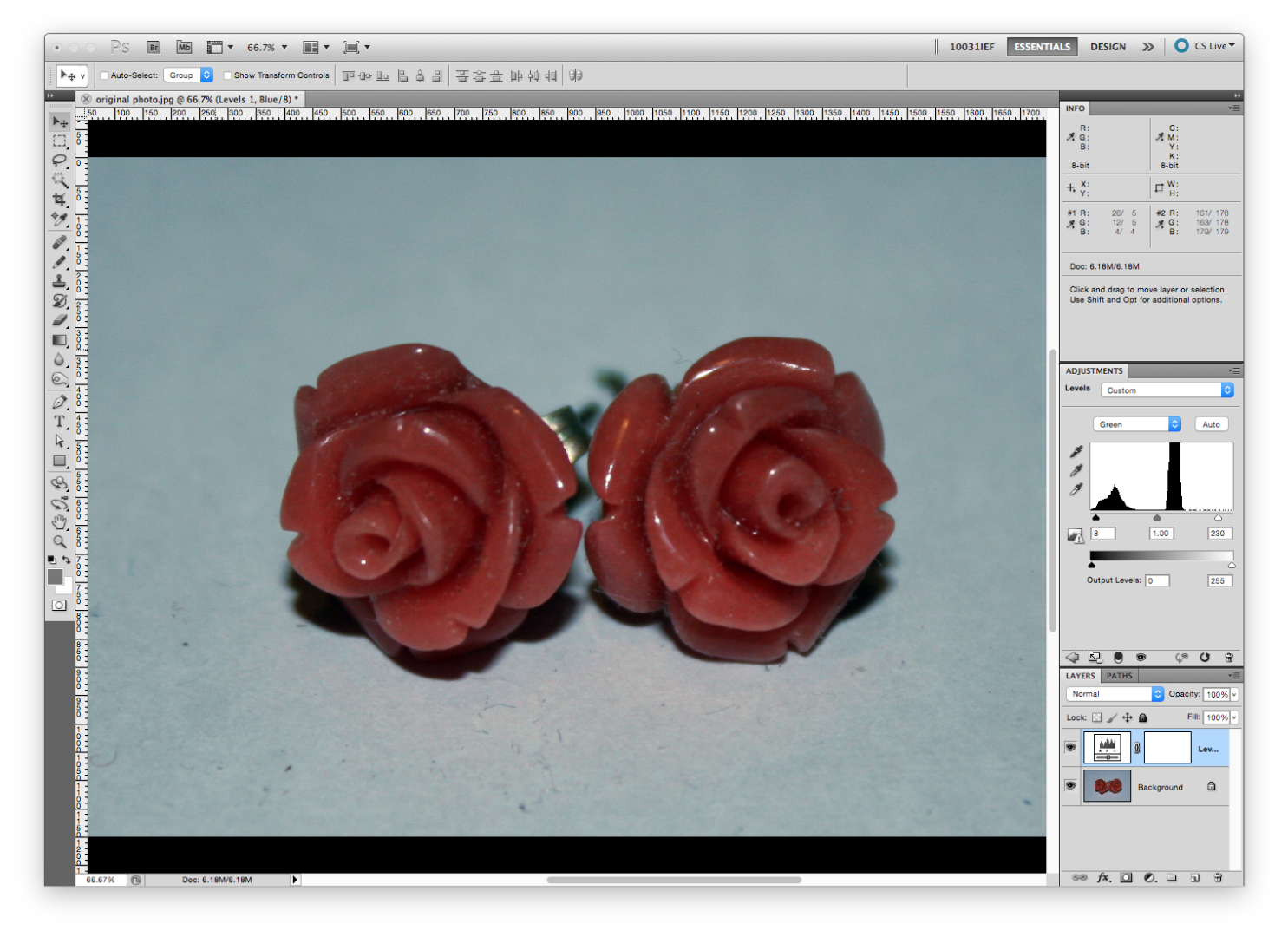
This is more of an art than science. But there are some basic guidelines I usually follow. For this step you need to have your ADJUSTMENT window and your INFO window open.
You want to create a new Adjustment Layer. Click the Adjustment Layer icon and select “Levels”
There’s a little drop down menu at the top of the Adjustment window that says “RGB”. You’re going to adjust each of these values to reflect the colour sampling readings you took in the previous step.
What you will notice is that in your INFO window, Your #1 value now says something like:
R: 25 / 26
G: 12 / 12
B: 4 / 4
What you want to do is match the numbers in the second column with the lowest value. In my case the number is 4. Slide the black arrow toward the middle to lower the number and adjust each RGB value by using the drop down menu at the top.
Now my first RGB reading says:
26 / 4
12 / 4
4 /4
We’re going to do something similar with the second RGB value, but this time we’re going to match the numbers in the second column with the highest value. In my case the number is 179. Slide the white arrow toward the middle to increase the number. Try to get it close. Mine’s not bang on but it will work.
Now my second RGB reading says:
161 / 178
163 / 178
179 / 179
Don’t worry too much if it changes your first RGB reading’s values. As long as it’s close it should be okay.
You’ll notice that in my case I have now removed a blue cast.
Brighten It Up
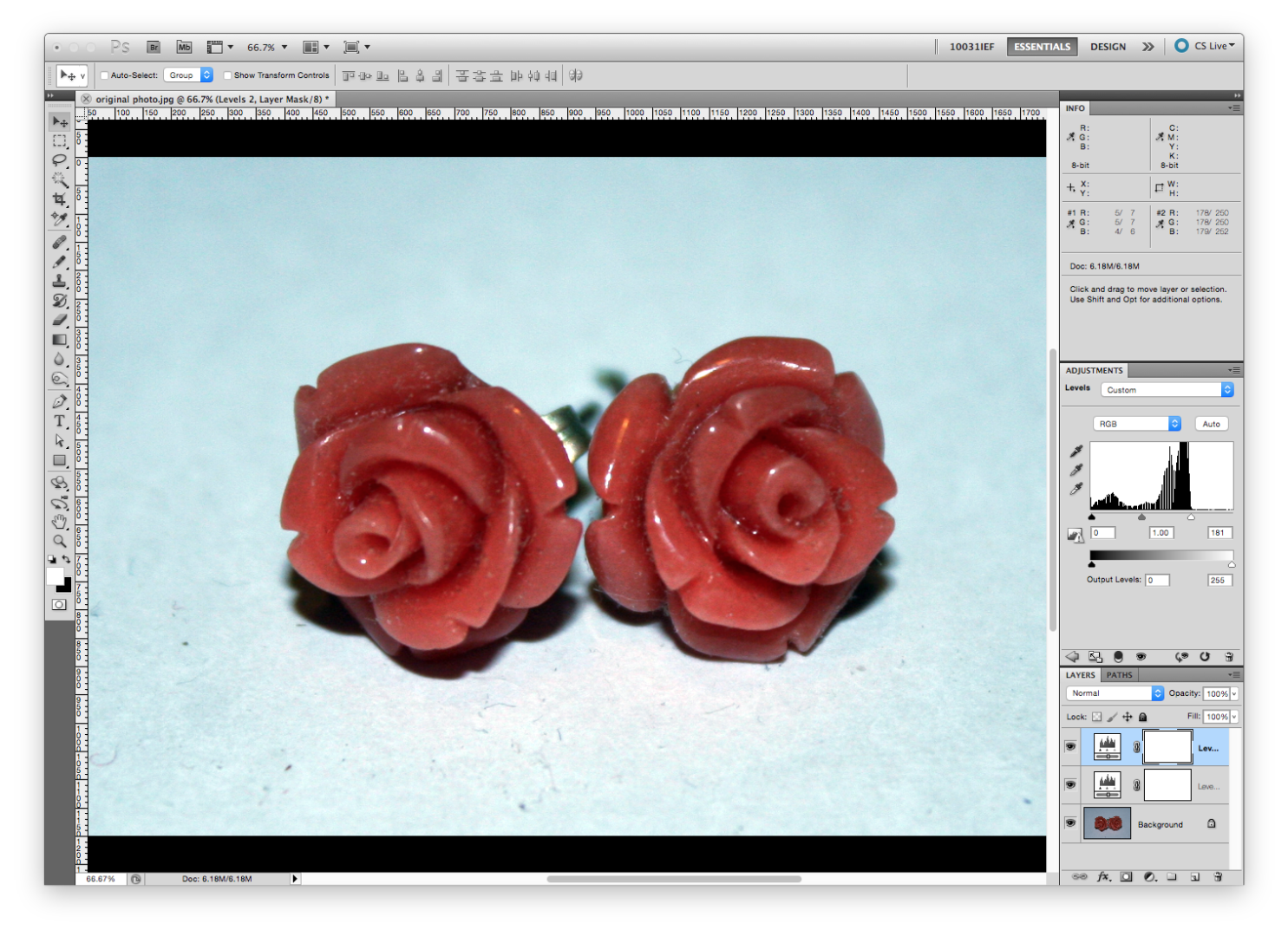
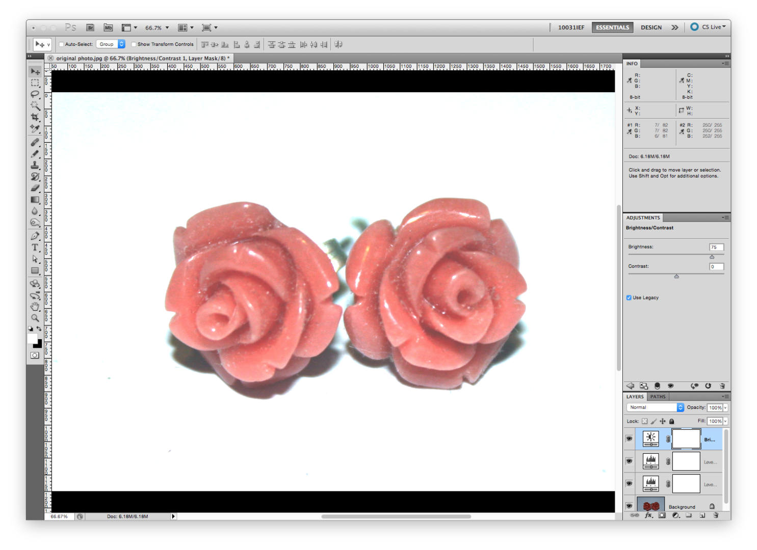
My image is way too dark. There are many ways to brighten it up, I like to do most of this with levels. You’re going to create another Levels Adjustment layer. This time examine the graph. Notice that in mine there is barely anything toward the right of it. Move the outer arrows to where the majority of the graph is.
Now I usually also add a Brightness and Contrast Adjustment layer. Select Brightness and Contrast in the adjustment layers and slide the arrow toward the right in the adjustment window.
Remember that your goal is to represent the product as accurately as possible while also shining it in the best light. That being said, try to match the colour of the image to the actual colour of the product. We already corrected the colour, so now it should be a matter of adjusting the value (how light or dark it is).
I have now adjusted the roses to be the exact colour of the actual earrings, but the stems are washed out. I’m going to correct this a little later on.
Add Some Contrast
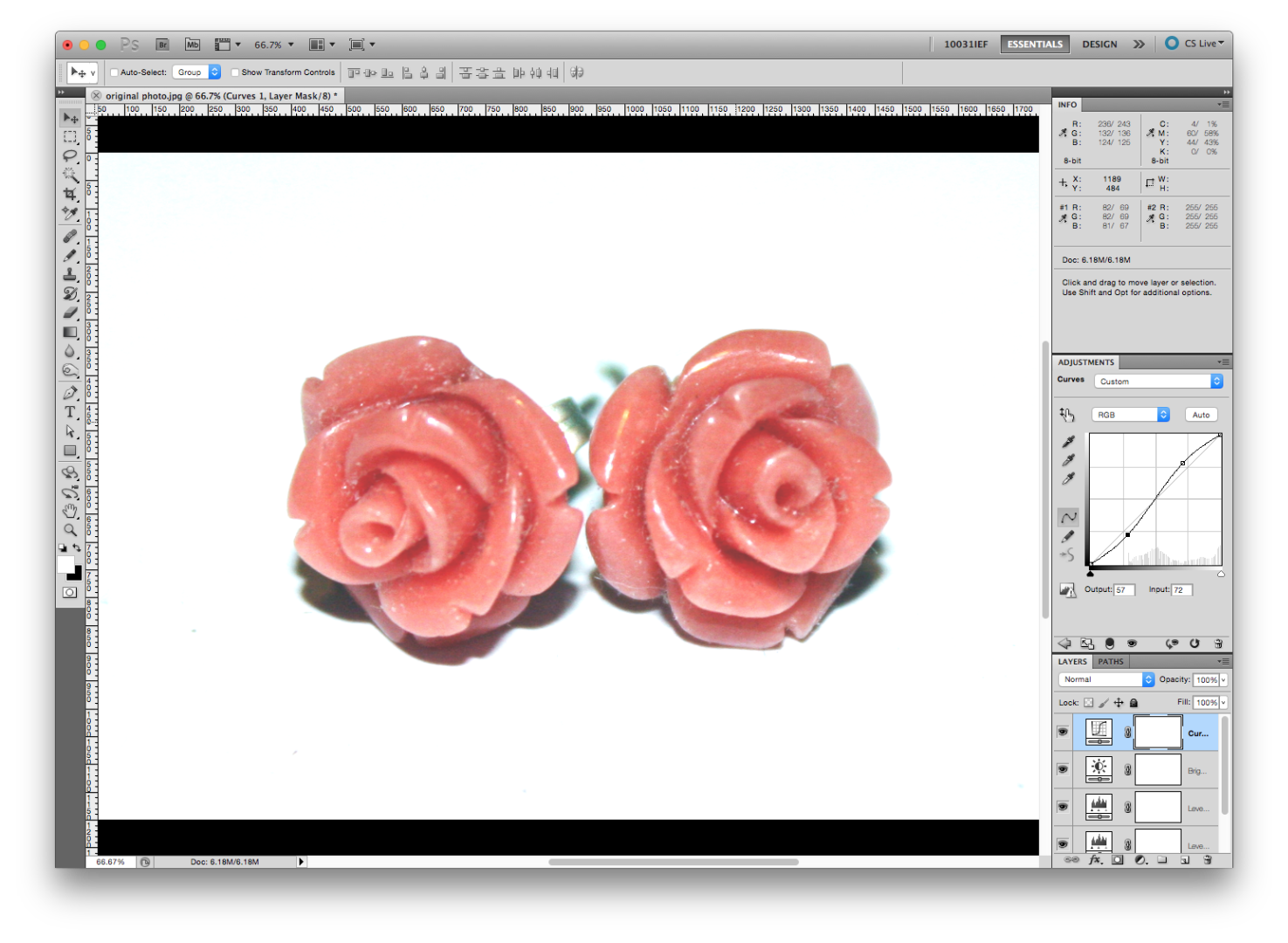
For this I use an S curve. Go to your adjustment layers again and select CURVES. Then you make a very slight “S” by selecting 2 points on the line first, and moving them slightly as shown in the image.
Get Organized
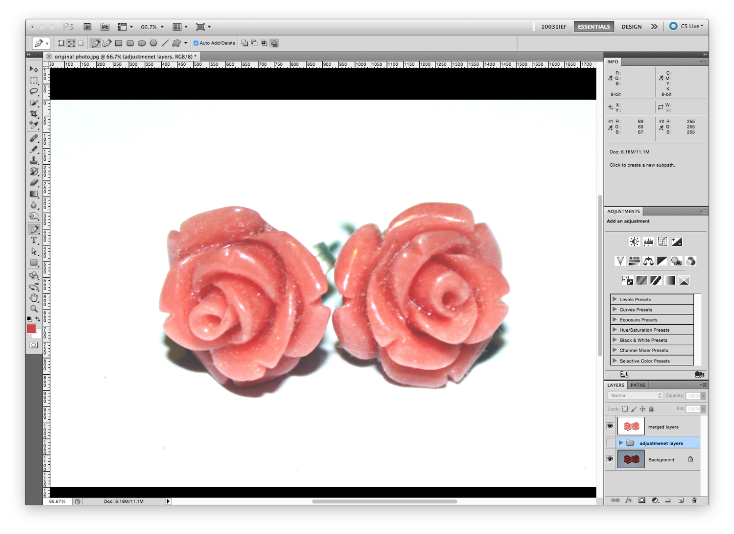
Before we crop this out, let’s organize our layers.
First let’s make a copy of your progress and group the adjustment layers. Select your top layer and then:
On a mac select: ⌘ + option + SHIFT + e
On a PC select: Control + Shift + Alt + E
A duplicate copy of all the layers should move to the top.
I renamed my merged layers “merged layers” and grouped my adjustment layers together. You can turn off your adjustment layers group by selecting the eyeball.
Make a Path
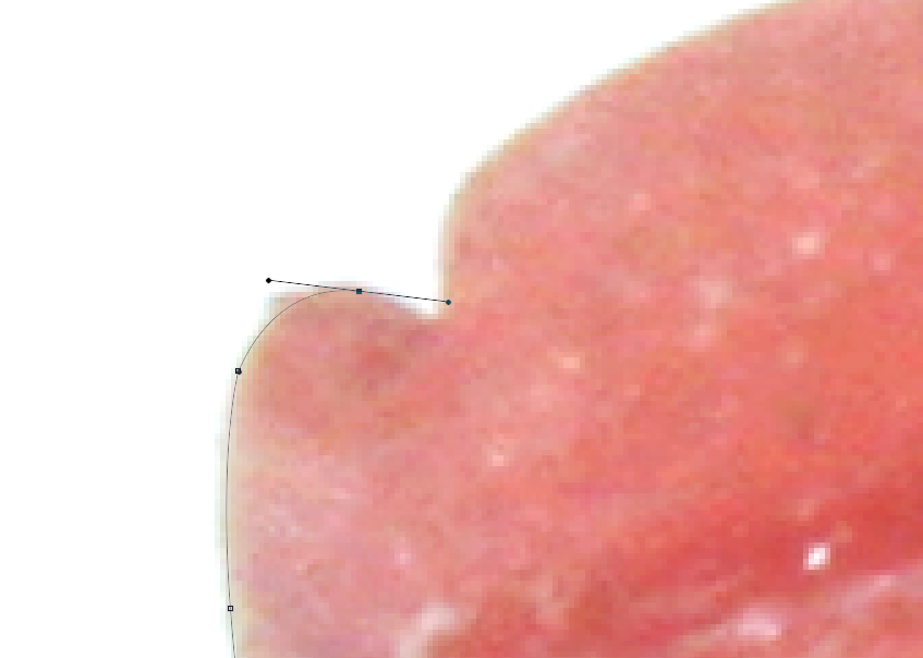
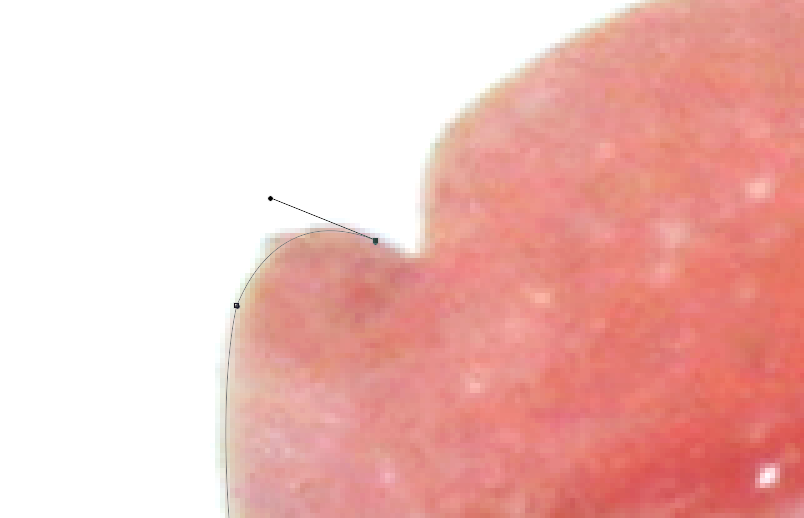
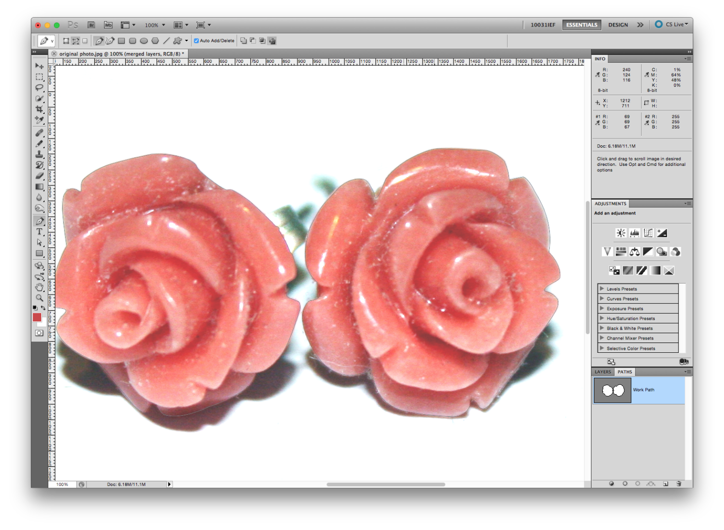

Select the Pen icon (or hit P on your keyboard). You’ll also want to select the “exclude overlapping path areas” icon at the top of the screen.
Zoom in as much as you can and select a point you’d like to start.
There are many methods to using the pen tool. I select my first point, then my second point and before I let go of the cursor I use the handle to move the path line to where I want it. When I have it lined up I select ⌘ + option on my keyboard. I can then control my handle without moving my path. I take my handle and put it inside the node. Then you just let go of your cursor and can make your second point. Slowly make your way around the object. This takes some practice but after a little while it becomes second nature.
I should also mention that you want to crop it so that you are not getting any white.
In my case I’m going to crop my roses separate from the earring stems. Once finished, click on your PATHS window. It should look like this.
IMPORTANT: Immediately name your path by double clicking on “Work Path”. If you don’t you could lose it and all your hard work.
Now we’re also going to do the same with the stems.
Make a Mask
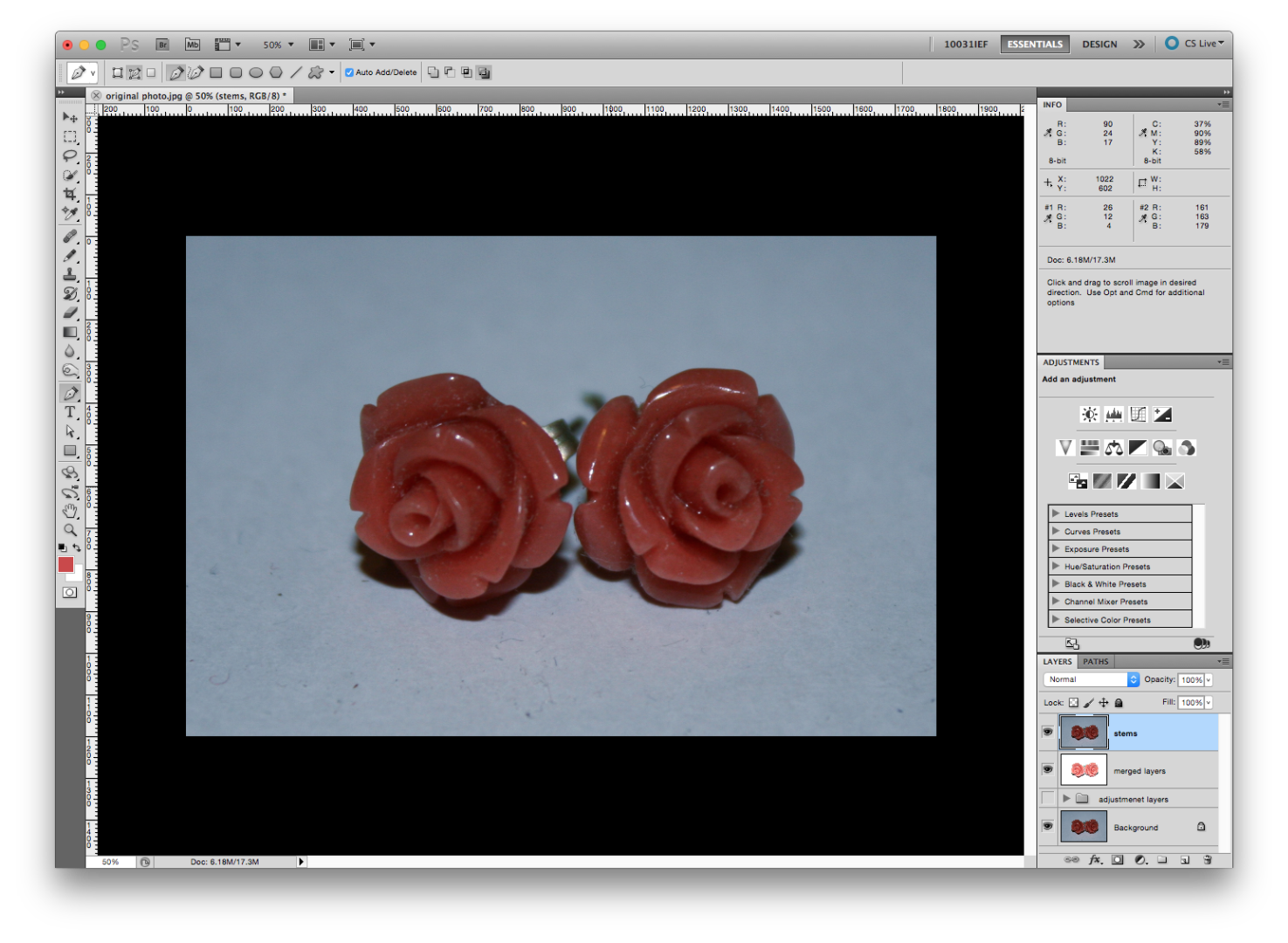
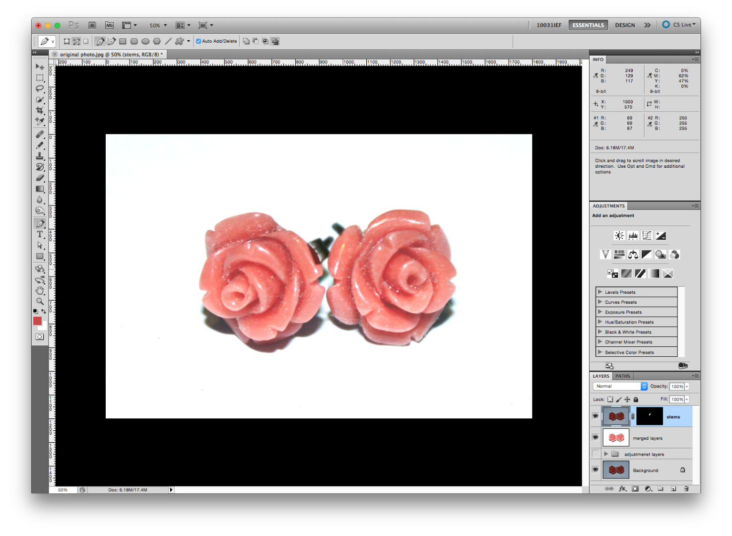
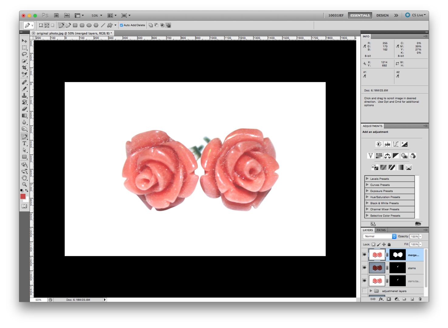
After adding all those brightening adjustment layers, my stems got a little washed out. So what I’m going to do it copy my background layer, and apply my stems mask to that.
Duplicate the “background” layer. You can do this by selecting the layer and hitting ⌘ + J on your keyboard or by dragging that layer into the “create a new layer” icon. I’m calling my new layer “stems”. Now move that layer to the top for now.
Because I’m not the best photographer, my stems are not in focus. To combat this I’m going to select my stems path and feather the edges.
To activate a selection select ⌘ and click on the path you want to select. The marching ants should pop up on your image.
Then go up to Select > Modify > Feather or shift + F6
I just gave it a 3px feather. This is subjective so you may have to fiddle to get it right.
Click ok, then, while your stems layer is selected click the mask icon at the bottom of your layer window.
Obviously this is far too dark, so I reduced the opacity of the stems layer to about 32%.
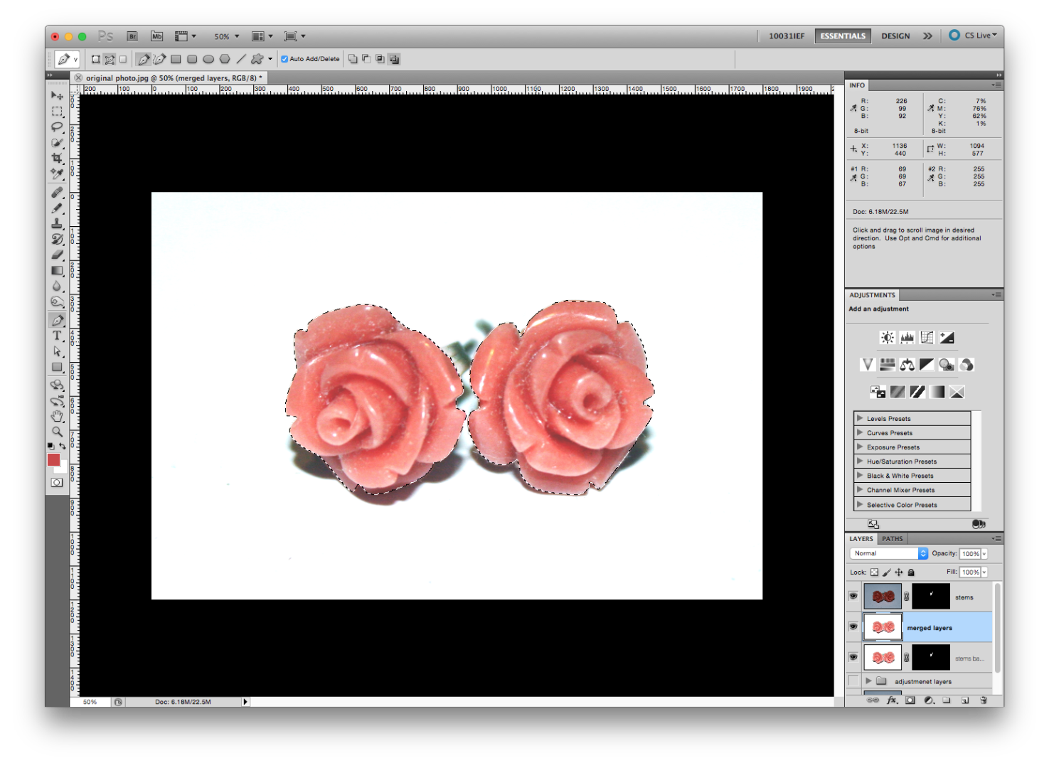
Because of the reduced opacity I made another copy of the “merged layers” layer to keep in the background. I then applied my “stems” layer mask to that layer. You can duplicate a layer by holding ⌘ + option and dragging it to the desired layer
Now we just activate our “roses” path to a selection and create a layer mask on the “merged layers” layer. I then moved the “merged layers” layer to the top of the layer order.
Fix Imperfections
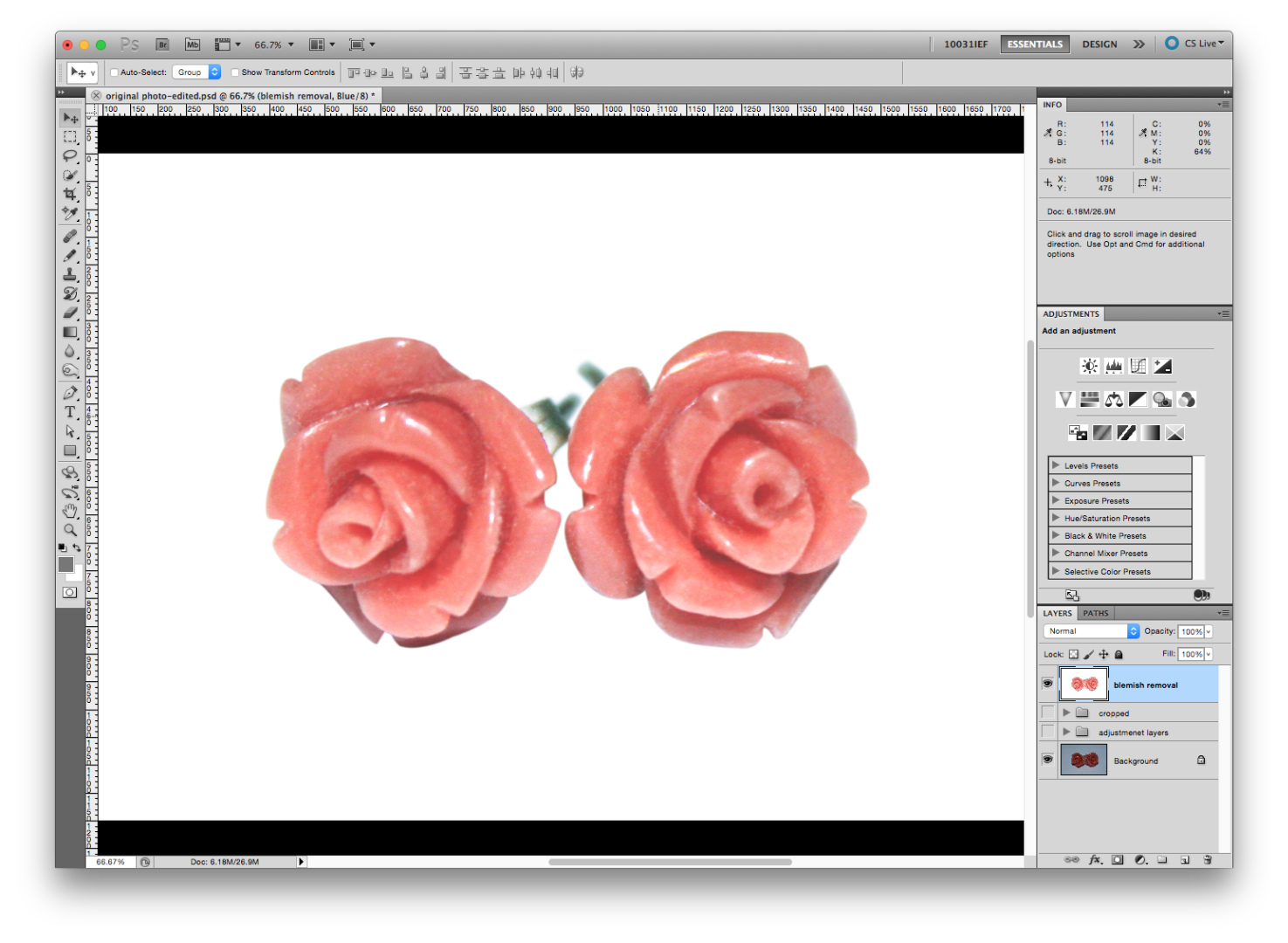
Make another duplicate copy of all the layers and call this layer “blemish removal”. Group all of the other layers together and name it “cropped”. You can turn the “cropped” group off.
We’re going to use the clone stamp tool to fix up any dust or scratches the product has. Sample some pixels near the imperfection by holding option (for mac) or alt (for pc) and colour over the imperfection. You can adjust how big your clone stamp tool is by using the square brackets on your keyboard.
Make your way around the image. This could take a while depending on how damaged the image is. Keep in mind you want your product to still look like your product when you’re done, don’t get carried away.
Crop and You’re Done!
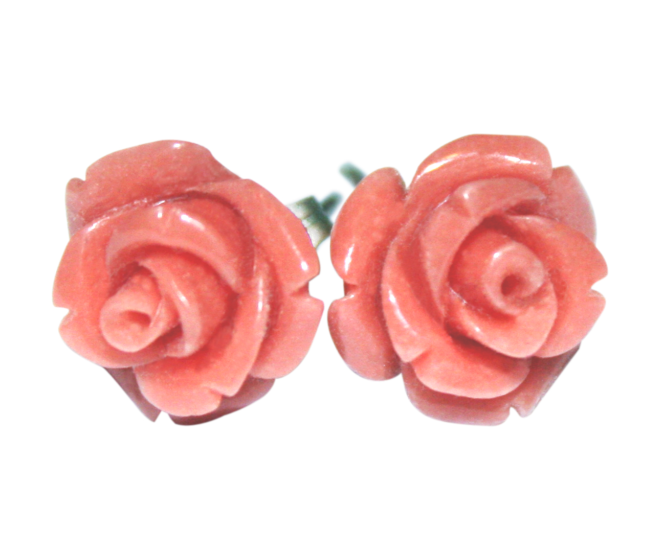
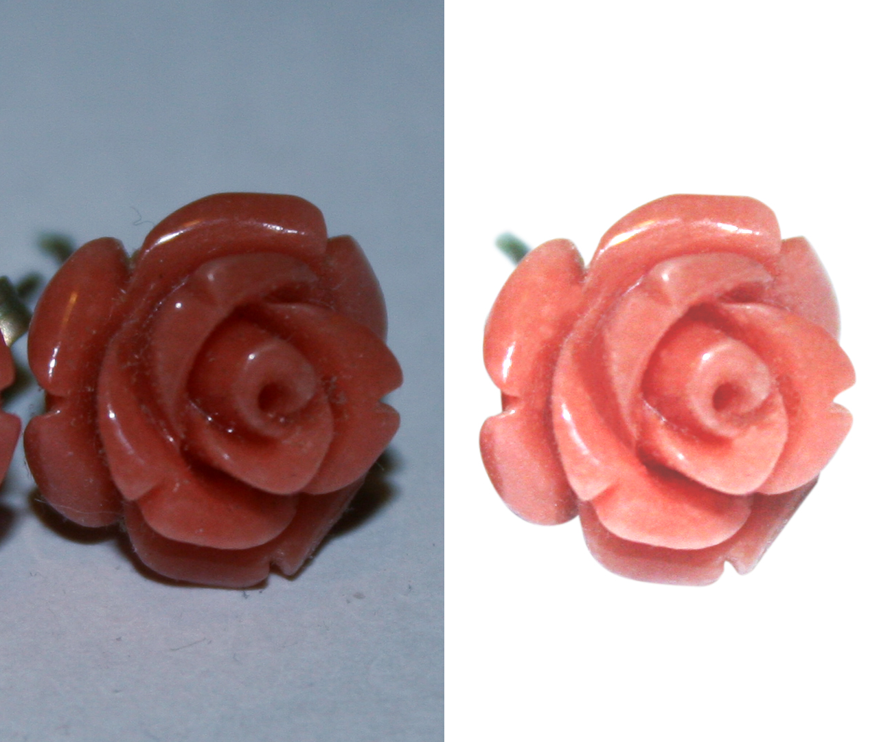

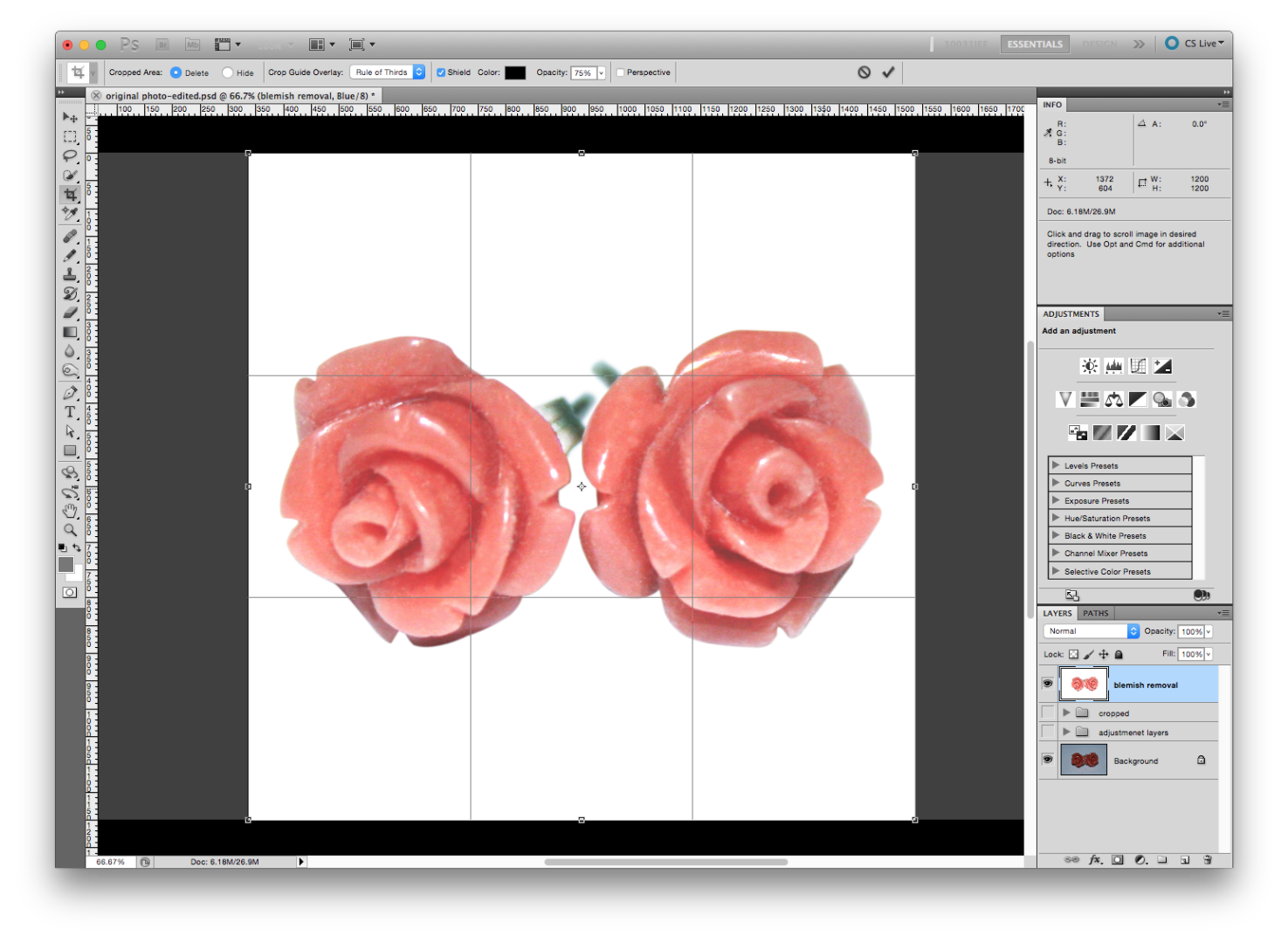
Select your crop tool from the tool bar. If you want a square as your final size hold down shift while you drag it out.
Feel free to ask me any questions you have. This is just the technique I use, there are many other ways to get the same effect.