How to Build a Faux Gothic Temple in a Small Space Using PVC Pipes & Mirror Illusions
by Stretch12 in Workshop > Home Improvement
7173 Views, 89 Favorites, 0 Comments
How to Build a Faux Gothic Temple in a Small Space Using PVC Pipes & Mirror Illusions




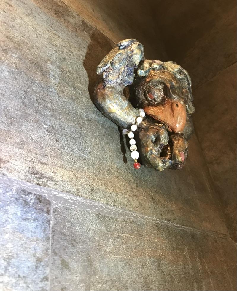
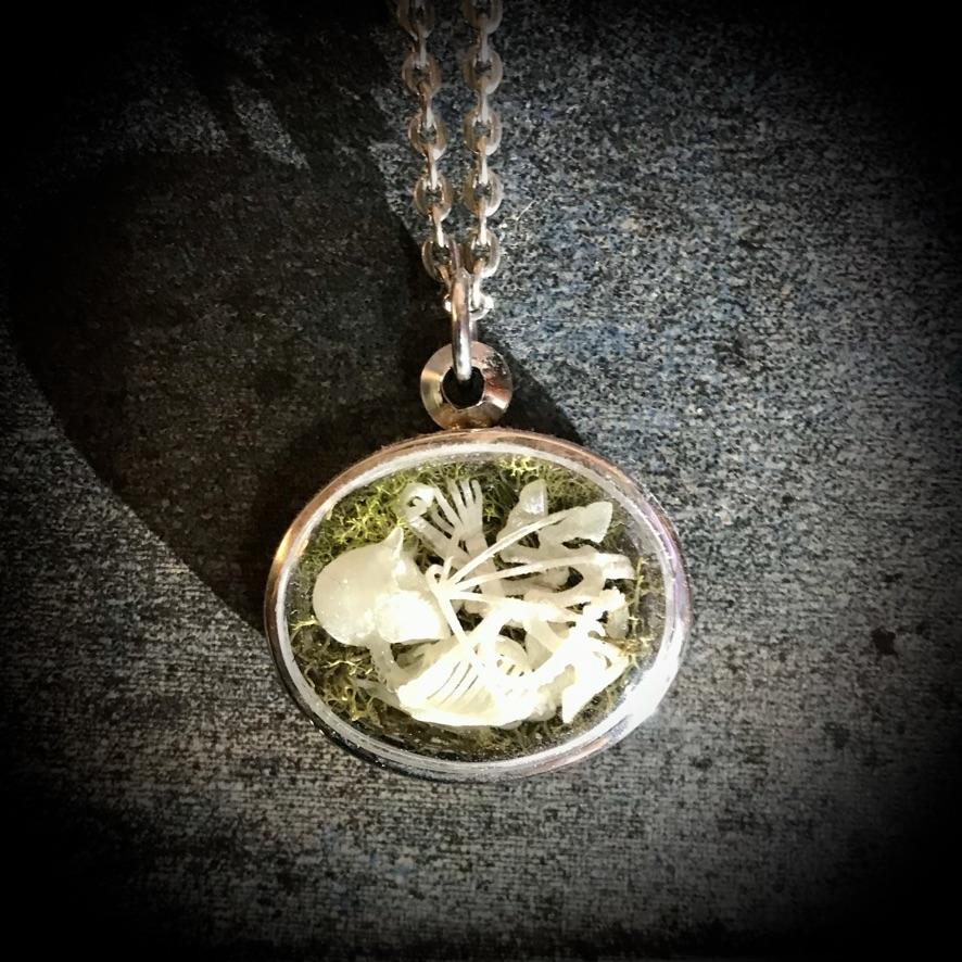
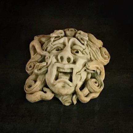

My wife and I love all things medieval. While we are much too old to get away with dressing in a Gothic style, we have spent many hours exploring medieval cathedrals, enjoy listening to Celtic music and have accumulated an assortment of grotesque creatures. Some years ago, friends of ours gave us a beautiful oak panel from a demolished country church that they had rescued from their local garbage dump. Years later another generous friend gifted us with an ornate cast-concrete base of a baptismal font that had been salvaged from a demolished church in our neighbourhood. We lived with those treasures sitting in our basement for several years, being unable to find a use for them but unwilling to part with them.
The opportunity to repurpose these items arose when we decided to install a guest washroom on the first floor. We live in a three-storey Victorian townhouse that at the time had only one bathroom that was located on the second floor. As our living areas are primarily on the first storey, we had become weary of climbing the long flight of stairs to the second floor — trips that were becoming increasingly frequent as our bladders aged. We decided our second washroom would be a fanciful little Gothic temple.
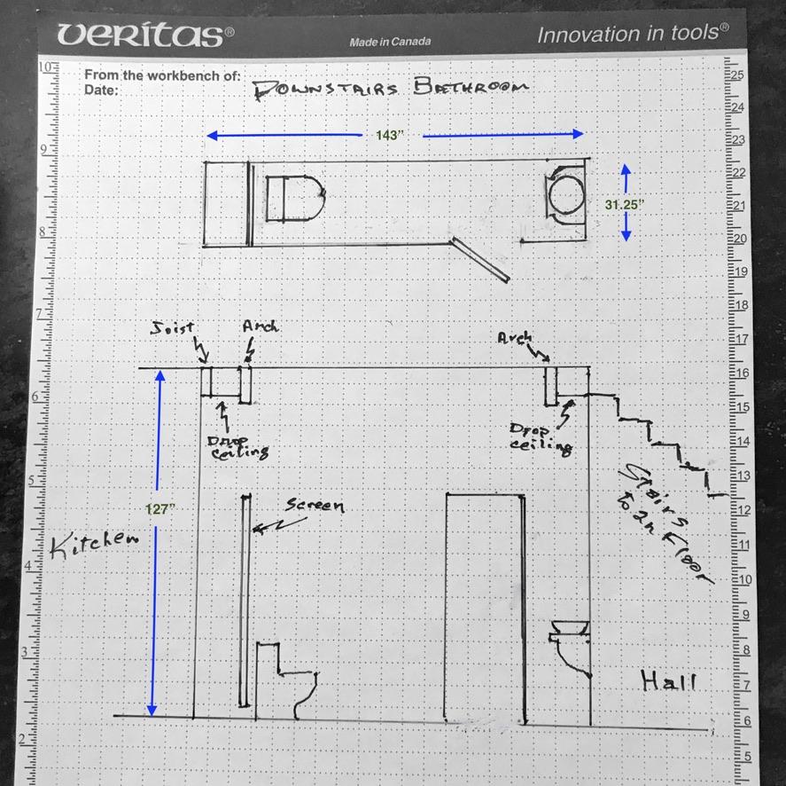
We had only one option for locating a first-floor washroom that would not require a major restructuring of the entire ground floor. The only space available was part of an old closet off our dining room. That space, however, presented challenges related to both its size and its location. The available space was long (143") and shallow (31.25”), with a high ceiling (127") and a door that opened directly into our dining room. The closet was located under a secondary staircase to the second floor that had been closed off by a previous owner. The narrowness of the space made it feel confining and corridor-like. It was windowless and had no exterior wall through which we could vent the air. The toilet's proximity to the dining room table would present challenges with respect to protecting the privacy and comfort of our dinner guests. We were not happy about the risks the cramped space might pose for triggering a panic attack in one of our claustrophobic friends. And we could not bear the thought of witnessing the humiliation of a sensitive guest as they emerged from the washroom — aware that everyone around the dining table must know exactly what bathroom activities they had been up to over the prior few minutes, because the noises and odours had been way too powerful to ignore. The solutions we settled on were to use mirrors and other illusory tricks to alter the perception of the narrow space, an audio system to mask nasty noises and a ventilation system to discharge noxious smells directly from the toilet bowl.
GOALS OF THIS INSTRUCTABLE
The market for DIY tiny faux-gothic-temple washrooms, I suspect, is not likely to be huge. It is possible, nonetheless, that some of the construction and faux finishing techniques described here might be helpful to readers who are interested in constructing fantasy rooms of any kind where a medieval style of architecture is desired — whether that might be a Harry-Potter-themed bedroom, a fairy-tale inspired playroom, a scary Halloween installation, a medieval-pub-themed den, a home chapel, a meditation room, a display for a trade show or a stage-set for a theatrical production. As well, the sections describing the use of mirror illusions, might be of interest to DIY decorators who are looking for ways to visually expand cramped spaces or to rework the aesthetics of awkwardly shaped rooms.
Unfortunately I do not have pictorial documentation of the project in progress and did not keep notes about formulas or procedures, but I will do my amateurish best to illustrate the steps in its construction. Rather than providing detailed step-by-step instructions for the entire project I will focus more broadly on processes and techniques that readers can adapt to their particular situations. Although components of the project are presented here as sequential steps, some components would be best constructed in coordination with other components — as is the case for most multi-component projects
HIGHLIGHTS OF COMPLETED PROJECT
I would like to begin by offering a brief summary of the (almost) completed room in order to provide an overview of the project and make it easier for readers to skip ahead to sections that interest them the most.
So — on with the tour:
Mirrored Wall
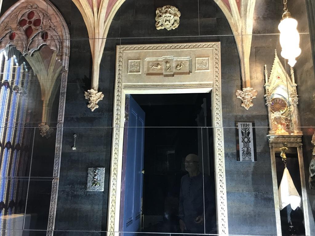
The long wall across from the entrance to the washroom is clad with mirrored tiles to create the effect of a room that is double its true size. We chose mirrored tiles over floor-to-ceiling mirrored panels for both aesthetic and practical reasons. Not only are mirrored tiles considerably cheaper and easier to install, they are thinner and thus consume a little less floor space (every silly millimetre counts in a room this shallow) and create a less noticeable gap between the reflected image and the surface it is reflecting (the abutting floor, wall or ceiling). The rectangular shape of the mirror tiles echoes that of the ceramic tiles on the other three walls. For those walls we chose large rectangular tiles glazed in a smokey blue colour, which reminded us of aging stone block that had been stained by years of candle soot and grime.
Large Niche
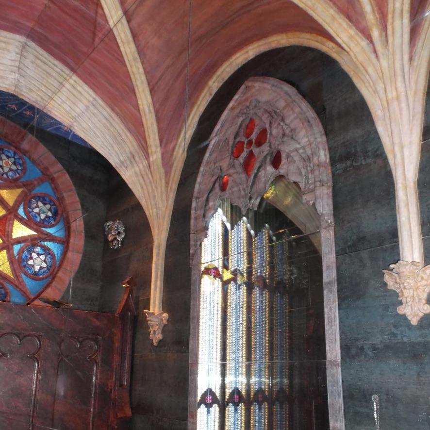
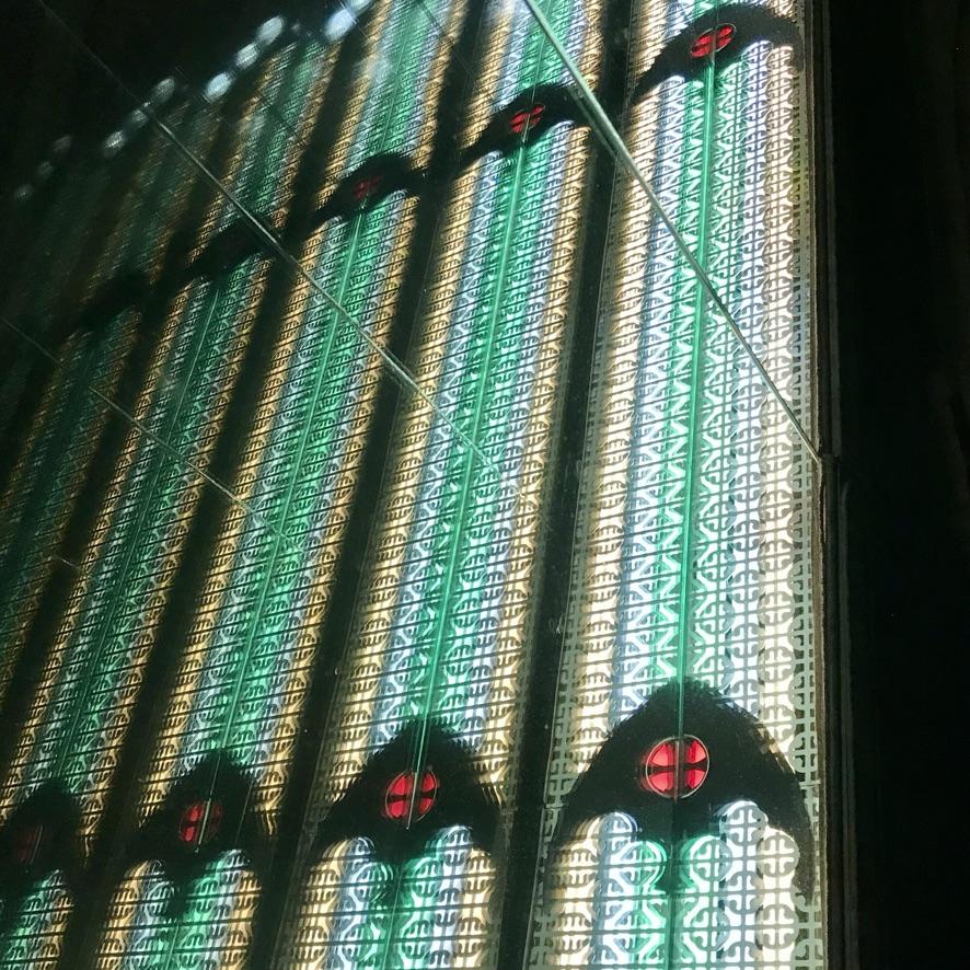
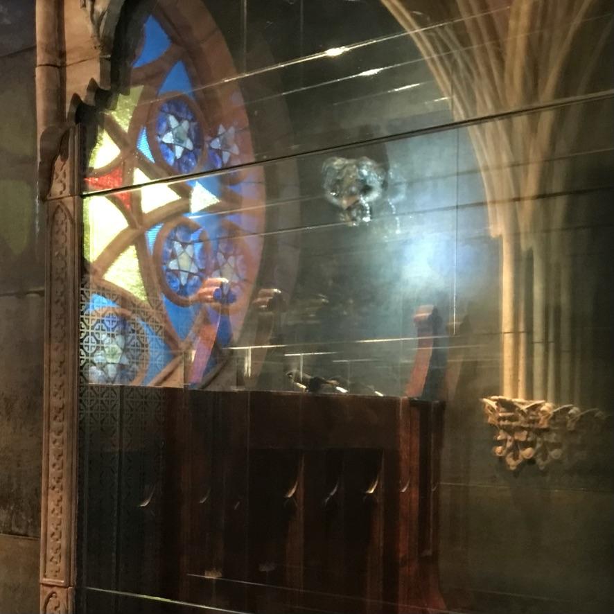
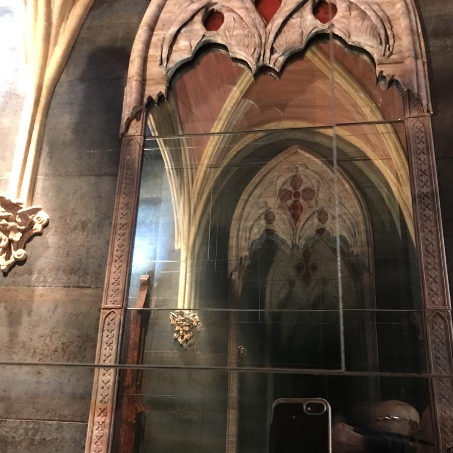
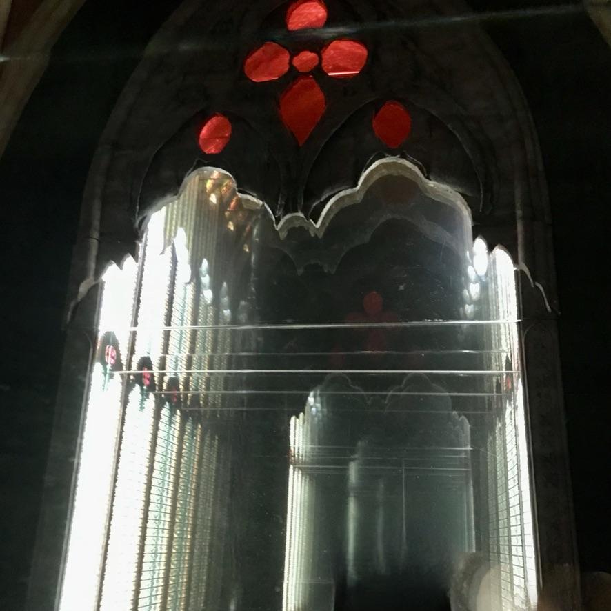
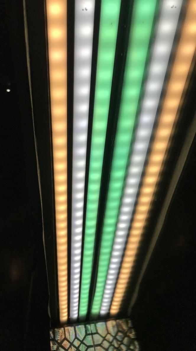
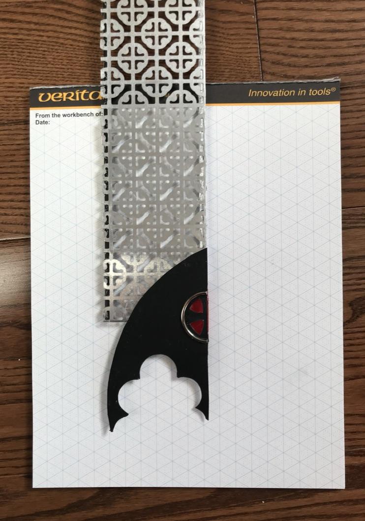
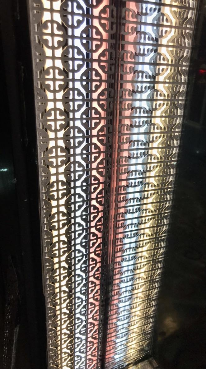
A shallow but towering niche was built inside the wall cavity, using the 3” deep wall space to create an infinity mirror. When reflected in the mirrored wall across from it, the effect is that of a transept, an area that runs crosswise through the main structure (the ”nave”) of a cathedral — a cruciform design typical of Gothic Christian churches. The walls of the transept appear to be lined with tall stained-glass windows. The stained glass-effect is created by three LED light bars mounted on either side of the niche. The LED strips have been covered in aluminum panels with die-cut perforations of a clover-leaf design. The floor and ceiling of the niche are decorated with Dollar Store laser-etched foil gift wrap and are illuminated by two sets of custom-made LED up/down lights mounted in the upper portion.
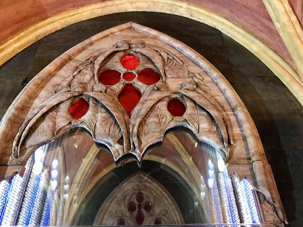
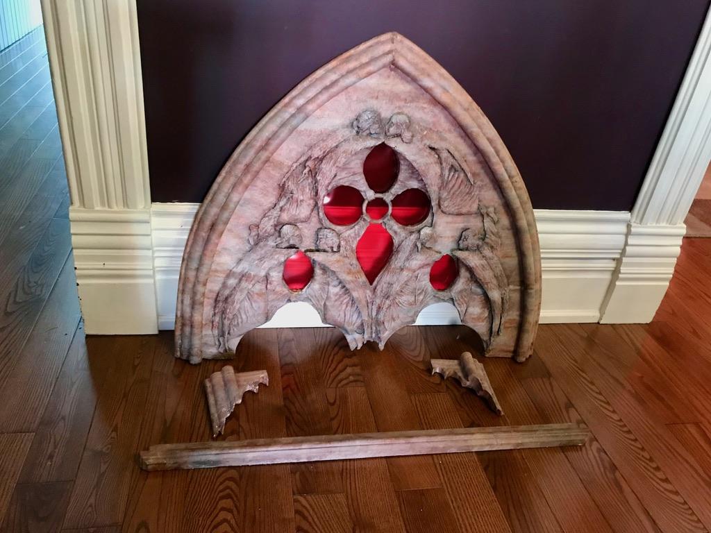
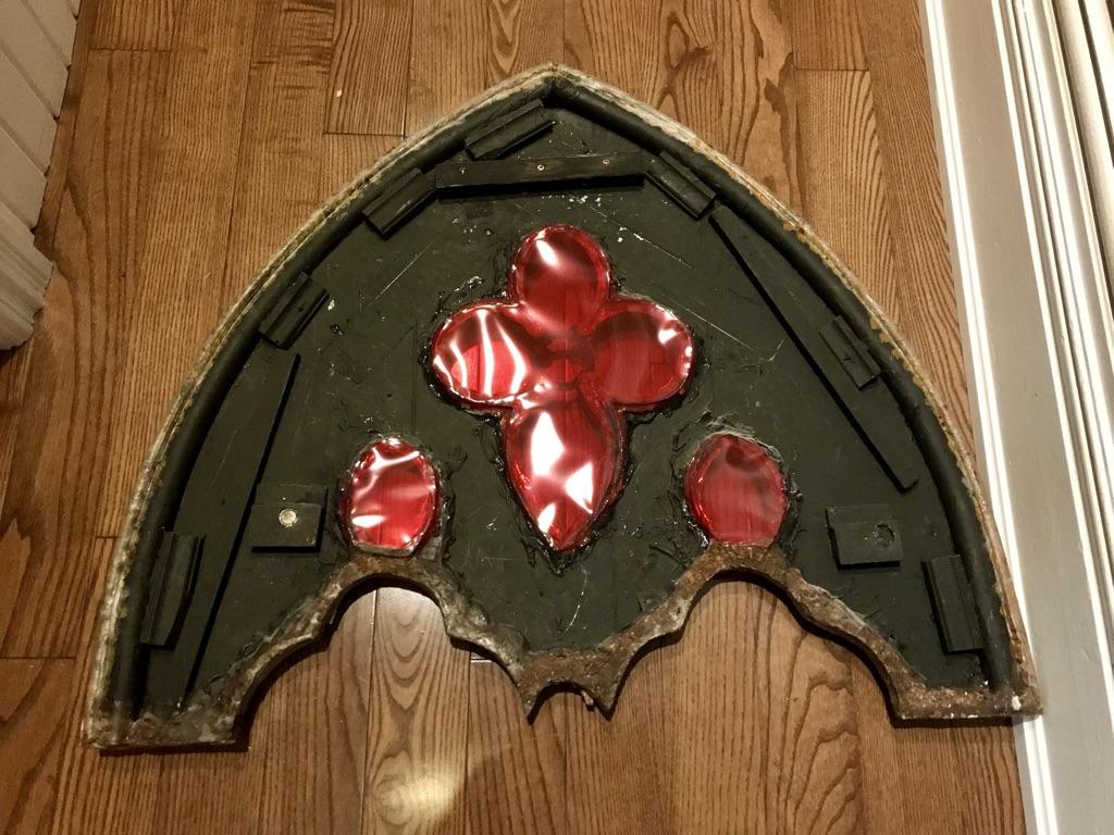
The decorative arch covering the top of niche, is a faux rendition of a primitive stone-relief carving of six hand-holding angels. The piece (which we have dubbed "An Orgy of Angels") is fashioned after a concept drawing for a Gothic window (artist unknown). The piece was constructed from plywood, tooled copper sheeting and PVC conduit; it was then faux painted to resemble a light pink sandstone and was backed with pieces of ruby red mylar to imitate stained glass.
The mouldings framing the large niche were constructed from a stock wood moulding, that I stencilled in a three-dimensional cloverleaf design and then painted to resemble sandstone in hues similar to the arch.
The reflection of the niche in the mirrored wall significantly amplifies the space-expanding effects of the mirrored wall by itself. The effect of this triple mirror reflection (a reflection of a reflection of a reflection) is more subtle and less disorienting than most infinity mirror installations. Unlike most infinity rooms, the space does not appear to stretch beyond the beyond. Since the mirror film used to create our infinity mirror is only partially reflective, it results in more pronounced ghosting effects and a corridor effect that gradually fades into obscurity at a perceived depth of about 20 feet or so on either side of the room. The result is in an overlapping array of multiple images. Glimpses of rooms beyond rooms are overlaid with ghostly images from other rooms; images of the vaulted ceiling are superimposed over images of the niche’s ceiling; ghostly images of arches are superimposed over other arches.
The lighting in the large niche is controlled independently of all other lighting, which enables the visitor to select from a variety of visual effects. When the niche alone is lit the effect is that of a long corridor lined with tall stained glass window. With the niche lighting turned off while the other lighting is on, the stained glass windows disappear, the space widens and the effect is more that of a series of rather gloomy unlit rooms that adjoin each other. With all lights turned on the effect is much more that of a melange of overlapping images — as described above.
Rear Screen
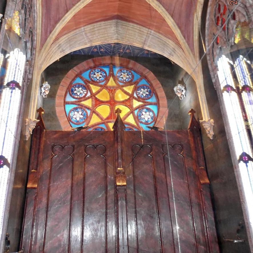
The toilet is framed by a faux red marble screen that serves to conceal the sound system and an up-light and to provide storage space for extra toilet paper and toilet cleaner. The screen is suspended on rollers to facilitate access to this area. We have christened our washroom “St. Micheal’s Chapel” in honour of our good friend, Michael, who gave us the screen that started us on our build-a-temple adventure.
Large Rose Window
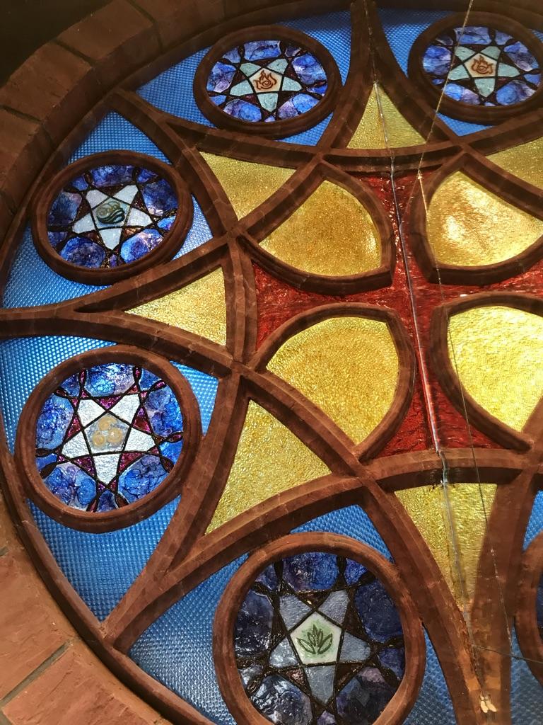
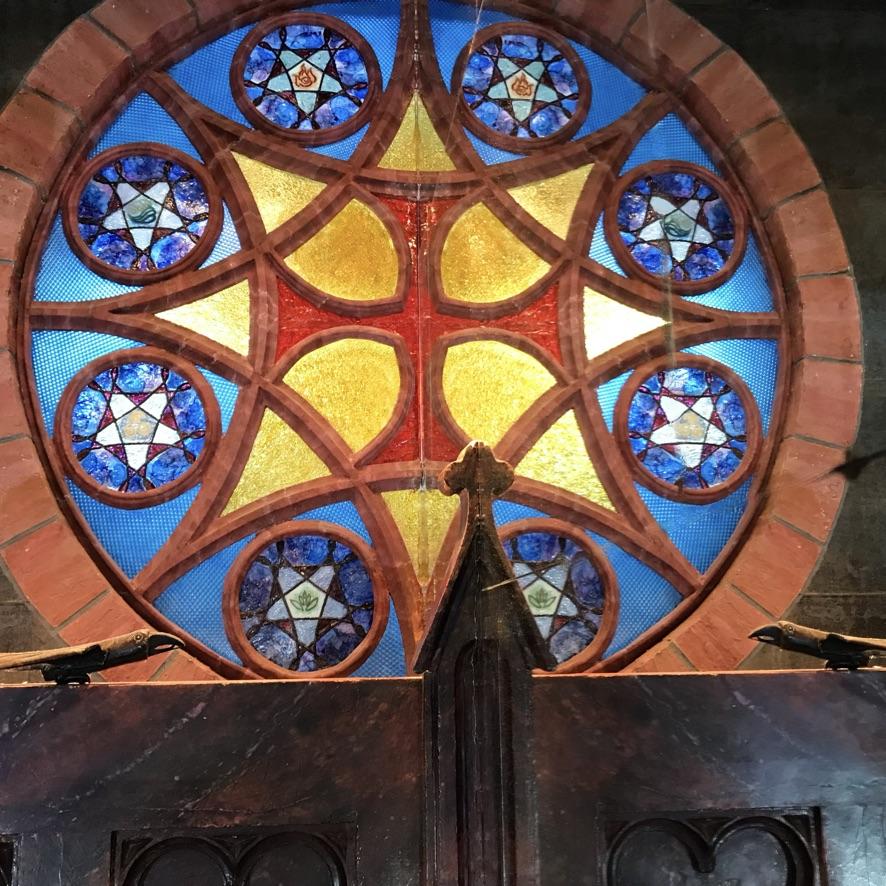
A large half-round faux stained-glass window is located at the top of the rear wall. The faux stone tracery for the window was constructed from plywood and stock vinyl moulding and painted in a shade of pinky brown sandstone. The faux stonework framing the window was created from spackling compound and paint. The faux stained-glass panels were constructed from sheets of coloured mylar and a polycarbonate lens cover from an overhead fluorescent light fixture. When reflected in the mirrored wall, this half-round construction appears as a fully round rose window with a cruciform design in the centre, surrounded by eight circles containing symbolic depictions of the four Greek elements — Earth, Air, Water and Fire. The window is lit from behind to give the impression of having being built into an external wall. The faux stone blocks surrounding the window are painted pink and brown in similar hues used for the window tracery.
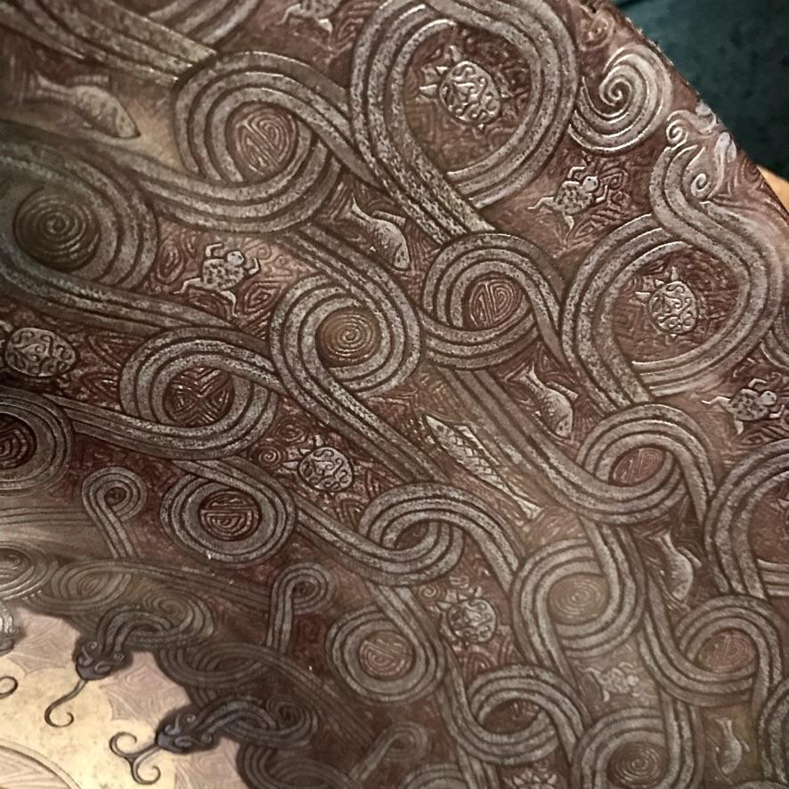
The ceiling above the large rose window has been temporarily covered with a poster of a grecian tapestry. It is to be replaced by an octagonally shaped infinity mirror designed to give create the illusion of an overhead dome. This project we hope will also lend itself to a future Instructable.
Toilet & Ventilation System
The toilet has been undergoing cosmetic surgery after the time this picture was taken. It is being reconstructed to look like a more fanciful version of a gothic receptacle constructed of embossed metal and blue glass — all faux, of course. If successful, we hope to submit another Instructable upon its completion.
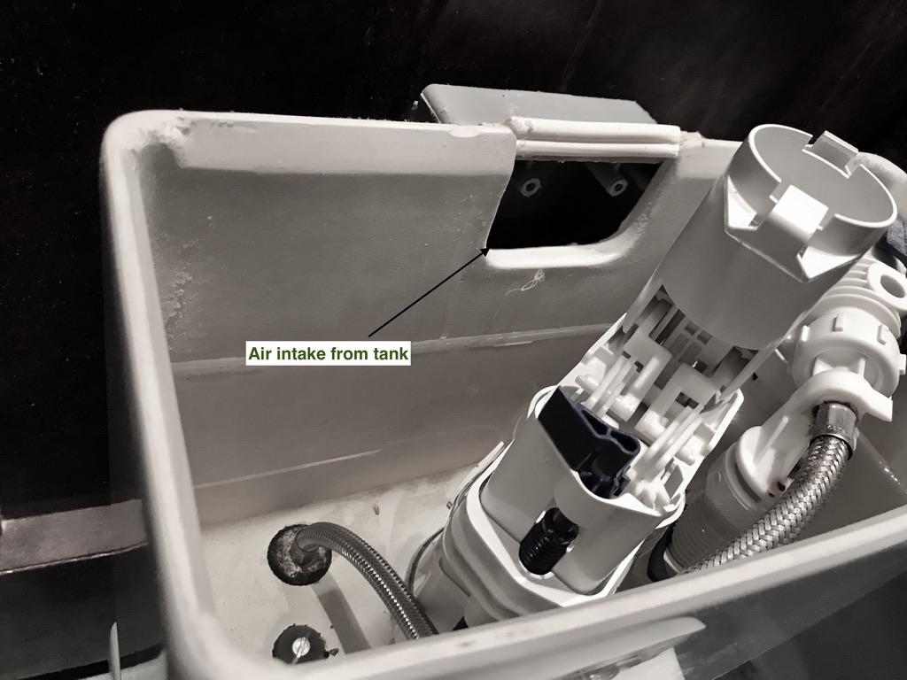
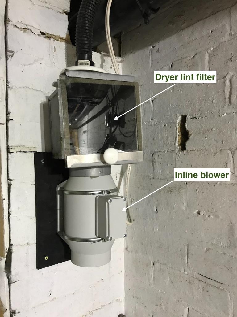
The ventilation system is designed to remove odours directly from the toilet bowl. This was accomplished by attaching a long vacuum hose to an opening in the rear of the toilet tank above the level of the overflow pipe. An in-line blower located in the basement pulls air directly from the bowl via the overflow pipe and the flush holes in the rim of the bowl. The air passes through a carbon filter before being exhausted into a basement room. This system is 100% effective in removing odours from their source and has the added benefit of being virtually silent since the blower is not located in the same room as the toilet.
Fountain & Sink
Hand washing facilities are located at the opposite end of the room. The sink is bowl-shaped with decorative detailing of Celtic origin. It sits on the salvaged concrete base for a baptismal font that was rescued from the demolition of a neighbourhood church. The base has been faux finished to look like it has been carved from brown granite. It is up-lit from below to highlight its decorative work.
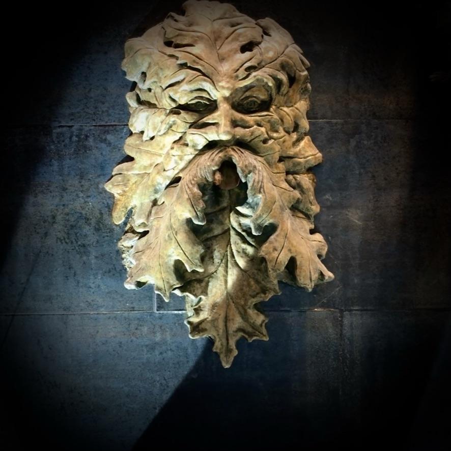
Water for washing is provided by a fountain created from a concrete cast of a Celtic Green Man wall sculpture. The piece was modified to serve as a fountain, with the water stream emerging from the Green Man's mouth. The fountain is automatically activated when it is approached. The piece was repainted in leathery brown hues similar to the base of the font.
Meditation Window
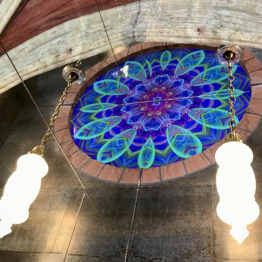
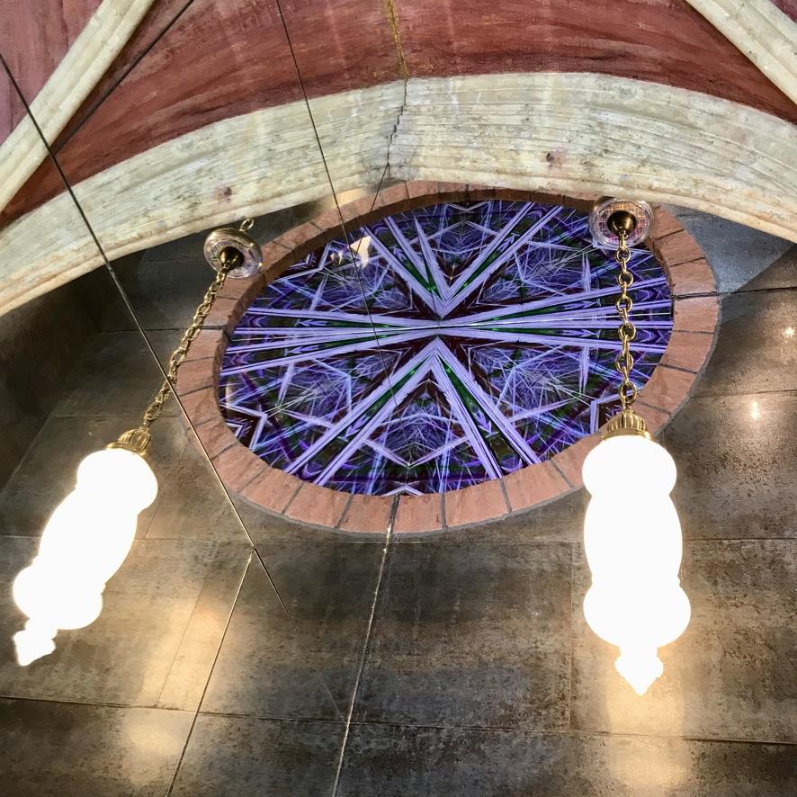
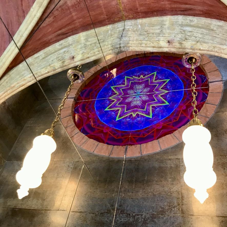
A quarter-round window is located above the fountain. It is reflected in an overhead mirror covering this part of the ceiling as well as in the mirror tiles on the abutting wall. This provides the illusion of a fully round window that has been built into a wall that soars many feet above the sink. A television screen mounted behind the window opening plays a two-hour-long fractal video that produces a kaleidoscopic display of continuously morphing shapes and colours. This video, produced by HDColors.com, was cropped to accommodate the quarter-circle opening for the window. (We refer to the window as our "meditation window" because of the mesmerizing effects of the display.) The window surround is finished in faux sandstone similar to the rose window in the rear.
Small Niche
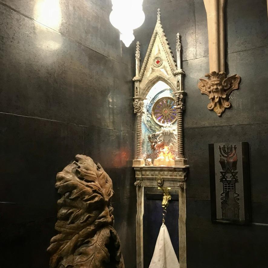
A tall narrow niche is located on the adjacent wall to the right of the sink.
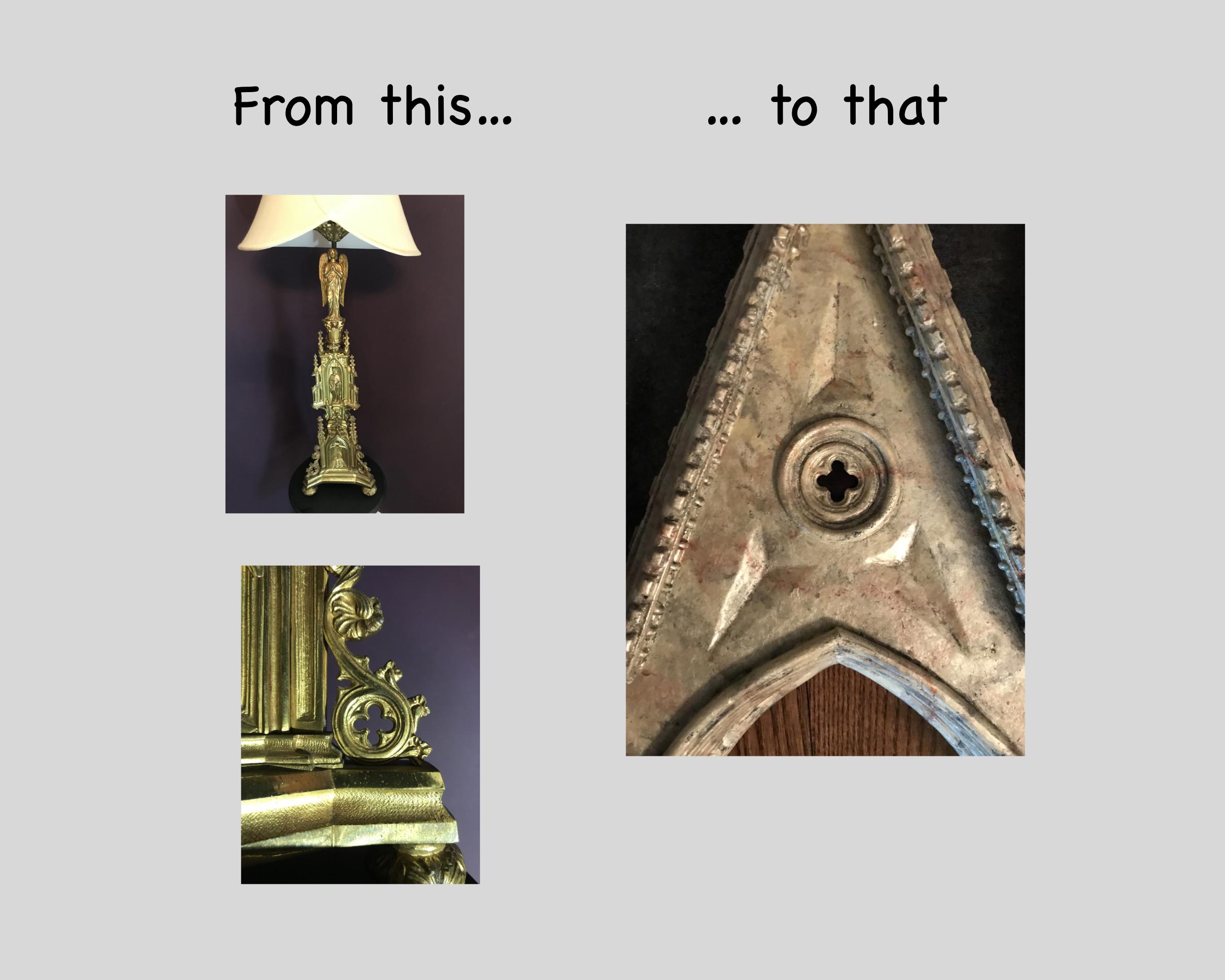
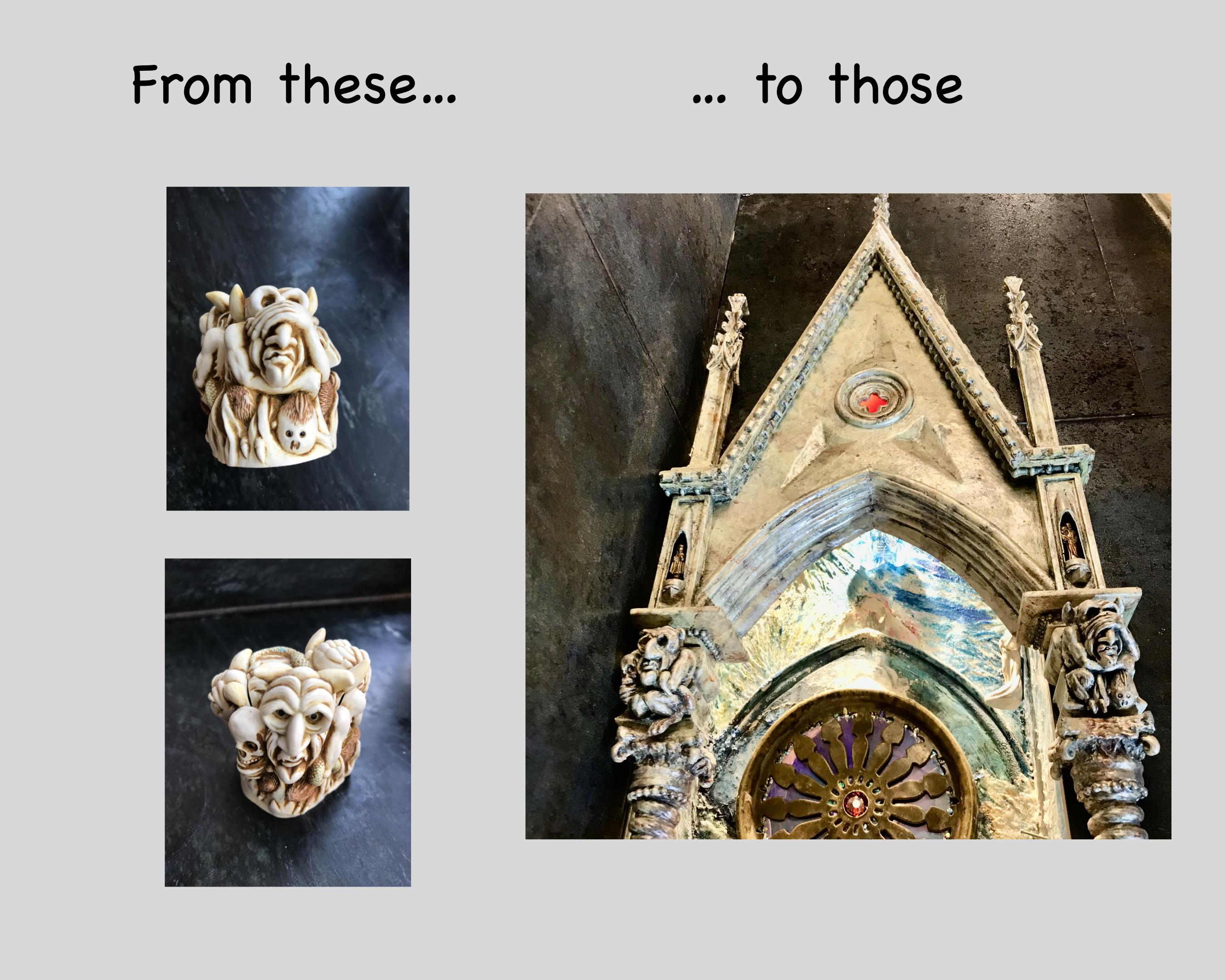
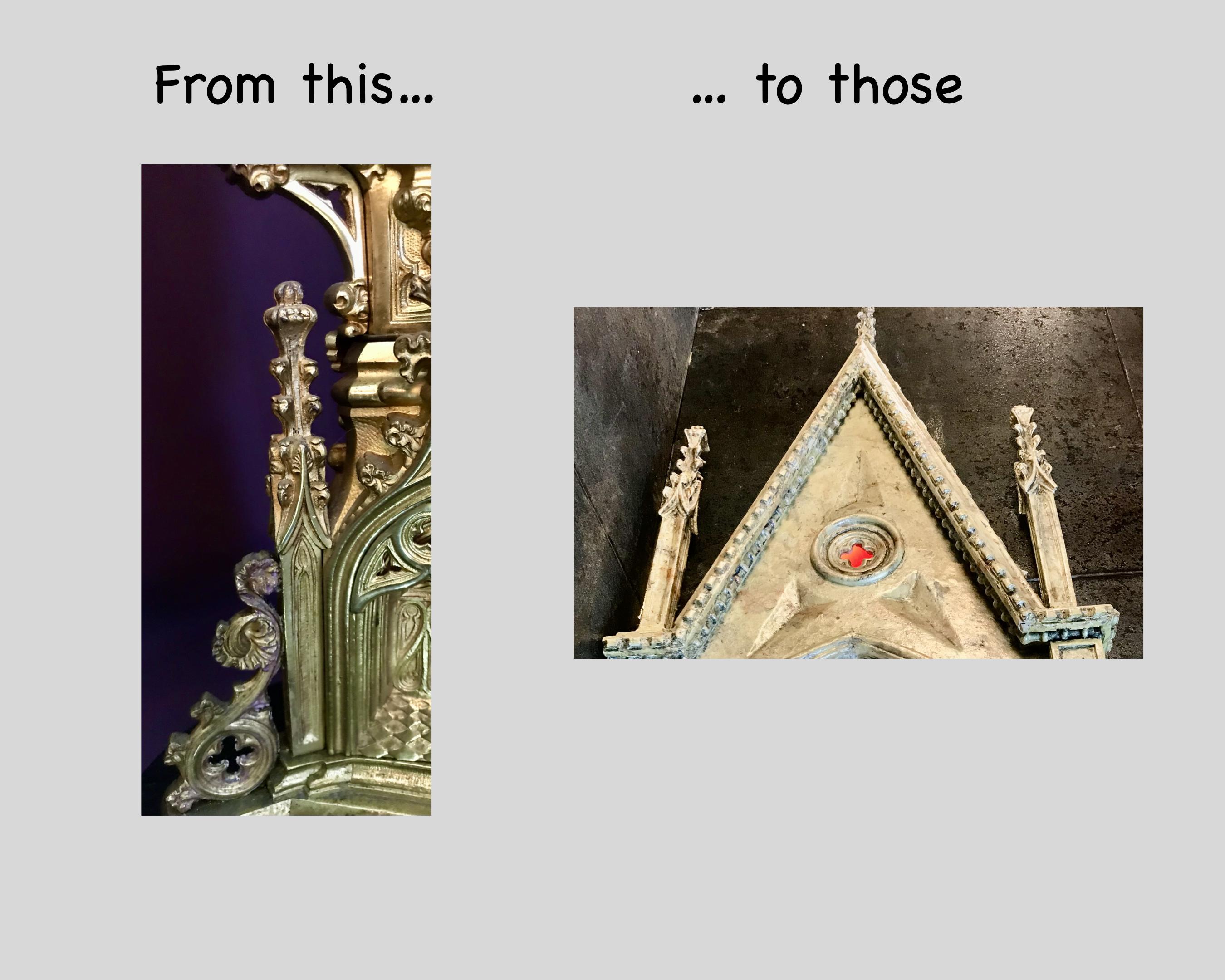
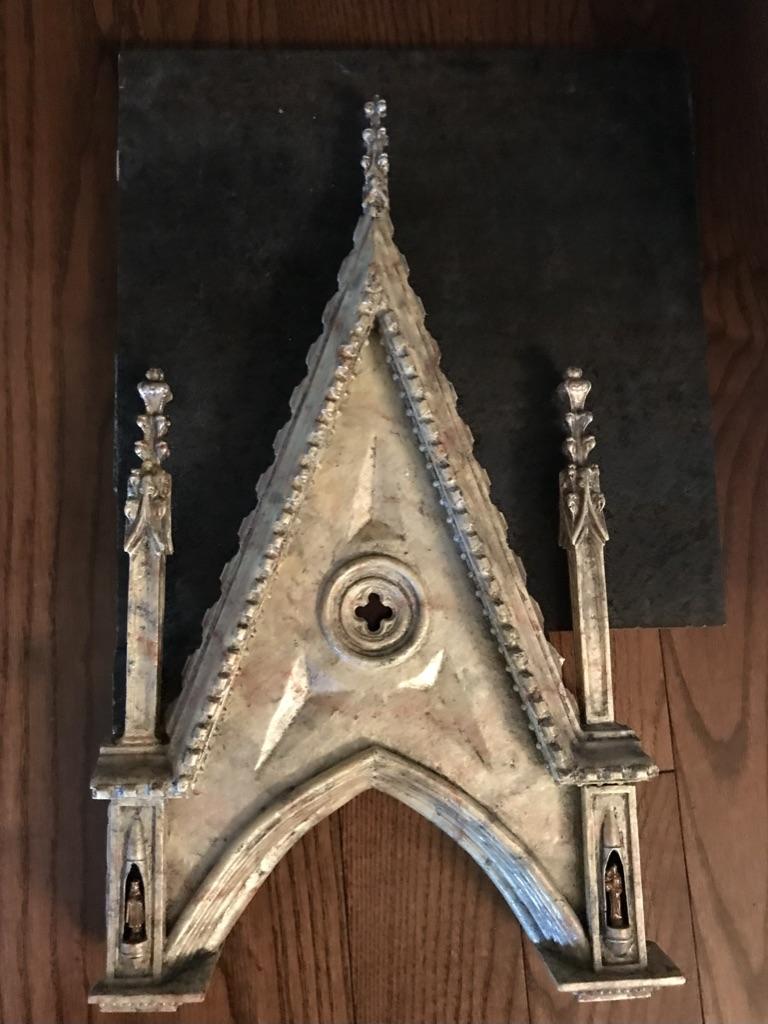
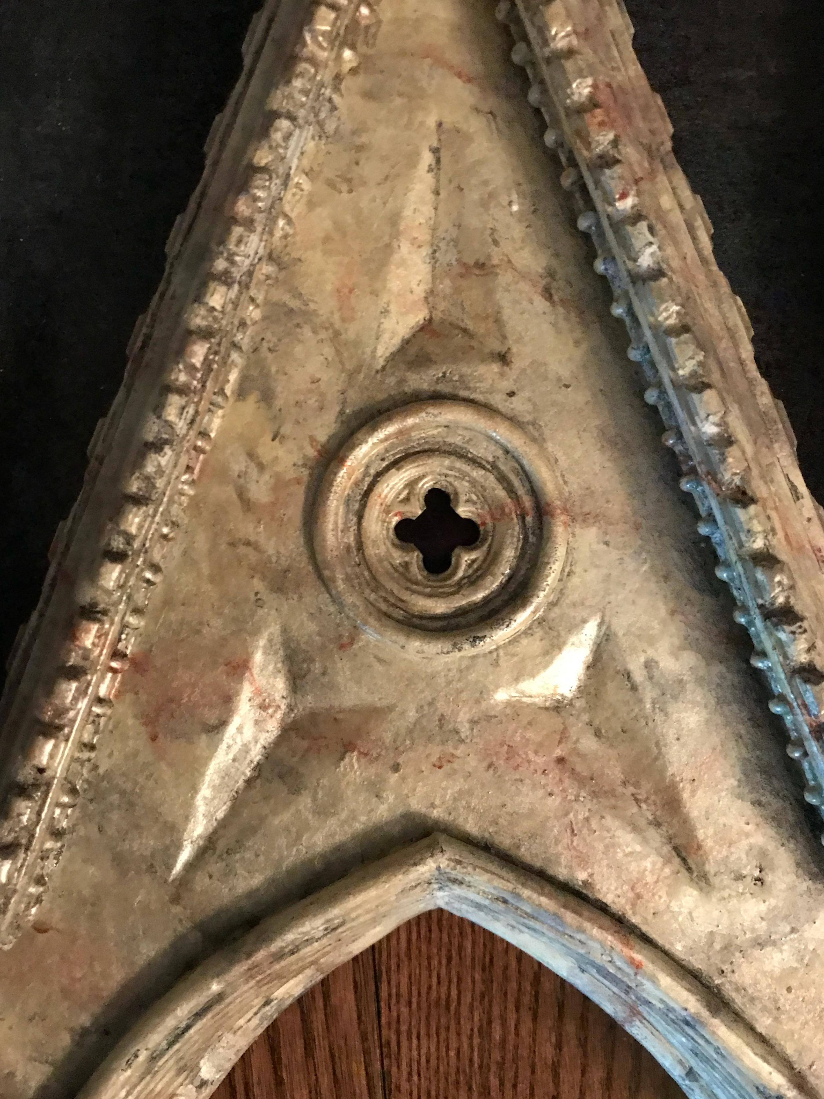
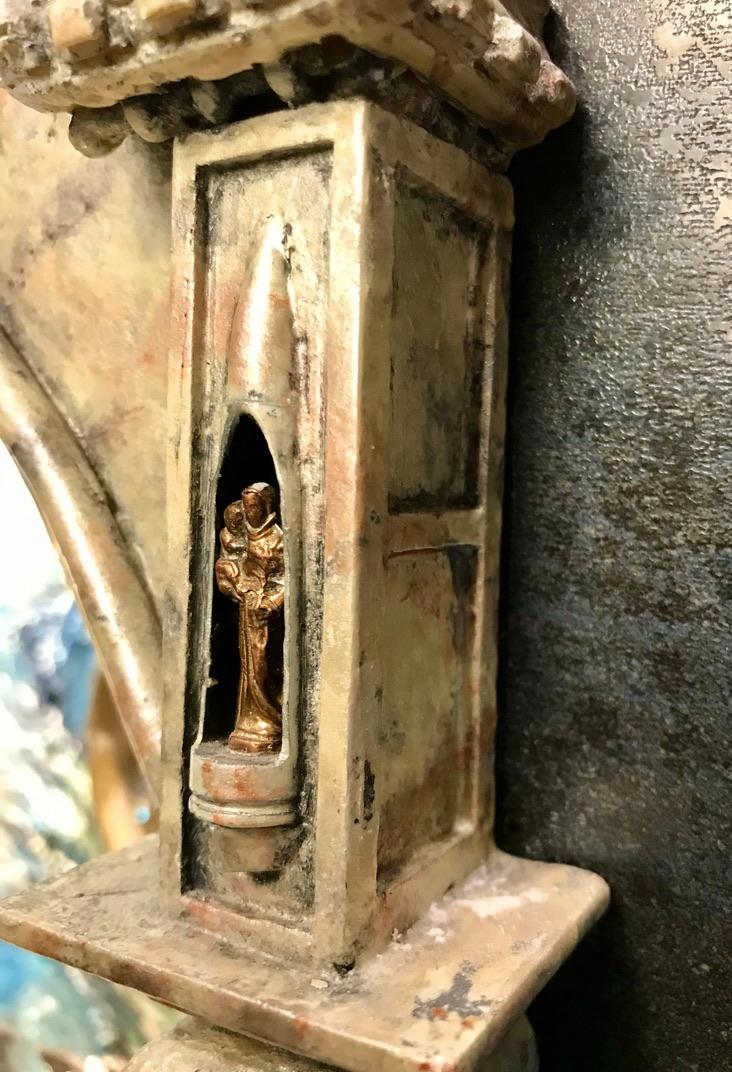
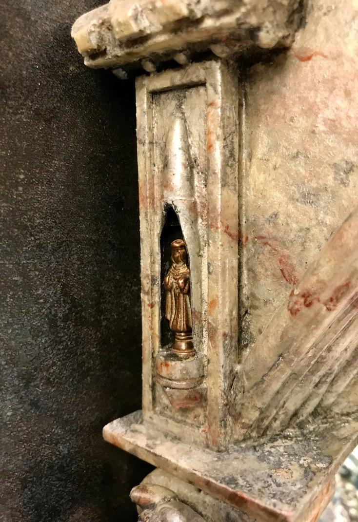
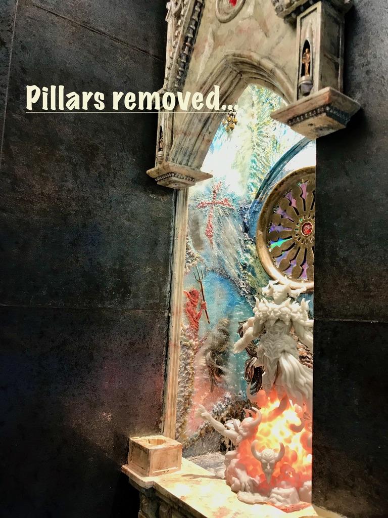
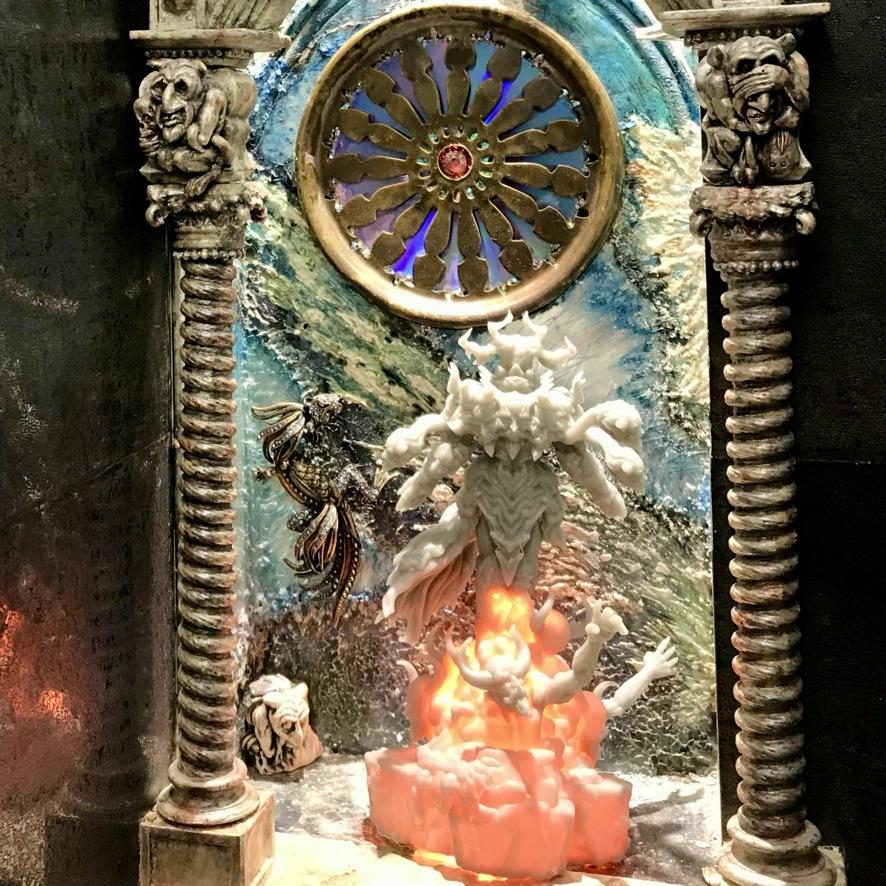
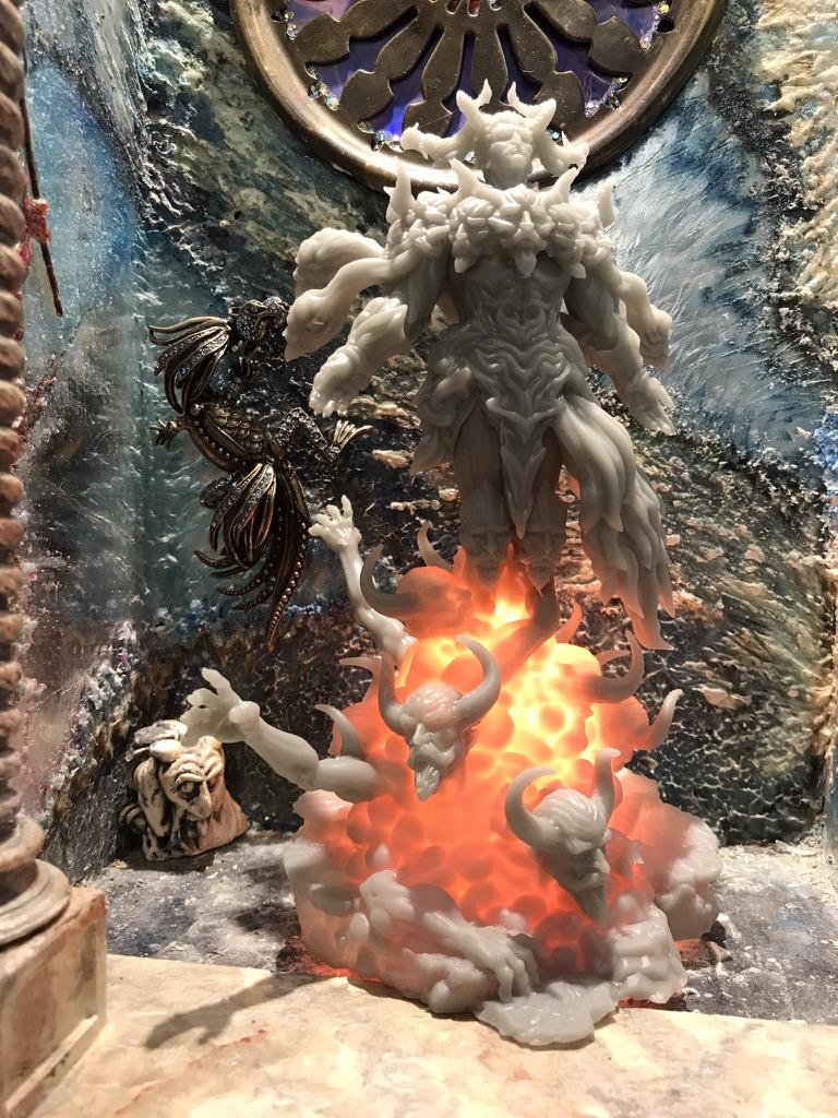
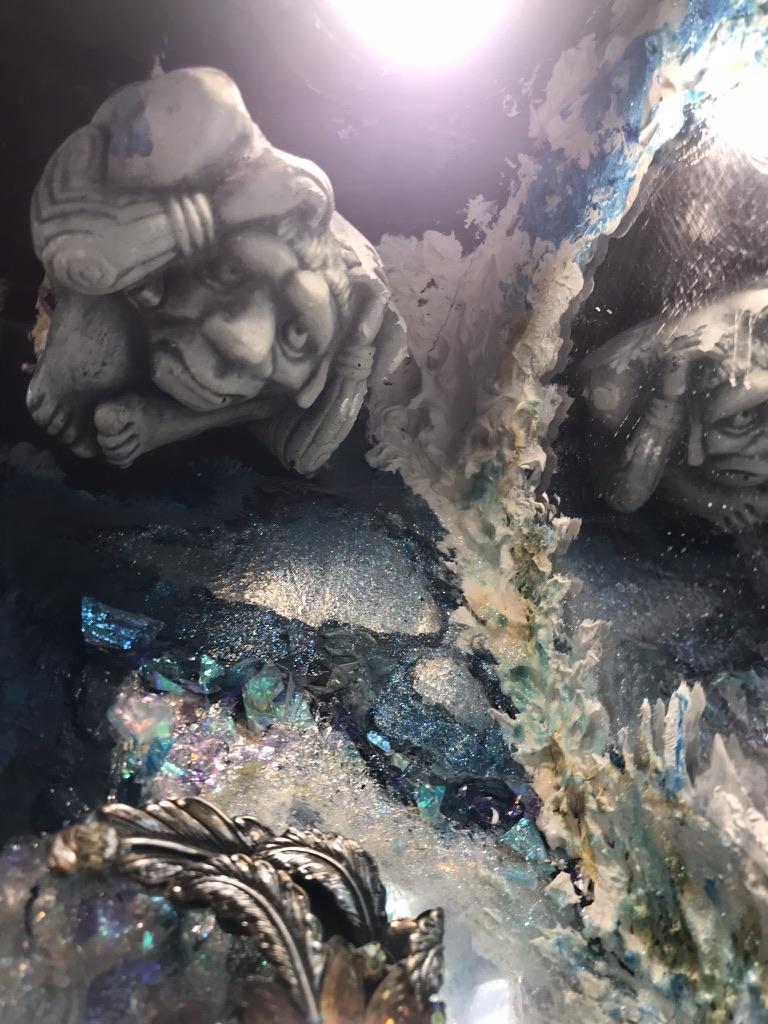
The top portion of the niche serves as a display case for a small collection of icons and mythical creatures. The pointy gable atop the opening mimics some of the decorative elements characteristic of many gothic shrines, were built to resemble church buildings. The facade of our shrine is constructed from a scrap piece of 1” x 6” pine, a couple of old Russian rifle shells, resin castings of a variety of objects displayed around our home, and left-over scraps of mouldings, plastic tubing and sash cord. The shrine exterior is painted to resemble glossy marble, as are the mouldings for the lower sections of the niche.
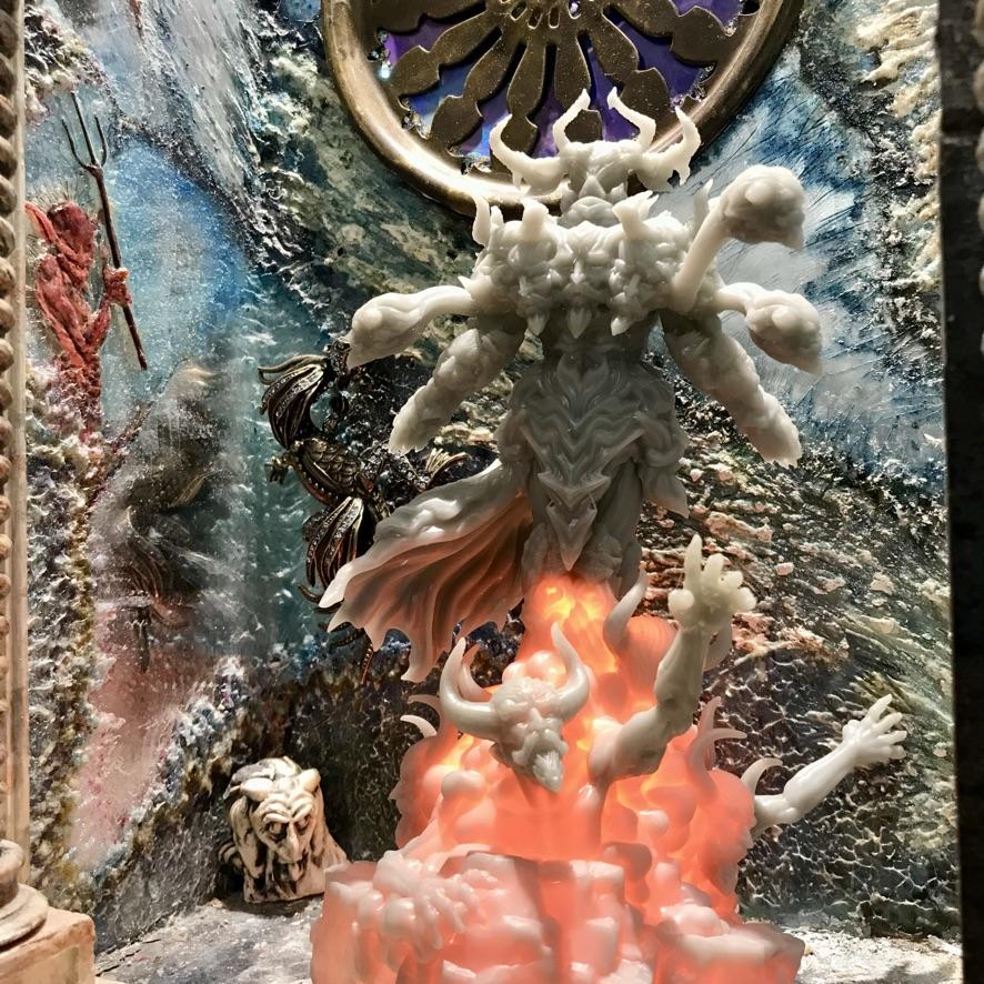
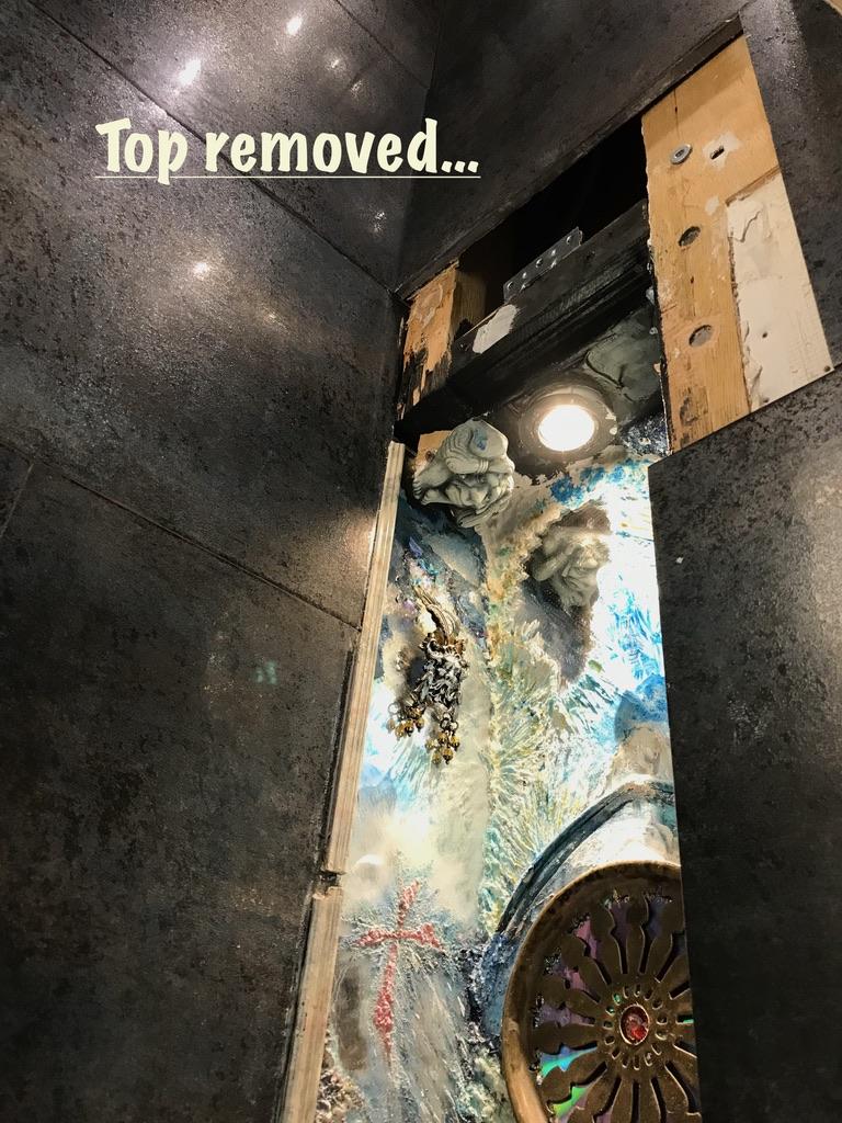
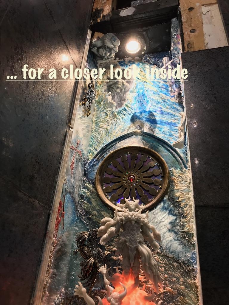
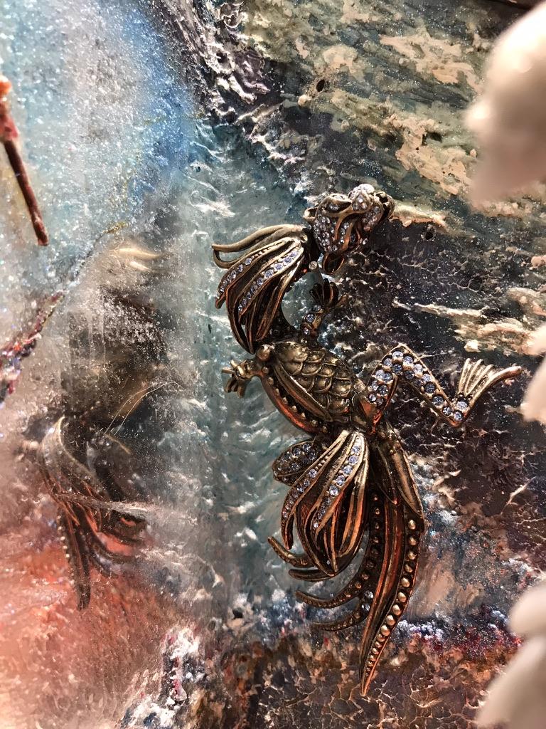
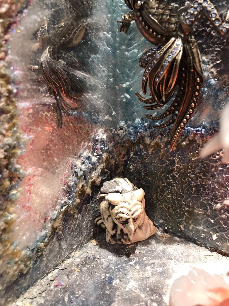
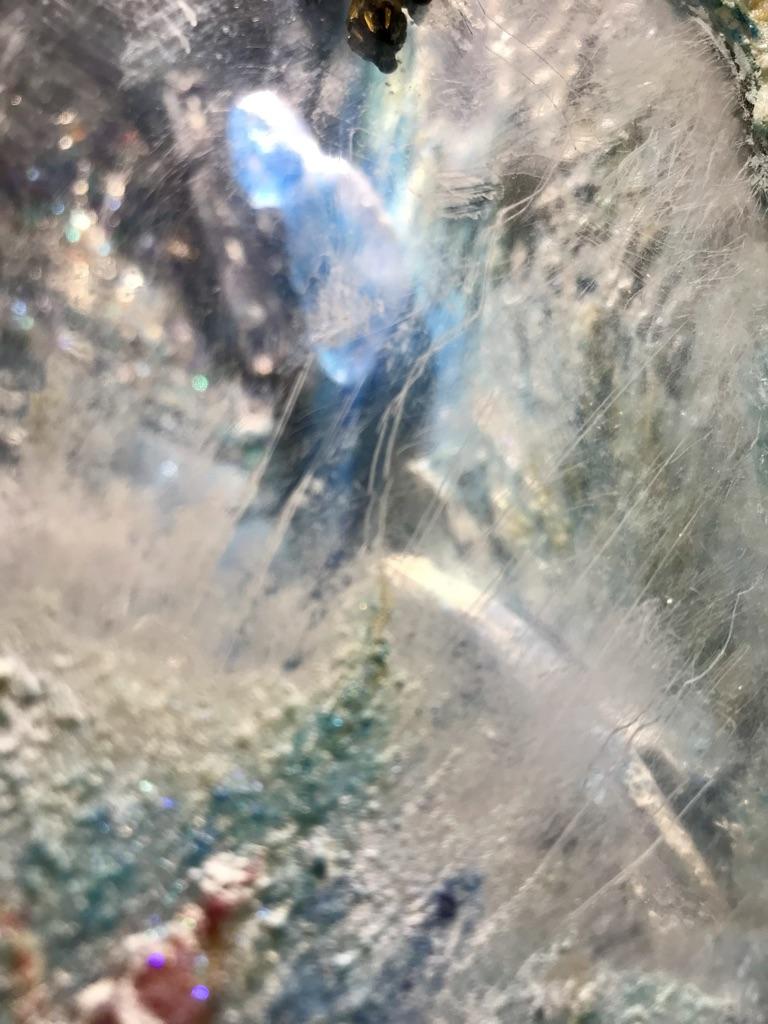
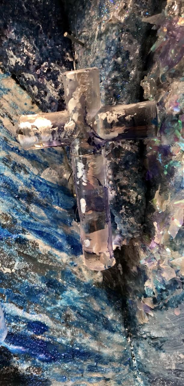
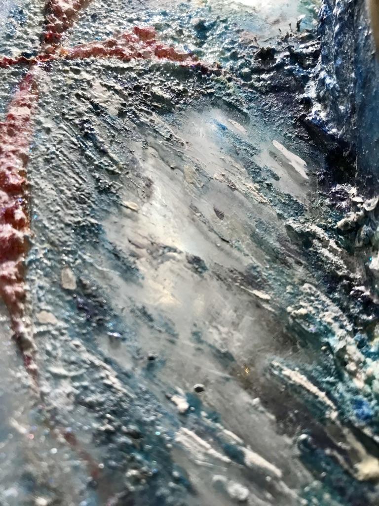
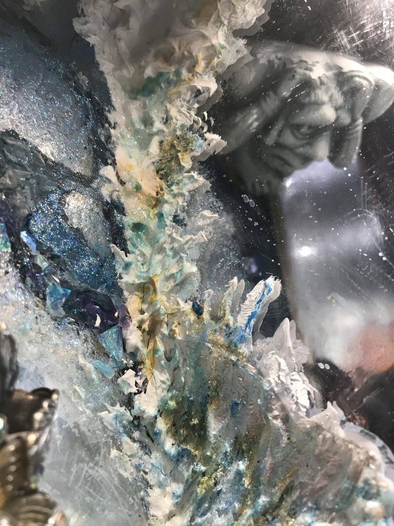
The interior of the shrine extends upwards behind the gable almost to ceiling height. In order to expand the interior space horizontally as well as vertically one side wall of the shrine is clad in acrylic mirror. The shrine’s walls have been finished with acrylic paints to mimic an exotic quartz agate — or perhaps some other type of semiprecious stone containing mineral crystals. Portions of the mirrored walls have been left unpainted or have been partially obscured to give the impression that some of the figures are deeply embedded under the surface of the rock. The miniature rose window in the rear wall is constructed from a brass trivet with a heat-distorted dvd mounted behind it to give the impression of stained glass.
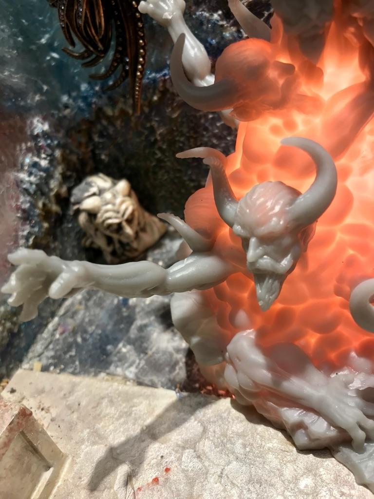
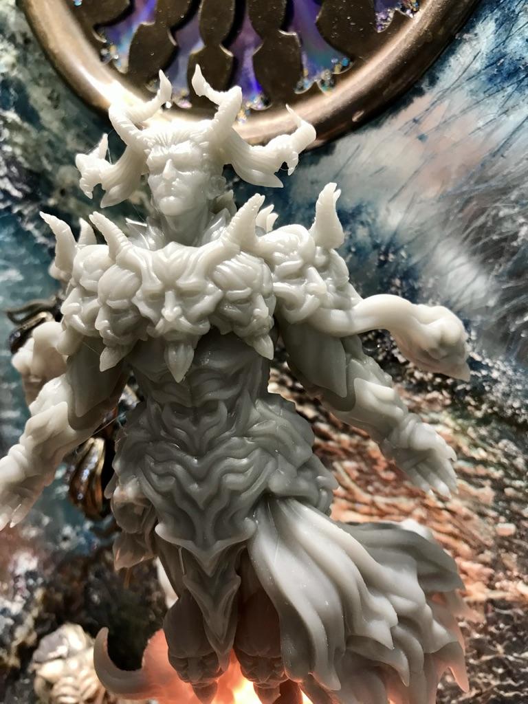
Unlike most gothic-era shrines, ours does not contain any relics — fake or real. I briefly considered including a miniature pickled toe of a saint but decided that could come across as cheap parody verging on blasphemy. Rather the arrangement of pieces within the shrine attempts to portray the age-old story of the battle between good and evil (heaven vs. hell). On the floor of the shrine, is a depiction of Belial, a prince of demons, who is rising up from the glowing embers of hell. [3-D print by GreyGhostMiniatures, available through Etsy.com .] Belial is closely followed by his minions who are emerging from the molten lava. As you cast your vision upwards, the scene gradually changes from demons and grotesque creatures to a more serene setting that provides distant glimpses of iconic items that are suggestive of peace, hope and forgiveness. Most of these items can be seen only in reflection and some require a degree of diligence (and physical discomfort) in order to be found. Sitting in a corner above it all sits a rather bewildered looking individual (a philosopher/observer) who is pulling at his hair as he struggles to make sense of the scene unfolding below.
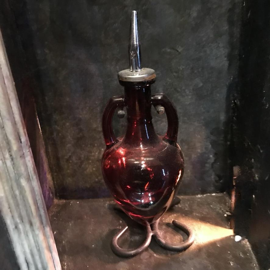
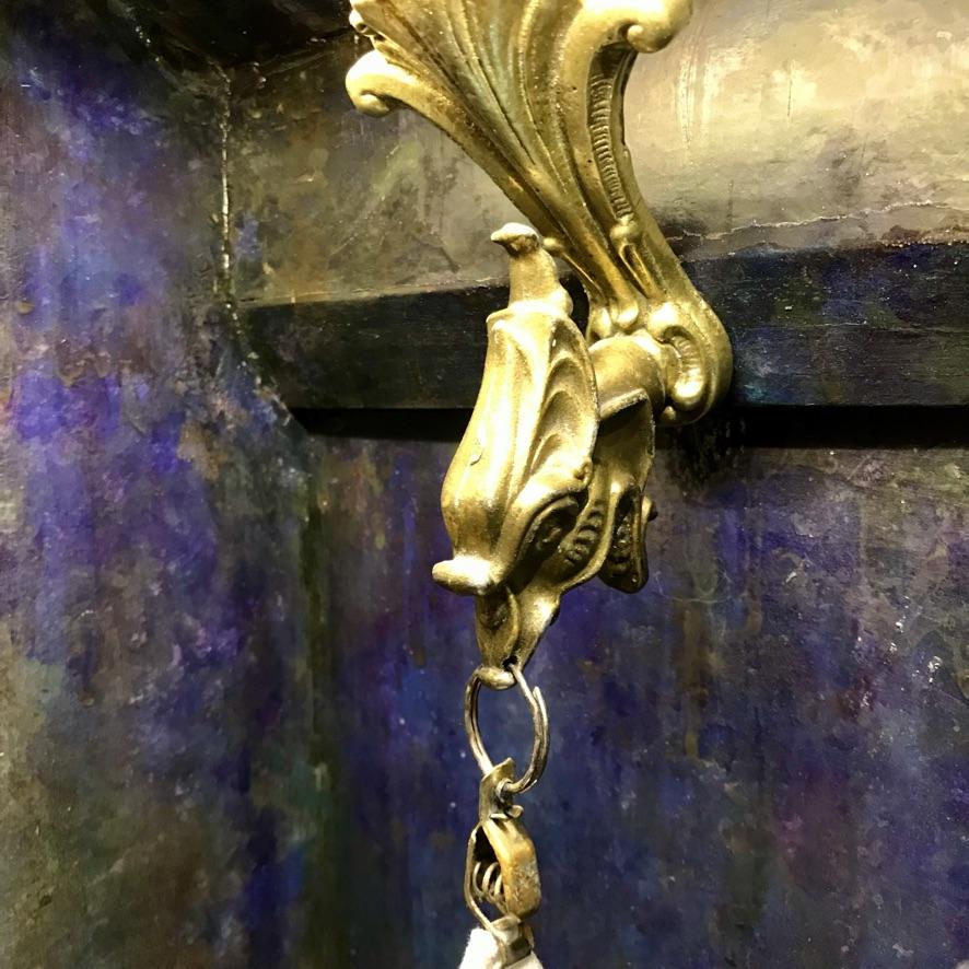
The centre section of the shrine provides space for a hand-towel and liquid soap. The towel hanger is constructed from a brass grotesque head (which once served as the handle of an old letter-opener), a bracket from an old brass ceiling fixture and a small alligator clip. The liquid soap container is a repurposed red glass oil and vinegar dispenser.
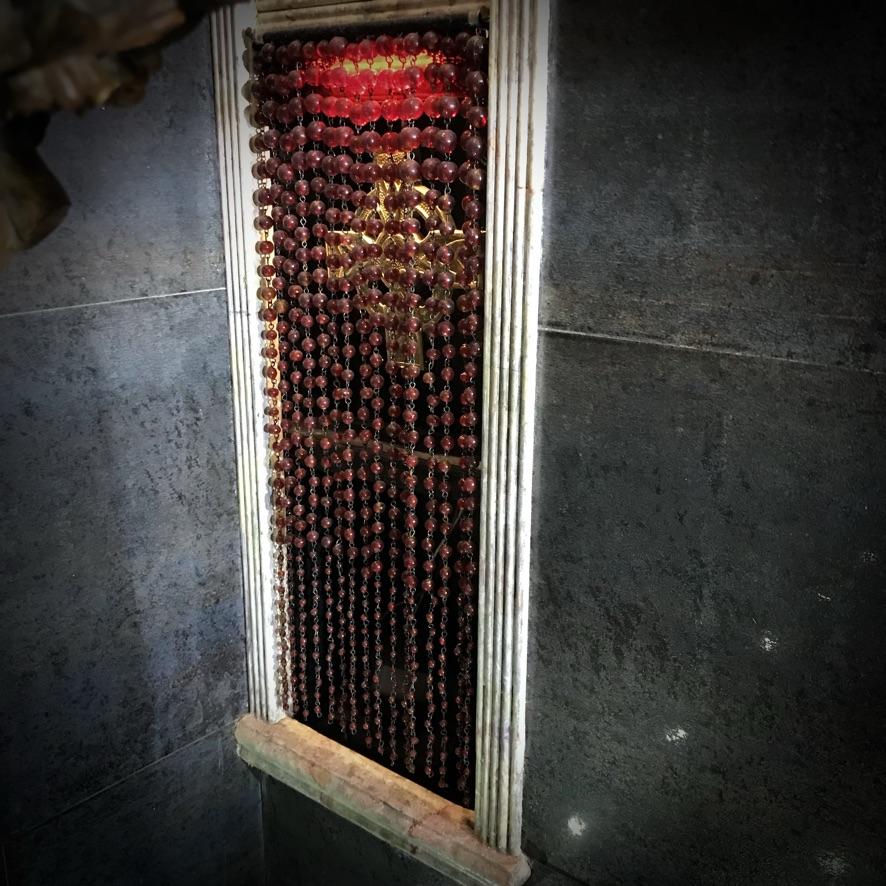
The bottom section of the niche, which extends almost to floor level, provides storage space for spare towels and for a motion sensor for controlling the fountain. The contents of this section are concealed behind a curtain of glass beads and a suspended Celtic cross.
Doorway
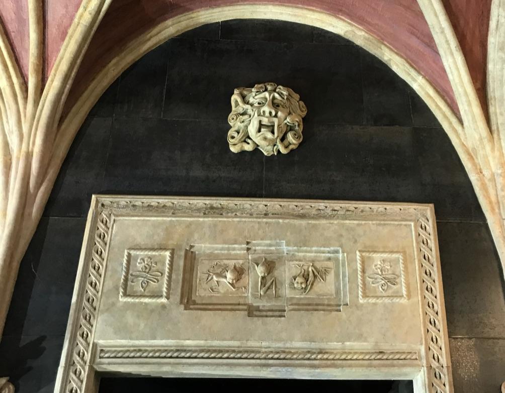
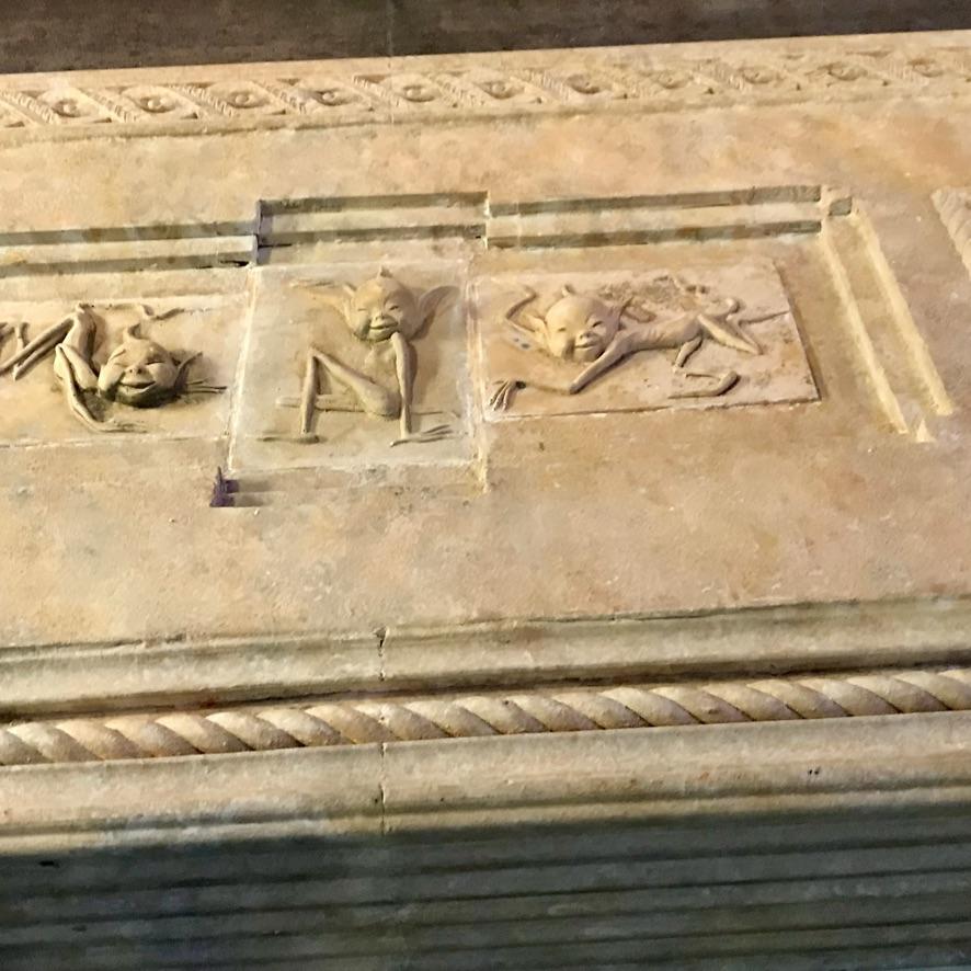
The entrance to the washroom is located between the two niches. Decorative mouldings around the doorway are painted to resemble limestone. The faux carved stonework above the doorway is constructed from ceramic tiles and incorporates three cast wall plaques of playful pixies (a gift from our son). The inside of the door is painted in a deep shade of purple but has not yet been faux-finished. The door handle and backplate are junk-store finds. The door bolt is a Victorian replica from Lee Valley Tools.
Vaulted Ceiling
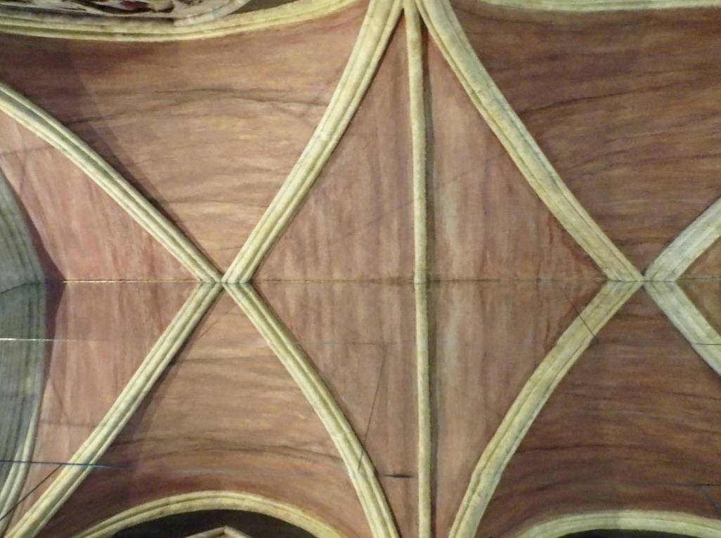
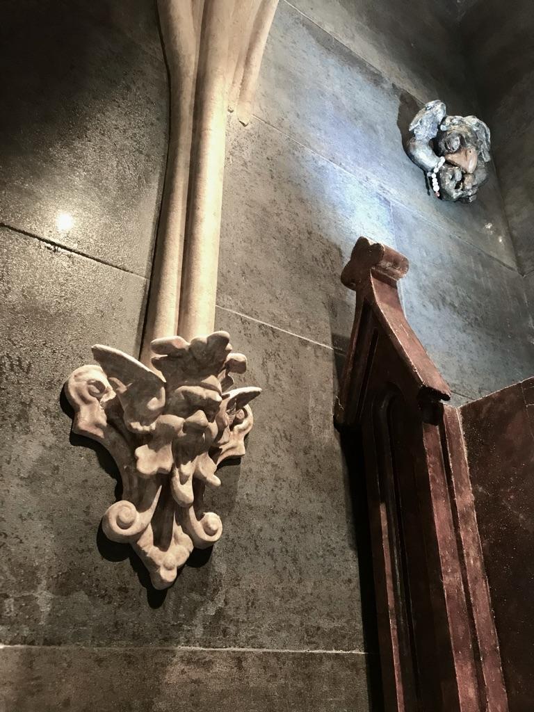
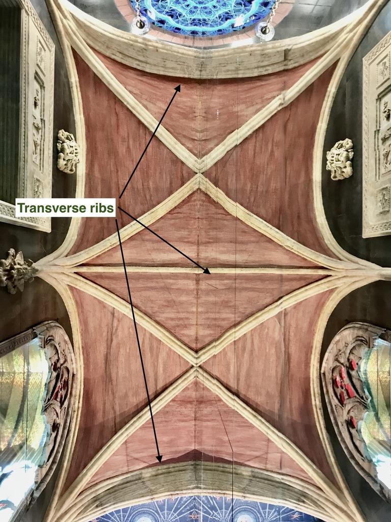
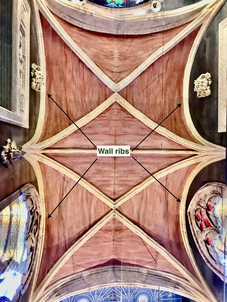
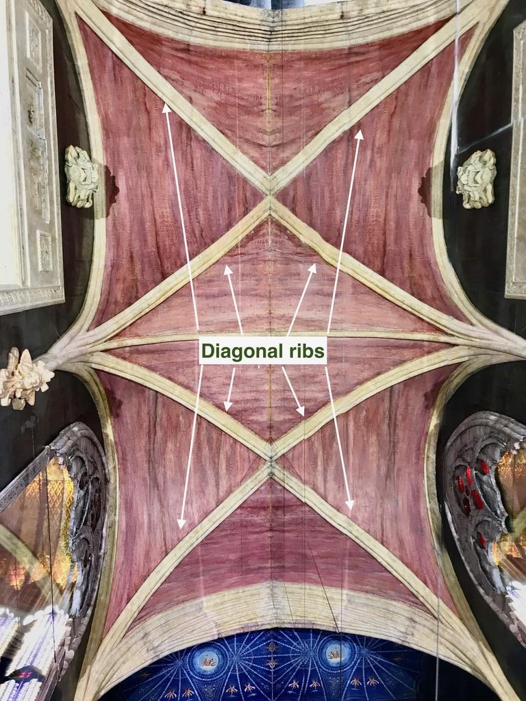
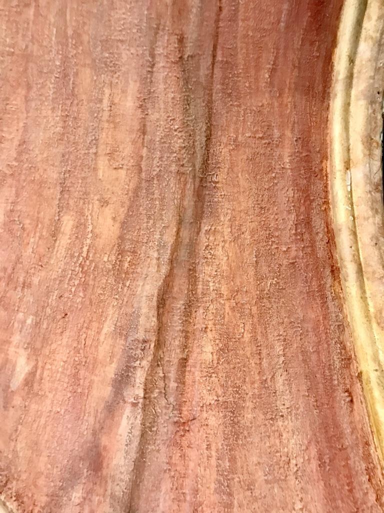
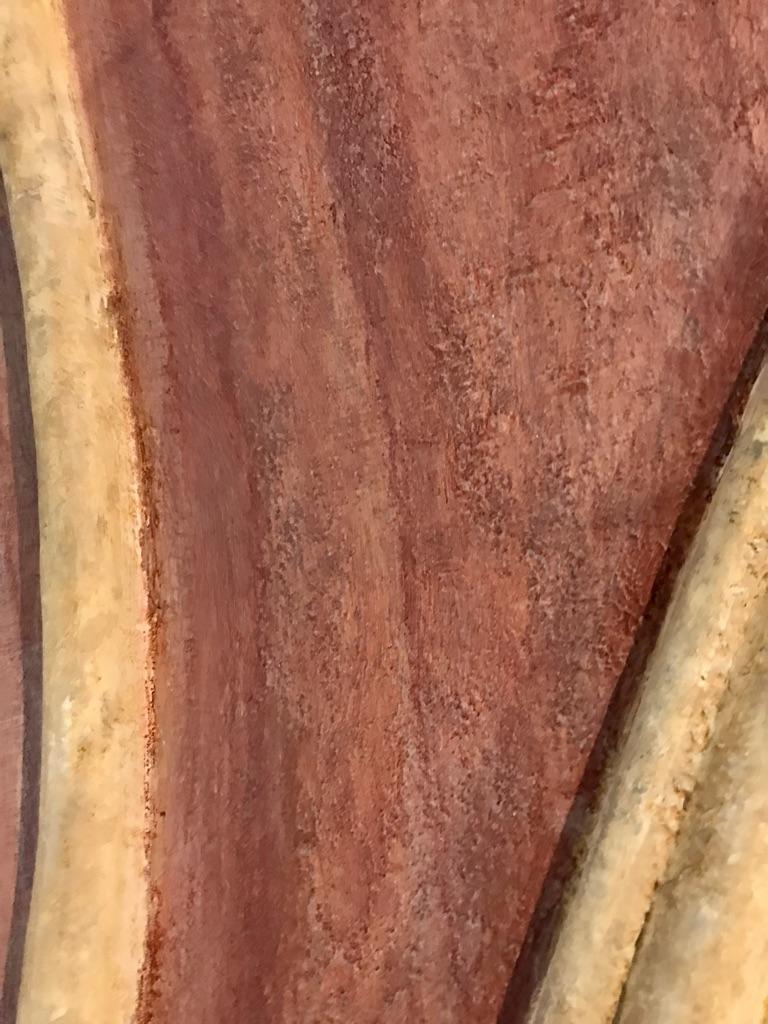
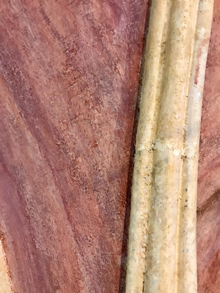
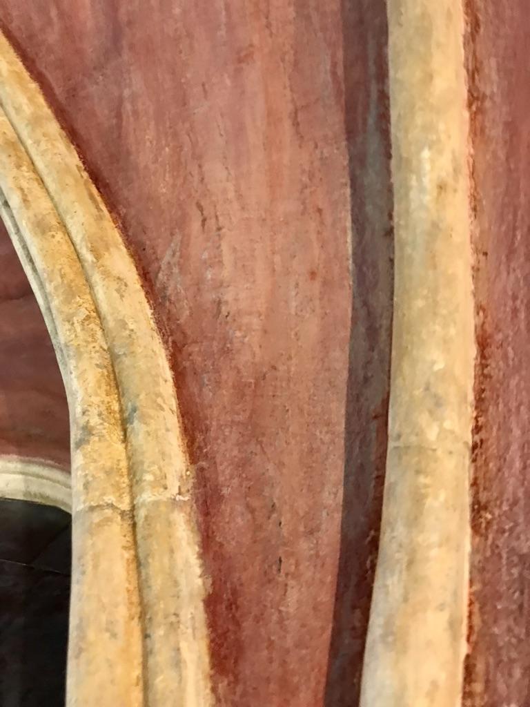
The ceiling is constructed from PVC electrical conduit and thin mahogany plywood and is designed to recreate the look of a type of Gothic vaulting known as “barrel vaults.” The PVC pipes have been painted to resemble limestone tracery (the supporting ribs for the vaulted structure). The panels between the ribs have been texturized and painted to resemble unpolished pink-coloured sandstone. The three supporting columns for the ceiling (formed where the ceiling ribs join together) appear to be resting on top of stone corbels carved in a stylized image of the Roman god Mercury.
Floor
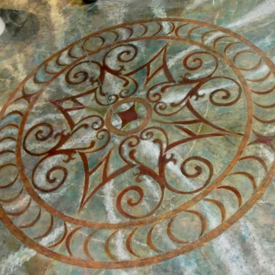
The floor is constructed from poured concrete. It has been faux-finished with alcohol inks , acrylic and oil paints in shades of blue, grey, brown and white to simulate a fantasy marble effect. A half-round design has been stencilled in the centre of the floor to create the appearance of an inlaid decorative medallion.
Electrical switches
The lighting, fountain, music and ventilation systems are controlled by three switches mounted to the right of the doorway. The top switch controls the ceiling lights, the back-lighting for the rose window, the TV screen for the meditation window and the water supply to the fountain. The centre switch controls the lighting in the large niche. The bottom switch controls the audio system as well as the ventilation system. These two systems are designed to function in tandem to mitigate unwanted noise and odours.
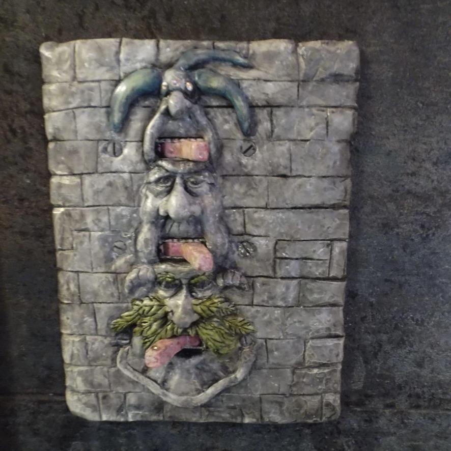
The wonderfully whimsical switch plate, custom-made for the space, was given to us by our good friends, Jamie and Annette Brick. Jamie conceived and sculpted the piece and Annette, his talented wife did the faux painting of it. Jamie, who might well be a touch mad (he claims, for example, to have been orphaned as an infant and raised in the woods by a pack of feral rabbits), is an exceptionally gifted sculptor and multimedia artist. He works primarily with found objects (e.g., pieces of household silver, silverware and driftwood) to create everything from small whimsical figures to more serious life-sized sculptures made from body casts and wall art. A lot of his work has been inspired by Medieval literature and ancient mythology. Examples of his recent work can be found on his Facebook page (www.facebook.com/JamieBrickStudio} and on Pinterest.
Before installing the switch plate, the switches were extended and painted in a faux rose quartz colour to resemble tongues. Grooves were cut into the switch casings to resemble teeth.
Artwork
Some of the other decorative pieces we have incorporated in the washroom include a relief plaque in black marble (titled "Jewish Heritage," by a Quebec artist, Rafael Rotondo, now deceased) located to the right of of the small niche and a large concrete cast of Medusa’s head that is hung above the doorway. To the right of the doorway there is the skeleton of an imp (the closest thing we have to a relic). The imp was made by Mythic Articulations, who make printed renditions of skeletons of a host of mythical creatures. [http://mythicarticulations.com/].
Towards the back of the room, overlooking the toilet, is an angelic plaster-formed grotesque (also a gift from our son and his wife) which I refinished to resemble Raku fired pottery. We dearly love this heavenly being but have not yet christened her since we know very little about her background. We think she is probably a Throne angel given her proximity to the toilet. She seems, in fact, to be pointing the way to the toilet to remind distracted visitors of the purpose of their visit.
Still to Come
Our tiny temple continues to be a work in progress. My work on this project has been stop-and-start over a period of several years, because I have been distracted by competing projects and by life events such as illness that have resulted in prolonged work stoppages. I am fortunate to have a patient life-mate with compatible DNA who has shared my passion for the project and has contributed enormously to the design of our washroom. I have never set a completion deadline for the project, since I view it more as a fun hobby than "just-another-renovation project."
Like much of the rest of our lives, we have made design choices we came to regret and have had to redo things when the finished product did not live up to our vision for it. Our major redo's for this project were for the floor (which we had originally tiled with a beautiful cut marble laid in a basket-weave design) and the decorative panel behind the toilet (which I originally had finished with a Venetian plaster). In addition to revamping the toilet, I will be installing a faux ceiling dome (another infinity mirror project) in the section of ceiling behind the toilet, I have yet to add a few finishing touches to the shrine, to add a decorative finish to the door, and to install a hinged metal access panel to for servicing the electrical and plumbing components inside the wall behind the fountain. Future plans (should I live so long) also include installing a colour-organ display that will rise up from behind the rear screen when activated and will play in synchrony with the audio system.
Design & Layout
Design Principles
Guiding principles for the construction of our new washroom were:
1. Don't spend a lot of money. We are pensioners living on a fixed income and tight budget. Except for the ceiling lamp, plumbing fixtures, toilet paper holder and building materials, everything else in the room came from our cache of treasures and architectural remnants (many of them gifts) that we have hoarded over the years.
2. Create a peaceful, fanciful space that is evocative of some of the feelings one might experience when visiting a majestic medieval cathedral — a special space that will inspire a sense of awe, wonder and tranquility. These are pretty lofty ideals, I know, for an awkward closet-sized space; our tiny faux temple could never hope to compete with the grandeur and majesty of the real thing. Nevertheless, we have strived to evoke some elements of a cathedral experience by:
- enhancing the perception of spaciousness — We have attempted to do so with the use of mirror illusions to expand the visual field, by the layering of space (e.g., through the use of overlapping reflections and overlapping architectural details such as screens and arches), by using converging vertical lines to exaggerate the perceived ceiling height, and by using other architectural elements (such as window placement) to draw the eyes heavenward.
- creating a sense of drama through the use of a mix of direct and indirect lighting and a mix of reflective surfaces, through the use of mirrors for illusory effects, and through the extravagant use of decorative accessories, finishes and detail. We wanted the space to have lots of bling, fake opulence and a host of grotesques and other curiosities to compete for the visitor's attention.
3. Fake everything. Wherever possible everything should be faked. The room has a fake ceiling with a fake shape (it only appears to have a cathedral shape because of the mirrored wall) and it is constructed out of fake stone. Some features can appear to be fakes of different things; the large niche, for example, can be viewed as a tall deep niche, as a tall arched window or as a long corridor lined with floor-ceiling-height stained-glass windows. Except for a piece of artwork and some jewelry, everything in the washroom has some element of fakery including all “stained-glass” and “stonework” and the purchased sink. The fakery principle was applied to the overall design. Our objective was not to attempt to recreate a miniature version of what might pass as a real temple or even a real chapel. The placement and over-sized proportions of windows, for example, are not plausible. Rather we attempted to create a melange of fictitious elements derived from Gothic architecture. We also did not fret about whether the faux stonework faithfully mimics natural stone, giving preference always to fantasy over reality.
4. Make it fake but not phoney — or at least not obviously so. A phoney after all is nothing but a loser of a fake; you are labeled a phoney only if you are seen to be fake. For example, in our hunt for a nice toilet paper holder, we came across one that was a well-crafted grotesque figure with its hands grasping the roller. The grotesque looked like it might have been salvaged from an old cathedral, but the fact it was hugging a roll of toilet paper sort of gave the gag away. A good fake should at least make you wonder whether it could be real. Admittedly our little washroom is in itself an obvious fake since nobody upon entering our tiny temple is going to wonder for even a moment whether they are entering a real gothic temple — but we would like visitors to wonder, if even briefly, whether some of the elements within it might be genuine.
5. Do not destroy the resale value of your house or offend your guests. Have fun building a fantasy temple but don't indulge yourself to the extent that it risks offending guests or turning off future prospective house-buyers. We did worry there might be visitors who could be troubled by the concept of a temple serving as a washroom, whether from a sense of sacrilege (e.g., poking fun at the sacred) or cultural appropriation (e.g., the use of sacred objects or symbols that some people identify with closely) or concerns that the temple edifies bodily functions in a way that is somehow unhealthy. Our backgrounds are both Judaeo-Christian, which is clearly reflected in the decorative detail of the temple. However, we have constructed the space to be adaptable to the cultural heritage of many potential buyers, whether Christian, Jewish, Pagan or otherwise. We have designed the room so that decorative accessories can easily be switched out for ones that better reflect the tastes and identities of new owners or even before the arrival of certain guests.
Thus far our concerns about offending have been groundless. For the past seven years that our tiny temple has been open for business (so to speak), it has been seen and used by numerous guests and tradespeople from a variety of faiths and cultural backgrounds. The response has been overwhelmingly positive. No one has expressed discomfort or shown any obvious signs of distress. We have never felt the need to reassure a visitor that the design intends no disrespect. I should add, though, that we have long had a fascination with religious art and artifacts from a variety of world religions and have collected many pieces over the years reflecting our passion. When seen within the context of the rest of our home, it may well be that finding religious artifacts in our washroom is less disconcerting than it might be in settings where it is totally unexpected.
6. Make the room functional as well as fun. Since there was no space available for floor or wall cabinetry, we attempted to create storage spaces within the wall cavity and within the screened-in area behind the toilet. All lighting and electrical connections are readily accessible. Both niches can be easily disassembled for service and cleaning. We have been able to achieve this through the use of rare earth magnets to attach removable sections of wall tiles, mirrors and decorative features. We have used magnets as well to attach some wall accessories to make them easily removed for cleaning or substitution.
Room Layout
Design decisions with respect to the location of fixtures, accessories, storage spaces and architectural features (such as ceiling vaults, arches and niches) were driven to a large degree by the dimensional constraints of our shallow closet. The closet's entrance was too close to the right wall to allow the baptismal-font base to be hung without having it intrude awkwardly into the doorway. To create sufficient space for it, we had to move the right wall 16" further away from the doorway's edge. Unfortunately, this meant the new wall would have to be erected under a step belonging to the front stairs to our second floor. As a result we would have to drop the ceiling (at least in this part of the room) almost 8" to accommodate the height of the intruding step. Moving the wall also meant that the renovated space would be that much wider, which would further add to the problematic corridor-like feel of the room.
After removing the unused staircase, we were delighted to find we had access to over 11.5’ of vertical space across most of the width of the closet. When the stairway was shut down the renovator had closed off the second-floor stairwell opening by laying a thick plywood subfloor over it. As there were no joists to contend with in this area, most of the closet ceiling extended about 10" higher than the ceilings of the other ground-floor rooms. Because we wanted the faux cathedral ceiling to soar as high as possible, we decided not to drop the ceiling in the central area of the closet. Rather, we applied 5/8" drywall directly to the exposed surfaces of the plywood subfloor and surrounding joists and to the exposed surfaces of the tread and riser of the intruding step.
We decided to compensate for the loss of height under the stepped-down section of the ceiling by applying acrylic mirror to this section. As well as exaggerating the apparent height of the front wall, the mirrored ceiling would serve to complete the illusion of the meditation window. The use of a continuously changing kaleidoscopic display, rather than faux stained glass, in this window was designed to serve as the primary focal point when sitting on the toilet.
A similar intrusion existed at the opposite (rear) end of the room, where the ceiling had already been dropped because of a supporting beam that ran through the closet. We decided to extend this lower section of the ceiling 2' further into the room so that it would outline the shape of what would become the screened-in storage area beneath it. We chose to temporarily cover this section of flat ceiling with a poster depicting a decorative palace tapestry rather than mirroring it, because we did not want to create a reflected view of the contents of the storage space below.
Arches at either ends of the vaulted section of the ceiling were designed to conceal the sides of the lowered ceilings, to provide visual interest and to visually divide the wide, narrow space into three sections with more aesthetically pleasing proportions.
The decision to create two ceiling vaults was based in part by the size and location of the entrance. One vault would be centred over the doorway. The second vault would be centred over the large niche, which we designed with similar proportions to the doorway.
We decided to create an oversized faux stained-glass window in the rear wall to provide a strong focal point when viewed while standing facing the toilet. We wanted the rear window to be as large and dramatic as possible and to be partly obstructed, like the meditation window in the front. Since we could not reflect the window on two planes, as we could at the front of the room, we were limited to using a half-round rather than quarter-round window.
We designed the large niche to be 3/4” narrower at the top to exaggerate its perceived height (the discrepancy in width is not easily discernible because of its height and its close proximity to the viewer). We positioned the top of the niche close to the ceiling to contribute to the illusion of a long tall corridor.
We decided to create a large medallion in the centre of the floor that would echo the circular shape of the windows and provide symmetrical balance to the space.
Preparatory Work
1. Sketch a plan for the layout of the ceiling vaults and end arches. In our case, we decided to divide the ceiling into three sections: a long vaulted section in the centre (where the ceiling was taller) and shorter flat sections at either ends of the room (where the ceiling had been dropped). The end arches were designed to cover the dropped sides of the ceiling to help disguise the difference in ceiling height and to give the impression of alcoves at either end.
2. Remove plaster and lath from the wall adjoining the dining room.
3. Demolish the front wall.
4. Employ the services of a carpenter to:
- build the framing for the new wall and install drywall,
- remove one of the studs in the wall adjoining the dining room in order to create space for building the large niche, and
- build a supporting structure to replace the the extracted stud.
5. Apply drywall, leaving open the two sections where the two niches will be installed.
6. Employ the services of an electrician to install wiring to lights switches and electrical outlets including:
- a hanging light fixture at the front of the room,
- wall outlets in an area behind the front wall to supply power to the television and video equipment and to low-voltage lighting in the floor, inside the small niche and behind the arch above the fountain,
- a wall outlet to power an up-lamp inside the storage area,
- an outlet under the large niche to supply power to low-voltage lighting inside the niche,
- a ceiling fixture above the rear storage area, and
- a wall outlet on the other side of the rear wall to power to LED lamps located behind the Rose window.
7. Employ the services of a plumber to install water supply and drainage lines for the sink and toilet, including the installation of:
- a hot-cold mixer valve to regulate water temperature,
- a pressure-reducing valve in the water supply line to the fountain to regulate pressure, and
- a solenoid valve in the water supply line to turn the fountain on and off.
8. Prep inside the sections of wall where the two niches will be installed by cutting off the ends of any drywall screws protruding from the dining room wall.
9. Apply 5/8" drywall to all exposed lath in the sections of wall where the two niches will be constructed. Use construction adhesive to attach the drywall to the lath. Short drywall screws can be used to temporarily tack the drywall in place while the adhesive sets but take care not to drive the screws deeper than the thickness of the lath.
10. For both of these sections, apply 5/8" drywall to all inner sides of wall studs and the supporting structure that was built to replace the extracted stud.
11. Apply 5/8” drywall to the exposed lath inside the two niches and to the exposed wall joists inside the two openings.
12. Rough-in niches and window openings
- For the large niche, install two braces in the top corners of the opening for the large niche in preparation for the construction of an arch inside the wall opening. Rough-in the framing for the sides and bottom.
- Rough-in the framing for the small niche.
- Cut a quarter-circle opening in the front wall for the mediation window. The radius of the circle should be the same dimension as the height of the television screen, less the width of the bottom frame of the TV.
- Cut a half-circle opening in the rear wall to accommodate the rose window. As mounts for the rose window, attach three 1"x2"x3" pieces of scrap wood using construction adhesive and 11/2" drywall screws.
13. Rough-in the two end arches from 2” lumber. I used some of the stair treads from the demolished staircase.
Installation of Ventilation System
Tools
- electric drill
- 1” carbide hole cutter
- thermoplastic adhesive (e.g., Goop)
Materials
- 4” inline fan
- 1” washer discharge hose
- hose clamps and connectors
- hardware to adapt 1” hose to 4” ductwork
- inline lint trap for clothes dryer (optional)
- activated carbon filter (optional)
- dryer vent kit (optional)
- weather-proof electrical junction box (or alternative hardware to connect hose to rear of toilet tank)
Steps
1. Cut a 1” hole in the rear of the toilet tank above the level of the overflow pipe — We were fortunate to have bought a toilet (made by Duravit) that had been manufactured with a cut-out. If you aren’t so lucky, you will need to cut your own hole using a carbide or diamond hole cutter. Be very careful to ensure that the ceramic doesn’t overheat to avoid cracking it. Pause frequently to cool the cutter and the ceramic using a moist towel or water sprayer.
2. Attach one end of the hose to the opening. Since the cutout in the rear of our toilet tank was rectangular, we improvised using a plastic junction box that we modified to accommodate the hose.
3. Attach the other end of the hose to an inline lint trap made for a clothes dryer. This is an optional step for setups where it is not convenient to discharge the vented air to the outside. We have had to vent the toilet bowl to a rarely used room in our basement because we do not have ready access to an external wall. The lint collector is used to hold a carbon filter to absorb odours. You will need to adapt the intake end of the lint trap to accommodate the 1” hose.
4. If venting to an inside room, attach the downstream opening of the lint trap to the intake end of the inline fan. If venting to the outdoors attach the hose from the toilet directly to the intake of the inline fan and attach the discharge end of the fan to 4” ductwork and use a clothes dryer vent kit to complete the installation.
Construction of Vaulted Ceiling
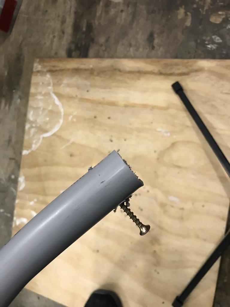
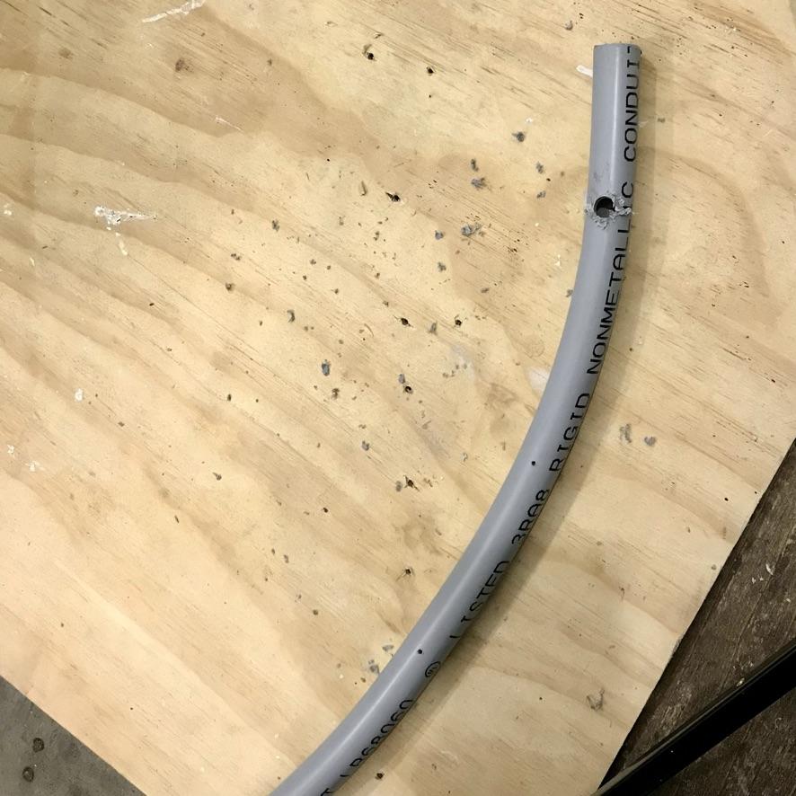
Tools
- handsaw, jigsaw or pipe cutter for cutting PVC conduit
- level
- jigsaw for cutting plywood
- oscillating tool with blade for cutting woos (optional)
- cordless screwdriver
- power drill
- hot-air gun
- 1/8” drill bit for wood
- 1/4” carbide drill bit for ceramic
- caulking gun
- gloves for holding onto heated PVC
Materials
- lengths of 1” and 3/4” rigid PVC conduit for the ceiling structure (You will need more than twice the amount of 3/4” conduit than the 1”.)
- lengths of 1/2” rigid PVC conduit for the archways at either ends of the room
- lengths of 3/8” rigid PVC conduit for making templates
- thin bendable sheets of plywood or fibreboard for the panels
- lengths of 1” x !0” lumber for the two archways
- scrap sheet of 1/2” plywood to be used in the creation of a pipe bending jig
- sharpie felt marker
- 1” & 1.5” wood screws
- 5/8” self-tapping screws
- wall anchors
- thermoplastic adhesive (e.g., Goop)
- paintable caulking
- brown wrapping paper
- scissors
- masking tape
Steps
1. Mark ceiling and walls to demarcate the placement and endpoints of all arches. Draw three vertical lines on the wall across from the mirrored wall (using a white marker or masking tape) to serve as reference points for the placement of the wall-mounted sections of tracery,
2. Create templates for the ceiling tracery using three lengths of 3/8” PVC pipe that you will temporarily friction-fit in order to obtain the profiles of the arcs for the three types of ribs. One template will be used for shaping the three transverse ribs that run directly across the ceiling before bending down the wall. A second template be used to shape for the four diagonal ribs that crosses the ceiling diagonally before joining the ribs of the adjacent vault. The third template will be used to form the two wall ribs that attach to the wall opposite the mirrored wall.
For the transverse ribs, cut the pipe to a length that is approximately 1/4 [?] longer than the width of the room. Drill an 1/8” hole close to one end of the pipe and use a wood screw to temporarily anchor it in the ceiling at a point that is adjacent to either one of the two end arches.
Holding on to the other end of the pipe, force the pipe to form an arch by sliding the loose end up the wall. When you are satisfied with the shape, temporarily secure the loose end of the pipe to the wall with duct tape.
Heat the full length of the pipe with a hot-air gun to set the shape of the pipe. Be careful not to overheat the pipe or it will sag and become distorted. The aim is not to melt the plastic but to warm the pipe just enough to set the “memory” of the plastic so that it will maintain the shape that you have forced it into.
Before removing the pipe, mark the locations on the wall and on the pipe where you would like the vertical section of the ribs to end.
Repeat this process to make templates for the diagonal ceiling ribs and for the wall ribs atop the doorway and large niche. Cut the pipe for the diagonal ribs approximately 1/3 [?] longer than the width of the room. Cut the pipe for the wall ribs approximately 1/2 [?] longer than the width of the room.
3. Prep the wall for mounting the end sections of tracery that run vertically down the wall. Drill two 1/2” holes through the ceramic wall tiles for each set of ribs above the marks you’ve made on the wall. Drill one hole about 1” higher than the guiding mark you made in Step 1. Drill the second hole about 6”—10” above the first. Use these holes to attach 1/2” x 1/2” x 12” furring strips with wood screws and plastic plugs.
4. Measure the lengths of the three templates and cut pipes to those lengths. If you are building a ceiling with two vaults similar to ours, you will need to cut:
- 3 lengths of 1” pipe for transverse ribs
- 4 lengths of 3/4” pipe for transverse ribs
- 4 lengths of 1” pipe for the diagonal ribs
- 8 lengths of 3/4” pipe for the diagonal ribs
- 2 lengths of 1” pipe for the wall ribs
- 2 lengths of 3/4” pipe for the wall ribs.
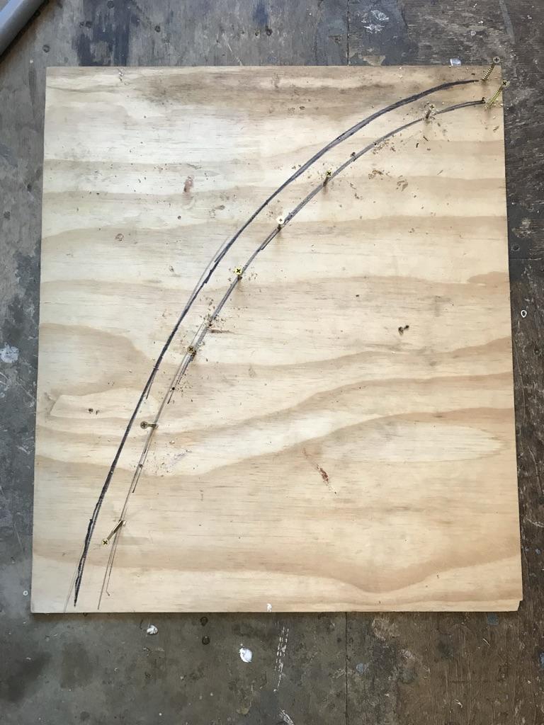
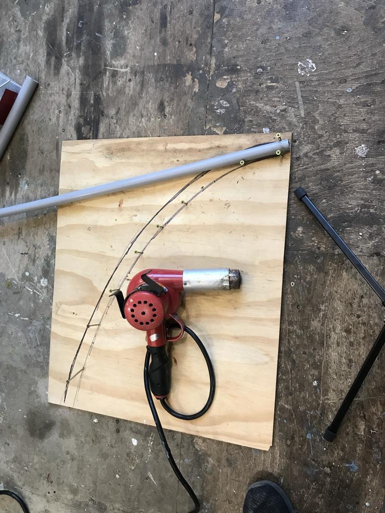
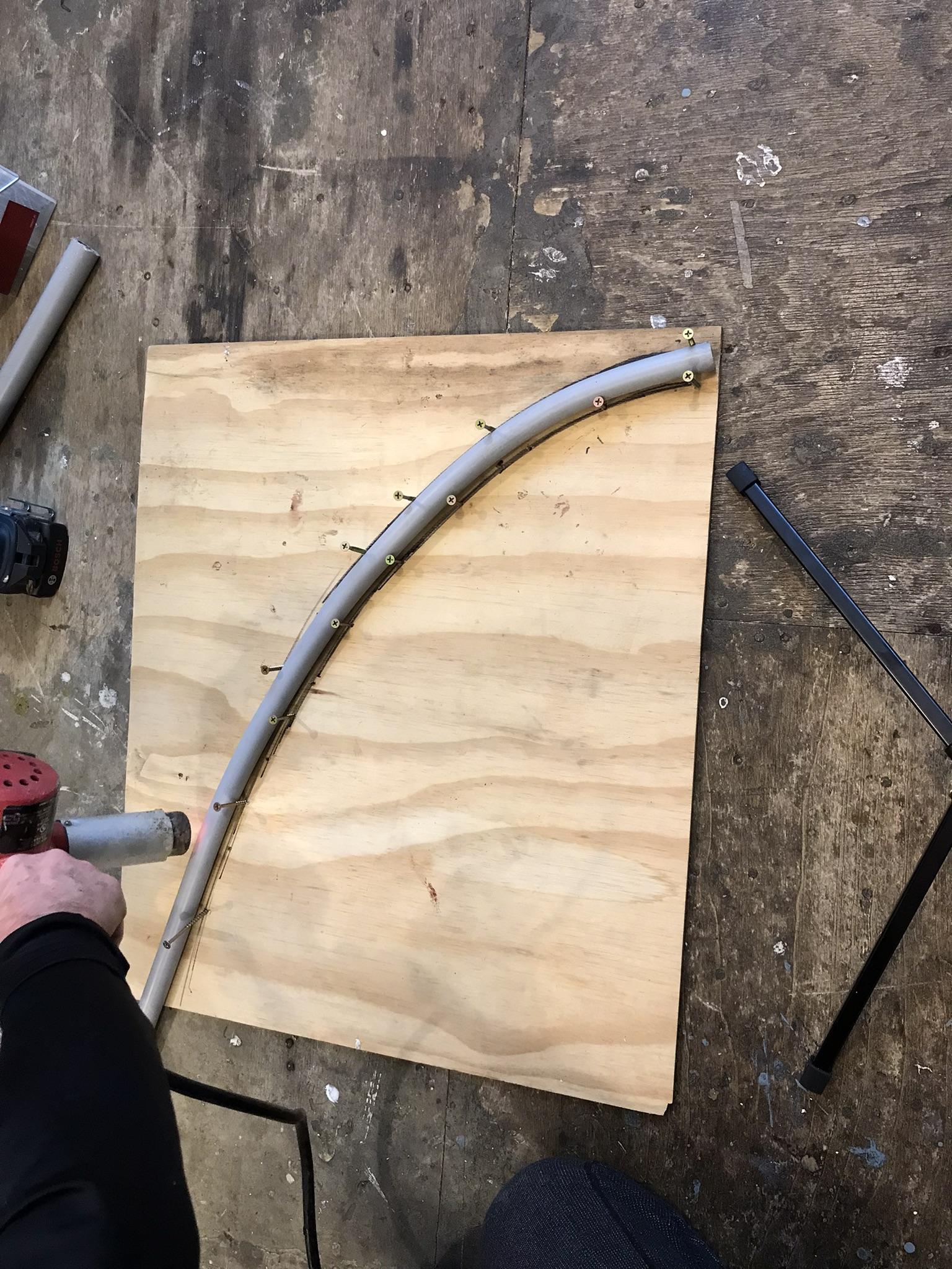
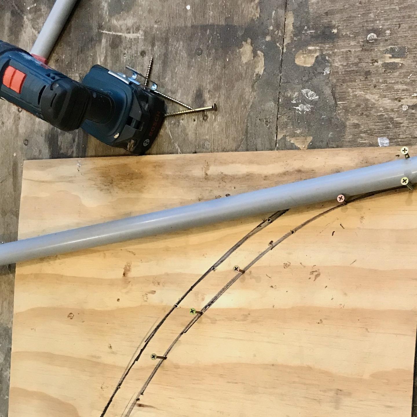
5. Create two jigs for shaping the pipes to create the ceiling vaults. Using the templates you’ve created in Step 2, copy the shape of the arches onto a half-sheet of plywood using a felt marker.
Drive 1 1/2” wood screws about every 2 - 3” along the outline of the arc to serve as stops for bending the pipes. Drive an additional screw about 1 1/4” across from the first screw to hold the top end of the pipe securely in place while it is being shaped.
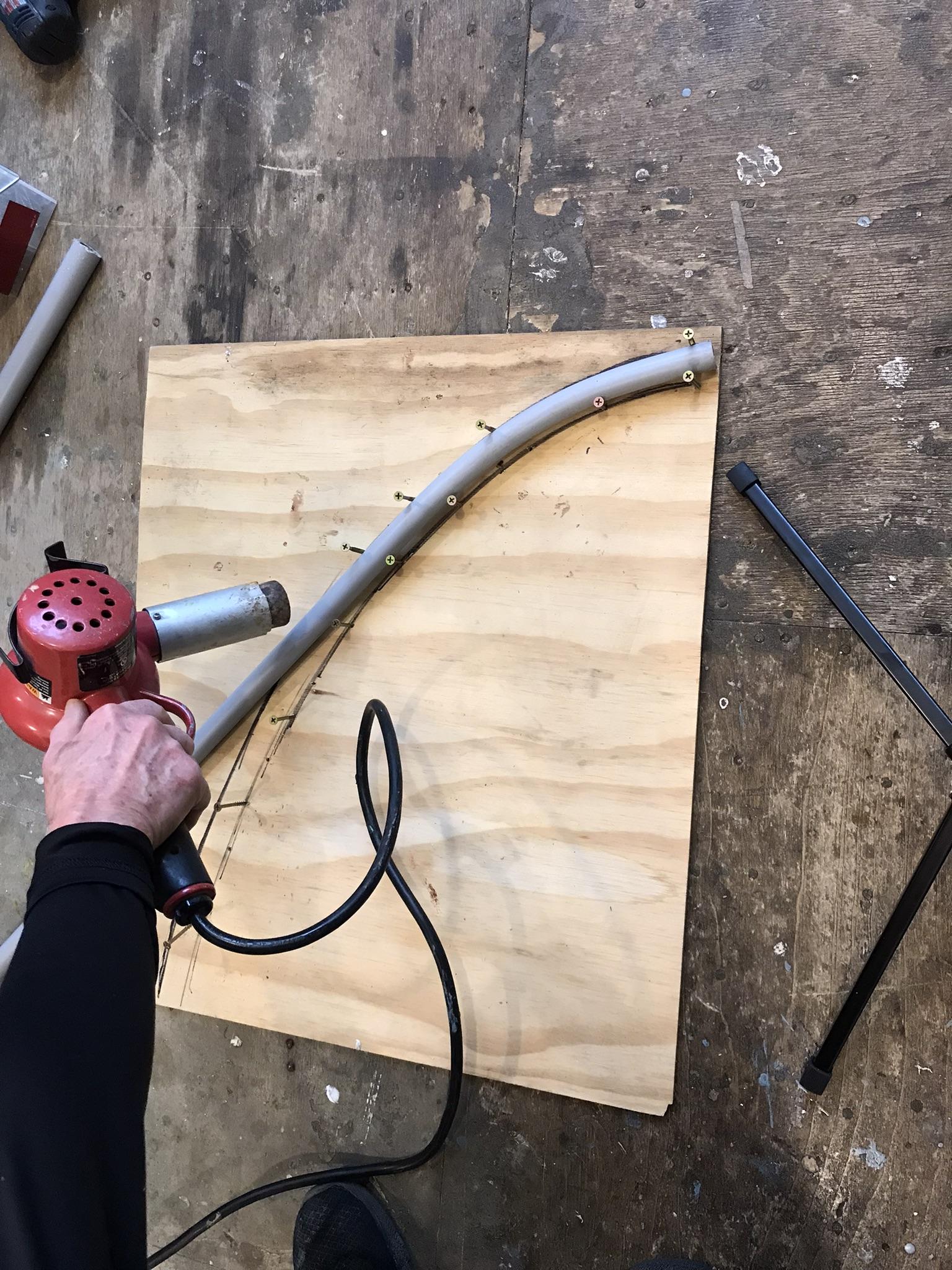
6. Bend the pipes to shape using the jig and hot air gun. Providing you take care not to overheat the pipe, there is no need to fill the pipe with sand before bending or to rent an electric pipe bender in order to prevent the pipes’ walls from collapsing or kinking. Because you are bending the pipes on a flat surface you do not have to worry about gravity causing the pipe to sag (as cautioned in Step 2), but the pipe will distort if you heat it to the point of melting. I have found it best to heat about 9-12” of the length at a time, while putting gentle pressure on the pipe to move in the desired direction, beginning at the top end of the pipe and working toward the bottom of the arc. Withdraw heat as soon as you feel the plastic becoming sufficiently pliable to bend into shape with little resistance. Drive additional screws, where needed alongside the freshly bent section of pipe to keep it from bending further while heating the section below it.
7. Install the transverse ribs, which will serve as the primary supporting structure for the panels of the ceiling vaults. One will run across the centre of the room and the other two will run across the ceiling and down the arches at either end of the room.
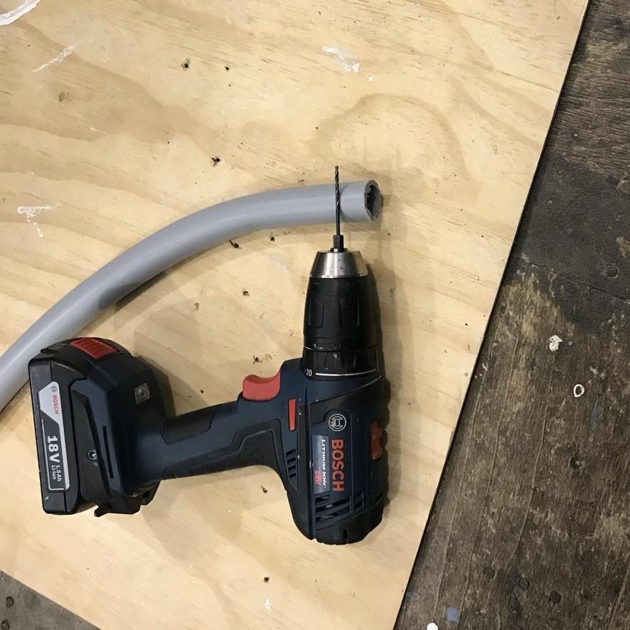
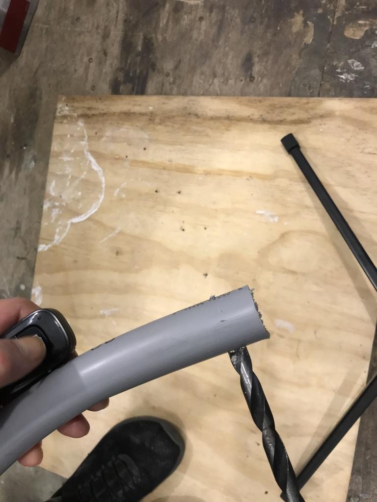
Prepare the 1” pipes for mounting to the ceiling by pre-drilling mounting holes at either ends of the pipes. Drill a 1/8” hole about 1” from the top of end and two 1/8” holes at the bottom end about 6” apart. Drill these holes through both the front and rear walls of the pipe. Now enlarge the holes in the front wall of the pipe by re-drilling with a 1/2” bit. These larger holes will provide access for a screw driver when mounting the pipe.
Attach the transverse ribs to the ceiling and wall using wood screws at the ceiling end and screws plus plastic anchors at the wall end. Make final adjustments to the positioning of the pipes where necessary, using the hot-air gun to soften the pipes.
Attach the remaining two transverse ribs to the arches using the same technique.
8. Make paper templates for each of the five panels. Attach brown wrapping using masking tape over the installed pipes and trace outlines of the shapes needed for the ceiling panels. Cut out templates with scissors. Although some of panels are the same shape as others, there will be some variances in fit. For a precision fit it is recommended that you trace and label each panel individually.
9. Cut the ceiling panels to shape using the paper templates as a guide.
10. Depending upon the flexibility of the material you are using for the panels, it may be necessary to soak them in water for several hours prior to installing. I soaked the mahogany-ply panels we used overnight by piling them between layers of wet newspaper and covering the pile with a plastic sheet. You may need to rewet panels during installation by spritzing with water from time-to-time.
11. Loosely install the ceiling panels. To facilitate installation, loosen off the ceiling screws holding up the structure. Slide the panels into place behind the tracery structure and retighten screws. Do not be concerned about the panels not fitting tightly at this point. They will be pulled firmly into shape after the smaller diameter pipes have been installed.
12. Attach the 3/4” pipes to either sides of the diagonal ribs that you have installed.
Begin by taping them in place alongside the curved ceiling portion of the ribs. Use an oscillating saw to shape the ends of the pipes where they merge with adjacent ribs on the wall. Heat the end sections with a hot-air gun to make final adjustments.
Join the 3-pipe segments of the diagonal ribs together using using the technique described in Step 9. Since you will be joining plastic to plastic you will need to ensure that you drill the mounting holes through the walls of both pipes.
13. Now that the ribs are solidly assembled, you can begin securing the panels to the smaller diameter pipes. Begin installation with the centre panel. Drill 1/8” holes through both walls of the pipe every 3-4” along the ceiling portion. As described in Step 5, enlarge the holes on the exposed wall of the pipe using a 3/8” drill bit in order to provide access for diving screws into the panel from inside the pipe. Start at the top end and word downwards. Using 5/8” self-tapping screws, drive them into the panel to pull the panel tightly against the pipe. For some sections it may be necessary to drive a drywall screw into the panelling adjacent to the section you are working on –– which you can then use to pull the panel in place with pliers.
14. Add decorative detail to the end arches. The end arches can be finished in a variety of ways. I chose to use scraps of 3/16” flexible vinyl tubing and scraps of coaxial cable.
NOTE re designing arches:
There are much more elegant and geometrically precise methods for designing templates for the ceiling vaults than the procedure I've described above — including hand-drawn methods using an architectural ruler, a compass or even a piece of string (a method apparently used by many gothic architects) as well as higher-tech methods using any of a number of computer drawing apps. One useful resource about the application of gothic geometry to designing arches, windows and tracery is a brief ebook written by a master stone carver, Joe Chiffriller. [http://www.newyorkcarver.com/ebooks.htm#author]
I developed the procedure described in here because I was in a rush to get the project underway and trusted that I could improvise an aesthetically pleasing (if not geometrically accurate) arch by forcing a flexible rod to form a natural arc between the ceiling and wall. I reasoned that not only might this method save me some time it would also provide a way of pretesting some of the installation methods, that it would produce precise measurements for fitting the components of this rather complex structure, and that it would allow me to gain a better sense of what the completed project would look like before committing to the design. I doubt whether this method actually saved me any time, but it did give me more confidence that everything would fit together at the time of assembly.
Faux Finishing the Ceiling Vaults
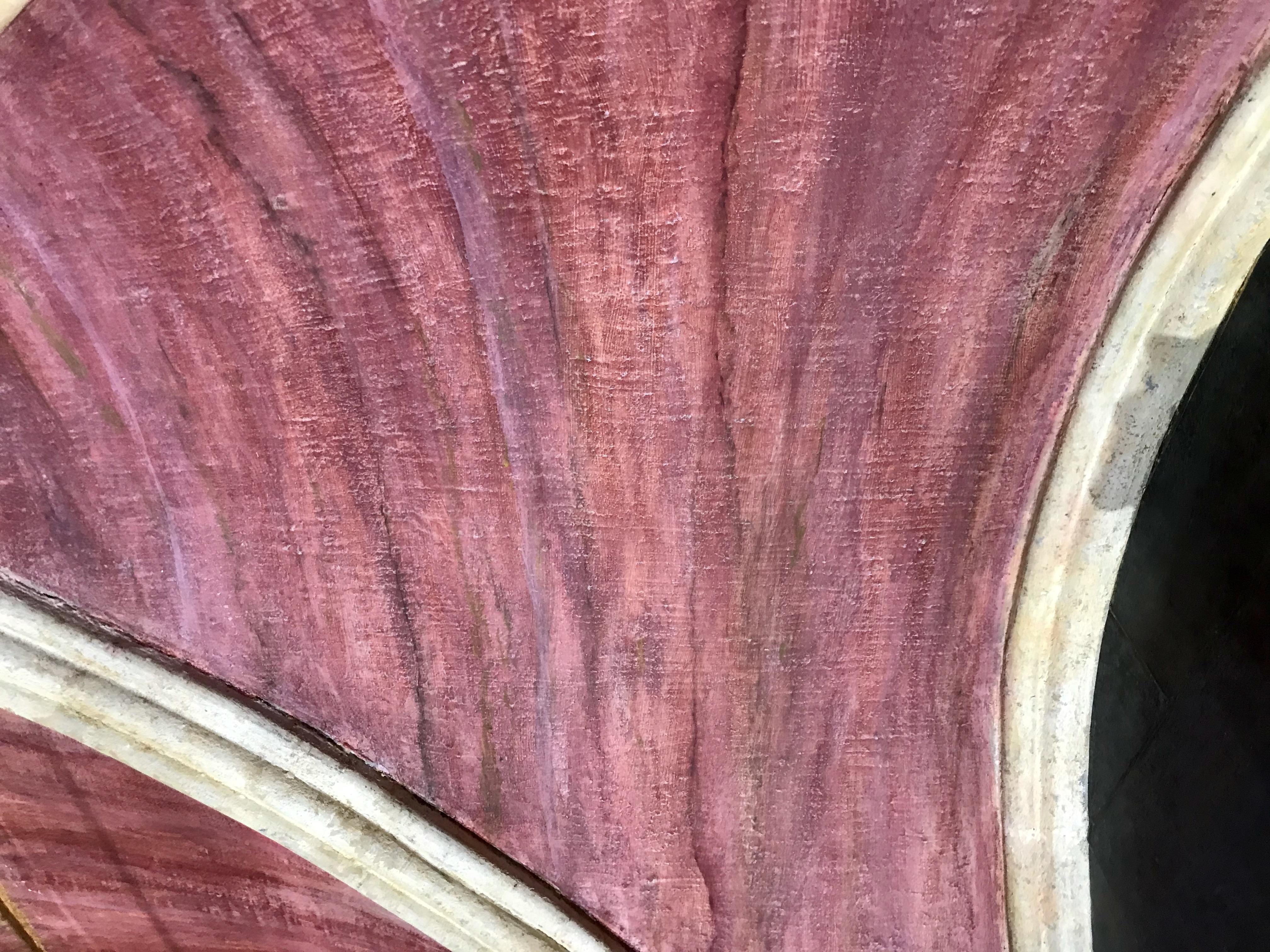
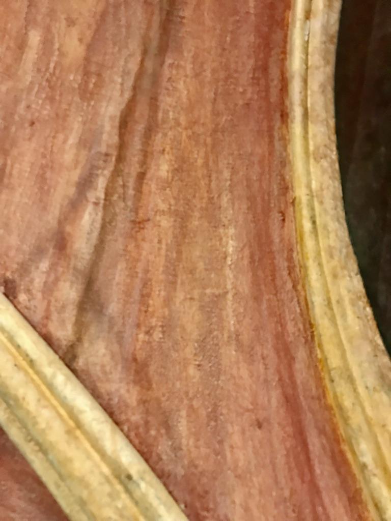
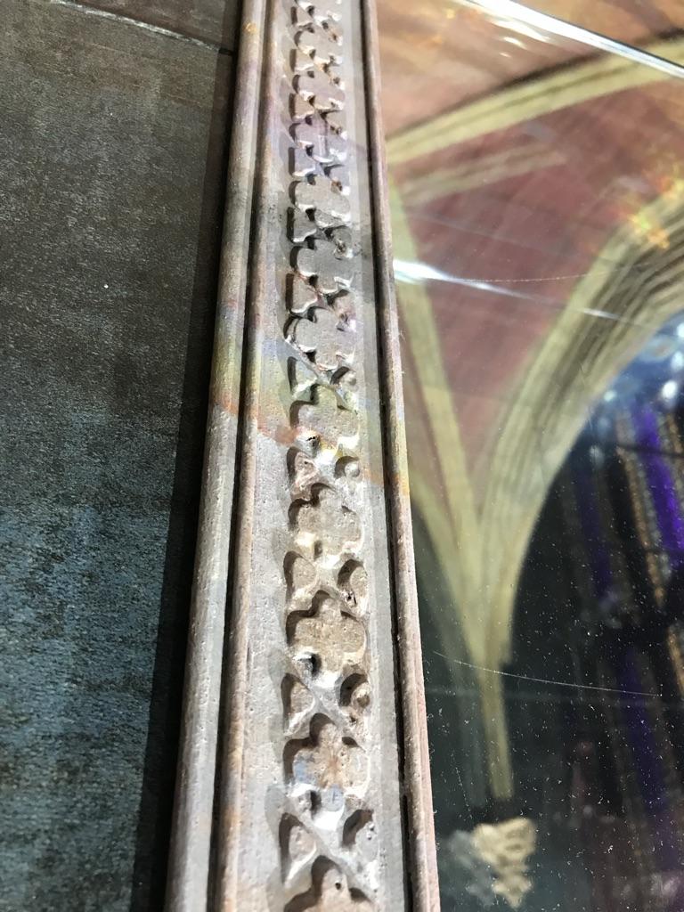
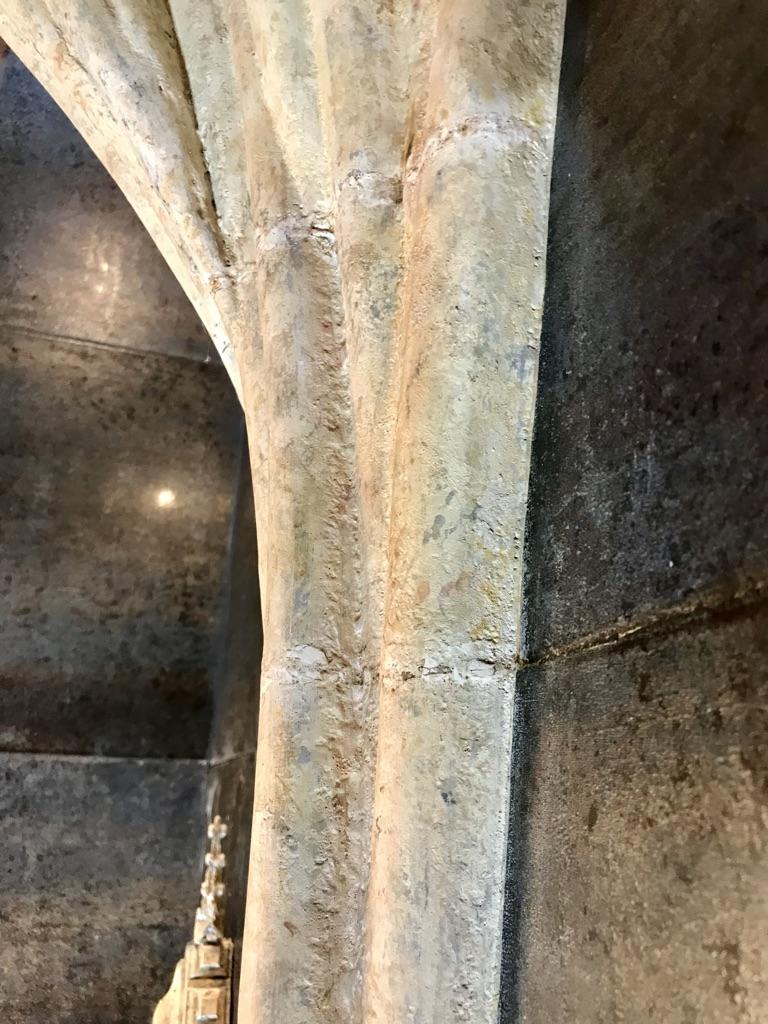
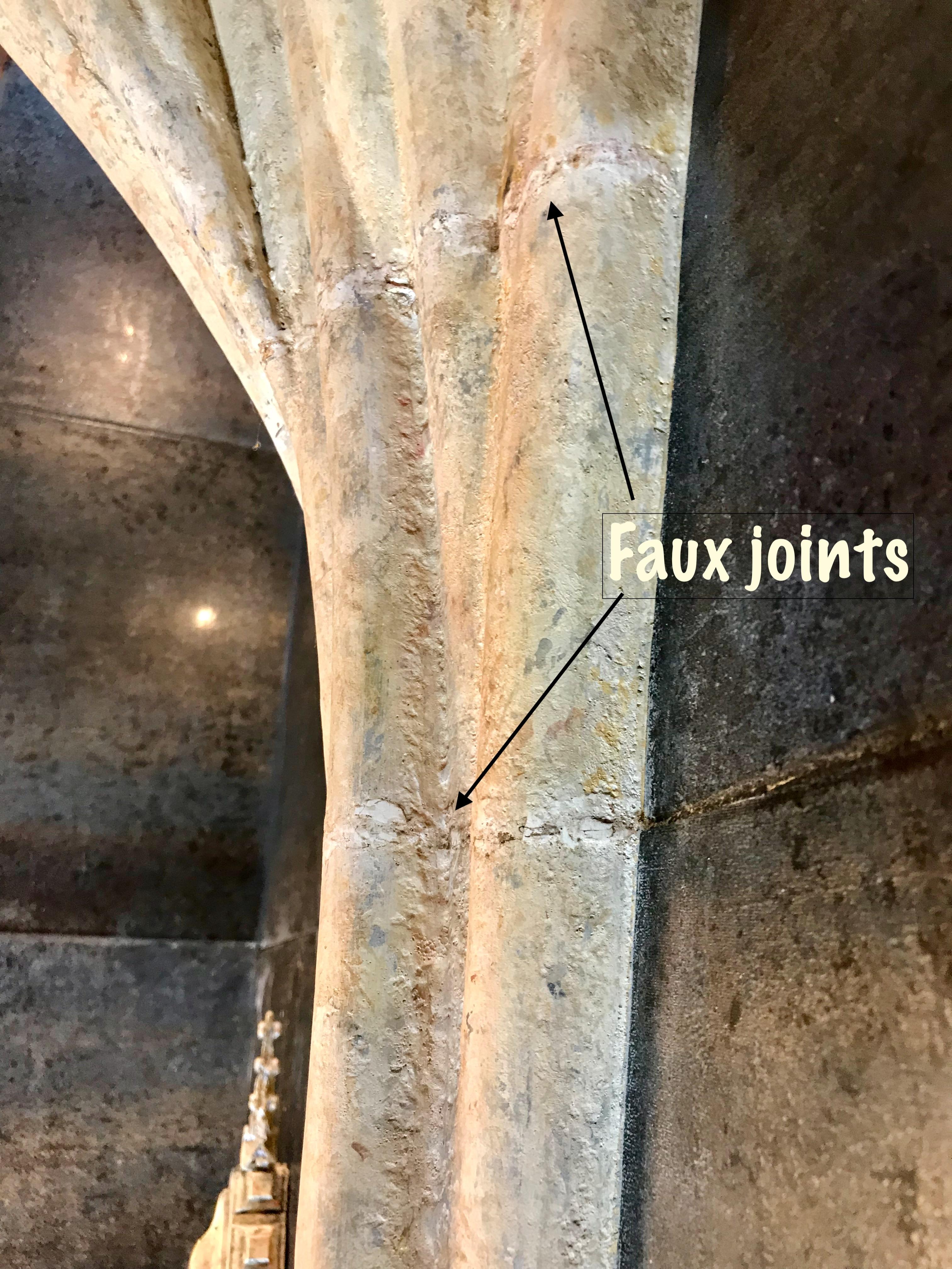
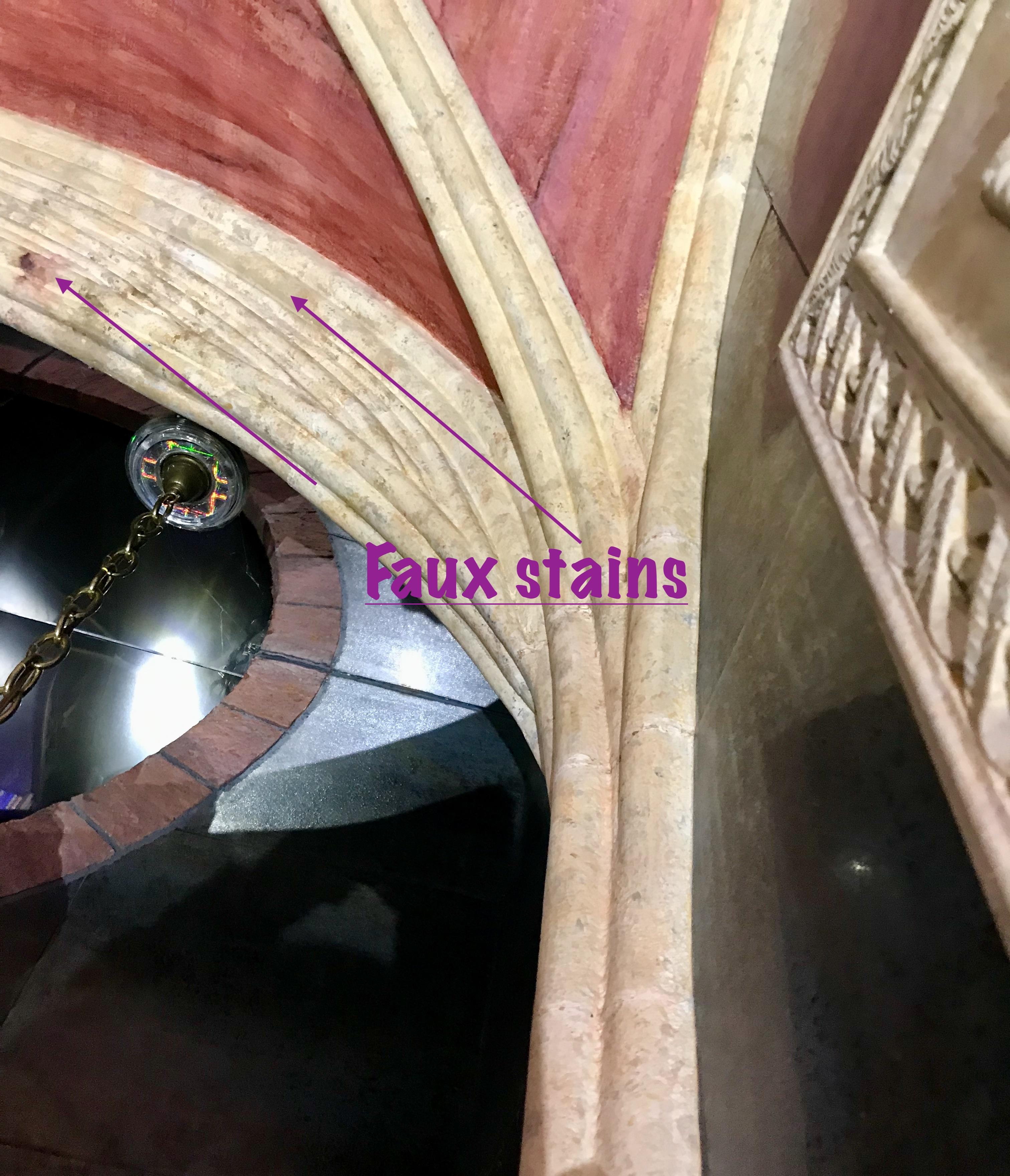
Tools
- caulking gun
- small trowel
- oscillating tool with blade for cutting wood or hacksaw blade
- paint brushes — 1”, 2” and small artist brushes
- floor cloth
- water spritzer
Materials
- siliconized acrylic latex caulk
- fine-grained sandpaper
- acetone
- acrylic primer
- acrylic matte paints in an assortment of earth tones — e.g., Raw Umber, Burnt Umber, Raw Sienna, Burnt Sienna, White, Black and Blue
- glazing medium or paint conditioner to slow drying
Application of Faux Limestone Finish to Ceiling Tracery and Arches
Steps
1. Prep tracery for painting. Fill all gaps where ribs meet the mirrored wall and where they meet on the adjacent wall. Fill all holes used to mount the pipes. Fill the gaps between all adding pipes. Lightly sand the pipes and wipe down with a damp rag.
2. Using an oscillating saw or hacksaw cut shallow grooves along the tracery to suggest seams where sections of carved stone have been joined. For realism, space joints further apart along lighter sections and closer together on heavier more complex sections.
3. Add the occasional nick or scratch to add further realism.
4. Apply a prime coat to pipes and panels. If you have used any flexible tubing in the end arches, apply several coats an acrylic medium that has been fortified with fibre — to give these elements a rigid protective outer layer (an exoskeleton, so to speak).
5. Apply paint to tracery using a stiff short-bristled brush (an old worn one works best). Apply the dominant colours first (white and browns) and blend together while wet. Apply paint using a pouncing motion in order to create a lightly textured surface. For realism sake, vary the colours and patterns between sections of pipes and across different areas of the room. Keep surface damp using spritzer to facilitate blending.
6. Add finishing touches using black and rust colours to suggest areas that have been stained by water infiltration and dirt accumulation.
Application of Faux Sandstone Finish to Ceiling Panels
Tools
- 10” drywall taping knife
- drywall hawk
- mud pan
- notched trowel (1/4” V)
- wire brush
- water spritzer
Materials
- masking tape
- floor cloth & plastic sheeting
- 1” and 1/2” flat paint brushes with course bristles
- drywall compound (setting type) — e.g., Durabond
- acrylic matte paints in an assortment of reds, browns and yellow earth tones
- black & white acrylic paints
- glazing medium or paint conditioner to slow dry time
Steps
1. Cover tracery with masking tape and protect walls and floors because this part will be messy.
2. Mix drywall compound according to manufacturer’s instructions in quantities that you will be able to ply before it starts to set.
3. Apply compound to ceiling panels using a notched trowel and drywall hawk. Trowel the compound across panels. Keep the strokes roughly parallel to the wall but allow for some variation for the sake of realism.
4. When the compound has partially set use a steel brush to gently remove most of the compound, working in the same direction that you troweled it on. The effect you want to achieve is that of a rough-cut surface, not one that is deeply gouged.
5. Paint the panels after the compound has set. Apply the dominant red and brown colours first and blend in the secondary colours while the paint is still wet. As sandstone is a sedimentary rock it should have a striated appearance (similar to some wood grains) which is very unlike the more uniform appearance of the limestone tracery. Apply the colours in parallel lines running across the panels but make them wavier and more irregular than the lines you scored into the drywall compound.
Construction & Faux Finishing of Small Shrine
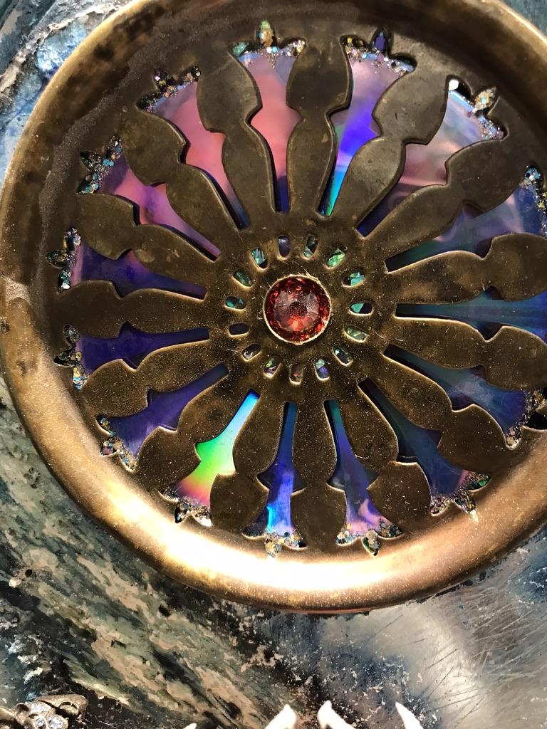
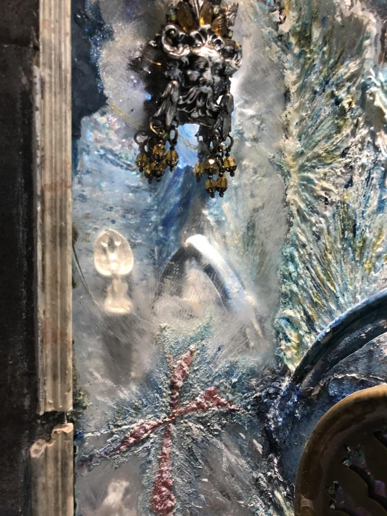
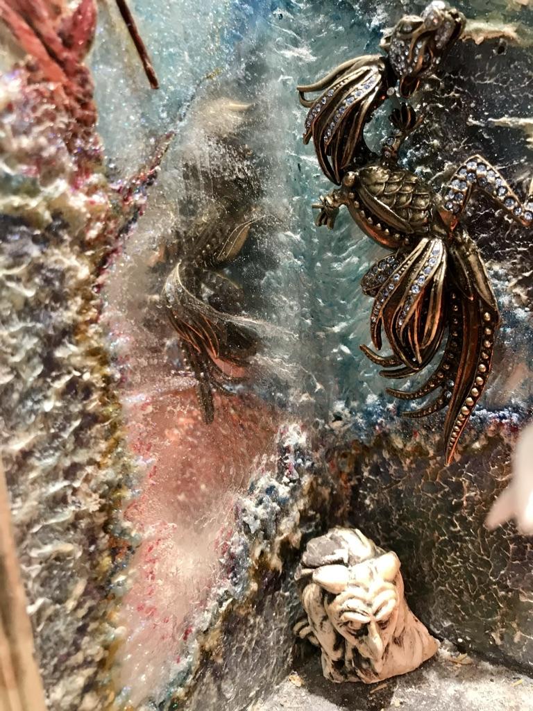
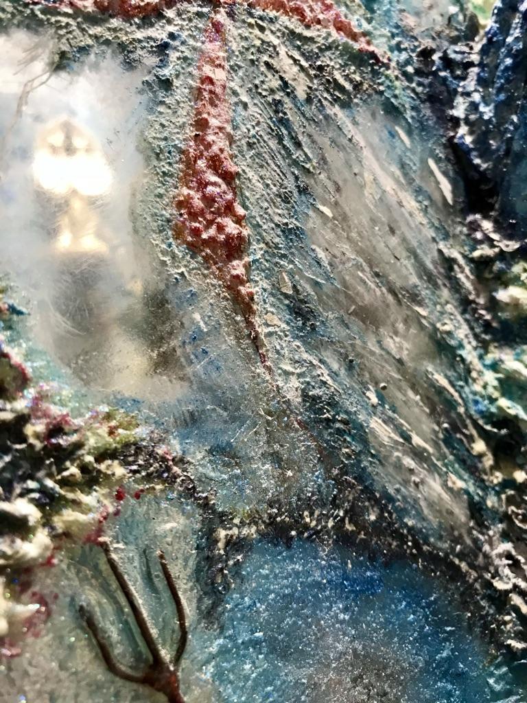




Tools & Materials
For shrine interior:
- assortment of artist brushes suitable for acrylics
- small painting knife (trowel style) Golden Molding Paste
- assortment of alcohol inks…….
- Vitrail Clear Glass Paint (Crimson)
- acetone
- methyl hydrate
- fine sand paper
For exterior of small niche:
- assortment of artists’ paint brushes suitable for solvent-based paints, including a fine-tipped brush and a small fan-shaped brush
- bamboo skewer (for veining)
- Golden Molding Paste
- Pebeo Fantasy Moon paints in an assortment of colours: Pearl, Veil of Smoke, Carmine, Silver & Metal Blue
- black & blue enamel paints
- varsol
- glossy acrylic varnish
- small rag
For the sake of brevity I will not go into detail about the construction of the small niche, which basically is just a tall narrow box. I will briefly describe of some of its features, which may be helpful to builders of similar structures.
Shrine Construction
As described in the introductory tour, the upper portion of the small niche houses a shrine.
The facade of the shrine was built to be easily removed to gain access to inside areas that otherwise would be unreachable.
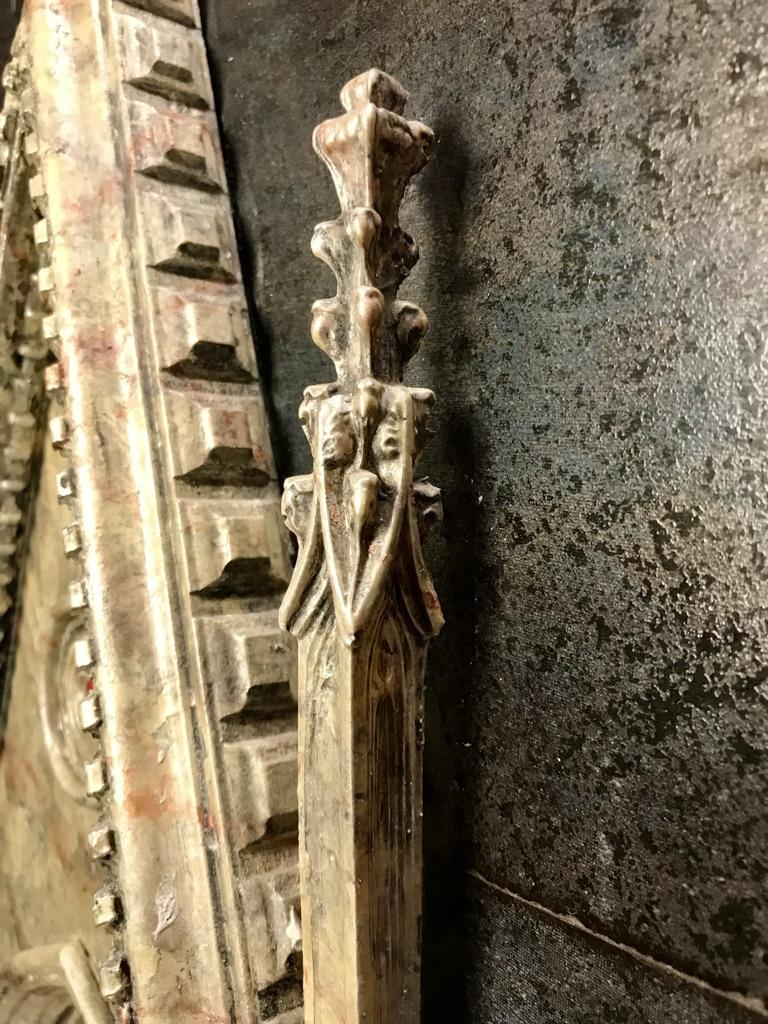
The gable atop the opening of the small niche was constructed from 3/4” scrap plywood. It has been glued to a removable tile and is held in place with rare earth magnets. The roof of the gable was constructed from scraps of stock wood moulding. The small dentil trim along the roof edge was constructed from a scrap of plastic panel retainer and the beaded trim underneath was constructed from a plastic drain snake.
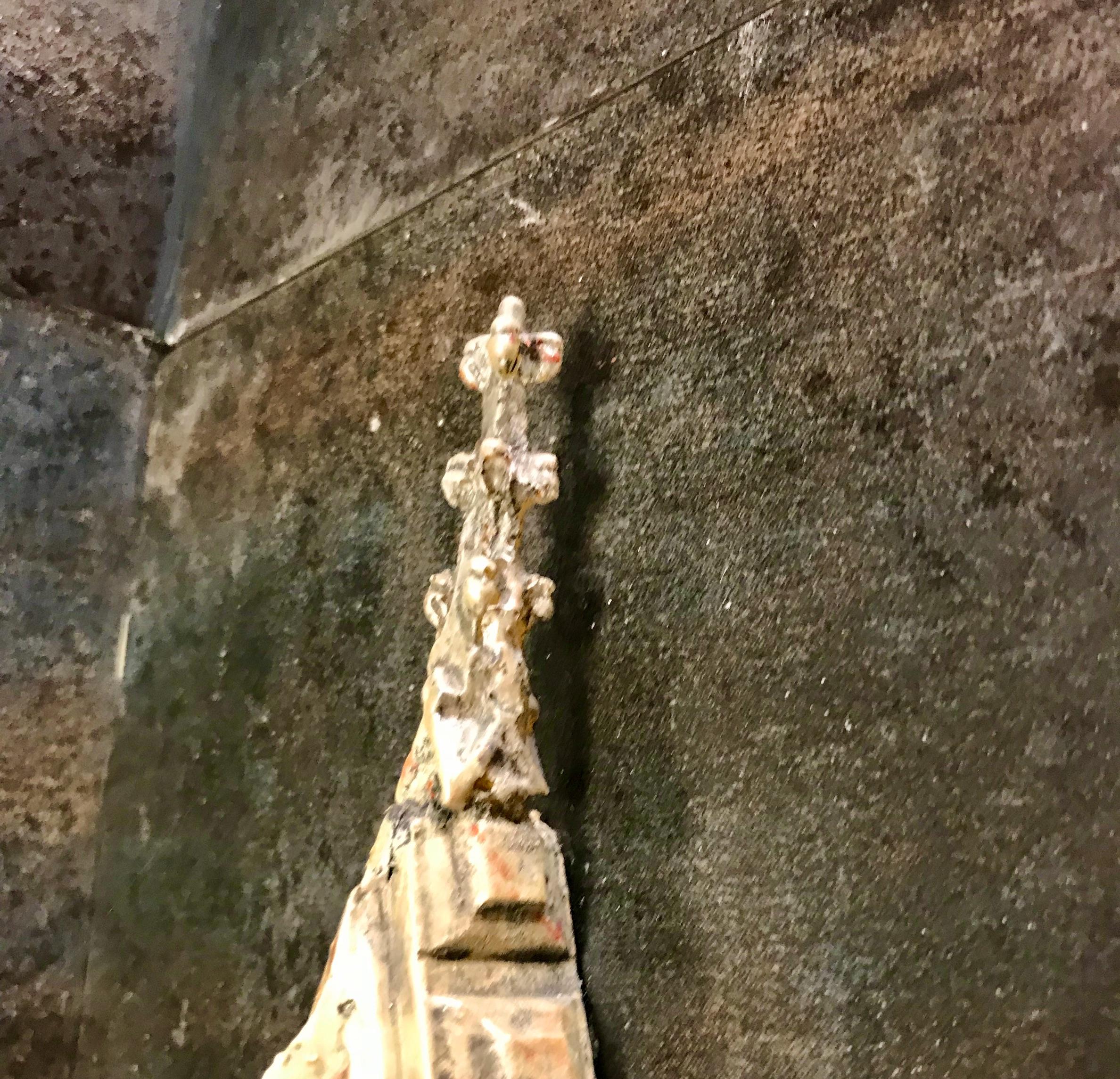
The spires located at the roof peak and atop the two towers were made from silicone casts taken from portions of a brass church lamp. The church lamp was also used to cast the inner centre of the quatrefoil window.
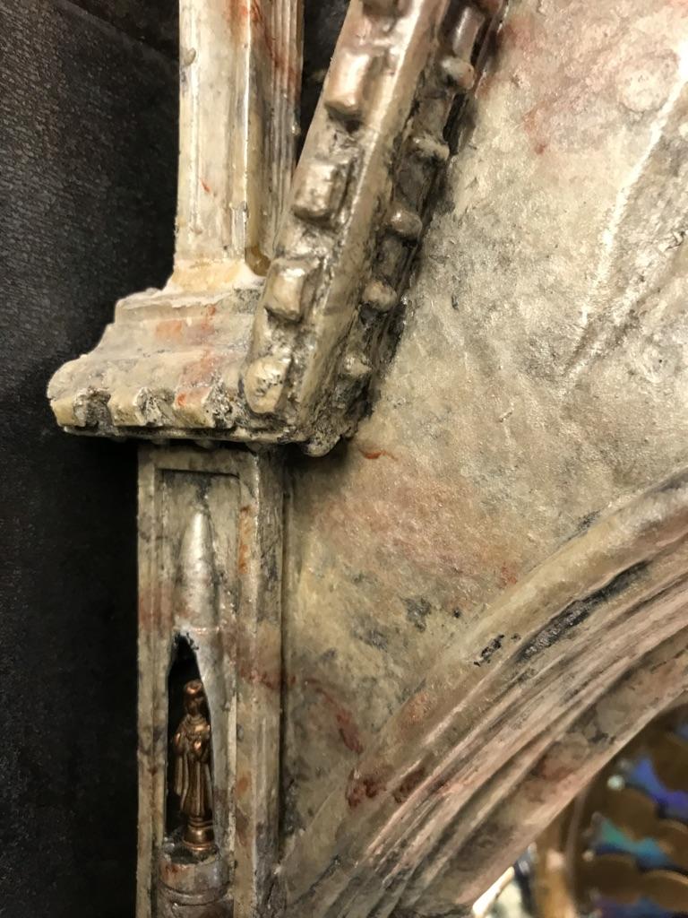
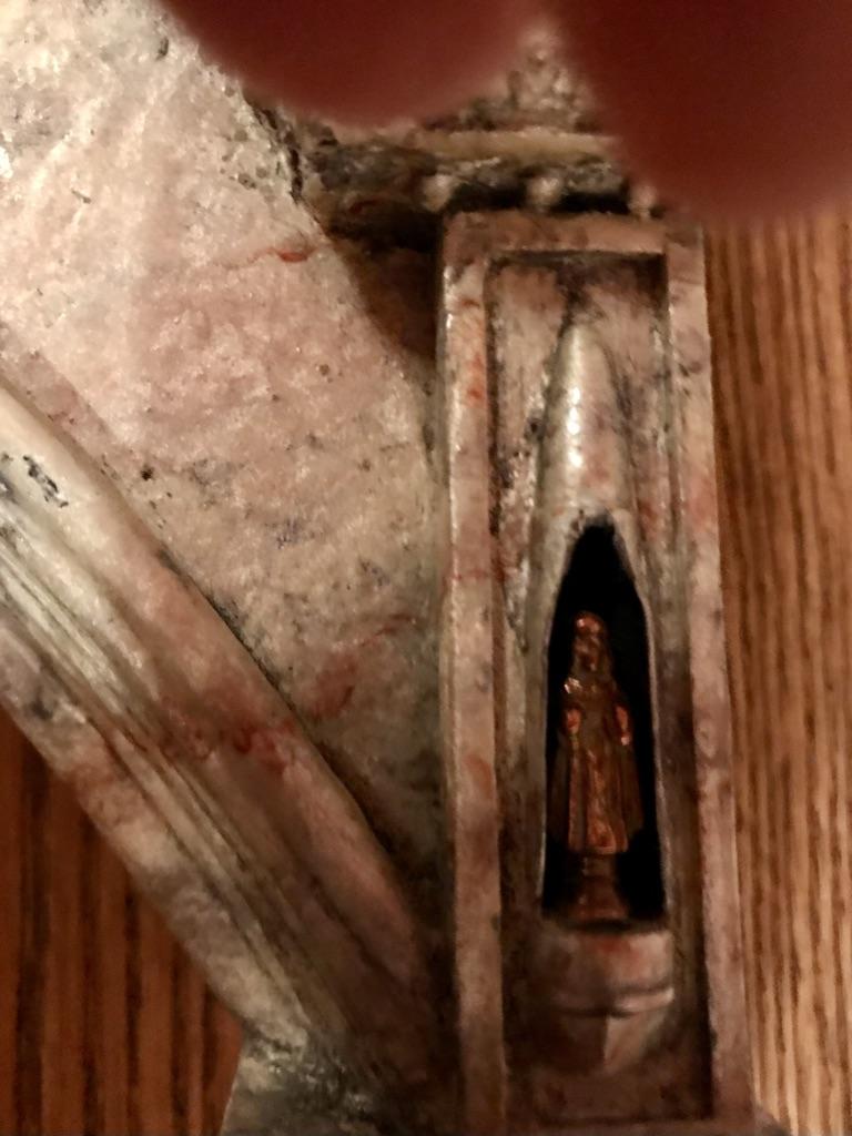
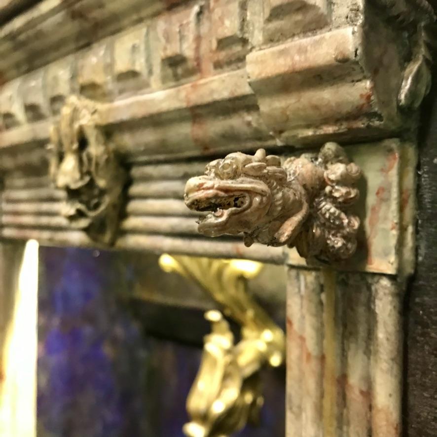
The grottos in the towers were constructed from bullet casings using a rotary grinder to cut the openings. They house miniature icons of two saints. The grotesques sitting atop the columns were cast from a small ornamental container.
The two columns were made from scraps of wood dowel wound with sash cord that had been soaked in white glue. The decorative volutes on the corners of the capitals were made from small snail shells gathered at our summer cottage. The circular trim at the base and tops of the columns were constructed from scrap wood and brass washers.
The dragon gargoyles below the shrine were cast from a bone carving. The dragon head in the centre was cast from a broach.
The archway opening onto the shrine was constructed from scraps of vinyl tubing.
The interior of the shrine can be accessed by removing the gable. It is removed by first extracting the pillars, which are held in place with magnets. The gable (which is attached to a removable tile) can then be lifted off. It has been removed for the photos.
Faux Fantasy Finish on Interior of Shrine
As described in the introductory tour, two of the interior walls of the shrine were clad in mirrored acrylic. The right wall was not mirrored and could be viewed only in reflection.
The wall-mounted decorative accessories were temporarily installed so that outlines could be sketched to indicate areas where the mirror should be left exposed.
Molding paste was applied with a painting knife to suggest crystal formations growing from the rock.
Blue and brown alcohol dyes were applied with a paint brush. In some areas the colours were softened with a brush dipped in methyl hydrate.
Acetone was applied to the unpainted mirror in some areas to make the surface cloudy. Other areas were lightly sanded to further obscure reflections.
Some areas were scratched with a nail to give the impression of fractures
Faux Marble Finish on Exterior of Small Niche
The facade of the small niche was primed with an acrylic matte medium prior to applying a decorative finish.
Those sections of the gable that had been constructed from soft plastics were given several coats of a fibre paste medium (made by Golden) to provide a more rigid surface that would be less susceptible to damage due to handling.
The faux marble effects on the exterior of the small niche were created using an assortment of Pebeo Fantasy Moon paints applied on top of each other while still wet. Working on small sections (3-4”) at a time, the dominant colours (Pearl & Silver) were applied first followed by accent colours (Smoke, Carmine & Blue) that were blended into the base colours or applied as veins. Veining was created using a fine-pointed brush and manipulated by dragging the pointed end of a bamboo skewer to extend the veins and a small fan-shaped brush to make veins narrower to to manipulate them laterally.
After the paint had dried thoroughly, a wash consisting of black and blue enamel paints thinned with Varsol was applied to provide an ageing effect and to highlight decorative detail. The wash was then wiped off the surface while it was still wet, leaving a residue of dark pigments in cracks and crevices.
After the wash had dried, a finish coat of high-gloss varnish was applied.
Construction & Finishing of Large Niche
Construction of Infinity Mirror
Infinity mirrors are constructed inside a structure from three basic components: a conventional mirror at the back of the structure, a partially reflective mirror at the front and a light source inside. For an excellent introduction to the workings of infinity mirrors, I would recommend checking out an Instructable entitled "How Infinity Mirrors Work." [https://www.instructables.com/How-Infinity-Mirrors-Work-With-Experiments/ ].
The rear mirror for our installation consists of four panes of 3 mil glass mirror that were cut to spec by the supplier. They were installed using the procedure described for installing the mirrored wall.
The glass for the front mirror panels was also cut by the supplier to spec. These pieces were cut from 8-mil safety glass and the edges were ground round to facilitate handling and removal.
I covered the front panels in a partially reflective mirror vinyl film, adhering it onto the inward-facing side of the glass. The panels were then fitted with magnets alongside the two side edges. The magnets allow the panels to be attached to steel angle irons that run almost the full height of the niche. I used a trial & error process for determining the optimal number of magnets required to hold a panel firmly and safely in place — keeping in mind that the magnetic forces should not be so strong that they made removal too difficult. I used duct tape to temporarily attach the magnets in place, starting out with four and working upwards, until I reached the right number — the criterion definition for “right’’ being the number of magnets required to attach the mirror strongly enough to the angle iron to prevent it from sliding downwards without the support of another mirror below it.
Strips of decorative moulding were attached to the front panels panels with a thermoplastic adhesive. They were positioned to hide the magnets from view and to hide the gap between the panels and the wall.
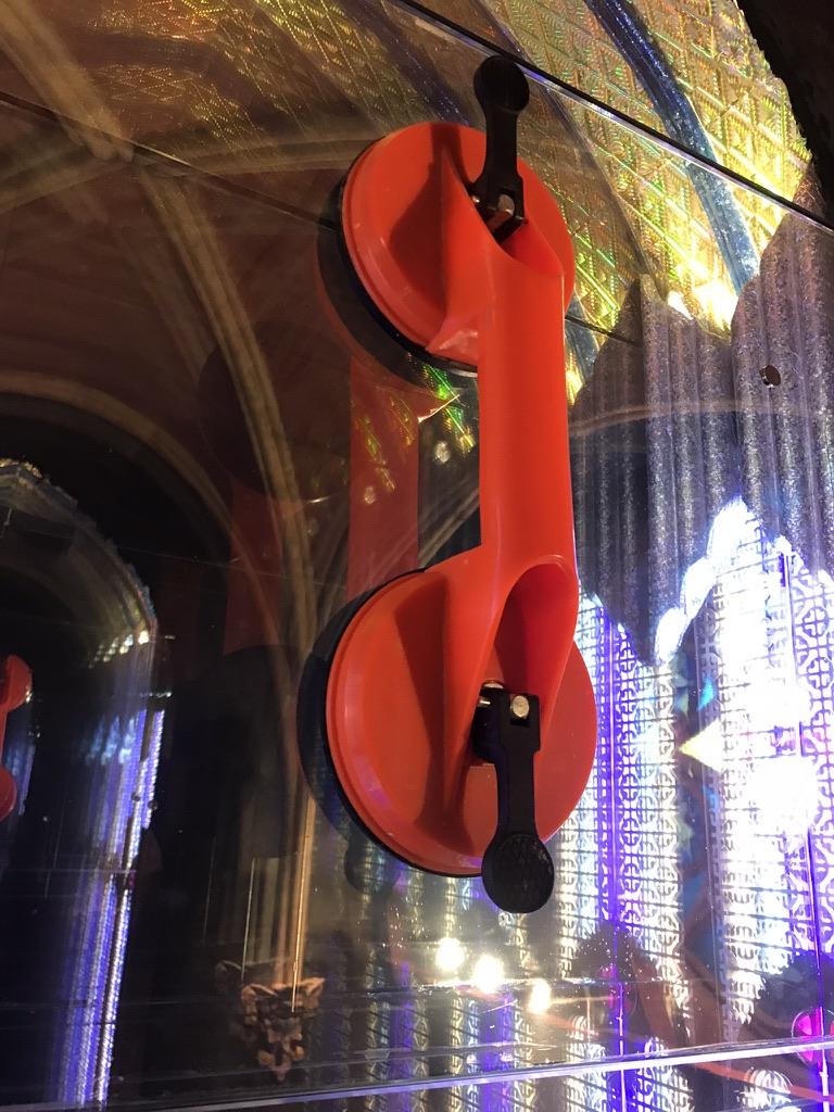
The front mirror panels can be attached, detached and carried with the aid of a short detachable grab bar, which serves as a junior-size version of a suction-cup glass-carrying device. Because of the rounded edges, a single panel can be removed without affecting the panels above or below it. The panel is removed by mounting the grab bar in a vertical position onto the glass surface and then using it to tilt the top end of the panel outwards before fully extracting it.
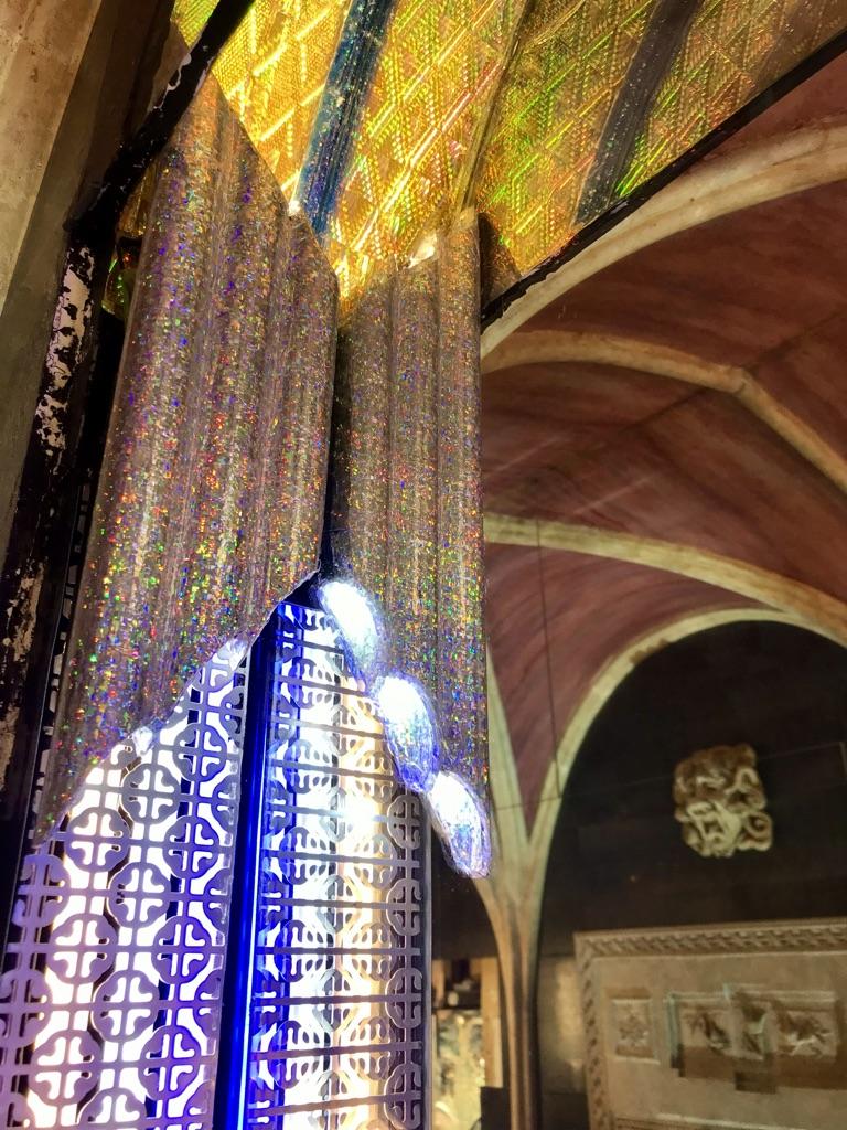
The vertical side lights in the niche were constructed using three colours of LED tape: RGB on the left, bright white in the centre and a soft white on the the right. Since the aluminum channel specifically for LED tape was at the time not available in long enough lengths, I instead used u-shaped steel standards designed for wall-mounted shelving. As the interior dimensions of the two types of channels are identical, the shelving standards provide a perfect fit for both the LED tape and the snap-on diffuser lenses used to complete their installation. Since the shelving standards are constructed from steel, it was easy to devise a system for removal with the use of magnets and steel mending plates that had been attached to the side walls.
The decorative aluminum panels were mounted on top of the side lights using magnets glued to the inside corners of each pane. The decorative half-arches were designed to cover the seams between adjacent panels. They were cut from tin, painted black and attached with a thermoplastic adhesive.
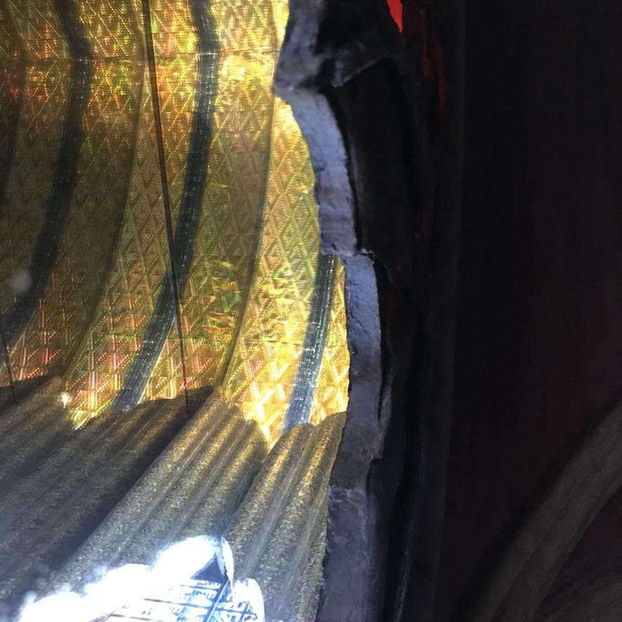
The tubular up-down lights near the top of the niche were made from three scrap pieces of 1” PVC conduit that were cut at an angle and bonded together using a thermoplastic adhesive. The inner and outer surfaces of the assembly were covered in a holographic foil gift wrap using a spray-on contact adhesive. A small LED spotlight was mounted inside the top-half of each of the tubes and a short strip of LED tape in the bottom half. They are mounted to the side walls using a magnet and steel mending plate.
Wiring for the lighting is hidden behind the vertical angle irons. The transformer for these light is located in a basement room below below the niche.
The arched ceiling inside the niche was covered using a gold-coloured holographic foil with an embossed diamond pattern. The clear blue-coloured arched ceiling moulding that is mounted against the rear mirror was constructed from clear vinyl tubing that had been filled with a blue blue glitter paint.
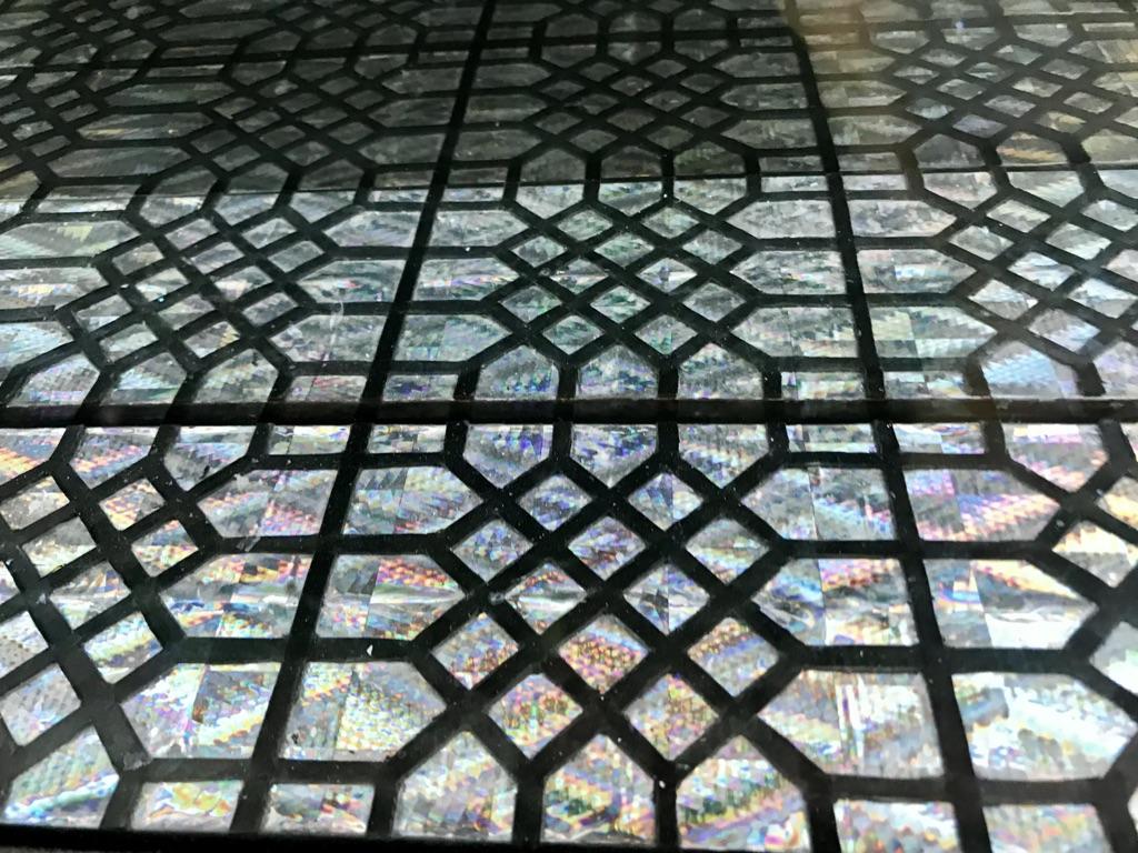
The floor of the niche was covered with a silver-coloured version of the foil in the same pattern. The geometrically patterned overlay was cut from black construction paper. The pattern was copied from one a grate covering the cold-air return for our furnace. The design was transferred onto the back of the paper with white spray paint, using the grate as a stencil and cut out using an X-Acto knife.
Decorative stone overlay
The design for the decorative stone overlay covering the top of the niche was copied from a photo of a concept drawing of a decorative Gothic arch. A drawing enlargement app (Rapid Resizer) was used to create a full-sized sketch. The outline was transferred to 1/2” plywood and the plywood was cut to shape using a jig saw. The angels were traced onto sheets of copper foil and embossed using wood and plastic shaping tools. The figures were cut from the sheeting so that they could be shaped more deeply. A second set of wings was created so that they could be mounted on top of the bodies to provide further depth. The pieces were filled with a thermoplastic adhesive to strengthen the copper. They were later attached to the plywood using the same adhesive. A 2” metal ring was used in the centre opening to support the angels hands. Acrylic modelling paste was used to fill gaps between the copper pieces and the base. Scraps of PVC conduit were shaped with a hot-air gun and affixed to the perimeter of the arch. The pointed bottom ends of the piece were cut away so that they could be mounted separately in order to facilitate disassembly. The piece was faux finished with acrylic paints to resemble pink sandstone. Ruby red coloured mylar was glued to the back of the overlay to simulate stained glass. A hanger for the piece was constructed by ripping two pieces of 1”x2” lumber at a 45° angle and gluing them horizontally — one to the wall and the other across the back of the overlay.
Construction of Rose Window
Window Design
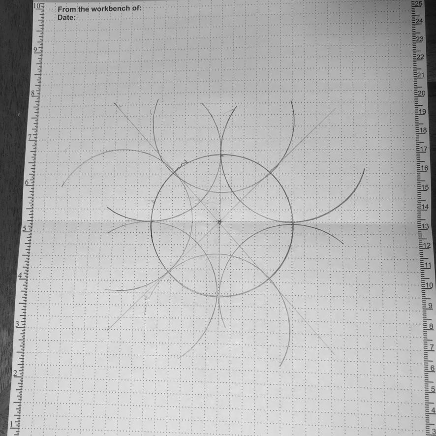
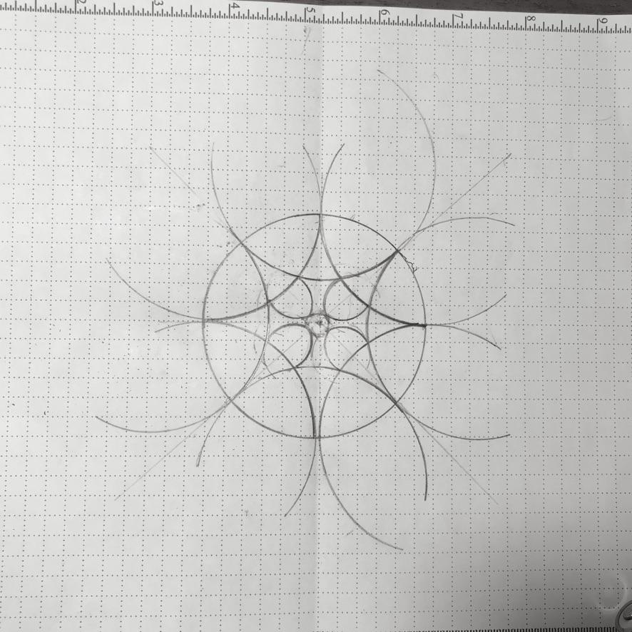
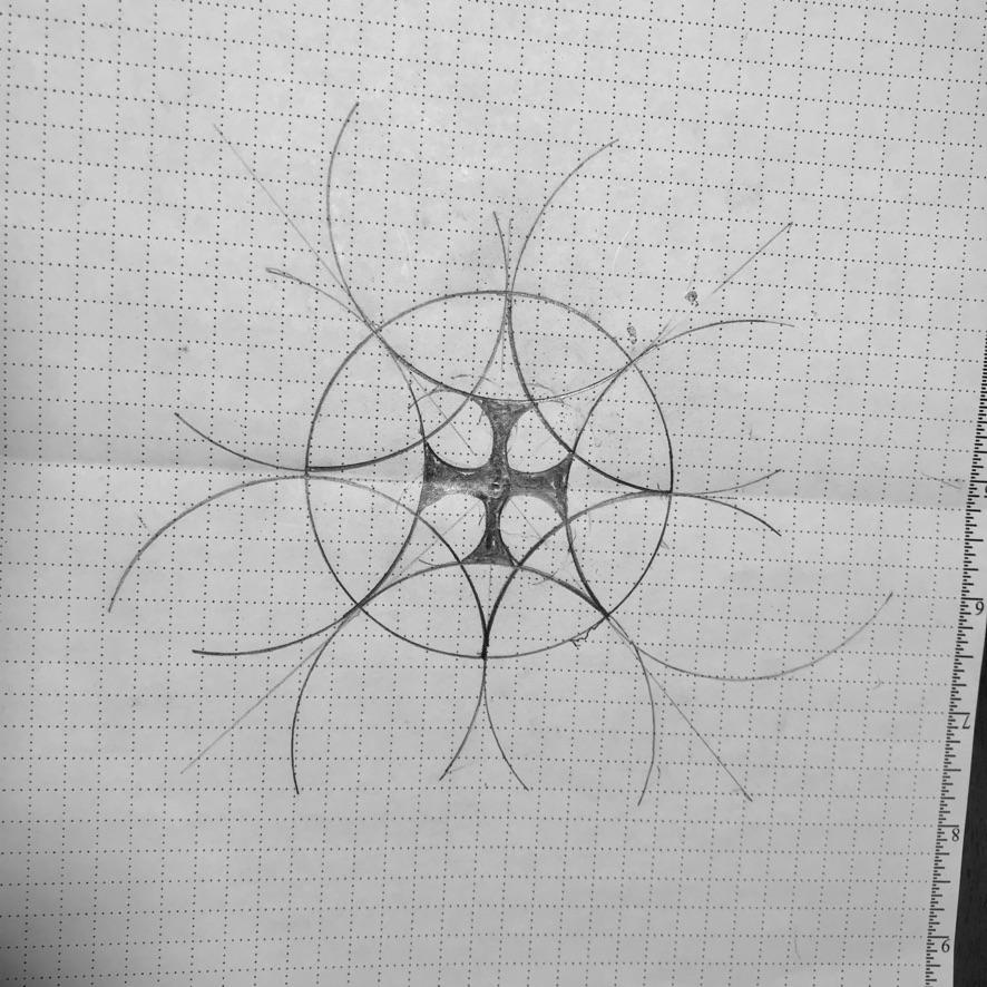
Design your window using pictures of rose windows for inspiration or design it from scratch using a compass or drawing app. Helpful resources include an ebook on gothic geometry [ http://www.newyorkcarver.com/geometry/rose.htm ], a Pinterest site devoted to rose window designs [ https://www.pinterest.ca/junksterdiva/rose-window-designs/ ] and Youtube videos such as “How to Design a Rose Window with a Compass” [ https://www.youtube.com/watch?v=V1fghsSMUME ].
The design for our rose window was inspired by a picture we found online. I used it to sketch a similar but simpler design applying the techniques described in the above-referenced video. If you wish to replicate our window, the radius of the small arcs that form the inner sides of the cross is one-third that of the large arcs.
Keep in mind that if you are going to use PVC mouldings to build your window you will have to construct a fairly large window. The diameter of our window is 43". If you attempt to go much smaller than that you will run into difficulties trying to bend the PVC mouldings without distorting their profile.
Constructing the Window Tracery
Tools:
- jig saw
- hand saw and miter box or power miter saw
- coping saw or rotary saw (e.g., Dremel tool with cutting bit)
- hot-air gun
- small hammer
- sharpie pen
- 1/2 heet 1/4” plywood
- yardstick
- small palette knife
- string & thumbtack (to serve as a large compass)
- finishing nails
Materials:
- PVC trim mouldings in 3 profiles: 1/2” inside corner, 1/2” nose &1/2” cove
- joint compound
- thermoplastic adhesive (e.g., Goop)
- gloves (to protect your fingers when heating mouldings)
Steps:
1. Draw a full-scale outline of the window on 1/4” plywood, which will serve both as the base for the window and as a template for shaping the mouldings. I used a felt pin and an improvised string-and-thumbtack compass to transfer the design onto the plywood.
2. Cut lengths of moulding slightly longer than the finished sizes to make them easier to handle without burning your fingers while bending them into shape. If you are recreating our design, you will require :
- 1 piece of inside-corner moulding for the outer edge
- 8 pieces of cove moulding for the four long arcs
- 8 pieces of nose moulding for the inner edges of the cross and the four round sections.
For the perimeter of our half-window you will need to purchase a length of corner-moulding that is at least a few inches longer than half of the circumference of the full window.
You will need about eight times as much of the cove moulding than you do the inside-corner moulding because each of the four long arcs will require two lengths of moulding that will be assembled back-to-back. For now, cut all of these pieces to fit the full length of the arc. You will re-cut some of them where they intersect at the time of assembly.
You will need a length of nose moulding equivalent to about one-quarter of the circumference of the full window.
3. Using the outline as a template, bend the mouldings to shape while heating them with a hot-air gun to soften them. Heat them to the point that they will bend easily but not to the point that distorts the shape of their profile.
For the large interior arcs, you will need to shape half of them with the cove edge facing the inside of the arc and the other half with the cove edge facing the outside of the arc.
To create the circular pieces, start bending the strip of nose moulding from the centre. Wrap the ends over each other to complete the circle. Allow the piece to cool before sawing through the overlapping ends. Then reheat the abutting end sections to lay them flat.
4. Assemble the sets of cove mouldings using thermoplastic adhesive. You might wish to use elastic bands to keep them together while the adhesive sets.
5. Beginning at the circumference, cut the inside-corner moulding to fit and glue it to the plywood base using a thermoplastic adhesive. Tack it in place with thin finishing nails until the glue sets.
6. Next attach two of the matched sets of cove mouldings to the base, trimming the ends with a rotary tool or coping saw to fit the shape of the outer moulding.
7. To install the remaining sets of intersecting cove mouldings, you will need to trim them to fit where they intersect the mouldings already installed. You can painstakingly cut them to fit accurately with the use of a coping saw or you can rough-cut them to fit (my preferred method) with a miter saw and fill the gaps later. Before cutting, place the moulding on top of the installed moulding to mark it for cut-points and cut-angles.
8. Cut to fit and install the four pieces of nose moulding that form the inner edges of the cross and the four circles.
9. Cut out the window openings and the outer edge of the plywood using a jig saw or rotary saw.
Application of Faux Sandstone Finish to the Tracery
Tools & Materials:
- fine-grained sandpaper
- 1" stiff bristle brush
- white acrylic primer
- acrylic matte craft paints in an assortment of reds, browns and yellow earth tones and white
- glazing medium or paint conditioner to slow dry time
- water spritzer
Steps:
1. Prep the window tracery for painting by filling the gaps using a palette knife and lightly sand it with a fine-grain sandpaper. Remove sanding dust with a dampened rag.
2. Paint all the tracery with a white acrylic primer.
3. Apply paint to tracery using a stiff short-bristled brush (an old worn one works best). Apply paint using a pouncing motion in order to create a lightly textured surface. For realism sake, vary the colours and patterning slightly between sections of tracery. Apply the paint so that the grain runs across (rather than along) each section of tracery in a striated fashion, alternating between reds, browns and blending in small amounts of white and yellow to soften the tones. Alternate colours as you go and apply adjoining colours while the paints are still wet. Use a water spritzer if needed to keep the paints wet to facilitate blending.
Creation of Faux Stained Glass
Tools & Materials:
- fine-tipped artist’s brush
- sheet of red mylar cellophane
- scissors
- craft knife
- small palette knife
- plastic refractor lens in 2 designs: Prismatic & Cracked Ice
- alcohol dyes — yellow, blue & red
- methyl hydrate
- Gallery Glass Liquid Lead — made by Plaid
- cake decorating pen
- glossy acrylic gel
- clear thermoplastic adhesive or clear silicone
- Sharpie pen
1. Trace an outline of the cross-shaped pattern (half a cross for our project) onto a sheet of red mylar using a Sharpie. Cut out the piece and glue it in place on the back of the window.
2. Use a clear thermoplastic adhesive or silicone to create the appearance of cathedral glass with a deeply textured surface. Apply a heavy coat of the adhesive to the back of the mylar. Use a small palette knife to create a striated effect. You may need to repeat this process as the adhesive continues to dry because it will tend to level out.
3. The faux yellow cathedral glass surrounding the cross was made from a damaged sheet of plastic reflector lens in a pattern called “Cracked Ice.” It is installed with the smooth side facing the interior. This plastic is very brittle and prone to cracking but it can be successfully cut with scissors if you snip off small pieces of the material as you approach the cut-line. Scoring the outline with a sharp Xacto blade before using scissors will also reduce the chances of it cracking. The yellow for our window was obtained by coating the plastic with a yellow alcohol dye. A piece of yellow-coloured mylar would be just as effective and would provide a more uniform effect. If you prefer this option, you can attach the mylar to the back of the lens with a small bead of adhesive applied around the edge.
4. The blue sections around the round windows were made from a lens with a “Prismatic” pattern — the most commonly used pattern in commercial fluorescent ceiling lights. It was coloured using a blue alcohol dye but a coloured mylar would also work just as well for these pieces.
5. The four small round panes around the perimeter are designed to resemble leaded glass panels that have been assembled from several varieties of opalescent glass. The relief designs in the centres of the panels appear to have been applied by the artisan using molten glass rods.
The round panels in our window were cut from the Cracked Ice version of lens. The designs for each panel were first sketched on sheets of paper with a Sharpie pen to serve as patterns for applying the finishes. The pre-cut panels were laid on top of the patterns, textured side down, and tacked in place with bits of tape. Gallery Glass Liquid Lead was used to simulate the look of authentic glass leading. Thin beads of the liquid leading were applied to the smooth surface of the panel following the lines of the pattern underneath.
After the beading had dried, a non-diluted red alcohol dye was dripped into the small sections that form the perimeter of the design. A blue alcohol dye was dripped into the larger spaces that surround the design and a few drops of a diluted solution of red were randomly dropped on top of the blue to create patches of purple.
A few drops of a thermoplastic adhesive were dribbled into each of the spaces that had been dyed — not enough to fill the spaces but enough to completely cover the surface. The adhesive serves to protect the alcohol-based dyes from water and to distort the light coming through the diffracted lens to give a mottled effect to the glass in the treated sections.
The raised designs in the centres of the round panes were created with the use of a cake decorating pen filled with a glossy acrylic gel. Using the pen like a squeeze-tube, thin beads of gel are laid down following the lines of the pattern underneath. The designs were then painted with acrylic colours — green for the symbol for Earth, white for Wind, blue and white for Water and red for Fire. To give the impression that some of the colour had bled into the surrounding glass during firing, a drop or two of the diluted colours dabbed onto the surface surrounding the symbols.
Like the other panes, the round panes are mounted to the rear of the window with an adhesive. Unlike the other panes, they are mounted with the treated side facing into the room.
Installation of Mirrored Wall
Issues to consider before purchasing wall mirror
If, like me, you do not have much experience in glass cutting, I would recommend that you purchase ready-made mirror tiles or have the tiles cut-to-measure by your glass supplier. I chose to have the supplier cut all our mirror in the same dimensions and then I would take on the task of trimming the pieces that required fitting along the top, bottom and sides of the wall. If you prefer to have the supplier do all the cutting, you will need to make templates for each of those pieces. You can expect this to be a slow process since the supplier will require a template for each irregularly shaped piece that you will have to cut from masonite or thin plywood. Also, for each row of mirrors, you will have to await the arrival of the custom-cut end pieces before you install row above it, since it can be very difficult to mount a mirror in a space that is surrounded by other mirrors. If you have never cut glass before, but wish to do your own trimming, I would recommend watching some tutorials and practicing on a number of pieces of scrap glass before making your first cut for your new mirror.
Prep the wall for installation of mirror tiles
To prevent reflective distortions in a mirrored wall, it is essential the wall be perfectly flat and plumb. The wall to be mirrored had been constructed of plaster over an interior brick wall. The 119-year-old plaster on this wall was in excellent condition but had a number of valleys and hills that would be time consuming to fill given my limited troweling skills. I decided, therefore, to span the depressions by cladding the wall with 1/2" cement fibre board. It meant some loss of precious space but provided some peace-of-mind knowing that we had a solid flat surface that would minimize the risk of having mirrors crack after installation.
Steps:
1. Check for flatness using a narrow 10' length of MDF moulding.
2. Fill any depressions in the wall and sand down any bumps or ridges.
3. Paint over sanded areas with primer.
3. Clad the wall with 1/2" cement backer board using a quality construction adhesive and a 1/4" notched trowel. Temporarily support each panel while the adhesive sets using 1 1/2" masonry screws.
Cut & Install mirror tiles
Materials:
- 3 mm mirror panels
- mirror adhesive
- protective film
- aluminum tape (the type made for sealing ductwork seams)
- cloth duct tape (for holding tiles in place while adhesive sets)
- protective safety cloves and goggles
Tools:
- glass cutter
- cutting oil
- glass nippers for trimming
- metal yardstick or similar straightedge
- level
- grease pencil
- wet tile saw with a diamond blade (optional)
Steps:
1. Decide on mirror thickness. We chose 3mm mirrors (the thinnest available) because their borders are less pronounced and they create the less ghosting (a faint double image reflecting off the glass surface) than thicker plate-glass mirrors. Using mirror tiles of course means that there will a multitude of seams, which could under some circumstances distract from the desired illusion. However, for our purposes we feel that the lines added to the three-dimensionality of the space and that they merged well with the lines created by the seams in the wall tile and niche. There are some downsides to thin mirror tiles, however. They are more prone to breaking than thicker mirror and, if breakage occurs after installation, they are notoriously difficult to replace.
2. Decide on mirror dimensions. The mirror tiles need not be the same dimensions as the wall tile, but you are likely to achieve a more pleasing look if you choose dimensions of similar proportions to the ceramic tile. Before finalizing dimensions measure the height of the wall to be mirrored and divide by the height of the wall tile. If the remainder of the division is too small (e.g, less than .75) you may want to adjust dimensions so that you do not have overly skinny mirrors in the top or bottom rows. Do the same calculation for the width to avoid having extremely narrow tiles at the ends of rows. Keep in mind, however, that size imbalances will be more distracting at the top and bottom than they will at the sides because of the nature of stone block construction. It may be helpful to begin with a pencil sketch of the layout for the mirrors. Adjust the layout to find the most aesthetic arrangement. Try to avoid arrangements that result in too much imbalance -- e.g., obvious differences in mirror dimension for the top and bottom rows or very narrow mirrors at the ends of some rows.
3. Decide on the finish for the edge. We chose a lightly sanded edge, which provides the least conspicuous border.
4. Buy at least 3 or 4 extra tiles. Expect to have some breakage while cutting or installing.
5. Starting at the bottom row, trim the tiles to the measurements indicated in your layout plan.
6. Prepare the tiles for mounting by applying 2" aluminum foil tape on the back of the tile around the perimeter. For full-size tiles, apply 3-4 strips of tape vertically across the centre.
[Please note — This may well be a totally unnecessary step. It was suggested to me by a mirror installer as a precautionary measure since some mirror adhesives may be incompatible with the coating on the back of some mirrors. Over a period of years the incompatibilities can result in discolouration due to corrosion. Using aluminum tape as a barrier between the mirror adhesive and the mirror backing apparently can avert this problem.]
7. Apply a generous, even bead of the mirror adhesive to the perimeter about 1" in from the edge. Begin and end the bead at about 1" in from the corners. Do not totally seal around the edges to allow for air circulation behind the mirror in order to prevent moisture from being trapped. Apply adhesive to the vertical strips of tape, beginning and ending the bead at least 1" away from the perimeter bead.
8. Start attaching the mirror tiles from the centre of the room. Press the mirror firmly in place, using the back palm of your hand to apply extra pressure along the taped areas behind the mirror. Work first from the centre to the sides and then all the way around the perimeter.
9. After installing your first mirror, reinforce it from the top with two 3" strips of duct tape to ensure that the mirror will not pull away from the wall before the adhesive sets up. As you continue installing mirrors, use two strips of tape across the sides of adjoining mirrors as well as at the top. Pull the tape tautly to ensure the edges do not separate.
As you continue to install the row, repeatedly check for level to ensure that there has been no slippage.
When you reach the ends of the row, use construction paper to make templates to assist you in cutting the end pieces.
Use a template as well to assist in cutting the irregularly shaped section of mirror that projects into the meditation window. You can have the piece cut for you or you can cut it yourself if you own a wet tile saw. Draw the pattern to be cut on the front of the mirror with a grease pencil. Use the tile saw to make the short cut into the mirror. Cut very slightly beyond the marked line to compensate for the curve of the blade. Use a glass cutter to trim off the edge that will abut the wall below the window. You can also use the tile saw in conjunction with the glass cutter and nipper to cut relief lines to facilitate cutting other difficult shapes.
11. Remove the duct tape carefully after installation. Any residue of tape adhesive can be removed with a paper towel moistened with mineral spirits.
Take care when cleaning your mirrored wall to prevent water infiltration along the seams. For this reason it is best to avoid using sprays or a squeegee. I recommend cleaning with a dampened microfiber cloth or sponge and drying with a lint-free towel and avoiding the use of ammonia-based glass-cleaning solutions.
Installing the Concrete Floor
Issues to consider before applying a concrete overlay:
A short video from the Concrete Network [ https://www.concreteconstruction.net/products/deco...] discusses some of the issues to consider before installing concrete overlays over tile, including issues relating to the integrity of the floor components, issues relating to incomplete adhesion to the subfloor and ghosting problems that can arise on floors with wide tile joints. The video also briefly address solutions to these problems and how to properly prep floors for a concrete overlay.
Fortunately, our floor was very sound and required little further prep. As mentioned previously, it was a marble tile floor that we had laid but later regretted. We had laid the tile over cement board which we fastened securely to the original pine flooring. Before installing the cement board, we used flooring screws to secure the old flooring to joists. Ridges in the old floor had been sanded down and a layer of thin-set troweled on to fill-in joints and depressions. We had not yet grouted the tile. The grout lines were narrow, which provided lots of gripping points for the concrete.
Tools & Materials:
- electric drill with concrete mixing paddle
- 8" concrete levelling hand trowel
- garden trowel
- plastic pail for mixing concrete
- wood saw
- 6” x .5” length of board to use as an implement for levelling the concrete
- plastic sheeting
- water spritzer
- concrete bonding agent
- concrete overlay mix
Steps:
1. Prep floor for pouring of concrete topping
Temporarily plug floor openings — Cut two or more circles from scrap 1” styrofoam slightly smaller than the opening for the toilet to create a temporary plug for the drain hole for the toilet. Caulk around edges
Plug openings for the water supply to the toilet and for the floor lights with pieces of PVC pipe the same diameter as the openings. Stuff pipes with plastic food wrap. Friction fit the pipes into the floor, leaving 1/2" of the pipe protruding above the floor.
2. Apply bonding agent to floor tiles
Mask the base of the tiled walls with 2" masking tape applied 3/8” above the level of the existing floor.
Dilute bonding agent with water following to manufacturer's directions to serve as a primer. Apply the water downed solution over the entire floor, working it well into all joints with a long-bristled brush.
Apply a full-strength second coat after the primer coat has dried.
3. Prepare forms for retaining concrete while pouring
After the bonding agent has fully dried, layout the length of the floor into four sections. The area between the front wall and the border of the storage area was divided into three equal sections. The fourth (smallest) section inside the storage area behind the screen would be poured first. (Since this section of the floor would be hidden, it would later serve as a testing area for faux finishing the floor.)
Decide the number of slabs you will be pouring, taking into account the length of your reach and the levelling tools you will be using. Given the cramped space for working in and the shortness of my arms, I decided to go with five sections.
Use a Sharpie pen to mark the border between each of the five sections where forms will be laid.
Cut ten lengths of 1/2" moulding that will be placed along the longer walls. These side pieces will serve as guides for levelling the concrete when pouring.
Cut two lengths of 1/2" moulding the length of the room to serve as the forms that will separate the five sections while pouring. These pieces should be cut precisely since they will be friction-fit between the side pieces to keep them in place while pouring.
Coat all pieces with silicone to facilitate later removal.
Cut a 1/2" x 6" board about 1/2” shorter than the width of the room. This board will be pulled across the poured section to remove excess concrete and to create a smooth level surface of uniform depth.
4. Pouring the concrete
Before beginning the pour decide the order you will use to pour each section so that you can avoid walking on the fresh concrete before it has fully set. Since our doorway was close to the front of the room, we would pour the first three slabs beginning at the rear of the room, then the slab at the front of the room, which meant that we would be able to pour the final slab from outside the doorway.
Beginning from the rear, friction-fit the forms for the first slab.
Mix a sufficient quantity of concrete according to manufacturers directions to fill the first section. If pouring it over ungrouted tile (as in our case) remember to take into account that you will require a little extra to fill the tile joints.
Trowel on a generous layer of concrete over the tiles. Tap the tiles as you go to ensure that tile joints are totally filled.
Pour a sufficient of amount concrete to completely fill the forms.
Level the surface with a trowel, moving excess concrete from the surface as you go.
Use the 6"x1/2" length of board to finish levelling. Holding the board at a 45º angle, pull the board across the surface, using the sides of the form as rails.
Allow concrete to set long enough that it is sufficiently firm to remove the form from the front side of the slab. Leave all other forms can in place for the time-being.
Set up three forms only for the next slab since the next pour will be retained by the first slab.
Continue pouring the remaining four slabs in the same manner.
When the concrete has set sufficiently to walk on, remove the remaining wood forms.
Prepare a small quantity of concrete mix to fill the gaps that have been left at the edges of the three tiled walls. If you have not installed the mirror tiles prior to pouring the floor, leave the gap along the remaining wall empty for now since it will allow the mirrors on this wall to be installed below the floor level. This will hide the reflection from the sides of the mirror, contributing to the perception that the floor is one continuous slab. Do not attempt to disguise seams between slabs since this will distract from the impression that the floor has been constructed using stone slabs.
Do not allow the concrete to dry for at least 7 days in order to facilitate curing and maximize compressive strength. Cover the concrete with plastic to slow down the rate of drying. Check daily for dampness and mist with water where needed.
Faux Finishing the Decorative Panel & the Concrete Floor
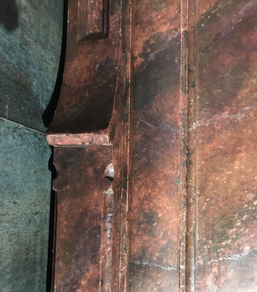
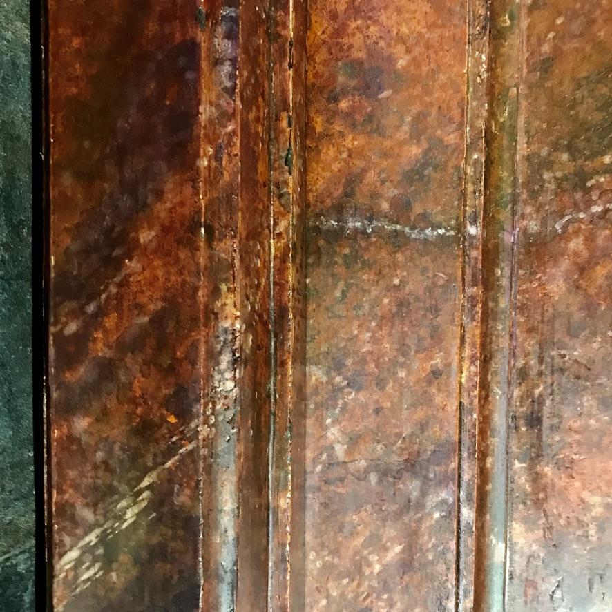
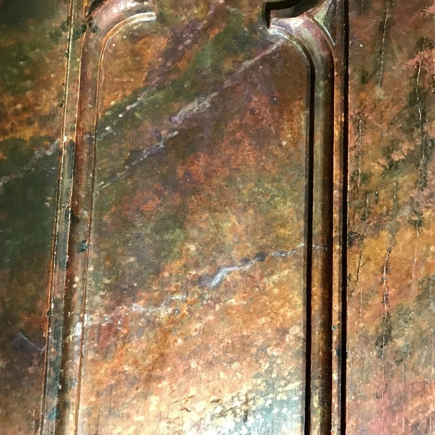
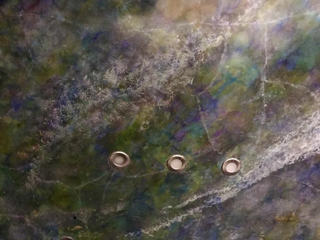
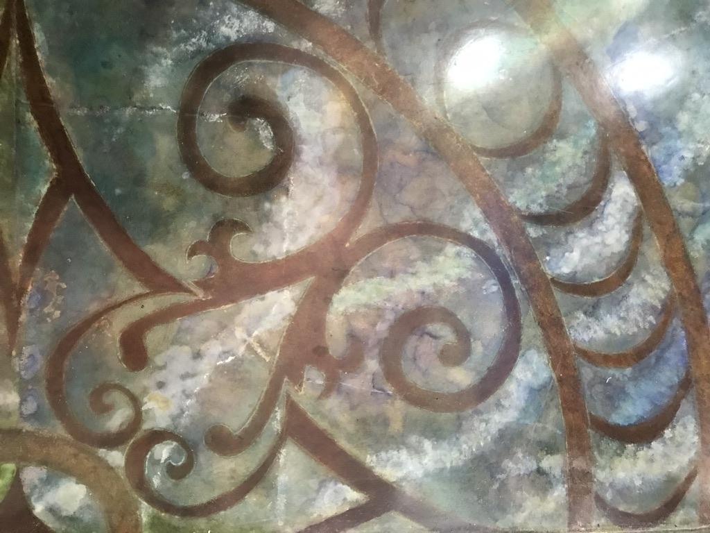
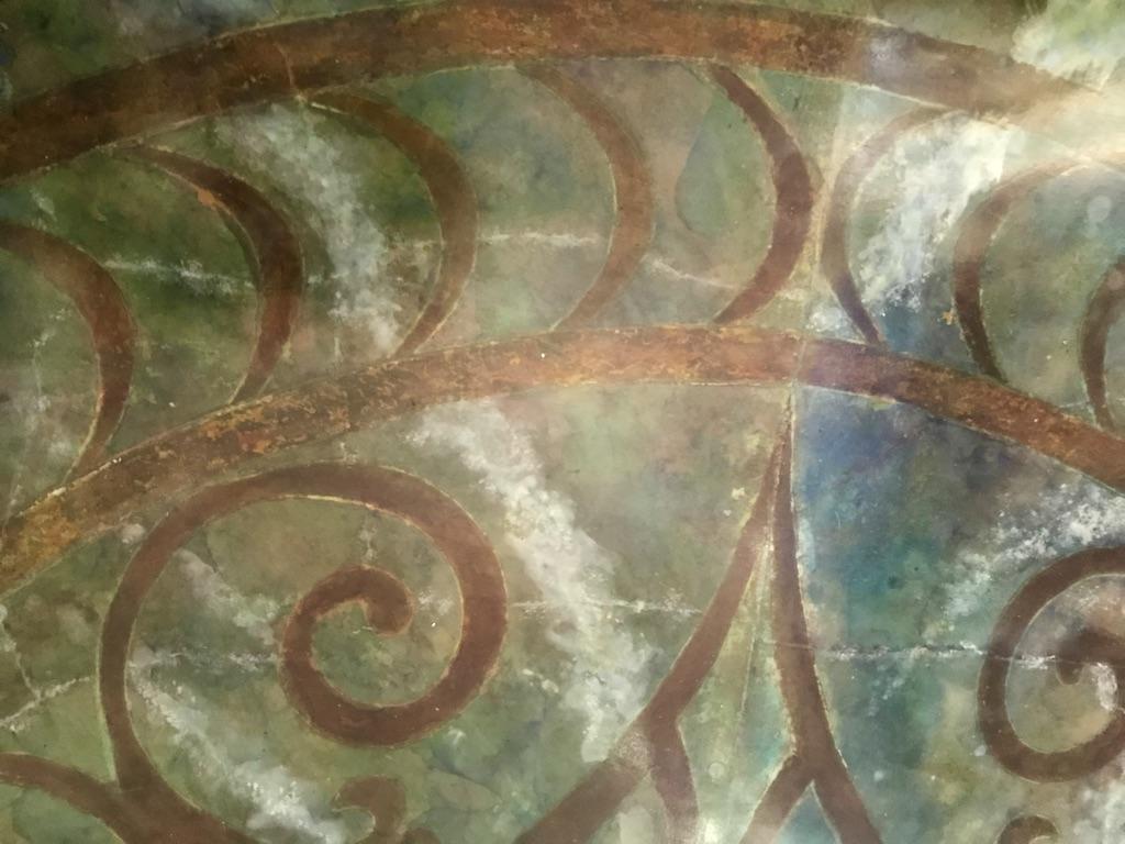
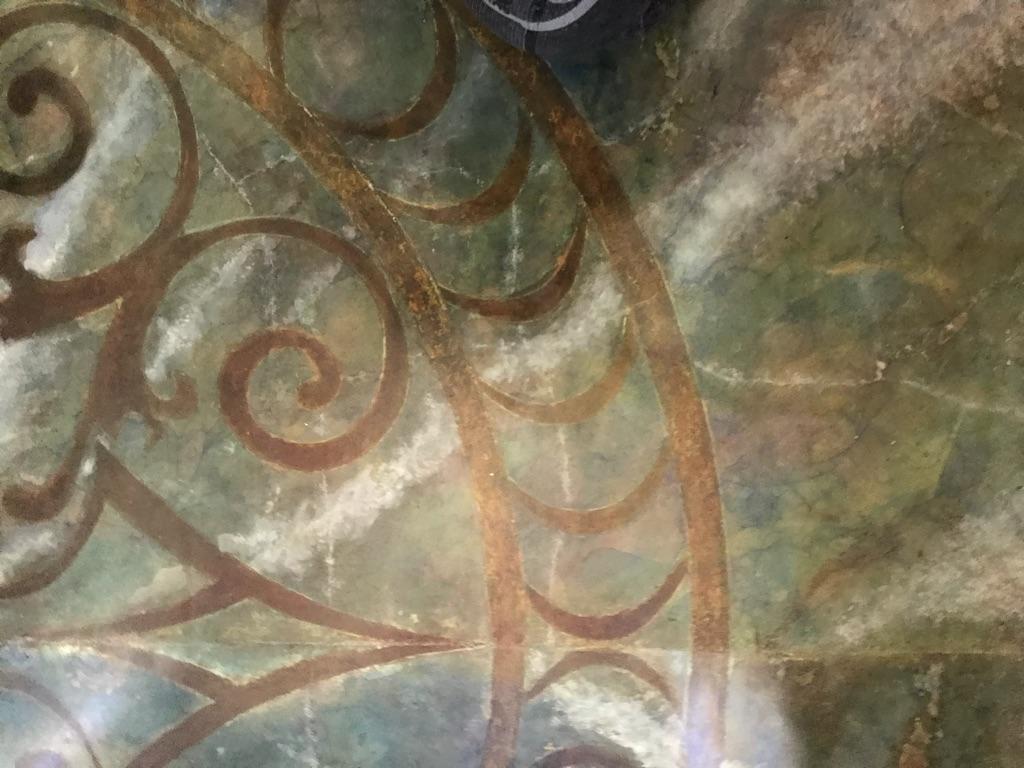
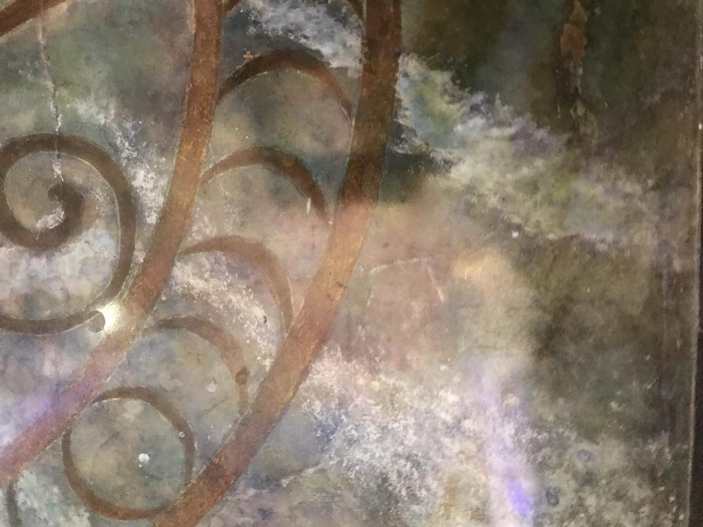
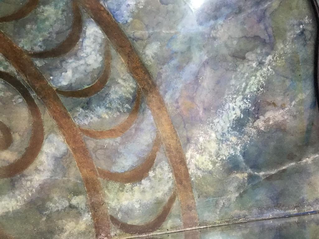
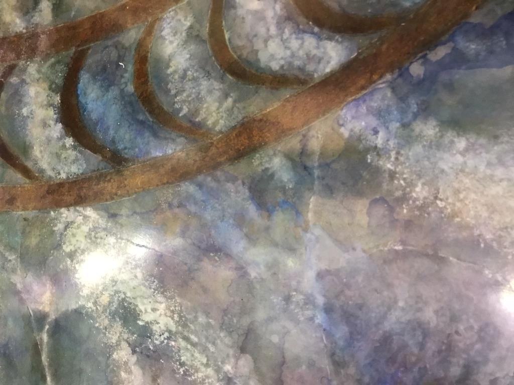
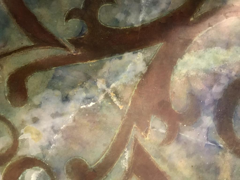
Application of a Faux Marble Finish to the Decorative Screen
Prior to the creation of our tiny temple I had minimal experience in faux finishing. I have long admired the work of highly skilled faux painters, have watched a number of their videos and have played around with some of their techniques. However, I found I had little patience in trying to master traditional faux painting. I have instead stumbled upon some quick and dirty methods for creating some stone and glass effects that require relatively little skill or talent.
The decorative screen behind the toilet was one of my first efforts. I had initially refinished the piece using a Venetian Plaster. The effect was interesting enough but neither my wife nor I were happy with it because it looked too busy and the colour was too pink, rather than the rich deep red we had envisioned. Rather than trying to remove the finish, I painted over it with a primer and took the screen to our backyard to experiment with batches of left-over paint from our living and dining rooms — a deep red (Prairie Poppy by Benjamin Moore), a very dark, almost black, purple (Black Raspberry by Benjamin Moore) and a white trim paint. I laid the screen on a tarp and diluted the red and purple paints with water and a paint conditioner to extend the drying time. I can no longer remember the ratios or the name of the additive — just that I diluted the paint to the point that it would readily run off a stir stick. I poured some of the diluted paints into separate containers and added a small quantity of white to obtain lighter shades of the two colours.
I applied the finish using a thick 2” paint brush to fling the paint onto the screen from a distance of about 3-4 feet, alternating among the four colours. I applied the paint so that the grain of the marble would run on an upwards slope across the screen. I applied several overlapping coats rather than attempting to get complete coverage in one pass, allowing the paint to dry or sometimes almost dry between coats. I alternated my standing position between coats from left to right to create greater variation.
I found the trickiest part of the application was to take care to not overly dilute the paint and to not overload the brush in order to avoid a splashy appearance and to avoid puddling. Nevertheless, from time-to-time I had to lift the screen, holding it at the bottom left-hand corner, and tilt it in the direction of the grain to drain off excess paint that had pooled inside a panel. When pooling occurred it was often along the edges of the panels where they join the stiles and the rail. Tilting the screen to drain puddles causes the paint to run even further along the joints. Fortunately there is a relatively easy fix when this happens. The excess paint be can be removed from the joint using a wide fan brush to soak up the errant paint without disturbing the paint alongside it.
I continued flinging paint in this manner until I was happy with the effect. When the paint was almost dry but not set, I used an old toothbrush to spatter methylene alcohol in a random pattern over some areas to add further visual interest. The drops of alcohol alcohol cause the upper layer of paint to open, exposing the colour underneath. I then filled a pipette with alcohol and used it like pen to draw random lines and dashes to imitate veins that appear and disappear. I added more veins using a fine-tipped artist’s brush to apply undiluted white paint. While the paint was still wet I used a spritzer to soften the veins, a bamboo skewer to drag them out and a small fan brush to narrow them.
After the screen had dried completely, I applied a paste wax and buffed lightly to mimic the appearance of old marble.
Application of a Faux Marble Finish to Concrete Floor
Encouraged by the outcome of the decorative screen, I applied some of the same techniques to marbleize the floor, except that for this part of the project I mostly used alcohol dyes rather than acrylics.
Tools & Materials:
- 3 — 2” paint brushes
- Artist brushes — 1 pointed and one flat
- Small stencil brush
- Opaque projector (or digital projector) for enlarging and tracing image (I used an Artograph Tracer Projector & Enlarger) — Optional
- Exacto knife
- Fine-point marker
- Etching pen (I used a battery-operated etching pen from Lee Valley ToolsAlcohol dyes in an assortment of colours
- Water spritzer
- Small mixing containers (e.g., yogurt tubs)
- Large sheet of adhesive-backed vinyl
- Fan for ventilation and/or respirator with carbon cartridge to filter out VOCs
- Alcohol dyes in assortment of colours — ……………………………….
- Heavy-bodied acrylic paints in white, burnt umber, raw umber & raw Sienna
- Methyl alcohol
- Spray-on art fixative
Design and Layout
Before beginning work, give some thought regarding the overall impression you are trying to create. For our floor, we wished to create the impression that the mason had hand-picked slabs of marble which he artfully cut and positioned in a manner that would compliment the shape of an in-laid medallion to be installed later. To recreate that impression, I took care to avoid having veins or other patterns running into similar veins or patterns in neighbouring slabs. Rather I painted a prominent white grain to run diagonally across the slab and I positioned the slabs to give the impression that they were radiating outwardly from the centre of the medallion.
Also give some thought to the finishing materials that will best match your circumstances. For example, I chose to use alcohol dyes, which as a group tend to be less resistant to UV-induced fading than most paints. Our bathroom is located in a central room that is far away from the closest window so fading was not a factor we needed to consider. For the finish coat, I chose to use an acrylic varnish rather than an epoxy varnish — a decision made out of an abundance of laziness. I now regret that choice and will redo the floor at some point using an epoxy finish.
Your best strategy for painting the faux marble floor of your dreams is to begin with a general outline of the design (your vision of your new floor) and then let nature or happenstance dictate most of the details, since nature and happenstance frequently can be more artful designers than humans. Before starting your work, take a close look at the concrete surface. Are there any “flaws” in the surface that you can take advantage of? Rather than trying to repair cosmetic imperfections, consider whether you might be able to find a way to integrate them into the design. Sometimes flaws will lead you in directions you hadn’t yet thought of — and using them artfully can save you a ton of time. In our case, I noticed that some minor crazing (shallow hairline cracks in the surface of the concrete) was beginning to develop toward the end of the drying period and used alcohol to cause more of it to happen. As discussed earlier, crazing in concrete occurs when the concrete is allowed to dry too quickly, which causes differential shrinkage between the core and surface. Crazing does not compromise the integrity of the concrete but is often considered to be aesthetically unpleasing. But the crazing effect for our purposes was desirable since it could readily be incorporated to mimic veining patterns found in some marble.
Prep for painting by masking the edges of slabs that adjoin the slab you are painting.
Develop the pattern on the floor one layer at a time, beginning with a variety of alcohol dyes diluted in alcohol. The strength of the dilution is not critical since the alcohol will soak into the concrete and dry very quickly. You can intensify the colour simply by adding a few extra dribbles of the mixture over the same area — or to obtain very intense colours, you can first wet the area with alcohol and dribble a few drops of dye on it directly from the bottle. You can dribble the coloured alcohol from a plastic container or use a 1” brush to splatter it on. If you want white to be one of the dominant underlying colours you can mix a very diluted solution of white paint and water that you apply in conjunction with the alcohol dyes.
Apply overlapping patches of colours in a random pattern. Do not over-think the process; allow the patterns to emerge as you work. Unlike the technique described for the finish on the screen, there is no need to apply the colours in a linear fashion since a directional grain will not be applied until a later step. Rather try to produce overlapping islands of colours. If you wish to have grey colours in the finished design, as we did, you can leave some patches of the concrete bare. If you have a pattern in part of a slab that you wish to preserve while working on adjacent areas you can lightly spray that area with an art fixative. That way if you happen to splash the pattern you can wipe it off with a rag or paper towel. The fixative will not interfere with the adhesion of other finishes you will later be adding. When you have completed a slab to your liking, spray the entire slab with the fixative to protect the pattern from splashes while you work on adjoining slabs and to protect it from the water based paints you will later be applying over the dyes.
When you have finished applying alcohol dyes, it is time to turn your attention to the creation of veins. Creating natural looking veins is often considered to be the most challenging step in applying a convincing-looking hand-painted marble finish. This is where the network of hair-line cracks that developed while the concrete dried can come to your rescue. Those cracks will be just as visible, if not more so, after you’ve applied alcohol dyes since they contain no pigments or binders that could collect in the cracks. Looking closely across the surface, you are likely to find an abundance of surface cracks travelling various distances across the slab. Your job will be to choose which ones you would like to enhance in order serve as veins in the marbling. I found it helpful to use a soft pencil to mark those cracks and to mark cracks I would like to join up in order create longer cracks, some of which will traverse most of the face of the slab. In reproducing these smaller veins keep in mind that they are pressure fractures — they will travel in any direction and often in a jagged manner — some will appear and reappear as they travel for a distance below the surface and resurface further along. As well, the veins will vary in width and colour since the cracks over time will have been filled with different kinds of minerals. Depending upon the effect you are after you can choose to use as many or few of the cracks as you wish.
I found that the simplest method for colouring the veins was to use heavy-bodied acrylic paints straight from the tube which I rubbed across the crack with a finger. After allowing the paint to dry awhile, I then used a dry or slightly damp paper towel to buff the paint off leaving a residue of paint inside the crevice and in some areas alongside the crack where I wished the vein to appear to be wider. I coloured some cracks using a titanium white and some using burnt or raw umber.
The prominent white graining is applied on top of the alcohol inks. If you plan to use them to compliment the decorative inlay, as we did, paint the grain on an angle across each slab so they radiate outwards from the centre of the room. I painted the graining using a flat brush with stiff bristles. Mist the floor lightly with water and apply the paint in using a pouncing motion. Soften the design further after applying the paint by misting it with more water and/or dabbing it with a soft dry paint brush to muddy the paint.
Stencilling the Medallion
There is a large variety of very attractive pre-cut stencils available for painting floor medallions. Unfortunately, we were unable to find one that coordinated well with the large rose window. However, we managed to find a picture of one that complimented the lines of the window. I printed a copy of it and used a projector to trace an outline of the design (or more accurately half of the design) on a large sheet of adhesive-backed vinyl. After cutting the stencil I used an etching pen to transfer the design to the floor, before painting the design with small artist’s brushes. Although this process is slightly more time consuming than the conventional method, in which very light coats of paint are tamped on using a stencilling brush, it is easier to achieve a marbled effect using a smaller brush and thicker coats of paint. The engraved outline provides a shallow depression that prevents the paint from seeping under the edges of the stencil and adds more realism to the effect of an in-laid medallion.
I used a small artist's brush to paint on overlapping layers of raw Sienna and Burnt Umber paints.
Application of Clear Coat
After drying, I applied five coats of an acrylic varnish to complete the floor.
Concluding Observations on the Use of Mirrors & Lighting to Enhance the Illusion of Space
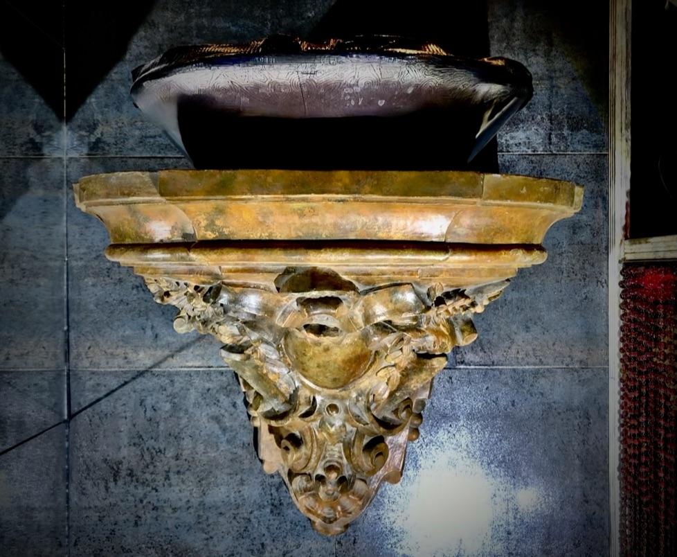

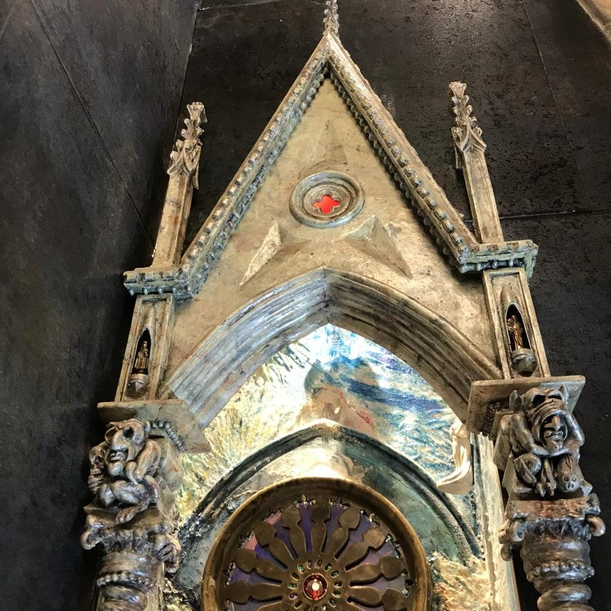
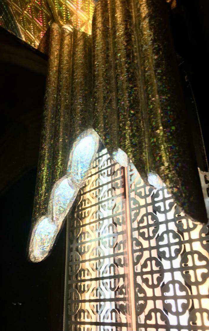
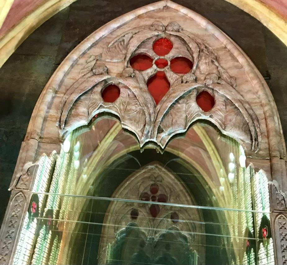
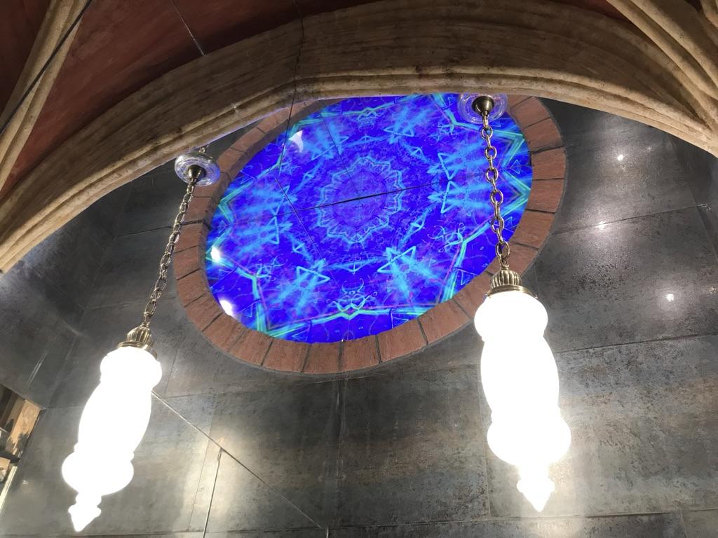
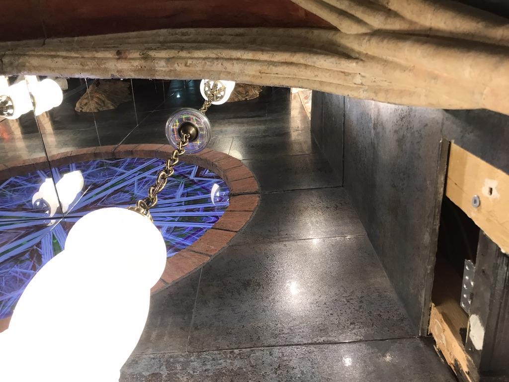

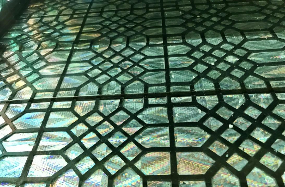
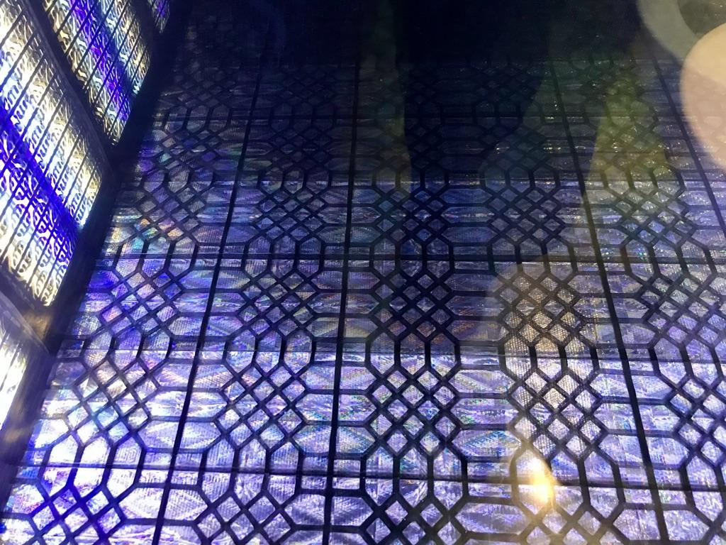
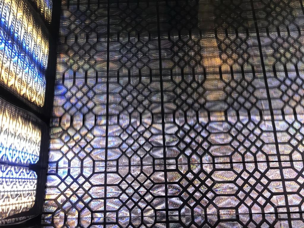
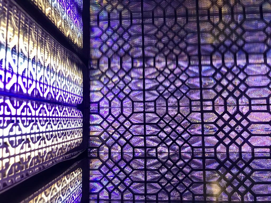
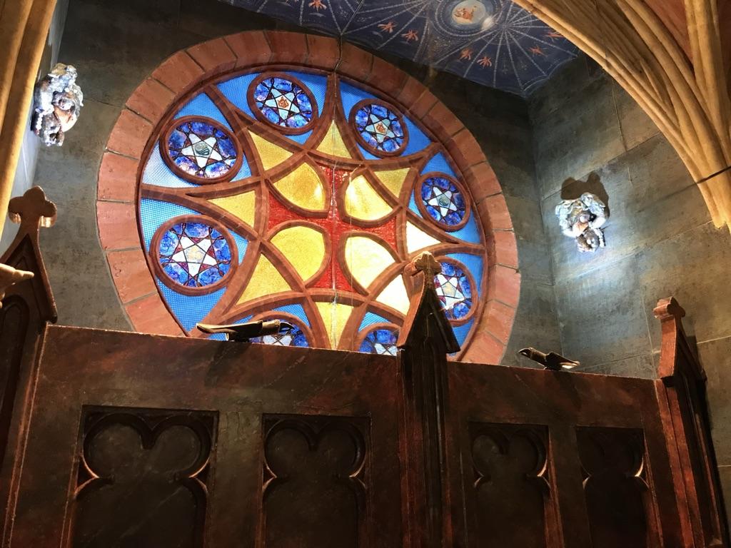
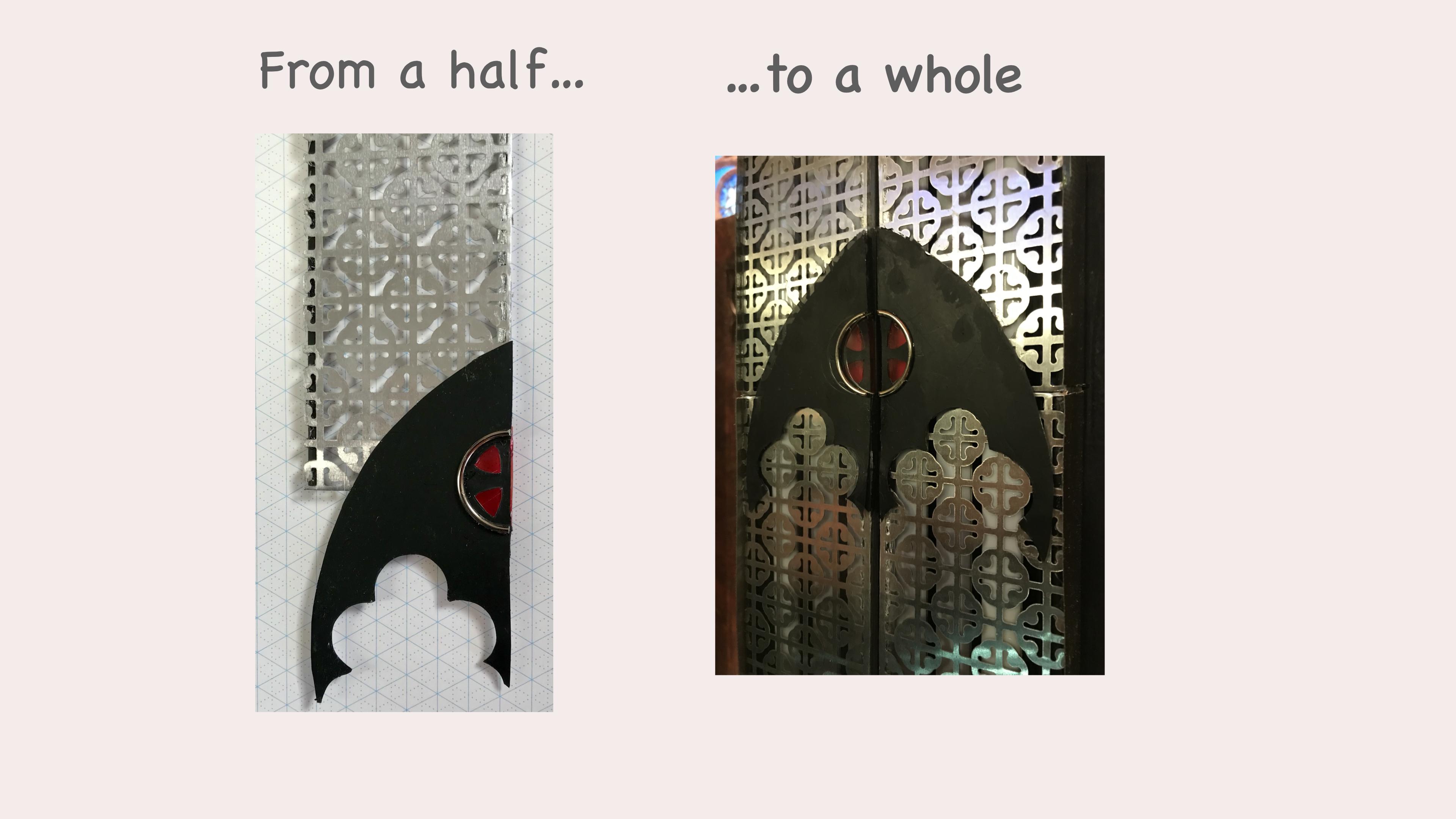
I would like to close with a quick summary of some of the things I’ve learned over the course of my brief career as a very small temple builder — in particular, what I’ve learned about small spaces and about ways to play with mirrors and lighting to make spaces appear larger. I feel that I have gained a deeper appreciation of the synergistic relationship between light and mirrors — and a better sense of how they can work in tandem to enhance the perception of spaciousness.
Standard advice for working with a small space is to keep it simple and keep it bright — e.g., use a single unifying colour for walls and ceiling; use only soft hues; avoid visual clutter; keep furniture and accessories to a minimum and choose pieces that are proportionate to the size of the space; use a variety of lighting sources throughout the space and use mirrors to bounce the light around. For our small space, we have heeded the advice about lighting and mirrors but have seriously violated the rules about colour, clutter and proportionality..
Lighting
We have attempted to maximize the contrast of light and shadow by distributing throughout the room an array of light sources of varied brightness and colours. Some light sources are directional and some diffuse; some are obvious and some are subtle or hidden. Spot lighting is used to highlight sculptural elements such as the font at the front of the room and the grotesque in the rear. Up and down lights are used in the shrine to highlight the art installation and in the large niche to highlight the ceiling and floor. Ambient lighting is provided by the pendant light at the front and by a spotlight hidden behind the rear screen that bounces light off the mirrored wall to light up the decorative arch and ceiling vault above it. Hidden lighting is also used behind the front arch to enhance the perception of a very high ceiling, and it is used inside the small niche to accent the washing station and to disguise the motion sensor. Brightly coloured lighting is used on all three walls — the meditation window in the front, the large niche in the side and the rose window in the rear.
Other than the constantly changing fractal display in the meditation window, we used colour-changing lighting only in the large niche and we used it there for only one of the three strips on either side. Although the colour shift is slow and subtle the effect is reflected in the prismatic floor of the niche.
Enhancement of mirror illusions
What we see in the world around us is determined not only by the images that fall on our retinas. Visual perception is more than just the product of information provided by the visual sensory system; it is moderated by brain processes that help us make sense of that information. How we see the world around us is influenced by our past experience with visual stimuli and the expectations we have formed over the course of our lifetime about their meaning. Those expectancies enable us to quickly process complex arrays of visual stimuli, but under some circumstances expectancies will cause errors in perception — such as believing that something is larger or smaller than it really is. In our project we have used mirrors to reflect architectural elements in ways that lead the viewer to ignore or misinterpret cues that the room in reality is a very tiny space.
A key technique, used repeatedly throughout the room, is the use of half-sections of elements that appear to be whole when seen in reflection. Examples include the rose window (a half-circle), the rear screen (the right style has been cut in half), the floor medallion (a half circle), the small arches inside the large niche (half arches) and the ceiling (half of a cathedral shape). For the meditation window (a quarter of a circle), it is the reflection of a reflection that completes the perception of a fully round window in a wall that appears to extend much higher than the other walls. “Reflections of reflections,” of course, are also the basis of infinity mirror illusions and — as described earlier — are key to the “transept illusion” in our tiny temple. When the mirrors on the front of the large niche are removed it is possible to perceive the structure as a continuous corridor only when the viewer is standing directly in front of it.
A number of the lighting installations also enhance the effects of the mirrored illusions. That is obviously so for the video installation in the meditation window and for the infinity mirror installation in the large niche. But reflected lighting plays a role in more subtle ways as well. For example, light from the rose window appears to be coming from a source located to the right side of the mirror, which is at odds with the usual expectation for a mirrored reflection that it should be coming form both sides equally. I suspect this unanticipated effect (which is more striking in person than in picture) is due to the optical qualities of the prismatic plastic used in the yellow panes of the rose window.
Visual contrast & distraction
I believe our little bathroom presents an exception to the "less-is-more" rule for designing small spaces. I didn't find that installing an abundance of decorative elements or the use strong colours made the space seem any smaller. Rather, in my (admittedly biased) perception, they seem to have had the opposite effect. Perhaps visual busyness can sometimes serve to distract the viewer’s attention away from clues about the room's actual dimensions.
We were concerned at the outset that having an abundance of distractions could be overstimulating for some guests and could run counter to the meditative vibe we were after. We provide some user options to reduce the level of sensory stimulation by turning off one or the other sets of lighting. When the large-niche option is chosen, the visual wall clutter fades into the darkness at either ends of the room. The patterns of light and shadow in the darkened sections can serve as a focus of meditation –– as can the patterns of slowly changing light in the large niche.