How I Make Complicated Scenes W/ Tips!
by Annette4591 in Design > Digital Graphics
566 Views, 1 Favorites, 0 Comments
How I Make Complicated Scenes W/ Tips!

This is a recounting of how I made this art piece. I included tips I know that would hopefully help you on your art journey!
Supplies
I used:
- Ibis Paint
- Onshape
- Magic Poser
You don't have to use these specifically, anything similar is fine.
The Environment Modeling
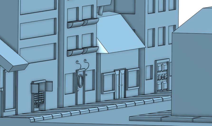
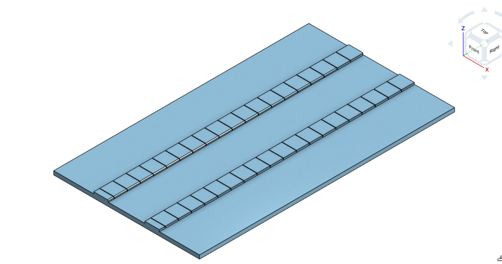
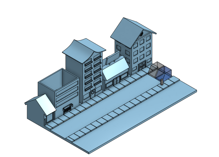
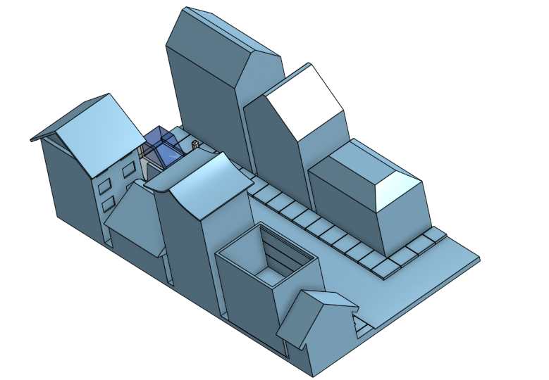
You can model environments in a 3D software to help with perspective. I used a free one, what you use doesn't need a lot of special features. If it has the extrude and remove, it's fine for buildings. For my piece, I wanted a street full of houses, so that's what I modeled. I finished one side, but not the other because you wont see it anyways. I didn't color it because it wasn't needed for what i was going to do (draw over it). I positioned the model to the place I wanted it and took a screenshot.
The things you see at the end of the road are an approximation of cars and a person. I didn't use measurements when I modeled, so the end piece looks off, but I think it's fine. It gets what I want across.
The Character Modeling
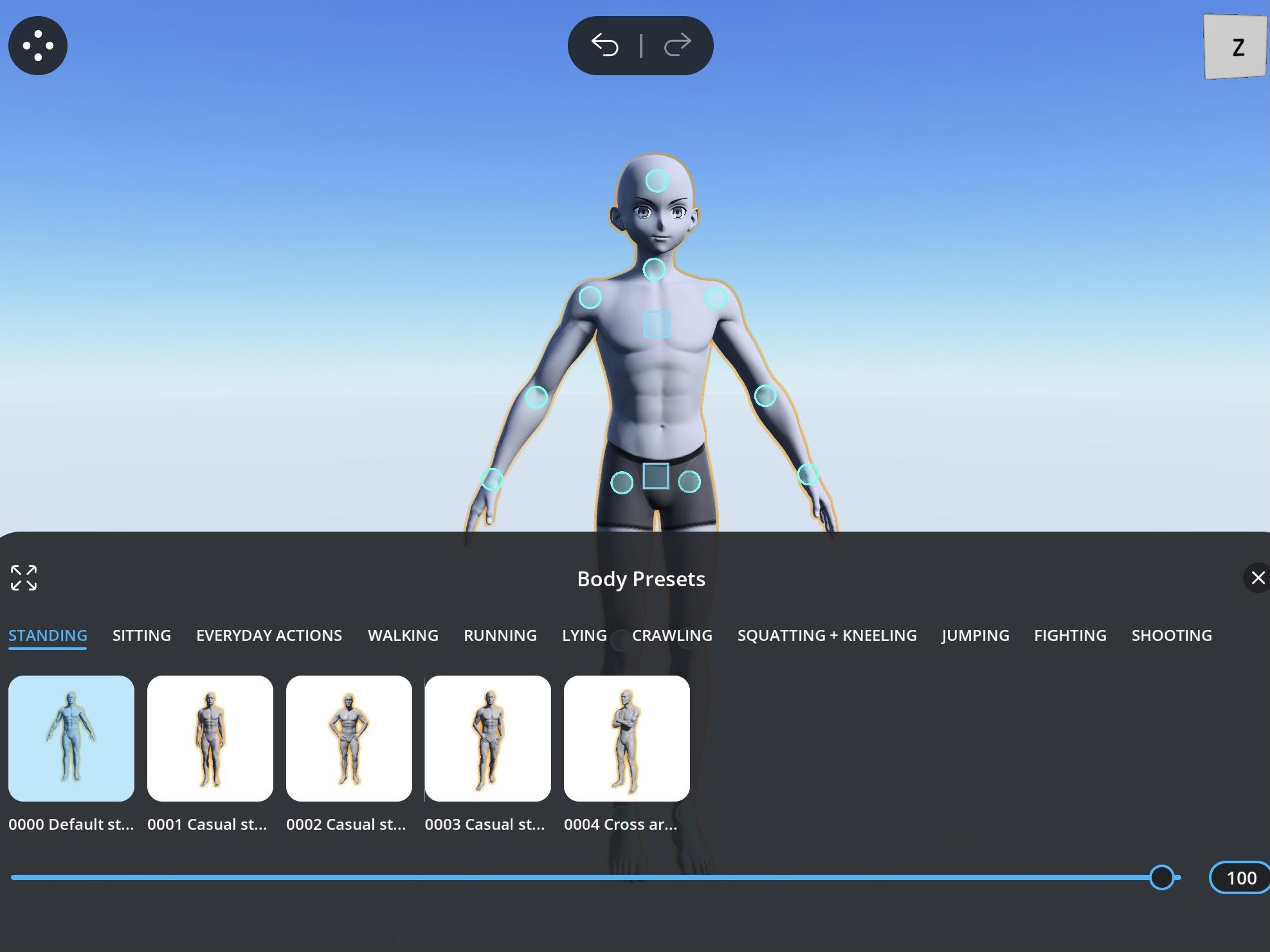
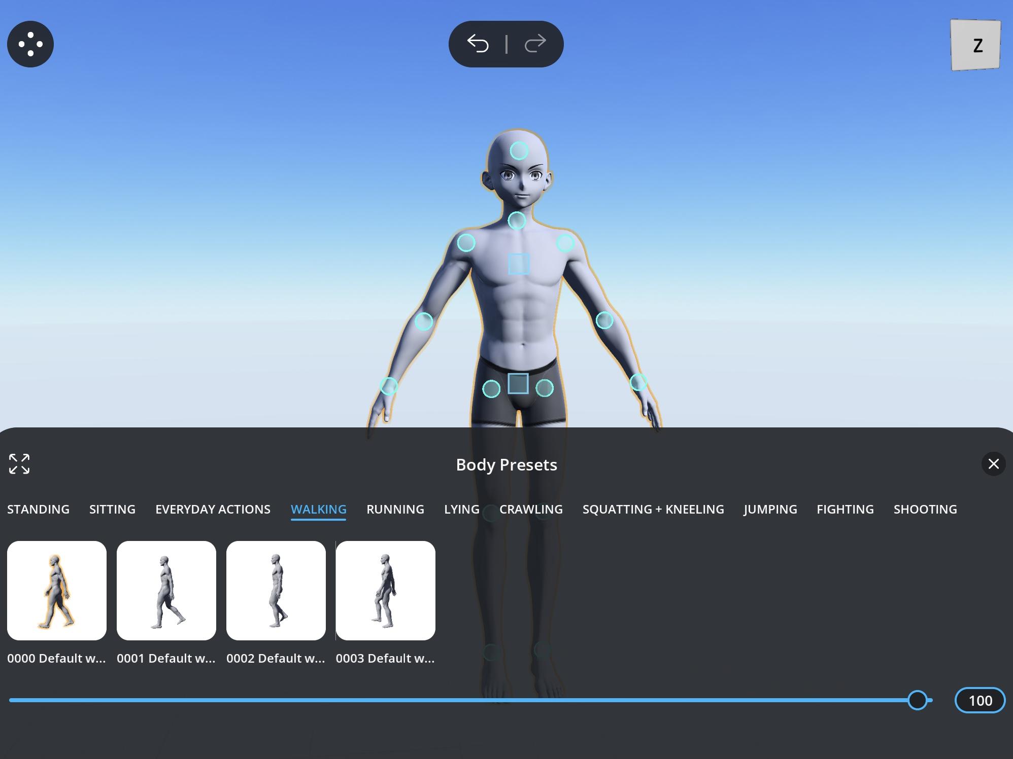
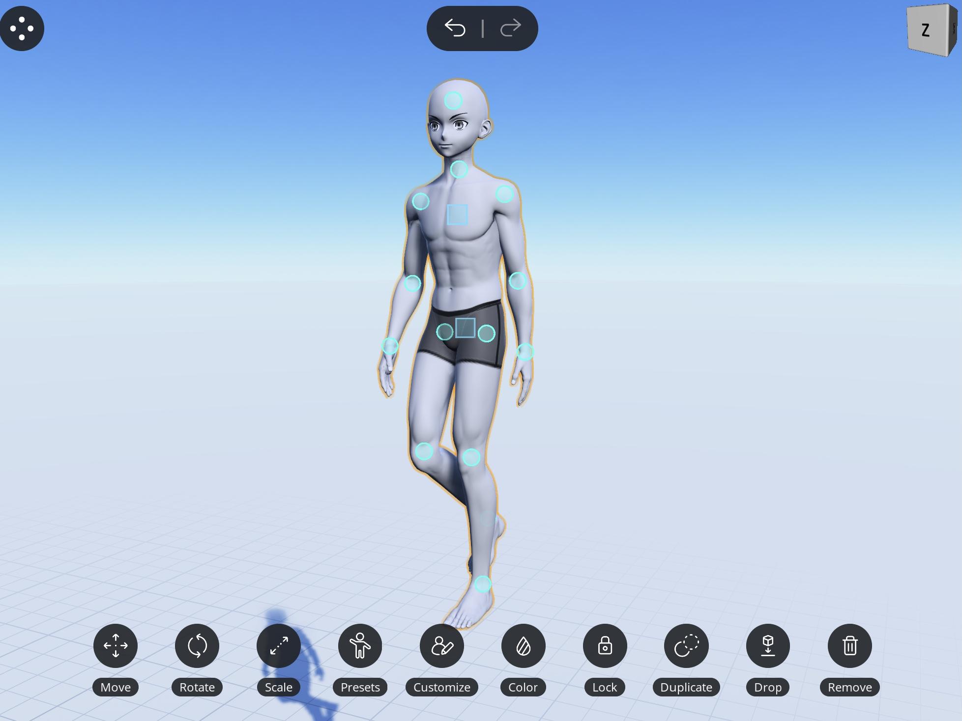
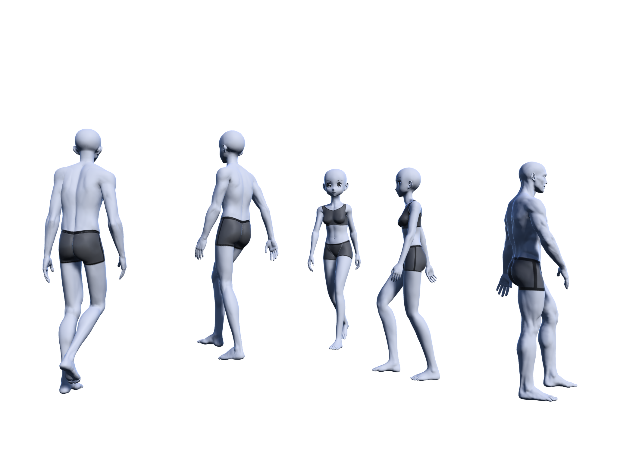
I used a free app where I can pose human models. It's really helpful when dealing with complicated angles and foreshortening. You can pose the models by hand or, use presets if they have any. Since what I wanted to do wasn't that complicated, and there were presets for it, I used the presets. I don't recommend directly tracing over the models if you don't have a firm grasp on anatomy, only reference it to practice and to see how close you can get. I traced over mine because they were small and only to save time and braincells for anatomy. I free handed a couple people though.
The Sketch
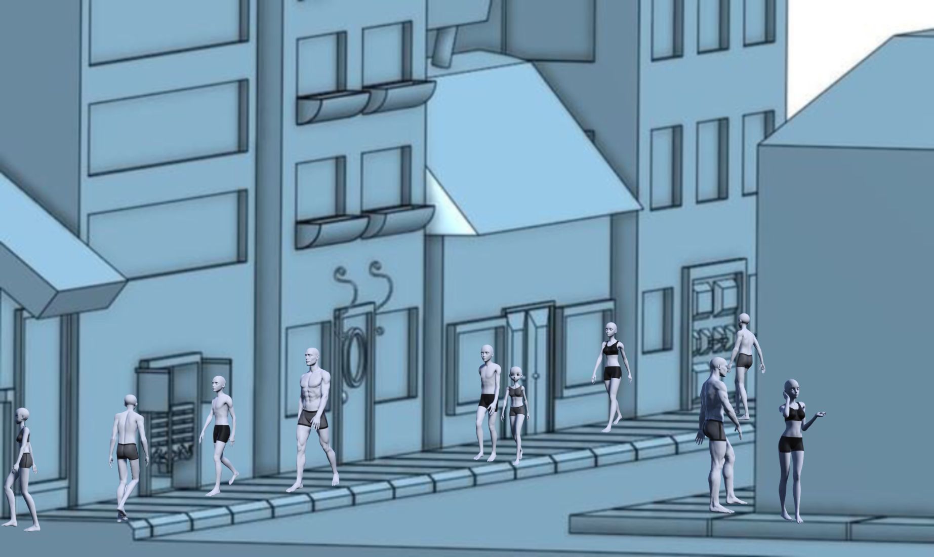
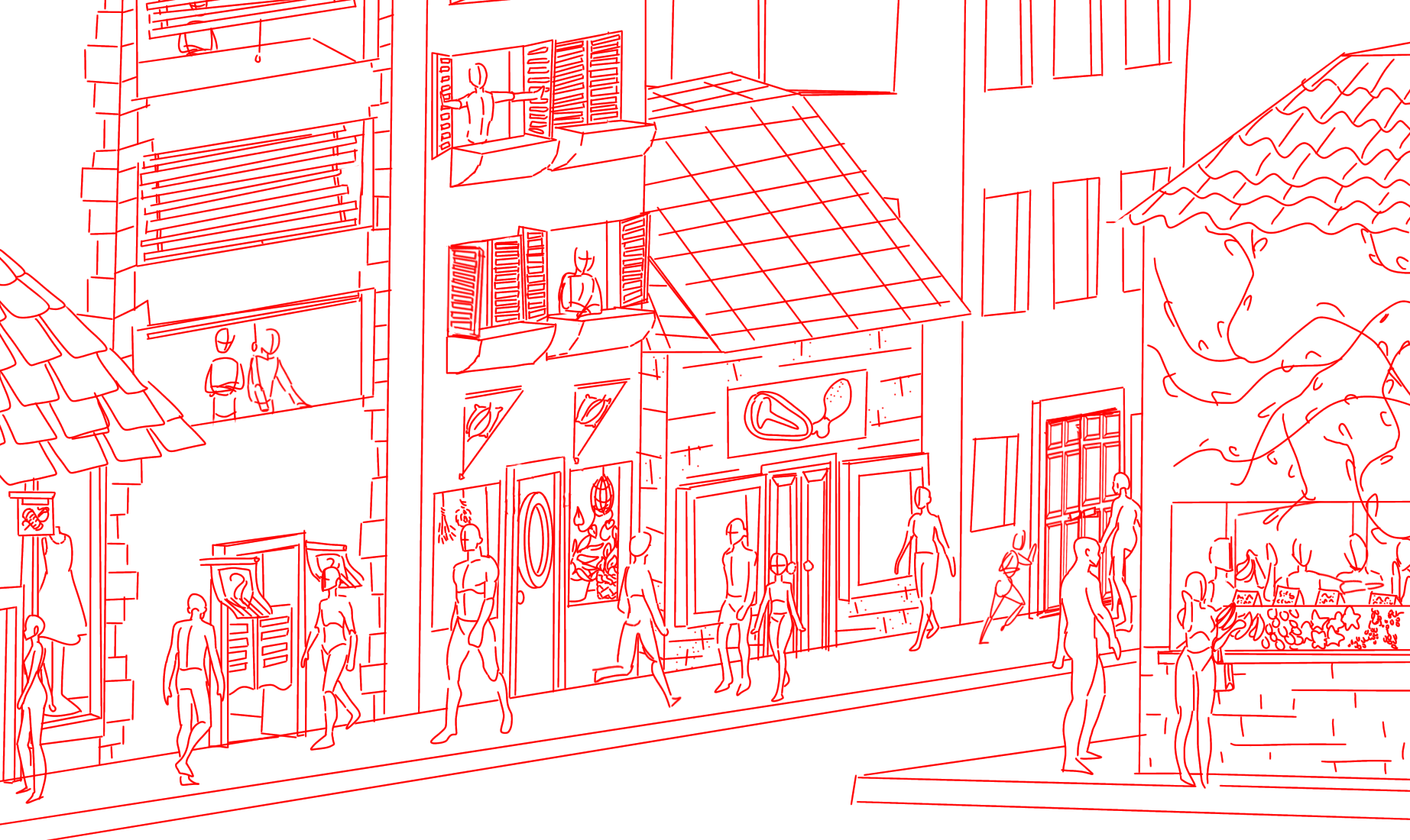
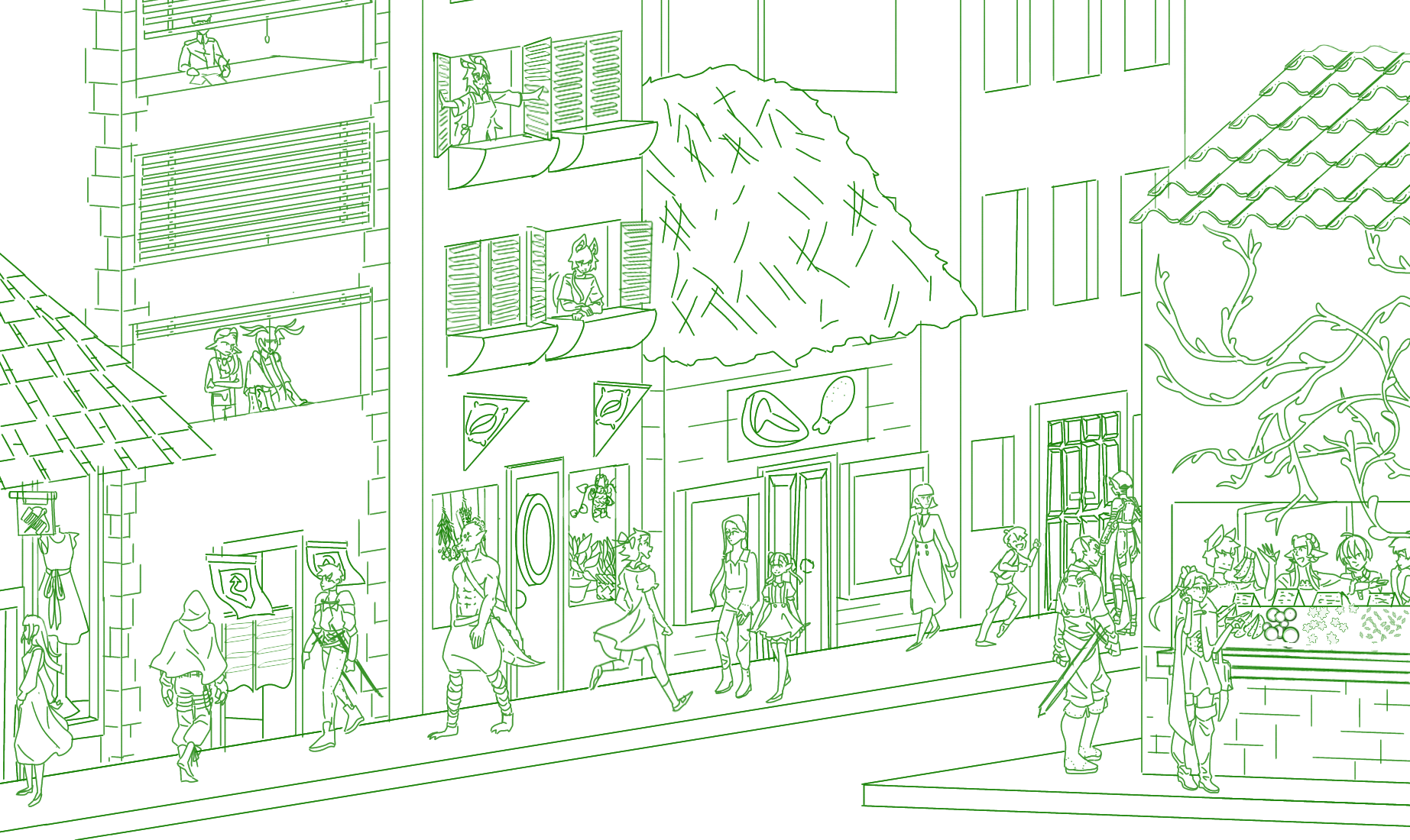
I placed the exported models onto the screenshot of the buildings in the place I wanted, and started sketching on top of the merged layers.
At first, it was a rough pass, getting the ideas of what I want the buildings to look like and what details I wanted them to have. I chose red because I would be able to see it over the blue buildings and black and white humans.
The second pass was to refine my ideas and decide what I wanted the people to wear (I chose a medieval fantasy theme because those are always fun). I chose green for this pass because I would be able to differentiate it from the red.
The Lineart
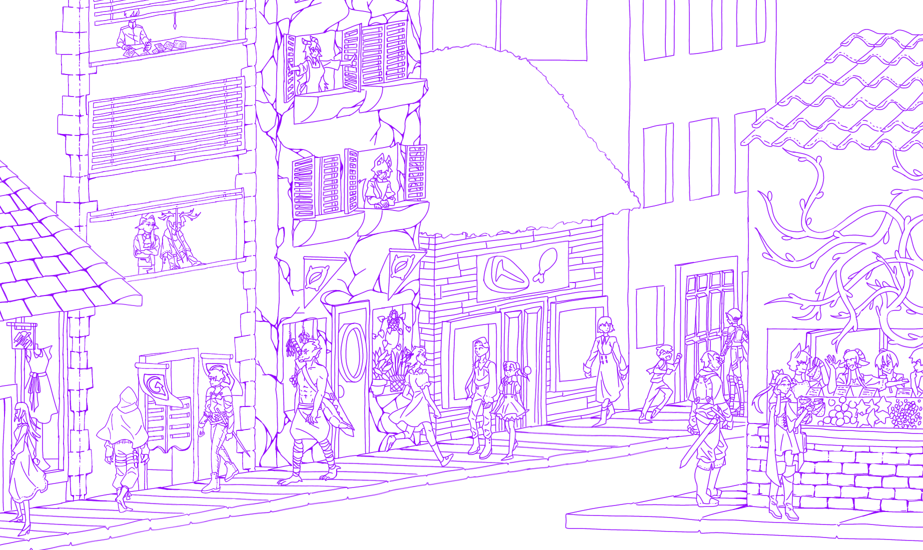
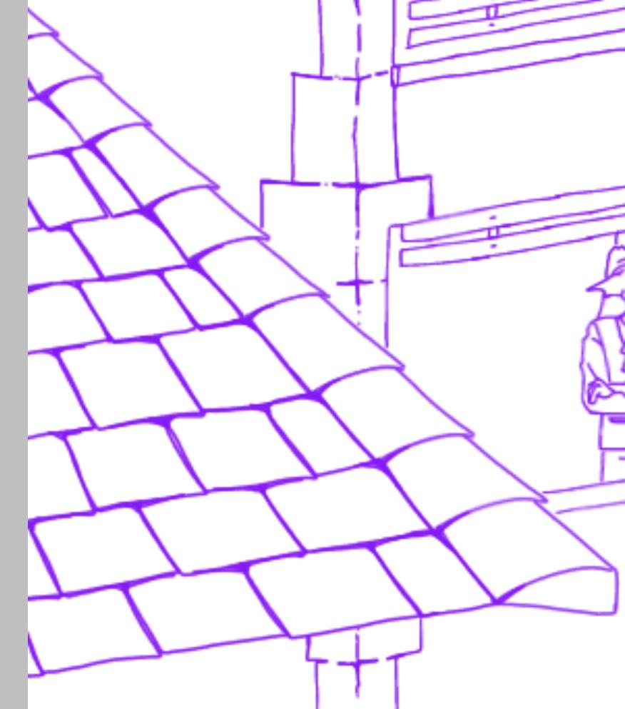
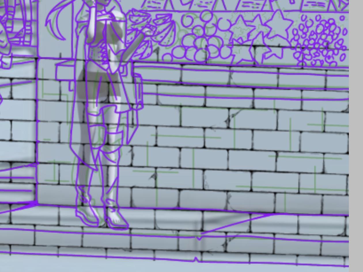
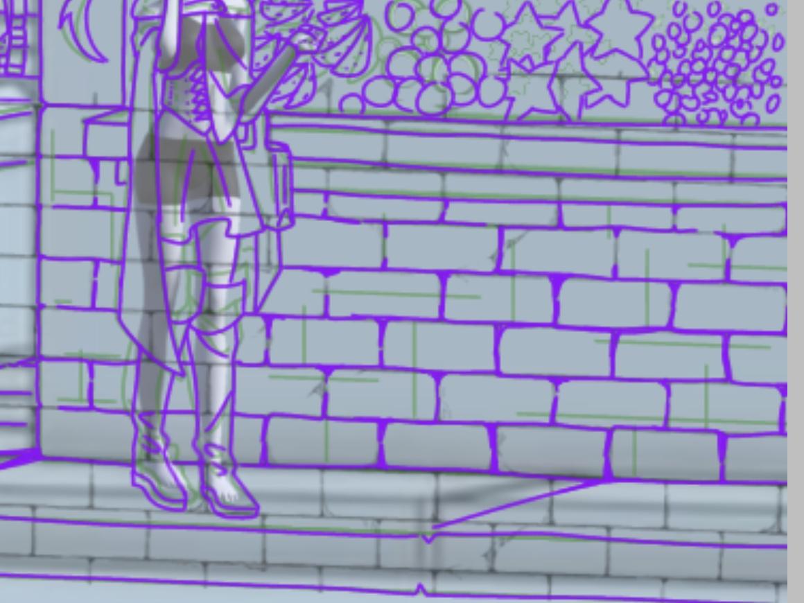
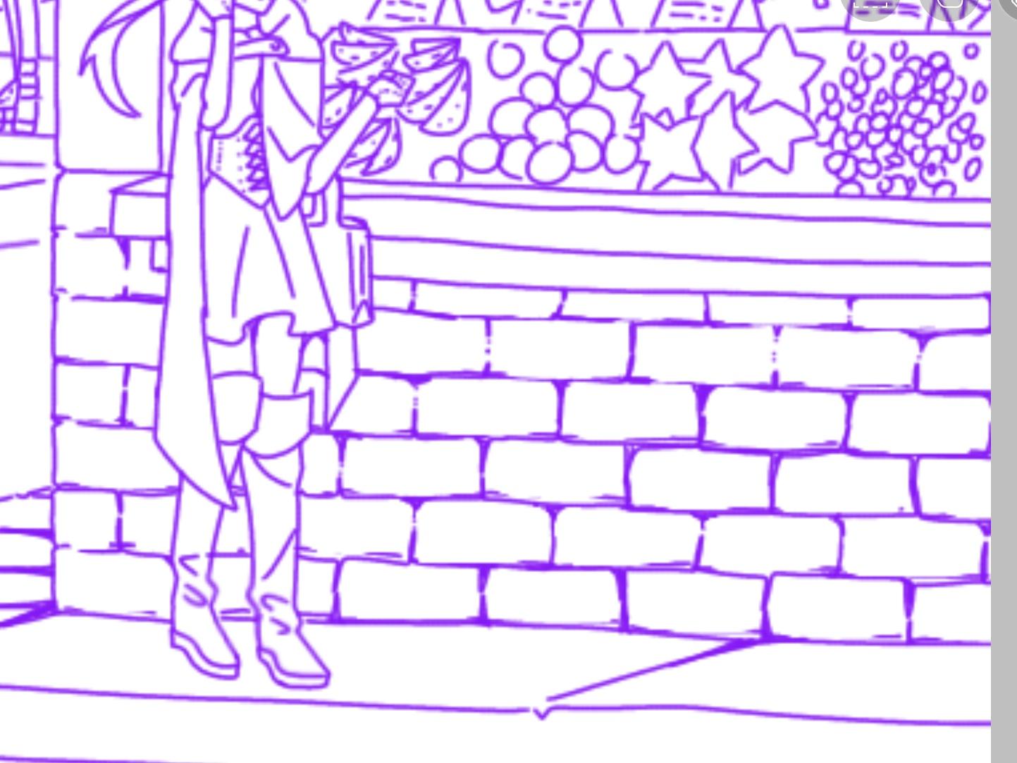
I lined the second pass of the sketch and added details as I saw fit. I cleaned it up more and I really like how it came out. I used purple to be able to see it over the green and sometimes red sketches.
I free handed everything including the straight lines on the building to make things seem more natural, though it'd be easier and faster to use the straight line tool or ruler.
I have some tips for line art if you would like to know!
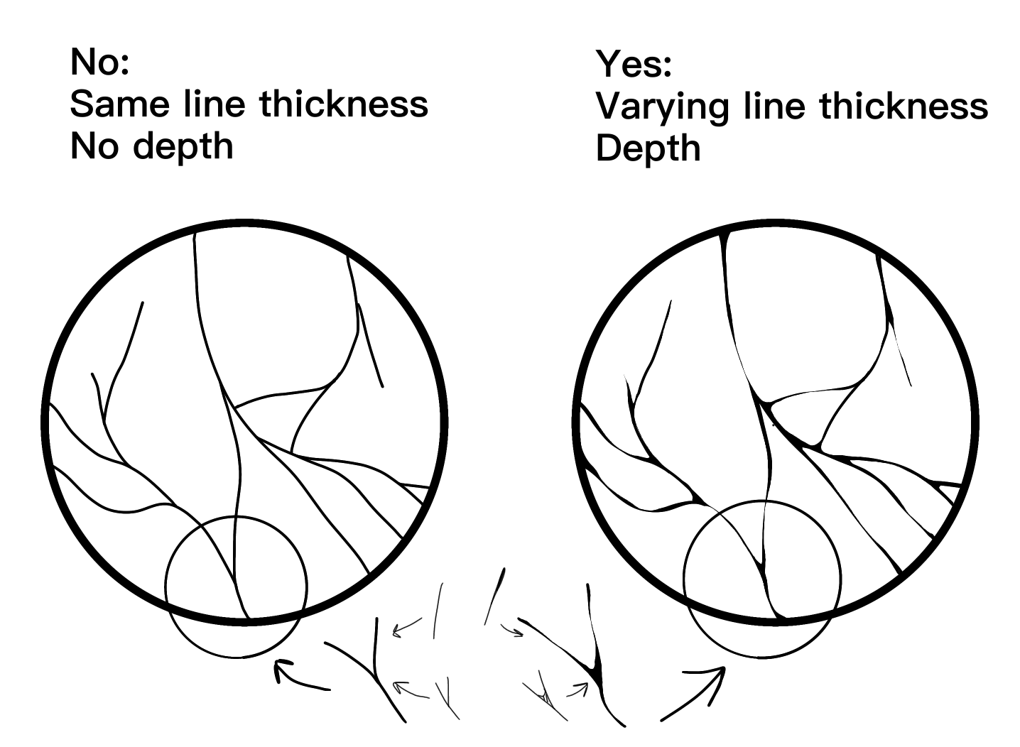
For places you know would be in a lot of shadow/the deepest part of a drawing, I would recommend adding thicker line art there. It adds more detail in the line art, and more depth in the coloring. It makes your drawing seem more interesting and lively.
You can exaggerate your line thickness in the whatever way you see fit with the rule I talked about, but to add more pizzazz, you can have the line art of things closer to the view have thicker line art to draw the viewer's eyes to the foreground. I didn't do it on mine because the drawing was so detailed, but, I know of a different way you can draw your viewer's eyes that I will talk about in the final touches!
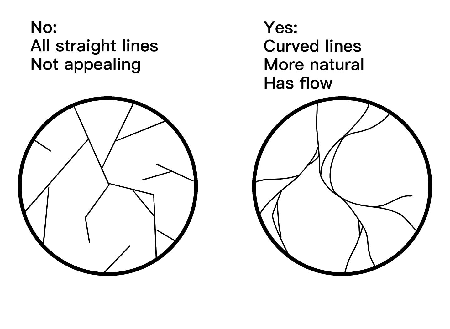
I also have some tips on how to do cracks on stone/buildings.
Instead of using all straight lines, use more curving, flowy lines. This makes it look more natural! But, you can add a few straight lines here and there if you want. You can use straight lines more on ceramics, but they have curving lines as well.
A tip I have for things like bricks is to use a brick pattern and trace over it. Of course, you can also just place in a transparent outline and call it done, but I find tracing over it makes it fit in more with the rest of the drawing. I use it just for the placement of the bricks. (Make sure to warp the pattern to match the perspective!)
The Rendering
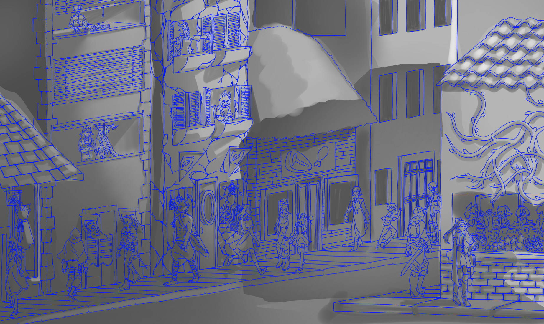
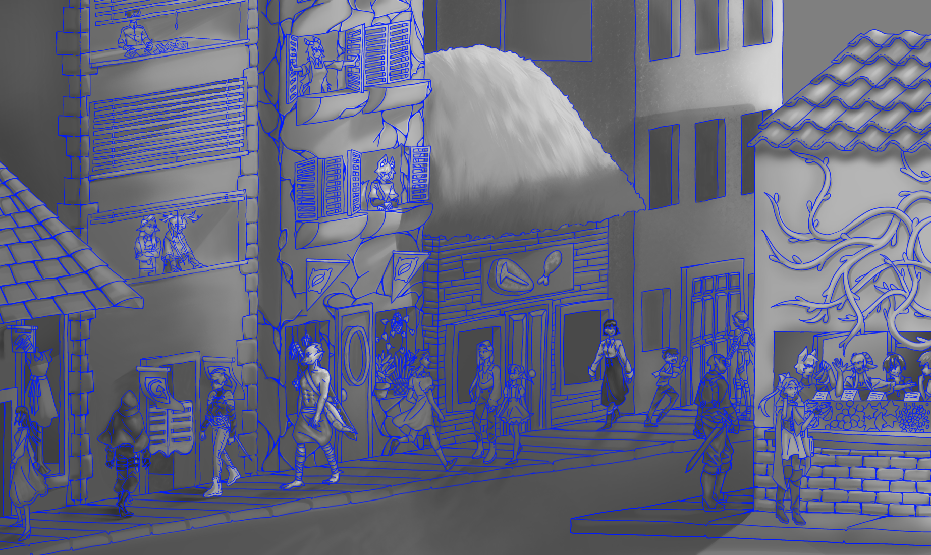
For the rendering/shading I did it in black and white. This was to save time by not having to color inside the lines or; fill in every small detail that was a different color, lock that layer, and shade it individually or use a boring one color multiply layer to shade everything; and to give me more control over the lights and dark values of my drawing.
I wanted it to look like sunset, so I shaded it in a way that there was a strong light source coming from the right side of the drawing. I kept in mind what would cast shadows including the things that you could not see in the drawing, like the buildings on the opposite side of the street.
The Coloring
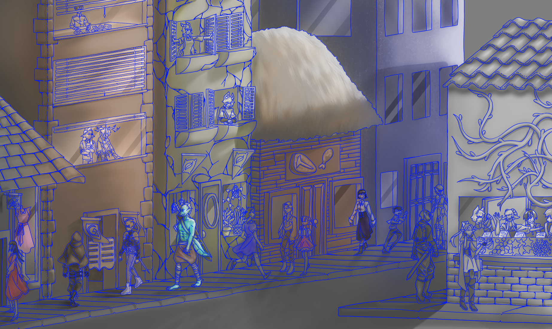
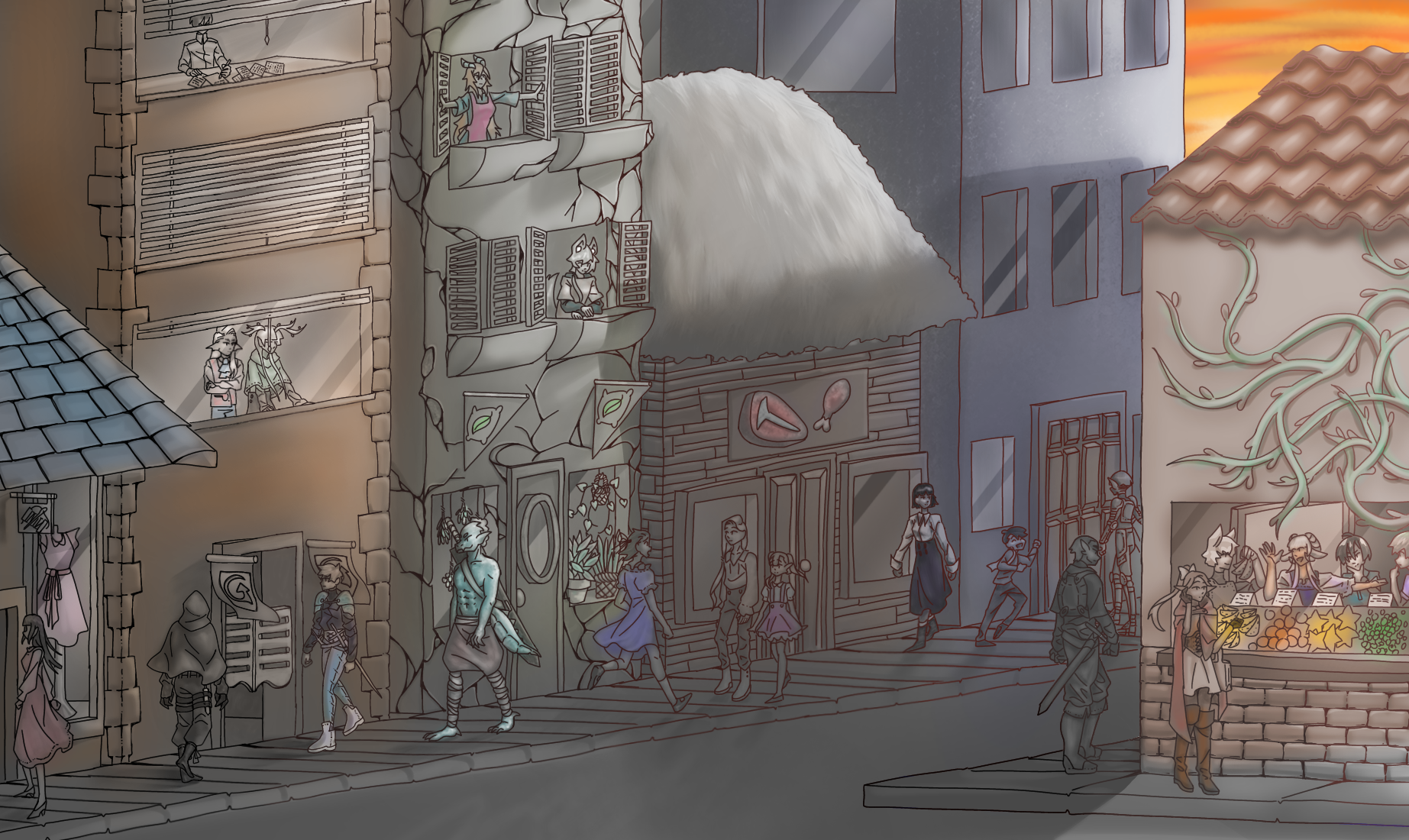
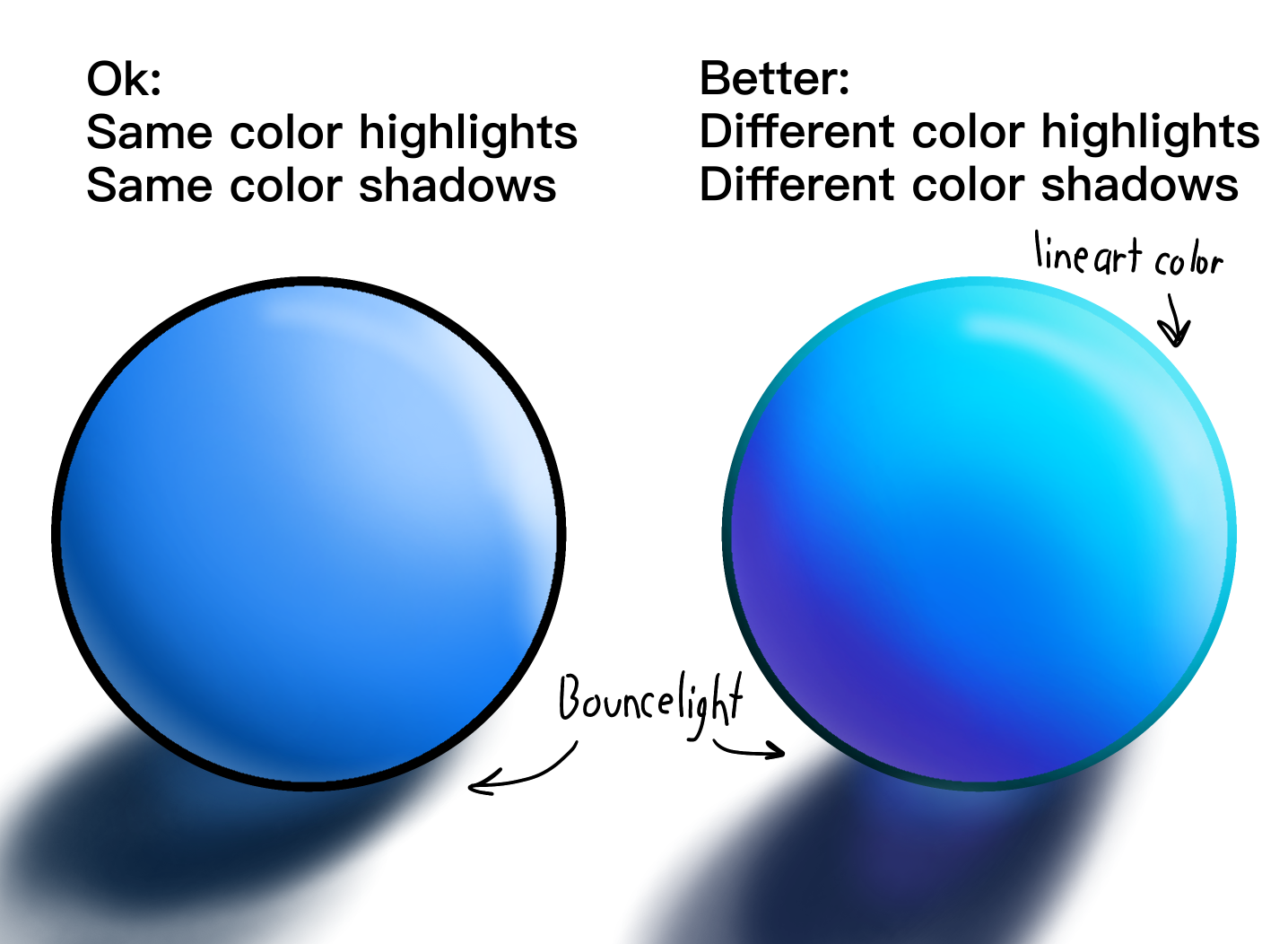
I used a layer mode called "color" to change the black and white drawing I had to something more colorful. In this situation, I decided it would be easier to change the things to the color I wanted them to be, then place an overlay of a sunset color on top. Instead of a single flat color, I took lighter and darker colors to shade the drawing further in the overlay.
When coloring, I kept in mind bounce light and how colors would look in shadow or in light. For example, in a blue color; when shaded, it would have slight hints of purple and navy; in light, it would have a lighter blue with hints of teal. Coloring like this would make your drawing pop and feel more lively as well as make it more colorful.
Final Touches!

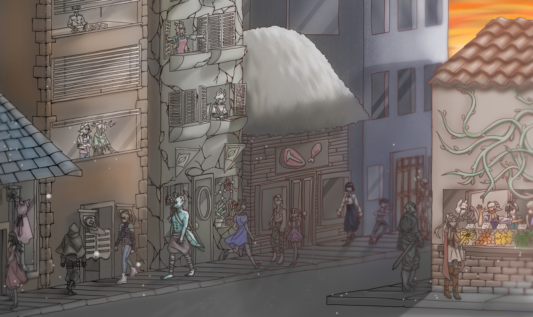
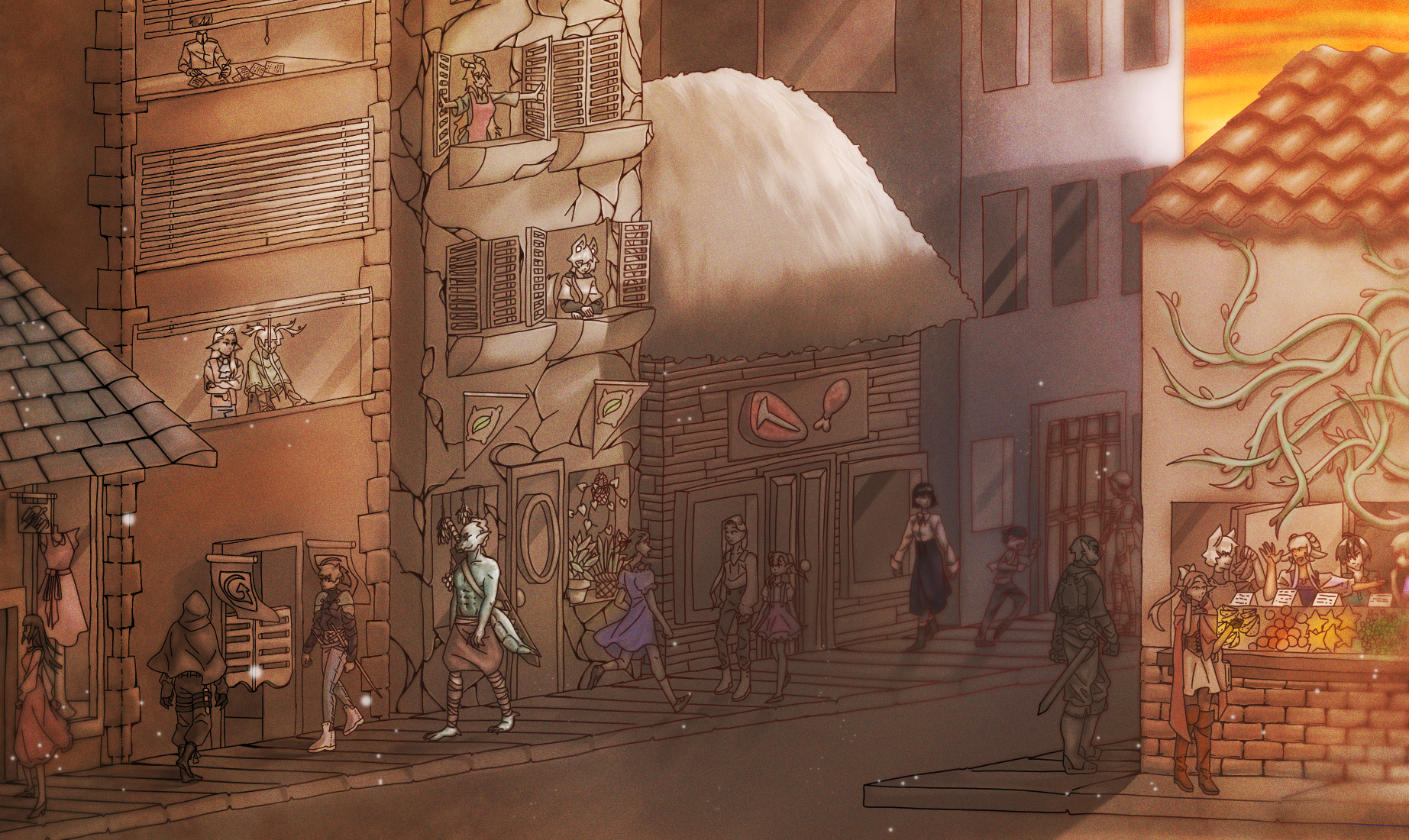
Time for the final touches! My favorite! It means I'm almost done with my drawing. :D
For the way to depict distance in your piece without changing the line art, you can simply blur it to make it recede in the background! Simple, right? In this stage I also added some white floaty bits to make the scene more magical. I also added some more overlays and edited it a bit to give my drawing more texture and punch.
Happy Drawing!
I hope you enjoy my little project and whatever tips I could give! I hope you will try to use them and that they'll be useful to you!!