HTML/CSS Publisher?

I'm a geek.
I'm not certifiable, I don't make money at it, I couldn't hack into my mother's Facebook page no matter how many FBI agents were after me.
But I am a geek, at least in spirit.
I know this because I just finished a week-long project that could have probably been accomplished by a non-geek in about 2.5 hours. Why did it take me so long? Because I didn't use Microsoft Publisher. I didn't use Microsoft Word. I didn't even use OpenOffice.
I used HTML and CSS.
In hopes that I connect heart-to-heart with other wanna-be geeks, here's my story:
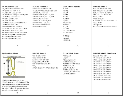
Project Goal: Create a 72-page, pocket-sized field book, with formatted pages that include graphics.
Easy, right? Fire up any standard word processing or desktop publisher, spend an hour and a half entering content, and perhaps another half hour to format and tweak page sizes and sections, another 30 minutes to print and staple together, and the project's done!
However, I'm a geek. I think HTML and CSS are cool. I like programming computers. I'm not normal.
Backstory

I work as a technician. I operate and maintain equipment that samples air. Everything we do is controlled by very official, frequently updated, Standard Operating Procedures. Highly classified and proprietary, of course. If I told you the details I'd have to kill you...that sort of thing (not really! Although, sort of...it's kind of complicated.)
Anyway, some of the stuff I need to know doesn't really change, not often, but it's not easy to memorize, at least not completely accurately. So, I keep a notepad handy. During my first year at work I wrote down important stuff in a 3x5 spiral notepad. When stuff changed, I scratched it out and added in the updated stuff. When the notepad was full, I got a fresh one, recopied all my important stuff and kept going.
After the first year, my important stuff outgrew my little notepad. It became a pain to recopy everything by hand. So, I cogitated how best to digitize my stuff.
Criteria
The method of documenting my stuff had to accomplish the following:
1. Easy to carry
2. Easy to revise
3. Easy for others to use
The third criteria posed the most difficult challenge. I really wanted to create a training tool, something that could be viewed on a computer monitor, as well as printed on paper. I wanted a digital version that others could use, no matter what kind of computer, Mac or PC, no matter what software.
The obvious answer would have been some sort of word processor or desktop publisher. I use Word at work, OpenOffice at home. I've used Scribus and Publisher. But still, not everyone has the same software. I know it's possible to convert to different formats. I know that Portable Document Format (PDF) documents can be opened by many free programs. But each format would appear slightly different. Each would print slightly differently. I wanted something that would be relatively universal and free for anyone with a computer to view and print.
Plus, I'm a geek.
I chose to create a document that could be viewed and printed easily and consistently across any computer system, using any internet browser.
I chose to use HTML and CSS.
Hypertext Markup Language (HTML) allows me to use a basic text editor, something as simple as NotePad or WorkPad, any program that accepts plain text. Using programming codes (tags) I can enter my stuff, my information and images, and organize it into paragraphs, lists and sections. Any browser can open an HTML document, with or without an internet connection.
Cascading Style Sheets (CSS) allows me to format the content in an HTML document. I can format font styles, sizes, bold, italic, spacing, alignment, color and so much more. If I format everything using Times New Roman, and then decide it's boring. With a simple code change I can reformat everything in an instant to Comic Sans MS. (NO! I did not just say that! I didn't mean it! I will NEVER use Comic Sans MS...probably.)
If you're not a geek, or never plan to be a geek, feel free to click off and go to another blog now. From this point on, I'm going to get technical, and it's not going to be pretty.
My HTML
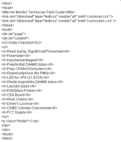
I created my HTML document. Here's the essential snippet. Feel free to copy, modify and expand.
<html>
<head>
<title>Air Monitor Technician Field Guide</title>
<link rel="stylesheet" type="text/css" media="all" href="css/reset.css" />
<link rel="stylesheet" type="text/css" media="all" href="css/screen.css" />
</head>
<body>
<div id="page">
<div id="content">
<h2>Daily Checklist</h2>
<ul>
<li>Read & Sign/Email/Timesheet</li>
<li>Flowmeter</li>
<li>Keys/lanyard/agent</li>
<li>Prep/install DAAMS tubes</li>
<li>Prep CPA/NOX/shooters</li>
<li>Radio/cellphone (for PMN)</li>
<li>LSS for UPA (213/316)</li>
<li>Waste bags/extra DAAMS tubes</li>
<li>Laundry tubes</li>
<li>PAS/Stack Probes</li>
<li>CEA Board</li>
<li>Work Orders</li>
<li>Driver's License</li>
<li>CEMS Cylinder Checksheet</li>
<li>PCT Supply</li>
</ul>
<p class="footer">1</p>
</div>
</div>
</body>
</html>
Of course, I had much, more more code than this. This was just the first page. I had 72 pages in my final booklet. I also had a cover page (with a cool graphic) and about 70 more pages after this. I didn't bother with meta-tags (I'm NOT going to explain what those are...not now, at least.)
The Details
From top to bottom, let's talk about some of these lines of HTML code.
<html>
Any internet browser (Explorer, Firefox, Chrome, Safari or a hundred more varieties) will respond to this tag by interpreting every other tag in the document as HTML code, displaying the document on a computer monitor as a webpage. The last tag on the document indicates the end of the HTML coding: </html>.
<head></head>
Everything between the <head> tags allows the browser to process the document according to specific rules. The information in the <head> section is normally never seen by the user who opens the document, except for the <title> information. The browser uses the <title> to display a short description of the webpage, usually at the very top tab of the browser window.
<link rel="stylesheet" type="text/css" media="all" href="html-css-publisher-reset.css" />
This line of code links the HTML document to a stylesheet called html-css-publisher-reset.css.
The reset stylesheet directs the internet browser to reset all formats and styles to a neutral or zero level. This reset is necessary the design of my booklet, because every internet browser is pre-configured differently by its maker. Internet Explorer formats HTML tags slightly different than Firefox, for example. Spacing and alignment are different, fonts are different, as well as many other style formats. Resetting all formats to zero makes all browsers essentially equal, at least for viewing on a monitor screen.
Immediately after linking my HTML document to the reset stylesheet, I also link to a stylesheet called html-css-publisher-screen. This stylesheet will define the formats and styles according to my own preferences. I can select font size, font type, spacing, alignment, colors...virtually every aspect of formatting can be customized. Since I've already linked to the reset stylesheet, my preferences won't be misinterpreted by different browsers.
After the <head> section comes the <body> section. The <body> contains the content of the document, the text and images that will be displayed on the webpage.
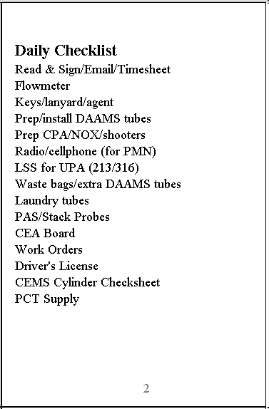
My HTML snippet displays one page of my field guide, the Daily Checklist that I review at the start of each day to remind me of what to get/do/consider. It won't make much sense to anyone else, but it does show you the HTML tags I used to display the information.
Tags
Let's look at those tags:
<div id="page">
<div id="content">
I've first set up two divisions, the first one called "page", and the second one "content".
The "page" division can be thought of as a box, or even as a page of the booklet (hence, the name "page"). I will later specify the size and type of division my "page" will be.
Immediately after setting up my "page", I set up another division, "content". Think of this as a smaller box nested inside the larger one, "page". Or, think of "content" as a small note pasted onto my larger page of my booklet. In reality, one division is not necessarily larger or smaller than the other. The size of a division is entirely dependent upon how I define them.
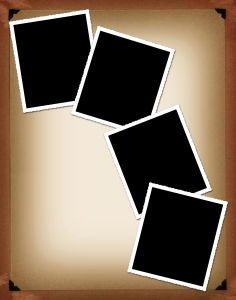
Another way to think of the two divisions would be to imagine a photo album page ("page"), with a photo ("content") pasted on the page. I can specify later the exact size of the album page as well as the exact size of the photo.
After setting up the "content" division I enter the information and images that I want to be on that small note.
<h2> is a tag that identifies my headline, "Daily Checklist". On other pages I used <h1>, which I can define as a large headline. For <h2> I specify later a slightly smaller font size, sort of a sub-heading.
<ul>
represents an unordered list, simply a bullet-point list as opposed to an ordered list, which would be a numbered list, or an outline list using letters.
Most internet browsers normally display <ul> lists with a bullet point. However, I chose to define it as having no bullet points.
It's my document and I'll cry if I want to...I mean, I'll list without bullets if I want to.
Each item in my list is tagged <li> at the beginning, and </li> at the end. At the end of the entire list is a closing tag, </ul>.
<p class="footer">1</p>
Normally, a simple paragraph in HTML is tagged with <p> at the beginning and </p> at the end. For my purposes, I wanted the paragraph to display page numbers in gray. I used my stylesheet to define a special class of paragraph that I called "footer".
<div class="page-break"></div>
This division tag will have a special class defined later, called "page-break". The division will have no text or images to display, so I immediately followed the tag with a closing tag, </div>. The purpose of the "page-break" division will be to signal the end of one page and the start of another. In my snippet, I put the page-break immediately after page one. In my original document, the full-length version, I put the page-break after every eight pages until I reached the end. I wanted to end up printing eight small booklet pages on a single piece of paper, 8.5 inches by 11 inches. With my page-break division, I could signal the internet browser to print eight booklet pages on one page.
The remaining tags are closing tags, indicating the end of the two divisions, the end of the body, and the end of the document.
My CSS
My CSS
With my content entered I could now define each tag according to my own preferences. I did that on a separate document called "html-css-publisher-screen.css", using CSS descriptors.
Let's look at my stylesheet.
div.page-break
{
page-break-after: always;
page-break-inside: avoid;
}
This first description is for a class called "page-break". the internet browser will send a signal to my printer (if I print the document) to start a new page when it encounters this division tag, but only after the small booklet page is printed, avoiding starting a new page if the printer is still in the middle of printing the booklet page.
h1
{
font-size: 2em;
padding-top: 1em;
padding-bottom: 2em;
}
This CSS description configures the font size and spacing above and below any text tagged <h1>. "em" is a way to specifiy letter size and spacing size. I could have specified using other units of measurement, such as inches (in), millimeters (mm), pixels (px) or points (pt).
h2
{
padding-bottom: .2em;
font-size: 1.2em;
}
This defines any text tagged <h2>.
p.footer
{
position: absolute;
bottom: 1em;
height: 1em;
width: 67.9mm;
margin-left: auto;
margin-right: auto;
text-align: center;
color: gray;
}
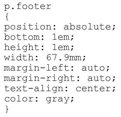
This is the definition of the special class of paragraph that will display my page numbers. The position of the page number paragraph will be at the absolute bottom of each booklet page, spaced one em up from the bottom. The paragraph will only be one em in height, 67.9 millimeters in width, equally spaced from the left and right margins of the booklet page. The paragraph text (page number) will be aligned in the center of the page, and it will be gray in color.
ul
{
padding-bottom: .8em;
}
My unordered list will have a space, slightly less than one em in height, after the list and before anything else. This separates my list from other text.
#content
{
line-height: 1.3em;
font-size: .8em;
padding: 1em;
padding-top: 3em;
}
All of my content text will have a line height of 1.3 em, although the size of the font will only be slightly less than one em. This allows a bit of spacing after each line of text, increasing readability. There will be a blank line of space, 1 em in height, after each division of content, with 3 em of space allowed at the top of each division of content. This allows me space to punch a couple of holes at the top of each page. I'll hold my booklet together with a couple of ring snaps.
#content.cover
{
line-height: 2em;
text-align: center;
}
I wanted my cover page to look a bit different that the normal pages. I defined a special class of content division called "cover". The line height will be bigger, and all the the text will be aligned in the center (center justified).
#page
{
position: relative;
display: block;
float: left;
width: 67.9mm;
height: 104mm;
border: 1px black solid;
}
Finally, I defined the larger page on which I will "paste" my smaller content, "notes". Each page will be positioned after the one before it, in a "relative" sequence. The page will display as a single block, always displayed from left to right. The width will be 67.9 millimeters, and height will be 104 millimeters. The page will display with a single solid black line border, only one pixel in thickness.
I can tell you that the size of my "page" was painstakingly derived. I started with an educated guess of 70 millimeters wide and 100 millimeters high. When I directed my browser to show me a preview of how it would look if I printed eight of these "pages" on a single page of paper, the size was way off. I tweaked the size, little by little, until I could fit eight booklet pages on a single 8.5 x 11 inch piece of paper, as displayed by my browser. The final size is the absolute most that I could get by with and still print the pages as I desired.
CSS

Here's the CSS all on one page:
div.page-break
{
page-break-after: always;
page-break-inside: avoid;
}
h1
{
font-size: 2em;
padding-top: 1em;
padding-bottom: 2em;
}
h2
{
padding-bottom: .2em;
font-size: 1.2em;
}
p.footer
{
position: absolute;
bottom: 1em;
height: 1em;
width: 67.9mm;
margin-left: auto;
margin-right: auto;
text-align: center;
color: gray;
}
ul
{
padding-bottom: .8em;
}
#content
{
line-height: 1.3em;
font-size: .8em;
padding: 1em;
padding-top: 3em;
}
#content.cover
{
line-height: 2em;
font-size: .8em;
text-align: center;
}
#page
{
position: relative;
display: block;
float: left;
width: 67.9mm;
height: 104mm;
border: 1px black solid;
}
That's It!

That's the HTML and CSS code required to print a small booklet page. You can take my snippet and copy and paste it 64 times and end up with eight printed pages, each page with eight small booklet pages. Cut the pages out, punch holes in the tops, and you've got yourself a geek-version self-published booklet.
However...
There is one small detail that is incredibly important.
I recommend that you use Firefox as your internet browser. Firefox allows you to specify the margins of your printed page. Start Firefox, open File, select Page Setup, and set all margins to zero, scale to actual size, landscape orientation, and disable printing of the header and footer. This allows the booklet pages to be at their maximum size and still fit on a single page. I further recommend that you have Firefox show you a preview of the page before you print...you might decide you need to tweak my CSS!
You can get a free download of Firefox here: http://www.mozilla.com/en-US/firefox/new/
Image of man courtesy of http://www.rgbstock.com/user/brainloc .
Image of eyeglasses courtesy of Jean Scheijen: http://www.rgbstock.com/photo/mWk9r3Y/Glasses
Image enhancement by GIMP: http://gimp.org
Image of books courtesy of Zsuzsanna Kilian: http://www.sxc.hu/photo/1219898
Image of photo album courtesy of Billy Alexander: http://www.sxc.hu/photo/1293981
Image of css courtesy of Svilen Milev: http://www.sxc.hu/photo/1083339
Enjoy!