Fabulous, Funky Mandalas
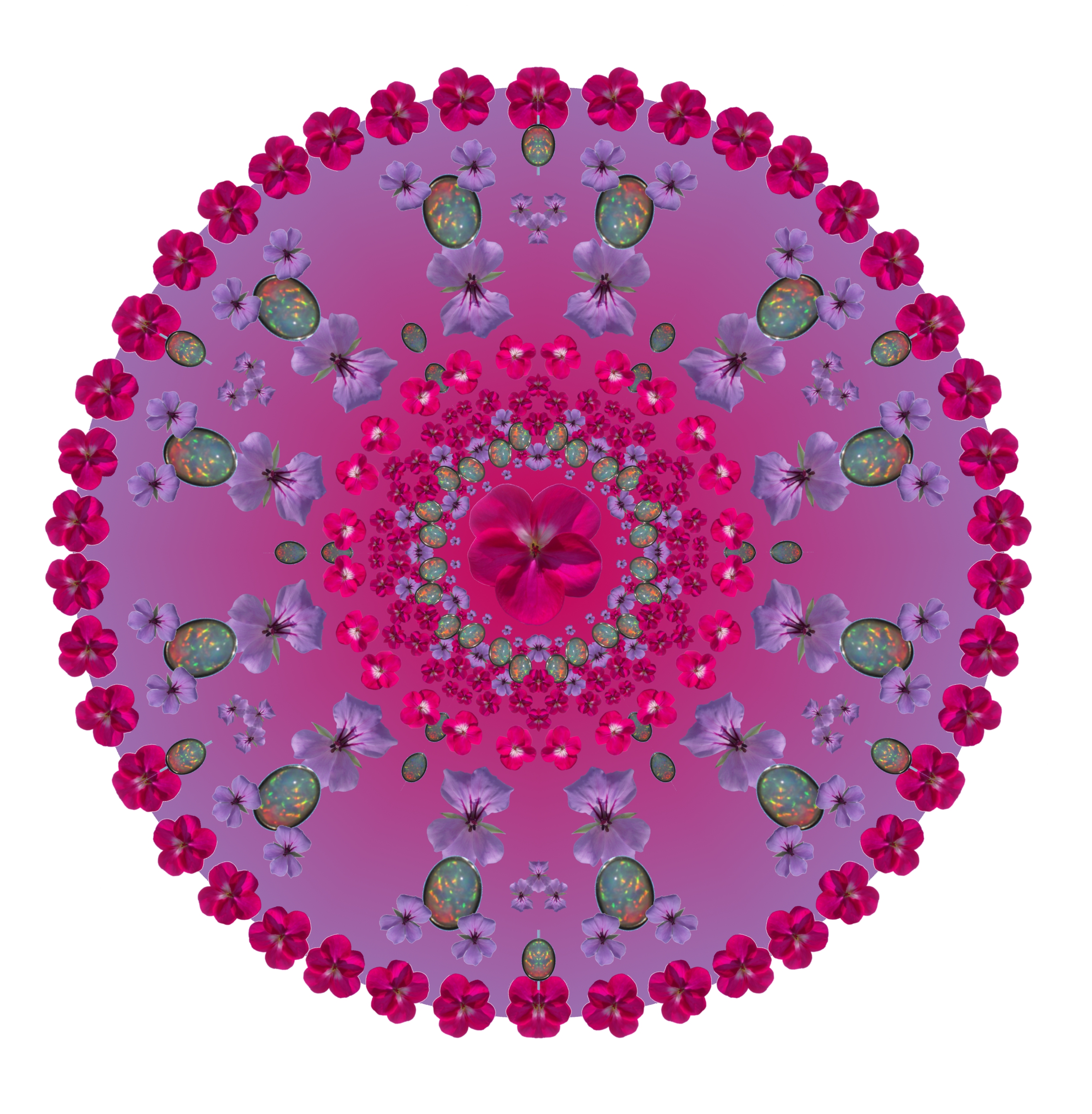
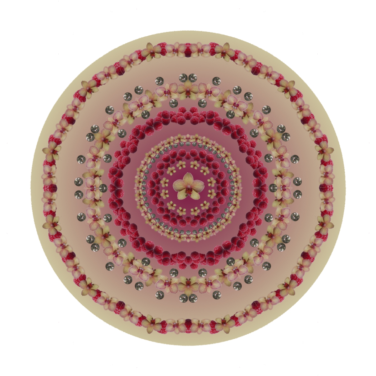
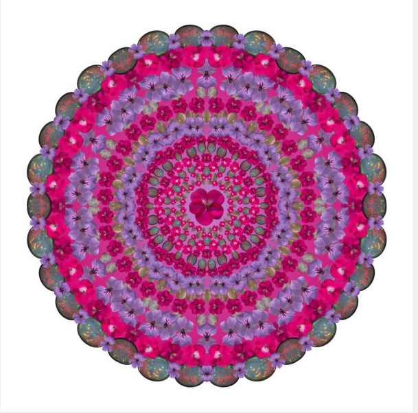
I recently stayed at MyHotel in Brighton where fabulous, funky mandalas in eye-popping colours were all over the walls and furnishings. A little research found that they were produced by Kundalini, and after some experimentation I figured out how to design something similar. You can incorporate things/people/animals/places that mean something to you in your design and then get it digitally printed onto a canvas to hang on the wall, or print it yourself onto transfer paper to make a bag, T-shirt, blind or cushion (pillow). You could even have it printed onto fabric or wallpaper using a service such as Spoonflower.
What is a mandala? According to the BBC website, it is a symbolic picture of the universe that is used in Tibetan Buddhism during meditation. Mandala is the Sanskrit word for circle.
This Instructable will be easier to follow if you have a basic knowledge of photo editing software. You will need to be able to remove the background from a photograph to leave just the image you want, duplicate it, re-size it, copy it, move it, rotate it and create mirror images by flipping it. You will also need to be able to select colours from images to create a background with a colour gradient, and you must be happy about working with layers. There are plenty of tutorials out there on the Web if you need help with any of the above that goes beyond the instructions I have provided, which are based on the Gimp v2.6.11.
What you need
A PC/laptop
Photoshop, the Gimp or similar image-manipulation software
Suitable digital photos you have taken, or copyright-free images from the Web
Choosing the Images
Mandalas that have a cohesive colour palette work best, so decide on shades of a particular colour (eg greens) or a pair of complementary colours (eg. brown and turquoise, lime green and deep purple). Look through your digital photo album to identify pictures with an object or living thing in them that fits with the colour palette you have selected.
You could create a mandala around a particular theme, such as a recent holiday, using pictures only from that holiday – perhaps a cocktail glass, a lizard, a sunset and an exotic flower.
The subjects you choose for your images should have clear outlines and fit into a square or round box rather than being too long and thin. All, or at least a substantial portion of them, should have a vertical line of symmetry, because some images will be placed centrally on the outside edges of the segment and will be “reflected” when it is copied to create the mandala. (If that makes no sense, don’t worry, it will when you get to Step 4.) The symmetry doesn’t have to be perfect, few things in nature are. Flowers, butterflies and most fruit (not bananas) work well and you may be able to cheat by re-colouring them if necessary. Pieces of jewellery, eg stud earrings, single stone rings, small brooches and pendants, can be good too as they give a bit of sparkle to the mandala. You could also try brightly coloured sweets (candies) or beads.
Look carefully at your pictures, there may be a small part that is usable such as a pretty button on someone’s coat or an interestingly shaped leaf on the ground. You will need at least 6-8 images for a small mandala like the example I show how to create (which is a little over 1,000 pixels in diameter on a 1,200 x 1,200 pixel background), ideally more for a larger one. The images should come in groups, ie 2 or more slightly different pictures of the same thing. You could use photos of 2 or 3 of the same item positioned close together as well as each one separately. According to Spoonflower, a resolution of 150 dpi will give a good quality print. This means that a 1,200 x 1,200 mandala can be printed at up to 8” square/diameter.
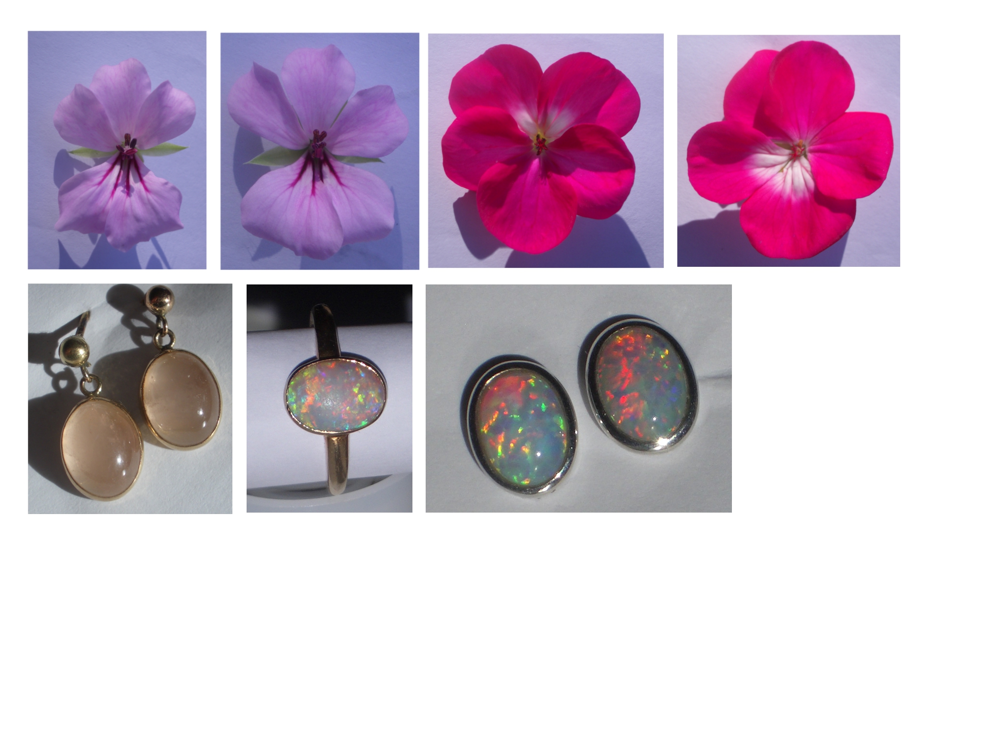
I decided to make a mandala to go in my kitchen which is white with splashes of lilac and fuchsia. The pictures in the Introduction show 2 versions of the end result, the second of which I show how to make here, step by step. There's also a mandala I created using images of orchids, raspberries and diamonds. In the end I took photos specially for the lilac/fuchsia project, taking as my subjects individual florets from lilac and fuchsia geraniums (pelargoniums), an opal ring and earrings with similar pinky-bluey colours and a pair of pink rosequartz earrings. If you are taking photos instead of using ones you already have, try to get good, well-lit close-ups against a white or contrasting background with no shadow, it will make Step 2 much easier. To photograph the florets I made a hole in a sheet of white paper and put each floret (one by one) on the paper with the stem through the hole so that it lay flat with minimal shadow on the paper. Doing it outside on an overcast day will avoid a directional light source and the resultant shadows.
The picture in this step shows the source images of flowers and jewellery that I started with.
Preparing the Images
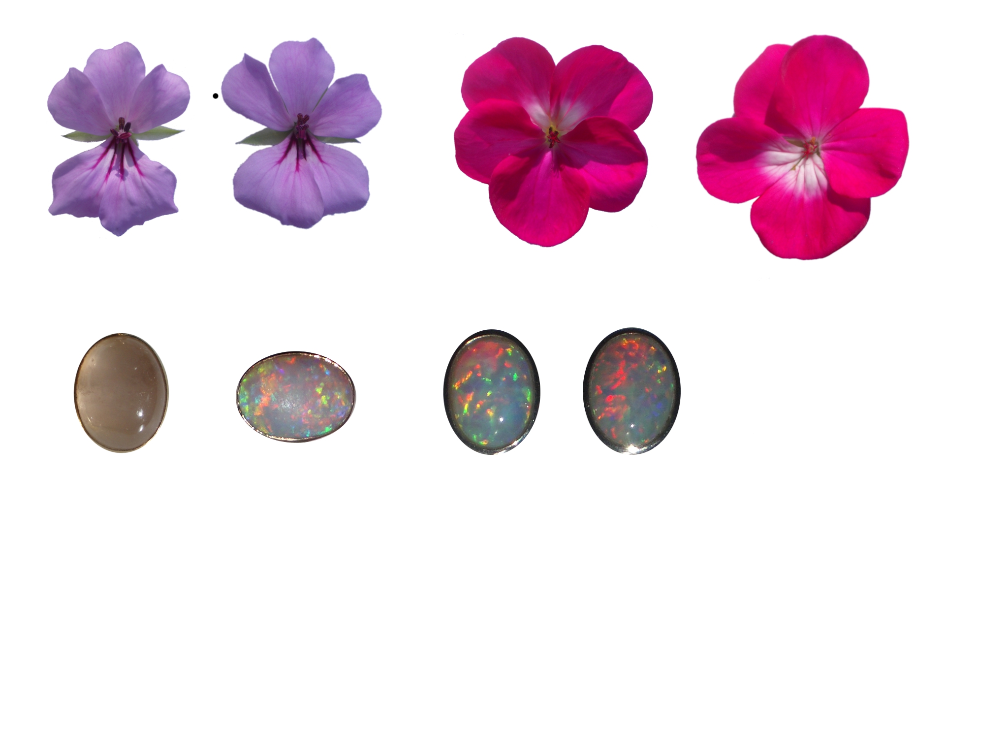
Open in turn each of the photos you plan to use in your editing software and cut the image you want out of its background using the appropriate selection tools. There are various ways to select the outline in Gimp, but this is how I did it:
Do this for the rest of the images you plan to use. Mine are shown in the photo with this step.
- Choose the Fuzzy Select tool and make sure the mode is set to “add to the current selection”. Click somewhere in the background just outside of the outline of the flower (or whatever). Keep clicking in different areas of the background until the entire outline is selected. Anywhere you see “marching ants” that aren’t on or within the outline, click. You will almost certainly need to zoom in as you get to the final stages.
- Click on Layer, Transparency, Add alpha channel. Then hit delete. The background should all disappear, but if there are any residual areas you can clean them up later with the Eraser tool.
- With the selection still in force, click Select, Grow and choose 2 pixels.
- Then Filter, Blur, Gaussian blur to smudge and smooth the edges a bit.
- Select, None to clear the selection.
Do this for the rest of the images you plan to use. Mine are shown in the photo with this step.
Creating a Blank Segment
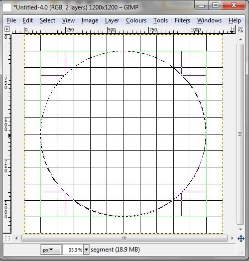
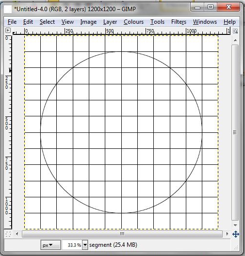
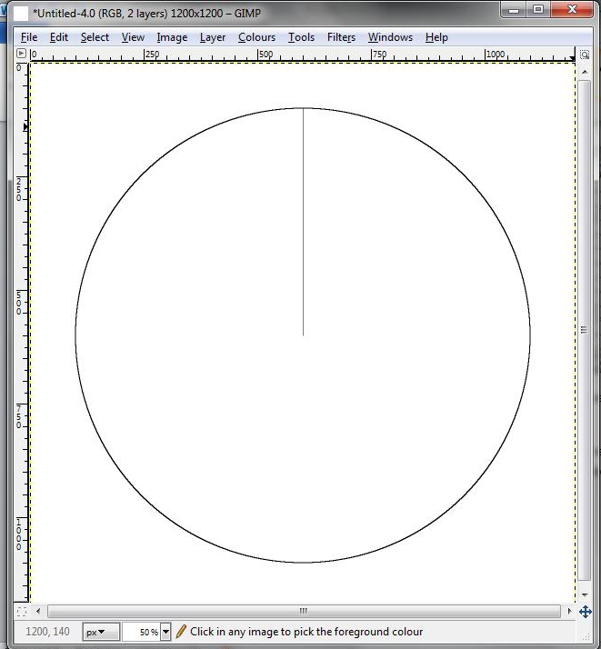
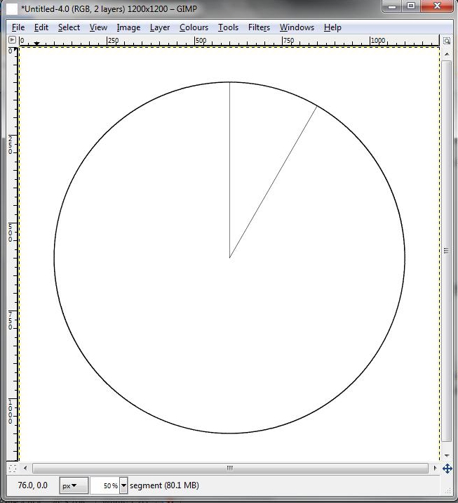
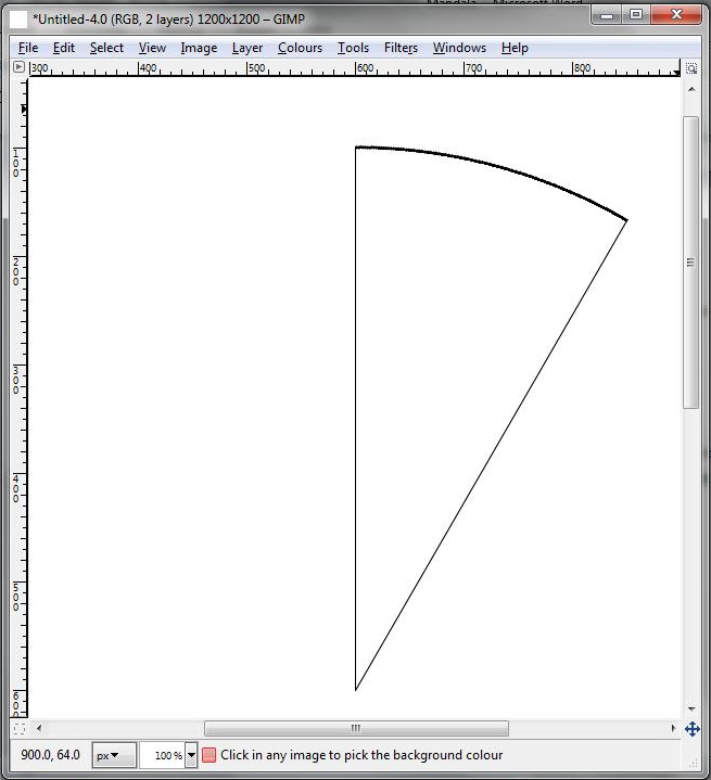
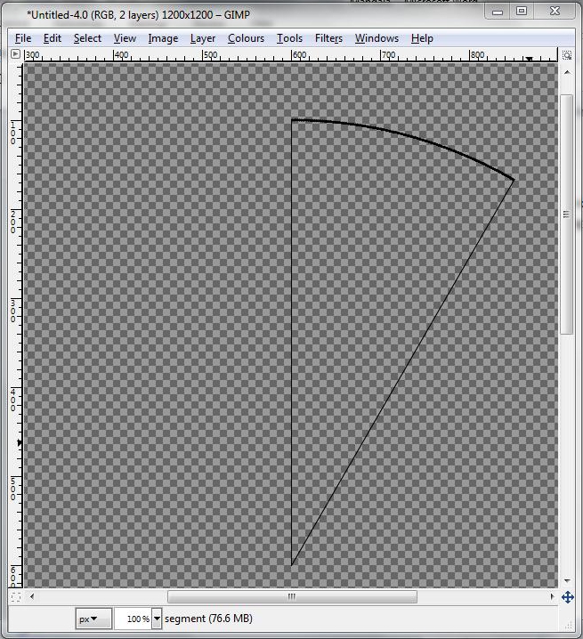
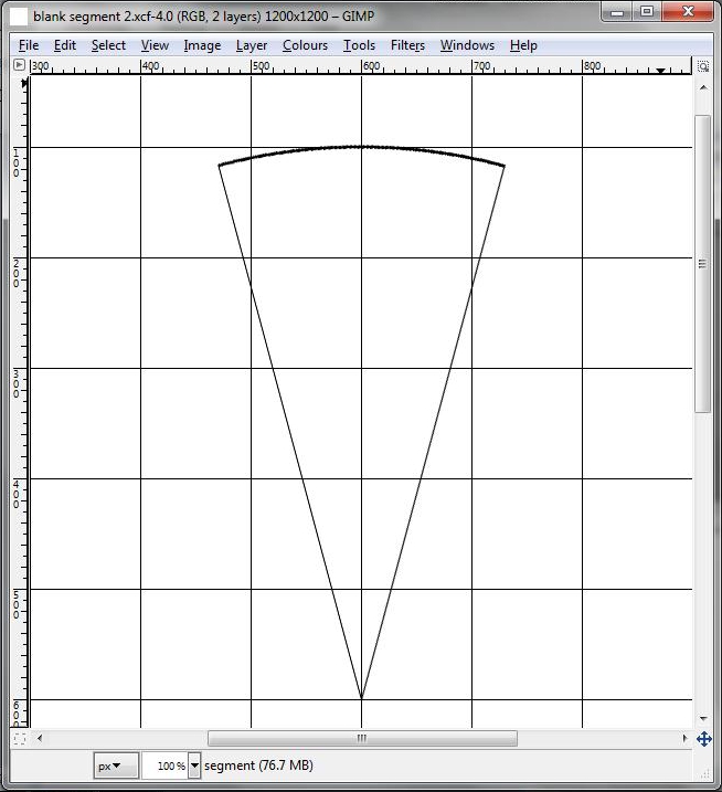
Mandalas of this type are created from an even number of segments, say 6, 8 or 10, each of which has a line of symmetry down its centre. So to create the pink and lilac example shown which has six segments you need to make one half-sized 30o segment, flip it along one of its straight edges to double it, copy it to make a 120o segment and then make 2 copies of this 120o segment to fill a whole 360o circle. So we need to draw a blank 30o segment to start with. Here’s how to do it with Gimp.
Select the pencil tool and the brush to 2 or 3 pixels. Zoom to 100% and get the top half of the circle in view. Click on the centre of the circle, hold down Shift to get a straight line and click again at the top of the circle to create a radial line.
Click on the symbol at the bottom of the Layers box that creates a duplicate of the layer. Working in that layer (“Segment copy”):
Still in the Segment layer, select the whole layer and rotate it as before, but by -15o so that its line of symmetry is in the y direction.
The blank 30o segment is done, in Step 5 we’ll move on to filling it.
In the following steps I’m going to call the lowest point of this segment the point (what else?) and the curved top edge the arc. When the segment is copied to fill a whole disc the point will be the centre of the disc and the arc the circumference. I’ll call the straight sides (ie radii on the finished disc) the sides.
- File, Open to create a new image that is 1200 pixels square.
- Layer, New Layer and choose Transparency. Call this new layer “Segment”.
- Edit, Preferences, Default Grid and set the grid size to 100 x 100 pixels.
- View, Show Grid. View, Snap to Grid.
- Working in the layer called Segment, choose the Ellipse Select tool and click on the grid intersection that is 1 square along and 1 square up from the bottom left. Drag the cursor to make a circular selection of 1,000 pixels diameter.
- Edit, Stroke Selection, set the line width to 2 pixels, Stroke. Enter, Select, None.
Select the pencil tool and the brush to 2 or 3 pixels. Zoom to 100% and get the top half of the circle in view. Click on the centre of the circle, hold down Shift to get a straight line and click again at the top of the circle to create a radial line.
Click on the symbol at the bottom of the Layers box that creates a duplicate of the layer. Working in that layer (“Segment copy”):
- Select, All.
- Tools, Transform Tools, Rotate. Make sure the centre of rotation is at the centre of the circle (drag it there if not), then select an angle of 30o and click on Rotate.
- Layer, Anchor Layer.
- Layer, Merge Down.
Still in the Segment layer, select the whole layer and rotate it as before, but by -15o so that its line of symmetry is in the y direction.
The blank 30o segment is done, in Step 5 we’ll move on to filling it.
In the following steps I’m going to call the lowest point of this segment the point (what else?) and the curved top edge the arc. When the segment is copied to fill a whole disc the point will be the centre of the disc and the arc the circumference. I’ll call the straight sides (ie radii on the finished disc) the sides.
How We're Going to Do It

Before filling the segment with images, a bit of an explanation:
-
We’re going to create a number of additional layers – 4 in this case – each of which has various combinations of the 4 different types of image we’re using, ie:
- Lilac geranium florets
- Fuchsia geranium florets
- Opals
- Rosequartz
- Mixing things up in the different layers gives an impression of depth that just wouldn’t be there if layer 1 only contained lilac florets, layer 2 only fuchsia ones, etc. That is because of the way the layers stack vertically, to show some images overlapping others as if they were on top of them.
- The other way that depth is created is by using smaller images positioned closely together near to the point and making them gradually larger and more spaced out as we move towards the arc. Of course, you can start with an image of whatever size you have and shrink it. It will be possible to enlarge if necessary as well, provided the source image isn’t too small and the finished mandala isn’t going to be viewed, or printed, so large that pixellation is apparent.
- A handful of different images is sufficient, because each one will be used in several different sizes. You can also make the same image look different by rotating it by different amounts and/or by using its mirror image.
- The images need to be placed into the segment in such a way that they are oriented as if on imaginary arcs. They should not be placed on imaginary horizontal lines instead. This means that, with the exception of any images placed on the vertical centre line of the segment, they will need to be rotated clockwise if they are going in the right hand half of the segment and anti-clockwise in the left hand half. There’s no need to do this very accurately, you can judge it by eye well enough.
- This 15o half segment will be mirrored about one of the sides when we’ve finished it, to create the base 30o segment that is then duplicated 11 times to fill the mandala disc. Some of the images need to be placed half way over that side so that, when they are reflected, they become a whole image again. This makes the mandala look more like a circular thing and less like a collection of segments. You can in addition place some images so they just touch a side, but most images will look odd if they extend over the edge by any less or more than half way. Think about a butterfly which is reflected in a line that comes part way across one wing.
- It isn’t immediately obvious, but the other side of the 15o segment (the one that isn’t going to become the centre line of the 30o segment) will also be a line of symmetry in the mandala. Any image placed over that side also needs to be half way across or just touching.
- You can fill the segment (or nearly fill it) with images close to the point, or leave a blank space there for a single image once the mandala disc has been created.
First Layer of the Segment
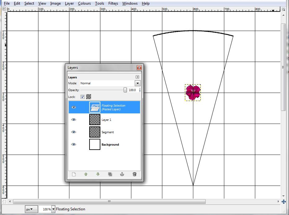
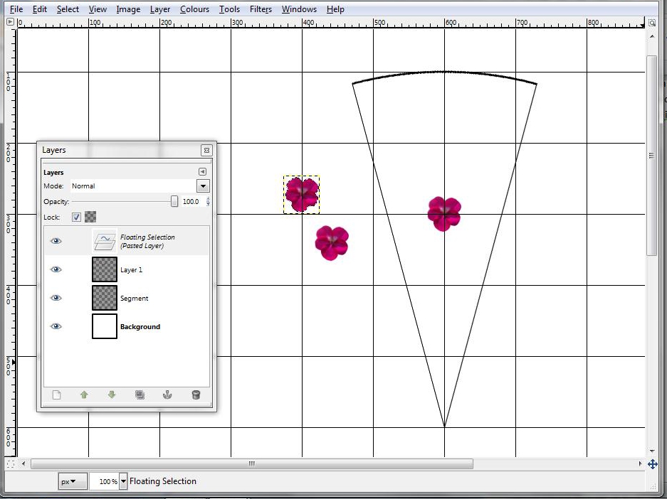
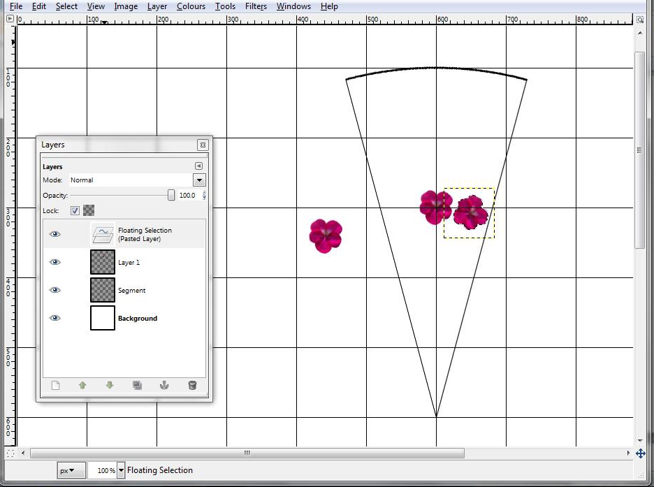
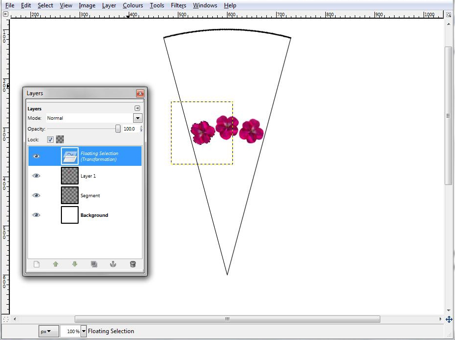
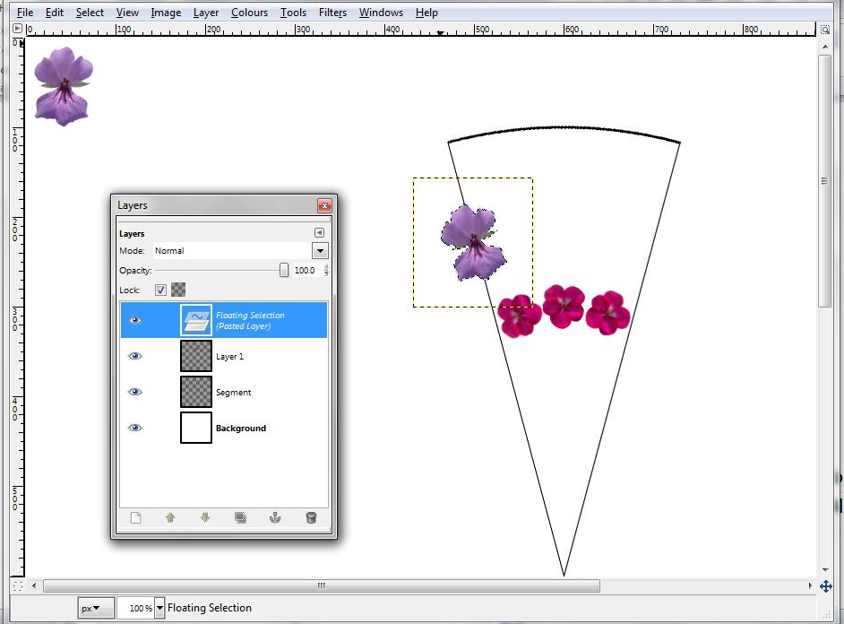
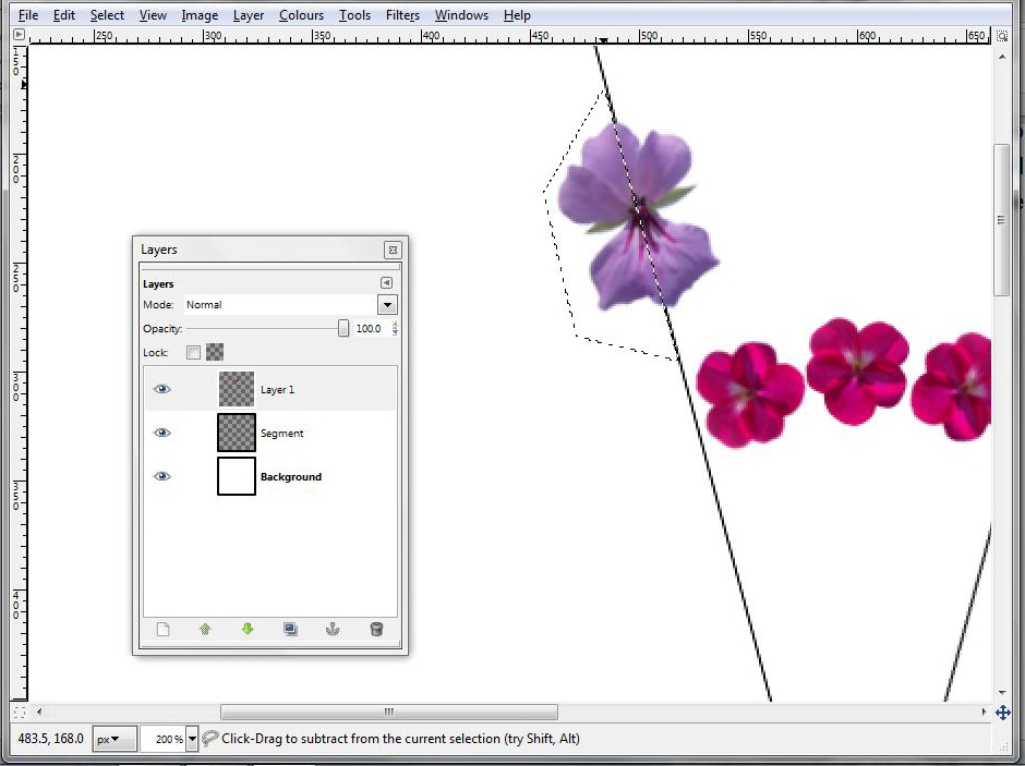
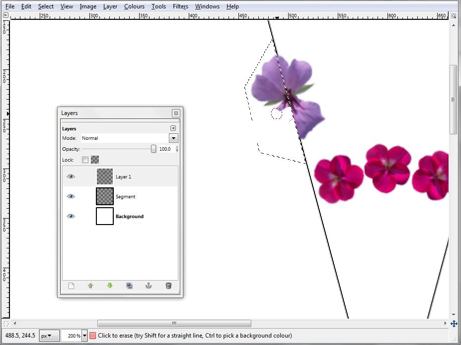
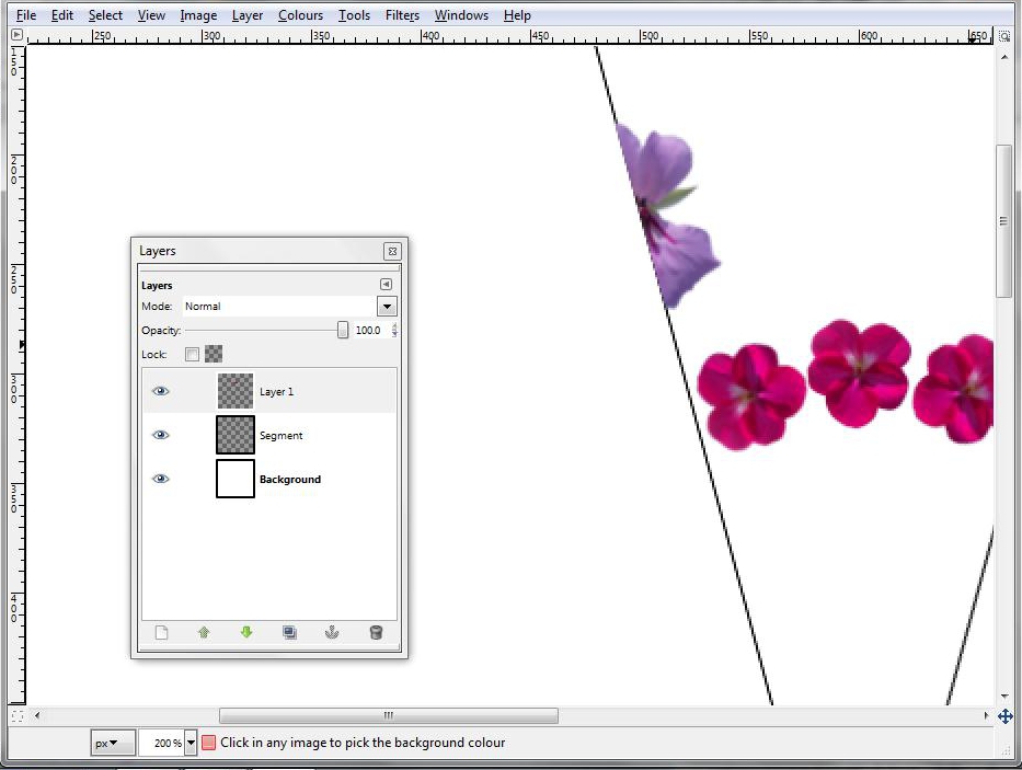
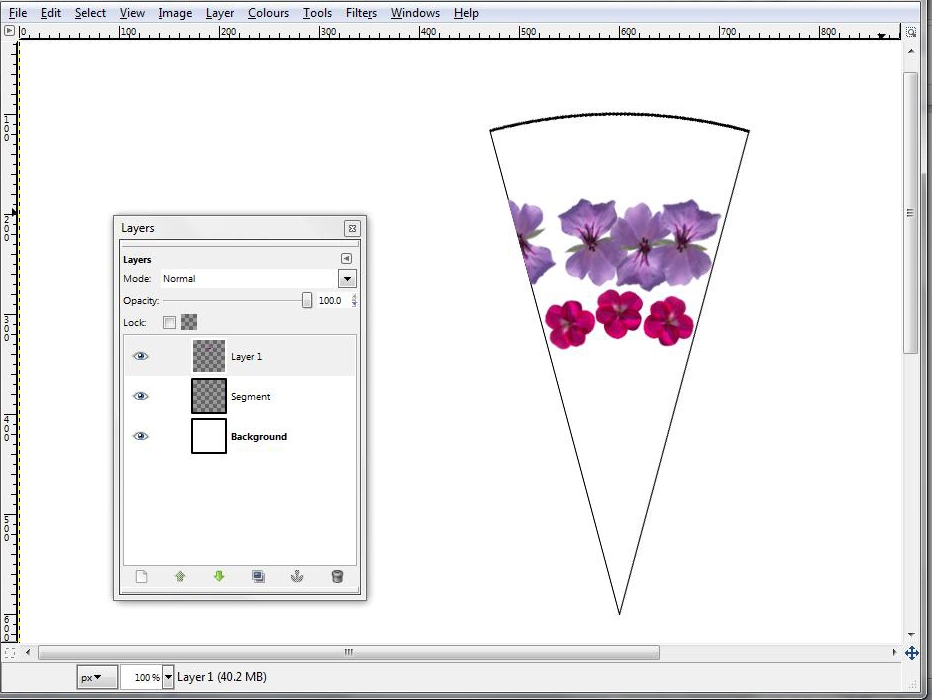
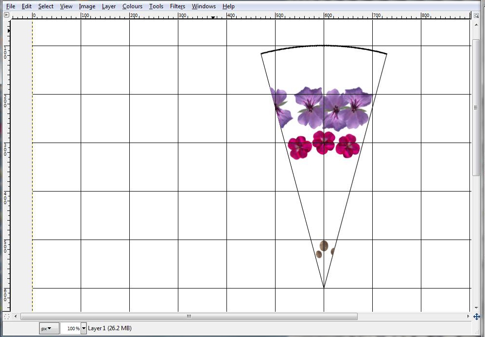
Let’s get going and create a mandala segment.
Zoom in so the segment fills the screen – 100% should work. Turn off the snap to grid function (in the View menu).
Create a new transparent layer (as in Step 3) and call it Layer 1. Work in that layer, but with the white background layer and Segment both visible. File, Open to open a suitable image (one of the two fuchsia florets, in the example) and then select the whole of the layer containing the image but not the background. Edit, Copy. Paste it into Layer 1 (Edit, Paste) but don’t anchor it yet. Resize it to something suitable using the Scale tool, remembering to link width and height in the dialogue box to keep the proportions right. Position it somewhere in the middle of the segment, on the vertical centre line. Before you anchor it using Layer, Anchor Layer, copy it (Control-C) and past a couple of copies (Control-V) onto the canvas but outside of the segment. Doing that will have the effect of anchoring the first and second images. Drag the third image off the second one so you can see it.
Rotate that image while it is un-anchored (using Tools, Transform Tools, Rotate) and position it on an imaginary arc that is the same distance from the point as the first image, but to one side. You can allow it to overlap the first image if you wish. Anchor it when it is where you want it.
Use the Rectangular Selection tool to select the remaining copy, then rotate it by a different amount and use the Move tool to position it on the other side. It should be more or less on the same imaginary arc, but don’t be too precise, a bit of variation adds to the effect. Turning off the visible grid may help. When you are happy with the position, anchor it.
Put some different elements (ie not fuchsia florets, or at least, not the same fuchsia floret image) into the same layer, smaller ones near to the point and larger ones towards the arc. Allow some to touch the sides, or overlap half way. When you have an image that overlaps, you’ll need to get rid of the portion of it that is outside the segment. Do that by zooming in and using the Free Select tool to select a polygon around the area to be removed, then use the Eraser tool to rub it out. Select, None to de-select when you have finished.
Finally I put several copies of one of the rosequartz images into this layer too, near the point.
Layer 2
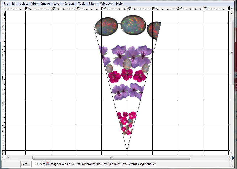
Create another new transparent layer called Layer 2. Keep the other layers visible while adding extra images into this new layer, to fill in some of the gaps. Use some of the images that haven’t already been used in Layer 1 but you can reuse maybe one or two of the Layer 1 images as well as long as they are resized, flipped or rotated to provide variety.
The Background
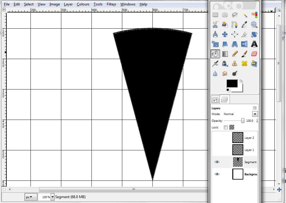
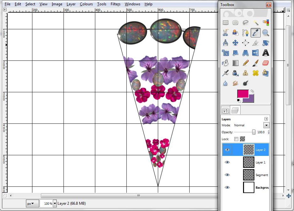
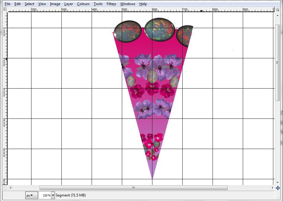
After finishing Layer 2, now is a good time to put in a coloured background. You could use a plain colour, but a shaded one is more interesting.
Turn off the visibility of Layers 1 and 2 and work in the Segment layer. Use the Bucket tool to fill the segment with the same colour as the segment outline - black in this case.
Use the Colour Picker tool to select a background and a foreground colour from Layer 1 and/or Layer 2. I’ve used the lilac and fuchsia colours from the flowers.
Then, back in the Segment layer with the visibility of Layers 1 and 2 turned off again, use Select by Colour to select the entire segment. Then use the Blend tool, dragging the cursor from the point vertically up to the arc. Turn the visibility of the other 2 layers back on and check the effect. You might want to try undoing the gradient and redoing it with the colours the other way round by dragging from the arc down to the point.
More Layers
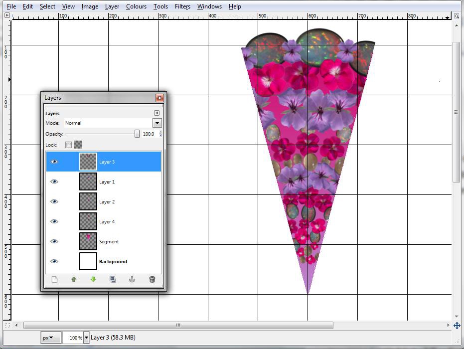
Create another 2 layers and fill them with images. It helps to change the order of Layers 1-4 in the stack from time to time as you work, to get a feel for how it could look when finished. Leave a few gaps between the images, tiny ones near the point and larger ones towards the arc.
When you have all the layers done, experiment with changing their order until you find which looks best, then merge all the layers down except for the white background layer. (Layer, Merge Down).
When you have all the layers done, experiment with changing their order until you find which looks best, then merge all the layers down except for the white background layer. (Layer, Merge Down).
Creating the 60o Segment
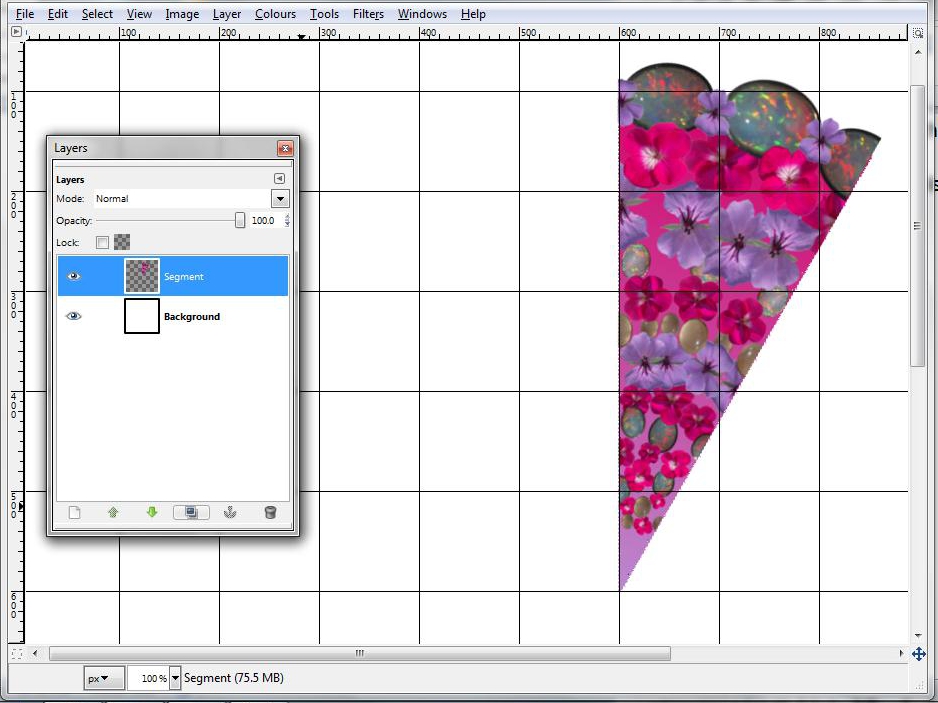
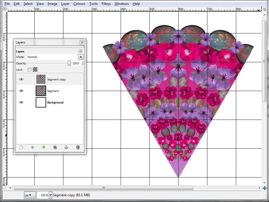
We create a 60o segment by rotating the 30o segment through 15o so that one of its sides is vertical, then copying it and flipping the copy horizontally to create a mirror image. Do this by:
- Working in the Segment layer, Select All and rotate (Tools, Transform Tools, Rotate) about point 600,600 (the point that will be the centre of the mandala) through 15o. Layer, Anchor Layer.
- Create a new layer that is a copy of Segment by clicking on the icon at the bottom of the layers dialogue box to “create a duplicate of the layer and add it to the image”. It will be called “Segment copy”.
- In the Segment copy layer, choose Tools, Transform Tools, Flip. If necessary, double click the Flip icon in the toolbox and select horizontal flip, then drag the cursor horizontally across the image to flip the layer.
Completing the Mandala
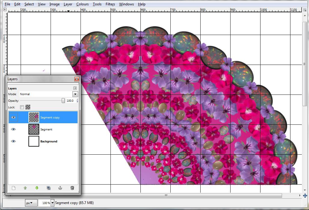
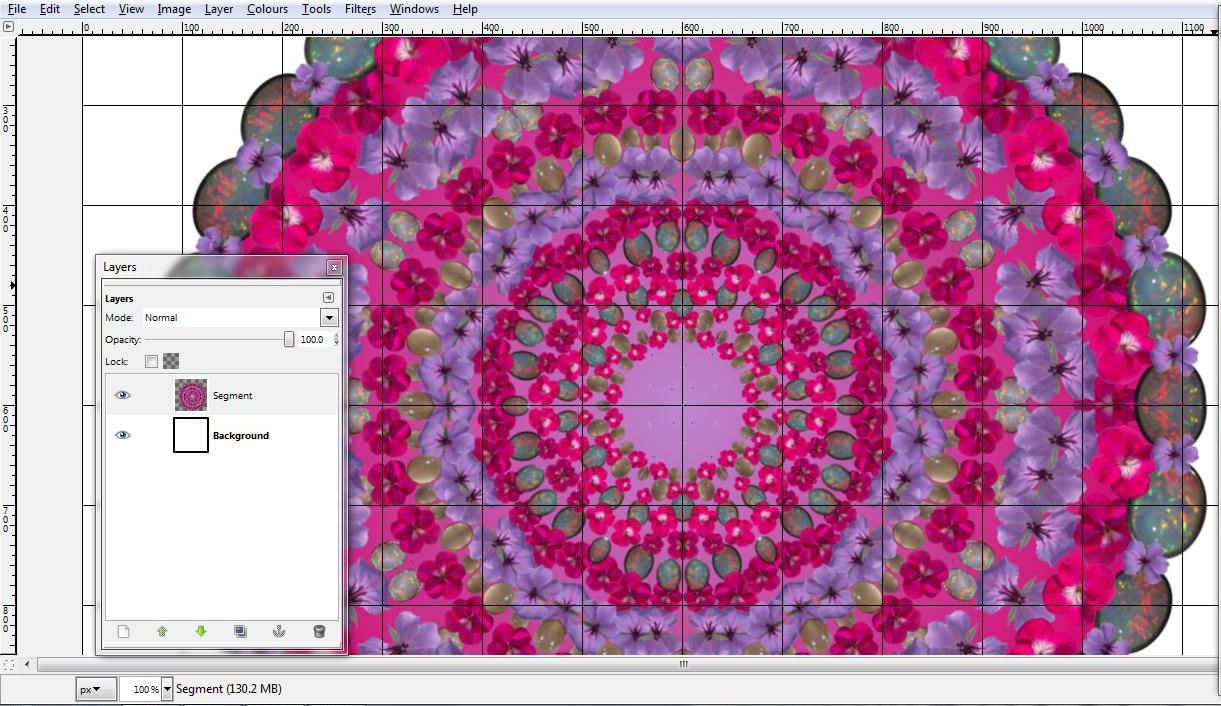

Create another copy layer in the same way as before and rotate the copy about point 600,600 through 60o. Merge down again.
Make 2 copies of this layer, rotate one through 120o and the other through -120o. Merge both layers down. Now you have a full 360o mandala.
As a final touch, add a central image if you wish.
Make 2 copies of this layer, rotate one through 120o and the other through -120o. Merge both layers down. Now you have a full 360o mandala.
As a final touch, add a central image if you wish.