Easy to Draw Halloween Characters
by John Induna AD in Design > Art
12194 Views, 38 Favorites, 0 Comments
Easy to Draw Halloween Characters
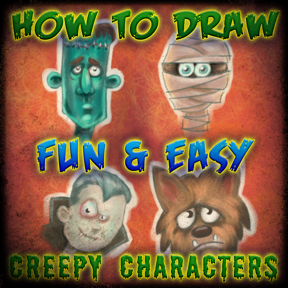
Drawing is a handy hobby for all Makers.
If you don’t draw, but think it would be fun, cool or useful to be able to draw.
I did this for you.
If you draw a little or even a lot, I hope you take a look and enjoy this.
First and foremost I consider myself a Maker. However, the first things I started making were pictures. As a kid pencils and paper were all I could get my hands on. By the time I was a teenager I was making sometimes breaking anything and everything.
Anyone can learn to draw simple characters and that is how a lot of people start a life long love of drawing. If you ever utter the words "wish I could draw" I encourage you to try this. Of course you probably thinking "I wish I could draw...but not that" Point here is, with a sound approach and knowing the reason for each step, anyone, any age can begin to enjoy some success in drawing or painting in any medium.
For this demo I used Sketchbook Pro 6.
as a side note :
I have recently upgraded and have been having a lot of fun with V6. I have had a copy of Sketchbook since version 1 but haven't really used it until the 2011 update came out. Been loving it since. I have always liked Sketchbook over other drawing software because it seemed to be smoothest transition from traditional to digital drawing and painting. It took a few updates for Sketchbook to get some of the brushes/textures and features I was looking for but it's all there now. So if you haven't tried it, download the free trial and give it a go.
As for my input device I am using a rather old Graphire 4 tablet....I am very interested to see what all the fuss is about with the in the newer Intuos5 touch Medium Pen Tablet is! ;)
Thanks for taking a look.
Music by: Michael Chapman & The Woodpiles
Enough of the random thoughts, lets get started.
Learning to draw from text, pictures or video is still like trying to learn how to swim from your couch.
I have included a video and would like to challenge all you “Wish I could drawers” to get pencil and paper and draw along. Of course you can pause and replay. Be warned, you will show no signs of improvement by just watching it. Either way I hope you enjoy it.
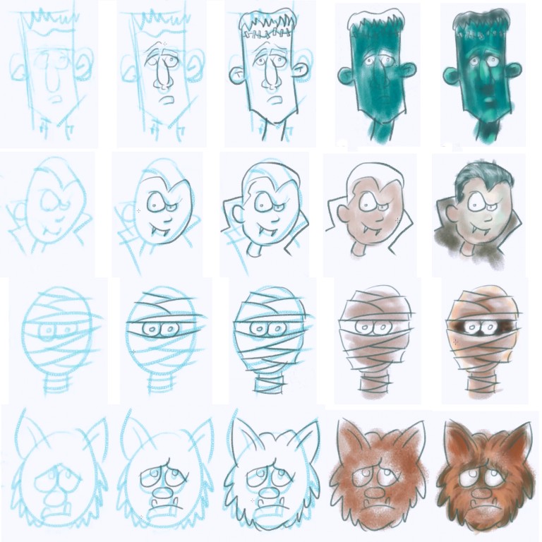
For instructional purposes and in the beginning I recommend keeping these steps separate and finishing each one before moving on to the next one. As you become more familiar with each step you may choose to bounce in and out of steps in various parts of the drawing for a variety of reasons.
- Rough Sketch
- Line drawing
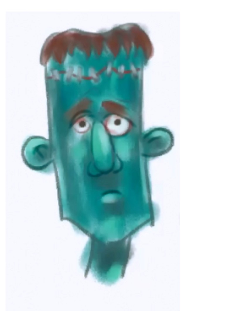
- Blocking in base colours
- Shadows and Highlights
- Detailing,Tinting and Toning.
Rough Sketch or Construct Drawing
.jpg)
.jpg)
.jpg)
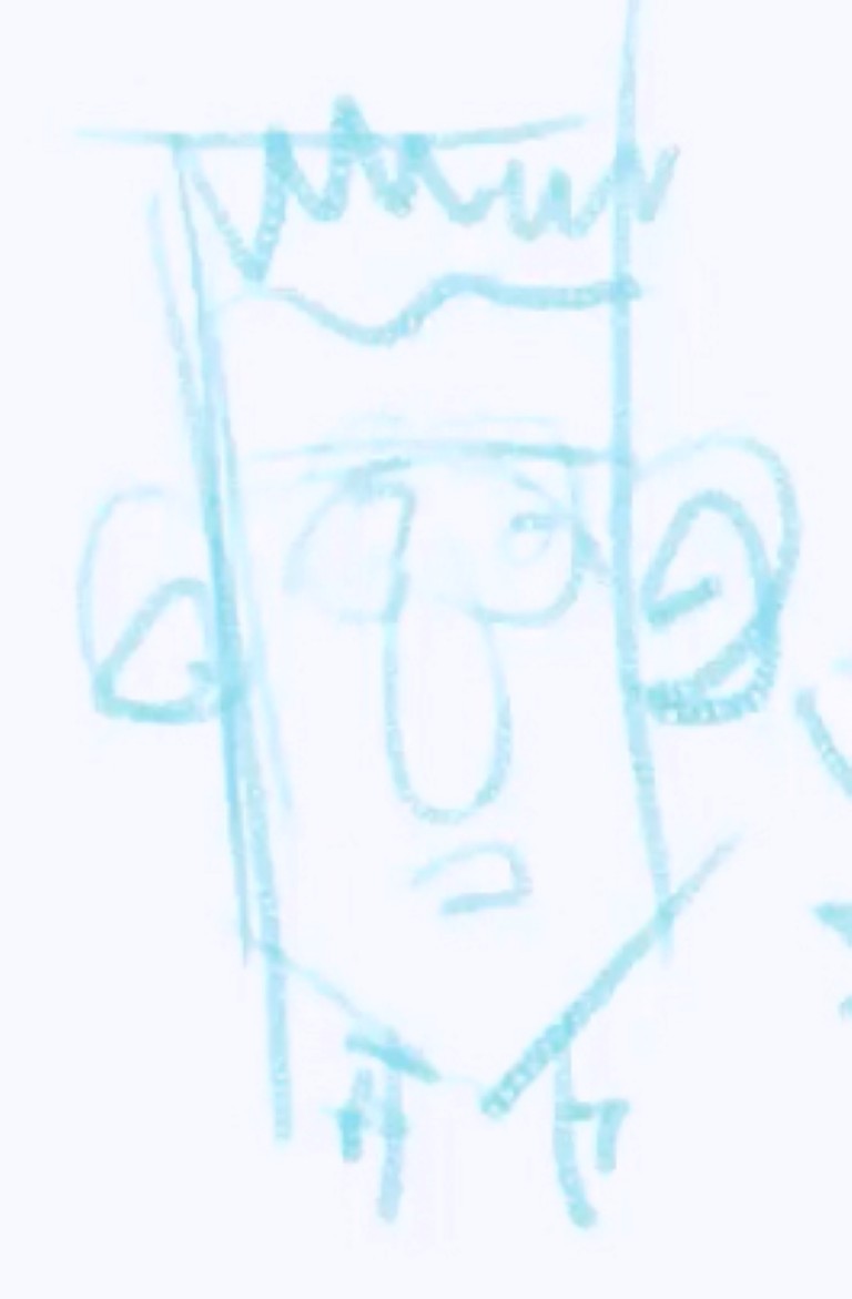
I have also heard this called “layout” or an older term, “scaffolding”. I use to think this was merely a way instructional art books taught students how to draw, this is not the case. True, it may be a good way to show an object in a simplified form but it is not the sole purpose. Roughs can be useful in laying out multiple objects a composition, making sure the big picture is kept in mind right from the start. They can also be used to simply make sure the drawing will fit on the page.
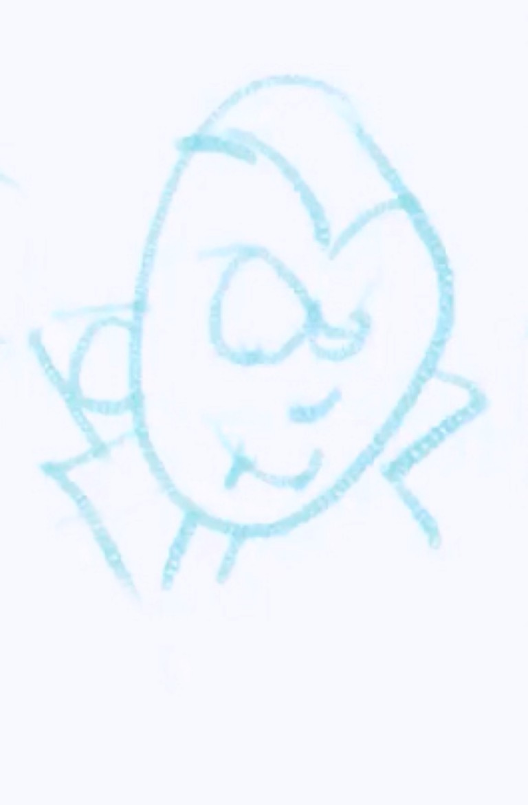
In truth, here are many reason to make a rough but for this demonstration the rough sketch is used more to get out a loose idea for the purposes of discovering the character, placing facial feature and simply laying a foundation to build on. Try to avoid “undo” or erasing at this stage of the drawing, the idea here is to keep moving forward and lay down something to work with. Be as loose or as sketchy as you are comfortable. Keep the lines light so you are able to build them up if necessary to define alterations.
If you watched the video you may have noticed that all of the characters were started with a head shape boundary. When I am playing around with ideas like in this demo, I sometimes challenge myself with some random shape and try to make some character that come to mind from looking at that shape. Other times I will draw a grouping of shapes to make up the features and then draw the head shape based on the feeling I get from the features. I recommend trying out both and even come up with other ways to brainstorm ideas.
Line Drawing or Inking
.jpg)
.jpg)
.jpg)
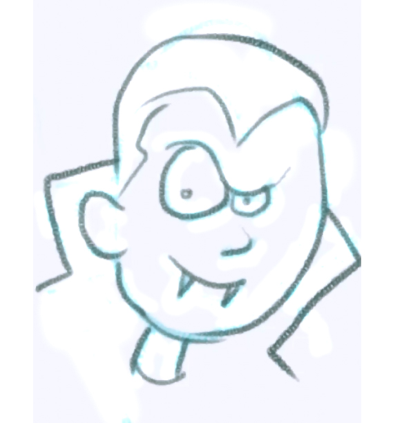
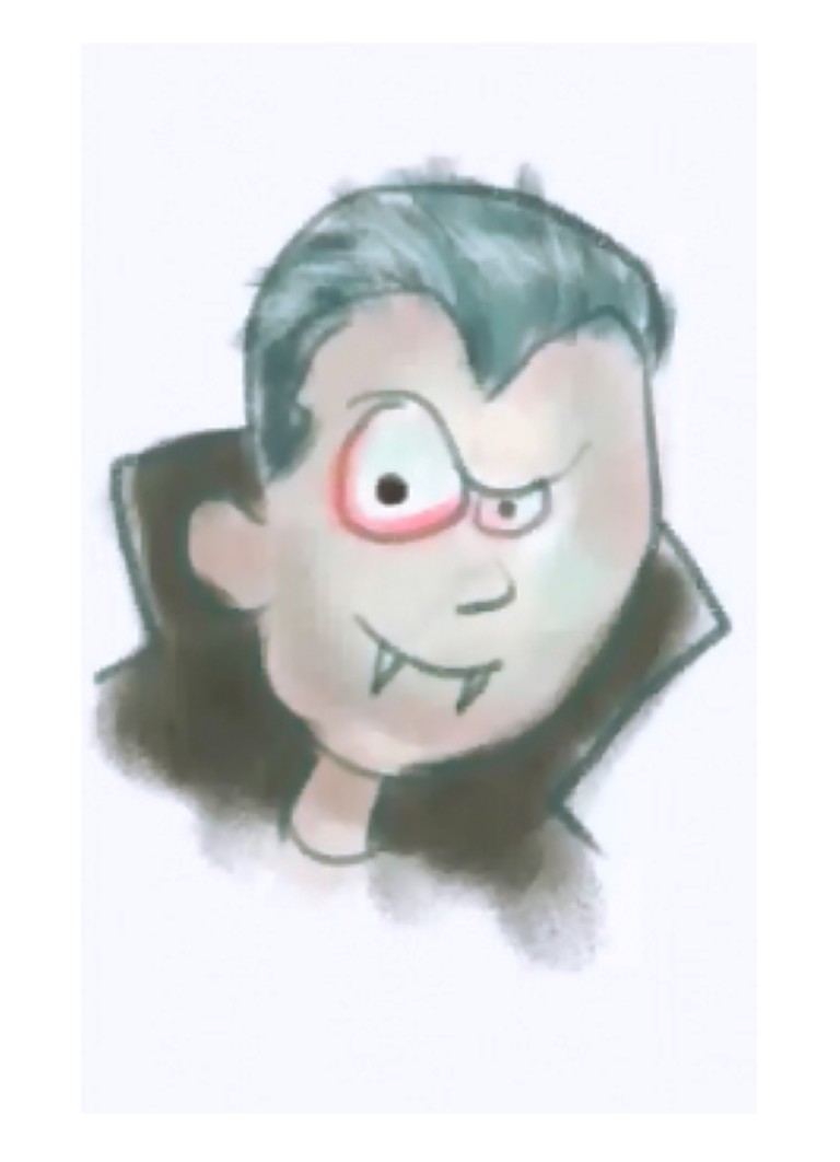
The line drawing establishes boundaries for colour and various objects in your painting. At another level it could also be used to define shadow shapes and texture but for our purposes, let’s treat this more like a colouring book. If you are drawing digitally, create a new layer above the existing one. You should be looking to use the rough sketch as a guide for the line drawing, however, do not feel bound to it, if you see areas for improvement continue to alter your character as you see fit. In other words unless you love part of your rough, do not feel the need to trace the drawing faithfully. If you have a better idea at this stage try it. If you are drawing digitally, all the more reason to try some ideas. There is always a few “undos” you can use.
Hot Tip: Whenever you are trying to follow or trace a line, keep you eye focused on a spot just ahead of your pencil or if using a tablet, the on screen cursor. The longer and gentler the curve, the further you eyes can be. Of course this sounds a bit crazy, feel awkward, maybe even seem impossible but trust me, if you get the hang of this it is awesome. It works great for more than just drawing. If it sounds familiar this is something I borrowed from driving and racing motorcycles. Your body has a strange ability to follow your eyes. The amazing thing is I find this work when drawing on a desk top tablet or drawing on screen in the case of my tablet PC I have a strange ability to account for the parallax that occurs due to the distance between the drawing surface and the screen. I even use the same technique to use a jigsaw and sewing machine for smoother more accurate curves. Try this, some people will benefit right away others it takes more time to get use to. Just remember you don't look at your front wheel to ride your bike.
Some artist pay close attention to making sure the boundaries of all shapes are close, colouring book style, so the can take advantage of Fill or “Bucket” tools. You could try this for a more “comic book” or “cell painted” look.
Blocking in Base Colours
.jpg)
.jpg)
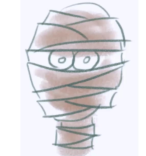
The first step of the colouring or painting phase is called block in. Here it is just like kindergarten, try to stay in the lines.
Here you will want to apply the base colours of the different shapes. The colour you choose should be a middle tone, not too dark or too light. In order to keep the line work as a guide, a new layer is created beneath the lines done in the previous step. In a traditional approach, care is taken to work the paint up to but not over the lines.
It is normal for it to look cartoon-like regardless of how realistic your line work is.
Tip: Try and use the larges brush you can. This is not only quicker and more efficient but in traditional painting it tends to lay down a more even coat or tone. Digitally if you have pressure sensitivity enabled use a brush you can adjust the size with pressure.
Shadows and Highlights
.jpg)
.jpg)
.jpg)
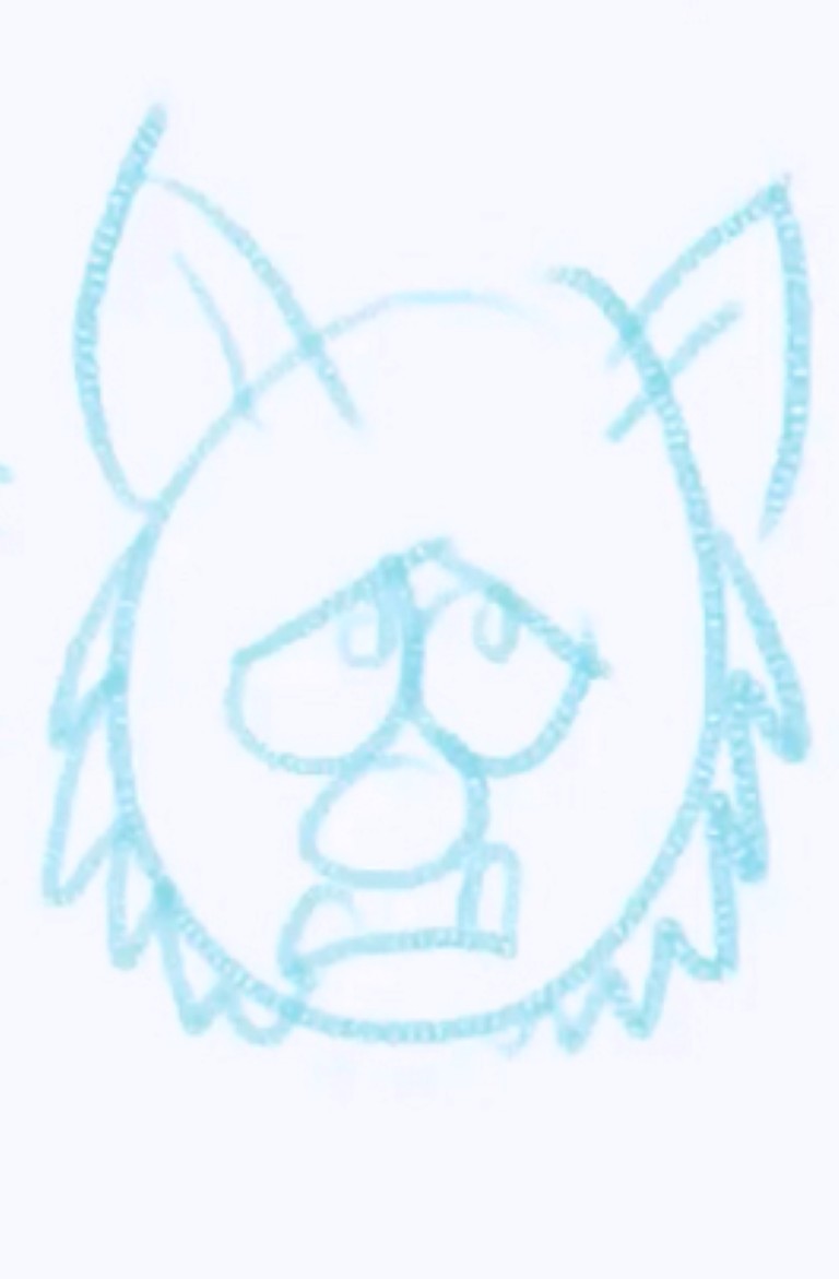
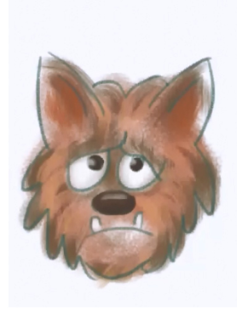
Shadows are the first step in adding dimension to a rather cartoon like drawing. For this it is a good idea to create a new layer. If you are at you layer limit, dump your rough sketch layer. To create more of a painterly look this layer should be above the linework layer to start covering some of the out lines.
Now before you start painting you will need to imagine a light source and where it is in relation to your objects.
(A supplementary instructable here would be handy to explain lighting.)
General rules to follow here:
Dark colours/value recede or appear behind
Lights colours/value advance or appear to be on top or in front.
Most often a primary light source is coming from above and somewhere behind you, the viewer. Curved surfaces will darken as the roll or turn away from the viewer simply put edges of curved surfaces get darker as the get to the borders.
These are of course a simplification of lighting principals but a lot can be accomplished by only applying these rules. In a simplified world of cartooning, this is all you may need to add dimension to your pictures.
As for highlights, they appear in the opposite parts of your picture, and as a general rule, your highlights and shadows should be separated by an area of your base colour no matter how thin that area might be. To say the same thing differently, don’t let your highlights touch your shadows. Now let me just say I have distilled lighting principles into very simple terms and of course there is way more to it. By sticking to these simple rules anyone can experience some level of success with their drawings. That said, I have seen some amazing illustrations that used nothing more than these principles.
Tip: Think about the texture of the surface you are working on. If it is hair try a brush that makes streaks. If it should look like a rough surface pick a textured brush. For smooth surfaces the air brush works. Also be mindful of how you apply the colour. If you are drawing hair, think about whether it is long or short, strait or curvy, your brush strokes should reflect that. Finally if you are digitally painting with pressure sensitivity, here is where I like to adjust my brush pressure to control opacity. If I am drawing on my phone with Sketchbook Mobile I reduce my opacity to 20-30% and build up the shadows or highlights.
Detailing,Tinting and Toning.
.jpg)
.jpg)
.jpg)
.jpg)
.jpg)
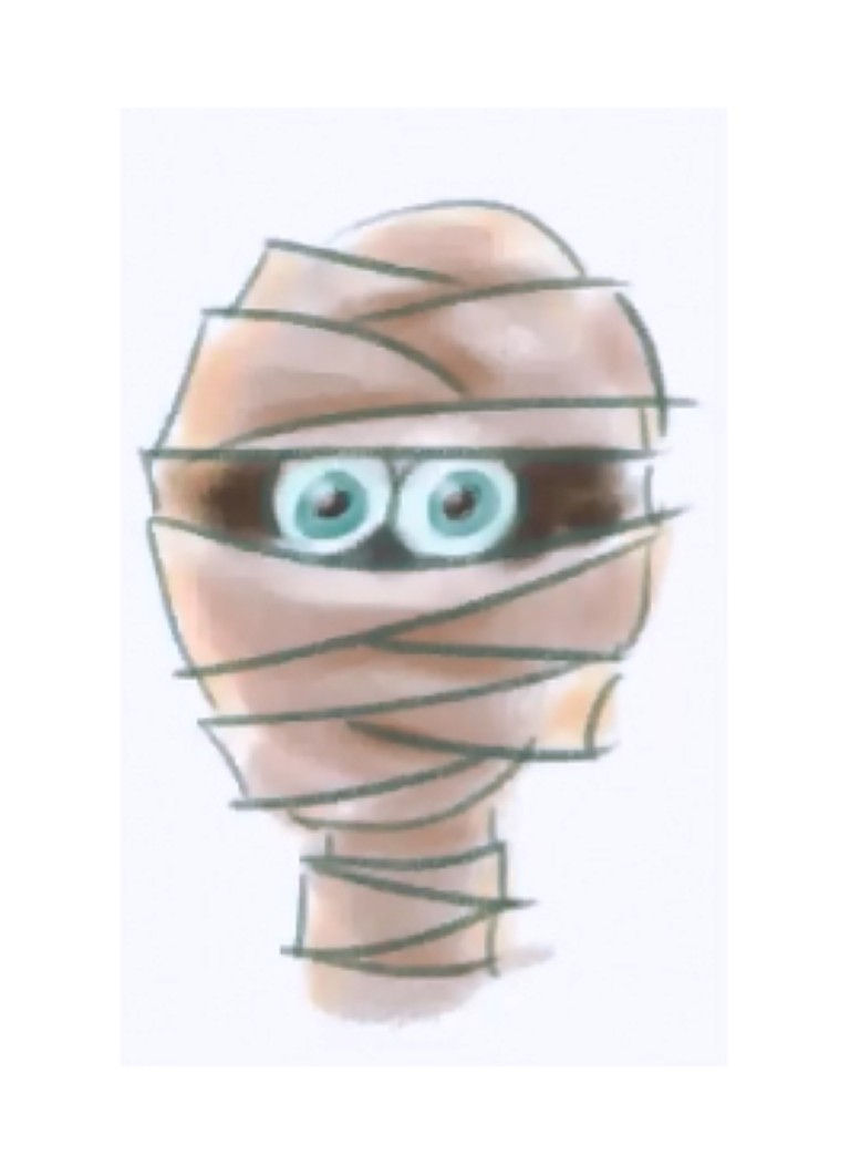
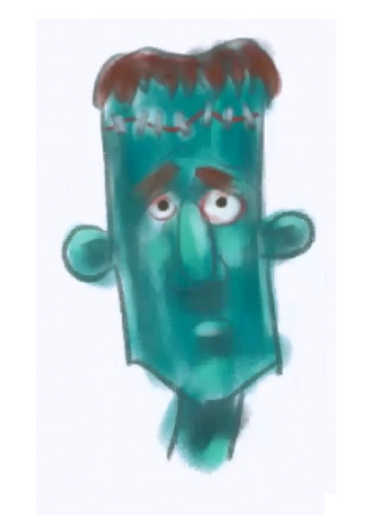
Detailing is no more than doing the same on a smaller level. This is how you tidy, refine your painting. You can zoom into an eye or ear and bring up the level of detail to your taste. I really like this idea because you don’t have to learn anything more than the first few steps to make a picture with the appearance of complexity and detail.
Tinting is an application of transparent colour to slightly modify base colours. Because of the simplified approach to shading and highlighting there is a danger that some of the areas are looking a little monochromatic, areas where the shading appears to only be lighter and darker versions of the same colour. In a way you could think of tinting as applying makeup. Colours are applied with low opacity to influence the other colours. (Rosey up cheeks or redden around eyes)
Toning is often done done at the end. It is a global application of shadows. To be more specific, in can be used to give a subtle overall roundness to a head by applying in large soft transparent shadow in the form of a sphere. It can also be use to make some objects appear to come forward or sit back into the picture plane by a similar application of soft transparent tones.
Tip: Continue to be mindful of texture, at this stage I often look to see how things are going, if it looks too rough I will tint and tone with soft brushes or conversely if the opposite is true. Also reducing the opacity will allow you to ease into these often subtle adjustments.
Final Thoughts
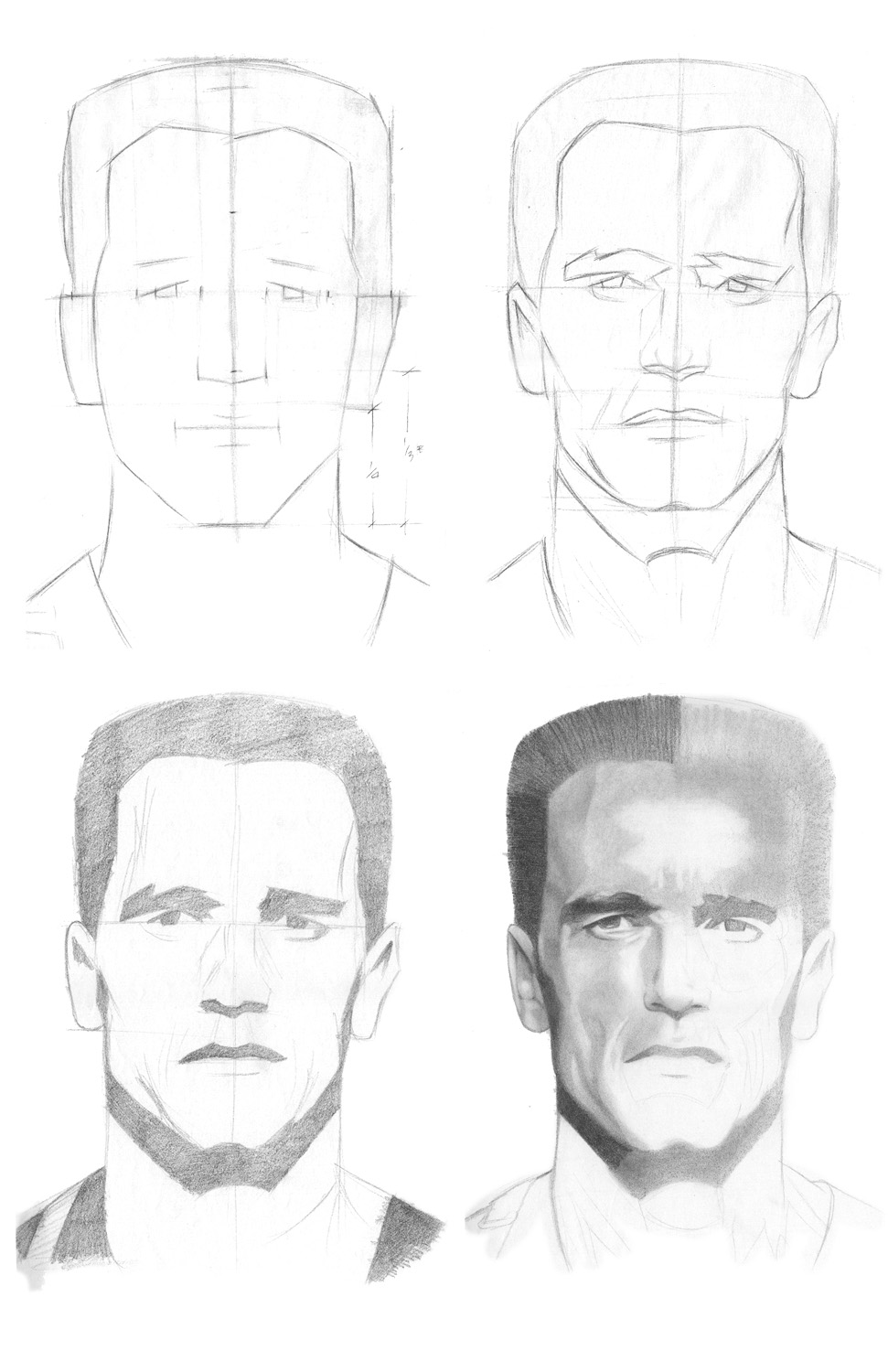
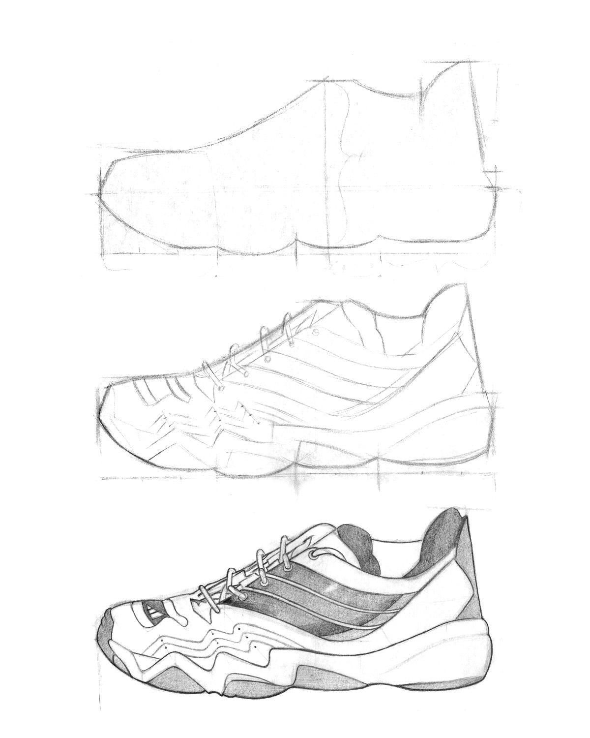
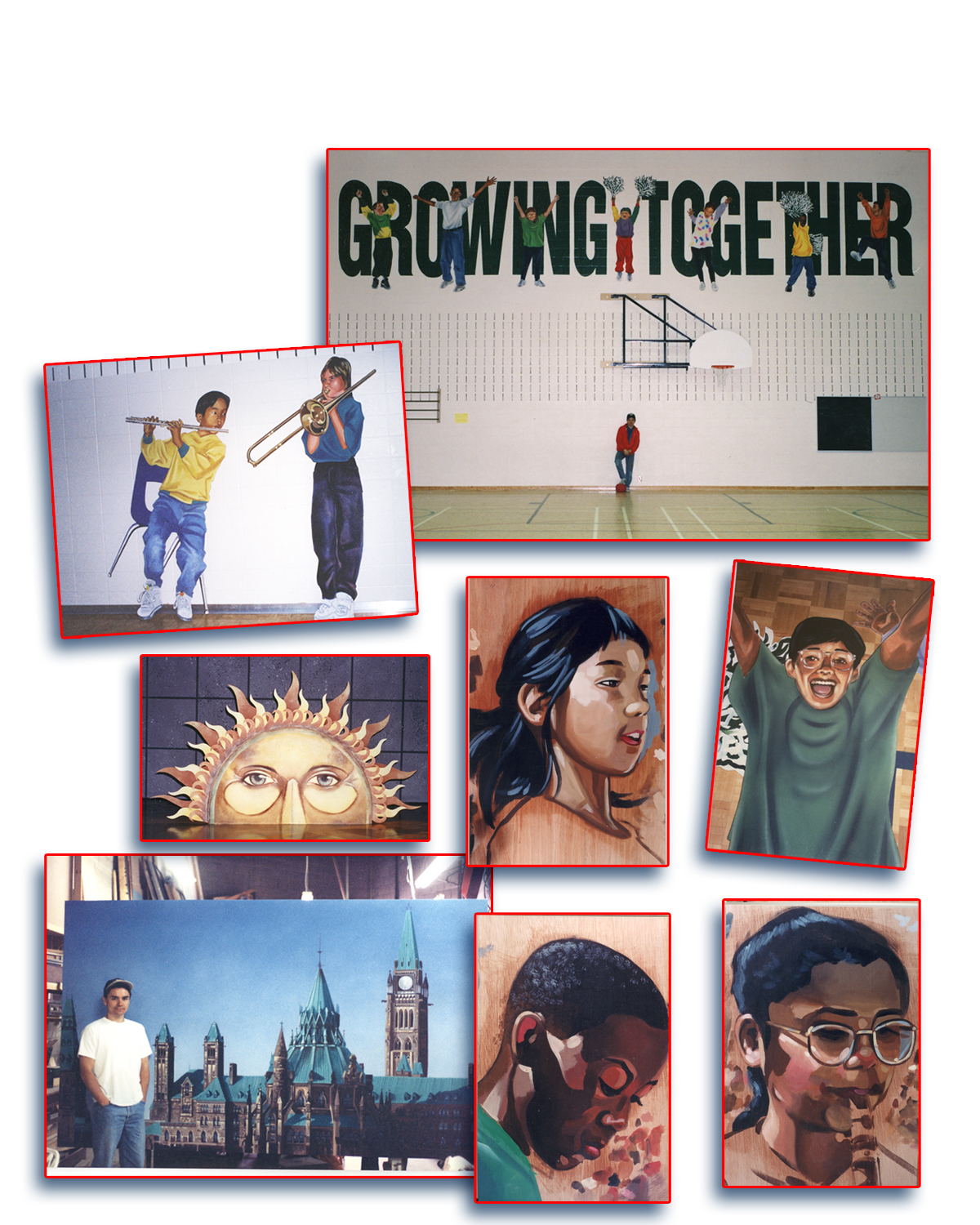
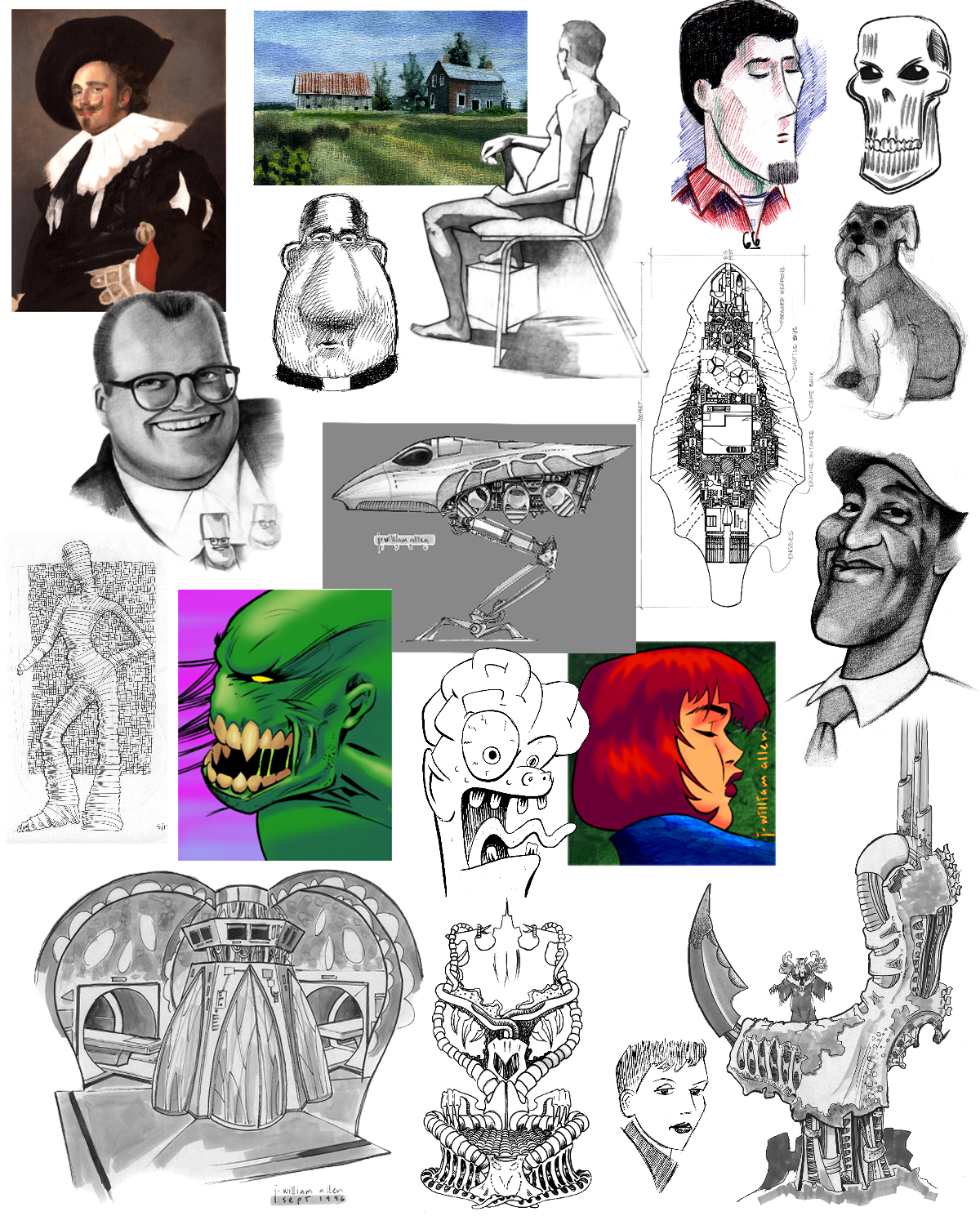
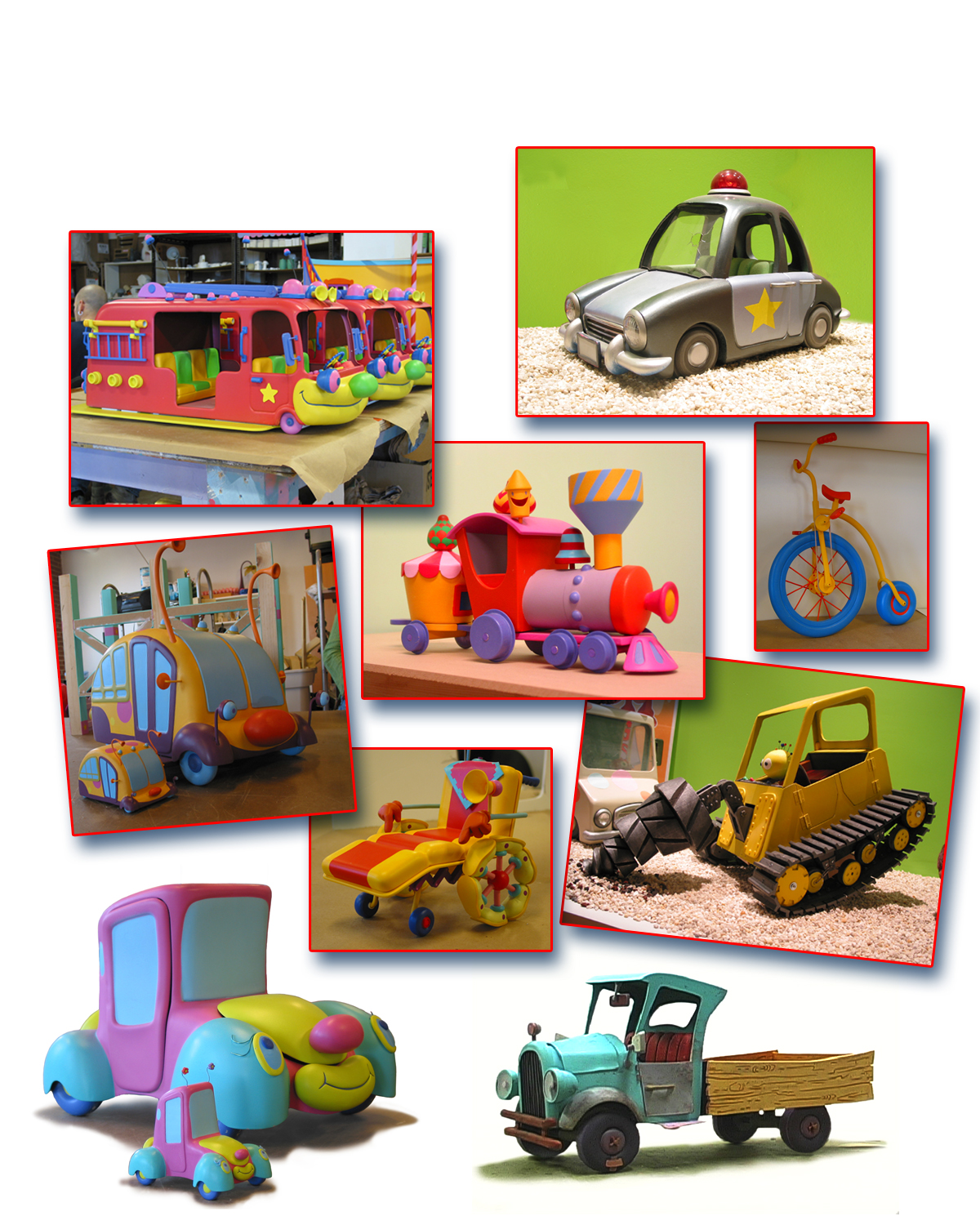
I have included some samples of my other lessons to show that the drawing principals don't change much. The same techniques can be use to draw in a more realistic mannor.
I hope this help some of you. I appreciate your thoughts and comments.
Thanks for taking a look.
- Construct drawing (more meaureing involved when drawing from life or reference)
- Line drawing
- Shadow shapes and Highlights (Shadow shapes are defined)
- Detailing and Toning.
I hope this help some of you. I appreciate your thoughts and comments.
Thanks for taking a look.