Doughnut Chart Tutorial
This tutorial will teach you how to make a simple doughnut chart on Microsoft Excel for a Mac computer.
Collect Data
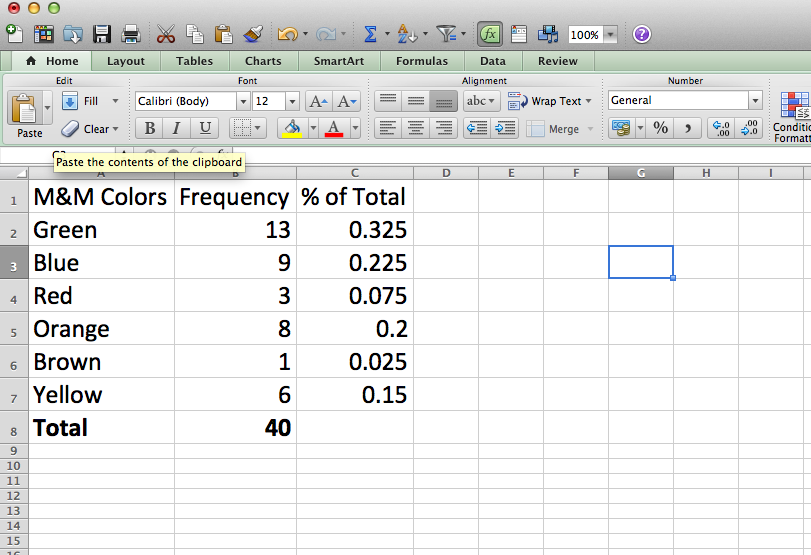
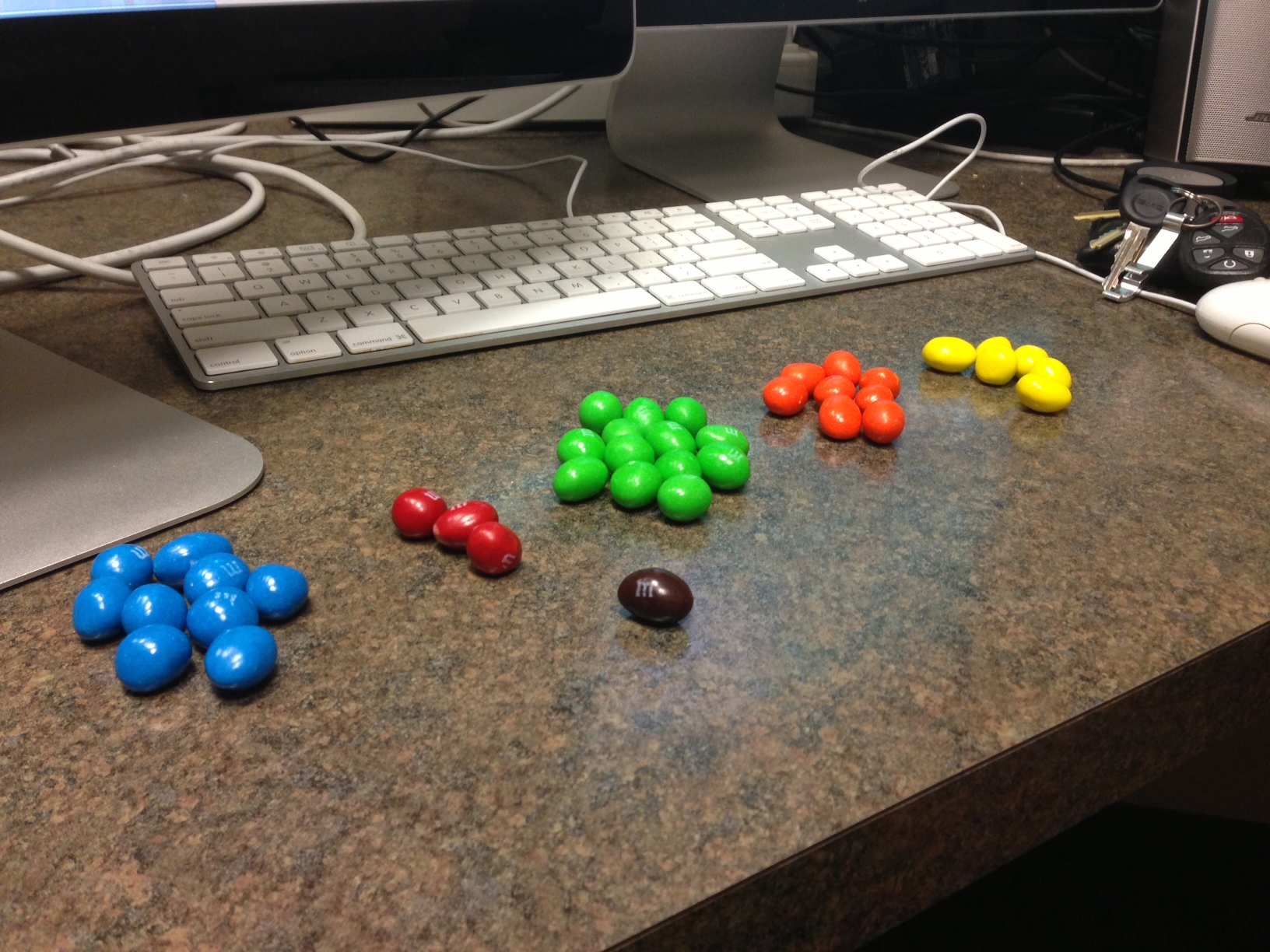
First you need to collect some data and enter it into excel. For this tutorial we counted the number of each color of m&ms in a sharing size bag. Column A is the M&M color and Column B is the number of that color.
Format to Percentages
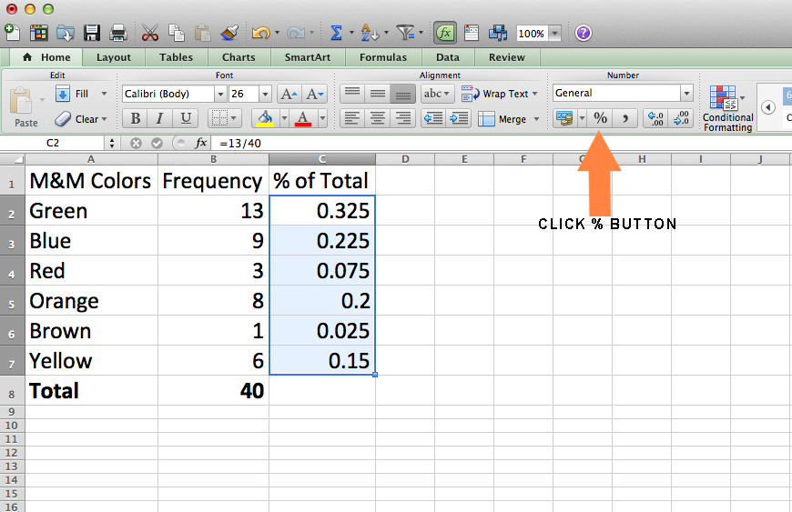
Once you have the data, you need to calculate some percentages. To do this, divide the number of each color frequency by the total number M&Ms. For example, the first percentage was calculated by dividing the number of green M&Ms (13) by the total number of M&Ms (40). To do this, hit the equal sign, type 13, hit the backward slash, type 40 and then hit enter. Next highlight all of the percentages by clicking and holding down on the first number and then dragging down your mouse until they are all highlighted. Then click the percentage button on the Home Tab under the category Number.
Simultaneously Select
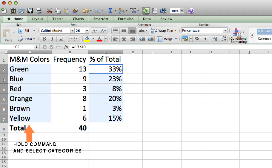
After you have turned your numbers into percent, hold the Command key and select your categories in column A. This will simultaneously select both the categories with the matching percentages.
Create the Doughnut
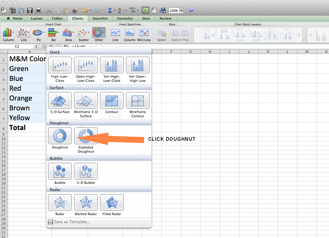
Next, click in the Charts Tab and then click Other. From here you will select Doughnut. Your chart should now appear in the middle of the screen.
WARNING: if your categories are colors, like ours, then the colors in the chart might not match up with the colors in the legend. For example the Green m&ms in our chart are blue.
WARNING: if your categories are colors, like ours, then the colors in the chart might not match up with the colors in the legend. For example the Green m&ms in our chart are blue.
Edit Sections
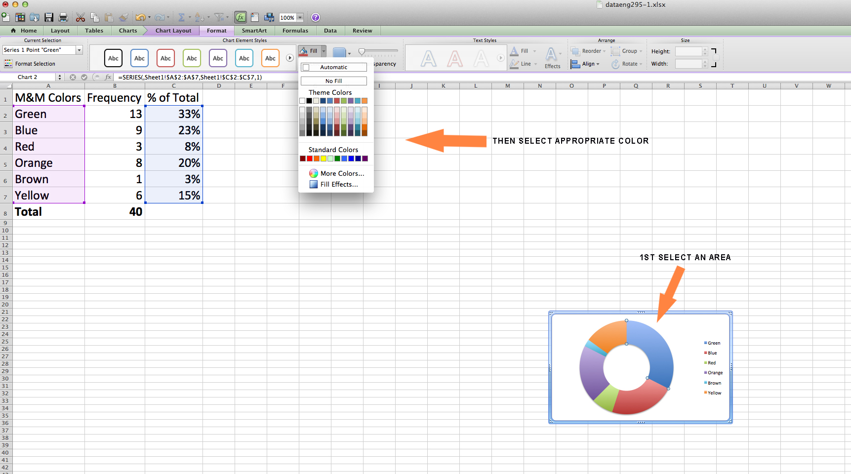
To fix this, select a piece of your doughnut and click it twice.
WARNING: do not double click it, but click once – then pause for a second – and click it again. Then click the Format Tab, go to Fill, and click on the drop down menu. You can now change the color.
WARNING: do not double click it, but click once – then pause for a second – and click it again. Then click the Format Tab, go to Fill, and click on the drop down menu. You can now change the color.
Add Title
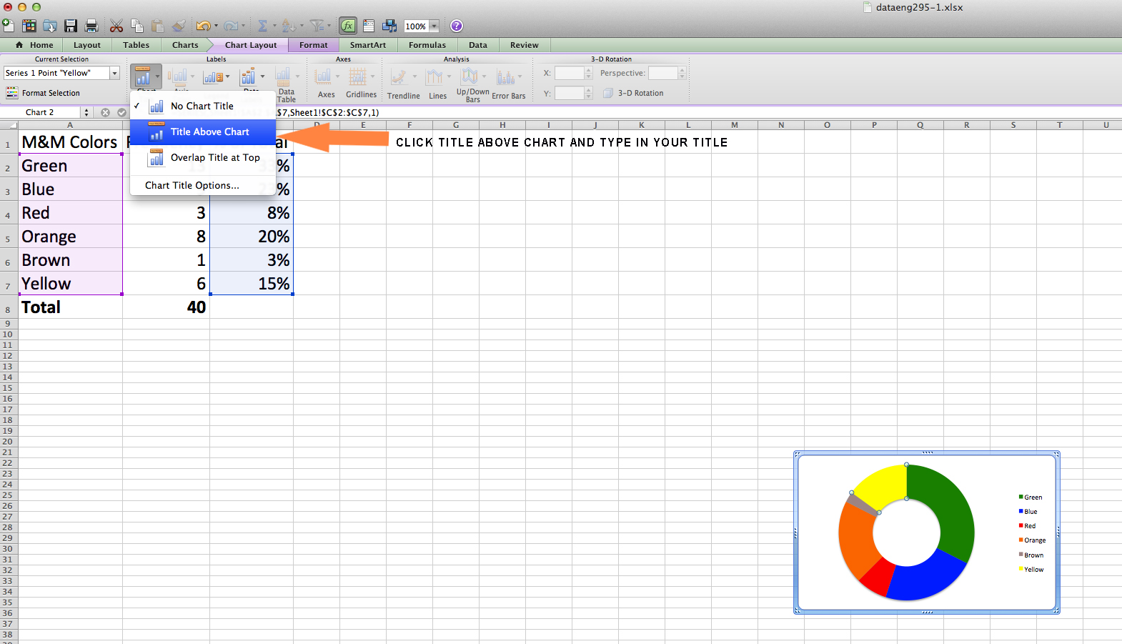
To add a title to your chart, click the Chart Layout tab and then click on Chart Title. Now select the Title About Chart option and add your title. We named ours “Frequency of M&M colors”.
Eye Candy
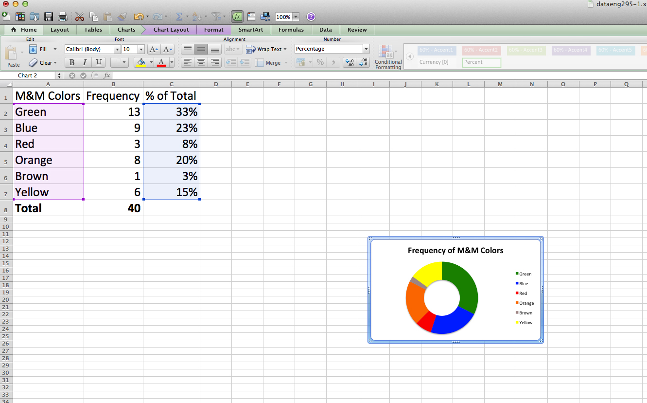
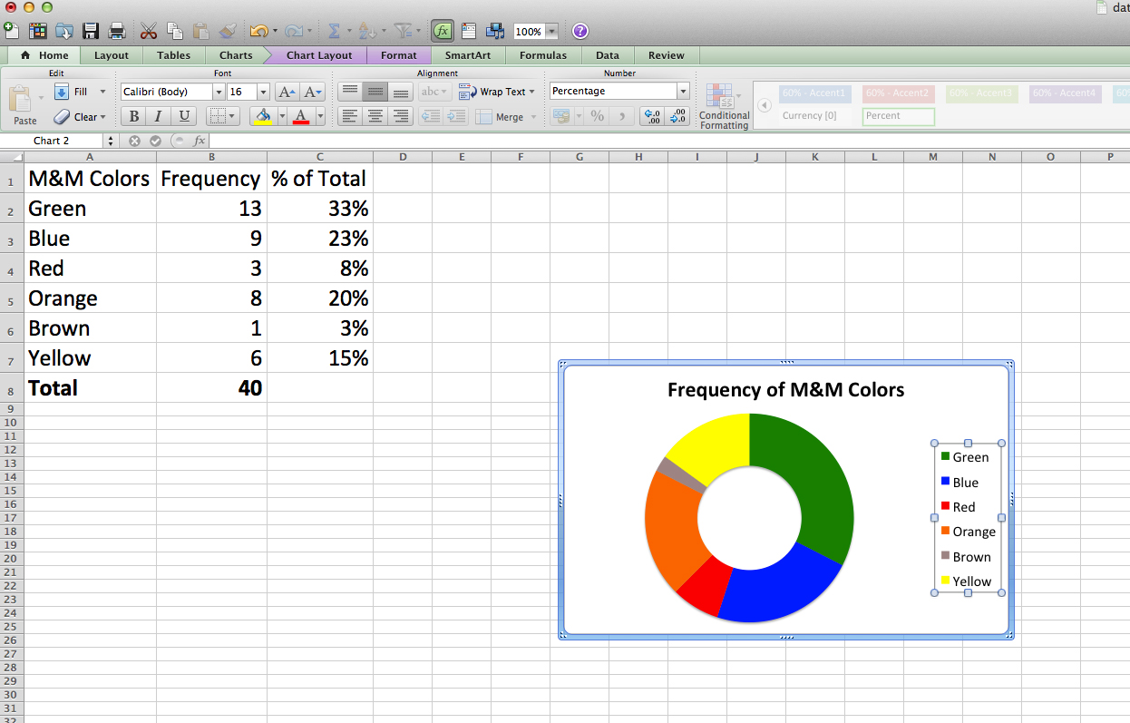
If you’d like to make your chart bigger, you and play with the height and width by hovering your mouse over any of the coroners until you see a double-sided arrow. When you click down on this arrow, you can now expand the chart or make it smaller. Now that you’ve made your chart bigger, you might notice that your Legend entry is a little too small now. To change this, click on it and then click on the Home Tab and under the Font category you can adjust your font size. This is also where you can change your font and the color of the font if you please. The same tasks go for the chart title. The first image is before, and the second image is after.
Add Details
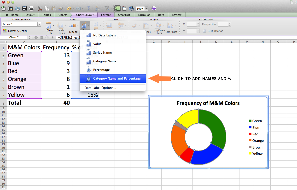
If you would like to be able to see the titles and percentages on your doughnut chart, click the Chart Layout Tab, Select Data Labels, and then select Category Name and Percentages. They now should appear on your chart.
WARNING: your labels and percentages on the chart might be too small to read. To fix this, go back to the Home Screen Tab and readjust your font sizes.
WARNING: your labels and percentages on the chart might be too small to read. To fix this, go back to the Home Screen Tab and readjust your font sizes.
Save
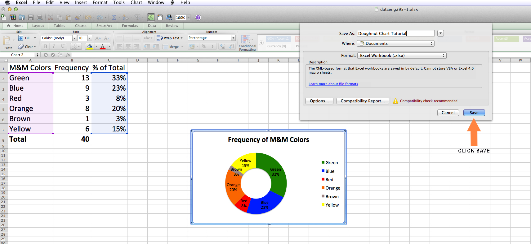
Once you are happy with your chart, Click File, scroll down to Save As, and type in a title for your work. We have chosen to call ours “Doughnut Chart Tutorial”. Then save it in any chosen file, and hit Save.
Video Tutorial
Below is the link to a video tutorial we created, so that you can watch the entire process of creting a doughnut chart.
http://www.youtube.com/watch?v=7odMTeQHNK4
http://www.youtube.com/watch?v=7odMTeQHNK4