Digital to Analog: How to Realize Data As Form
4436 Views, 105 Favorites, 0 Comments
Digital to Analog: How to Realize Data As Form
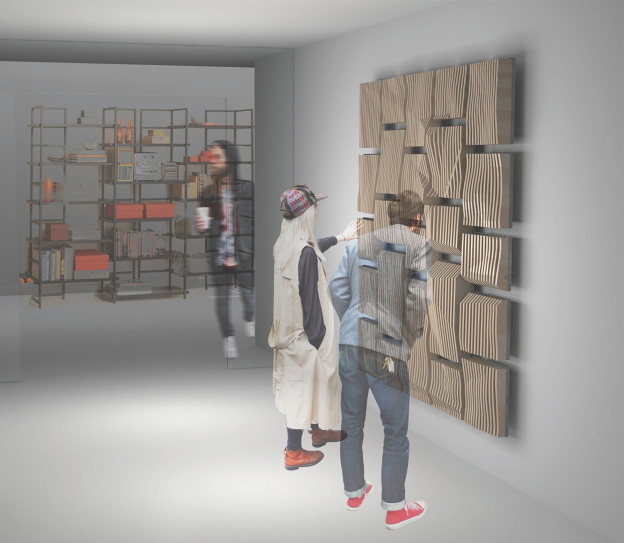
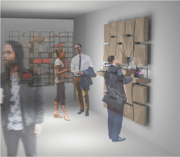
Data is everywhere! It’s the number of birds you pass out and about as you walk down the street, it’s the types of ice cream flavors people pick on a hot summer day, it’s all around the world we live. Data can be a quantity of specific things, it can be geospatial, it can be organized into categories, sometimes it cannot be organized into categories, it can even be qualitative. The point being, data is everywhere whether we see it or not.
However, here lies a problem. We often cannot see it! Most of the time, data is an intangible relationship or correlation between things. This means that while we may see the values of data, as tangible objects, the data itself, existing as an intangible collective, is invisible. So how do we make sense of data? How do we see and better understand this invisible world?
What you will need:
Your eyes to look at the world.
An interest, question, or problem you see around you.
A computer to collect and look at data.
Computer programs to model and visualize data (GIS, Grasshopper, Rhinocerous3D, Sketchup, AutoCad, etc.)
Building materials, depending on how you want to visualize your data.
Project Credits:
Alex Schofield
Kelsey Brennan
Chandni Sheth
Choose Your Data.
First step is to choose and find data. Sometimes it helps to start with a question. Why are there so many cupcake shops popping up in my neighborhood, maybe I should look at cupcake locations and wealth distribution in my city? Or maybe you simply have an observation. There seems to be a lot of crime in this area of my neighborhood, maybe I should make a map of crime locations? Whatever it is, simple or complicated, big or small, choose something and start looking for data!
Now its time to look for a set of data. Many people, government agencies, and companies are constantly collecting data which is often already organized for use. There is no need to waste a lot of time painstakingly collecting data when there is so much free information on the Internet. However, if you want, feel free to collect your own data. In fact, sometimes very specific and obscure data is not available or is private. But fear not, there are plenty of places to look online! Try looking at your local city, government, or simply do a goggle search. For example, San Francisco makes a large amount of its cities data free and available through SF OpenData at data.sfgov.org. You can also check out NOAA (http://www.ncdc.noaa.gov) for environmental data or USGS (http://www.usgs.gov) for geological and land data.
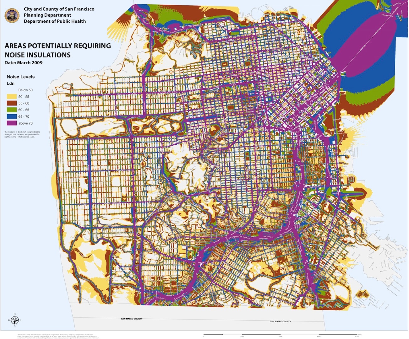
For my project, I chose to look at density and activity within San Francisco using a noise map provided by City of San Francisco’s Department of Public Health. The assumption is that places of more noise are places of greater activity, and thus a place of business and population. While this is not extremely precise, it would be otherwise impossible to map and pin point the locations of everyone and their activities at any particular moment.
Map It!
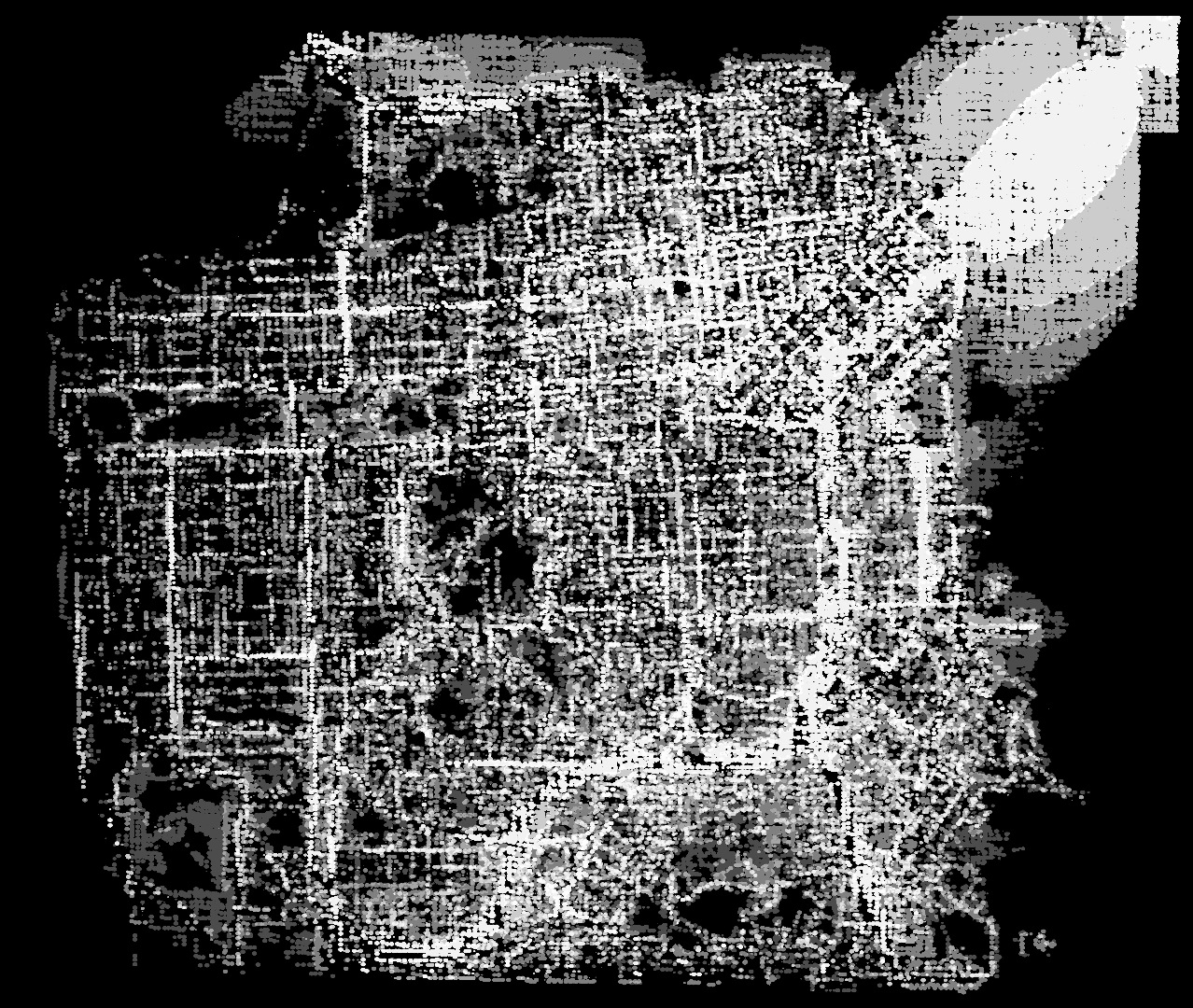
Now that you have selected and found a set of data, its time to map it! You may already have a map or may just have a spreadsheet of values. It helps to make a map which you can think of as an abstract instruction on how to read your data. Values often have points, X,Y,Z coordinates that might refer to a point in cartesian space or a geographical location. However, if you have data that does not have a location, that’s ok – a list or matrix will work too. Depending on your data, there are many ways for you to choose how it will be organized. But for now, try and turn you data into a map!
Programs like GIS, Geographic Information System, are great for making maps as they read lists and distribute data for you. GIS can be a difficult program to learn, however shapefiles (.shp is a vector data storage format for storing the location, shape, and attributes of geographic features) are free and readily available online. These files can be read by Grasshopper plugins such as Meerkat GIS, Localcode/Webfinches, Elk , or Heron.
For my project, I already had a map however I wanted to manipulate it so that it could be read a little bit more clearly. Often, leaving superfluous data out of your map, like too many specific pieces of information or lines, can make a map appear busy or unreadable. By synthesizing your data and map to its most basic core set of information your map can become more legible. In this case, I abstracted the map into a dot distribution map – a series of dots used to show a feature or phenomenon that often show spatial in density. The map was also turned into a gray scale so that the our eyes and the computer could more easily interpret the data in a more easily understandable value. Lighter colors being a higher value and darker colors being a lower value.
OPTIONAL: Compare It to Something Else.
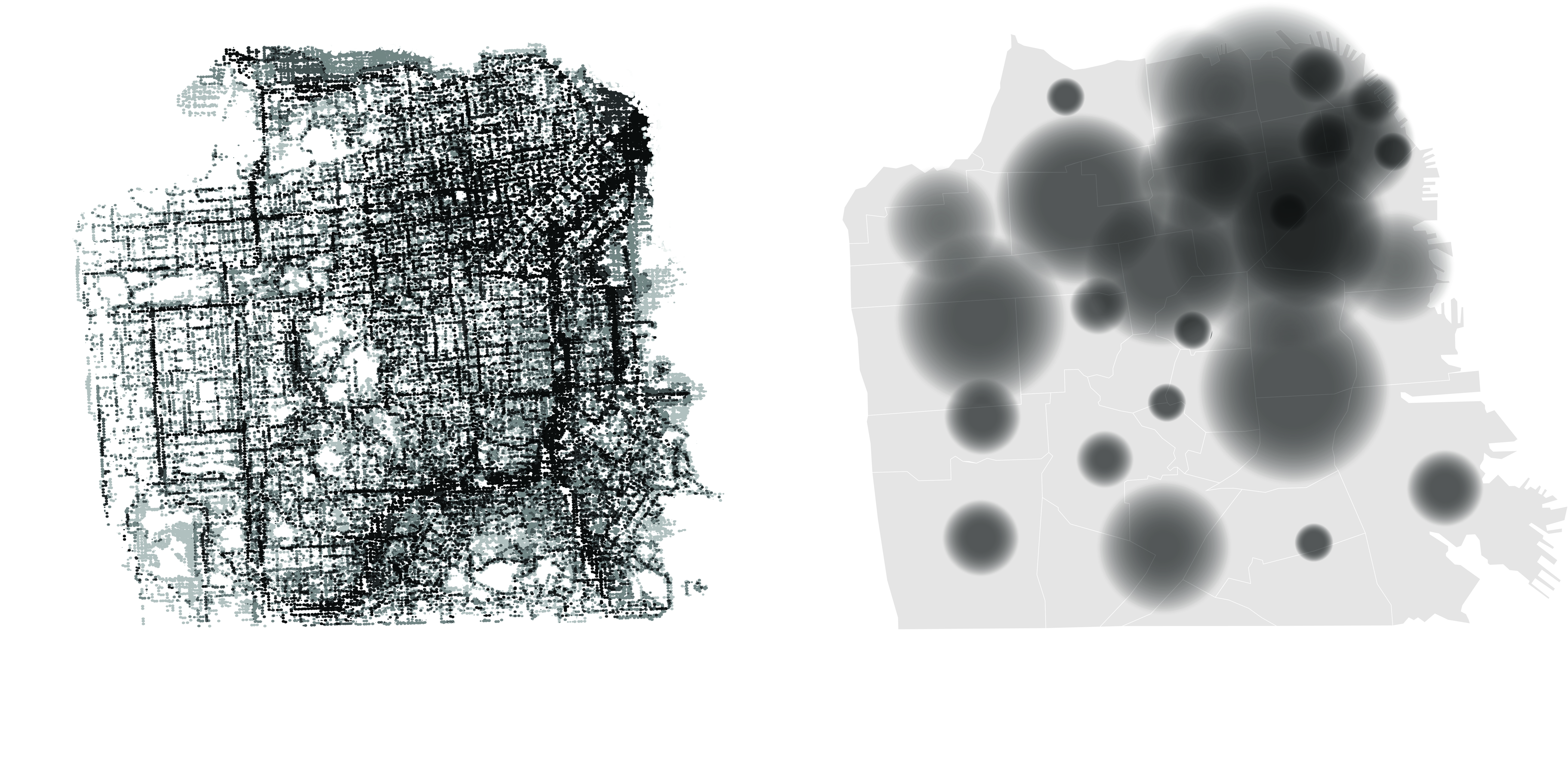
Sometimes it helps to compare our data against something else to find similarities or differences. While our data is valid in and of itself, meaning any set of data has something to teach us, we can often find new understandings or correlations when it is compared to something else. For example, if you chose to map out all of the cupcake shops in your city, we might learn more about why or where these cupcake shops are popping up with we look at local wealth distribution (income, property value, etc.), crime locations, or any other socio-spatial set of data. By comparing the two data sets we might learn that there are more cupcake shops popping up in wealthier neighborhoods, or that they crime occurs closest to them, or maybe you might learn that there is no correlation at all (which is still important to learn!). Check out this article here where Danya Al-Saleh looks at gangs and cupcakes in the mission district of San Francisco.
The point being that there may be hidden correlations or new interpretations of your data when you juxtapose or overlay a new set of data. Give it a try!
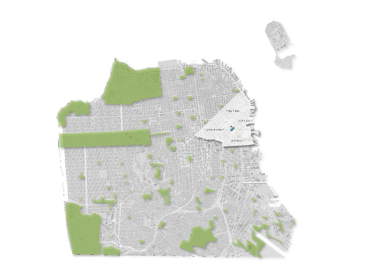
For my project, I wanted to look at a specific user group. This new set of data would tell me where these users are in relation to our already mapped understanding of density and activity in San Francisco. Maybe these users occur where there is most density of activity? Maybe in specific neighborhoods with no relation? The point of overlaying this new set of data is not specifically to make a new assumption, but to see what one might learn from location to location. I am open to thinking in a new way and to the possibility that my preconceived notions might not be what I realize. It is important to be open to new possibilities. I chose to represent the user group map by neighborhood as a point which is smaller or lager depending on the amount of users. The map is, again, gray scale so that it is consistent with the previous map. If you want, you can overlay your maps now using different colors, but for the sake of this exercise it is best to keep them separate. You’ll understand why in a moment!
Give It Form, Model It!
![3_18_data_diagrams final [Converted] copy.jpg](/proxy/?url=https://content.instructables.com/FWJ/8957/IDLNYZ2Q/FWJ8957IDLNYZ2Q.jpg&filename=3_18_data_diagrams final [Converted] copy.jpg)
Now comes the fun part, model it! We are modeling our data to give it form in order for us to begin to understand it better. By giving our data form by modeling it in the computer, we are one step closer to giving our intangible data a tangible form. When we model our data, all we are really doing is moving points around in space. I prefer to use the program Rhinoceros 3D, however you are welcome to use any other modeling software such as Sketchup, Modo, Maya, Vectorworks, Autocad, etc. Now you have to decide how to model your data. Do you want to connect points in space with lines? replace the points with shapes? Create a plane using the points you already have? Maybe you want to write some sort of scrip which takes values from your data set. Whatever operation you want to run on your data, do it now! You choose how to show your data through modeling.
If you chose to use two different sets of data now is the time to decide how you will incorporate each set of data. You overlay the two forms on top of each other which will create a new form based upon the merging of data. This way you could then choose whether to union or Boolean the too forms, essentially merging the too sets of data or selectively culling based upon form. Or perhaps you could write a script which would use the two sets of data to set the parameters for a form. Again, your choice whether to merge or cull pieces of the data. Whatever you choose, it is often most interesting to let the data determine the form rather vice versa.
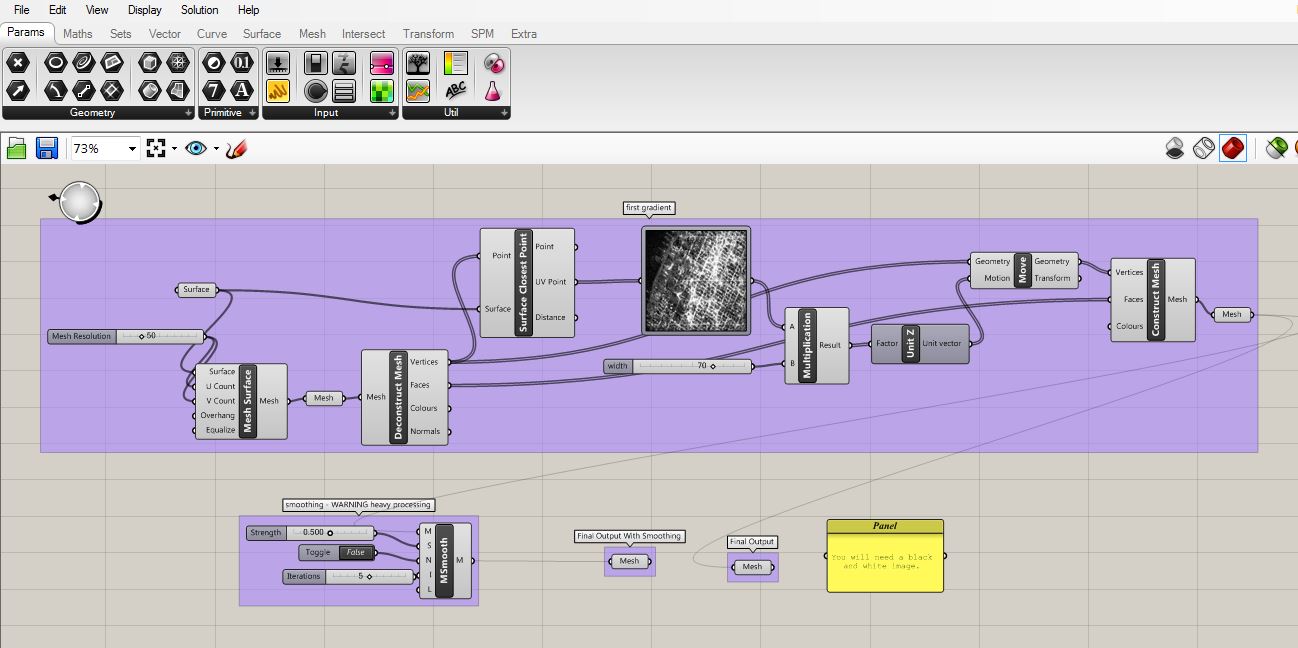
For my project, I wanted to create a plane or form which would have height based upon the value of data. For the first map, the density of activity, I used grasshopper to run a script which would the gradient value of each dot as a value and then move that point up, in the Z direction, according to its value. In such a way, I could generate a new landscape of San Francisco where areas of higher density of activity are high mountains and areas of lower density of activity are lower valleys. To make this form, I used an image sampler in Grasshopper which essentially use my gradient map as a bitmap to generate and move points based upon the images embedded values (which are derived from out data). For the second map, the user groups, I used Grasshopper again to extrude each point according the number of users the point represented.
Both maps create a series of points that are floating space at various Z heights, so we need to connect them all. I used a delaunay mesh, an operation to triangulate points resulting in a mesh surface, to generate each map’s data sets into a surface. The resulting surfaces were then extruded to a common base in order to give them both a point of reference. The two maps were then merged together in order to create a new form derived from the comparison of both maps. Thus, we can see from our new form where there are areas of either more users or higher density of activity or where the two merge. While we may have previously thought that areas of higher density of activity meant more people, and thus more users, what we learned was that there are perhaps higher density of users independent of activity. We can then zoom into certain areas, which create curious discrepancies, and try to understand more based upon that particular location in the city.
Now that your data has form, you have a new way to look at your data and thus more to learn!
Above is a sample picture of my grasshopper script for reference on how to use the image sampler as well as the attached Grasshopper script and Rhino file. Tinker around!
Choose How to Present It, How to Make Sense of Your Data's Form
Now comes the fun part, model it! We are modeling our data to give it form in order for us to begin to understand it better. By giving our data form by modeling it in the computer, we are one step closer to giving our intangible data a tangible form. When we model our data, all we are really doing is moving points around in space. I prefer to use the program Rhinoceros 3D, however you are welcome to use any other modeling software such as Sketchup, Modo, Maya, Vectorworks, Autocad, etc. Now you have to decide how to model your data. Do you want to connect points in space with lines? replace the points with shapes? Create a plane using the points you already have? Maybe you want to write some sort of scrip which takes values from your data set. Whatever operation you want to run on your data, do it now! You choose how to show your data through modeling.
If you chose to use two different sets of data now is the time to decide how you will incorporate each set of data. You overlay the two forms on top of each other which will create a new form based upon the merging of data. This way you could then choose whether to union or Boolean the too forms, essentially merging the too sets of data or selectively culling based upon form. Or perhaps you could write a script which would use the two sets of data to set the parameters for a form. Again, your choice whether to merge or cull pieces of the data. Whatever you choose, it is often most interesting to let the data determine the form rather vice versa.
For my project, I wanted to create a plane or form which would have height based upon the value of data. For the first map, the density of activity, I used grasshopper to run a script which would the gradient value of each dot as a value and then move that point up, in the Z direction, according to its value. In such a way, I could generate a new landscape of San Francisco where areas of higher density of activity are high mountains and areas of lower density of activity are lower valleys. To make this form, I used an image sampler in Grasshopper which essentially uses my gradient map as a bitmap to generate and move points based upon the images embedded values (which are derived from out data). For the second map, the user groups, I used Grasshopper again to extrude each point according the number of users the point represented.
Both maps create a series of points that are floating space at various Z heights, so we need to connect them all. I used a delaunay mesh, an operation to triangulate points resulting in a mesh surface, to generate each map’s data sets into a surface. The resulting surfaces were then extruded to a common base in order to give them both a point of reference. The two maps were then merged together in order to create a new form derived from the comparison of both maps. Thus, we can see from our new form where there are areas of either more users or higher density of activity or where the two merge. While we may have previously thought that areas of higher density of activity meant more people, and thus more users, what we learned was that there are perhaps higher density of users independent of activity. We can then zoom into certain areas, which create curious discrepancies, and try to understand more based upon that particular location in the city.
Now that your data has form, you have a new way to look at your data and thus more to learn!
Fabricate!
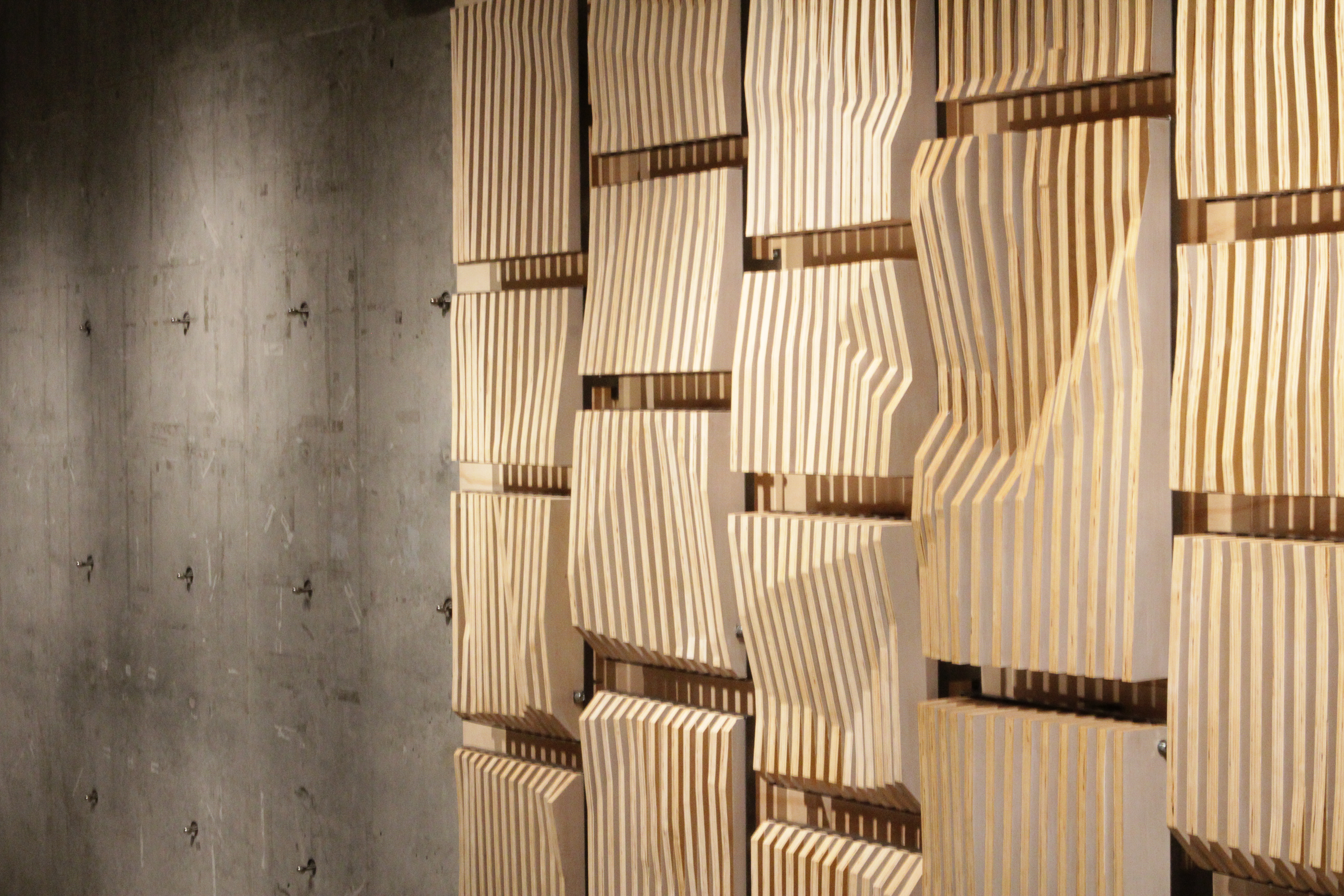

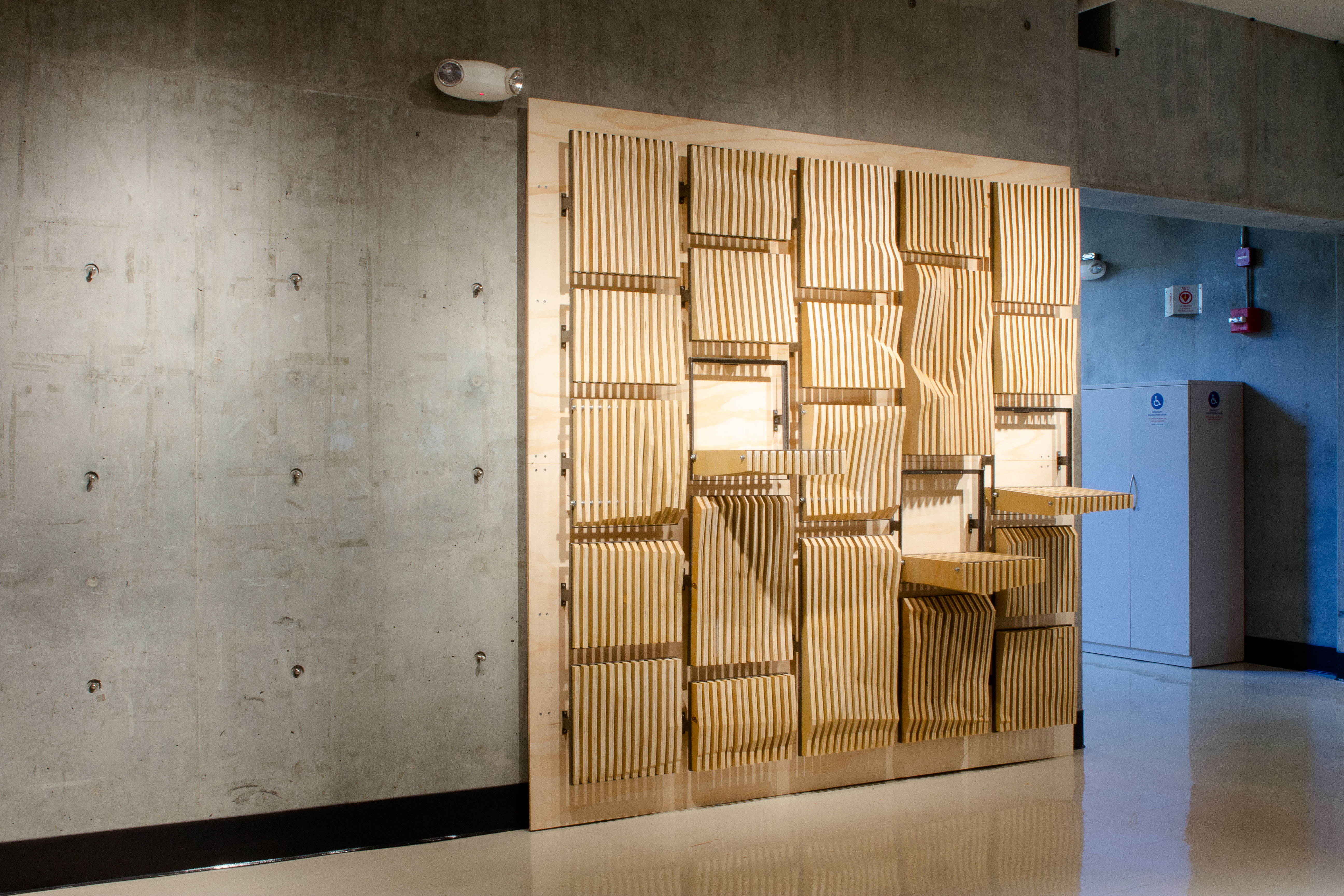
Now that you have a form, you get to decide how you want to represent it. This is the point where you get to turn you data into a tangible object. An object which will help to express the meaning or interpretation of your data through physical form – digital to analog.
You can cut it out by hand or with laser cutters, you can 3D print it, you can cut it out of wood as a whole or in pieces using a CNC router. You can fabricate your form however you want! One beneficial aspect about this method is that you have all of your data and form as a 3D digital file which you can use as a template for fabrication using digital tools. Tools such as the ones previously mentioned (laser cutters, 3D printers, CNC routhers, etc.) great to use because they can give us precision and detail that would take us significantly longer to fabricate on our own.
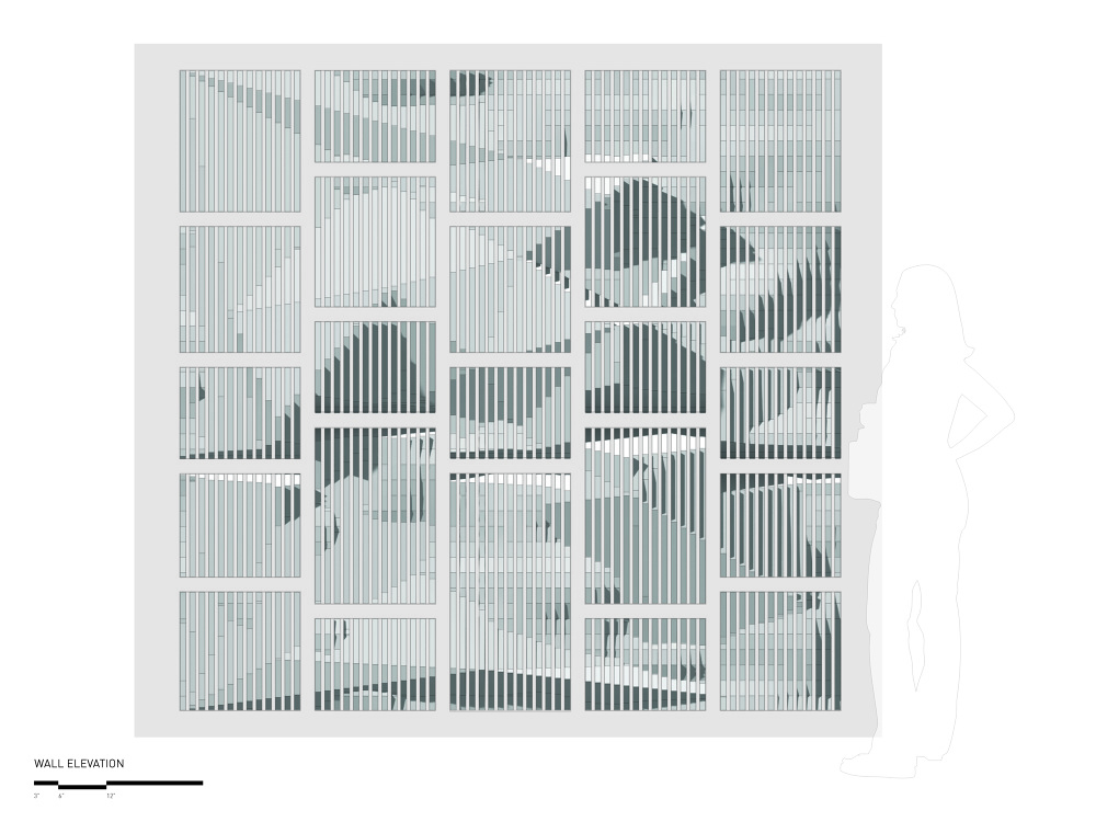
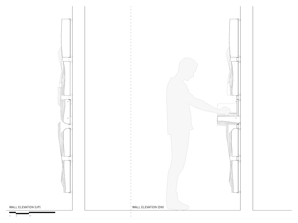
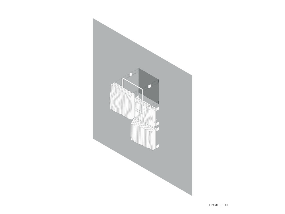
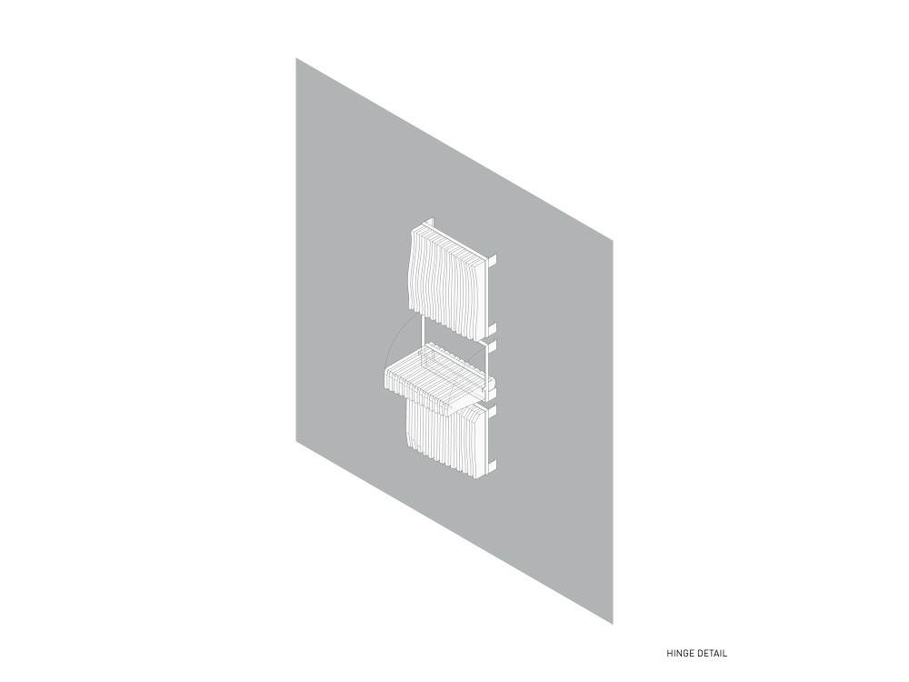
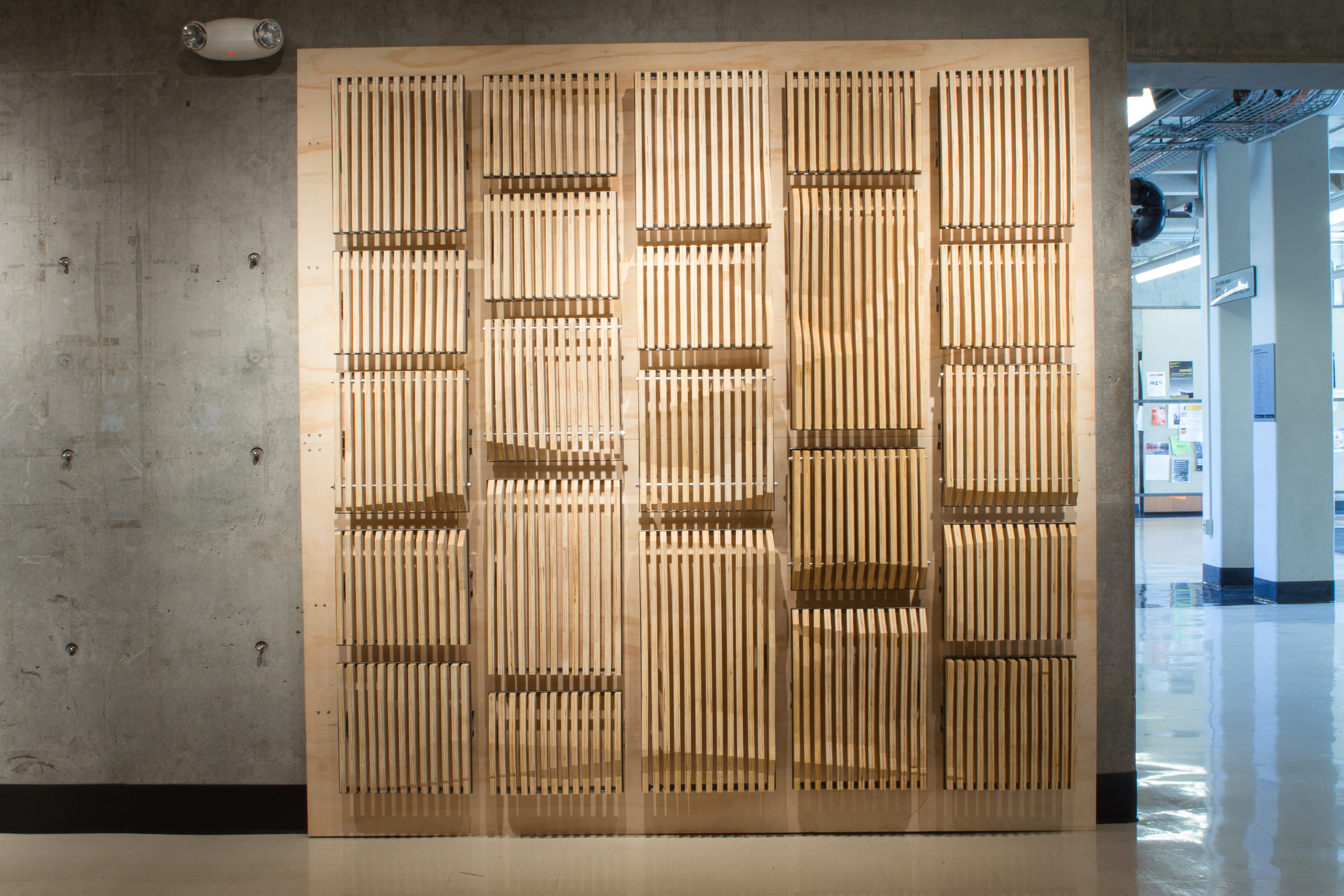
For my project, I chose to break the form into several vertical slats which act as section cuts to show the registration of two different sets of data. I decide this data would be best displayed sitting on a wall, so I organized it as a 7’x7’ vertical wall (7’x7’ similar to the 7 mile by 7 mile grid of SF). These slats where then further organized into shelves cut up by an aesthetic choice which would provide functional sizes for my intended wall. I thought it would be fun to make this an interactive installation so I designed a few of the shelves, one in every column making sure for them to have varying heights, to flip down. These shelves could then become space for people to work, rest their belongings, or even to create an informal meeting spot.
The fabrication mostly involved CNC of several sheets of plywood and welding together 23 unique frames in which to hold the wood slats and mount to the wall. Because I already had a digital file of my form, it was easy to measure the width of the plywood (3/4”) and choose a spacing (1/2”) so that I could properly cut my form into slats. I then organized and nested, for efficiency and so as not to waste material, a tool path of each slat so my CNC router could cut precise pieces. The wooden slats were then finished with a clear coat and a white pickling so as to distinguish both sets of data. The user group was white and the density of activity was clear coat, in such a fashion priority was given to the user group data that shows where it is greater or less than the clear coated density of activity data. Next, using Rhinoceros, I model frames to hold and mount the slats based upon steel metal sections (such as angles, channels, and bars) I could easily purchase locally at a metal shop. I made an inventory of the pieces I needed cut out base upon my Rhinoceros model, cut them out to their specific length, and MiG welded them together. As I was able to create a precise template for myself in the computer’s 3D model, everything fit perfectly and came together to create the finished wall. As you can see, I have taken intangible data and turned it into a tangible interactive form. Now you decide how you are going to turn your data into a form!