Digital Painting Lesson 2: a Feather
23765 Views, 21 Favorites, 0 Comments
Digital Painting Lesson 2: a Feather
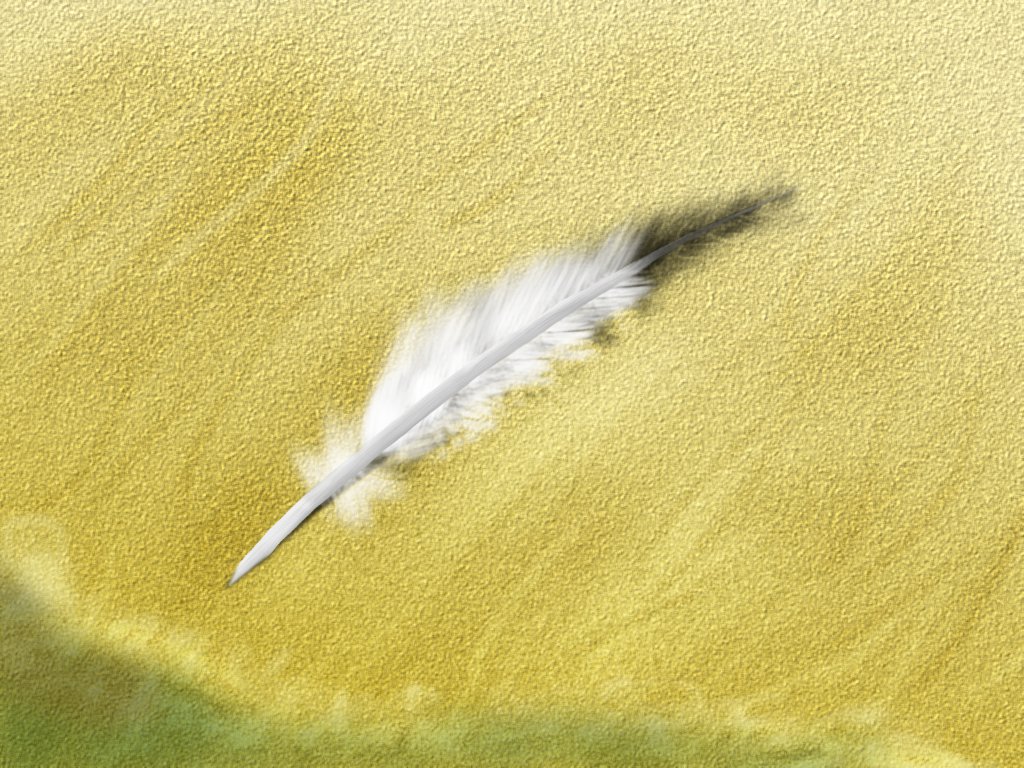
Computers have brought change to every corner of modern society. One of these corners is art. The internet is full of concept art, desktop wallpapers and many other kinds of image that have been drawn by some user at a computer.
When I bought myself a graphics tablet (roughly a week before this ible was published), I was dissapointed to find there are no beginner tutorials to digital painting. They either assume you have previous experience in some form of art (I suck at painting and drawing), or are so basic that they leave out the art.
So the aim of this little series of tutorials is to provide a few tutorials to teach people how to use their graphics tablet, but perhaps more importantly, leave the creative aspect in the drawers hands.
This is the second tutorial in the series. The first is:
Lesson 1: The graphics tablet.
The Magic of Digital Painting (tools, Requirements)
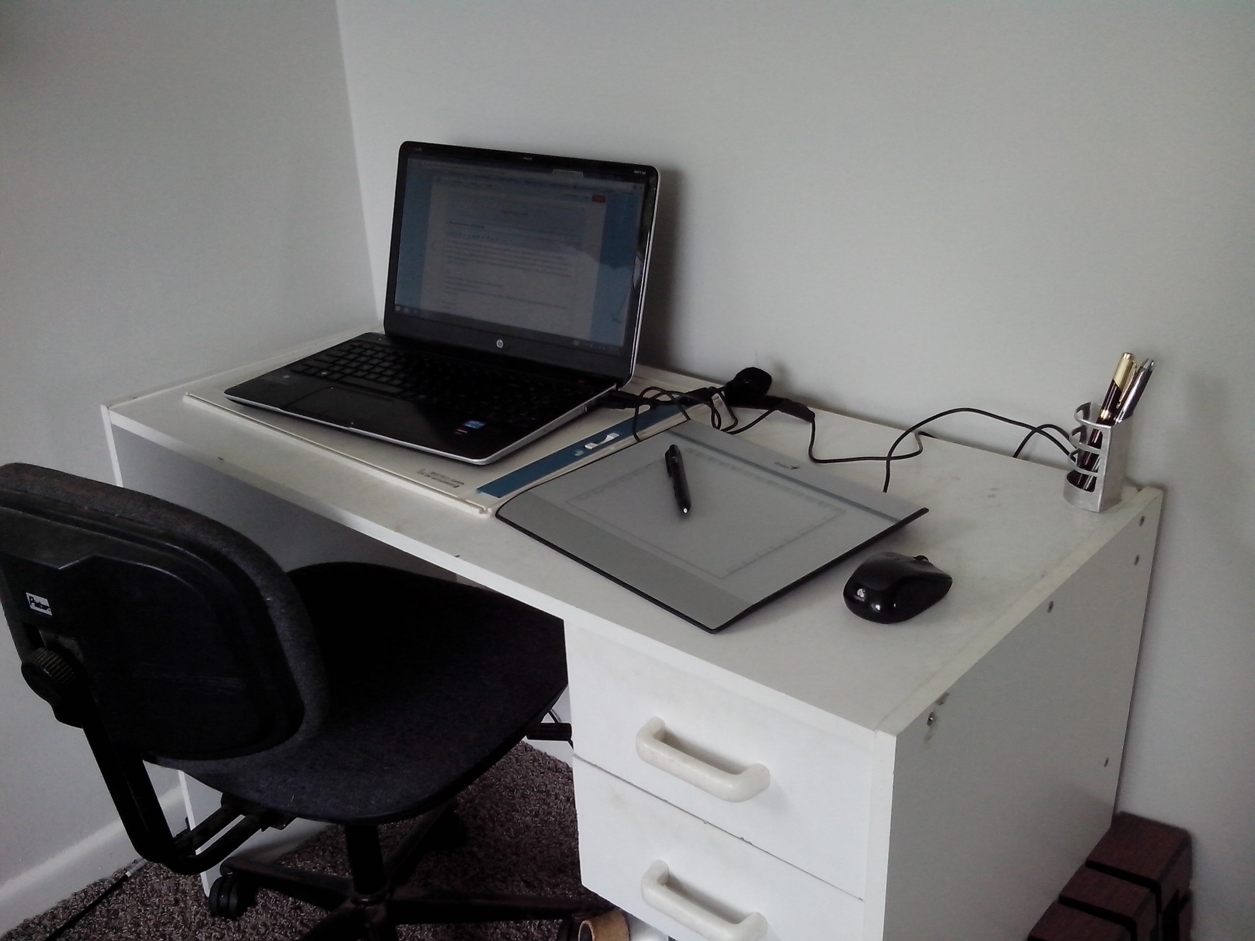
In traditional artwork, the artist has to draw every single thing, but in digital artwork, we are not constrained by physical tools. Through the use of various filters and brushes, what would have taken a painter hours, can takes us a few strokes of our digital pen. For this reason, I'm going to ignore software that focus' on emulating traditional media (eg artweaver) and instead use a digital image manipulation program. I'm cheap, and can't afford photoshop, so I'll be using Gimp.
Tools:
- A computer (with enough specs to run Gimp properly)
- A graphics tablet (with drivers etc)
- Gimp (or photoshop if you can translate to the tools there. Note that I'm using v2.6 because v2.8 has some issues with my tablet)
Requirements:
- An hour or so
- Some proficiency with gimp, or the ability to use google
- The ability to move your hand
- The ability to see what's on the screen
- Some creativity.
So sit down at your desk, get comfortable, put on your favorite music, and let's start.
The Feather
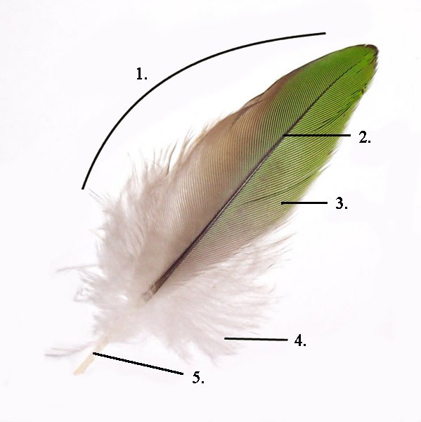
What is a feather? Well, it's the bit that falls of birds! Feathers seem to be made of fluff except for a spine of fingernail-like material running down the middle.
Wikipedia goes into a lot more detail, but we don't really need it. We can see that there are only a few things we have to draw:
A tapering cylinder for the spine running down the center (2)
The fluff at the base, (4)
The neat bit of the feather (3)
Part 3 and 4 are quite similar in structure
I don't know about you, but I don't want to draw a million strands of hair. This is where digital painting saves us. We can use brushes that are more than just a simple dot/line.
Making the Feather Brush
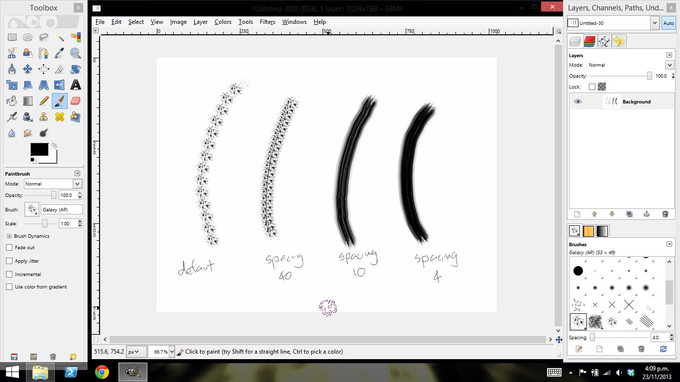
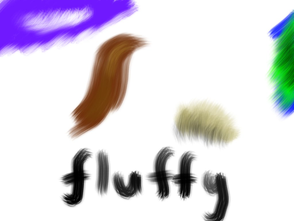
So what would make a while bunch of parallel lines like the fluff on a feather? Well, if we take a whole bunch of dots, and move them in a direction we will get lines!
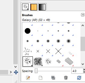
So in gimp, select a brush with lots of dots. I used 'Galaxy (AP)' and have no idea what that stands for!
The problem is that it's too wide, so go and tweak the spacing to bring it closer together.
I found a value of 4 was perfect. Have some fun drawing fluff!
So in gimp, select a brush with lots of dots. I used 'Galaxy (AP)' and have no idea what that stands for!
The problem is that it's too wide, so go and tweak the spacing to bring it closer together.
I found a value of 4 was perfect. Have some fun drawing fluff!
The Feather Part 1: the Vane
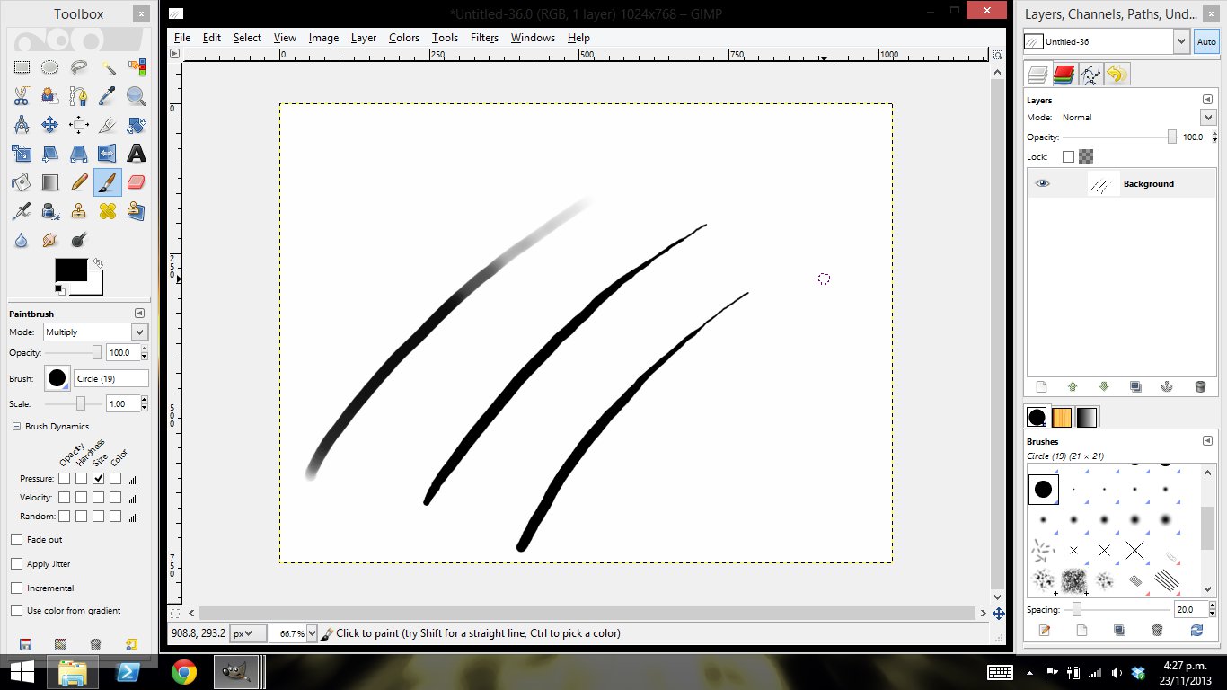
The vane of a feather is the hollow cylinder that holds the fluff together (yes, feathers are fluff in my world) If you went through the previous tutorial you should have a good idea on how to shade this, but there is another trick to show you.
By default, the brush will change opacity based on how hard you press. The vane of the feather tapers, so it is a good idea to change this so the size of the brush changes based on pressure. In Gimp this is as easy as checking a check-box in dynamics options (the screenshot is gimp 2.6. In gimp 2.8 you have to open the dynamics options dockable dialog)
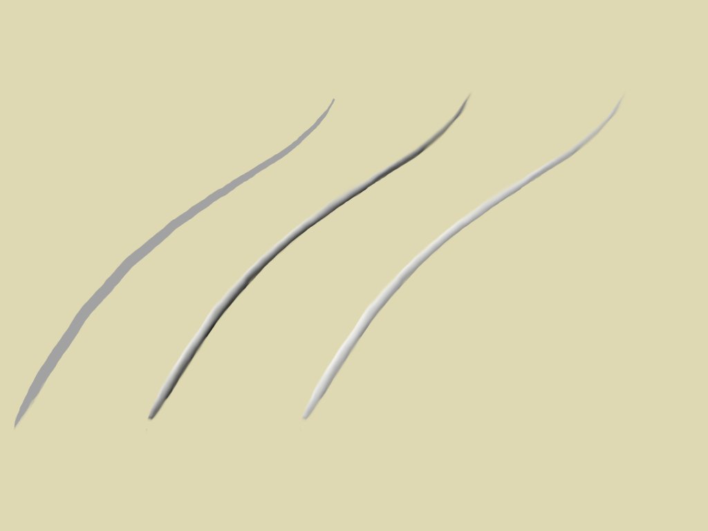
Create a new layer, called something like 'Vane' and on it draw the best taper you can (hint, it's easiest from the small end first. You want this to be a medium-grey, though we'll work on the color later.
Shade it so that it appears round. I do this with a brush set to 'hard light' as described in the previous tutorial.
Then tweak the brightness contrast to make it appear white. It's a good idea to give it a roughly sand-colored background so you can look at it in the right environment.
The Feather Part 2: Fluff
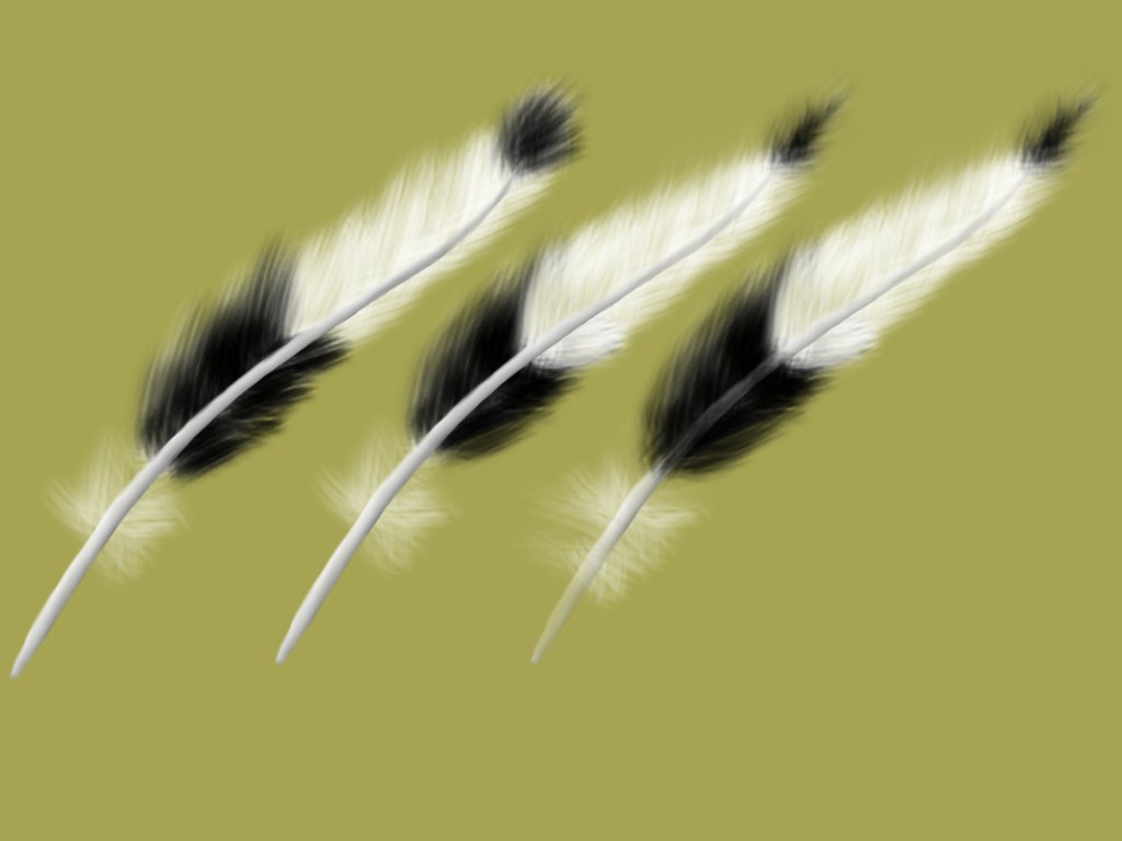
Time to add the fluff. So grab the brush we tweaked earlier, and draw it on. If you draw it on a separate layer, you can put it behind the vane, so you don't have to worry about overlap.
It is worth noting that using the erasor with the same brush will erase it without ruining the fluffy look. I find this helpful for the narrow end of the feather, so you can make them too long, and erase them to the right length.
After you have the fluff to your satisfaction, color in the vane so that it fits as well. I also made my vane slightly transparent, as they often are.
If I were doing this with real pen and paper, I would have given up half-way down one side of the feather, but because we are painting bristles by the hundred, it's very quick.
The Environment (A Beach for Me) Part 1
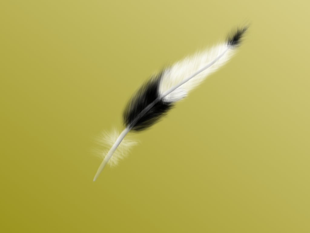
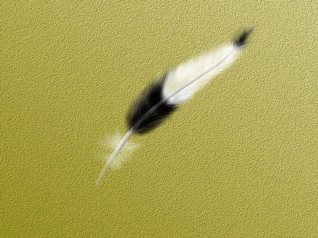
I wanted my feather to be in a natural situation, and the place where I find feathers is the beach! So we need to make sand.
On paper, this would take hours, but with a few helpful filters we can get the computer to do most of it for us.
First, the base colors. Sand is not a consistent color. In some places of the world it is white, in others it is yellow as anything. But in all cases, it tends to have a slight gradient from wet to dry. So grab out the gradient tool, and make it slightly darker in the bottom corner, as this is where our water is going to be. On a new layer, generate some noise. In the gimp I used Hurl noise. Use this layer and the bump-map filter to make the sand grainy. Tweak the opacity on the noise layer and merge it down to give the sand some color variation.
The Beach Part 2
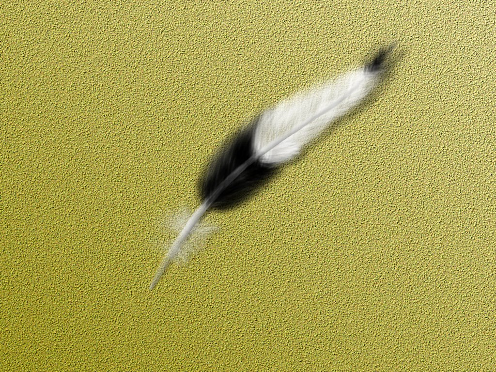
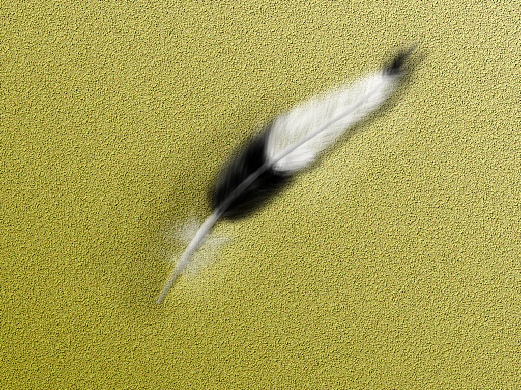
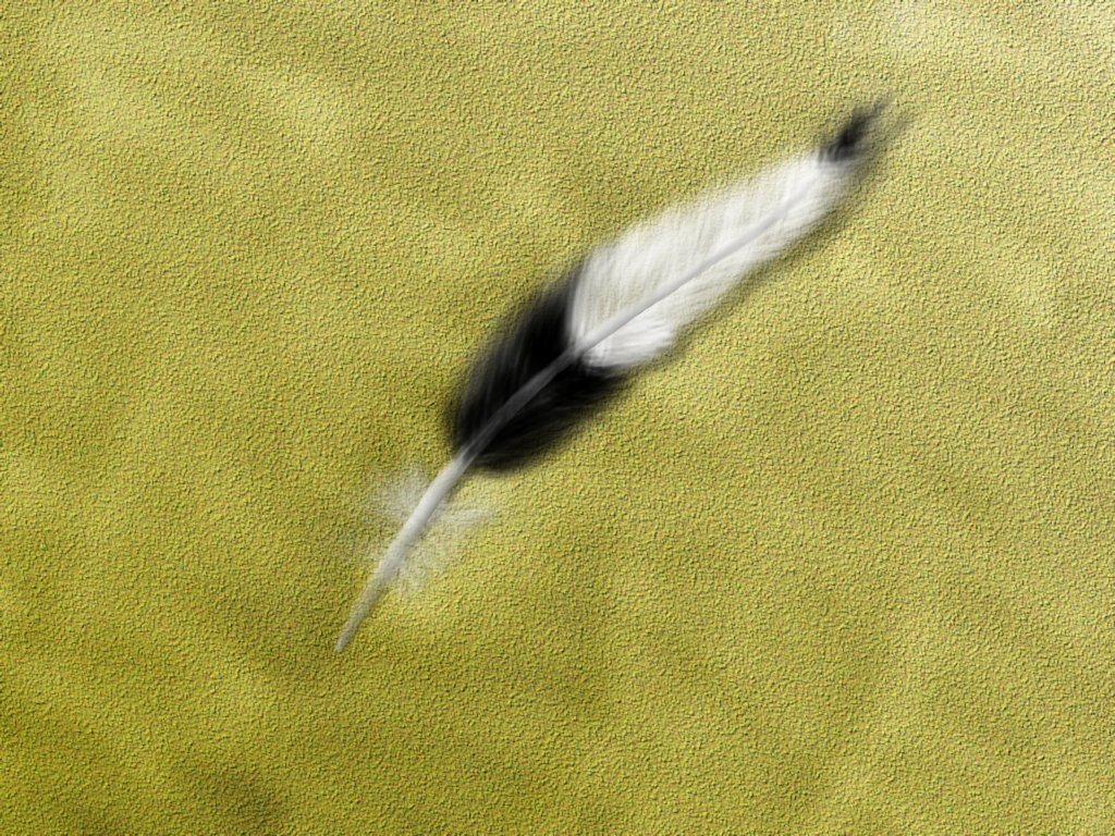
Our feather is currently looking out of place on the sand, as though it doesn't really fit.
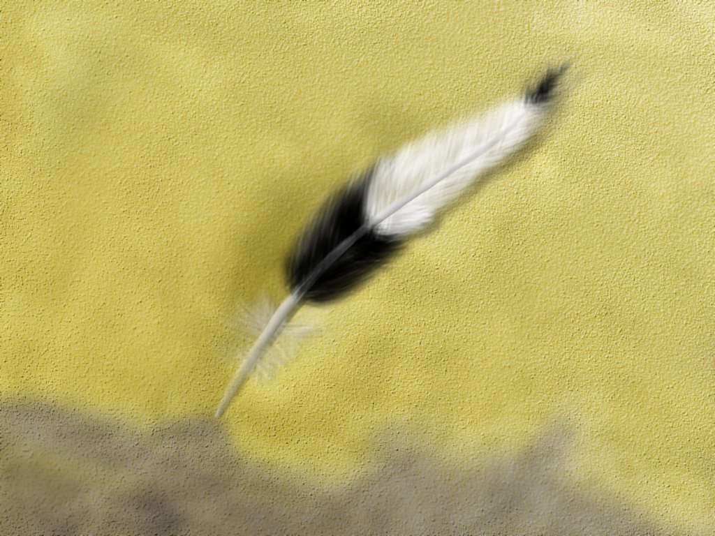
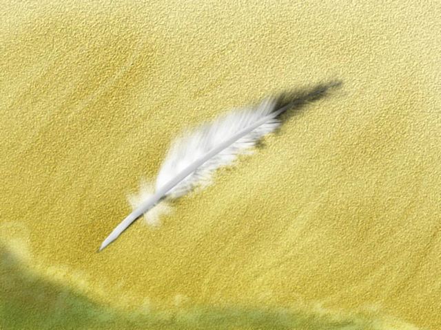
There are a few reasons for this. The first is lack of a shadow. Because a feather is flat, we can just duplicate the feather, make it black, blur it, and tweak the opacity.
The second reason is because it does not interact with the environment. The feather will make an indent in the sand. So, bearing in mind the position of light you used for making the feather vane, shade the sand to make a small depression around the feather.
I do this on another layer using 'Grain Merge' and either a white or black brush.
The sand is not smooth everywhere else though, so also add in general ridges and bumps. Dont' go over the top with this. I did a few too many on the image I was working on here.
The Beach Part 3: Water
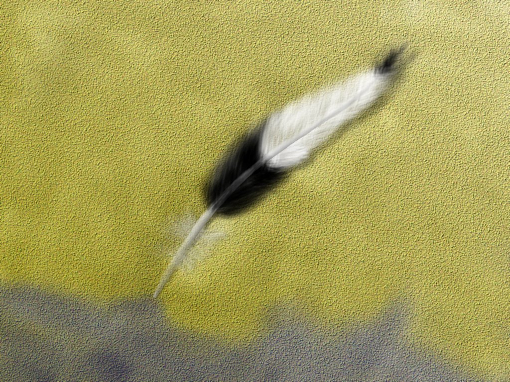
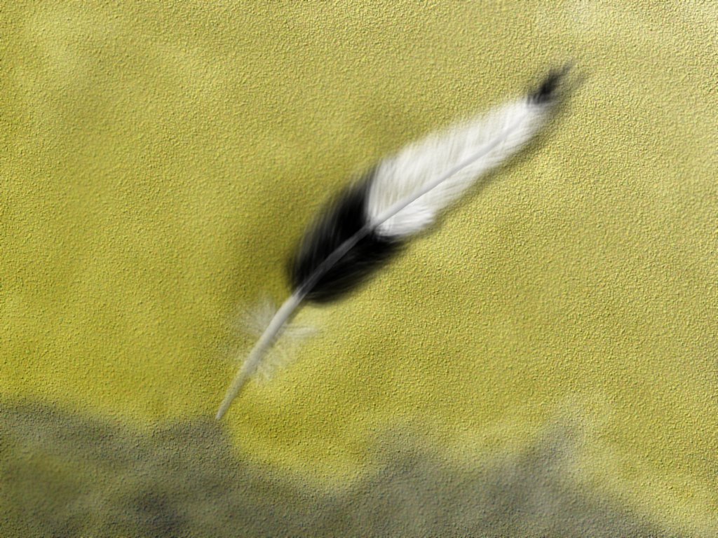
The feather is a bit lonely, and needs something to accompany it. So I chose to add some water. As per normal, do it on a new layer.
The water itself was done with a dark blue brush, and the layer was set to grain merge at a lowish opacity.
Another layer was created for foam. This was drawn with a white brush, and the layer then set to grain merge.
Colours were then tweaked to create something I was happy with.
I'm still not too happy with how the water came out. If anyone has better ideas about how to do this, please tell me.
What to Take From This Ible
Sure, you can go through this ible doing exactly what I did, but then you wouldn't be learning would you? So here are a few things to realize:
- Working on different layers makes it easy to edit things later
- When you want layers to be applied over another layer, but not overwrite it completely, use grain merge
- When you want a layer to shade another, use hard light
- Think about how your object interacts with those around it
- Use technology to make your life easier. Don't do all the strokes by hand, get the computer to make things look more complex than what you put in.