Delaunay Mosaics
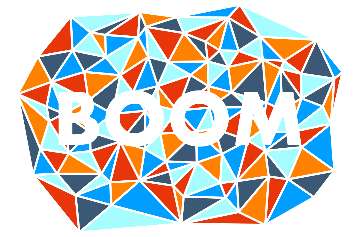

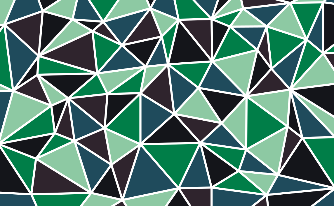
Art can inspire powerful emotions. Math can provide powerful answers. Combined, they can create something calculated and precise, yet poetic and beautiful. In in this case, a supernatural force of nerdy, quirky goodness that I like to call a Delaunay mosaic.
I have seen similar patterns out there (and there may already be a name for this technique), but when I first decided to try to make my own I was at a bit of a loss. This tutorial will describe my method for producing these pieces, and leave you with one of your own to use as you please.
These patterns are fun to use as a background or fill for text in other graphic design projects, or simply on their own. They are also very simple to produce using some handy tools in Inkscape.
More than anything, I hope you will share in my appreciation for math-based art and how fun it can be ;). Let's get going!
The Man, the Myth, the Legend
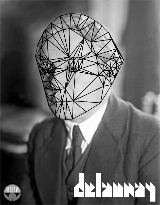
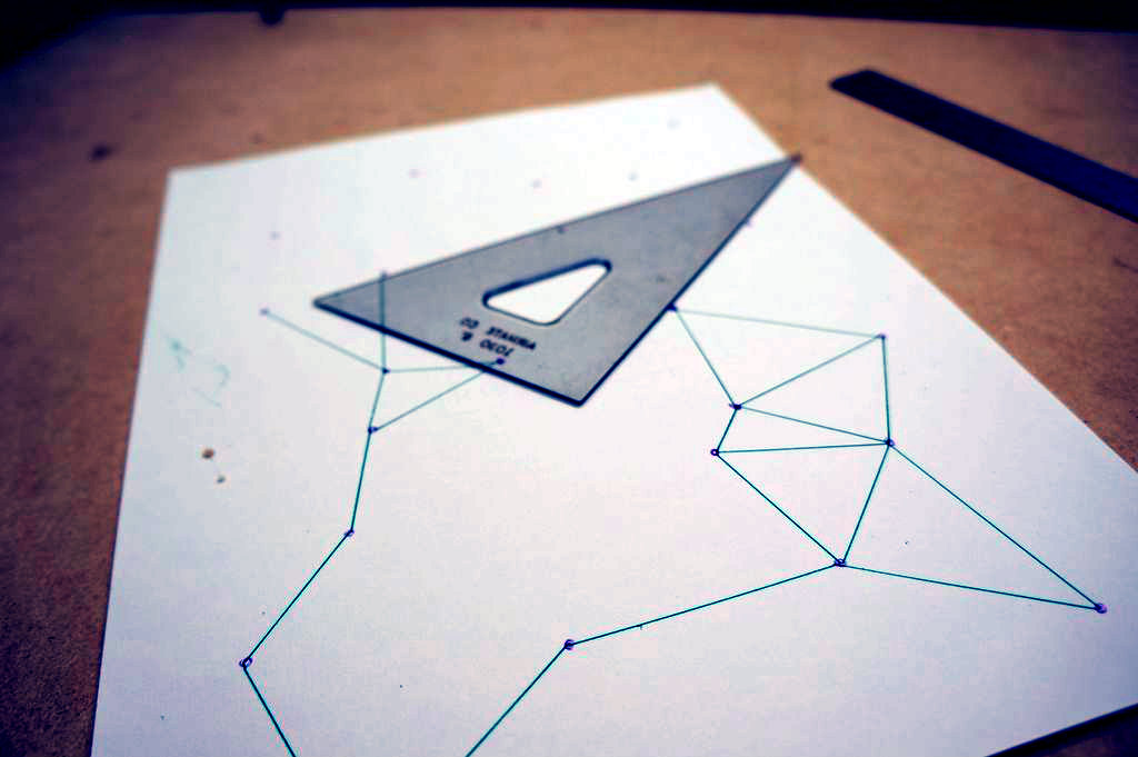
In a recently published Instructable, I talked about Voronoi diagrams and how a major step in creating them is drawing a Delaunay triangulation. There is a great overview of both methods in Step 2 there, but all you really need to know here is that a Delaunay triangulation is a mesh of triangles that connect all of the nodes on a plane to their nearest neighbors.
In the other Instructable you will also find some history on the men behind the aforementioned methods, Boris Delaunay and Georgy Voronoy. However, today the spotlight is on Delaunay. Briefly, and for posterity, he was a student of Voronoy, a Russian mathematician, and a pro mountain climber.
Yes, you read that correctly. A mountain climber. Sounds like a pretty cool dude! Let’s show him some love with this design!
If you are interested, I have included some links so that you can read more on him and the diagrams that bear his name.
A Byte Sized Toolbox


Resources needed to complete this project are very minimal. All you really need is Inkscape (Version 0.91), a free vector graphics program similar to Adobe Illustrator. You can download it here.
I suppose you could do this in Illustrator as well, but I am not going to cover that since Inkscape is open source and available to everyone. There may also be a few plugins out there that greatly automate this process. Feel free to mention any that you have heard of in the comments.
For this tutorial I will assume that you have a basic understanding of Inkscape and general vector graphic design terminology. However, since Inkscape is a big program that can be overwhelming, I have made it a point to try and include any applicable keystrokes to make finding things easier. For example: Use the paint bucket tool (Shift + F7) to color in your triangles.
Array and Spray
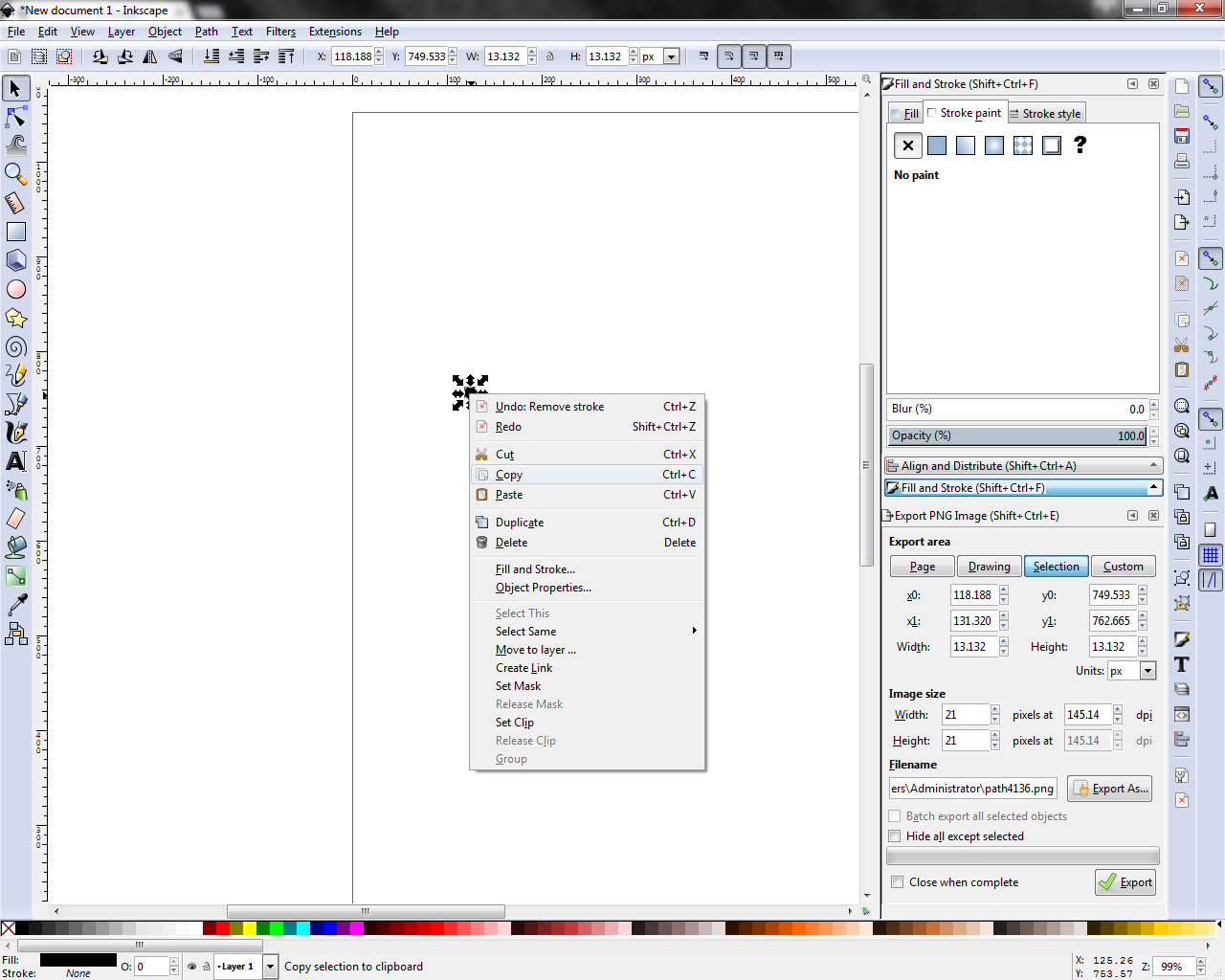
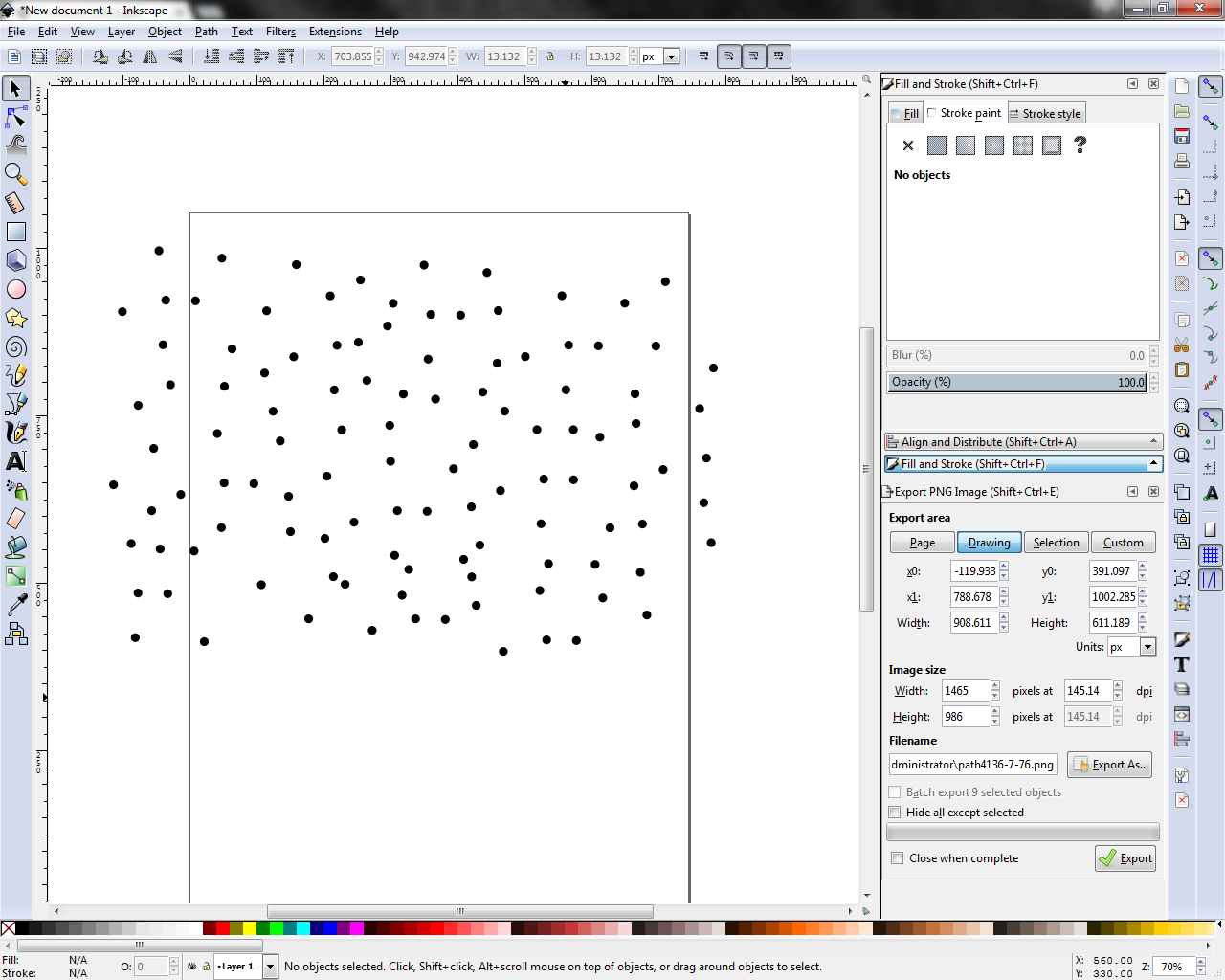
Begin by building an array of dots (or any other shape) on the canvas. The dots in this array will serve as the nodes for your Delaunay triangulation. To create a dot use the circle tool (F5).
PRO-TIP #1: Hold down Ctrl as you draw to create a circle.
This is one of those steps where randomness is encouraged, so go wild! Understand that closer node placement will result in a tighter mesh with smaller triangles, while distant nodes will produce larger shapes.
PRO-TIP #2: Copy/Paste is your friend. Draw one dot, copy and paste it a few times, then select/copy/paste all of those dots. Adjust as needed later. This will speed up the generation of your array significantly.
The Triangulator
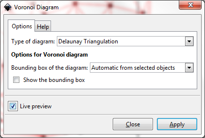
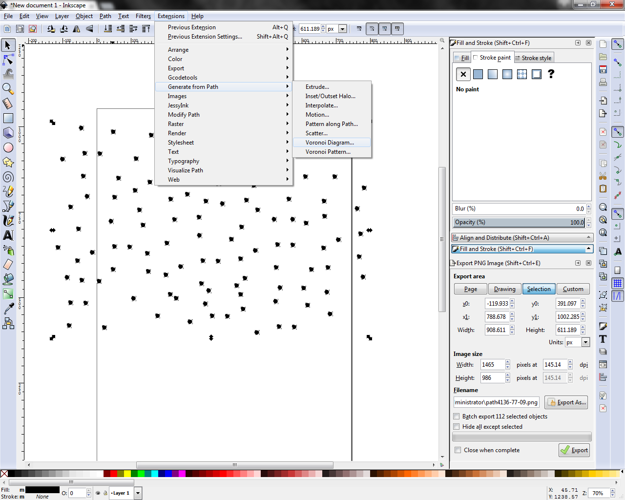
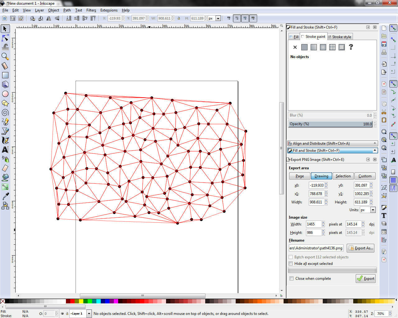
Select the entire array of nodes you drew in the last step. With everything selected, open the Voronoi Diagram tool by going to Extensions > Generate From Path > Voronoi Diagram.
In the tool menu that appears, select the following options:
Type of diagram: Delaunay Triangulation
Bounding box of the diagram: Automatic from selected objects
Show the founding box: Unchecked
Live Preview: Checked (optional). This will let you see what you are getting before you actually create anything.
Press Apply to create the paths in the triangulation.
Housekeeping
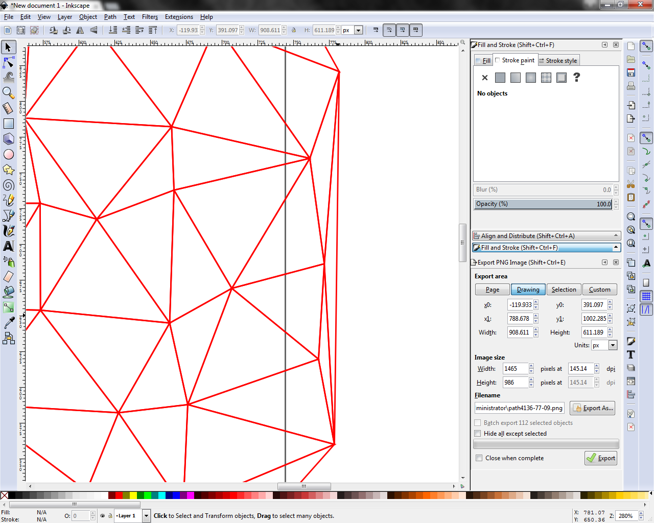
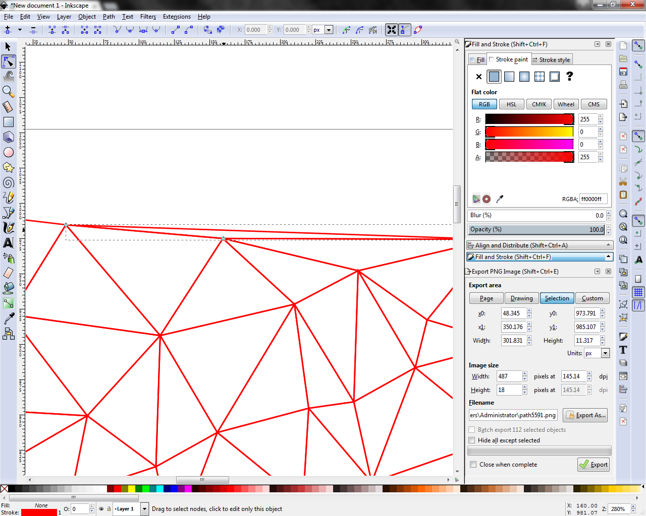
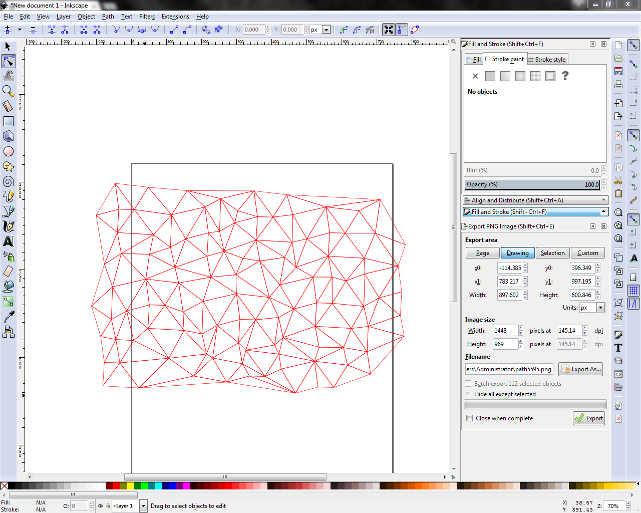
Inevitably, there will be some nodes in the extremities of the array that produce some long, narrow triangles. From an aesthetic standpoint, these are not particularly desirable so we will get rid of them here.
Use the path tool (F2) to select individual triangles and the general selection tool (F1) to delete them. Sequence works like this: F2 > Select triangle > F1 > Delete. Repeat as much as necessary until the you are satisfied with the overall mesh.
Palette Jack
Once your triangulation is on point then we can start working on the fun stuff. Coloring!
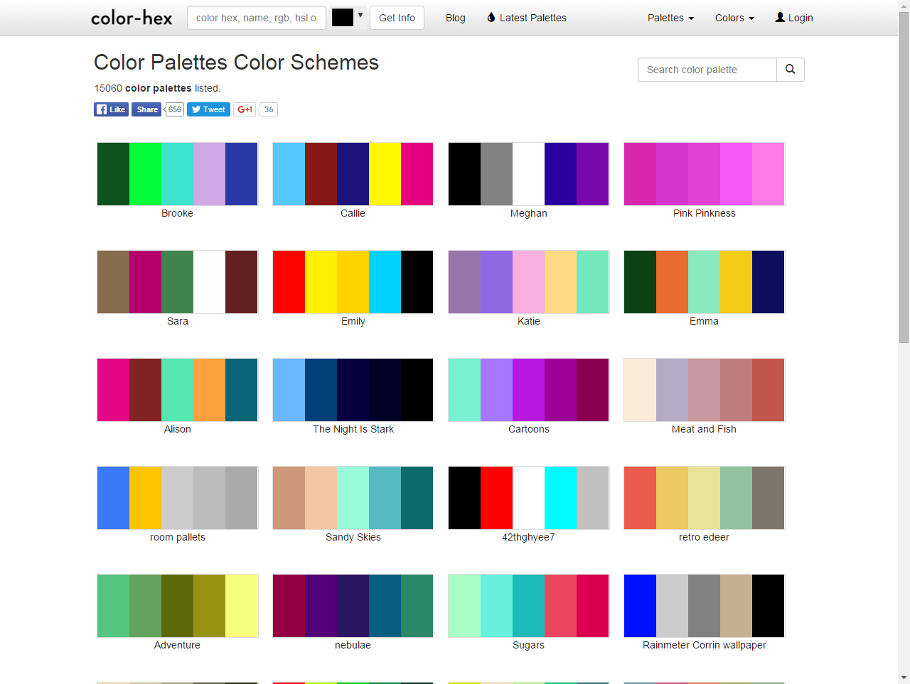
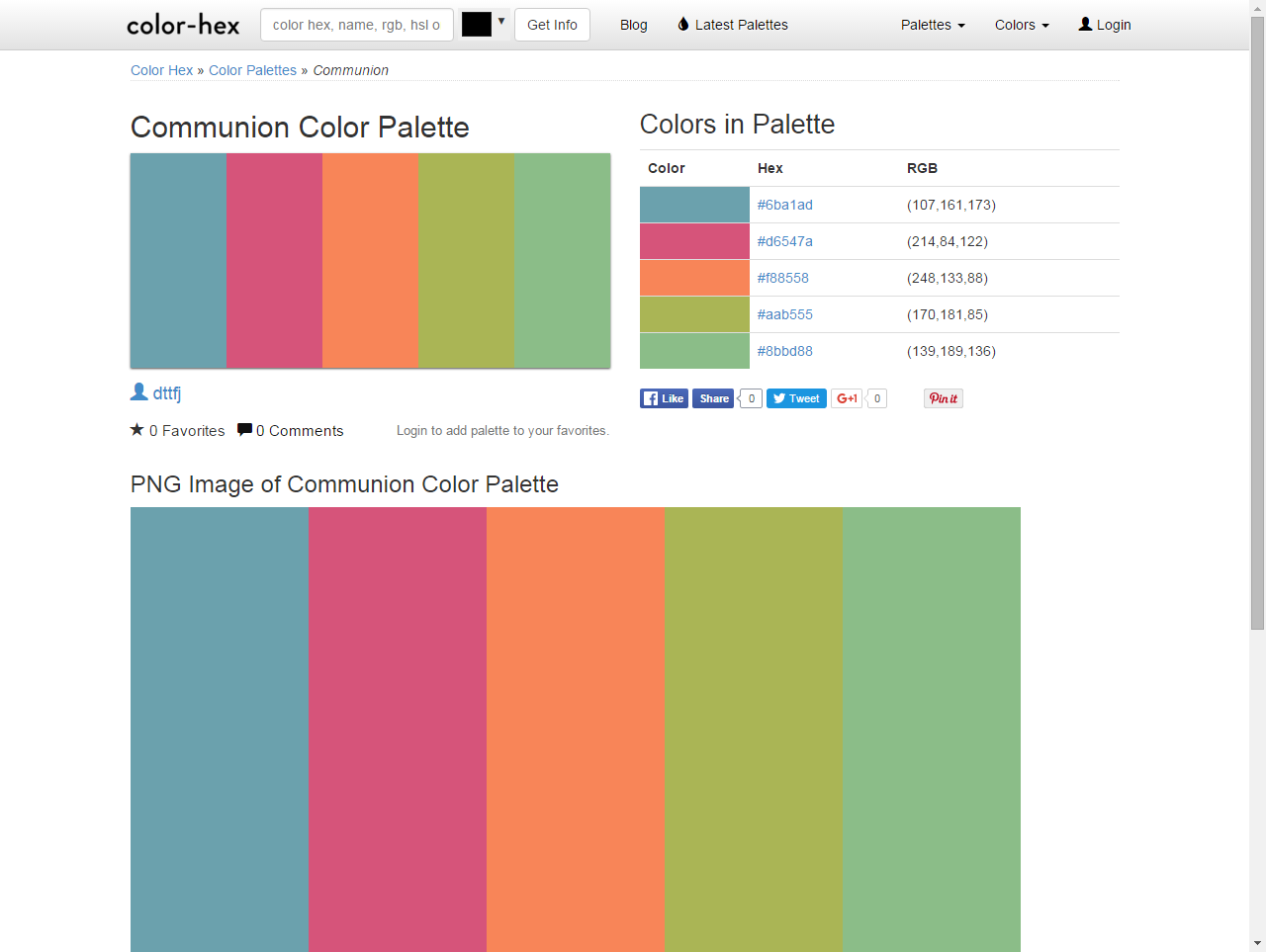
There are many wonderful resources out there when it comes to choosing color schemes and palettes. A favorite of mine is color-hex.com, which offers a near endless list of complementary colors, monochromatic shades, hex color codes, etc.
Most useful in our current endeavor is a collection of user-created color palettes. To access these click on the link in the upper menu or that I have provided here.
Of course, there are no wrong answers here so have fun choosing a palette that meets your individual needs or tastes.
Count on a Math Problem
We could just dive right into filling the shapes right here, but I'm way too analytical for that...
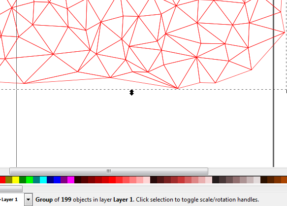
In order to get the most homogenous blend of colors in your mosaic, we need to calculate what that even means. To do so, select all of the triangles in your mesh using the selection tool (F1) or by clicking a single triangle, right-clicking, and pressing Select Same > Fill & Stroke.
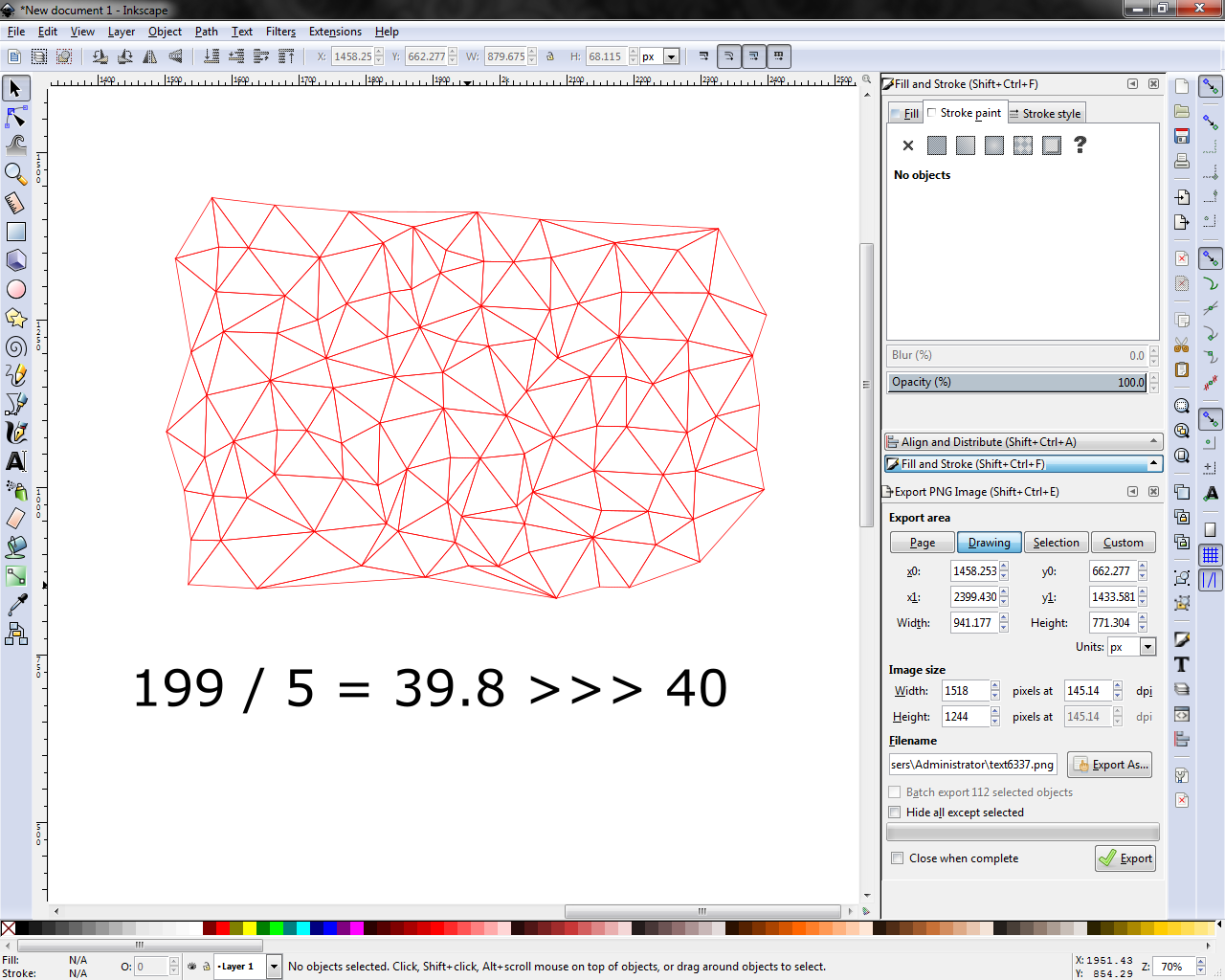
The total number of selected objects is displayed in the lower toolbar of Inkscape. Take this number and divide it by the number of colors in your color palette (that you plan to use), i.e. 199 / 5 = 39.8 >>> about 40 instances of each color. This is our magic number.
Pretty Colors
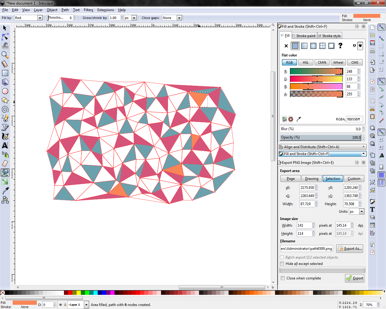
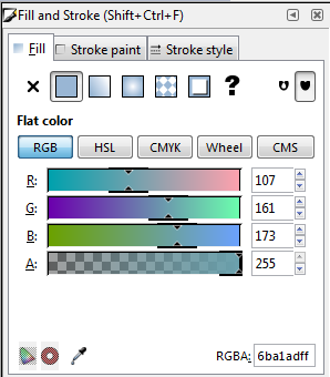
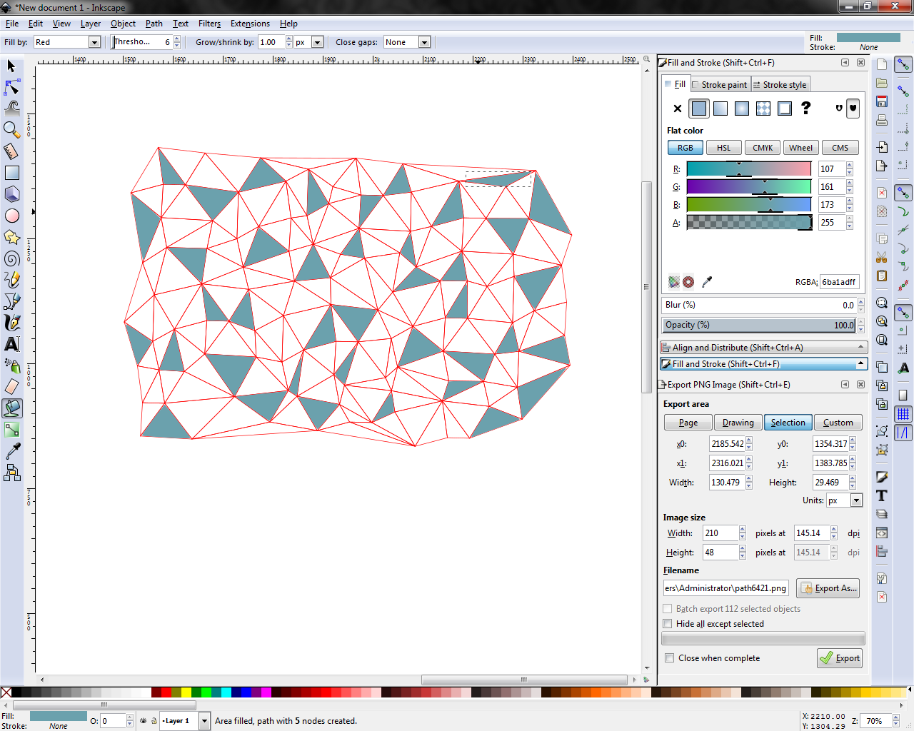
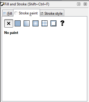
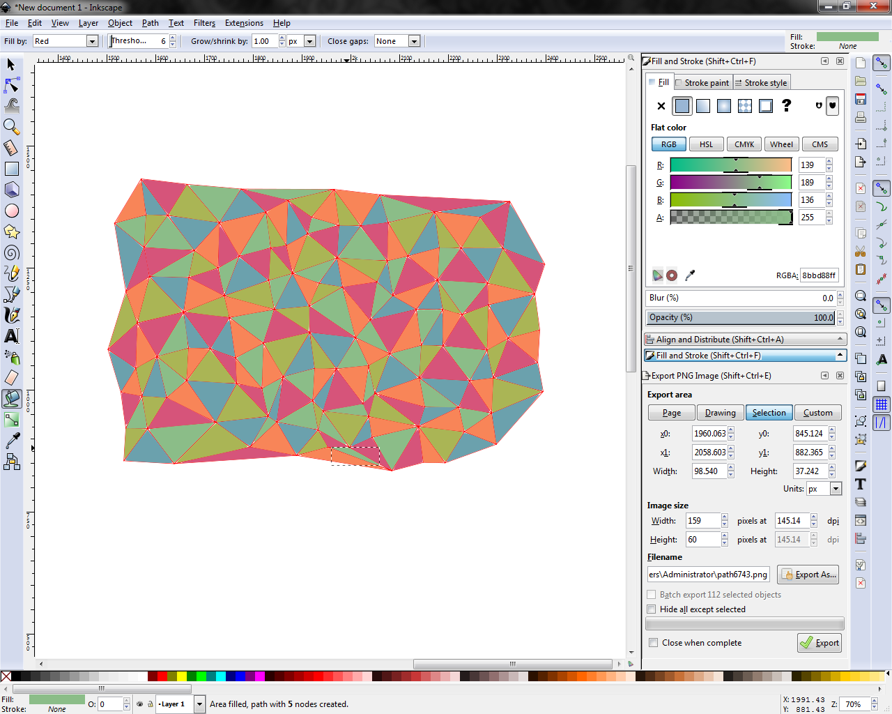
Finally, it's time to lay down some colors. Select the paint bucket tool (Shift + F7) and go to the fill/stroke settings menu (Ctrl + Shift + F). Disable the stroke and set the fill color to the first color on your color palette.
PRO-TIP: Use the hex color input ("RGBA:" input box in bottom right of Fill/Stroke menu) to specify your fill colors instead of the RGB boxes (or CMYK, or whatever you're using). The hex color code is a single six-digit alpha-numeric string so you will only have to copy/paste it once instead of 3-4 times. In Inkscape you will see eight digits in the input box. The last 2 are the alpha channel (transparency) value. Leave them set as "full" = 255 = "ff" :) code is fun.
Use the paint bucket to fill up the number of triangles you calculated in the last step. Be as random as possible, and avoid placing the same color next to itself.
Repeat this for each of the colors in your color palette.
Dial It In
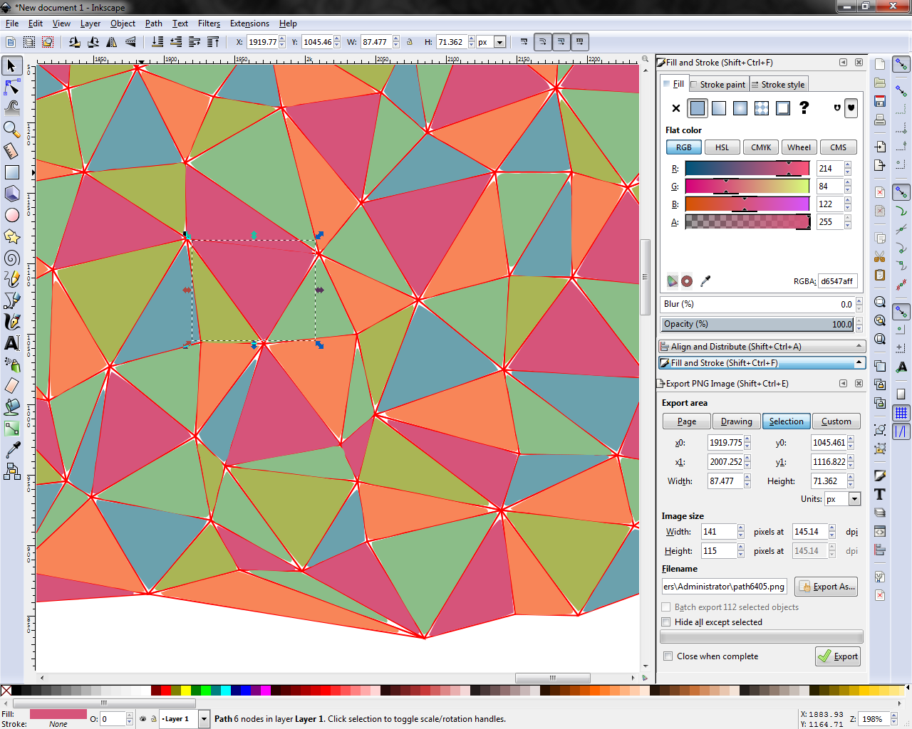
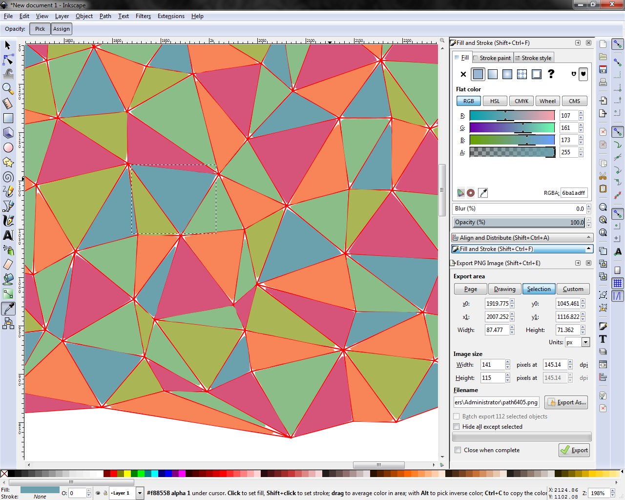
Look, we're not perfect, so chances are you will make some mistakes along the way. If you are unhappy with your color placement then select the offending triangle(s) and use the eyedropper tool to match the color of another triangle.
On Another Level
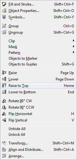
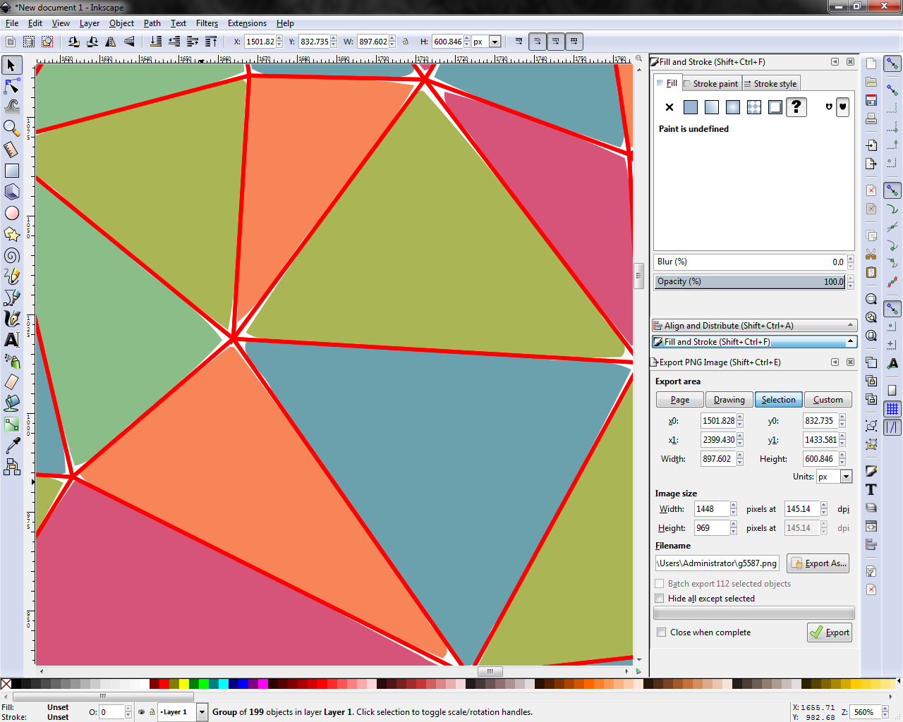
With all of this fun we've been having you've inevitably buried your original triangulation beneath a bunch of pretty colors. Time to dig it back out.
Use the selection tool to carefully select the entire mesh. An exterior corner provides a good place to do this. Then, in the Layers menu, press Raise to Top (Home). The triangular mesh should rise to the top of the canvas.
We do this so that the strokes will overlap the triangles and we can control the perceived spacing between them. More on that in the next step...
A Stroke Under Par
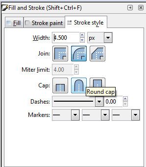
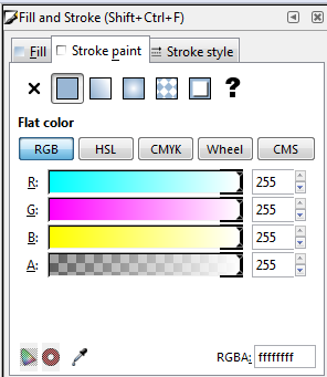
As promised, now we will adjust the mesh strokes to get our triangle spacing perfect. With all of the mesh still selected, head over to the Stroke tab on the Fill & Stroke menu.
First, select rounded endpoints and round caps. This should get rid of any weird points or overlaps at the nodes.
For Stroke Width, adjust as desired. I typically use a value from 3-5, but your needs may vary depending on the scale of your drawing. At a certain point, you will notice the path of the mesh beginning to cover up the colored triangles below. Stroke width above this point will increase the perceived spacing between the triangles. Lower values will make them seem closer together, but beware going too small as you will lose the sharper edges of the mesh paths.
Color is also entirely up to you. I mostly use white, however sometime I like to use black to tie into other strokes in letters or shapes.
I say all this, but just take some time to experiment and find out what works for you!
One Happy Family

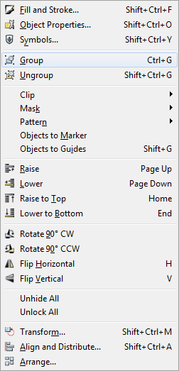
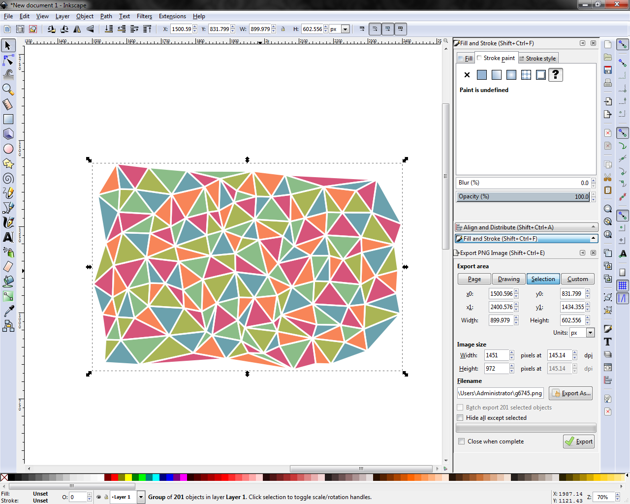
As a final touch, go ahead and select everything. In the Objects menu, select Group to combine all together into a single object that you can select and move. This makes it easier to keep everything aligned, and in place for whatever you have in store next.
Put It to Use
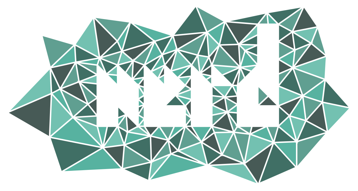


And you're done! Now take your piece and use it everywhere!
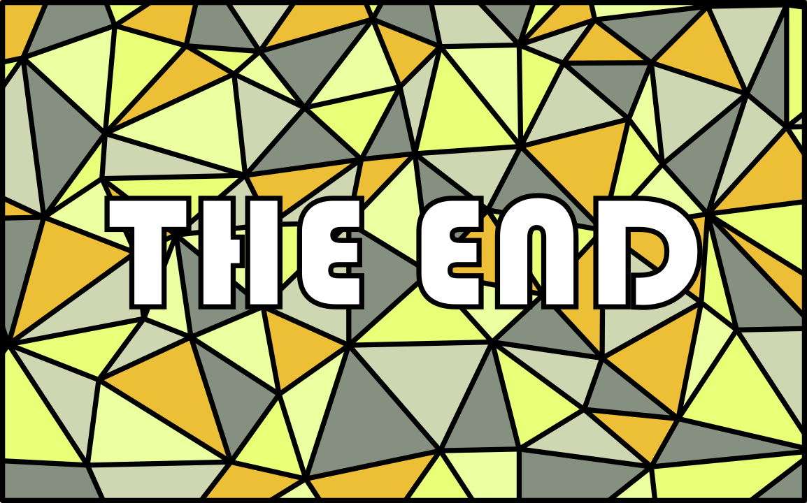
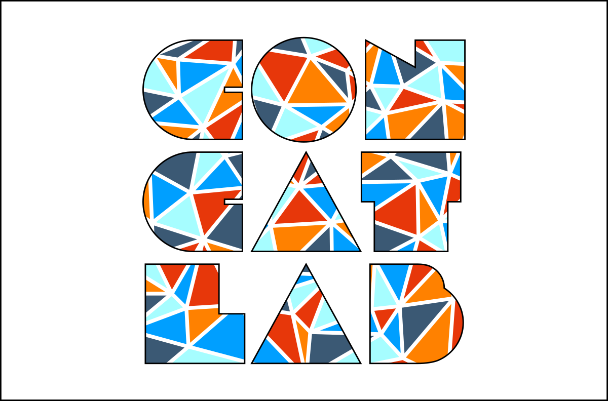
Some examples of my work are displayed above, but I would love to see your own implementations of this technique. Please post them in the comments.
Thank You!
As always, thank you so much for taking the time to check out this Instructable. I spent a lot of time and effort putting it all together and hope that you learned a lot from it.
Math-based art and other digital creations are two things that I really enjoy and that I plan to share a lot of in the future. Please follow me here on Instructables or go check out some of my other work so you don't miss out!