Day of the Dead Skull Embroidery Using Inktense Pencils, Plus a Super Quick Embroidery Display Tip
by sharlzndollz in Craft > Embroidery
3719 Views, 17 Favorites, 0 Comments
Day of the Dead Skull Embroidery Using Inktense Pencils, Plus a Super Quick Embroidery Display Tip
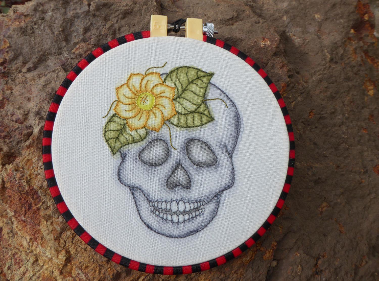
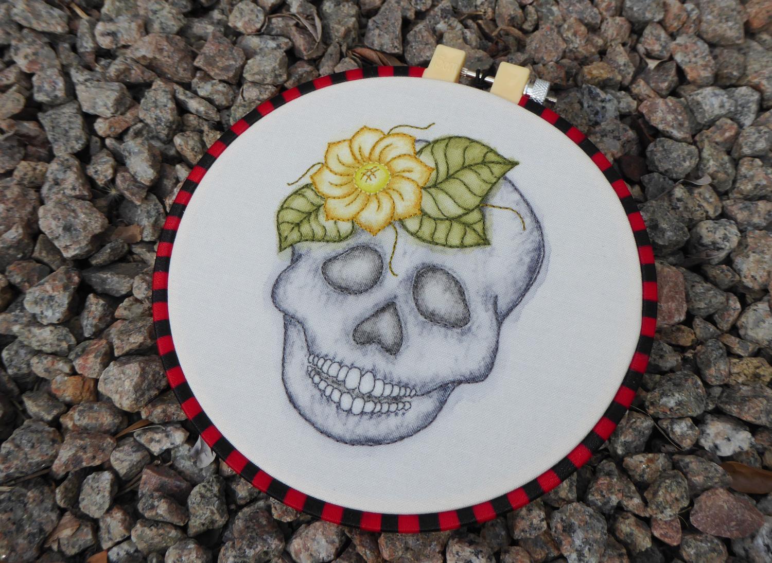
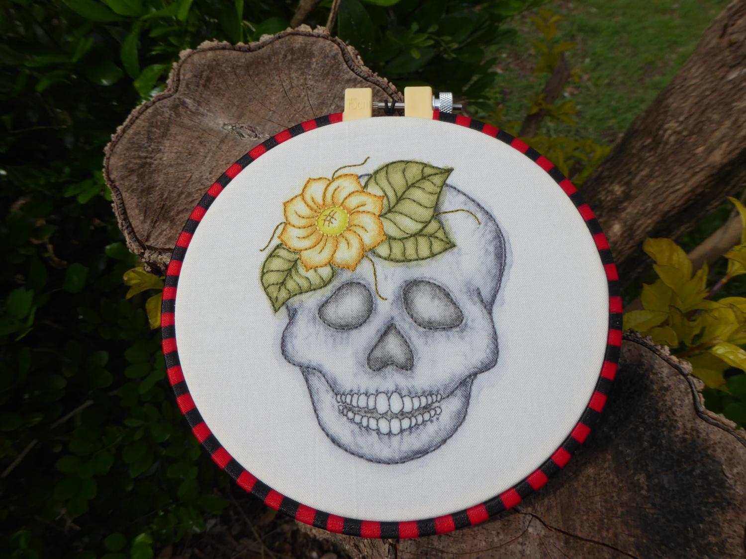
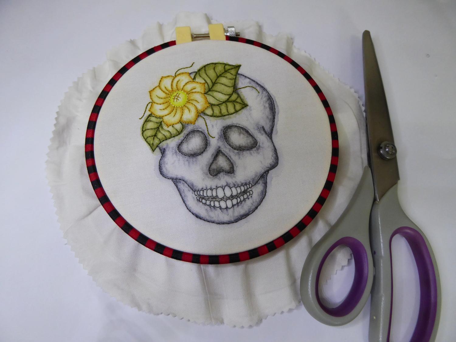
I love embroidery, but sometimes I want it to pop out of the hoop just that little bit more. I wanted to see what would happen when I combined the inky goodness and uncontrolled dynamism of Inktense pencils, with the precision and texture of embroidery. The result is a vivid inky backdrop to the boldness of the embroidered stitches. I just had to relinquish a little control of the outcome because of the way the ink will do it’s own thing. The ‘ghostly’ effect of the ink works well with a skull image, and the simple charm of Day of the Dead sugar skulls suit the colour palette of embroidery thread.
Inktense offers both a bright colour response while maintaining the look (although not all the features) of watercolour. If you have ever wondered if you would like to experiment with these pencils, this project could be for you as it uses only six colours.
If you want a bit of a deeper dive into Inktense pencils, I’ve included some of my colour testing information in here as well.
And if you are just after an embroidery tip, I have my super quick display trick to share, too!
Gather Your Materials and Iron and Mark Up Your Fabric
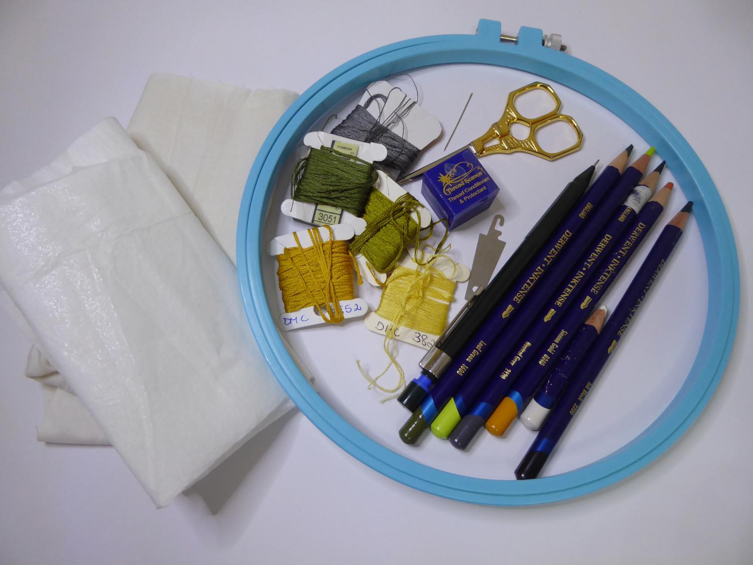
Firstly gather all your materials!
30cm square of Ivory Homespun cotton fabric
30cm square of light weight iron on interfacing
2B pencil
Inktense painting supplies
Inktense pencils:
- Antique White 2300
- Sienna Gold 0240
- Leaf Green 1600
- Neutral Grey2120
- Sherbet Lemon 0100
- Ink Black 2200
Medium size water filled synthetic brush (Aqua-brush)
Embroidery Supplies:
Skeins of DMC embroidery thread in the following colours:
- Olive green 732
- Dark green grey 3051
- Very light ash grey 535
- Very dark straw 3852
- Light straw 3822
Embroidery needle
Embroidery hoop 18cm
Scissors
Embroidery Display Supplies:
Hat elastic 70cm
Wool darning needle or needle with really big eye
Needle threader
Display hoop 15cm diametre (mine is from Daiso)
Next iron your fabric:
Using a hot dry iron, iron the light weight iron on interfacing of the back of the fabric square. I have used Ivory homespun, which is a nice colour for the Gothic feel of this embroider. I did not wash the fabric before hand so it still had some of the manufacturing ‘size’ (a substance that is applied to, or incorporated into, other materials—especially papers and textiles—to act as a protective filler or glaze to change the absorption and wear characteristics of those materials) in it, which meant that the colours of the pencils probably didn’t move as much as they would if I had pre-washed the fabric.
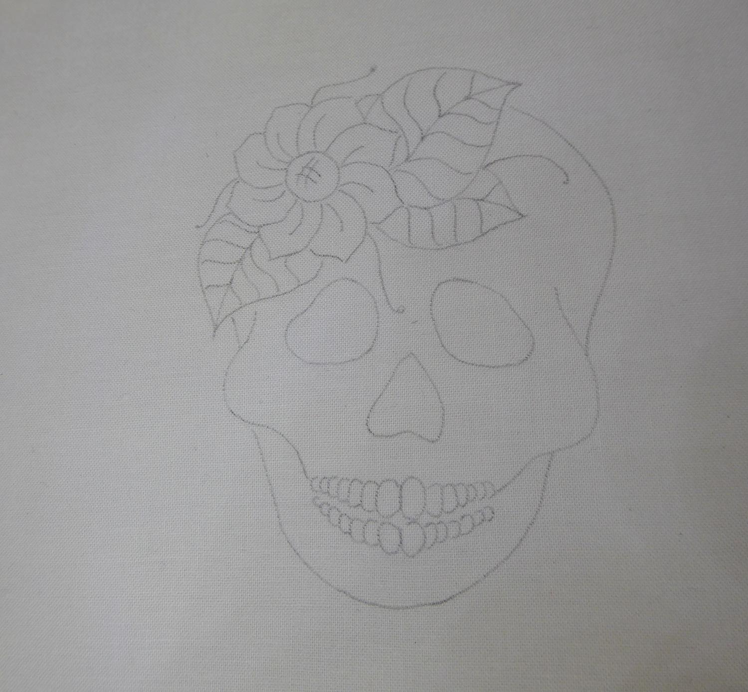
Then mark your skull onto the fabric:
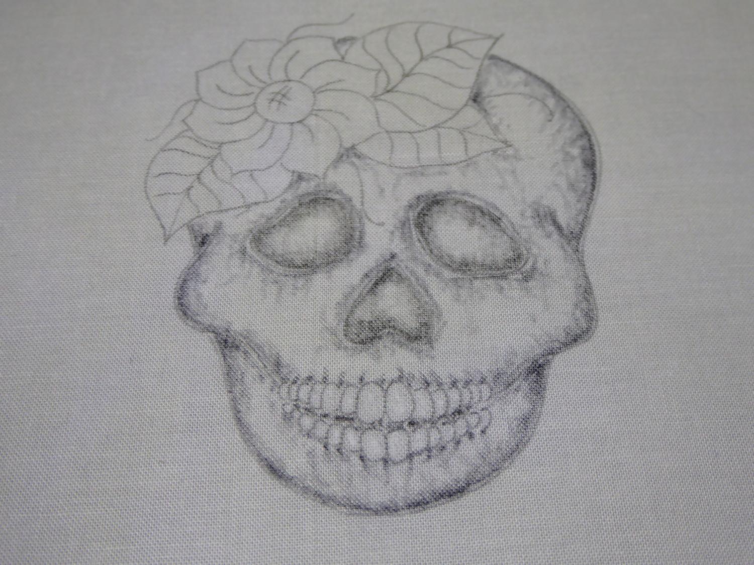
Using a light box (or a well lit window and bit of sticky tape) transfer the skull image from the download pattern onto the front of the fabric square using the 2B pencil.
Applying the Inktense Pencil - the Basics
Firstly, a little tip. It’s worth practising the pencil on a paper version before hand just to get the feel of the way the pencil work with water. I just used copy paper for the tests but you can see there are big differences in colour and texture of the pencils before and after you wet them.
Once you are ready to go to the fabric, here’s my suggested order of work:
- First pencil the eye sockets, mouth gap and nose socket.
- Then pencil in the grey of the skull itself
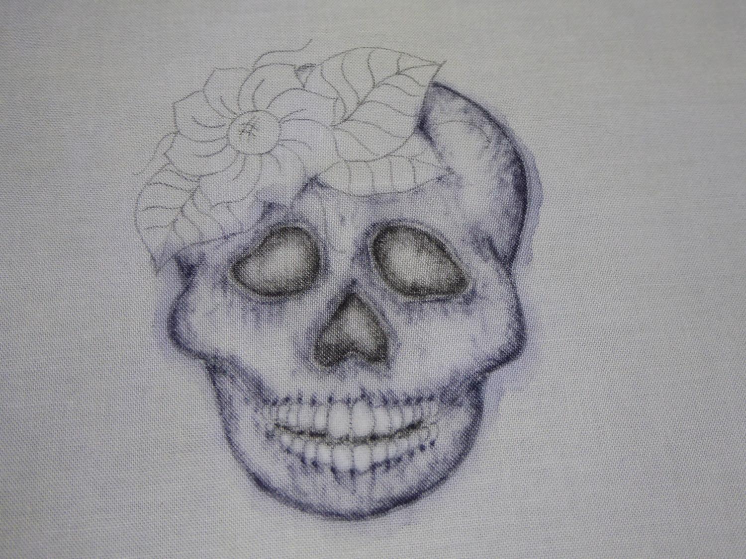
- Next apply water to these items at the SAME time (Note: this is important. I tried one version working just the eye sockets, nose socket and mouth first. The result has nasty rings – see picture 4 in this set!)
- After the skull has fully dried, pencil in the leaves
- Then pencil in the flower
- Finally apply water to the leaves and flower
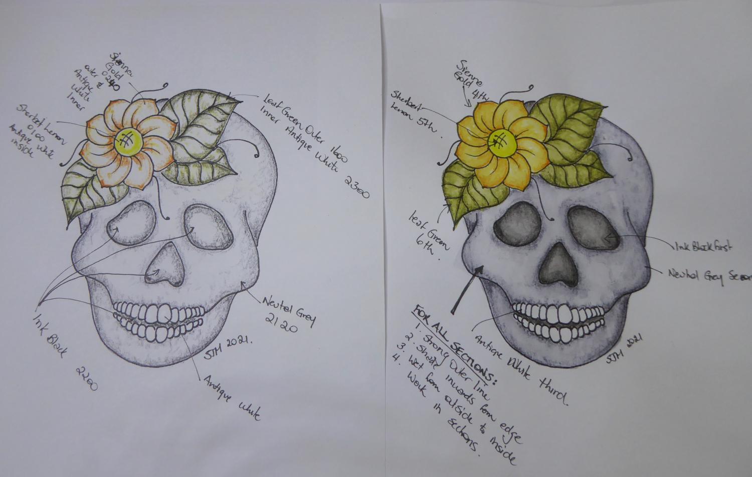
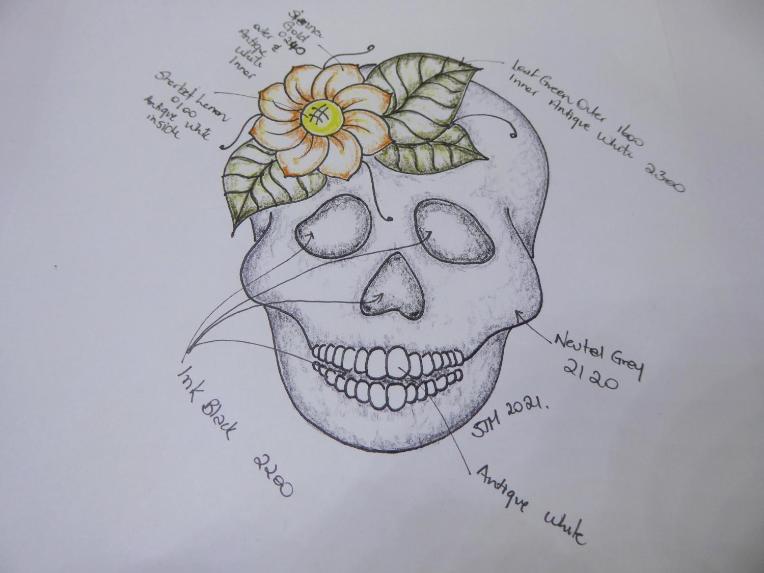
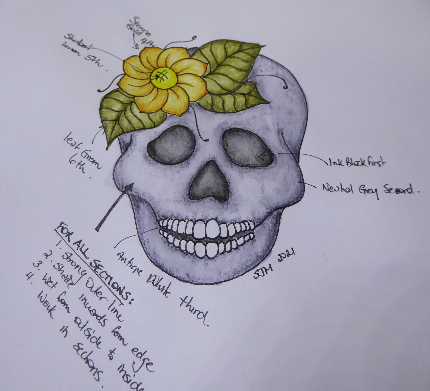
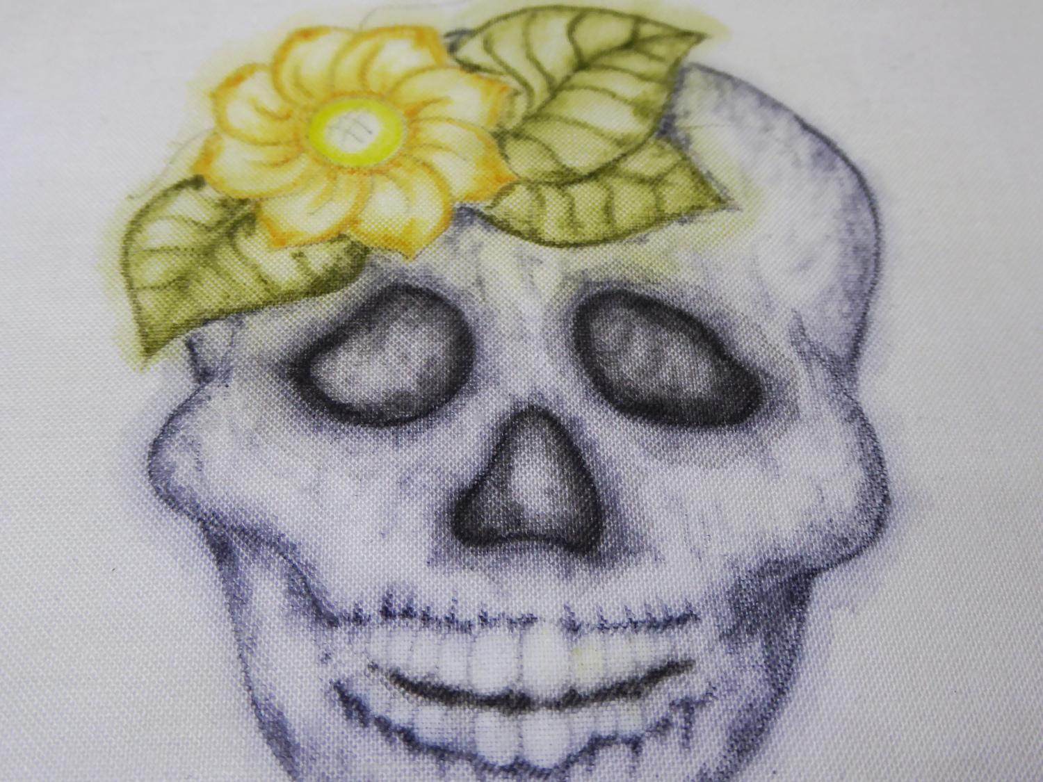
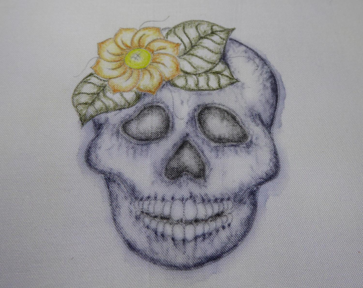
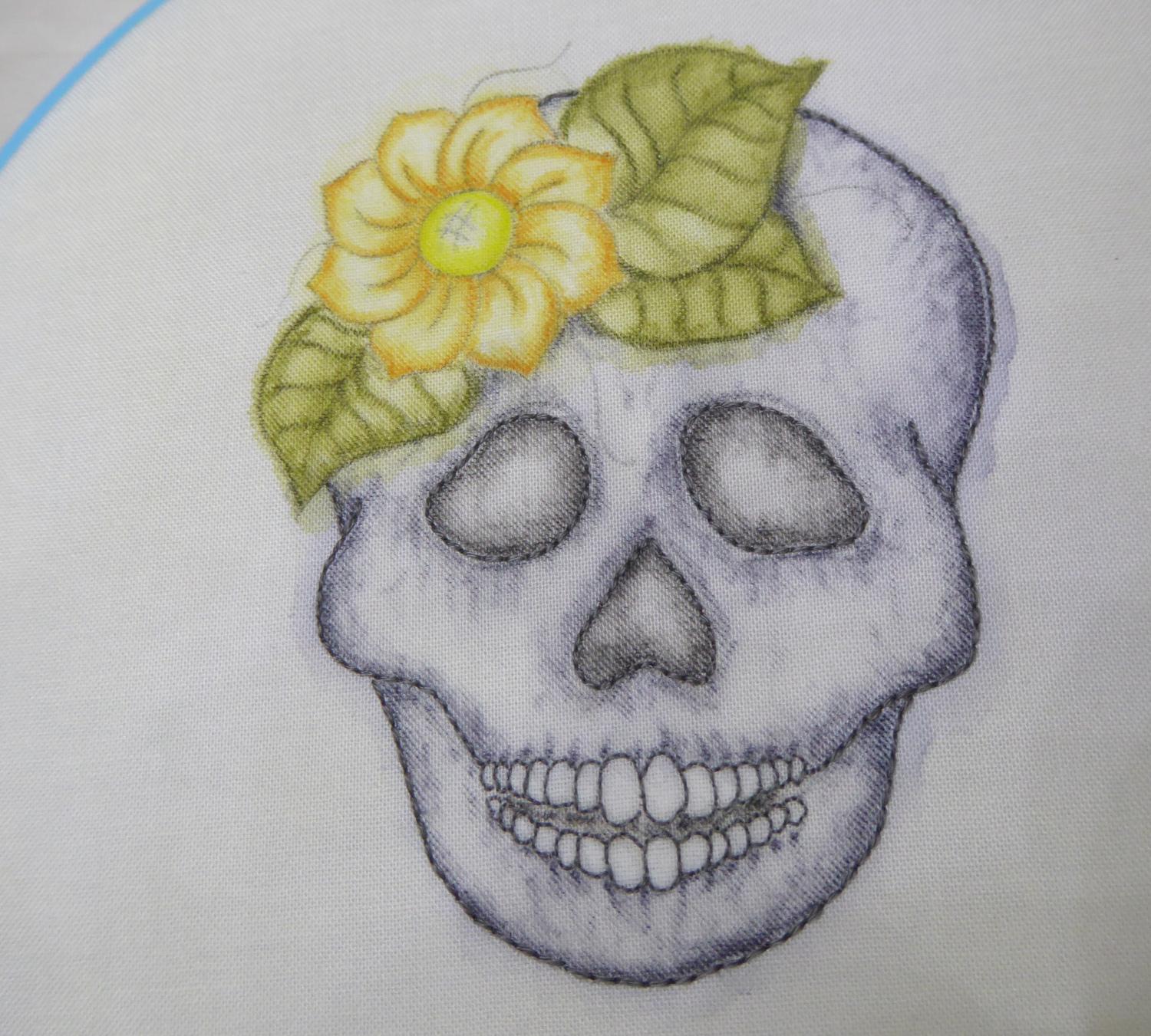
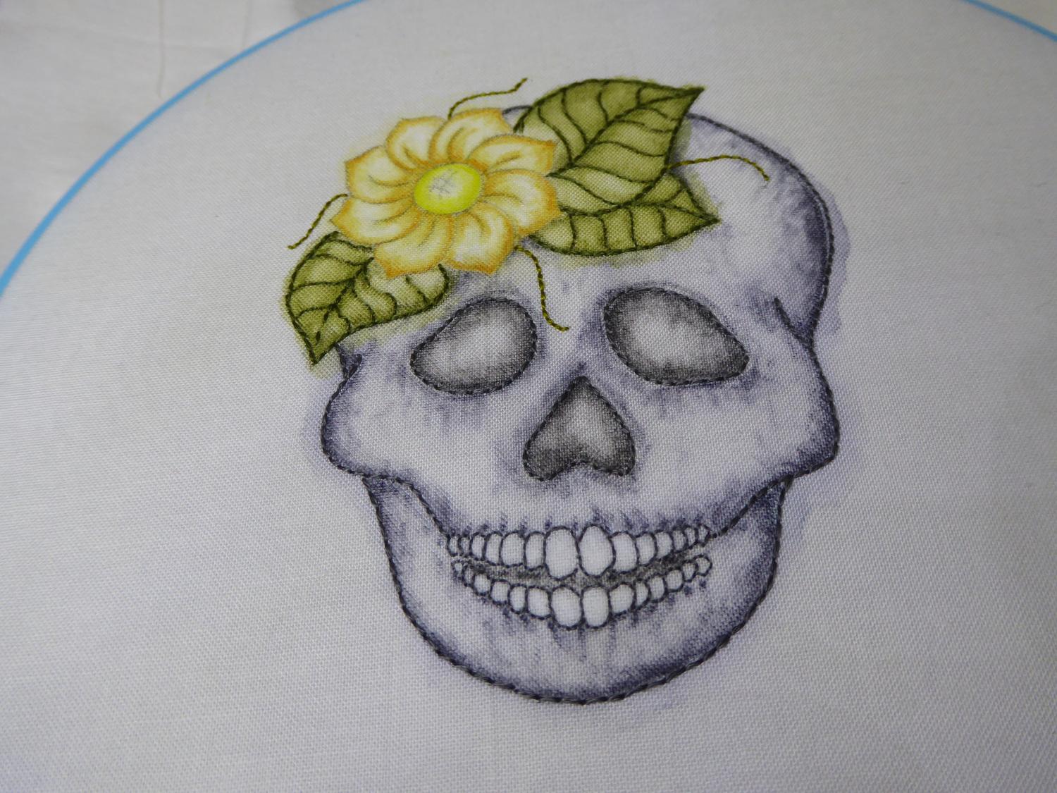
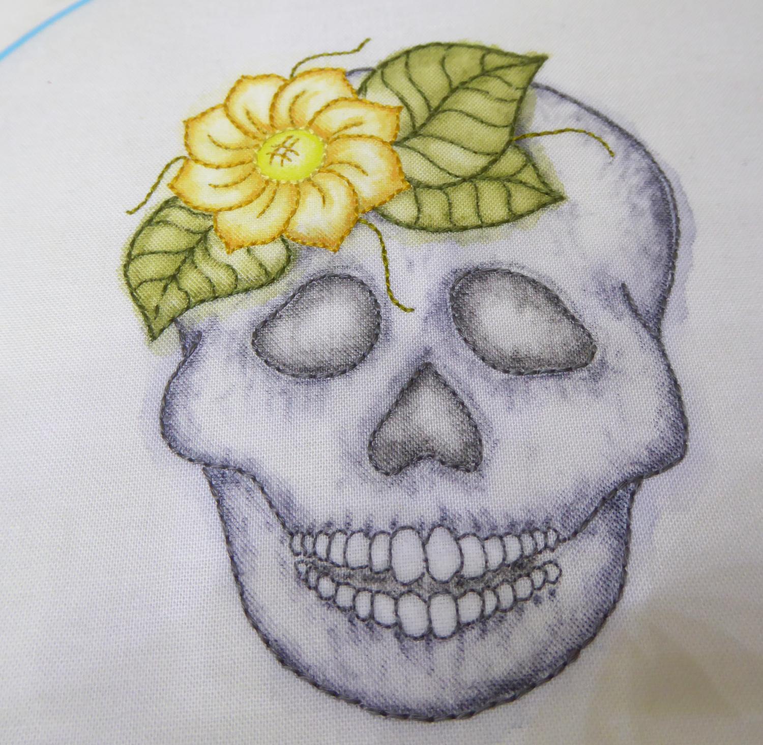
To apply colour to the fabric skull image, I have started each area with a fairly strong outer edge in the colour. Then I shade the colour in from the edge until it fades to nothing before I reach the centre of each image section.
Painting the Skull
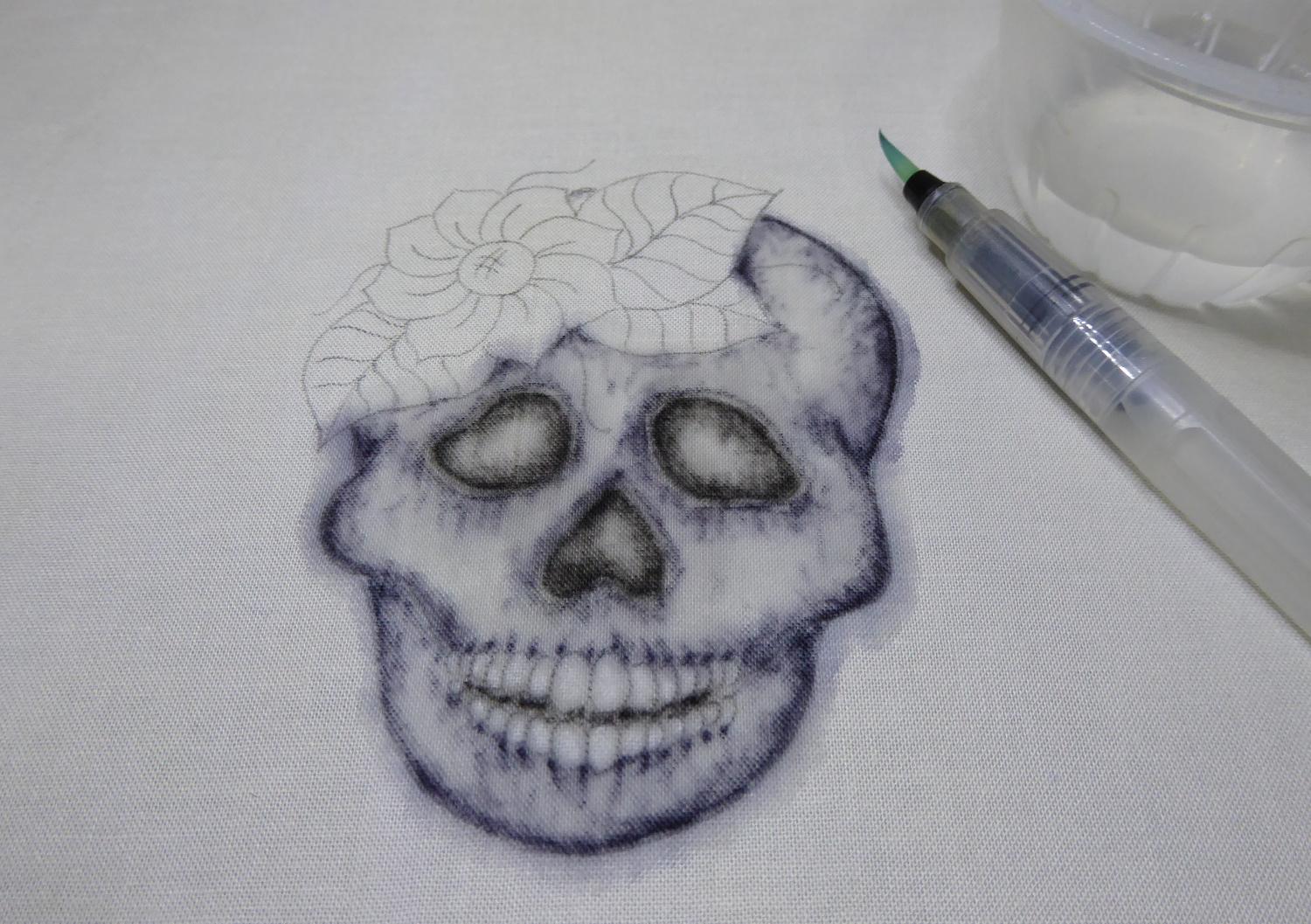
To paint the skull, I use an aqua brush (a water fill synthetic paintbrush). It gives the ability to add water by squeezing. I also worked the water from the outer edge inwards in each section.
You will notice from the photos that the colours start out bolder and the water markings are lot more noticeable until the work is dried. Be patient with the painting and follow the order. You will also see there is a bit of lack of control with the effect. It will spread outside the lines depending on the amount of water and amount of size in the fabric. That’s part of the charm of the medium! This image lends itself to a ghostly outer edge.
For the eye sockets, nose sockets and mouth gap:
I used Ink Black pencil. For the eye and nose sockets and the small gaps between the teeth, I worked in ink Black. I drew strong outer lines and then shaded into the centre of each shape.
For the skull:
I worked the skull in Neutral Grey. I worked my shading of the skull in little gentle circles and I worked some dots of stronger colour around the mouth to highlight the teeth. I applied stronger colour on the skull, where the shadows would be if the light source was from the front (so around the cheeks, edges of the skull, and edges of the sockets)
Applying the Antique White:
I applied a little on some of the teeth to make them pop out a bit against the Ivory fabric.
Painting the Leaves and Flowers
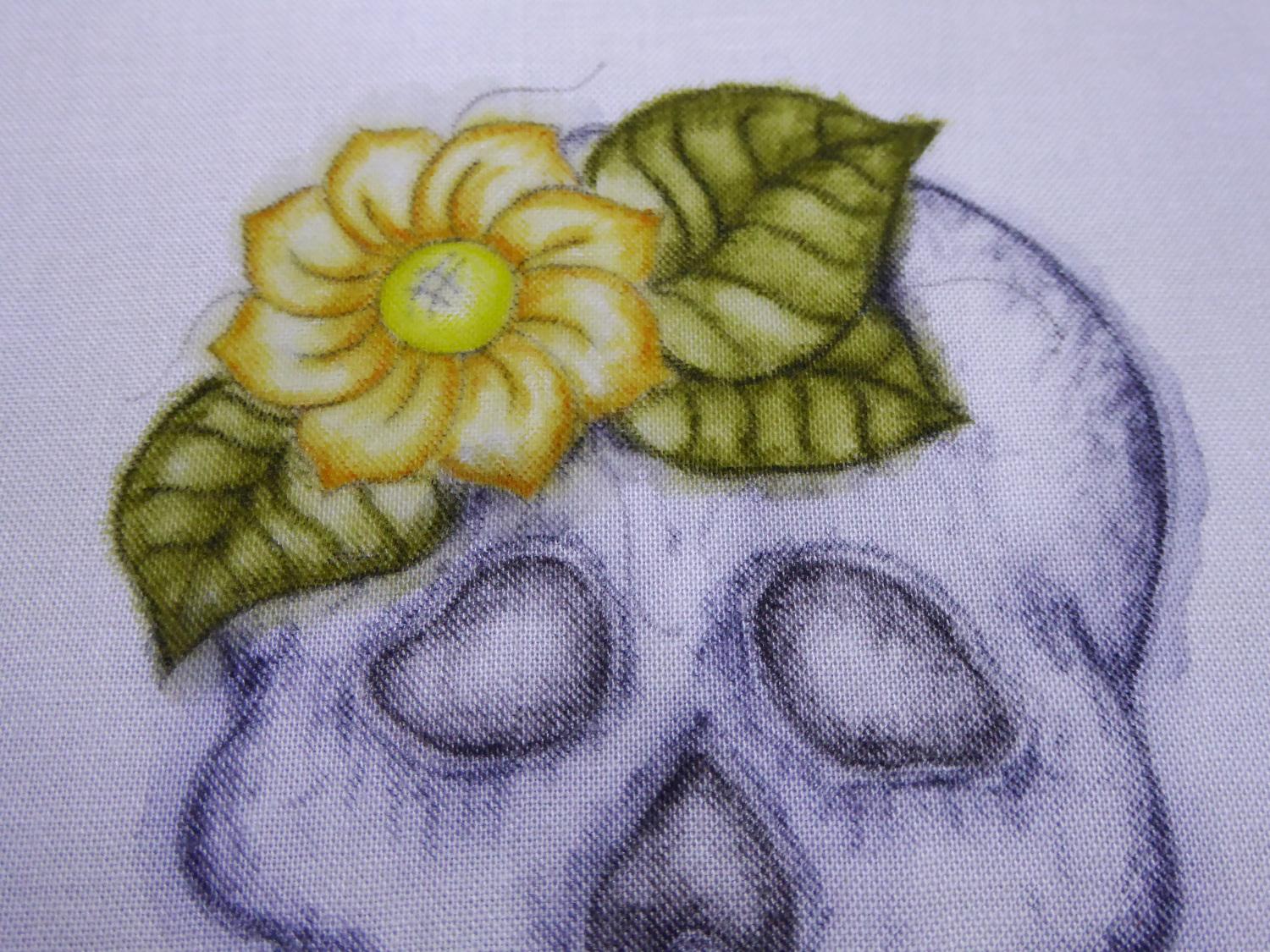
For the leaves:
I used Leaf Green. I worked the outer edge and then worked each vein in a strong line. I shaded out from each vein.
For the flower:
For the flower I used Sienna Gold for the petals and Sherbet Lemon for the centre. I marked the outside edges of the petals, then a strong line for the line on the petals, and then some shading at the tip and base of each petal. The centre is just a strong outer line, shaded in.
Applying the Antique White:
I applied the Antique white to the centre of the each petal and blended it lightly into the Sienna Gold. I also worked a little into the centre of the flower’s Sherbet Lemon.
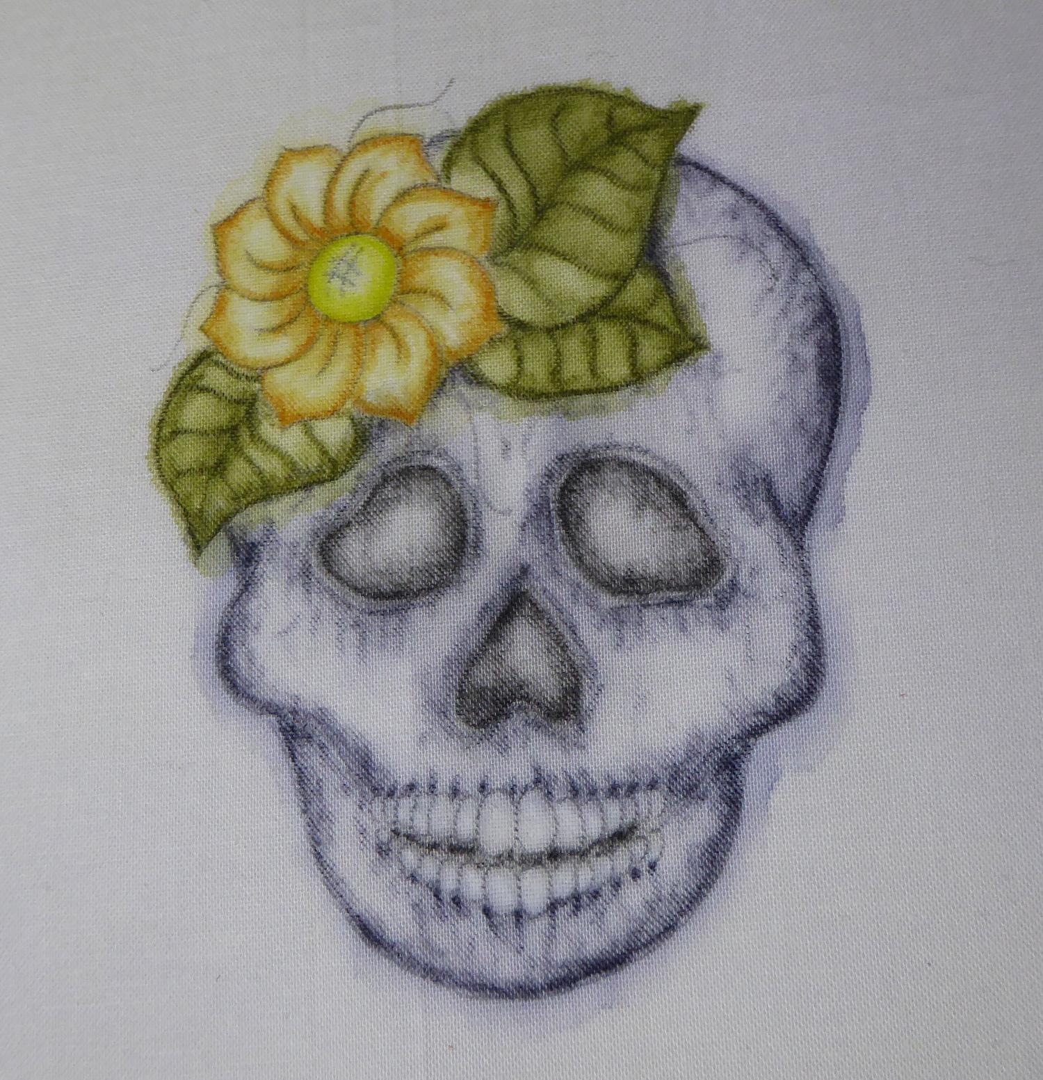
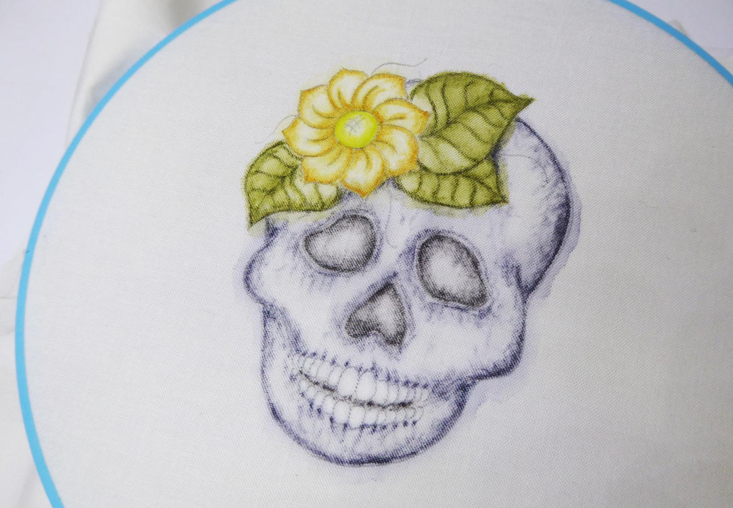
After the paint has dried, pop your fabric into the embroidery hoop to begin stitchery!
Embroidering the Skull
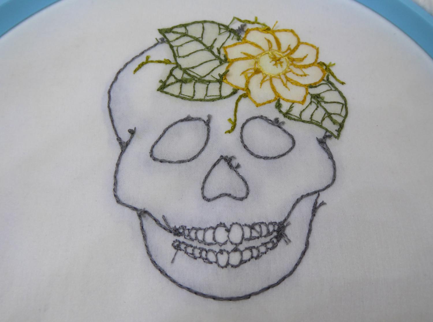
Here’s the stitch guide for the embroidery. All the embroidery is worked in back stitch in either one or 2 strands as listed:
- Teeth - 1 strand DMC 535
- Skull Edges, eye socket edges, nose socket edges – 2 strands of DMC 535
- Leaf edges and centre stem – 2 strands of DMC 3051
- Small veins off the stem – 1 strand of DMC 3051. Note, sometimes I only partly filled a line to add interest to the leaves.
- Vines – 2 strands of DMC 732
- Flower petals outer edge – 2 strands of DMC 3852
- Flower petals inner line – 1 strand of DMC 3852
- Flower centre – 2 strands of DMC 3822
- Flower centre cross hatch detail – 1 strand of DMC 3852
I used a nice simple back stitch on all the sections to keep it simple but I think stem stitch would also look great on the leaves. You could also fill the flower centre with french knots instead of the cross hatching.
Super Easy Way to Displaying Your Embroidery
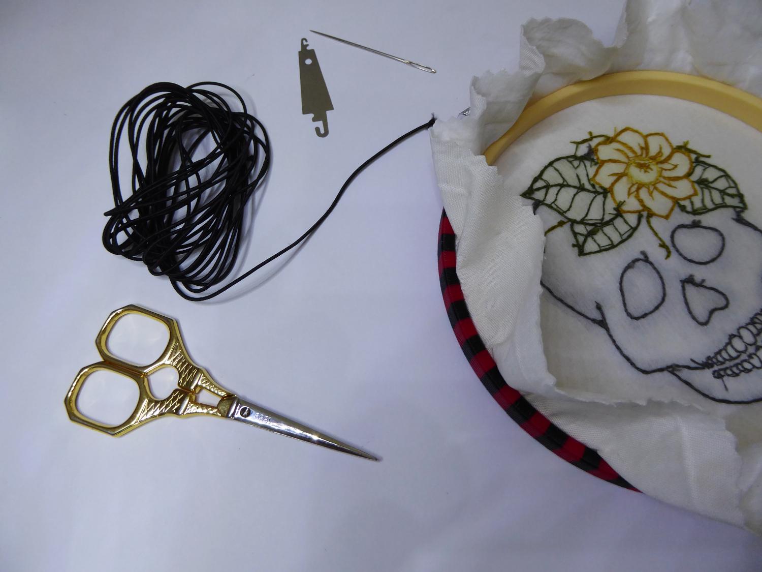
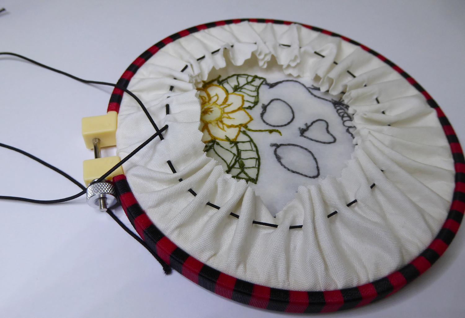
I worked the embroidery in an 18cm hoop, but to display, I swapped to a smaller 15cm hoop I got from Daiso and wrapped in fishing line wrapping nylon (see my other Instructable lesson for how to do this) as a display hoop.
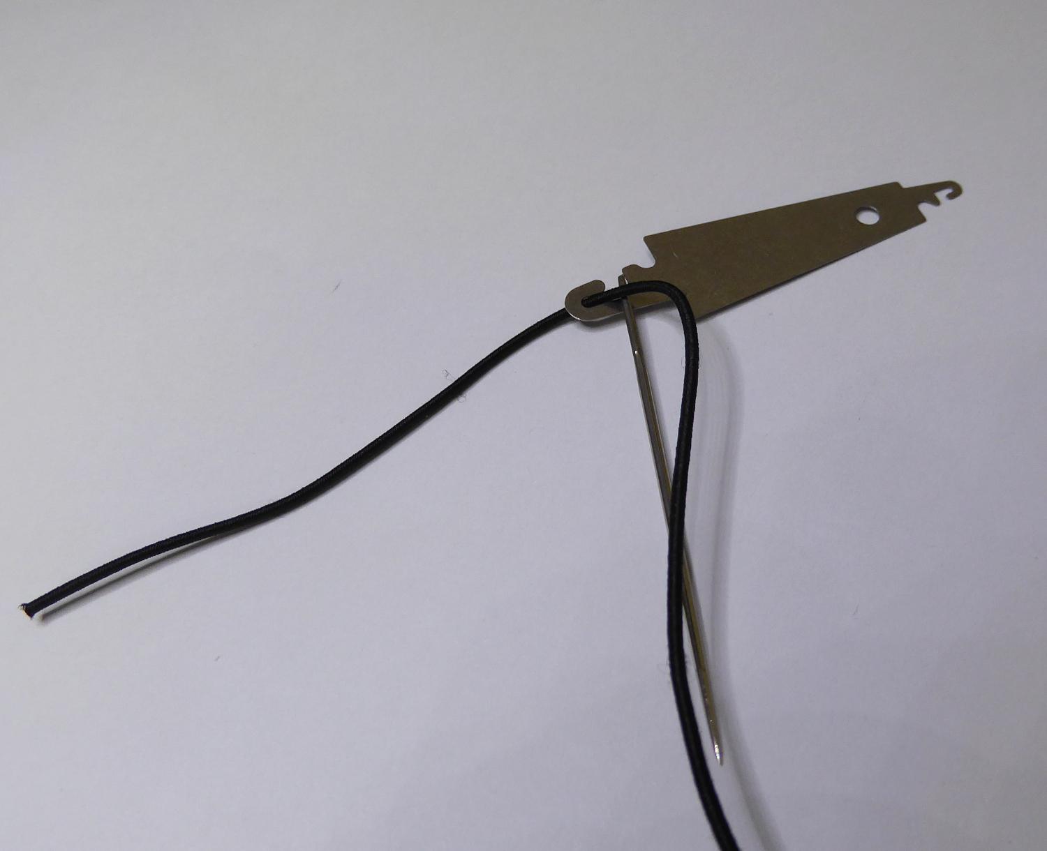
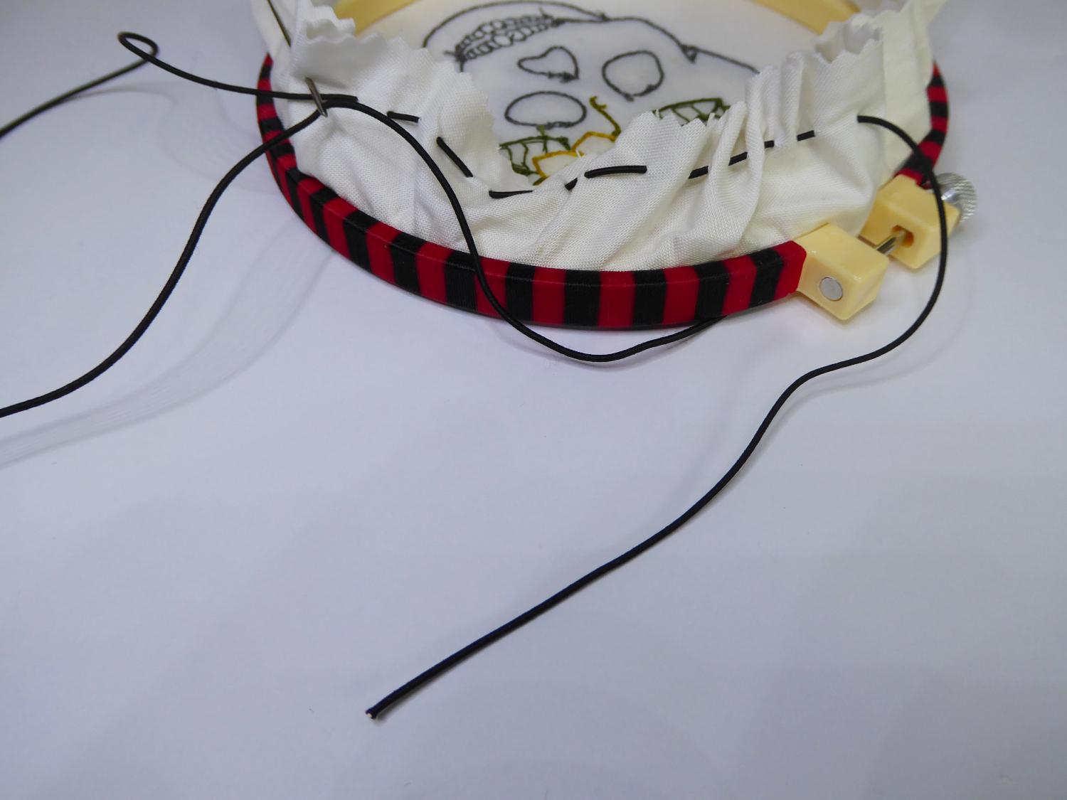
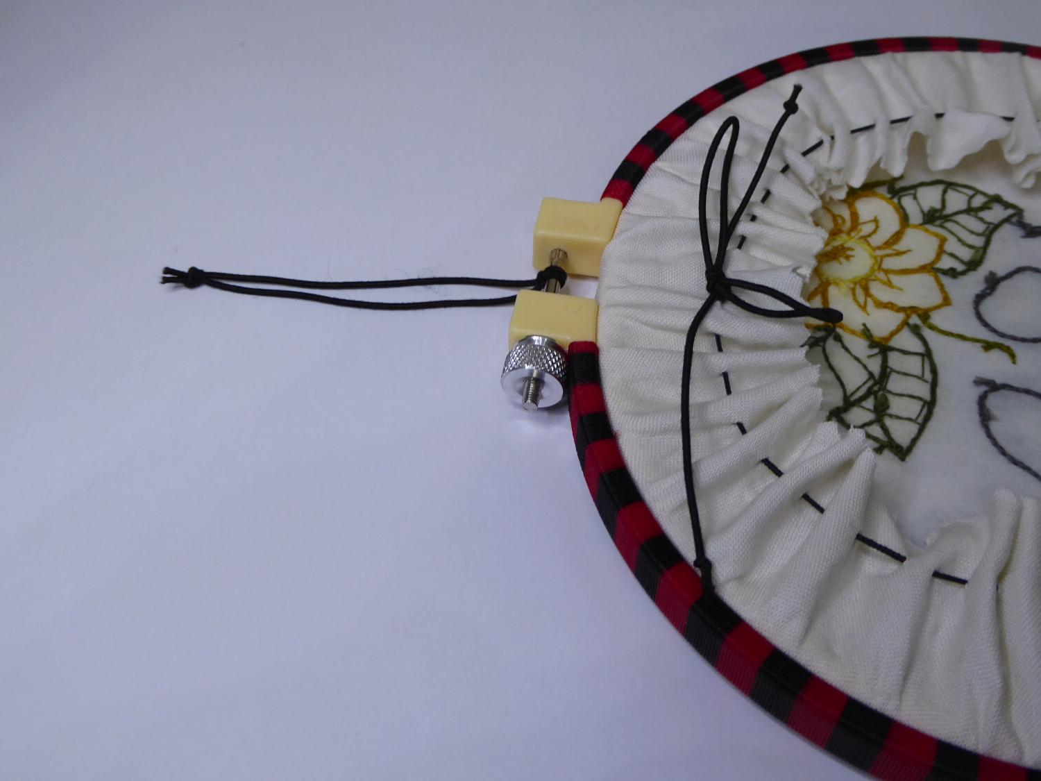
I have a super easy way to stretch your embroidery in the hoop. I use a length of hat elastic (I cut 70cm) and a wool darning needle to run a gathering stitch around the edge of the embroidery. First I trimmed the fabric to a fairly neat circle about 3cm bigger than the embroidery hoop. Then I threaded the needle with the hat elastic. I used a needle threader to get this into the needle as it’s quite thick. Start the gathering stitches at the hoop tightening screw and work them around the edge of the fabric about 1.5cm in from the edge. Keep working until you reach the tightening screw again.
Pull up the elastic to tighten evenly and then knot the elastic. Tie a decorative bow over the knot and then trim the elastic shorter.
Use the left over elastic to make a little hanging loop.
Hang and enjoy the stitchery!
A Deeper Dive Into the Inktense Pencils
Summary of Inktense Pencils Do’s and Don't s:
DO
- Make a colour mixing chart
- Think about the order of applying the pencil to the paper
- Record your favourite colour mixes including the recipe
- Use a synthetic brush (Aqua-brush)
DON’T
- Apply too much pencil – a little goes a LONG way
- Add too much water at once – this product dries quickly
- Overwork low-quality paper – the mixing needed will cause the surface to “pill”
- Expect the dry colour to be an exact match of the colour once you add water – treat the colour as a guide
In-Depth Review of Using Inktense Pencil:
I was drawn to the Inktense Range by the combination of the bold colour and the wonderful spontaneity of mark with watercolour. Inktense offers both a bright colour response while maintaining the look (although not all the features) of watercolour.
Because this product is unique it only obeys some of the rules for watercolour pencils. So when I was looking for information, I was a little disappointed with what was already available. Hence, this review answers many of the questions I wanted answers for.
I have divided this information into the simple do’s and don’t s I have found for using this wonderful product.
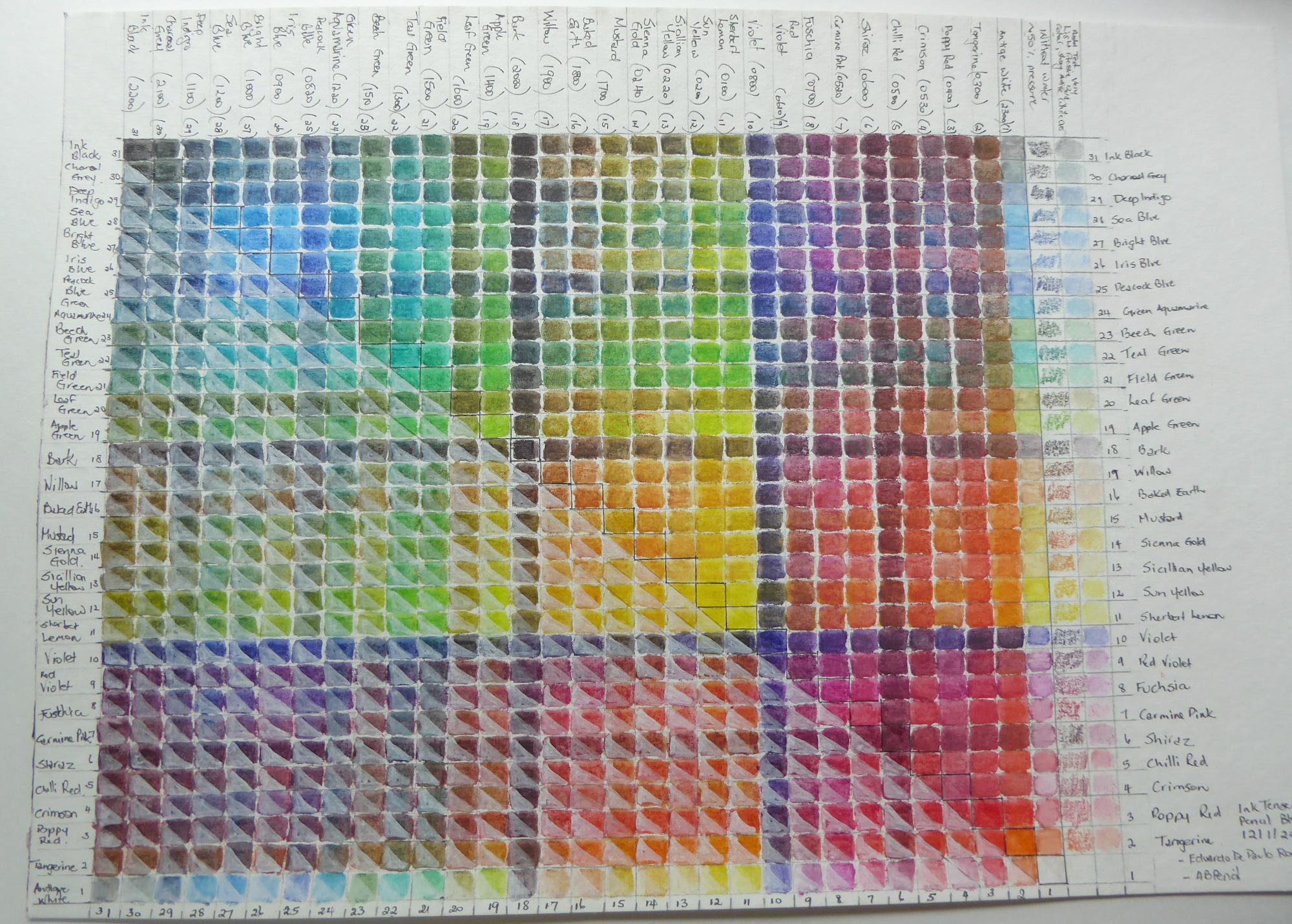
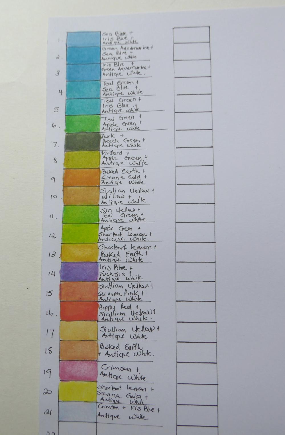
Make a colour mixing chart
This is a must for using your Inktense pencils. In the beginning I decided to get a set of 24. It was very good but I was worried I would not have enough colours and I started to collect random extra pencils so that I ended up with 31 pencils. This still seemed like a limited palette and I wanted to purchase more.
I saw Derwent strongly recommend a 2 way colour mixing chart and they have an example of a 12 blend available on their website.
The original set of 24 pencils I purchased contained the following colours: sherbet lemon, sun yellow, tangerine, poppy red, chilli red, shiraz, fuchsia, violet, iris blue, bright blue, deep indigo, sea blue, teal green, apple green, field green, leaf green, mustard, baked earth, willow, bark, charcoal grey, black, antique white and outliner. To this I added sienna gold, green aquamarine, red violet, crimson, peacock blue, carmine pink, sicillian yellow, and beech green.
I undertook a 2 way colour blend using my 31 colours (I left out the outliner pencil). The maths of the results of my 2-colour mix chart says it all: I got an amazing 465 additional colours (see the top right diagonal of the chart for the colours achieved). This does not include blends with 3 or more colours, or combinations with more or less of one or other of the colours (I was trying for 50% saturation in total so 25% of one colour and 25% of another). In fact I learnt I had an amazing colour palette to play with!
The colour mixing test allows me to address some issues on colours in the Inktense pencil range. I have read that some artists are concerned the Inktense pencil range has limited pastel and skin tones available. I will say I found it quite easy to create both skin tones and a wonderful rainbow of glorious pastels when you mix.
The most important pencil I have found for creating these ranges is the antique white. When I first got the pencils I was disappointed with the antique white pencil. I had tried using it like a gel pen to add highlights on top of other colours – this is definitely not it’s function. But the antique white is brilliant for introducing a creamy note to any colour you mix. I find the order the antique white is laid down is vital to getting the best mix (see my notes on colour order further below).
One thing I noticed straight away from my colour mix chart were that I couldn’t see any of the remaining colours in the 72 pencil range that I don’t currently own and that felt I wasn’t getting when my mixing chart. My next purchases are more of existing pencil colours, in the one’s I use more of, instead of more colours. In saying this, the additional colours not part of the 24 set that I can’t live without are sienna gold and green aquamarine. The sienna gold pencil has a nice random way the colour comes out of the pencil and I like the random flashes of deeper red tones.
With the colour chart I kept a column where I just applied the pencil at the same pressure as the rest to give a nice reference for how the colour looks before water and to know how much of the colour I put in my recipe. I also added a very pale pastel mix with lots of antique white applied over a very light amount of the other colours again to see the pastel range.
I tried with the bottom diagonal of the colour chart (where each colour is duplicated) to try out what happens when applying the antique white from the block set over the dried colour, and applying water-based varnish over the colours. I tested the antique white block because I had heard from other sources that it has different capabilities to the pencil version – and it does. The antique white from the block dries very white (way whiter than when you first apply it -Beware!). I wanted to see if just applying the block white over the top of a dried colour gives creamy pastel tones. I was unhappy with how the antique white block applied over the top looked – it just looks like a washed out version of the base colour and I can see from even the tiny testers that you would have to be very even applying the block layer over the top to give even results. Positively though for the test, the dried swatches definitely don’t lift or move when re – wet. This is one of the major points of distinction of the Inktense pencils from regular watercolours. Once it’s activated and dried that’s it. It cannot be reworked.
I was happy to see the application of varnish doesn’t really change the colours of the dried ink either, although when it is wet the colour is much darker.
The paper I used for the colour chart was a rough paper (Eduardo de Paulo Watercolour Rough: a not very expensive paper). The thing I noticed from using this paper is the uneven surface makes a great difference to smooth colour mixing. I think it’s important to imagine the paper surface is a bit like a paint palette for the colour you are mixing. You need to work the colour a little with your brush to get the final result. The uneven nature of the rough paper captured especially the base colour (the colour I applied first) as little “pools” of colour which is great when you are looking for variations and random places in the colour (I like this) but it’s not what you like for solid colours. I recommend smooth papers for mixing colours you want quite even. The Eduardo de Paulo Watercolour Rough paper is also not super white and some of my other colour tests on smoother whiter paper give different results. I will eventually test again on smooth white paper as a comparison as my work progresses.
Think about the order of applying the pencil to the paper
The order in which you apply the pencil to the surface of the paper will affect the colour you get (the permutations V's combinations). For creamy colours like pastels and skin tones the antique white needs to go on top. For most colours I like the darker colour on the base and lighter colour applied over the top. The red tones have a tendency to stay slightly unmixed at the base of a colour mix.
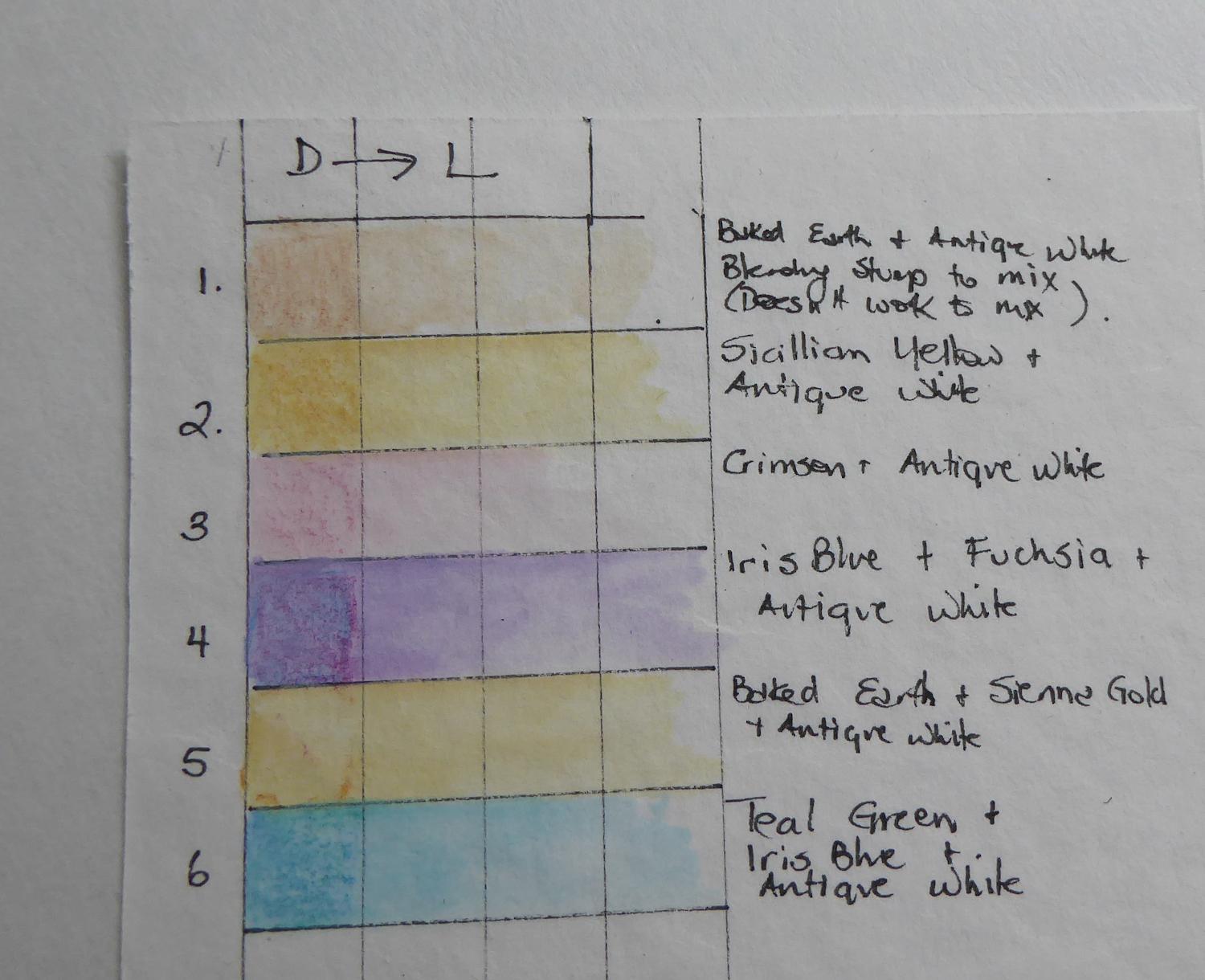
Record your favourite colour mixes including the recipe
To further my colour experiments I am adding to a Recipe chart – a test rectangle with the recipe for mixing applied beside it. This is great for Permutations and for multi-step mixes and I have already discovered some of my favourite mix recipes.
Use a synthetic brush (Aqua-brush)
I listened to what other artists have said about the Inktense pencils and use a synthetic water brush rather than more expensive brushes. Because you are using the surface of the paper like a palette the brush needs to stand up to the punishment. Using the water brush allows you to work quickly and mix to your desired level. I like to leave some pencil marks in the paint and the water brush lets me do this.
Don’t apply too much pencil – a little goes a LONG way
Inktense pencils are very bold and cover a lot of territory. This will make them cost-effective as a medium to work with over time for me. I have tested some of the pastels/creams as a direct mix and then dragging the colour and they cover a lot of territory. If I wanted some of these really pale blends, I would mix elsewhere on a paper palette and then apply to the area from that palette. Beware, that these pencils do dry very quickly so the palette will also dry very quickly and it would be worthwhile attending to all sections where the same colour is needed at the same time or only wetting a little of the palette colour at a time.
Don’t add too much water at once – this product dries quickly
I painted in Australian summer (temperatures over 30 degrees and a mix of either very dry or very humid). I noticed the paint dries fast. This means for best results you only work one section at a time. The good news then is that you don’t have to wait long to move along with your work. I found I could get some spontaneous colour markings moving together because I work with an ink illustration that I then colour over. This process means sometimes a small amount of the pencil is right on the ink line and a large wet brush worked over the surface at the end will allow this to be moved around in a spontaneous manner.
Don't overwork low-quality paper – the mixing needed will cause the surface to “pill”
One of the effects I didn't think about when starting my experiments with Inktense Pencils was the quality of the surface I was working on. I tried a Reeves heavy drawing paper which can stand a little watercolour to test on. I found that even a small amount of moving more than a little water as I was mixing colour was causing the surface to pill. This is evident in the background pastel colour in this piece. I have been far more successful moving a lot of water on a rougher surfaced paper.
Don’t expect the dry colour to be an exact match of the colour once you add water – treat the colour as a guide
The Inktense pencils look very different dry to wet. To show you just how different I completed a piece by colouring it all in and then adding water afterwards. This would not be my recommended approach because it’s really hard to be neat and not wet adjoining colours.
You can see from the comparison just how much bolder the colours are. The other things to note are that you don’t need to be super neat in filling in shapes because the colour moves so well to fill the space, and that like regular watercolour you can plan the use of white spaces to fill in a more pale fashion (see the flower petals before and after water)
I have just started my journey using Inktense pencils but already I am hooked!