DIY Hospital Compare: Analyze and Compare the Quality of Local Hospitals Yourself!
by jpdeshazo in Workshop > Science
1526 Views, 5 Favorites, 0 Comments
DIY Hospital Compare: Analyze and Compare the Quality of Local Hospitals Yourself!
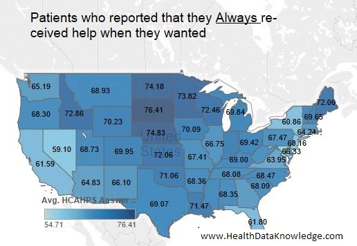
Hospital Compare is a useful site where you can search for hospitals and compare them across many different dimensions of quality including patient satisfaction and clinical best practices. The data and site are produced by the Centers for Medicare and Medicaid Services. The idea behind it is that we (as health consumers) should start comparing hospitals and shop around for the best care. -Which might help put pressure on hospitals to improve their quality. Whether this transparency has a big impact or not remains to be seen, but the data is interesting and fun to work with. The data is also freely available, which I hope means lots of creative people will get their hands on it and produce amazing apps, analysis, and other data products.
In this instructable, we will
- download the data,
- export a subset of the data to use in our analysis,
- load the subset data into a great free analysis tool (Tableau public),
- and make a cool looking visualization that shows the patient satisfaction of hospitals we choose.
This is my first instructable, so please leave suggestions for improvement as well as any other comments or questions.
Introduction to Hospital Compare Data

Hospital Compare data is a packaged collection of process and quality outcome measure from a variety of sources. It includes:
- Hospital characteristics and inspection information
- Structural (e.g., registry measures)
- Timely and effective care: heart attack, heart failure, pneumonia, surgical care, stroke, blood clot, pregnancy and delivery
- Timely and effective care: children’s asthma
- Readmissions, complications, & deaths: 30-day mortality and readmission
- Readmissions, complications, & deaths: Surgical complications
- Readmissions, complications, & deaths: Healthcare-associated infections
- Outpatient imaging efficiency
- Patients’ survey
- Number of Medicare patients
- Spending per hospital patient with Medicare
Awesome right?
Although many of these measures come from different sources at different collection intervals(quarterly vs annually) The hospital compare people make it easy to get all the data in 12 month chunks. If you plan to do analysis over a period of several years, CMS appears to have data back to 2005 archived.
Download Hospital Compare Data
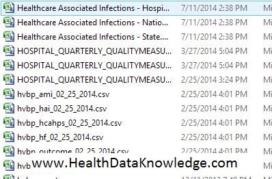
You can download the most current data two ways: A zipped up Microsoft Access Database, or a zipped up set of CSV flat files .
The former is 32 MB, the latter only 10 MB, so neither is going to max out your data plan. When you get them downloaded (remember you only need one or the other) they unzip to ~300MB and 220 MB respectively. I wish you could download only the files you want to use, but apparently it is all or nothing with them.
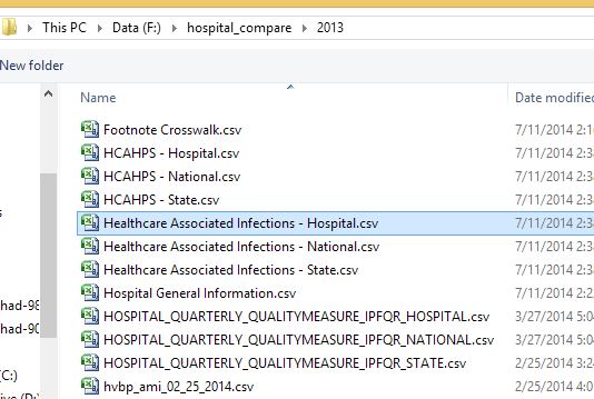
What you will then have is either a directory of freaky looking CSV file names like this, or an equally freaky looking list of Access Tables with similar (though not always the same) names. The Downloadable Database Dictionary will help you a lot here. In the dictionary you will find more freaky code words, but at least along side them will be decent English descriptions.
Note: This instructable is just using one patient satisfaction file: "HCAHPS - Hospital.csv". So if you wanted to try the absolute easiest way first you should download the zipped up CSV files and try the Access way later.
Extract the Tables You Want to Use
Now that you have the data downloaded and unzipped, the most important advice for using this data is to be very selective with the data you want to use and ignore the rest. In other words, don’t try to link all the tables together and create a comprehensive “State of US healthcare” report (at least not at first).
Important note about the one of the differences between the CSV flat files and the Access tables:
The CSV flat files have hospital name and zip on (almost) every file, so each file could be used by itself for some kinds of analysis. However, the Access files do not have this information so you have to merge hospital name and other hospital demographic information if you want it in your analysis.
If you are using the CSV files: Just identify the "HCAHPS - Hospital.csv" because that's the one we are going to use in this instructable.
If you are using Access database you need to join the hospital demographic file with the hcahps file, and then export to a CSV or Excell file.
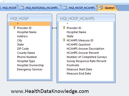
If you are using Access, simply create a query joining the two tables on Provider ID.Do this by selecting Create–>Query deign from the menu. Choose the “HQI_HOSP ” and HQI_HOSP_HCAHPS” tables. Join them by Provider ID by dragging one “Provider ID” on to the other table’s “Provider ID”. When it looks like this, double click on the (*) on each table to add both tables’ entire column list to your query. Then you are ready to save it and export it. Menu “External Data–>Export–>Excel (or whatever).
Open Up the Data in Tableau

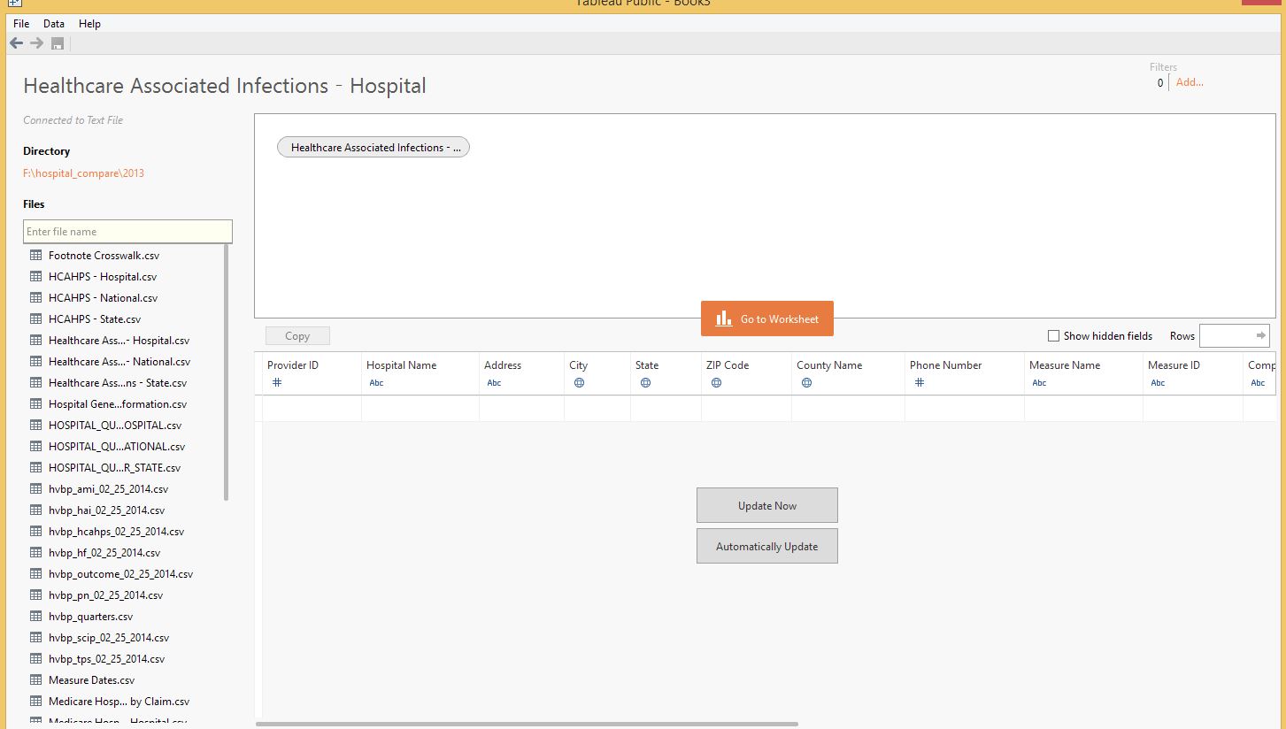
Download Tableau public if you don't have it yet. Its free, fun, and easy (my favorite things). If you have Tableau Desktop the steps are still pretty much the same.
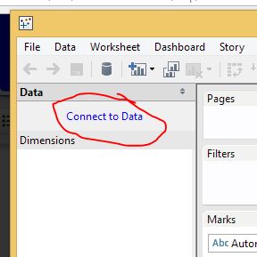
Once you start up the Tableau program, click on "Connect to Data". Then under "In a File" select "Text Files" from the menu on the left. Browse to the file you want to open, Healthcare Associated Infections - Hospital.csv and open it.
The screen will then show you the fields you have available in the data. If the field names look funny (for example if you see quotes(") around everything, you need to click on the gear icon that you see when hovering over the data table and make changes to the settings.
If it looks OK, click on the orange, "Go to Worksheet" button in the middle.
Now the Fun Part: Create an Awesome Interactive Chart
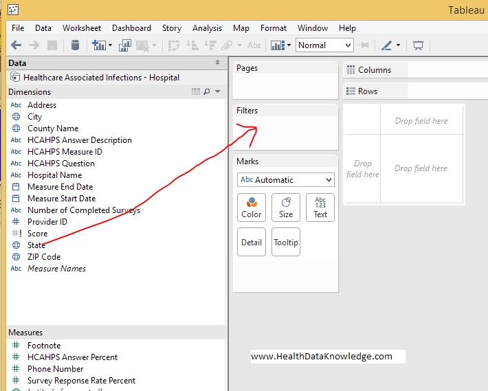
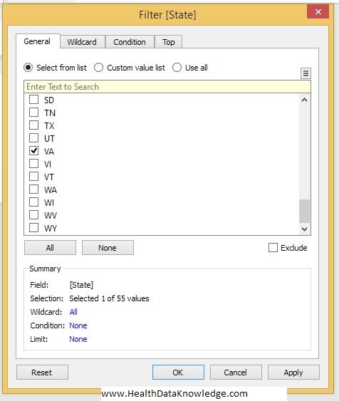
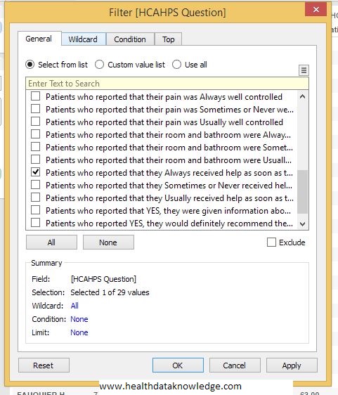
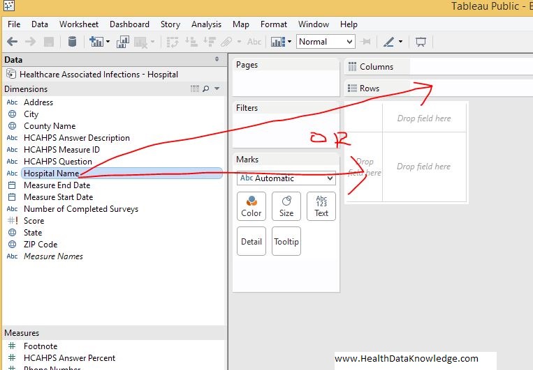
First, lets add a couple of filters so our chart doesn't show all the data (we can always change these later). Drag State over to the "Filters" panel and select one state to view. I picked Virginia because that's where I am sitting.
Now we want to start out by showing only one patient satisfaction question. So drag "HCAHPS Question" over to the filter panel like you did the State. Select one question to display: "Patients who reported that they Always received help when they wanted."
Drag "Hospital Name" over to the columns section of he chart. (if you get a popup asking, let it add all members). See how it lists the hospitals down the rows now?
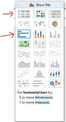
Drag HCAPS Answer Percent over to the Column place or right into the middle of the chart. One way will give you number values in a table, and the other will give you a line chart representation. Either way you can switch from one to the other (and other chart types) by clicking Charts in the "Show Me" Panel.
Try selecting more (or different) questions in the filter and different chart types to explore Tableau and the data. You can also very easily plot these on the map by using zip.
Wen you get more advanced you can create an interactive dashboard.
Have fun and let me know your thoughts on this instructable. Plus, please feel free to post links to your dashboards that you published using tableau public and hospital compare data. Id love to see them.
-Jon from healthdataknowledge.com