Creating a Comics Page From Pencils to Colours
6874 Views, 43 Favorites, 0 Comments
Creating a Comics Page From Pencils to Colours
Before I start with this instructable i just want to make it clear that I am by no means an expert or a professional in the comics industry. I have many years experience reading comics, but I've only been creating comic art for a short time. this is an instructable on how I do it, and by no means reflects industry standard. so with that out of the way, here's what you will need to create a comic page
.
What you will need:
Heavy paper or Bristol Board
pencils (I like the hardness of HB, but also use 2B)
ink (I kinda cheated with this page and used ink pens. Most artists would use indian ink and a brush).
a scanner
Adobe Photoshop (I'm using CS5)
.
What you will need:
Heavy paper or Bristol Board
pencils (I like the hardness of HB, but also use 2B)
ink (I kinda cheated with this page and used ink pens. Most artists would use indian ink and a brush).
a scanner
Adobe Photoshop (I'm using CS5)
Planning the Page

panel layout is a really important part of a comics page. the number of panels, their shape and the way they flow all have bearing on the pacing of the story. The page I'm doing for this instructable is a big character page with some smaller quick action panels. Most comic book writers have a basic plot that is writtten in script form. I'm working from my wifes fantasy novel, remnant. here's the text from the scene:
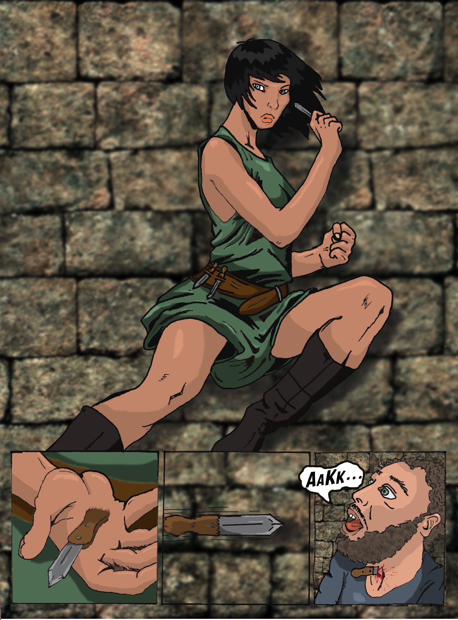
"As Jayde turned her attention back to the fight, Kasu stepped quickly to the side allowing an unobstructed view of his opponent. Almost quicker than the human eye she whipped out her dagger and flung it at the man. Jayde hit him squarely in the throat. While he gasped and gurgled on his own blood she stepped past her stunned leader and undid the man’s belt. She retrieved the keys and handed them to Kasuratu.
“What?” she asked coolly. He failed to reply. “You were taking too long.” She grabbed her knife and cleaned it on her unfortunate victim." Remnant, Chapter 10 by Lesley Barklay.
the best way to plan a page is to draw a small thumnail of the page, paying particular attention to how many panels you need, where they go and what size and shape they are. In this page I wanted to portray the character's agility and deadliness, so I went of a full page panel with 3 smaller, connected panels inserted at the bottom of the full page panel. hopefully the sense speed is conveyed, 'cause that's what I'm going for!
Top tips for panel layout:
1. don't try to convey too much information on a single page.
2. vary the 'camera' angles and point of view.
3. panels dictate pace, so plan the size and number of panels according to the pace at which the story is going.
4. make sure the panels flow in a way that can be easily followed and read.
Pencils

once youve planned the page, you can begin drawing. Here's some tips.
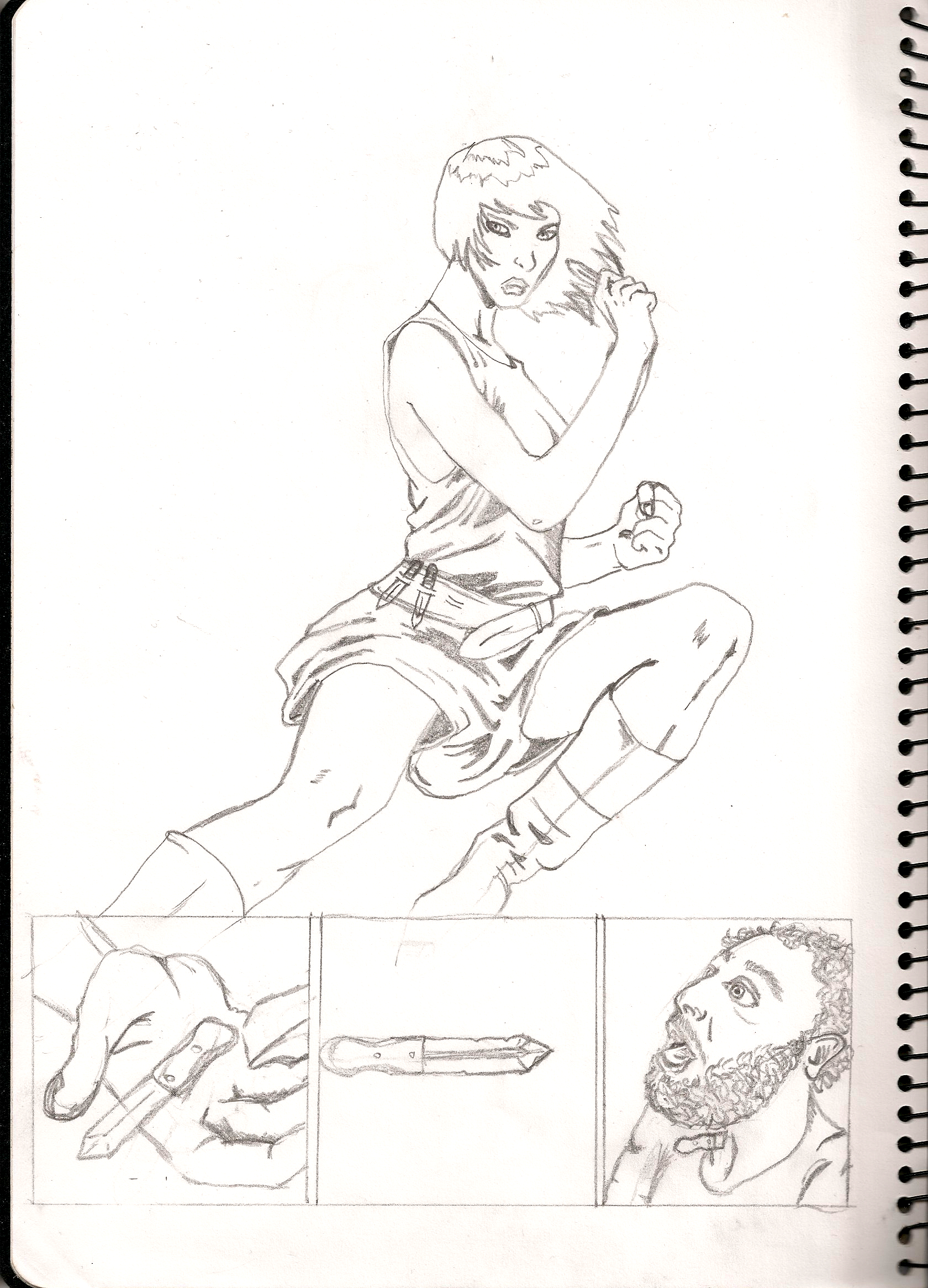
1. Start with a basic framework. softly draw some basic shapes that will be the basis of your panels and build on them.
2. Use reference. unless you've been drawing for years, it's very difficult to get human anatomy right from your head. look at pictures online, use a friend as model, etc. I'm not talking about tracing or direct copying, but just using reference so you can get proportion and shape right.
3. vary your character's appearances. body and face shape, size, shapes of lips, nose and eyes, hair - make every character look different.
4. make mistakes. The great thing about pencil is it rubs out. I usually draw a basic shape before I draw detail, and I almost always change something.
Next step - inking.
Inks

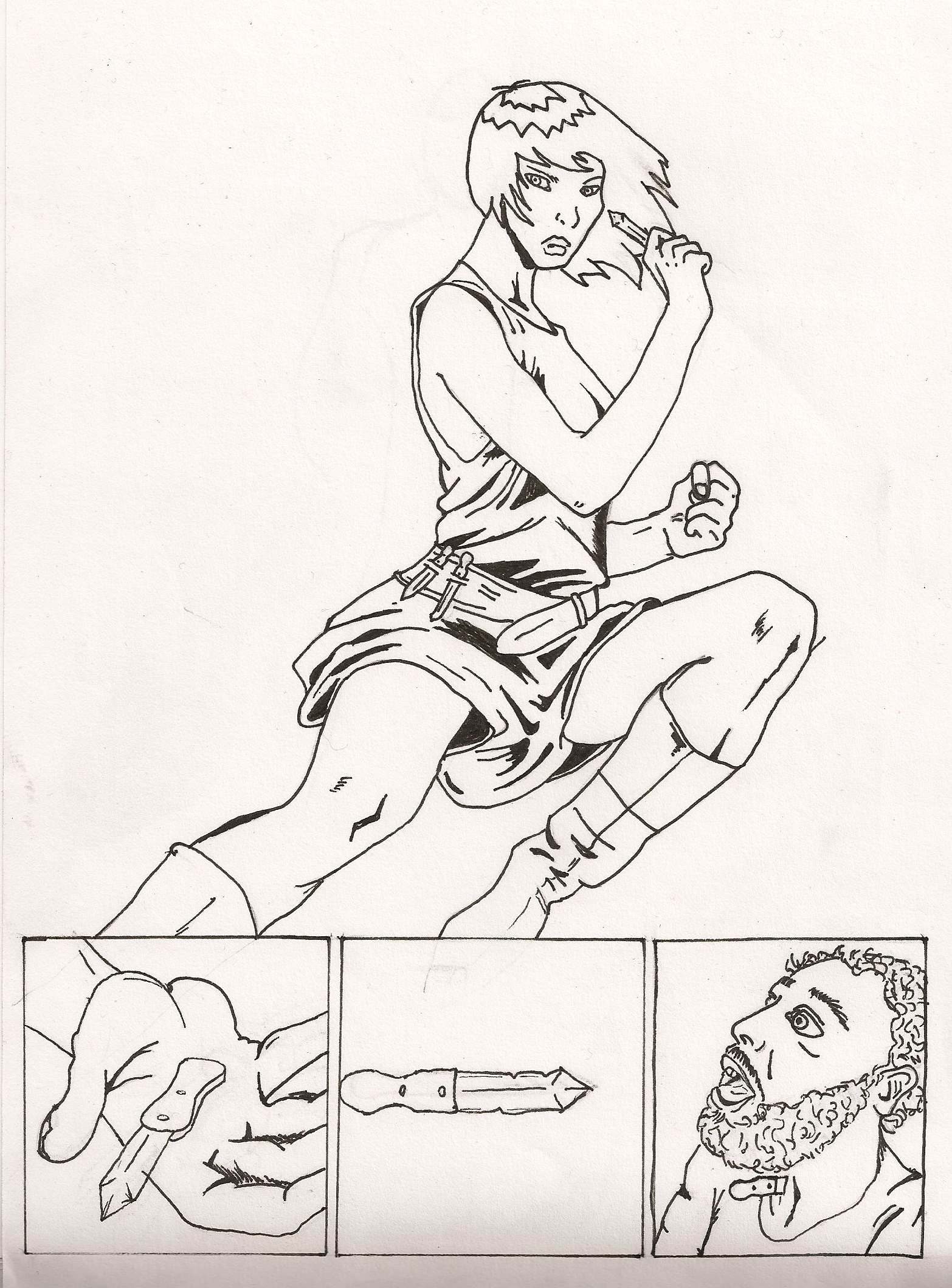
I'll admit my lazinesss and say I used ink pens rather than an ink and brush on this one. ink pens are a great way to start out, though. the advantage of brush and ink is that you can vary line size and remain fluid in your strokes. here's some inking tips.
1. keep your line flowing as much as possible. ti creates cleaner, crisper images.
2. vary line width. this keeps the image exciting and dynamic.
3. when inking shadows on clothing, keep in mind your light source. where is the light coming from, and where will my shadows lie?
4. If you make a mistake, it's no big deal. the beauty of making comics in this day and age is that you can always fix mistakes in photoshop.
5. this might be obvious, but wait for the ink to dry completely before you rub out your pencil lines. you don't want to rub of the ink, as well.
Now scan the image in (the better the scanner, cleaner the image) and open it in photoshop.
Cleaning the Image
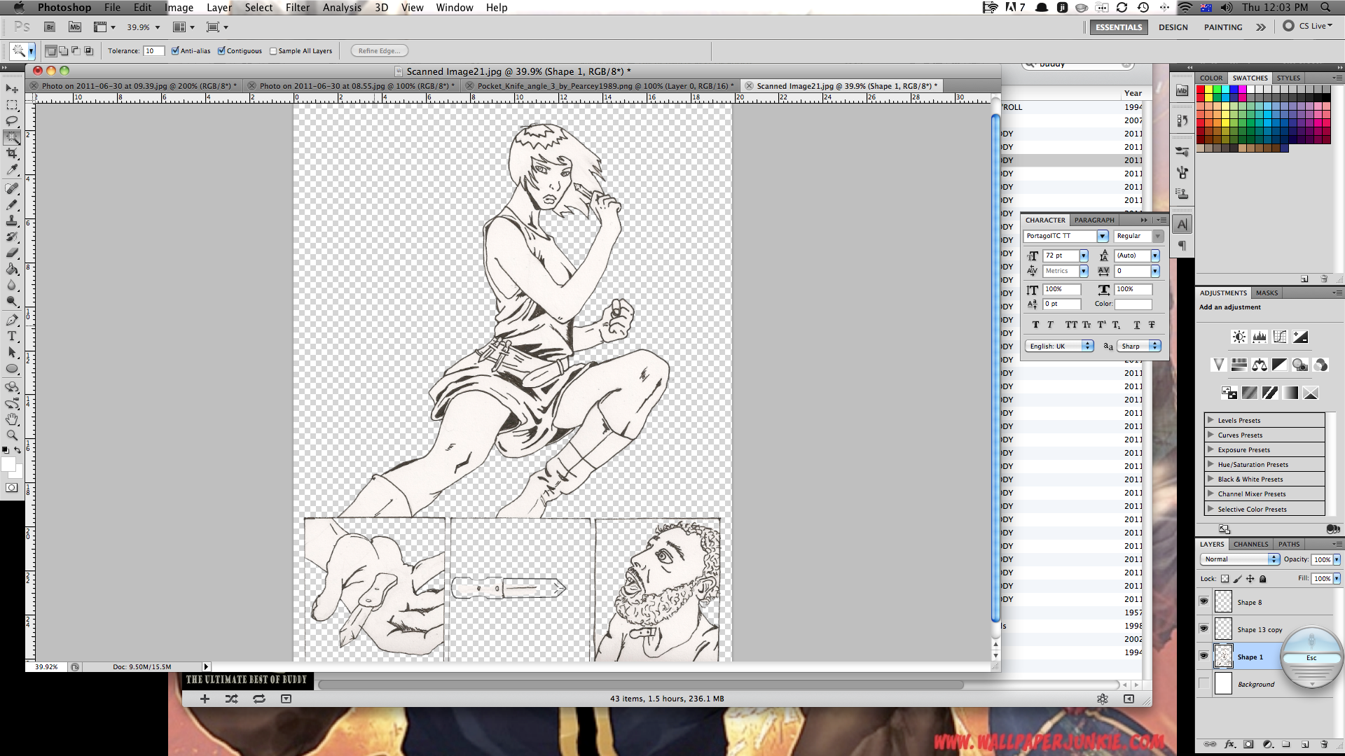
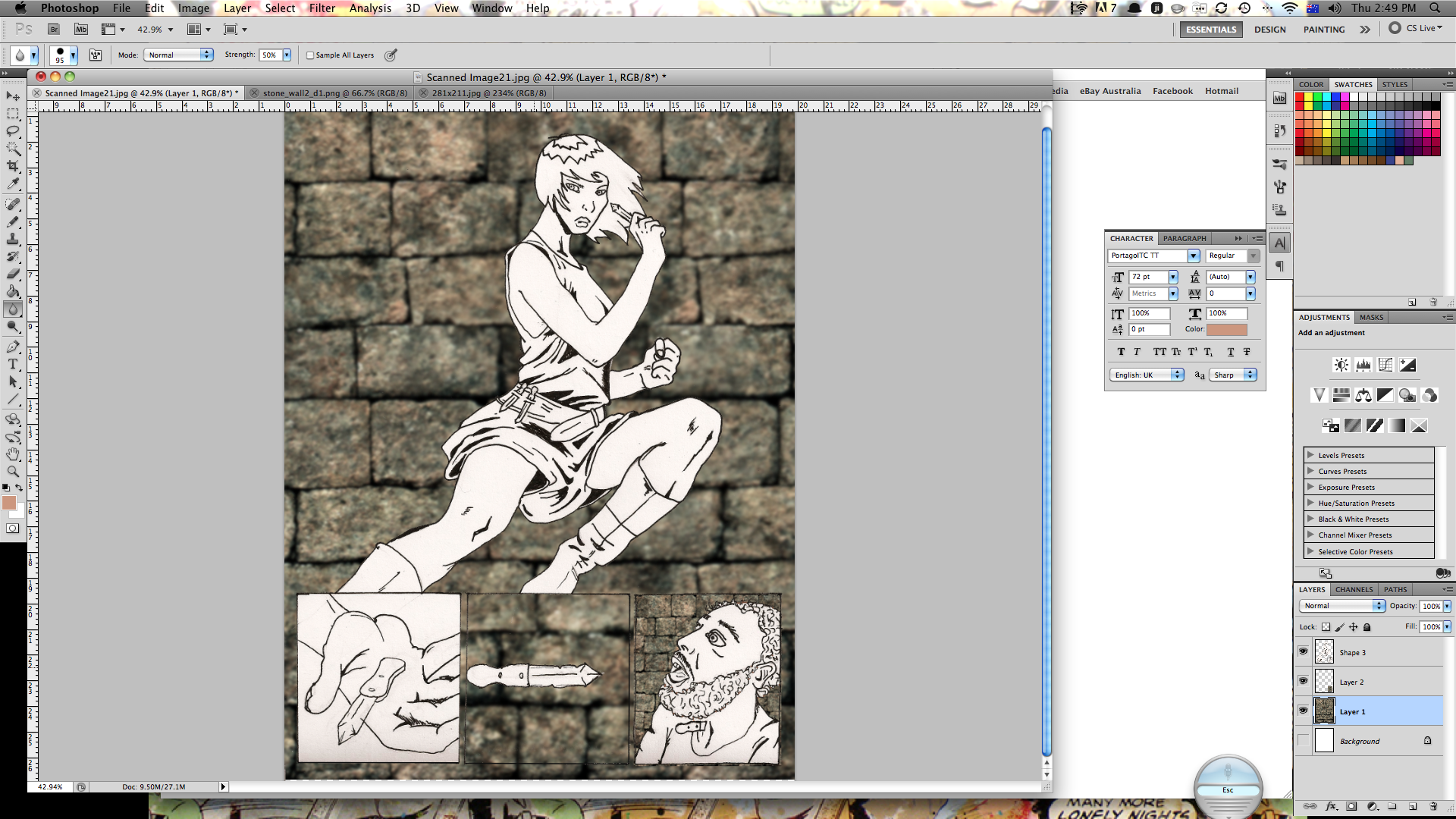
usually you'll have to clean your image up a little bit in photoshop. here's how I do it.
1. create a new layer.
2. from your background layer, select all and cut.
3. paste onto the new layer.
4. using the brightness/contrast settings, adjust the settings to make the lines more crisp and the white space 'whiter'.
5. using the magic wand, delete the whitespace that will be the background.
6. use the eraser to clean up any lines etc that aren't supposed to be there.
7. use the brush/pen tool to fix up any lines or add any detail that wasn't inked.
I'm using a stock background (which is a stock image that i've blurred a little) and I added it as a new layer behind the layer with the main drawing.
Once the image is clean and crisp, you can start colouring.
Base Colours
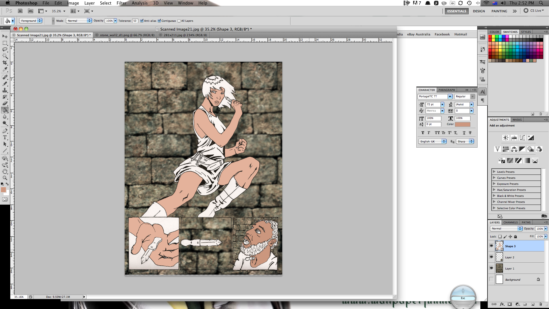
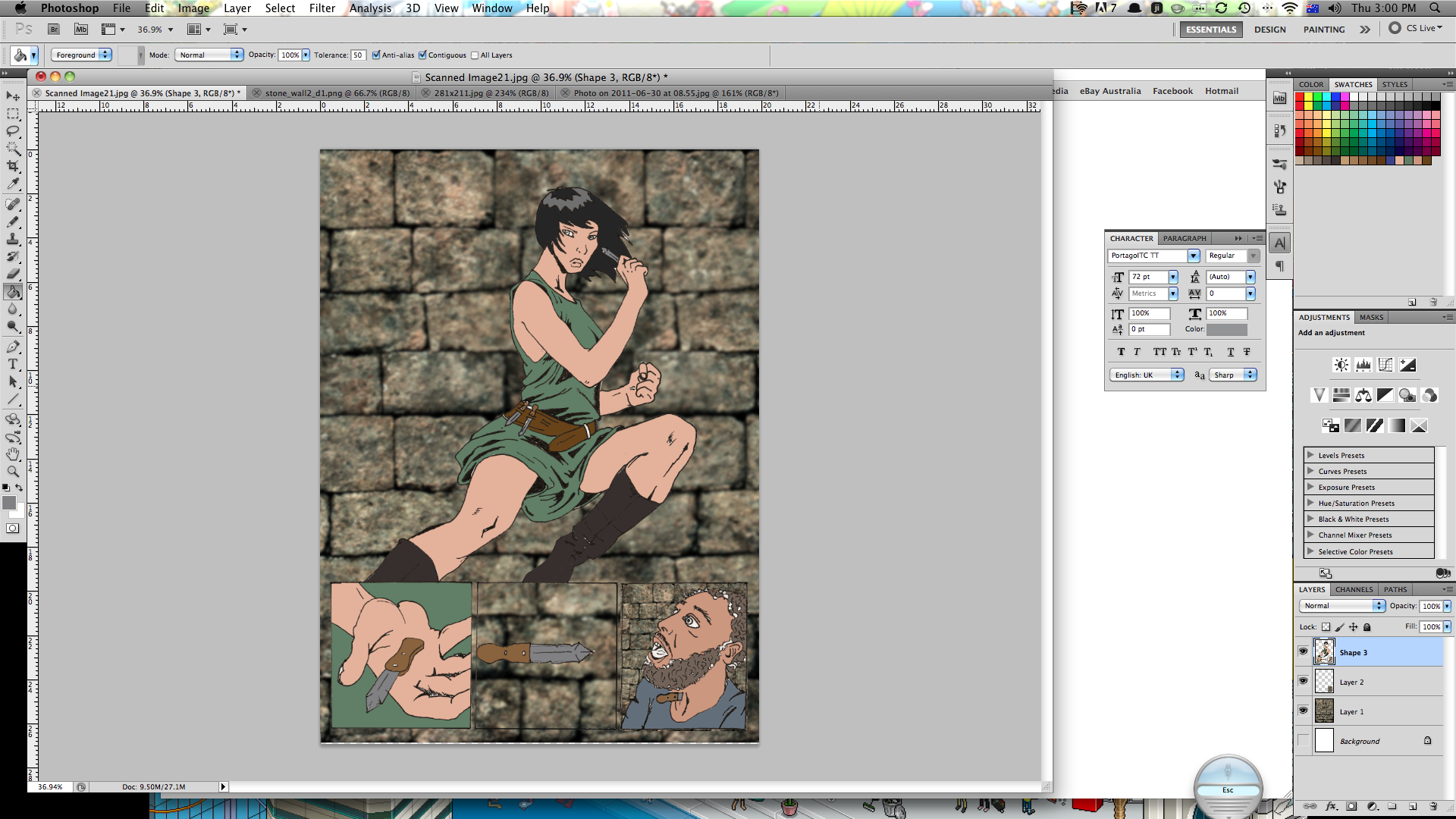
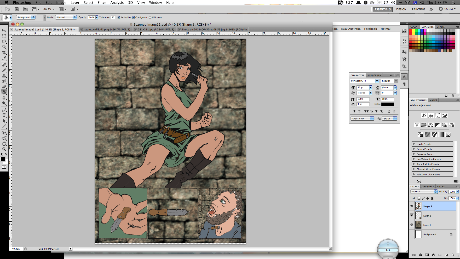
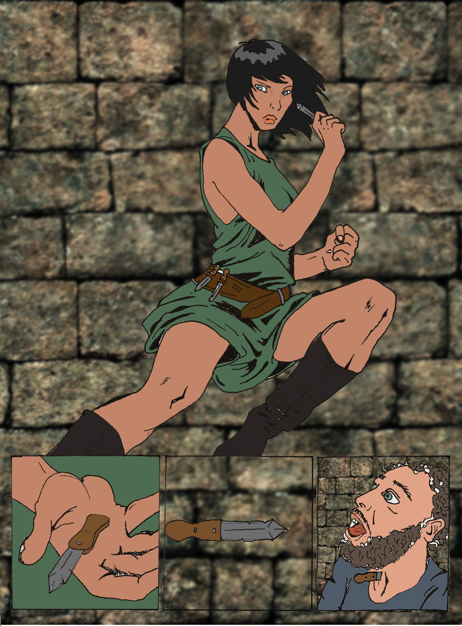
when colouring, it is (once again) important to understand where the light is coming from and how shadows will fall. I begin with base colours - flesh, hair, clothes - just one single colour for each. use the magic wand to select certain areas and then the bucket tool to fill them. use keyboard shortcuts it saves so much time. you dont have to spend to much time getting every little bit the right colour - you can fix it up later.
Once all the base colours are done, it's onto highlights and shadows.
Once all the base colours are done, it's onto highlights and shadows.
Highlights and Shading
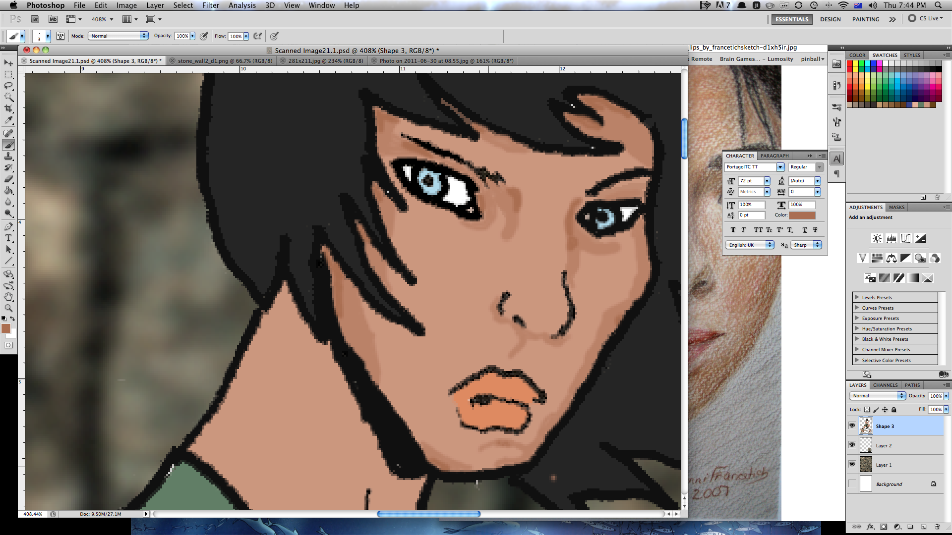
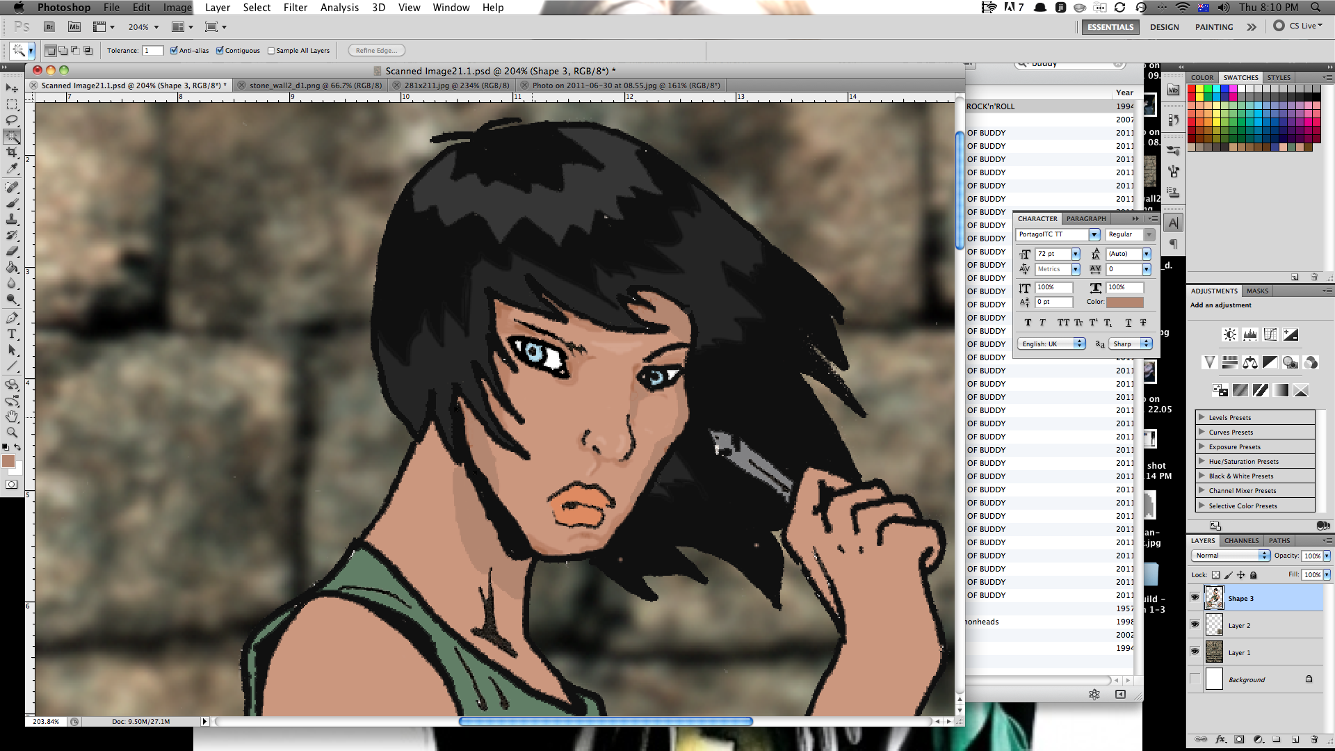
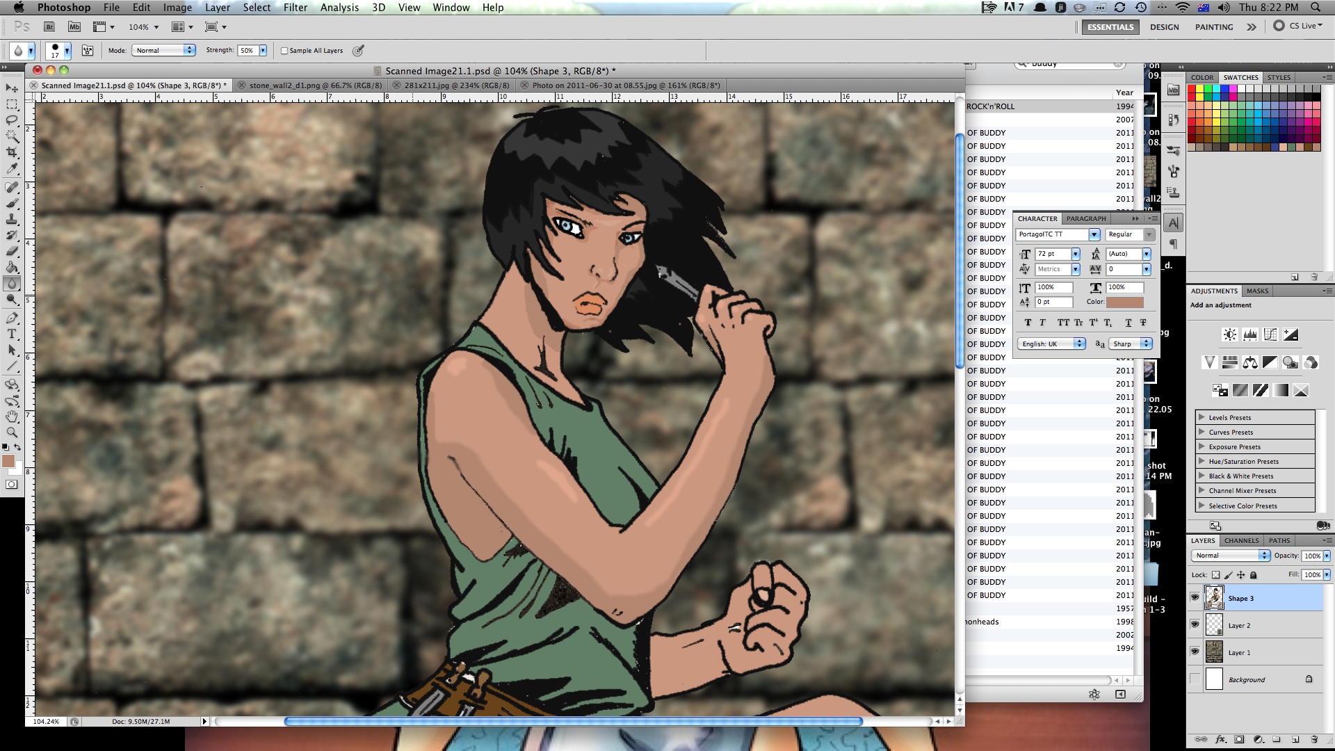
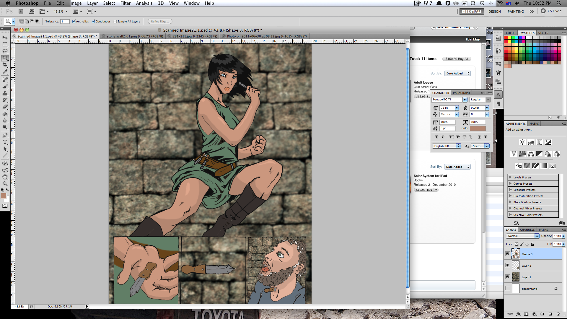
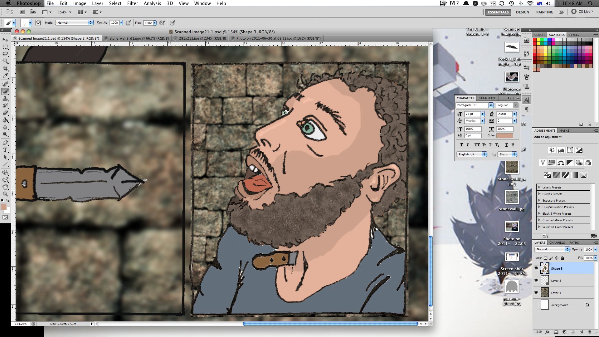
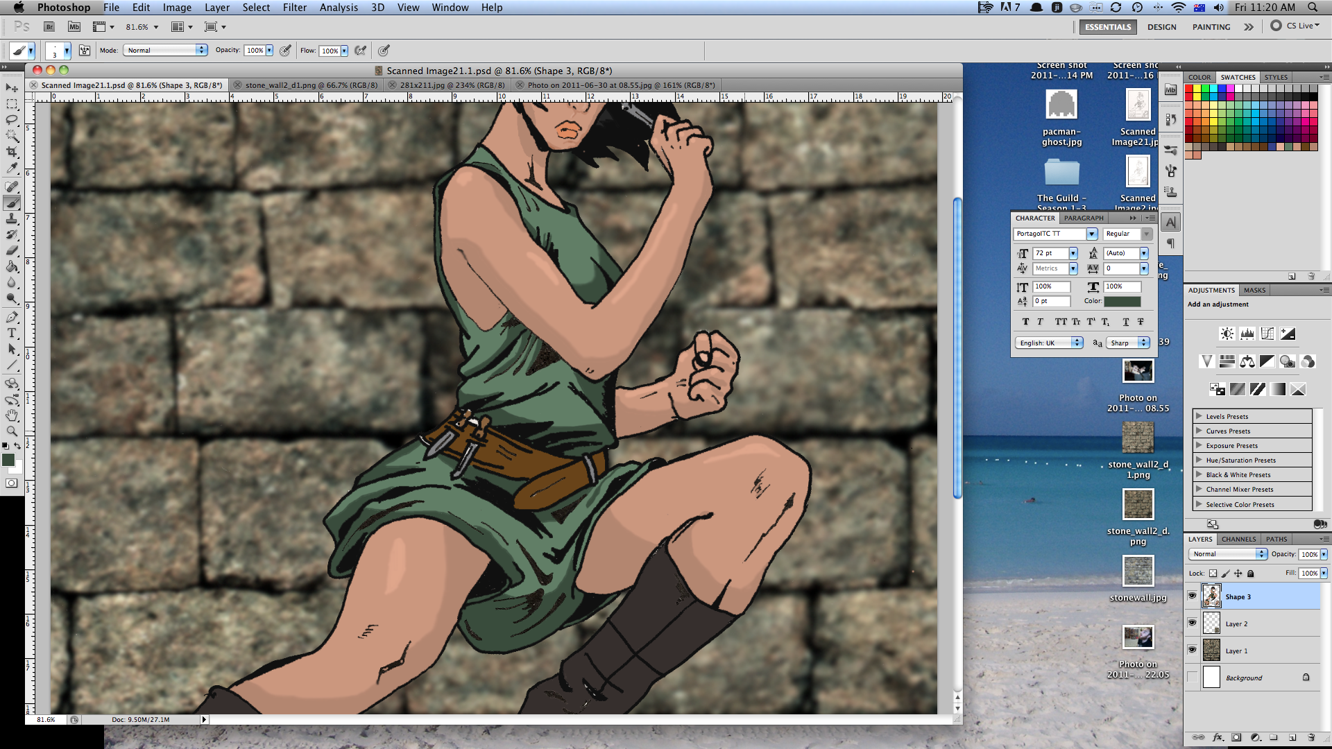
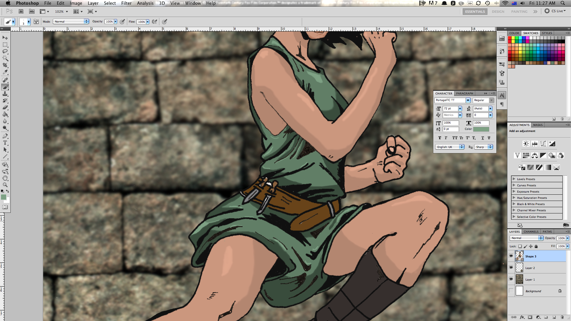
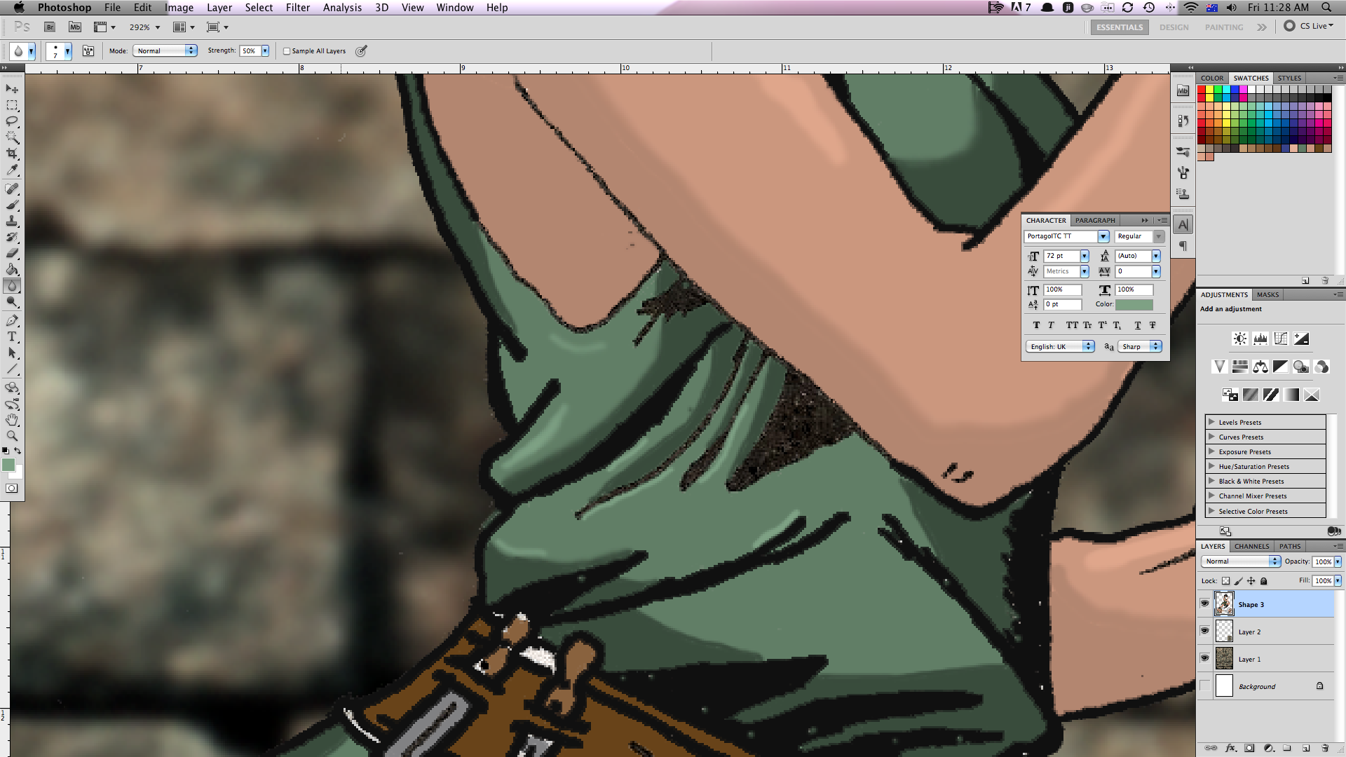
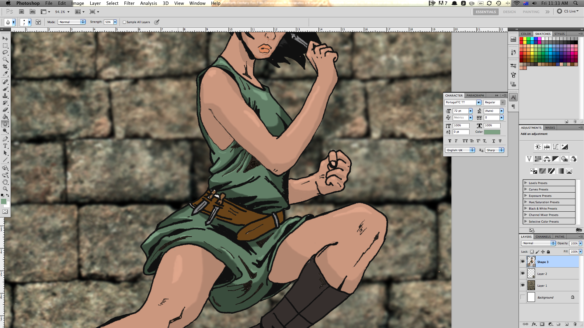
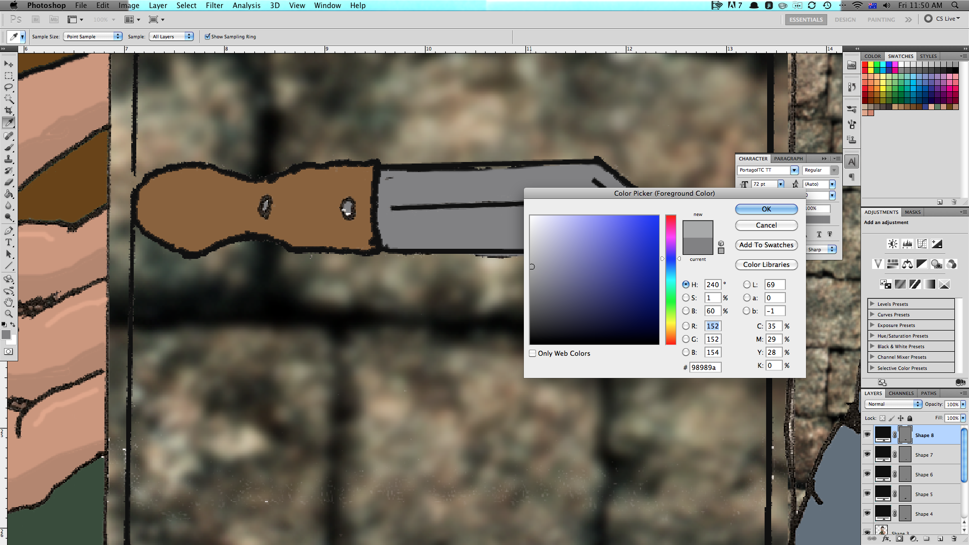
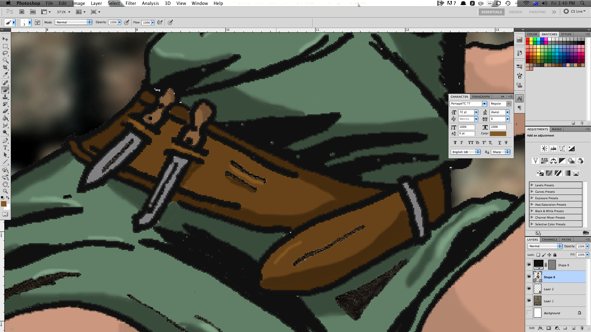
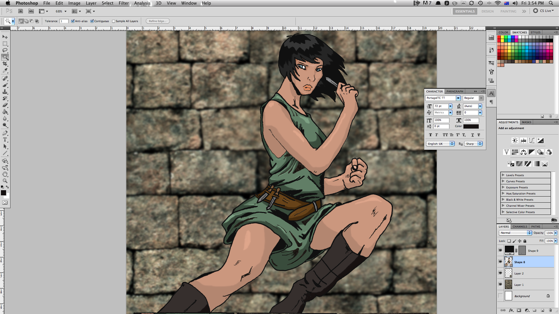
I usually do shadows first, and I do one colour at a time - all the flesh on the page, then all the green, etc.
1. use the dropper tool to select the colour your going to shade and highlight. select the colour in the left toolbar.
2. chose a colour directly darker than your base colour. try to get it so it's dark enough to stand out, but not to dark that it looks unnatural.
3. using the darker colour shade areas that might be obscured from direct light. on a face, usually it's just below the hair, the area where eys meet nose and whatecer side of the face is turned away from the light source. with bigger areas (her legs for example), draw a line with your shade colour where you want the shading to come up to and then use the magic wand and fill tools to paint the area.
4. select your base colour again and then choose a colour directly brighter than the base.
5. colour areas that stand out and may have light reflected of them.
6. go easy on the highlights. i find and image with too many highlights looks kinda busy.
7. I use the blur tool to soften the edges of shades and highlights.
8. now is the time to colour all the bits that you missed during the base colouring. make sure there are no white areas left (unless they're supposed to be white).
it's amazing the difference shading and highlits make to an image.
Lighting and Effects
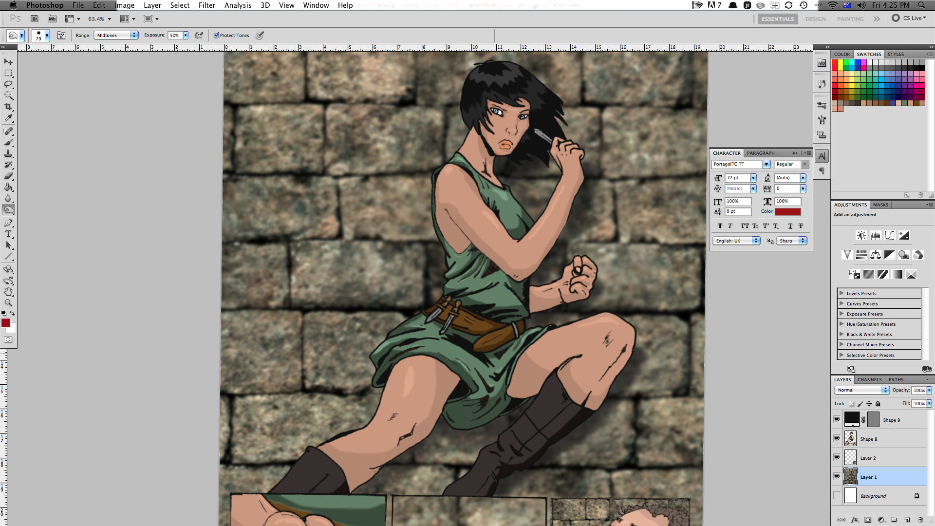
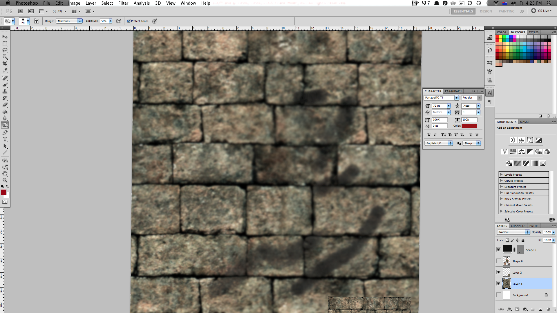
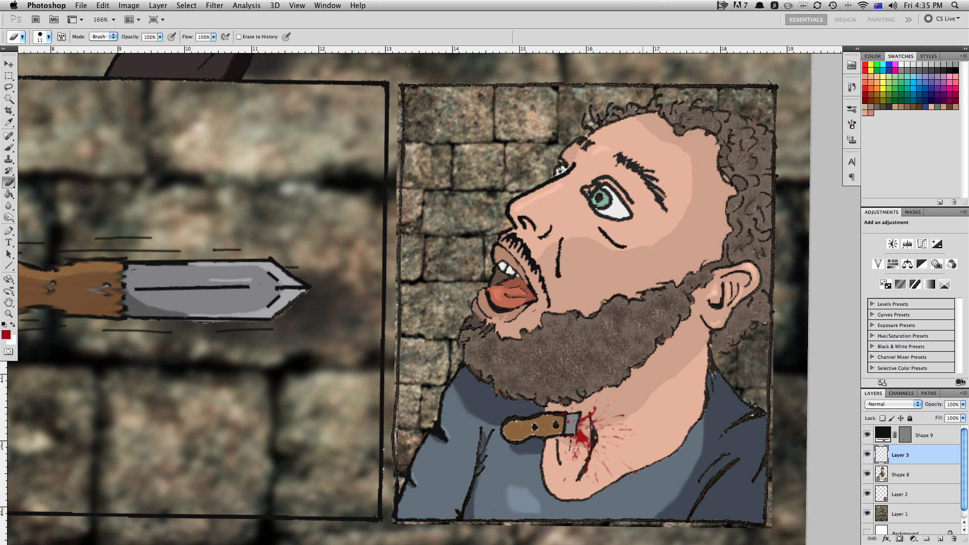
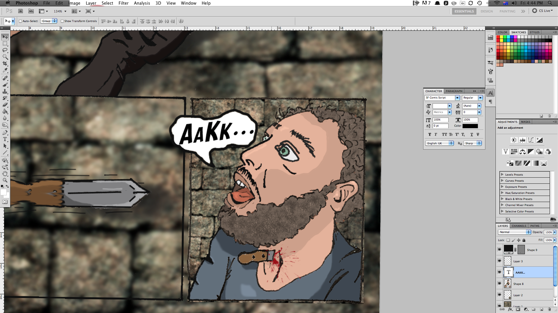
shadows are an important part to getting an image right. to create shadows I:
1. create a new layer below my main image but above my background.
2. select the Burn tool and adjust it to about 50% hardness.
3. Use the tool to darken the areas where shadows may lie. The closer an object is to a surface, the darker the shadow. for example, a bottle on a desk casts a shadow that is darkest at the base and lightest at the top.
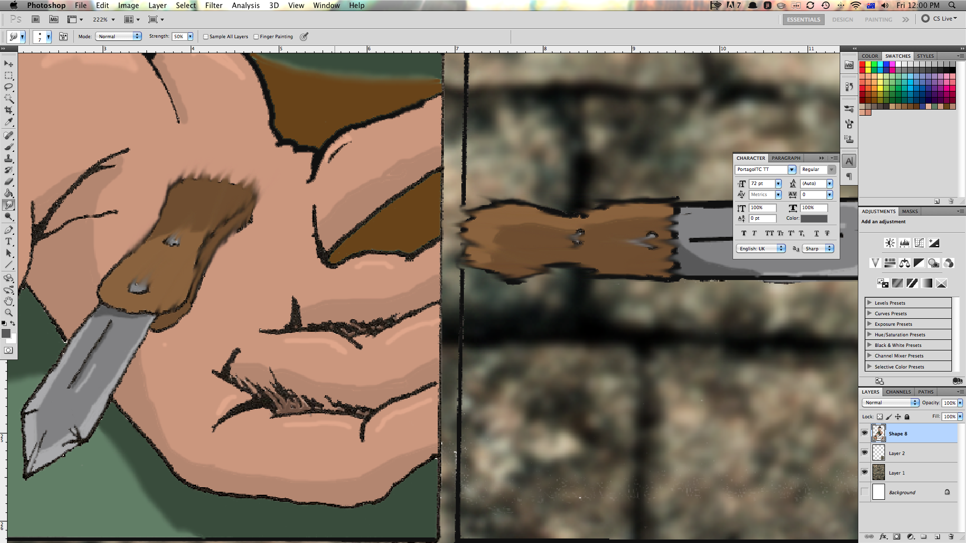
I then added some effects - to show the movement of the knife, i used the smudge tool to 'blur' the knife so it has the appearance of movement. I used a splatter brush that I downloaded for the blood, and created a speech bubble for the victim's sound effects.
The page is finished! the whole thing probably took me about 10 hours to complete. I'm sure, with practice, I'll be able to get it done quicker.
Removing Lines
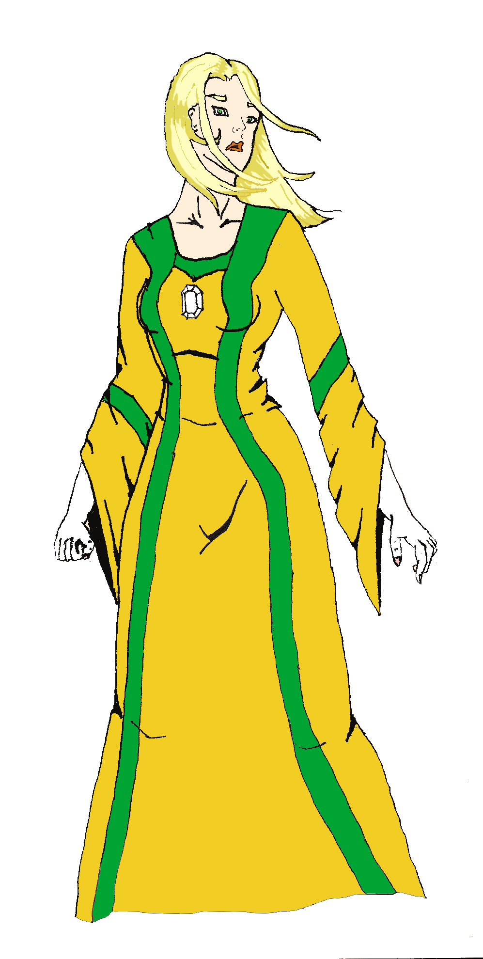
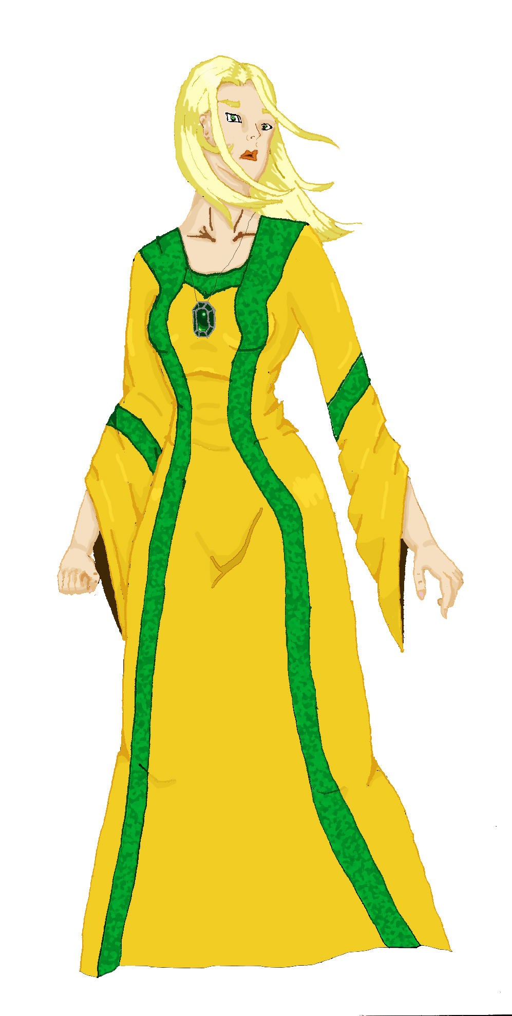
An effect I sometimes do is removing the black lines from an image. it makes it look smoother and a little more realistic. I didn't get time to do it on this page, so here's something I did a while back.
I hope you enjoyed this instructable. It is by no means comprehensive, but it shows the basics of how I put together a comic page.
If you have any questions, feel free to ask.
I hope you enjoyed this instructable. It is by no means comprehensive, but it shows the basics of how I put together a comic page.
If you have any questions, feel free to ask.