Creating Satellite Imagery - Landsat
by rjc287 in Workshop > Science
31511 Views, 259 Favorites, 0 Comments
Creating Satellite Imagery - Landsat
Introduction
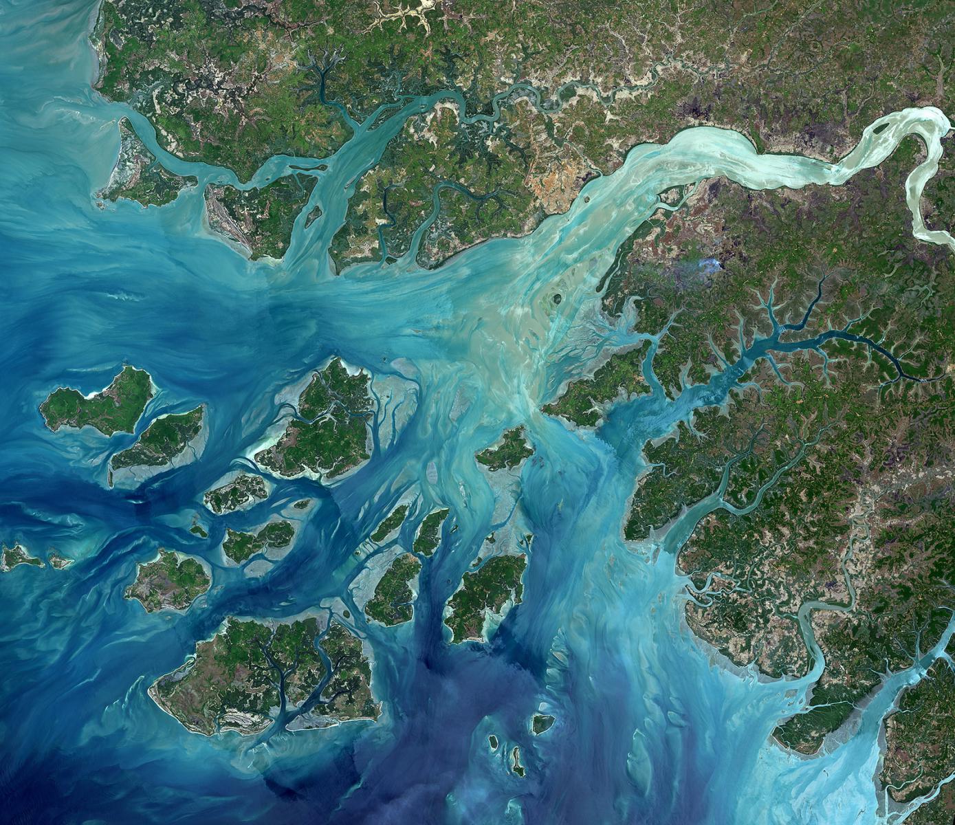
Creating satellite imagery is quite easy and really a lot of fun. You can see the world in a completely different way. Not to mention, some of those images make for a great desktop background! :)
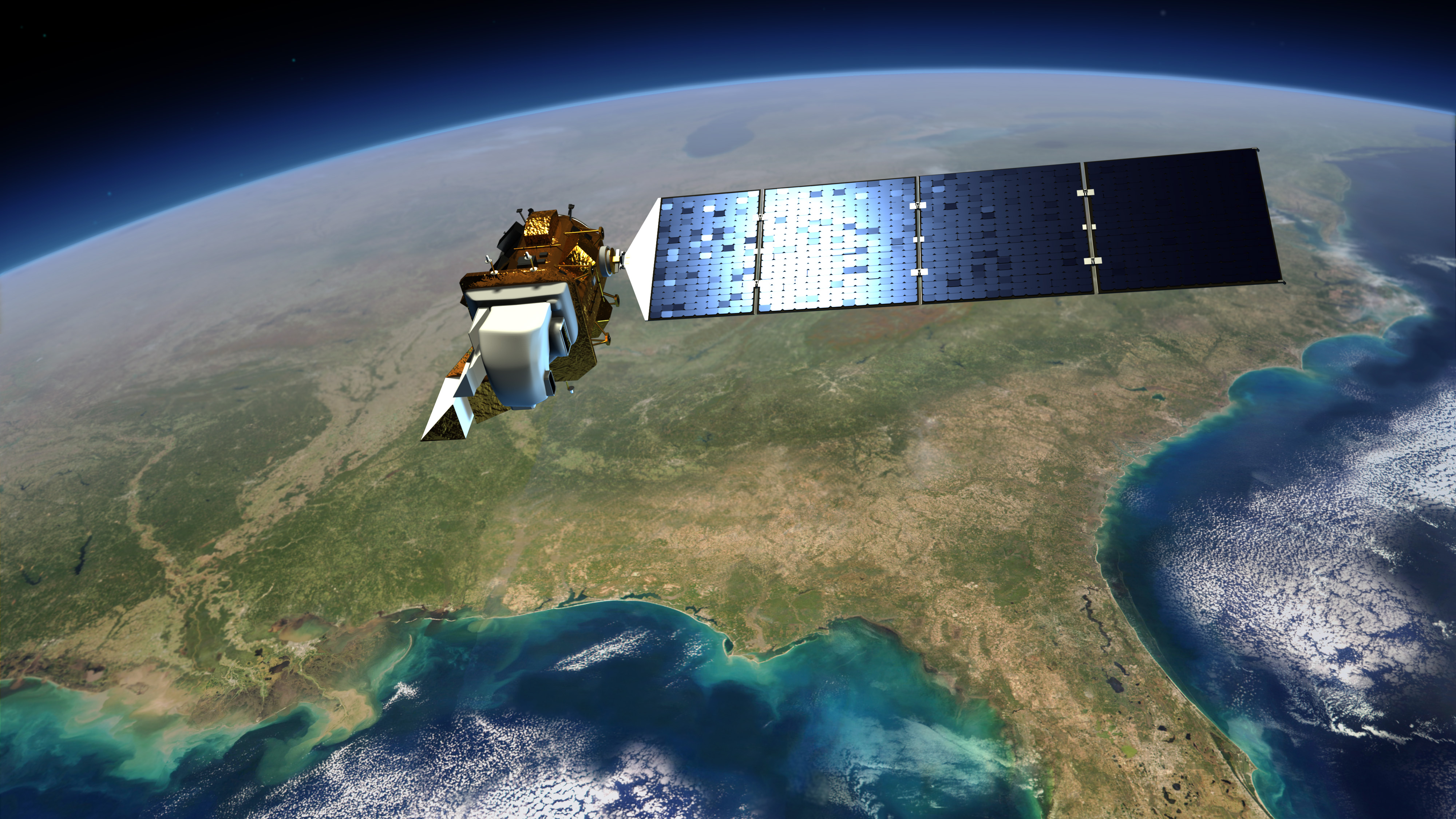
In this tutorial, we're going to focus on imagery from Landsat 8, a NASA (National Aeronautics and Space Administration) and USGS (United States Geological Survey) satellite. However, this can easily apply to older versions of Landsat data (Landsat 7 and earlier).
What is Landsat 8?
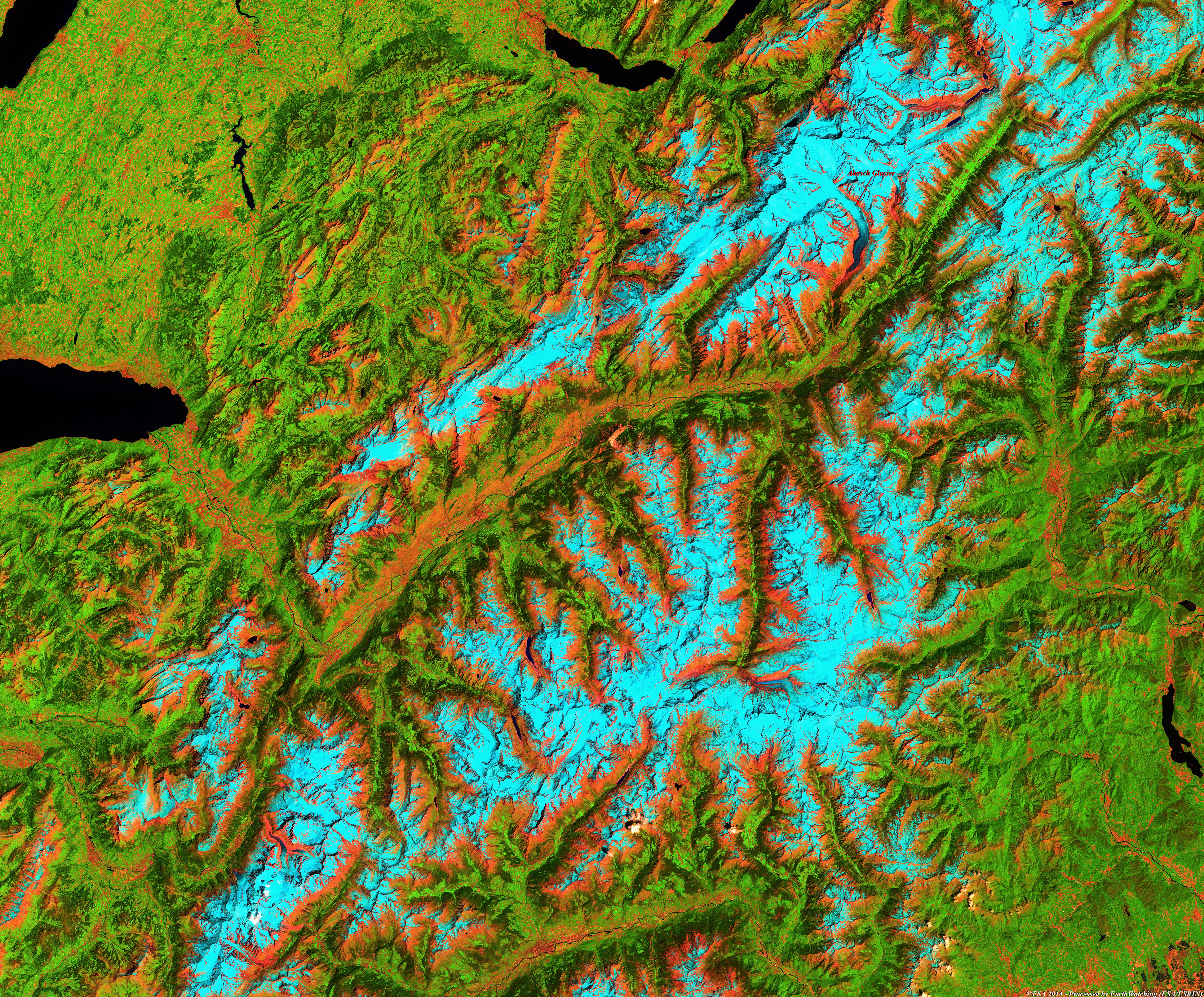
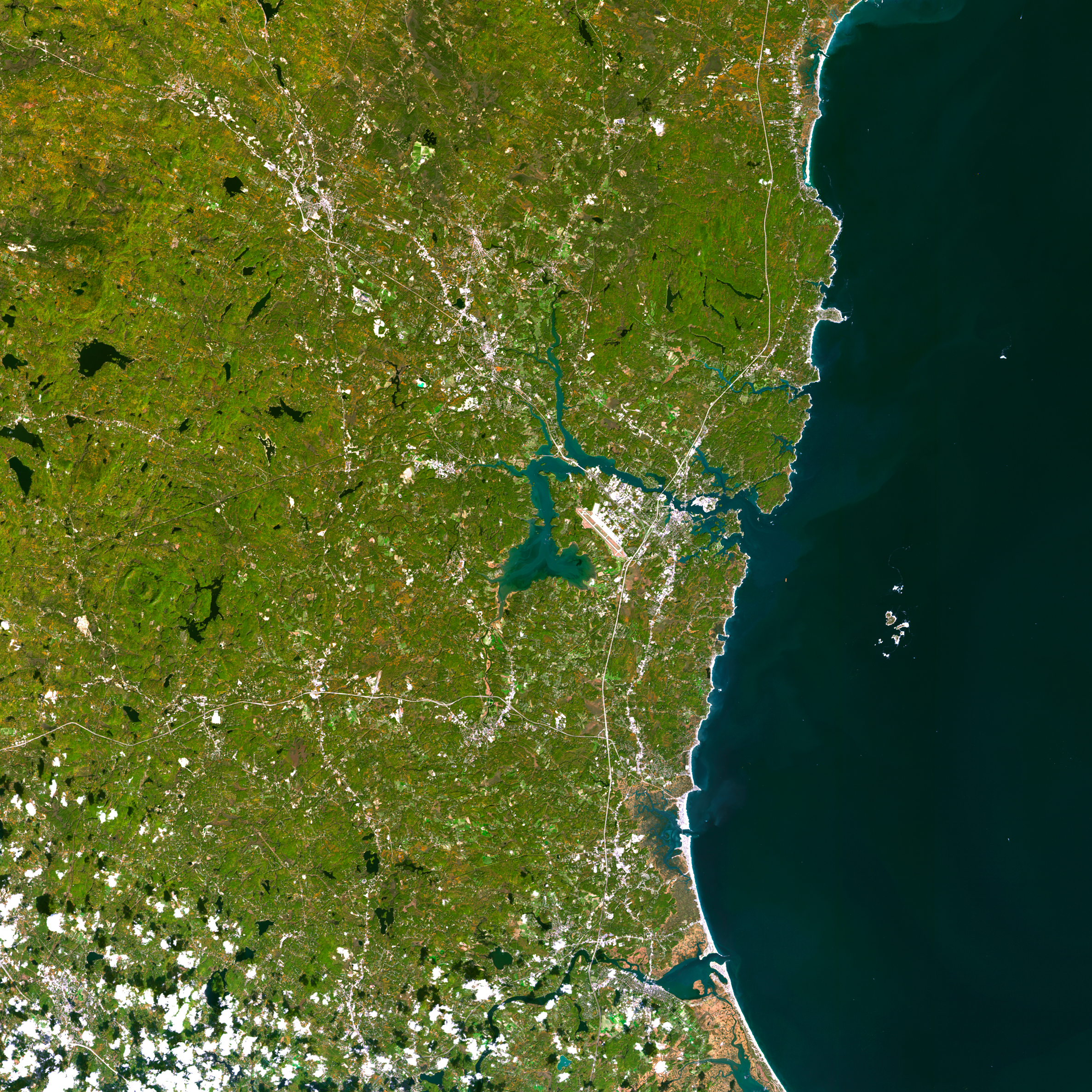
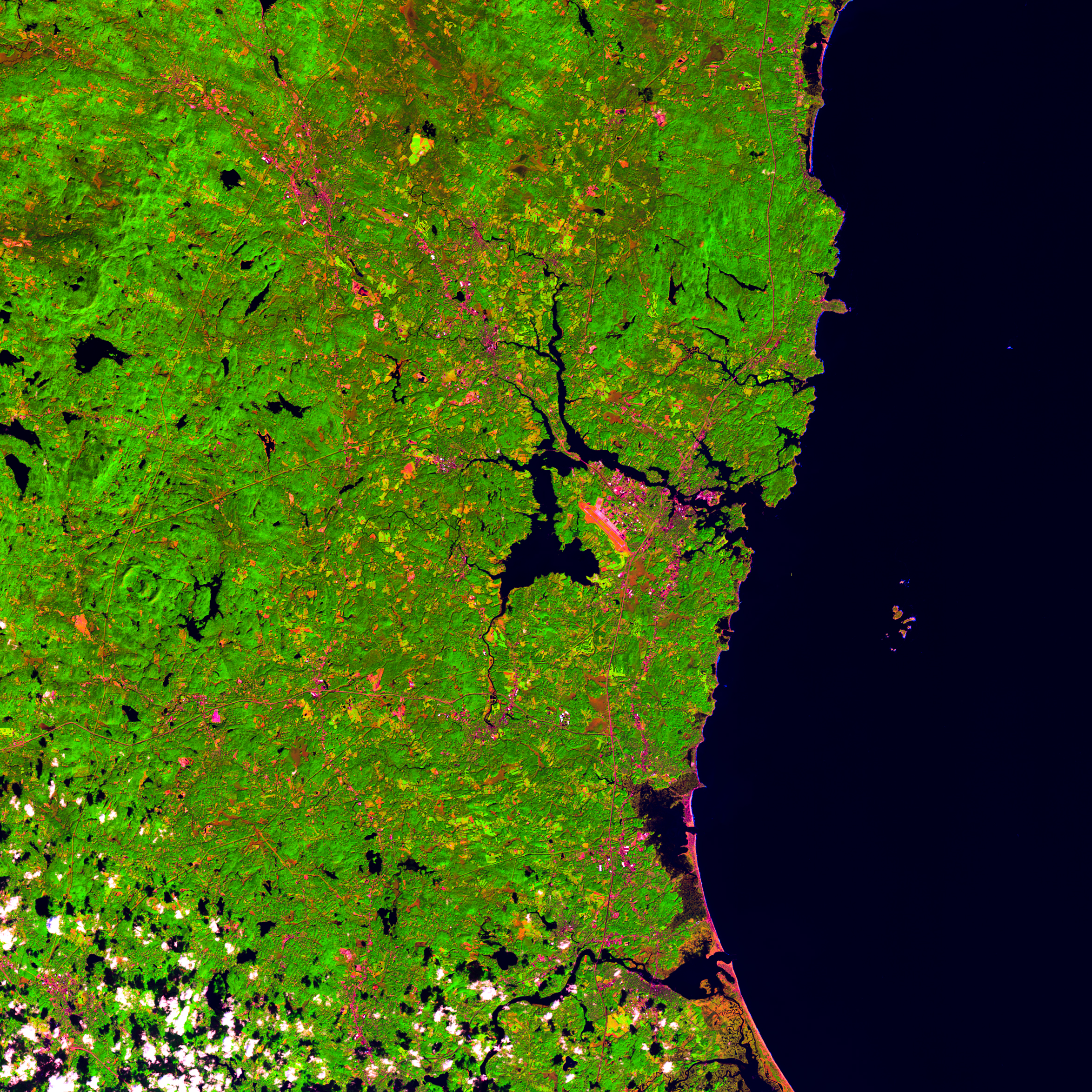
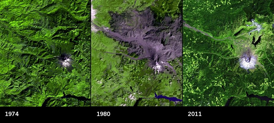
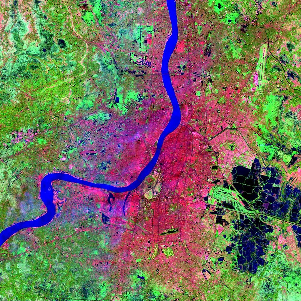
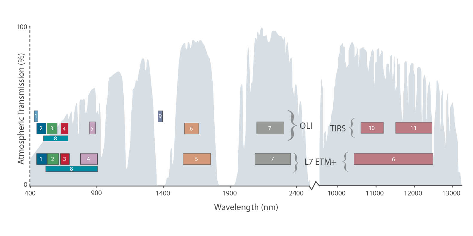
Landsat 8 was launched in 2013. It constantly takes pictures of Earth and can see the entire planet in 16 days. The two instruments on board, the Operational Land Imager (OLI) and Thermal Infrared Sensor (TIRS), Landsat 8 can record data from 11 different wavelength bands (discussed later). Only three of these bands comprise of visible wavelengths. This means that there are 8 other bands of wavelengths that we couldn't see without Landsat 8's sensors. There are some example images using these other wavelengths attached.
Why do you want to make images from Landsat 8's data?
Well, why not?? It sounds pretty cool, right? Here are a few reasons you might want to make images:
- For fun - the Earth is a beautiful place
- Education - you can learn a lot about the world, how it works, and how humans impact our planet by studying these images
- Mapping - maps are useful!
- Visualizing trends - If you use data over a period of weeks, months, or years, you can see some significant trends in temperature, city expansions, foliage, etc. These could be natural or anthropogenic (human-caused) effects.
- Agricultural health - plants reflect certain wavelengths of light depending on their health. With this, farmers can use Landsat to see which parts of their crops are healthy and which are stressed. Or, you can use it to study forest health!
- These are only a few reasons. I'm sure you can find your own as well!
Objective
The objective of this tutorial is to demonstrate the process of creating an image from Landsat data. Note that this does not show you how to normalize the data, analyze the data, or perform calculations from your processed data… I am by no means even close to an expert at using this data so I am in no place to teach such methods.
*Note: This will focus primarily on Landsat 8 data sets. There are some subtle differences between Landsat 8 and Landsat 7 data sets (as well as even earlier versions of the Landsat series). These differences will be very briefly discussed below. Therefore, this tutorial can be used with the older data sets with appropriate corrections.
Completion Time
This tutorial should only take about an hour to complete. This does not include time searching for a location or downloading data.
Required Resources and Software
First of all, creating images can be done for FREE. There are some pieces of software that you can pay for that (maybe) do a better job and make part of this process easier. However, this tutorial focuses on doing this for absolutely zero cost to you.
Great, so what do you need to start creating your own satellite imagery?
- ImageJ - This is a piece of open-source software used for scientific image analysis. It can do all kinds of stuff. Read about it and/or download from their website (https://imagej.net/). I downloaded my copy from (https://imagej.nih.gov/ij/). I assume it's the same exact release.
- Computer - Windows or Mac will be fine. You just need to run ImageJ which is a Java application.
- Data - Of course, you need to download some data to process. This will be covered in a later step.
- Optional: Image editing software. I occasionally use Adobe Lightroom to bring out some additional features. It's not natural, but it can be fun to bring those features out more.
Image Location and Downloading Data
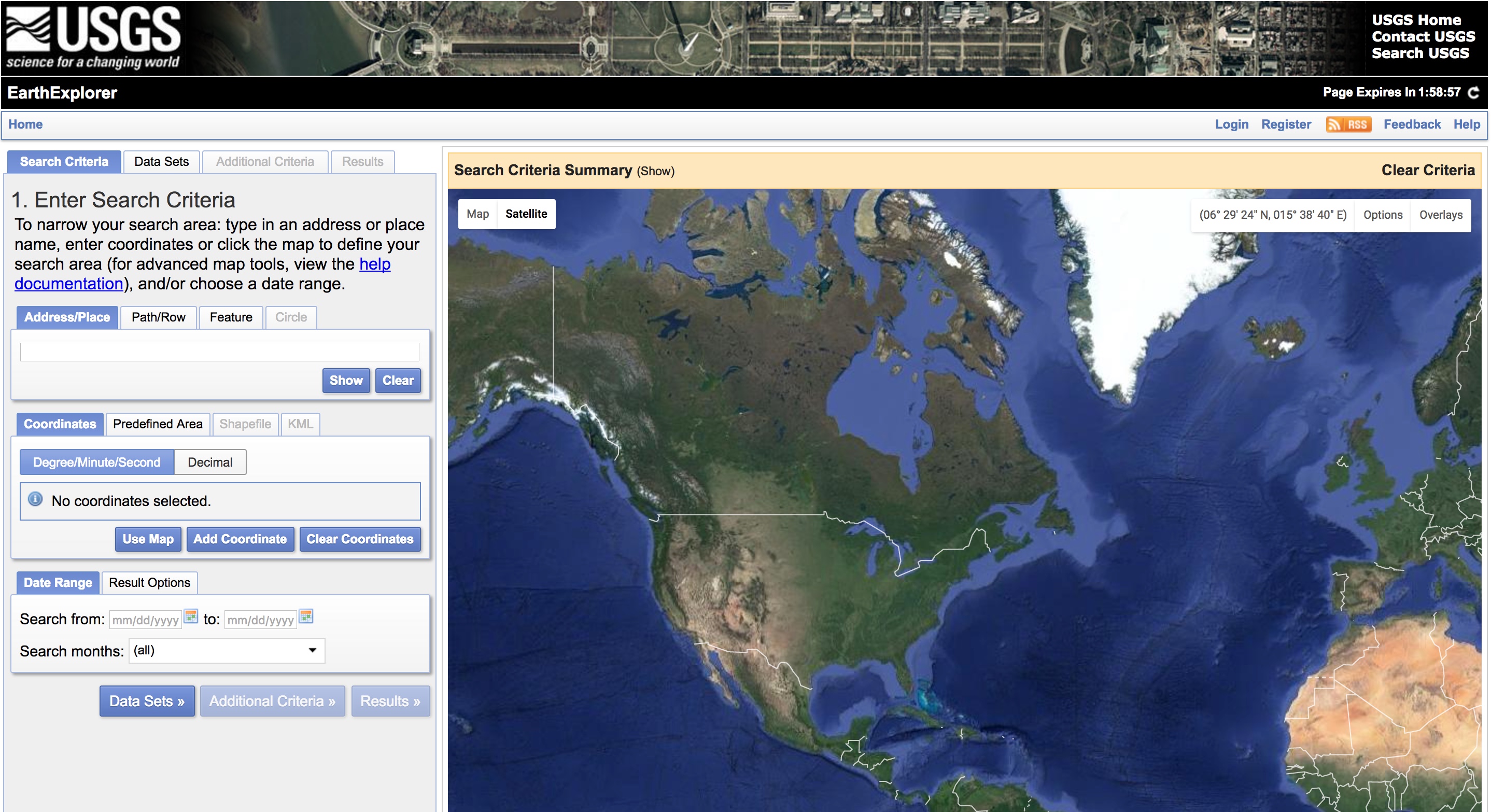
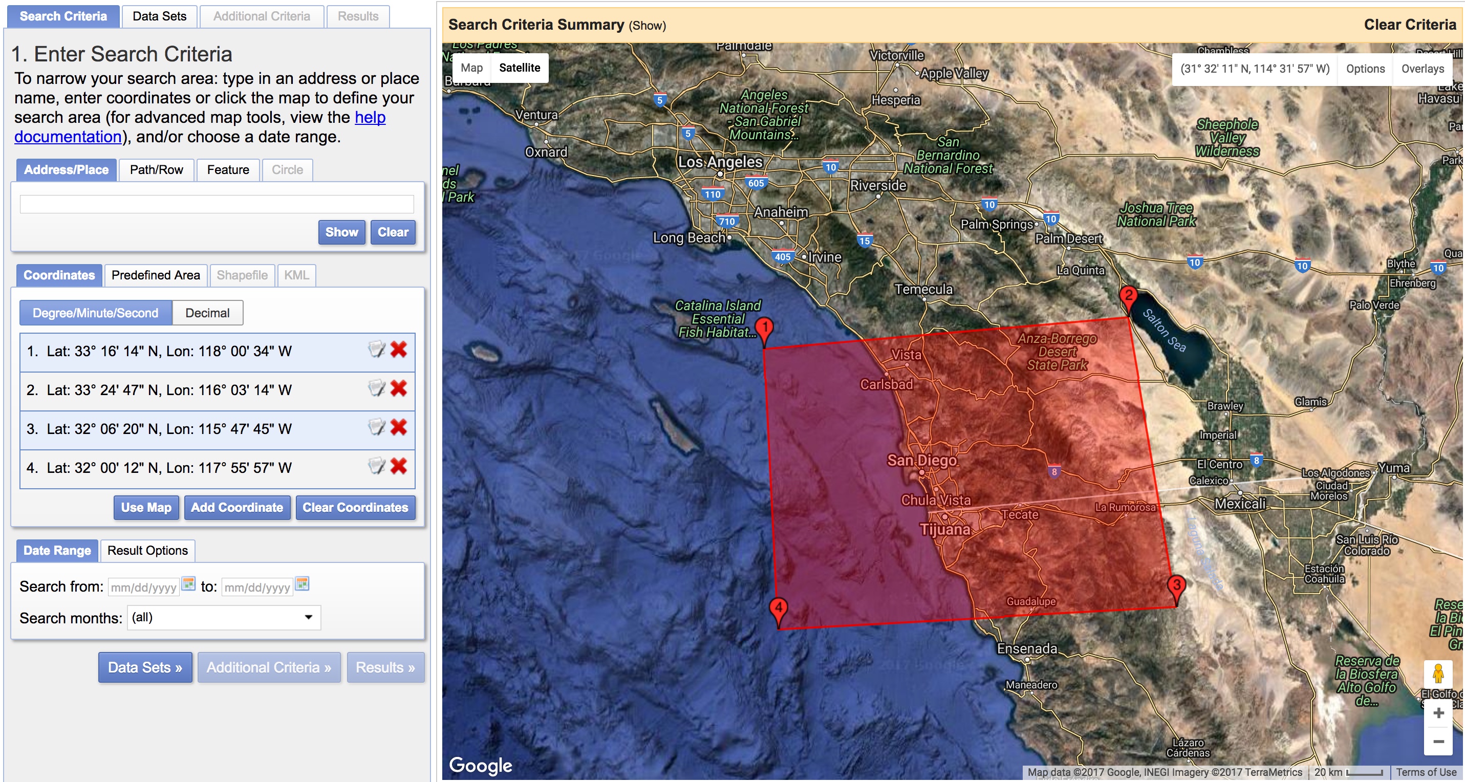
Consider a location that you'd like to produce an image of. Now, head on over to the Earth Explorer site from the United States Geological Survey (https://earthexplorer.usgs.gov/). You're going to have to create an account (name, email address) to download data.
Find Your Spot
Find your location of interest. I would recommend just clicking and dragging around the map until you find the location you're interested in. You'll notice you can also type in address or place. A more advanced feature is searching by path/row. Don't bother with this for now, but it will be useful if you're looking to image the same patch of land over and over.
Each "square of land" had a path/row reference. You can find these by a simple Google search of something like "Landsat 8 path row map."
Once you find the location you're interested in - for this example I chose the San Diego area - you need to bound it. Click on the map to select 4 corners of a polygon that will bound your region of interest. Red markers will land where you click and the coordinates of the red markers will show up on the left side of the screen.
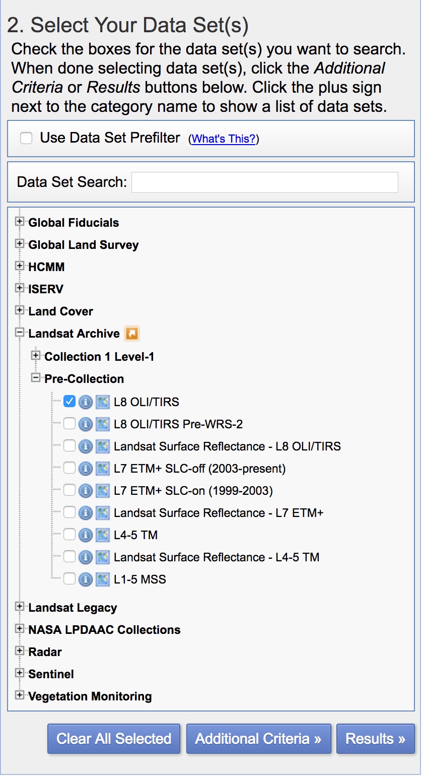
Now click on the "Data Sets" button at the bottom left. This takes you to step 2 where there is a whole list of satellites/sources you can download data for. Select Landsat Archive, then Pre-Collection, then L8 OLI/TIRS. A message may pop up...just dismiss it by clicking OK.
Next, click the Results button.
Search for a Good Data Set
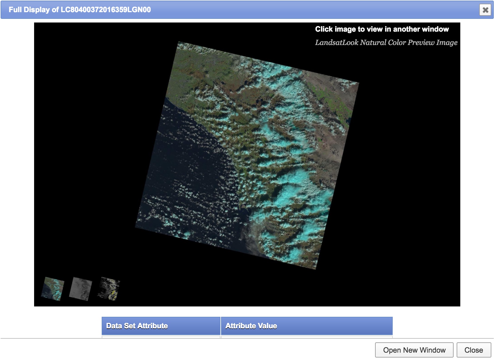
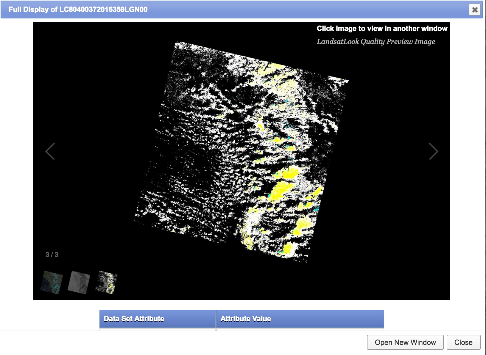
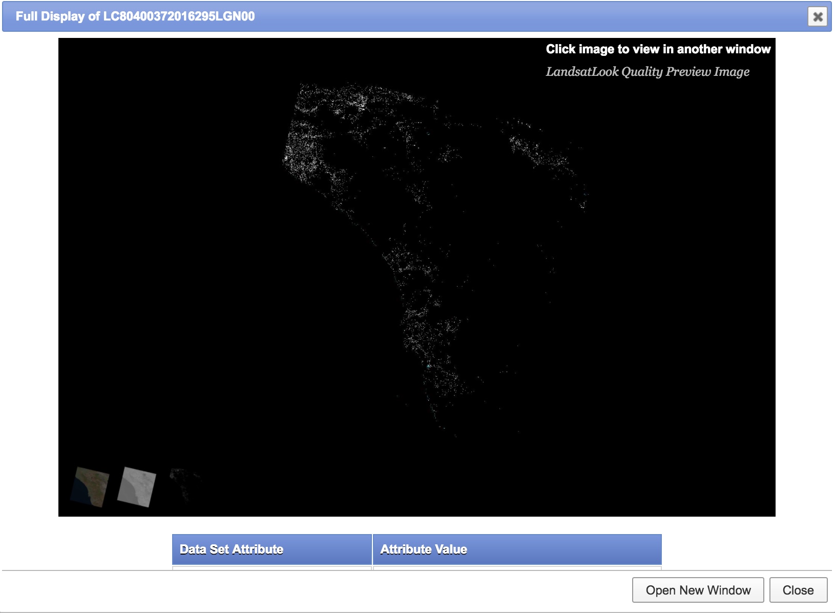
You need to find a good set of data. Scroll through the results and click on one of the image thumbnails. This opens a true color preview of the data. Are there lots of clouds? If so, scrap it and find another set. You can see cloud cover better if you select the third image in the preview - they call it the "quality preview." This shows just the clouds, nothing else. I have selected a set that is bad for the images above, then finally a set that is good.
Download It
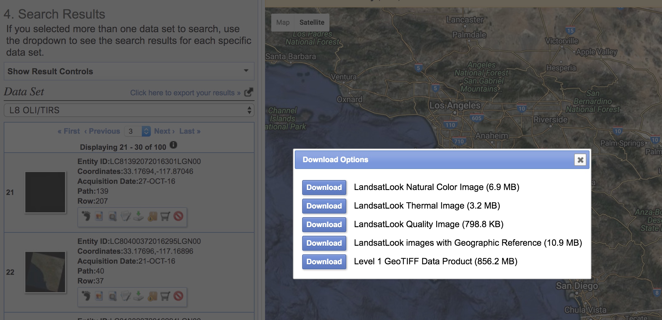
Click the little icon with a green arrow pointing down to a white boxy thing that looks like a hard drive. This icon is in a row of 8 icons next to the thumbnail. A box pops up with a few download options. Download the Level 1 GeoTIFF Data Product.
At this point, go make yourself some tea and a sandwich because downloading the data takes 10-15 minutes. It's not a large file..the hosting servers are just a tad slow.
Sample Data
I have attached the exact data set I used for this tutorial. Feel free to use it as a starting point.
Downloads
Understand the Data
TL;DR: The data sets you choose matter. Use sets 4, 3, and 2 for a true color image.
The Technical Detail
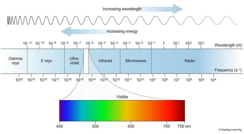
Light is an electromagnetic (EM) wave. If you are not familiar with this, that's fine - just follow along. Waves of light have a certain wavelength, the distance between two successive peaks for example. Visible light - the light that we can see - takes up only a small portion of all of the electromagnetic waves. See the section picture for a visual of this. If you're looking at that picture, you may notice "ultraviolet" to the left with shorter wavelength and higher energy. You'll also notice "infrared" to the right with longer wavelengths and lower energy.
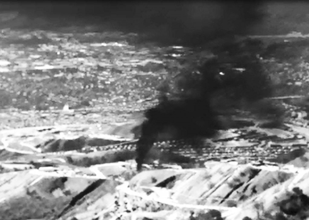
Landsat 8 has sensors that pick up both visible light and infrared radiation (which us humans cannot see with our eyes). Infrared radiation is important as it can show us many things that we couldn't typically see. An example (attached image) is a natural gas leak. You can't see natural gas with your eyes. However, when observing the correct infrared wavelengths, you can't miss this leak.
Anyway, Landsat 8 picks up 11 different bands of EM waves. Three of these bands are visible light - red, green, and blue. These bands can be put together to make a true color image, something that you'd see on Google Earth or something of that sort. The other bands however can be combined in place of the standard red, green, and blue bands to see other interesting things... but I digress. Let's talk about Landsat 8's bands.
Landsat 8 Bands
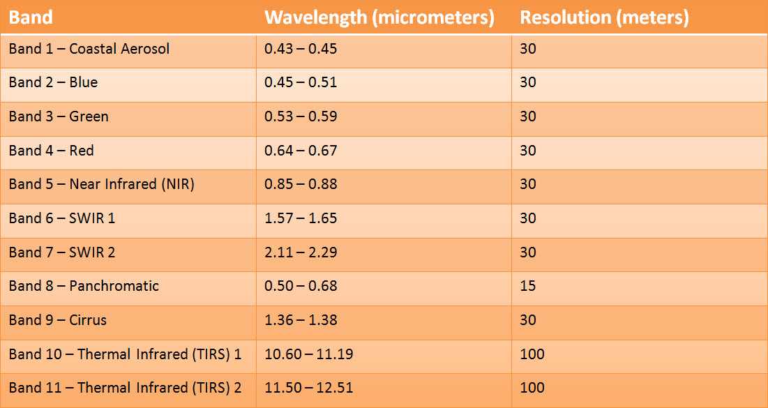
Band 1 - Coastal/Aerosol or "deep blue and violet" band. This is used to differentiate water from land. It can also see aerosols which are all these little particulates floating around in the air.
Band 2 - Visible blue. You can see this with the naked eye.
Band 3 - Visible green. You can see this with the naked eye.
Band 4 - Visible red. You can see this with the naked eye.
Band 5 - Near Infrared (NIR). This band can be used to study ecological health. Healthy plants will reflect the NIR, so you can get an idea of how healthy they are. From this band, you could also create a Normalized Difference Vegetation Index (NDVI) to study vegetation health. Discussion of that is beyond the scope of this tutorial.
Band 6 - Short Wave Infrared (SWIR). Will contrast wet and dry earth, as well as soil versus rocks.
Band 7 - Short Wave Infrared (SWIR). Same as band 6 but different wavelengths.
Band 8 - Panchromatic (PAN). The PAN band essentially takes a black and white photo. All of the visible light is collected into one channel (versus bands 2, 3, and 4 where each color has its own channel). The PAN band is the sharpest of all of the bands with a resolution of 15 meters. The previous bands have a 30 meter resolution.
Band 9 - Clouds. This is what I call the cloud band. The ground doesn't show up here, but clouds sure do. This is the band you were looking at when we checked out the quality thumbnails while deciding which data set to use.
Band 10 - Thermal Infrared (TIR). This band measures the temperature of the ground.
Band 11 - Thermal Infrared (TIR). Same as band 10.
Check out the attached images. The orange table tells you the wavelengths of each EM band. Each band's resolution is also in there.
*** I sourced this information from the NASA Landsat 8 Bands page. Please check out that link for a more in depth description of each band if you desire. There are also some great sample images there.
Landsat 7 vs. Landsat 8 Bands
I want to take a moment here to note that Landsat 7 and Landsat 8 have different band numbers. For example, I believe bands 3, 2, and 1 are Landsat 7's RGB (visible) bands. You can do a quick Google search to figure this out if you're interested in using some data from Landsat 7 (which obviously you'll have to do if you want to image things prior to Landsat 8's launch). In fact, ESRI's website will tell you exactly that.
Band Combinations
There are a bunch of different band combinations you can make. First of all, what do I mean by "band combinations?" Well each of these bands is recorded as a black and white image with different shades of gray. Each pixel is some level of "grayness" depending on the intensity of the EM radiation from that particular 30 meter square on Earth. More on that below. What you ultimately end up doing is assigning red, green, and blue colors to three different bands of data that you choose. Let me give you an example as this can be confusing.
Let's say you want to create a true color image. You're going to take Landsat 8's red band (band 4) and assign it the color red. Then you're going to take the green band (band 3) and assign it the color green. Then, you probably guessed it, you're going to assign blue to the blue band (band 2). Once you've assigned these colors, you overlap all three layers. Each pixel's color intensity is determined by the shade of gray (how dark or light it the gray is). Once they're appropriately overlapped and colors are balanced, you have your image! This would be called a 4-3-2 image, as you've assigned bands 4-3-2 to R-G-B, respectively.
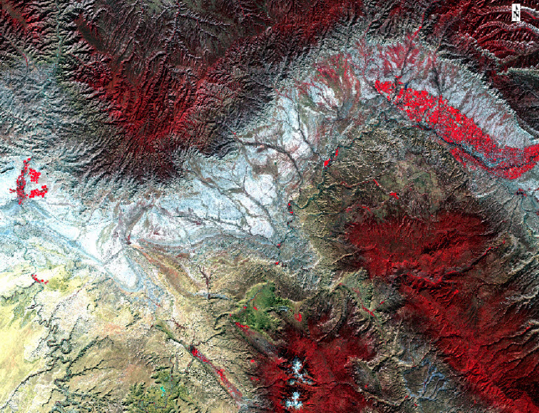
Now, what you can do is take a different band combination to get totally different results. How about a 5-4-3 image. This is called a Traditional Color Infrared (CIR) image. See the red, white, and brown image attached for an example of this. You can get all kinds of important information from different band combinations.
Here are a few bands to start with. You can do the research about what they all mean and what you can get out of them... an entire tutorial could be written on each! These, along with the image I discussed above, are sourced from Harris Geospatial Solutions. However, you can find band combinations all over the web... There are some pretty standard combinations.
4-3-2 : Natural Color
5-4-3 : Traditional Color Infrared (CIR)
7-6-4 : False Color - urban environments
5-6-4 : False Color - land vs. water
7-5-3 : False Color - vegetation and water
6-5-2 : Agricultural health
7-5-2 : Fire burn scars
7-5-1 : Vegetation and water
Remember, these are applied to R, G, B color channels respectively... You can apply them in any order really, but they'll look much different from standard images you'll find online. More on combining these in the coming steps.
Combine Desired Bands and Merge Color Channels

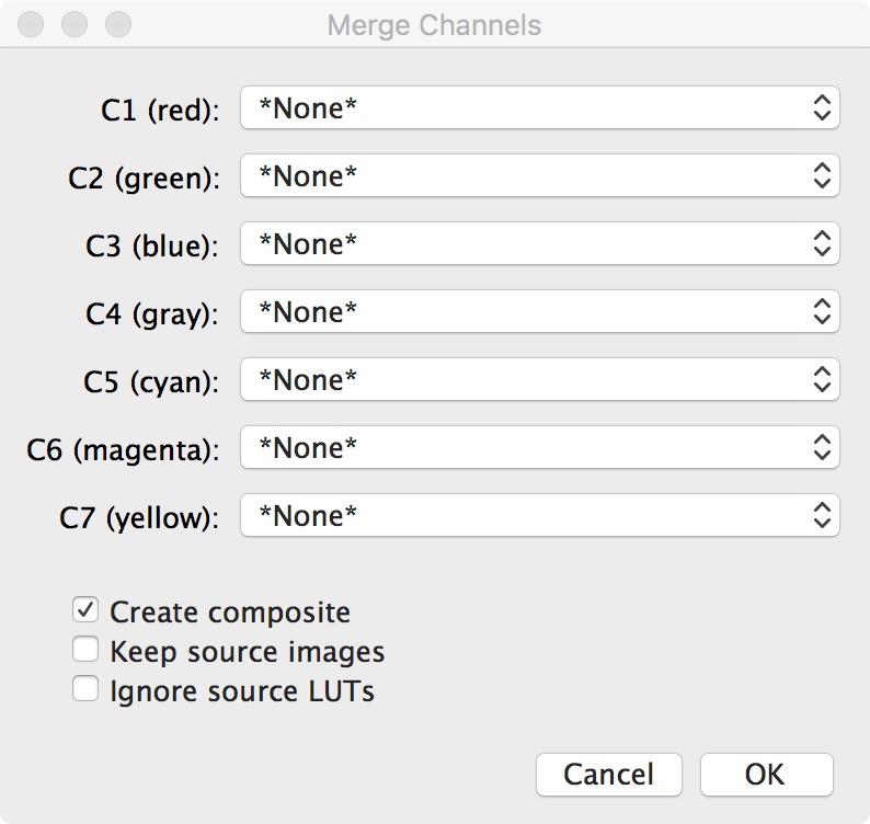
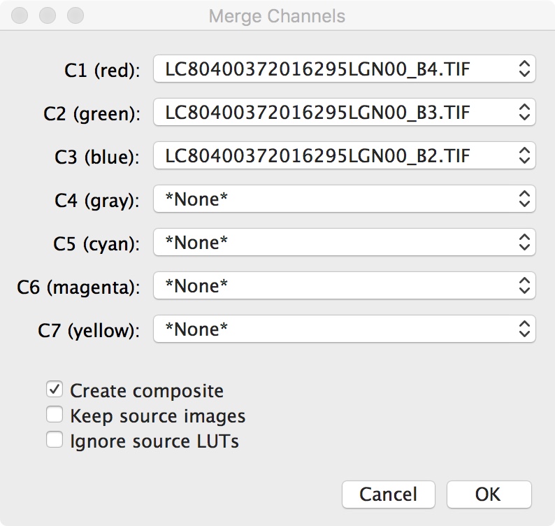
We're just going to make a true color image here. You can play with more band combinations yourself once you get the process down.
For a true color image, we need the 4-3-2 bands. We're going to assign them to red, green, and blue channels, respectively. So, 4 = red, 3 = green, and 2 = blue.
Merging Channels
- Open up ImageJ. Before you do anything else, select the hand tool (panning tool - see attached image). Your time using ImageJ will be much happier if you do this. Trust me, it'll save you some frustration later.. ask me how I know that.
- Unzip your data. Your data needs to be in a folder, unzipped.
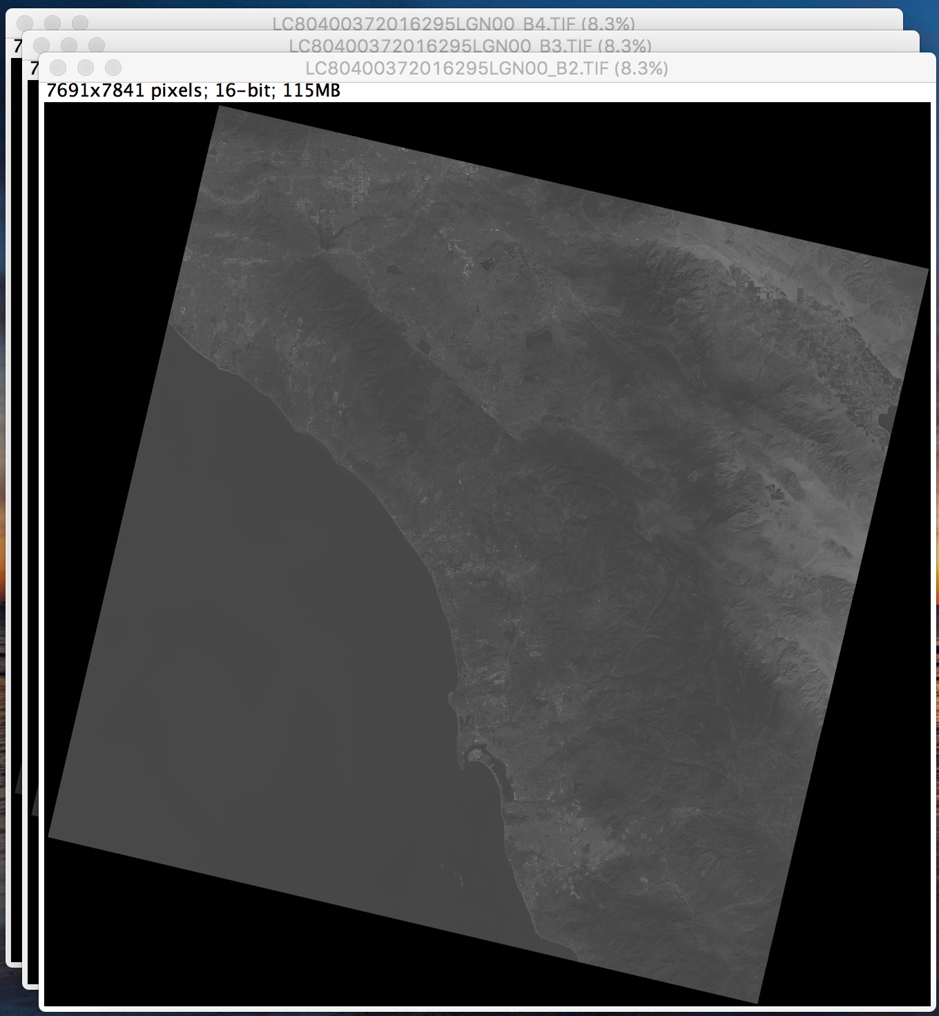
- Import your three bands of data. Go to File > Open and select the desired bands (you'll have to open them one at a time). In this case, we're using bands 4, 3, and 2. You can tell which bands are which in the files as each ends with a "_Bx.TIF" where "x" is the band number. For example, band 4 from the sample data set is called "LC80400372016295LGN00_B4.TIF."
- Merge the color channels. In ImageJ, click on Image > Color > Merge Channels. A new window pops up.
- Select images for channels. Select the channel 4 (C1 (red)) file to be the band 4 image (remember, the file that ends with "_B4.TIF." Select the channel 3 (C2 (green)) file to be the band 3 image. Lastly, choose the channel 2 (C3 (blue)) file to be the band 2 image.
- Click OK.
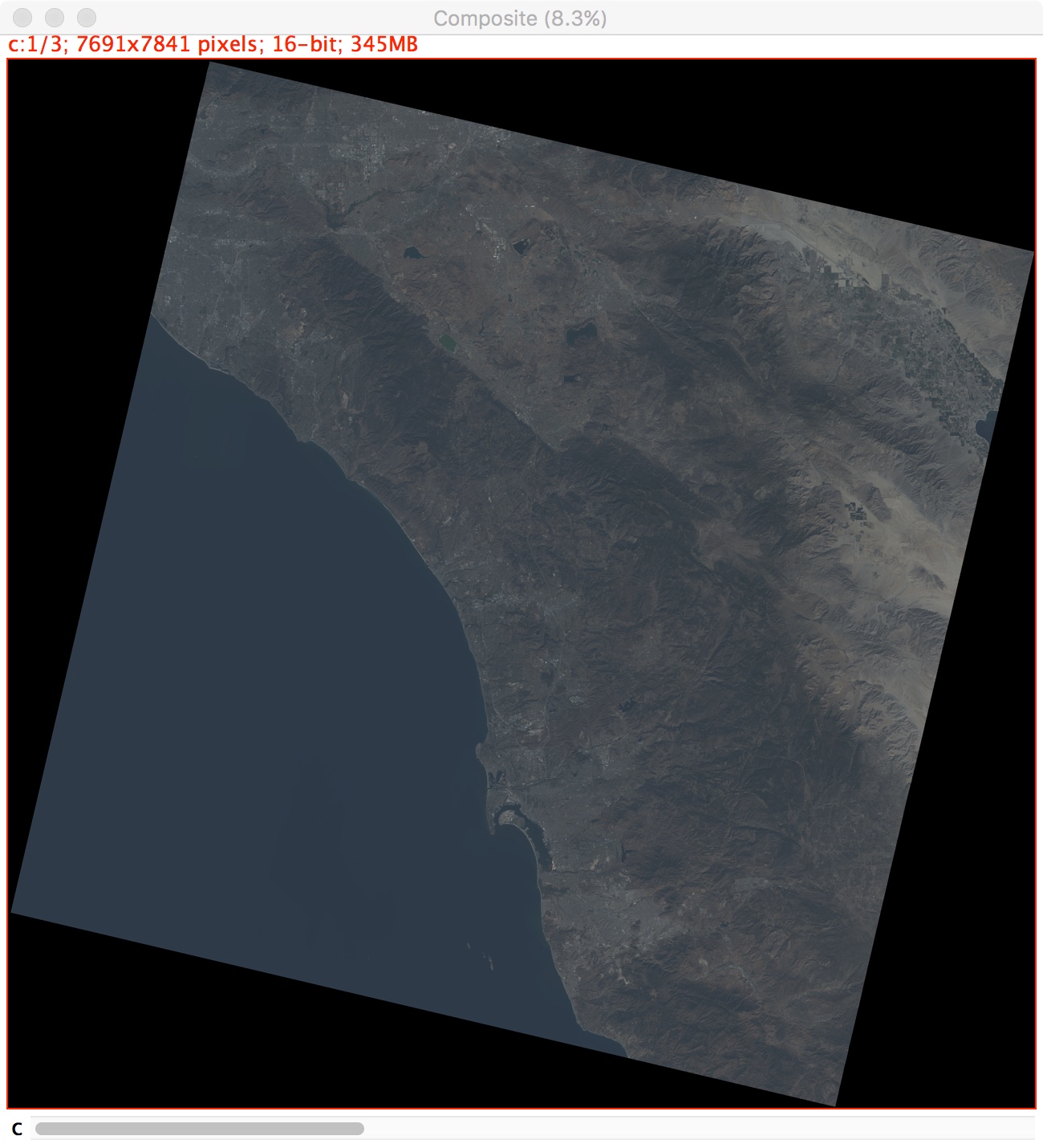
You now have a merged image. Exciting! But hey, it doesn't look very good, does it? Maybe a little washed out (see my merged image attached).
Now we need to adjust the color balances.
Adjust Color Balance
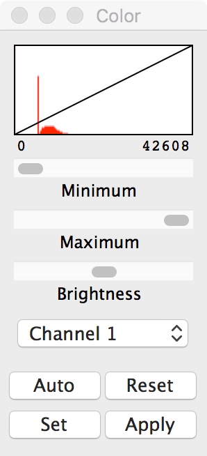
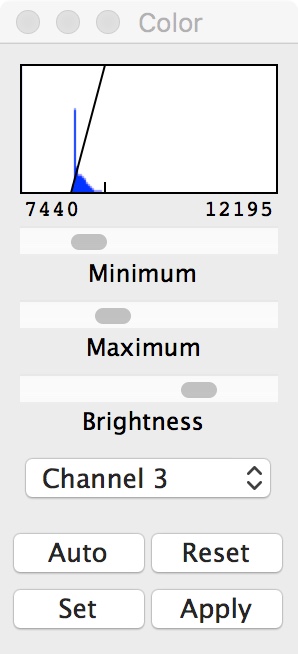
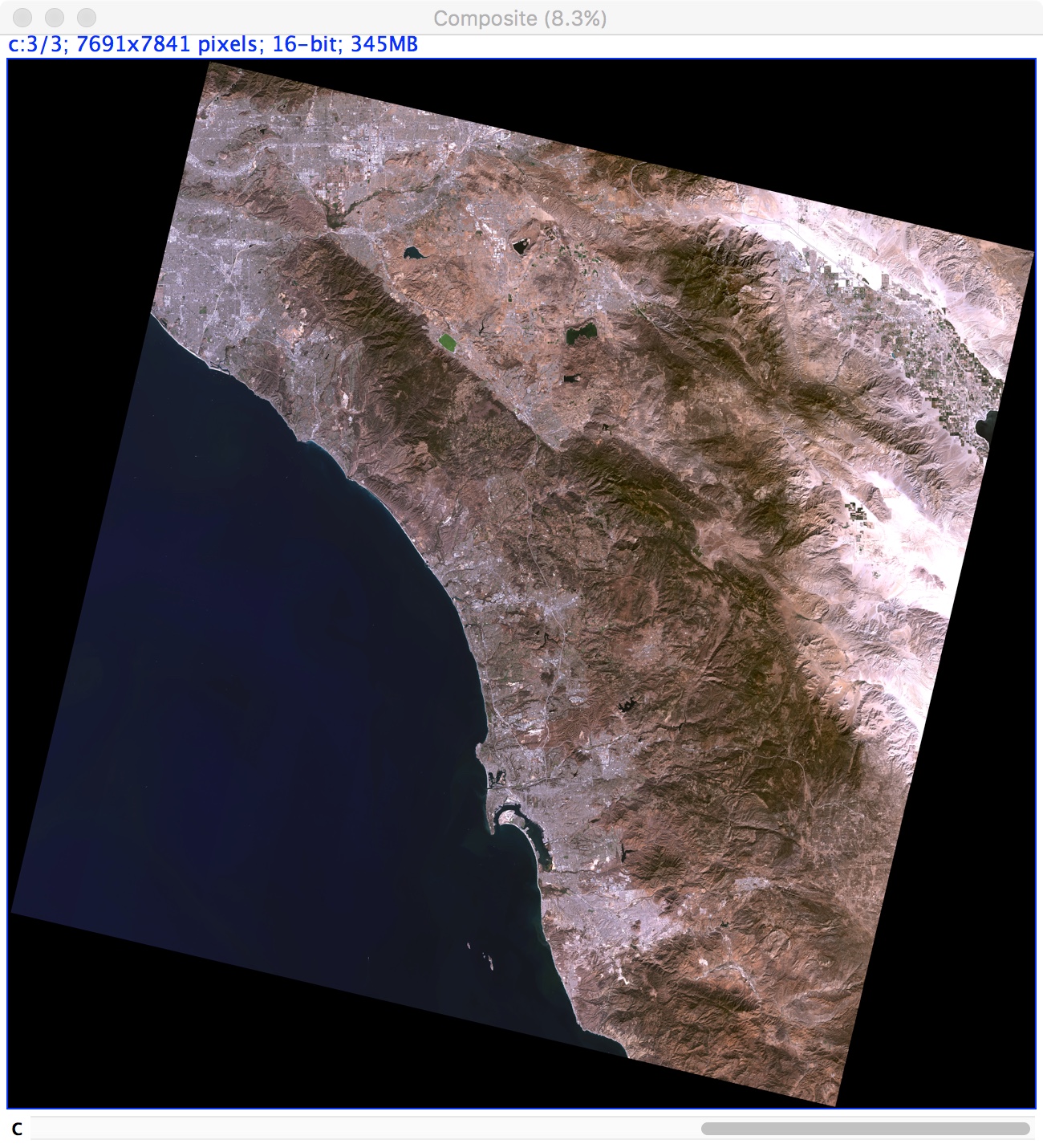
You've probably realized that your image doesn't look all that great. What you have to do next is adjust the color balance to make it look better.
- Open the color balance window. Select Image > Adjust > Color Balance.
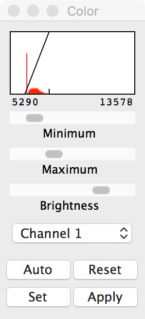
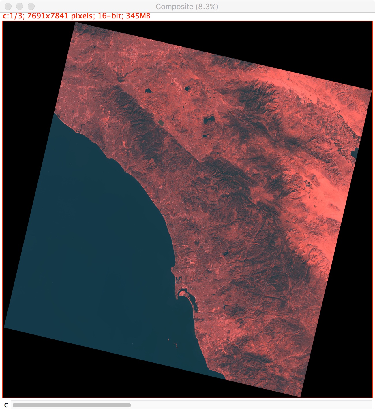
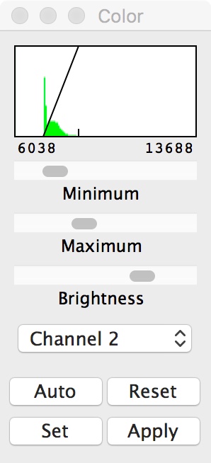
- Adjust sliders. Notice the histogram at the top of the color balance window. Also note the diagonal line on the histogram. What you need to do is move the Minimum slider until the left side of that diagonal line is just at the left side of where the color begins on the histogram. Move the Maximum slider until it is at the right side of the color on the histogram (there is a little vertical bar at the bottom of the histogram to more easily align the right side of the diagonal line). See attached image to see what I mean by this. You'll then notice on your image that it has turned quite red. That's okay!
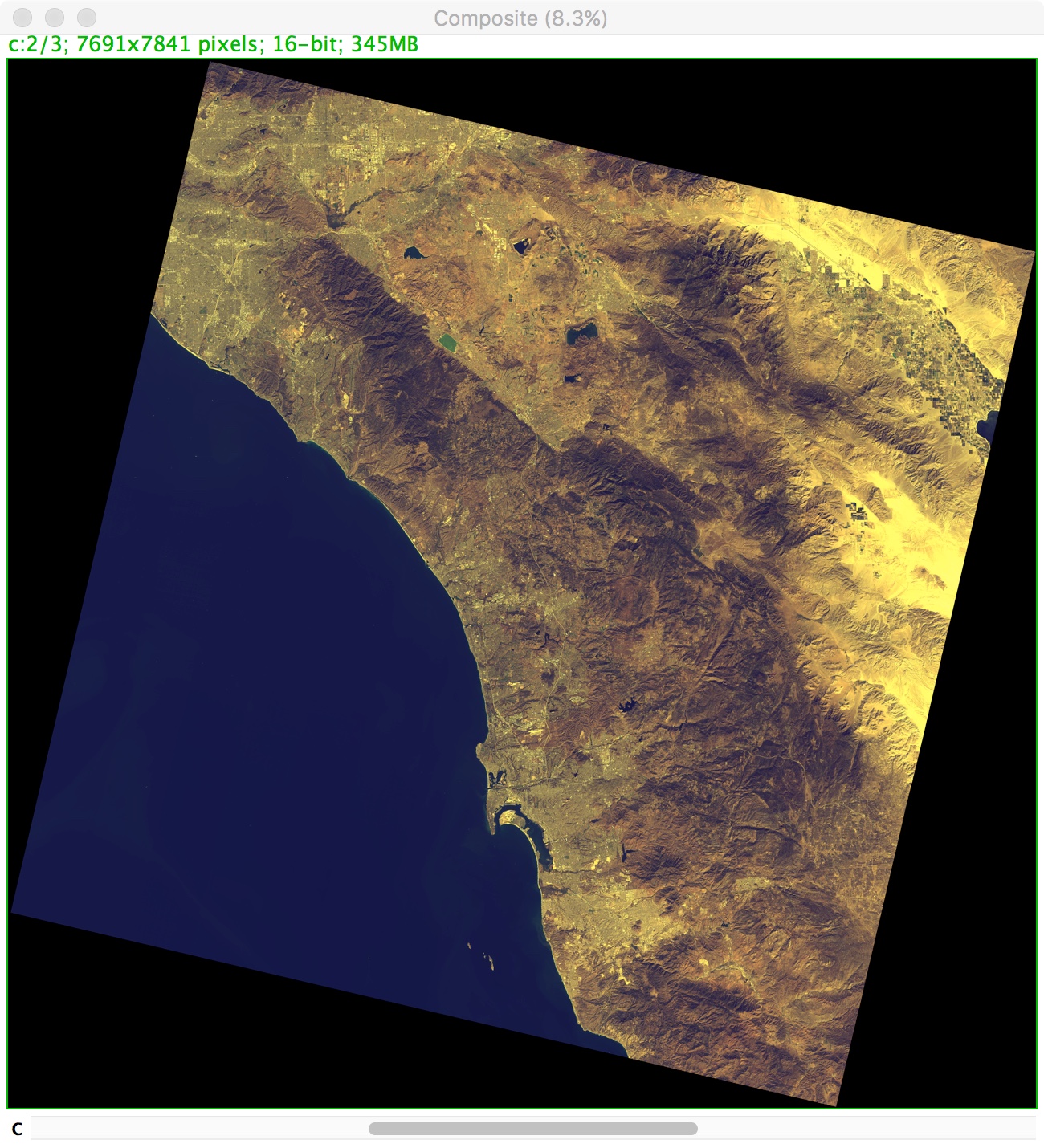
*Note: Don't touch the Brightness slider! Also, don't hit Set or Apply buttons. The Auto button will do a pretty good job of aligning the edges for you, if you want to try that. Reset will obviously reset to what you started with. - Adjust the other channels. Note that there is a list on the color balance window with Channel 1 selected by default. This is your first channel, or red (recall the previous step where you applied the red band data to the color red in the channel merge window). You need to repeat the color balancing for green and blue, channels 2 and 3, respectively. See the attached images for clarity.
Now you have a true color image! Let's save it.
Save the Image
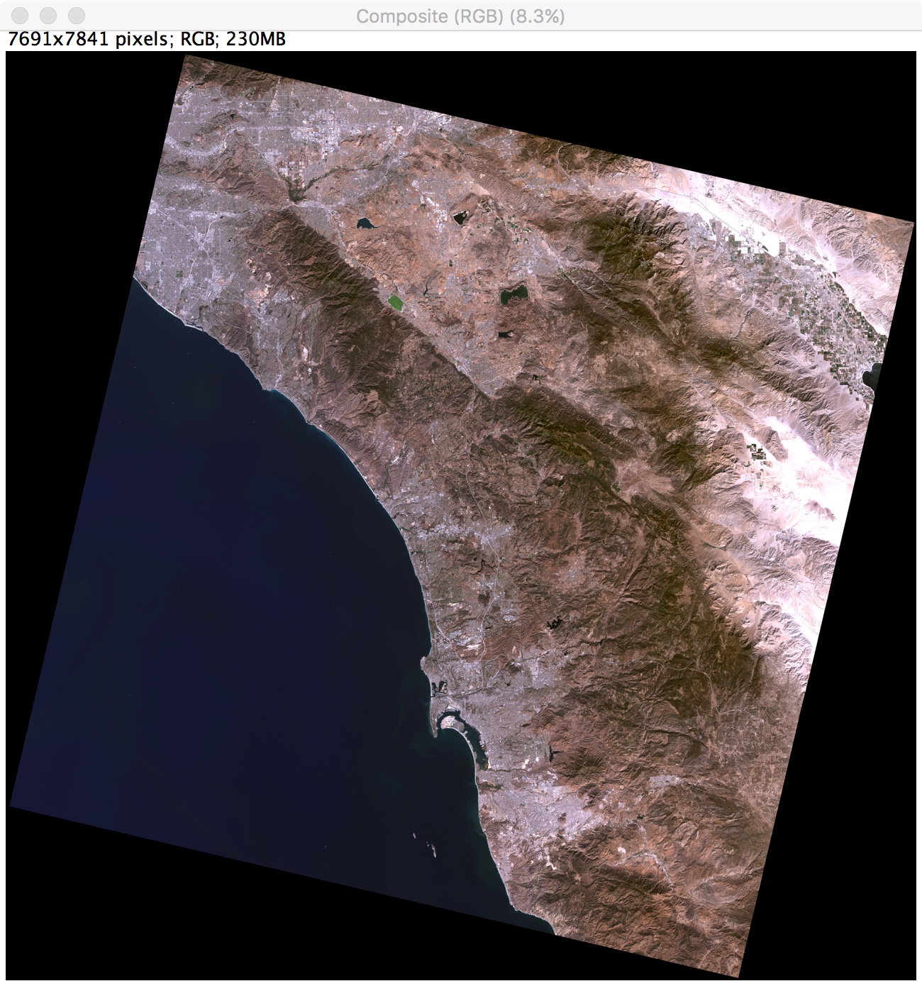
It's time to save your image. Don't worry about it being crooked - we'll fix that.
- Select your image. Make sure your image is selected. Just click on the window with your image so that you make sure it's active.
- Change to RGB. Go up to Image > Type and select RGB Color. A new window opens with your composite RGB color image. See attached image to see what the new window looks like.
- Save it. Go to File > Save As and choose your file type. Save the image.
Post-Processing
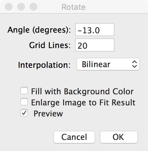

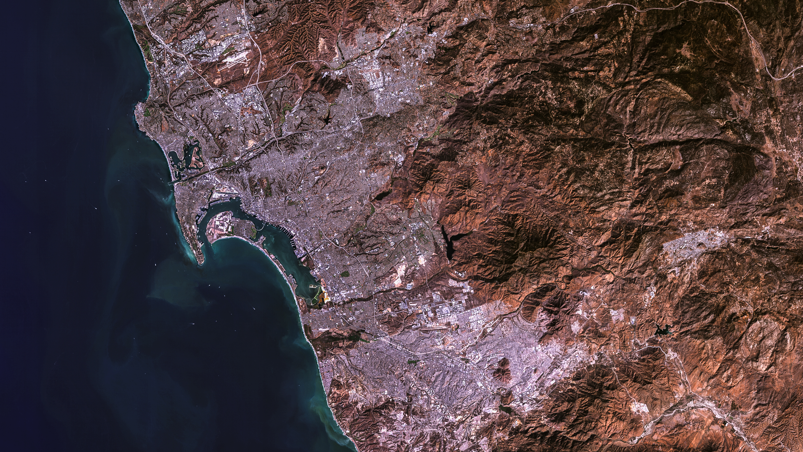
We need to get rid of the black stuff around the image. This means straightening and cropping. You have a couple of options from here:
Option 1: Open your saved image in another program. This could be Adobe Photoshop, Adobe Lightroom, Gimp (which is completely free and very useful), or any other way you can think of straightening and cropping an image. I have even done this in Microsoft Word before. I'm not going to outline how to do this; there are simply too many options and I assume you know how to use the software you choose.
Option 2: If you want, you can straighten and crop right in ImageJ. I'll outline this method below.
Straighten and Crop with ImageJ
- Select your RGB image. This should be already selected from the previous step.
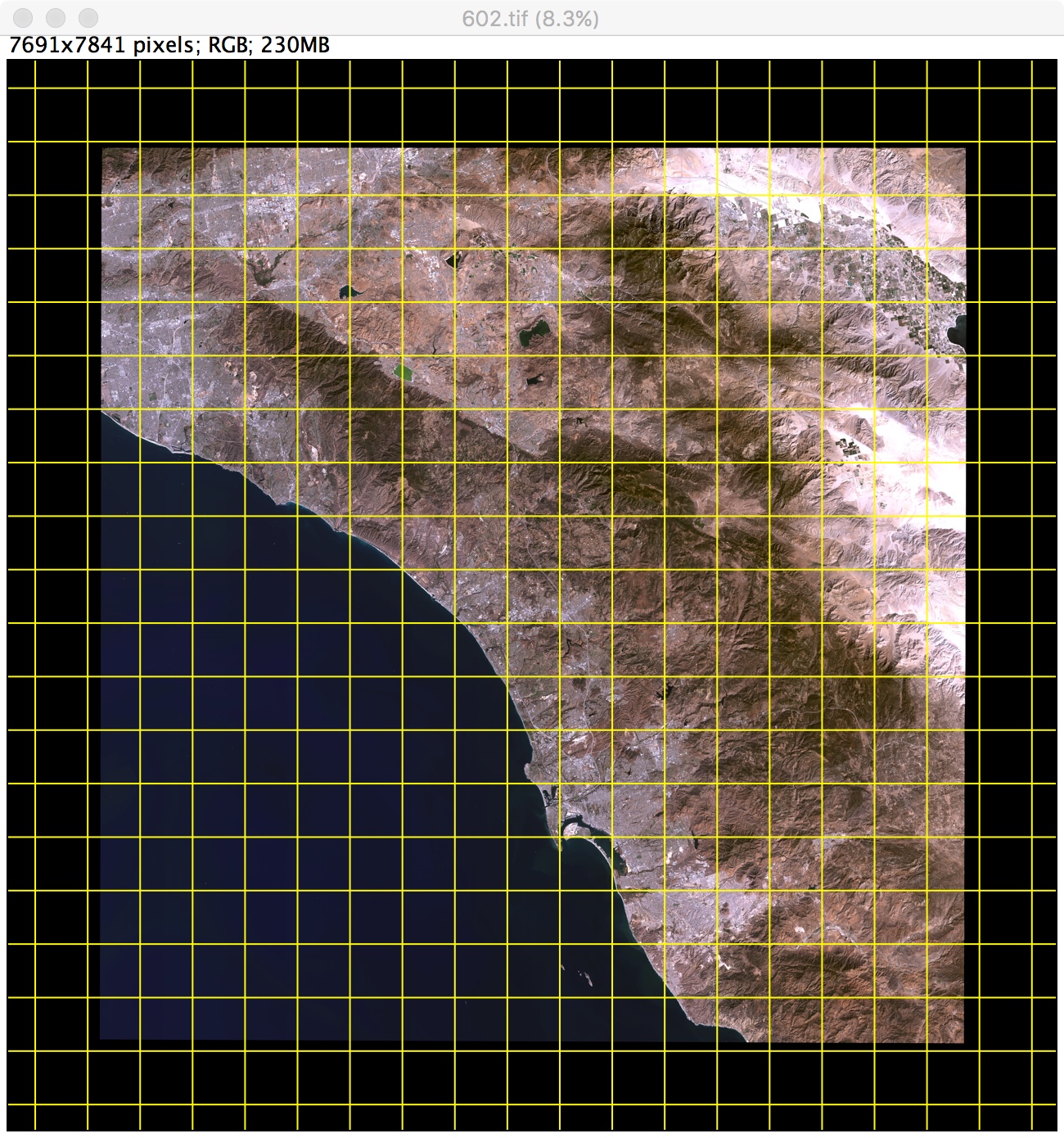
- Rotate. Navigate to Image > Transform > Rotate... The Rotate window opens up. Type in some number of gridlines - I like 20 or so - as they'll help you straighten your image. Check the Preview checkbox. Type in some angle to rotate your image. In this case, -13° worked well for me (negative rotates counter-clockwise). See image for clarity. When you're satisfied, click the OK button.
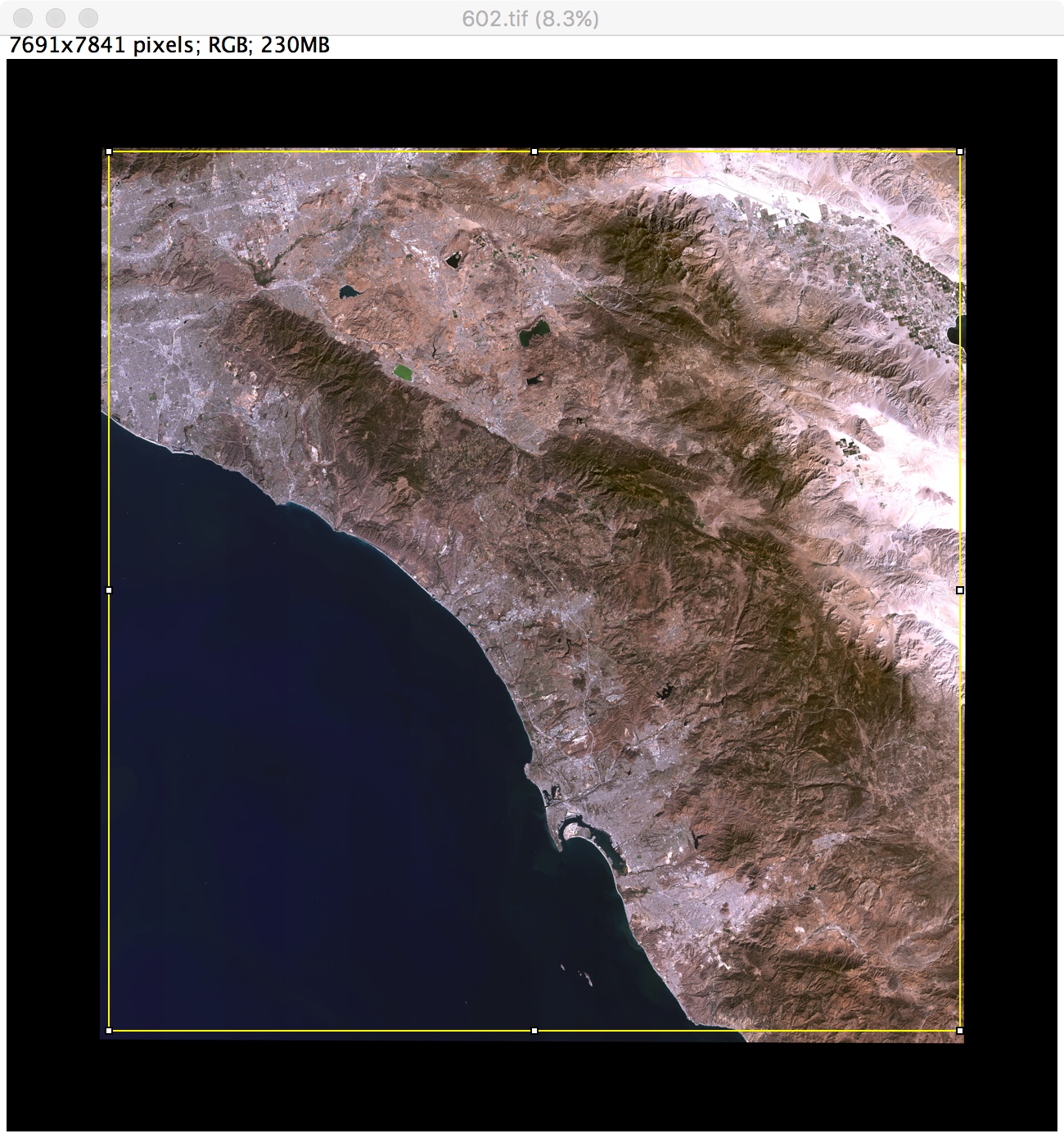
- Select crop area. I always like to crop even just a little bit. This makes sure I have vertical edges as it's nearly impossible to rotate perfectly so things are nice and square. In the ImageJ toolbar, click the Rectangle Selection tool - the icon on the very left of the toolbar. Draw a rectangle on your image. Adjust it by dragging the edges until it is filled with your image. You'll probably notice right away that you didn't do as great of a job rotating as you may have thought! ;)
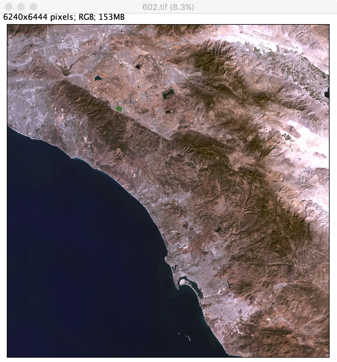
- Crop it.Go to Image > Crop. This crops your image.
- Save it. Save it again. File > Save As, select your file type and save.
Optional Edits
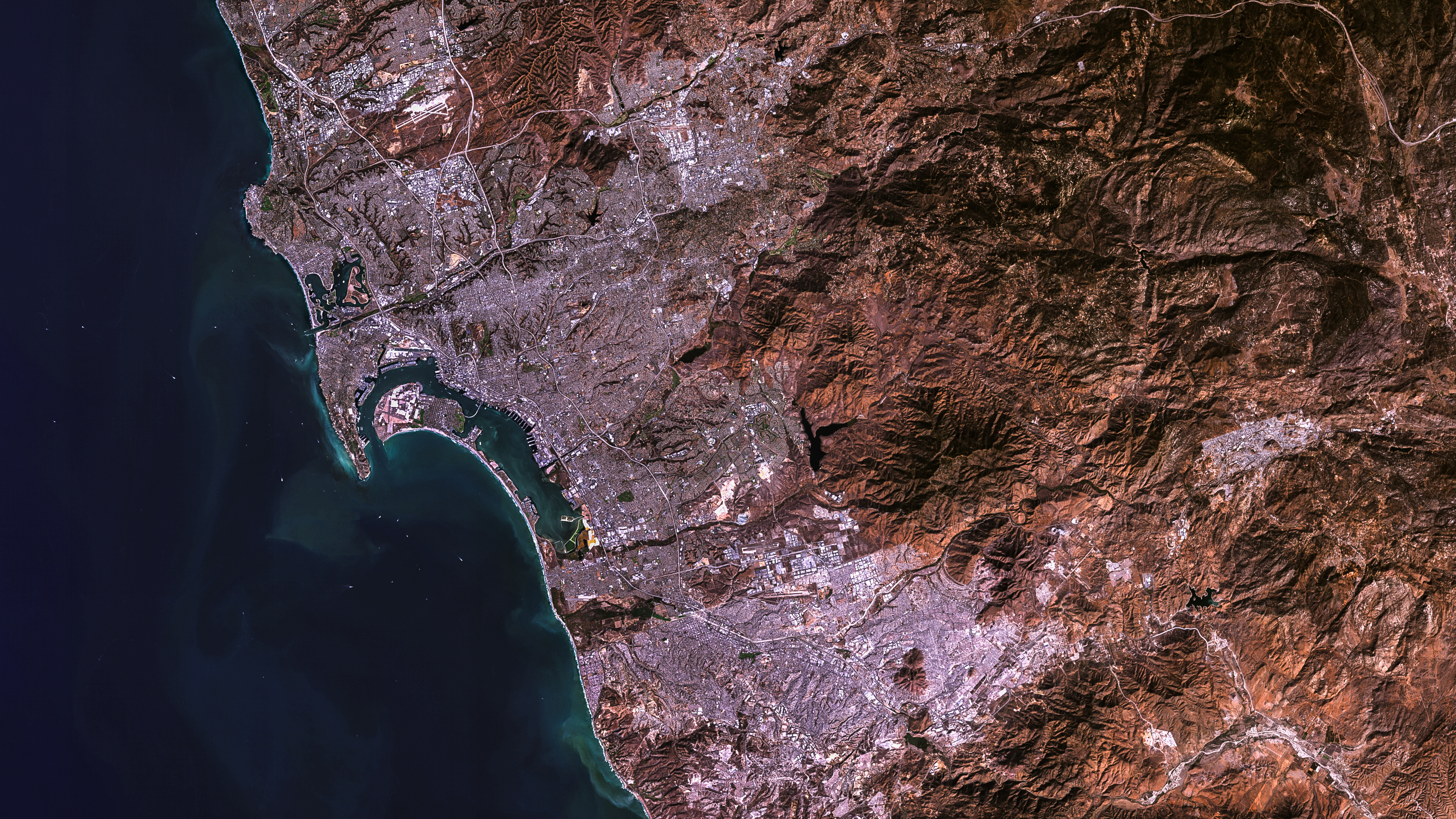
From here, depending on what I'm using the image for, I'll throw it into Adobe Lightroom (my software of preference) and make some color, brightness, contrast, and tone edits. I did this with our example image (see attached image). I have attached my image from Lightroom to download for your enjoyment and as an example.
Downloads
Creating Sharper Images (PAN-sharpening)
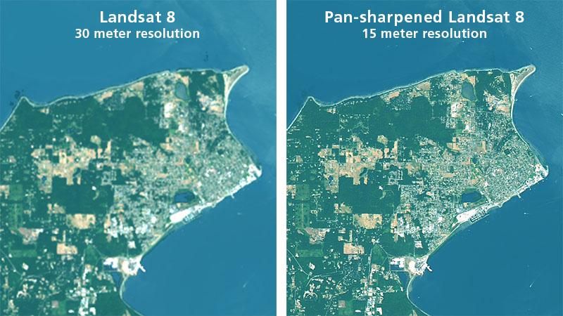
You might notice that if you zoom in enough, you get a blurry image. This is due to the resolution of the bands we've been using; they have a 30 meter resolution. The panchromatic band (PAN band) as you may recall from our previous discussion, has a 15 meter resolution. You can use this band to create sharper color images.
Right now, I'm not going to write a tutorial on this. However, I will supply resources to start with if you're interested.
- To learn more about pan-sharpening and see some great examples, check out this Mapbox link.
- USGS has a page on creating pan-sharpened images from Landsat 7 bands. You could use this method to create your images. Note that they use a different piece of software called ERDAS.
- These downloads are here. Note that you'll need ERDAS Foundation before installing ERDAS Imagine. I'm not sure if this is free software.
You're Done! Now What?
Congratulations! You've created your first image from satellite data. Now what?
- Analyze your image...qualitatively
- Analyze your image...quantitatively (you'll have to do your own research on this)
- Set as your desktop background
- Share with friends and family - people like to see this stuff; they think it's cool!
- Upload it to a mapping app/website like Mapbox
- Make more images!!!
Sources
I have noted most of my sources throughout the tutorial, or at least credited for images where necessary. Sources that you may be interested in for further research are:
- NDVI Maps with ArcGIS
- NDVI Maps another piece of software
- If you have Photoshop, this tutorial may be helpful
- Some band combinations
- More band combos and a comparison of Landsat 7 and 8 bands
If you have any questions, please comment below or send me a private message. I will reply!
I hope this has been helpful. I look forward to reading your comments and seeing the images you have created.
Happy imaging!!! :)