Color on a Makelangelo 3
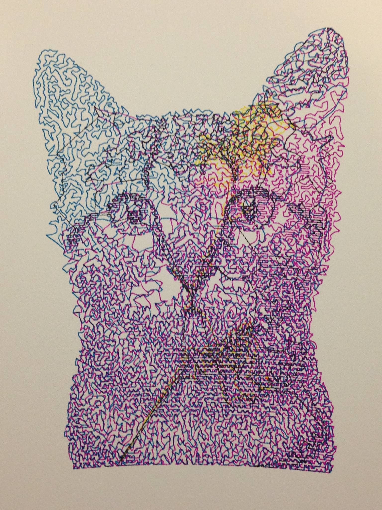
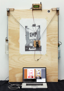
So, for a couple months, I have been making color drawings of cats on a Makelangelo 3, a drawing robot made by Dan Royer at marginallyclever.com. It takes a bitmap, makes and approximation with a pen almost like a halftone, and draws it (or spraypaints it). You give the software a bitmap, and select a dithering/path algorithm. I’ve been using the zigzag algorithm, but I’m sure that will be the case only for 3-4 series, as I have already begun layering different algorithms for their effect.
How Prints Are Made
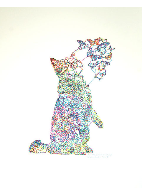
The question is: color on the M3?
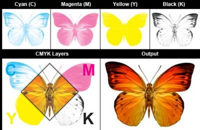
Isn’t it a one pen, single color machine? Of course it is. But the secret to unlocking color on the M3 is to consider what other processes lay down color one at a time. For example, in graduate school, Janet Ballweg taught me an incredible method in which one can use digitally etched solar plate to approximate old-school color litho. And the secret, of course, is that offset print uses four colors, cyan, magenta, yellow, and black (interesting that it is called “k” because of black having been the key, or registration plate). So, the secret to color on the M3 is to separate the channels of color and lay them downk with the proper color pen to approximate your image. But, as I use the path algorithm, it is going to be stylized, which is my intent.
Splitting the Channels
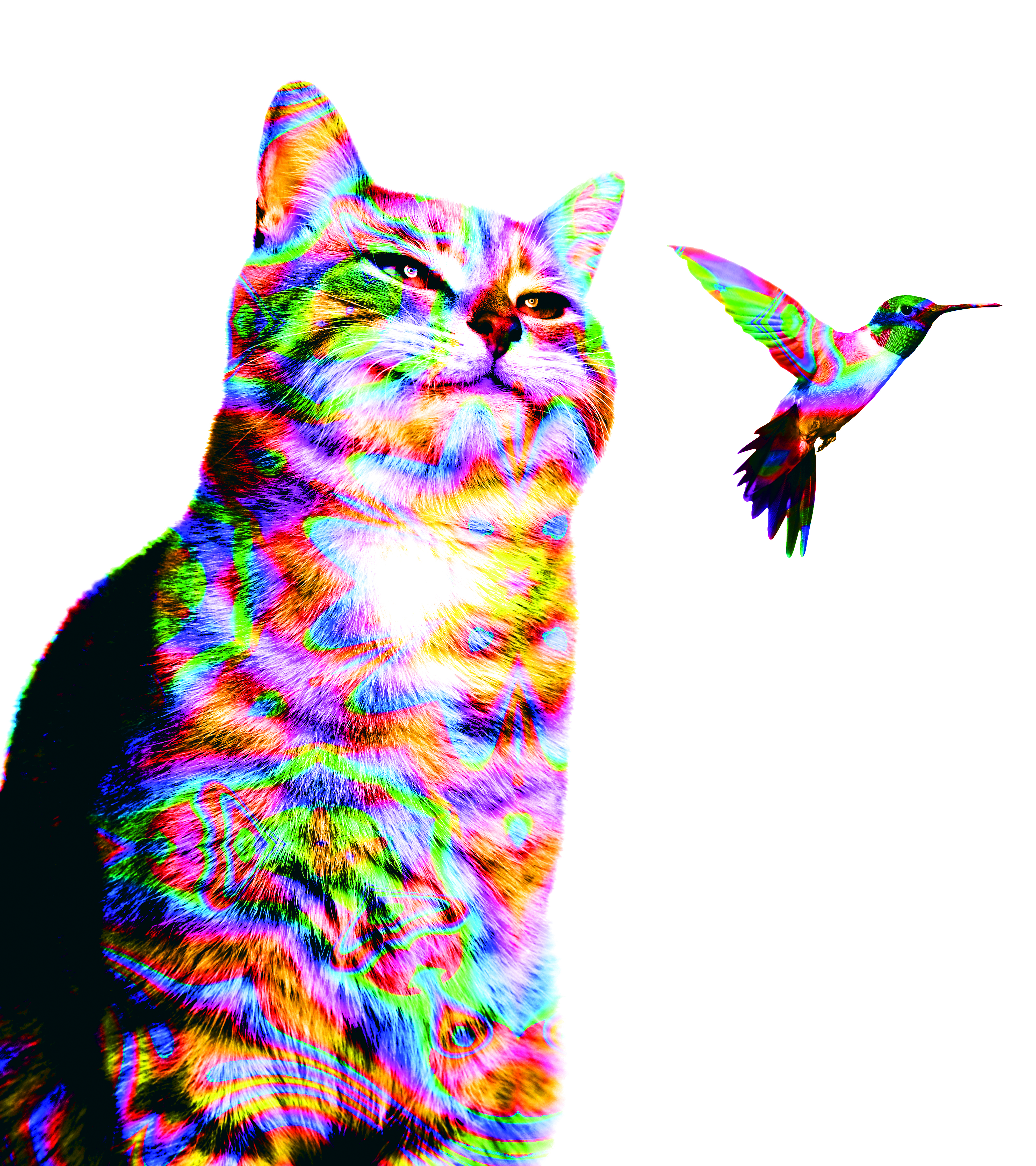
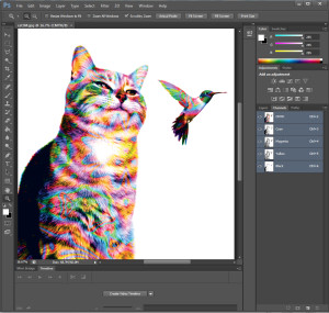
But how do you go about separating the channels for the robot? That’s pretty easygoing. Go into Photoshop, GIMP, or what have you, and change the image to CMYK, then export the channels as grayscale bitmaps for the robot to use with your given color. Why not use RGB? That is the old additive/subtractive issue, and we’re imaging with ink, not light. Secondly, and this is a fairly big issue, that, if you’re using wandering paths, you know that results may vary. Therefore, I always recommend cranking up the saturation and contrast at least 50% to accentuate the colors and details of your image. I do this on both ends, by cranking up the saturation before export and the contrast on the grayscale channel image after. That way, I get a lot of tonal and hue differentiation.
The rest is easy. Call each channel something like randominternetcat1cyan.jpg and so on, load, generate gcode, and load your pen.
Go for It!
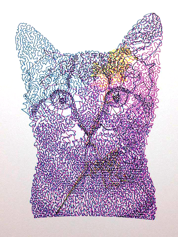
Even though the M3 depends on just toothed belt for registration, it generally works fine. Dan tells me to take the Gcode and combine all four blocks of code with a pause to change each pen (Next Instructable?), but I haven’t done that yet, as the freezes are rare. Now you know how to do color on an M3.
But a couple notes in passing. If you notice, my Random Internet Cats are very colorful, and if you find one of my source images online, you’ll see I’m not using a realistic color palette at all. That would be boring, right? Also, why also use CMYK colors for CMYK channels? I’m starting to use fluorescent sharpies for variety, but I still like to use a black channel to ground the image a little. Lastly, why use the same algorithm on each channel? I’ve had really mixed results going this far, but it’s been interesting to see the results. Mainly for now I tend to like layering algorithms monochromatically. Pulse line with a wandering path is pretty cool. So go nuts. This is art, right? Why stick to reality. I rarely do.