Center for Activism
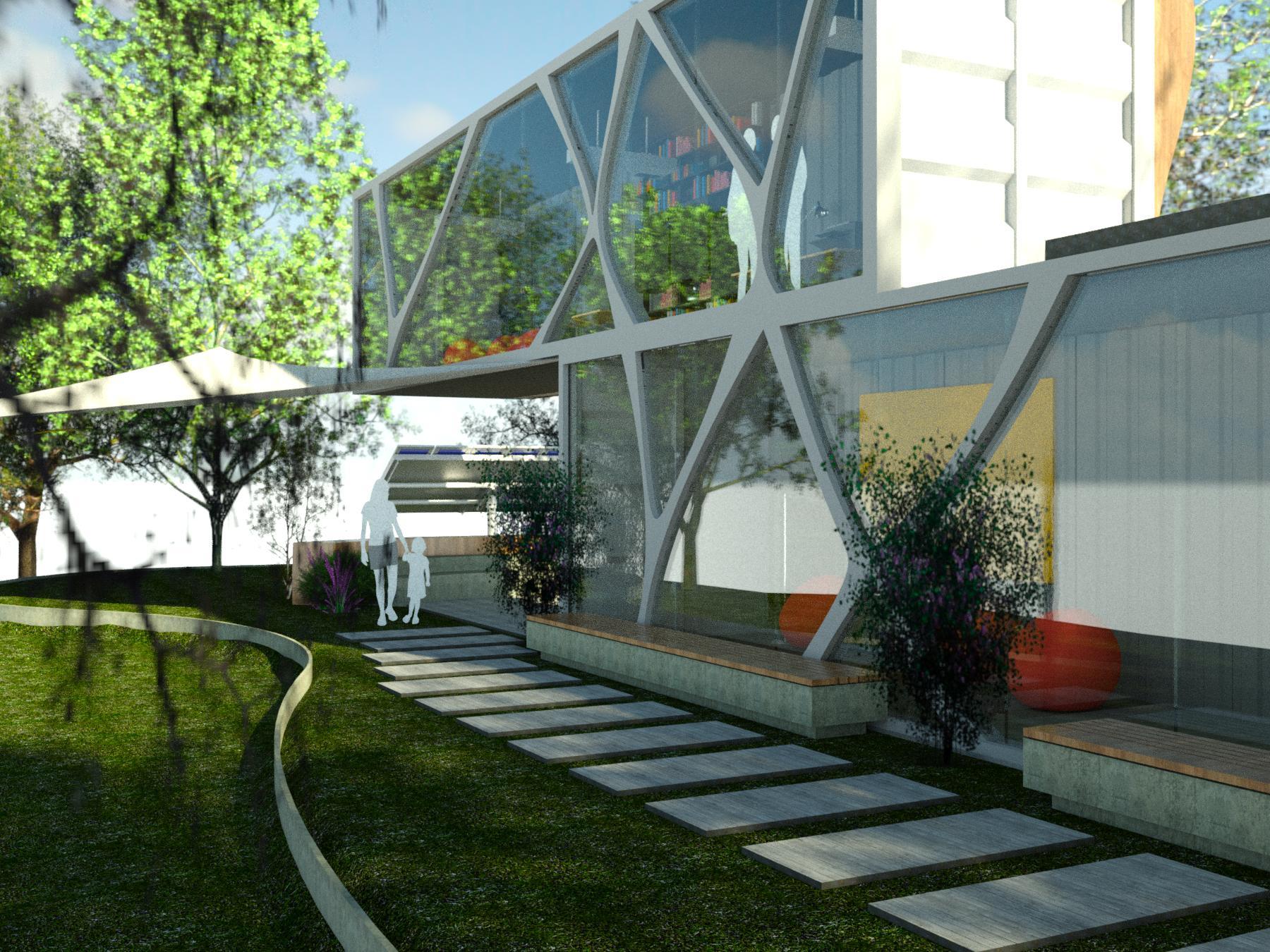
Hi! My name is Bryce, I am a current sophomore at West Campus High School in Sacramento, California. I wanted to construct something that would not only be an embodiment of an innovative and green future but act as a breeding ground for community organizing and change. That's why I decided to create a Center For Activism.
This center's main goal is to be a place where activists of all ages can come for free, to organize and make their dreams a reality. A place to come together and amplify their voices. A place where they can have discussions, create placards, reach out to other organizers and so much more. And also a place that will embody a sustainable, innovative, and clean environment for them to work. Focused not only on the indoors but mainly on the outdoors, because that's where the action happens.
--GOAL--
The goal of this project wasn't to create a container that people felt locked into, the goal was to create a cargo container that the community awes at, motivating them to work and make/demand change. The goal of my project was to create a space for the people, a space where events could be held, meetings could take place, classes could be taught and insightful conversations with community leaders could take place. That is why I tried my best to make it not a simple structure, but a unique one. Macking is an area where people are drawn to, where people want to come, a place where people don't just fulfill their drives and passions but also where they manufacture new ones.
Supplies
First floor--
- two 20' long x 8' wide x 9'6” or one 40' long x 8' wide x 9'6”
- 3 bing bag chairs
- 4 green walls
- 1 projector
- 1 crossed leg table
- 1 Jimi Hendrick painting
- 1 dynamic lighting fixture
Second floor--
- two 20' long x 8' wide x 9'6” or one 40' long x 8' wide x 9'6”
- 3 bing bag chairs
- 4 green walls
- 2 desks
- 1 all purpose printer
- 1 dynamic storage/book shelf
- 3 hanging light fixture
This is what I used, just recommendations most elements are not crually needed and can be changed
Also, I decided not to put my landscaping supplies like trees, plants, etc... because this would depend solely on what the climate is like wherever this center is placed.
Brainstorming
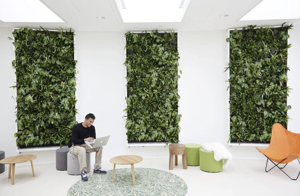
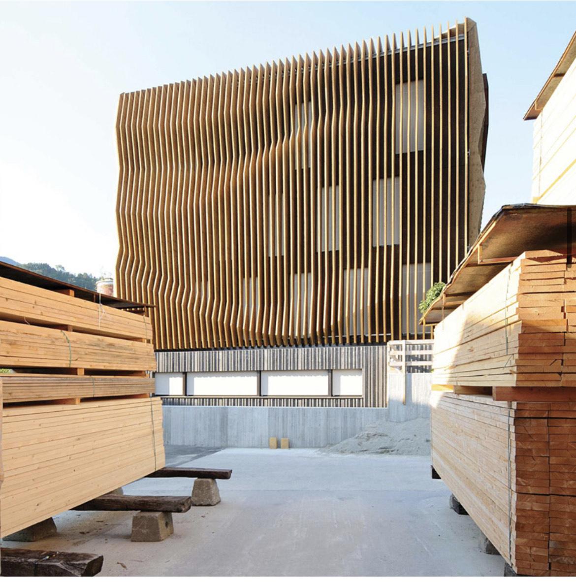
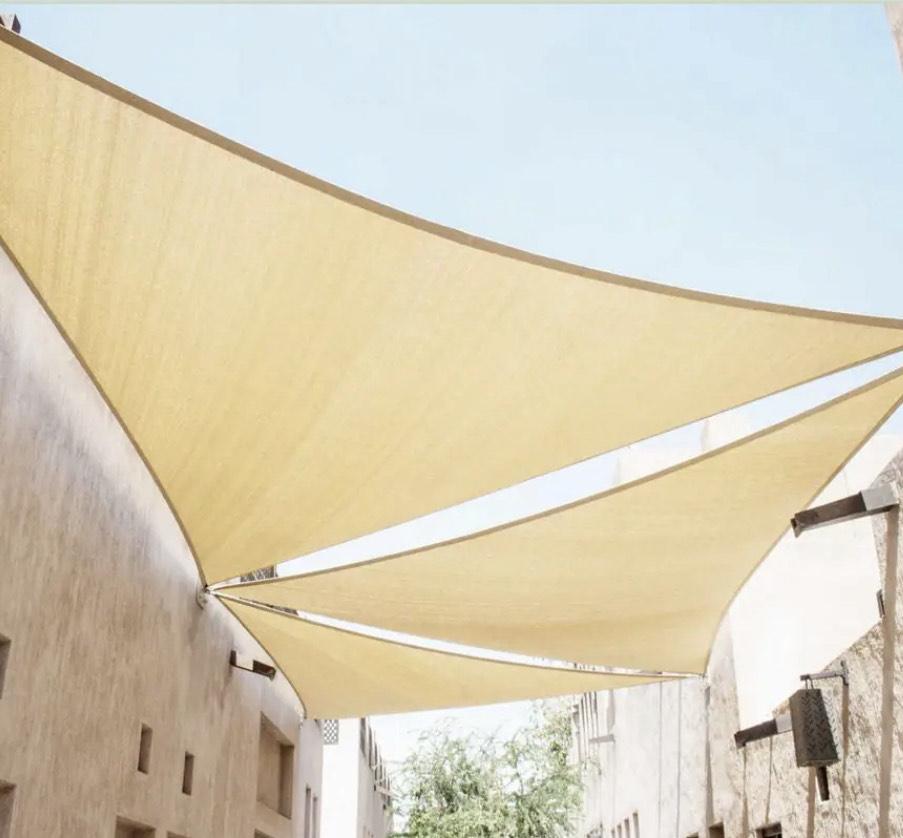
Brainstorming:
As previously mentioned I want to create a place that is open to everyone, and that pulls young and old activists and community members together.
I wanted to create a building of the future. Focused on green and clean construction, where the construction and end result will be environmentally friendly. So that's why reusing an existing shipping container fits perfectly into my vision.
Finally, I wanted to create a space that felt open and that felt different compared to what people are used to. Different not only in the architecture and design but how people organize, how people come together, and how people fight for what they believe in. (I had written this way before the most recent supreme court rulings, having to do with abortion and climate change. And with these new rulings, I know a place like this is needed more than ever for everyone, but especially for those ones who want to get involved and fight for what they know is right, but simply don't know how to or do not have the resources, community, and space to do so.)
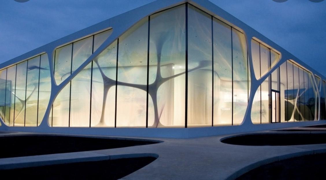
Above are examples that demonstrate perfectly the elements I wish to implement into this center for activism. An open place that catches people's attention, motivation, and dreams.
For this project I used Revit. And thank god I did because I believe it gave me the opportunity to show my vision as clearly as possible compared to some other programs. It also acted as a challenge figuring out tools I had never used before, commands I didn't even know existed and so much more.
Sketches
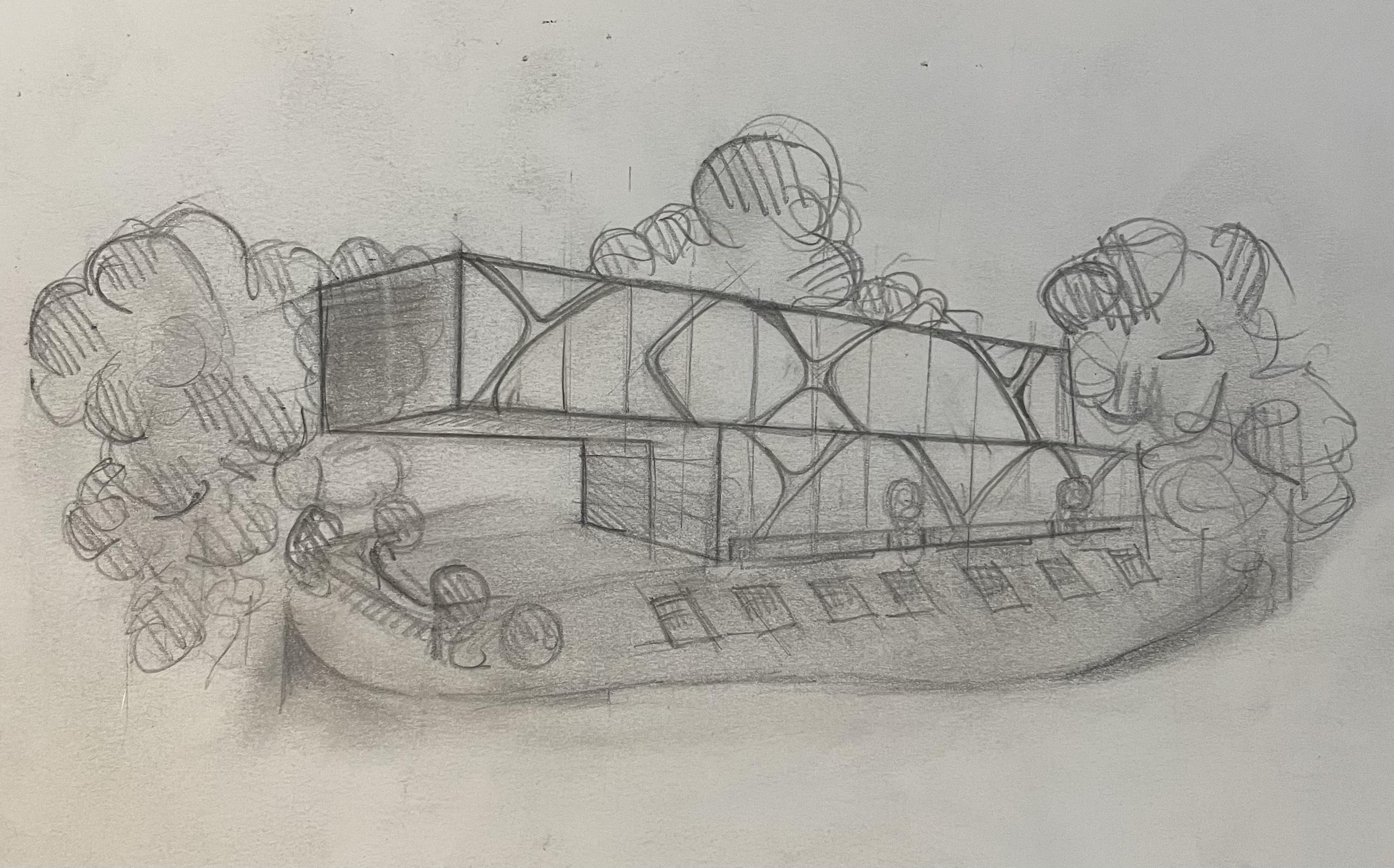
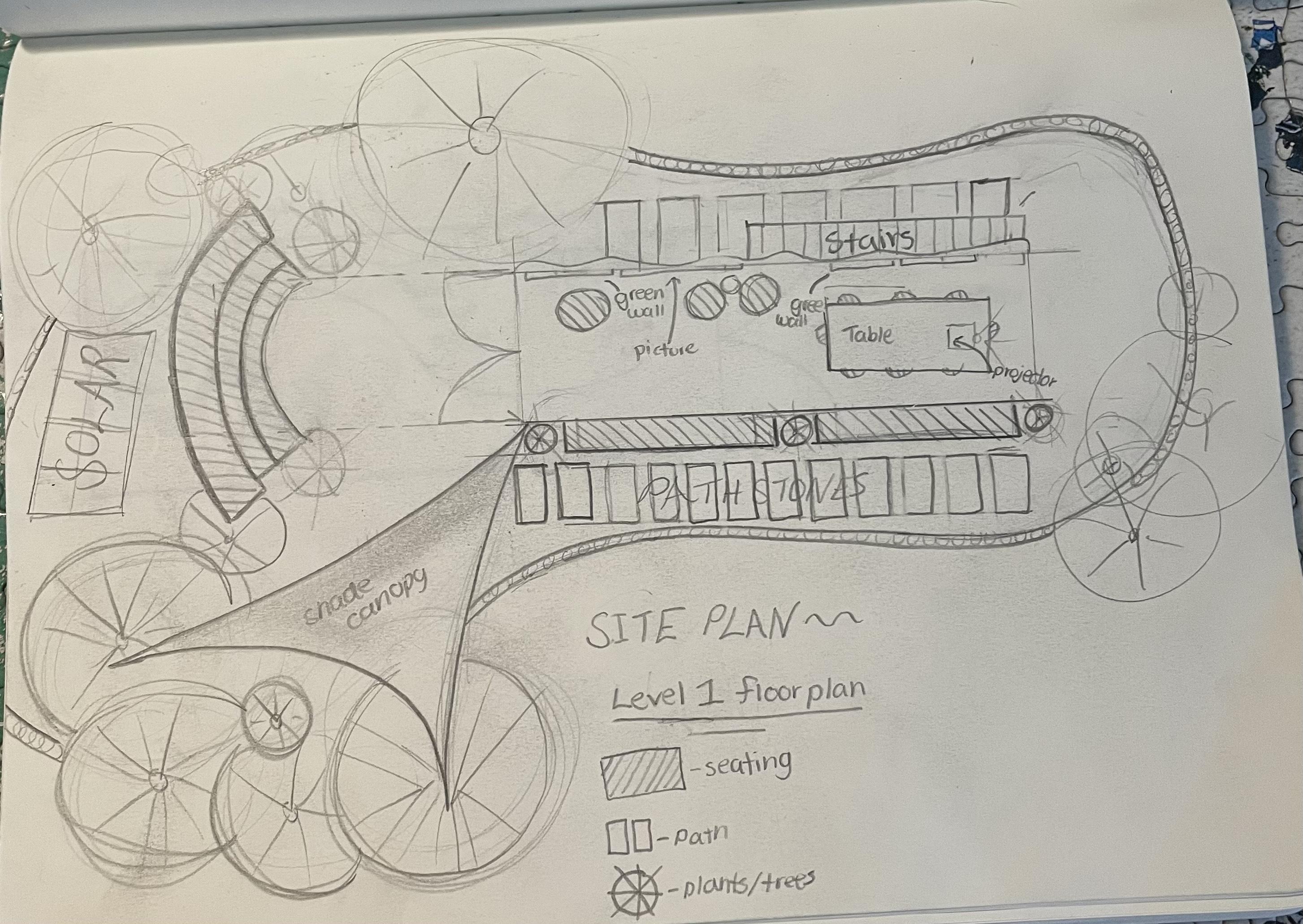
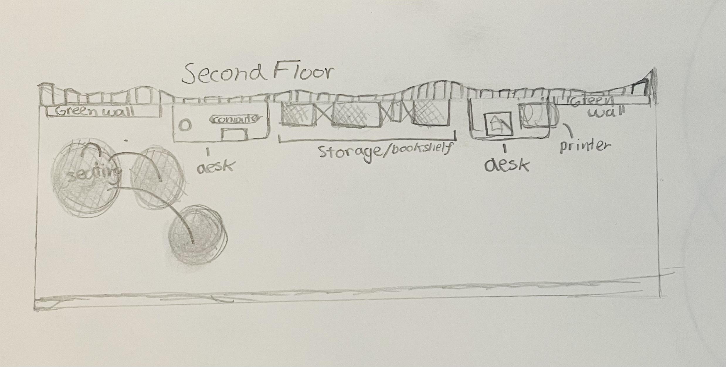
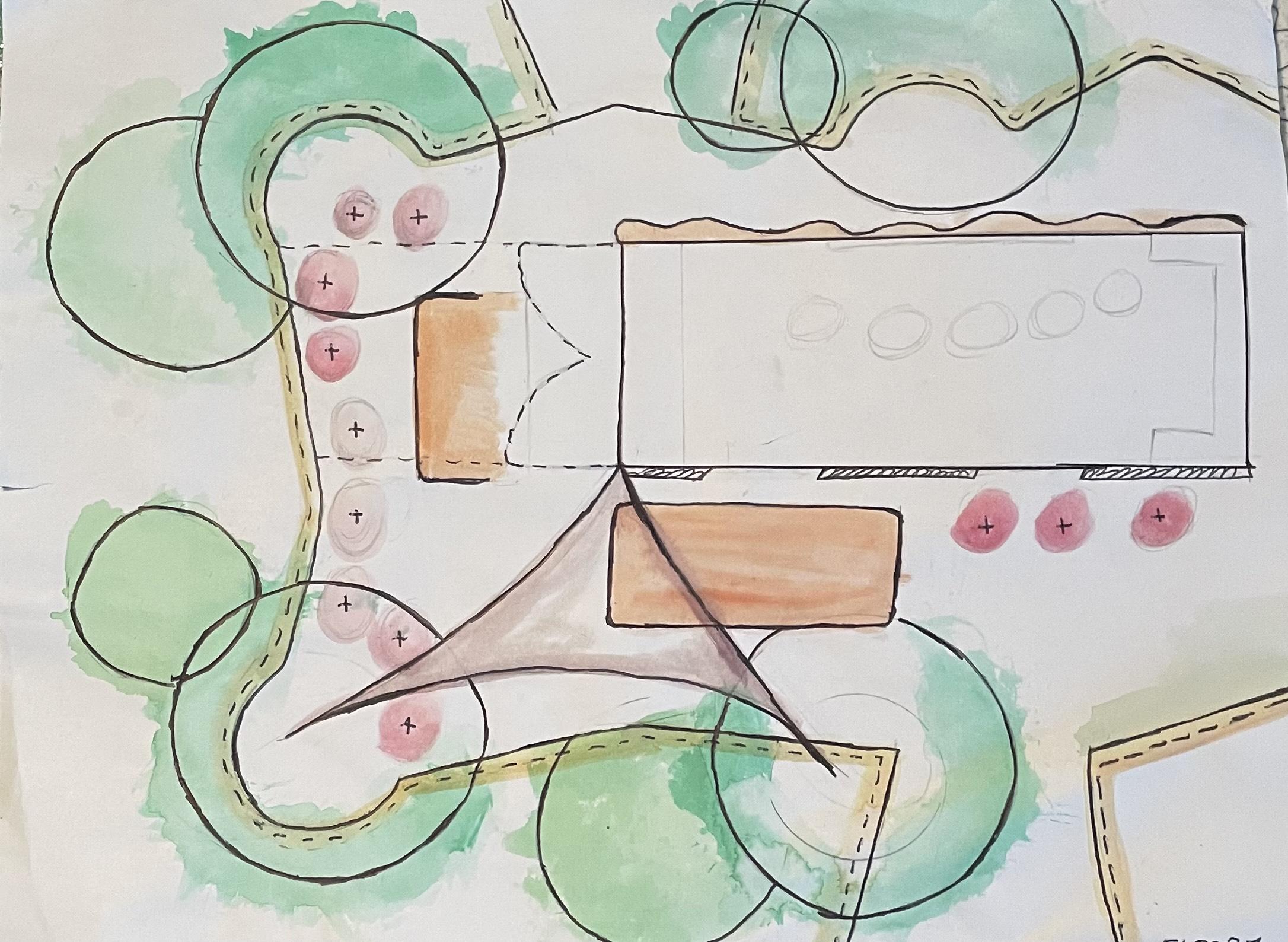
AND HERE ARE MY SKETCHES →
These sketches are based on my inspiration. I tried to incorporate everything I could to make it the space that I wanted. Also, these are just sketches and broad ideas, so they do not represent and show exactly what I ended up creating, some things I changed something I added.
Picture1 - Front View
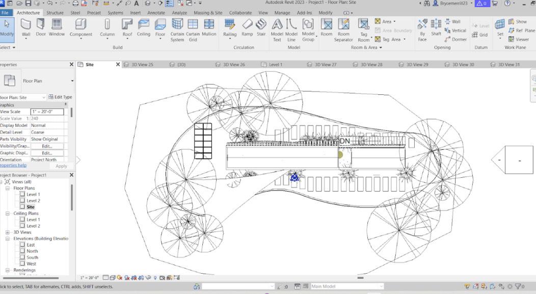
Picture2 - First-Level Floor Plan and Landscaping Plan
Picture3 - Second-floor plan
Picture4- First-floor Plan and Landscaping Plan (draft)
Cargo Container
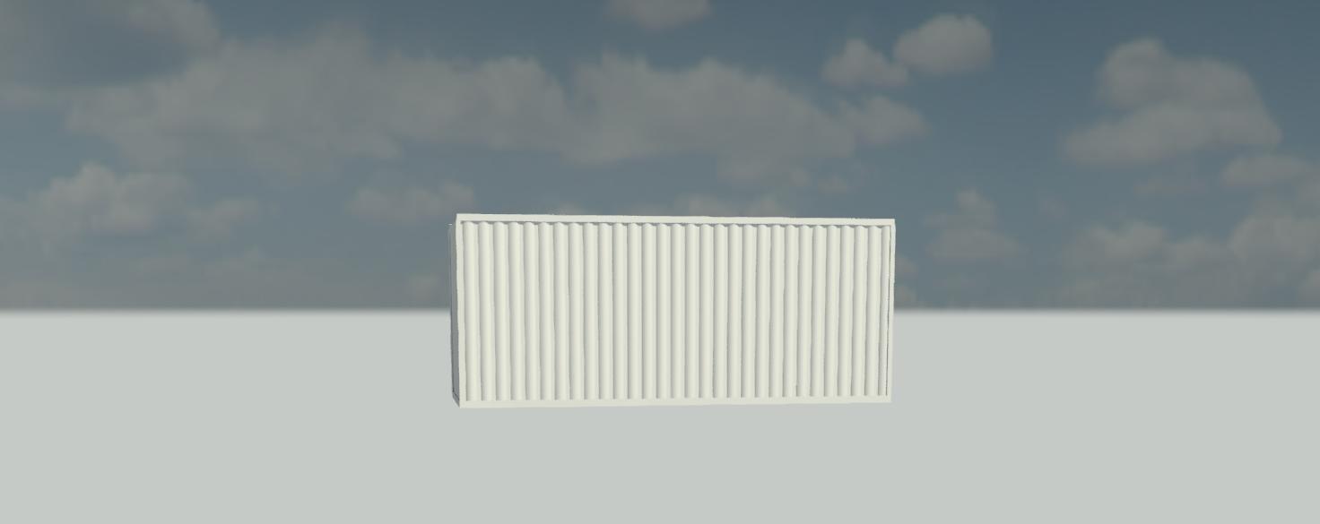
Step 1 - Shipping container
Each level can be constructed using two 20’ containers or another standard shipping container size of 40’
The Door (picture 4)--
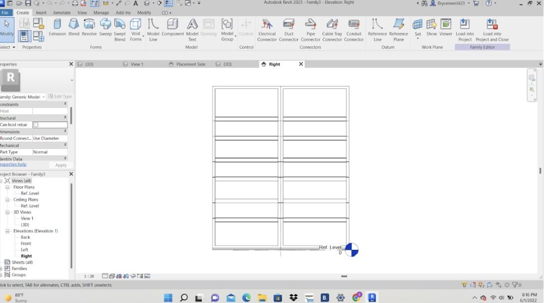
First I started with a metric generic template to create a door family that could open and closes. First, I created an extrusion line to represent the height of the container. Then, I made two more extrusion lines in this line and evenly spaced them out using the dimension tool. then I made two little notches using these dimension lines for placements. I then deleted the two extrusion lines that helped me with these elements. Then, I used the trim and extended tool to connect my notches to the high extrusion line. Then, I offset this element by 1 cm and capped the open lines at the ends. And for the extrusion end, I put 120cm, and the extrusion start at -120cm. Next. Finally, I went into the front view and created a rectangle around what I have already created to become the shape of a door and then offset this rectangle by 10cm. then, I joined these elements and that is the door.
The Supports (picture 3)--
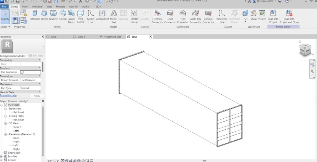
I create a new generic family model and added some reference planes to mark my perimeter and used the dimension tool to create a perimeter of the length, giving me the ability to change the length of this container. Then I imported my door and locked it to the center point so it slides along the middle. And then I mirrored this element to the other side. Next, I went to the left view and made little square extrusions on all four sides of the container door and then connected these lines to the other door to act as supports.
The Ribs (picture 2)--
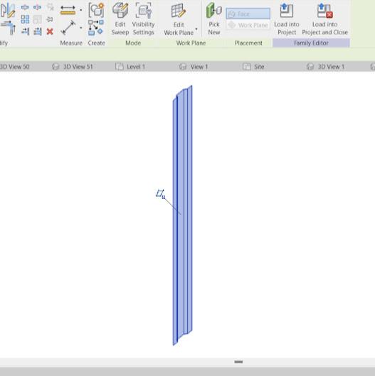
I created the rips that would make up the shipping container's sides. (I am not going to explain this part because it is almost exactly like what I did for the door notches but only this time it was only the rip not connected to the door. )
(picture 1)
Then I imported this rip into the family with the doors and aligned it to the supports and just used the array tool to line it up all along the container's sides, to get the final result as you can see in the picture.
The SHAPE--
I didn't just want one simple shipping container, I wanted the shape to be something different, something that would have its benefits but also make people drawn and fascinated by it. So after many different variations, I landed on this. A shape that not only looks sick and different but also a shape that provides shade, roof space, and more.
Glass Facade
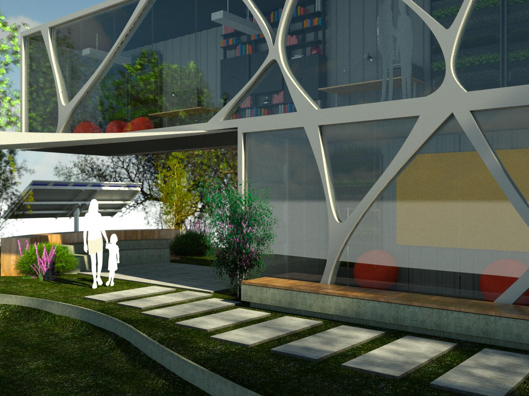
The Glass Facade---
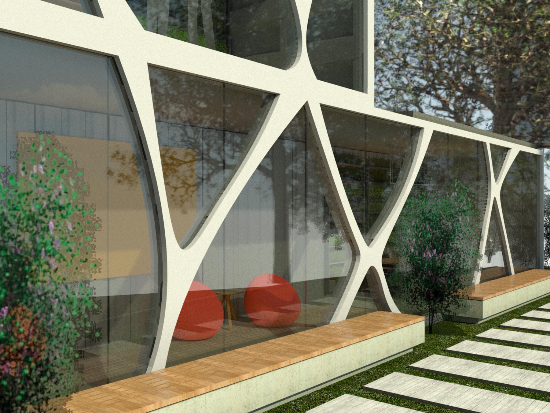
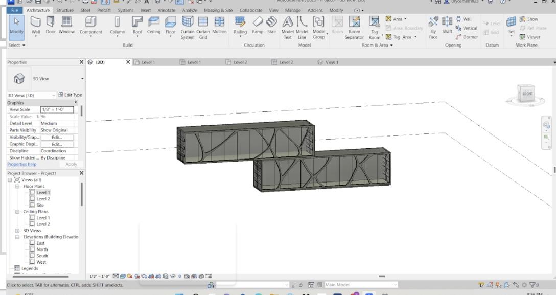
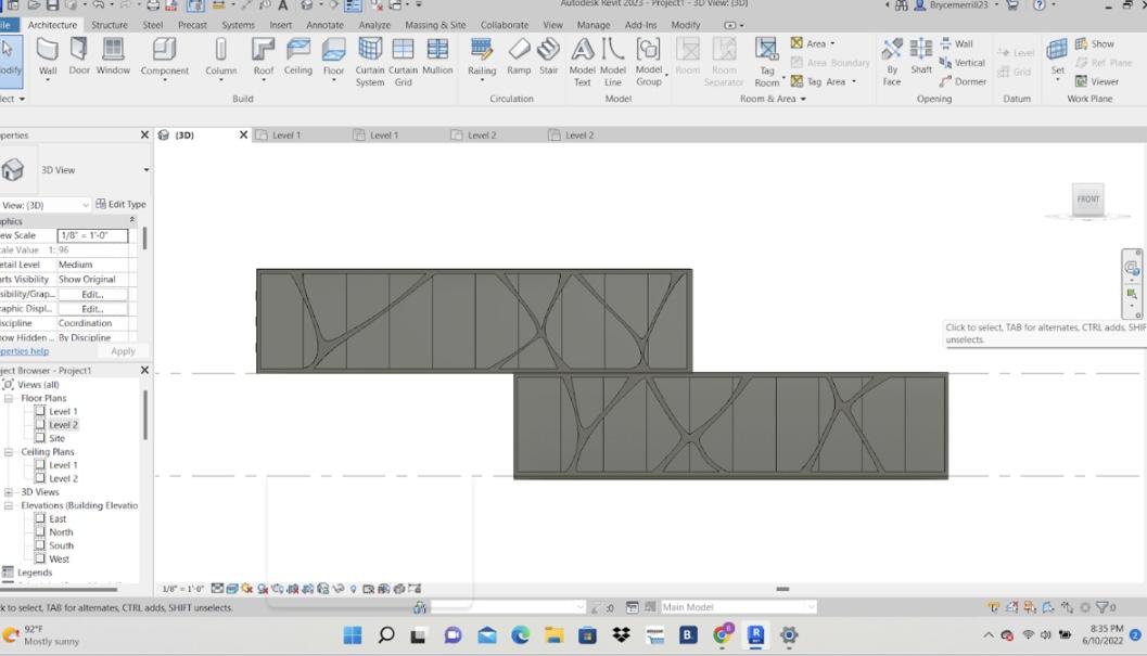
Tacking inspiration from one of my favorite pieces of architecture the Leonardo Glass Cube which is a glass-fronted brand pavilion in Bad Driburg, Germany designed by 3Deluxe I created my own glass facade. I know that this cargo container structure has to be able to be reused again and again and even with this inspired component it still can be. My hope and vision for this facade is to make it something like what the Serpentine Gallery does with their pavilions, but instead designing a wall, using local artists, architects, and visionaries in the local areas wherever these cargo containerships will be reutilized and reimagined in the future. It also ties into one of my main goals throughout this project, which is to not forget the importance of natural light. Not only does it go with my green and sustainable goal for this center by using less energy and utilizing our natural light source instead, but it is also crucial for us humans to feel productive, and simply better physically and mentally. This component also makes this workspace/community center feel open and wider than it is. I wanted people to feel free, and most importantly I didn't want people and their ideas to feel trapped and contained. Because cargo containers aren't meant for people they are meant for our stuff so naturally, they feel claustrophobic and dark, so I designed this element to help exterminate that built-in feeling.
---- Down below are the steps I took in creating this element ----
Step 1 - The supports
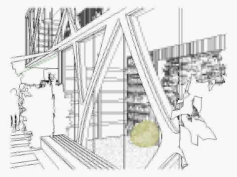
First, I created a separate wall from the cargo container and placed an edited curtain wall inside this wall. Then I pressed edit profile, then using the spline tool I created the curved supports you can see on the wall(pictures 1-4). I wanted these supports to flow from top to bottom so when constructing the top I used the first floor supports to help model the second floors, so it will look like it was one continuous piece(pictures 4 and 1). Next, I used the split element tool to make the bases and tops of the supports closed loops. Then finally to finish this part of the design a pressed finished edit mode.
Step 2 - The glass
Second, to get that glass/realistic look I wanted, the glass couldn't/can't just be huge junks of glass. So to solve this problem I created equally spaced rectangle-shaped curtain grids to achieve this look you can see in all the pictures. And I used the copy and paste tool to achieve these glass screens precisely all along the top and bottom glass facades.
Wood Facade
.jpg)
.jpg)
Pictures 1,2 and 3
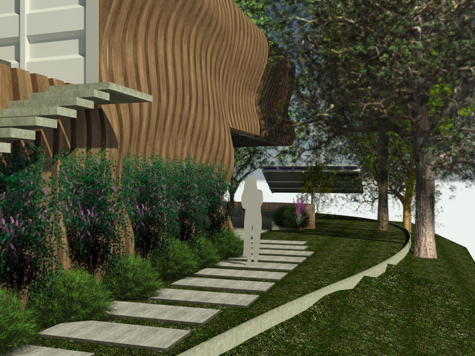
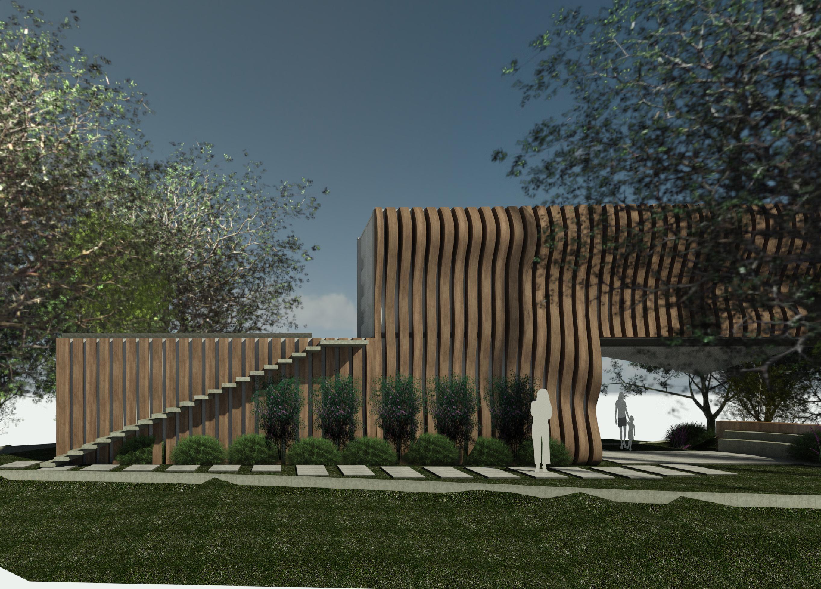
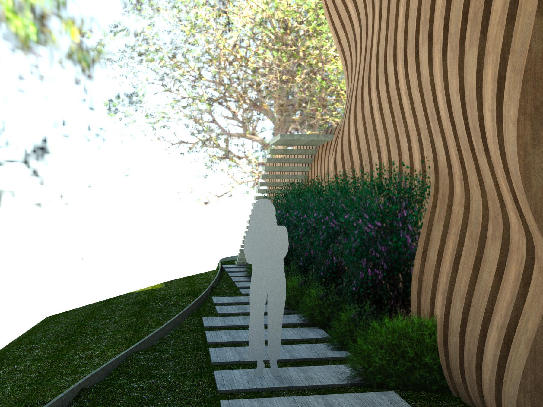
Here is the end result of my wooden facade. Despite the challenge, I feel this is an excellent addition to my structure. It gives it a unique flair, with its almost entrancing wavey look. It makes people feel at home with the local wood from their surroundings (The wood from this project would come from the local community where ever this center is placed, reusing trees that would have just been burned or left there. For me in CA this would probably be something like blue-stained wood, as a result of our recent and current bark beetles attaches in our forests). It also gives this once-box structure diverse dimensions that separate it from its neighbors and captures people's eyes, pulling them in and getting them involved.
----- Down below I describe the process I took in creating this element ----
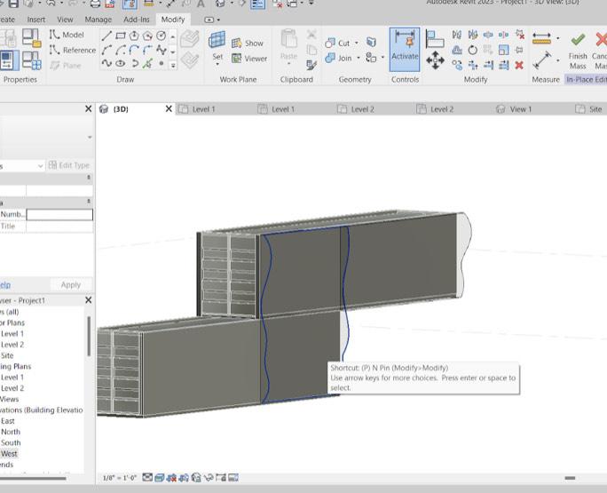
Step 1 - Massing (picture 4)
First I went into in-place mass. And using a multitude of named reverence places, selecting one at a time, and using the spline tool I created different curves on each reference plane. And after selecting all the reference planes and then pressing create a solid form I created would you can see in the fourth picture.
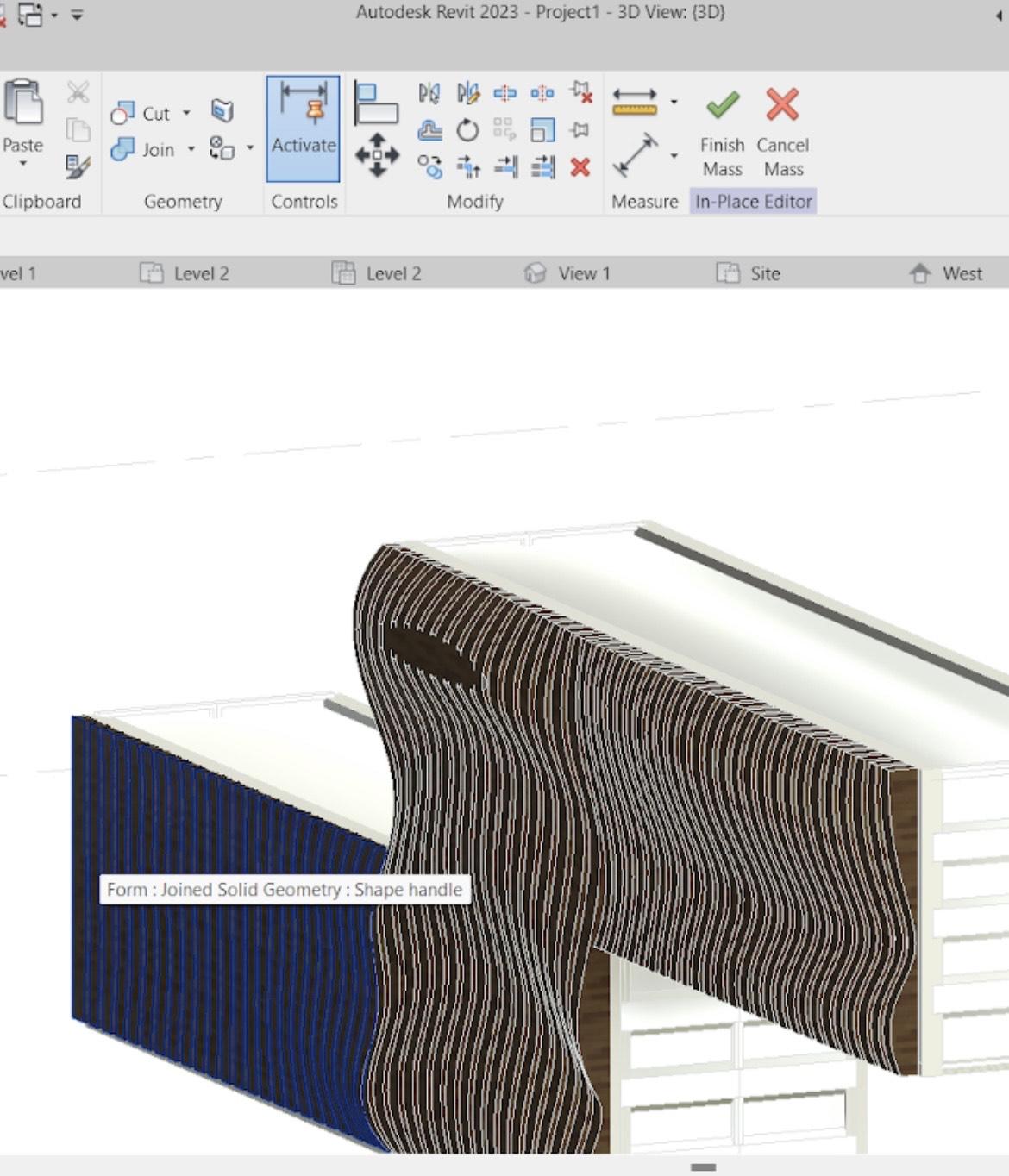
Step 2 - Voids (picture 5)
Now after creating another reference plane I used this plane to create around a 1inch long rectangle with the rectangle, tool on the wall. And after selecting that rectangle and making it a solid void I extend it out and therefore created a rectangle shape void in the wall. And after coping and pasting that same element across the solid void I created what you can see in picture 5.(The picture 5 glitched out that's why you can see the empty part with no voids)
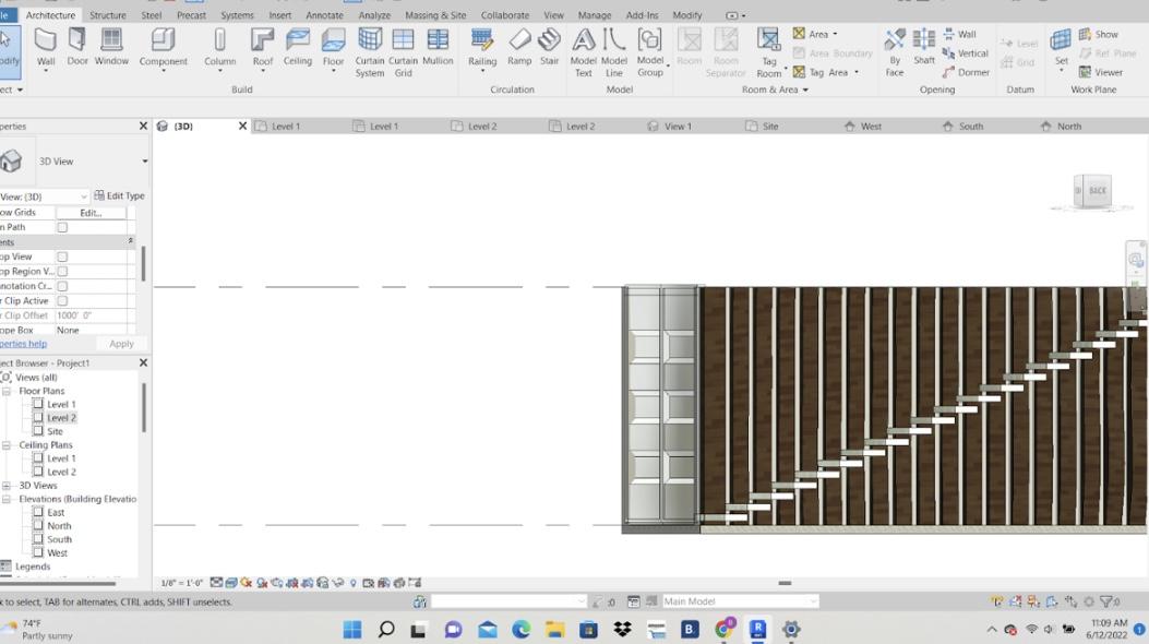
Step 3 - Stairs (picture 6)
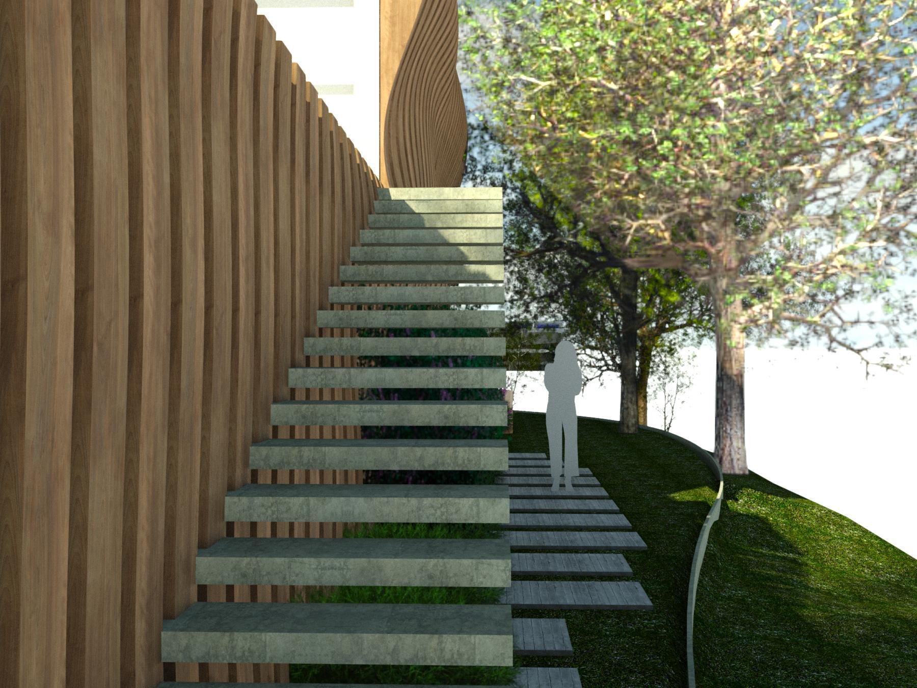
I didn't want to put simple stairs case against the facade because that would look dumb in my opinion. So with these stairs, I wanted to make them as least noticeable as possible to leave room for the facade to shine and but at the same time make them not incredibly boring. So using the stair tool in Revit I twiqued the basic stairs to my liking and change the material to get what you see in picture 6.
Interior
My goal for the design of these spaces was to formulate a well-designed public space that strengthens collaboration between people in an innovative setting. Making this the main focus of the interior of this building and also incorporating my knowledge and personal experience in how this space plays an intricate role in this center's values, and everyone's assumptions, attitudes, and behaviors surrounding it, I created what you can see the upcoming steps.
A well-designed space, with an open and diverse layout, is instrumental in facilitating productive performance, outputs, participation, teamwork, and more and this is what I tried my best to accomplish.
Two elements that you can see on both the first and second floors are the green walls and bing bag chairs.
--Green Wall --
I thought it was crucial to implement greenery and life into my building, so a green wall fits right into my vision. Not only does it go again play into my goal of sustainability and appreciation for what nature has to offer, but it also acts as a source of a little extra oxygen resulting in “less stress, less fatigue, and less anxiety”. And it also acts as an opportunity to grow local flowers and plants, and to even grow your own food.
--Bingbagchairs--
To go with my goal with the interior I chose to bring bag chairs for the primary indoor seating. Because not only are they the sickest and most comfortable chairs out there(in my opinion) they create a space where people feel invited, a space where people actually want to work and want to be there and make a change in their communities and the world.
These two elements I feel make the space feel natural. A plant wall brings nature inside and bing bag chairs bring the feeling of home and comfort with them.
Interior Floor 1
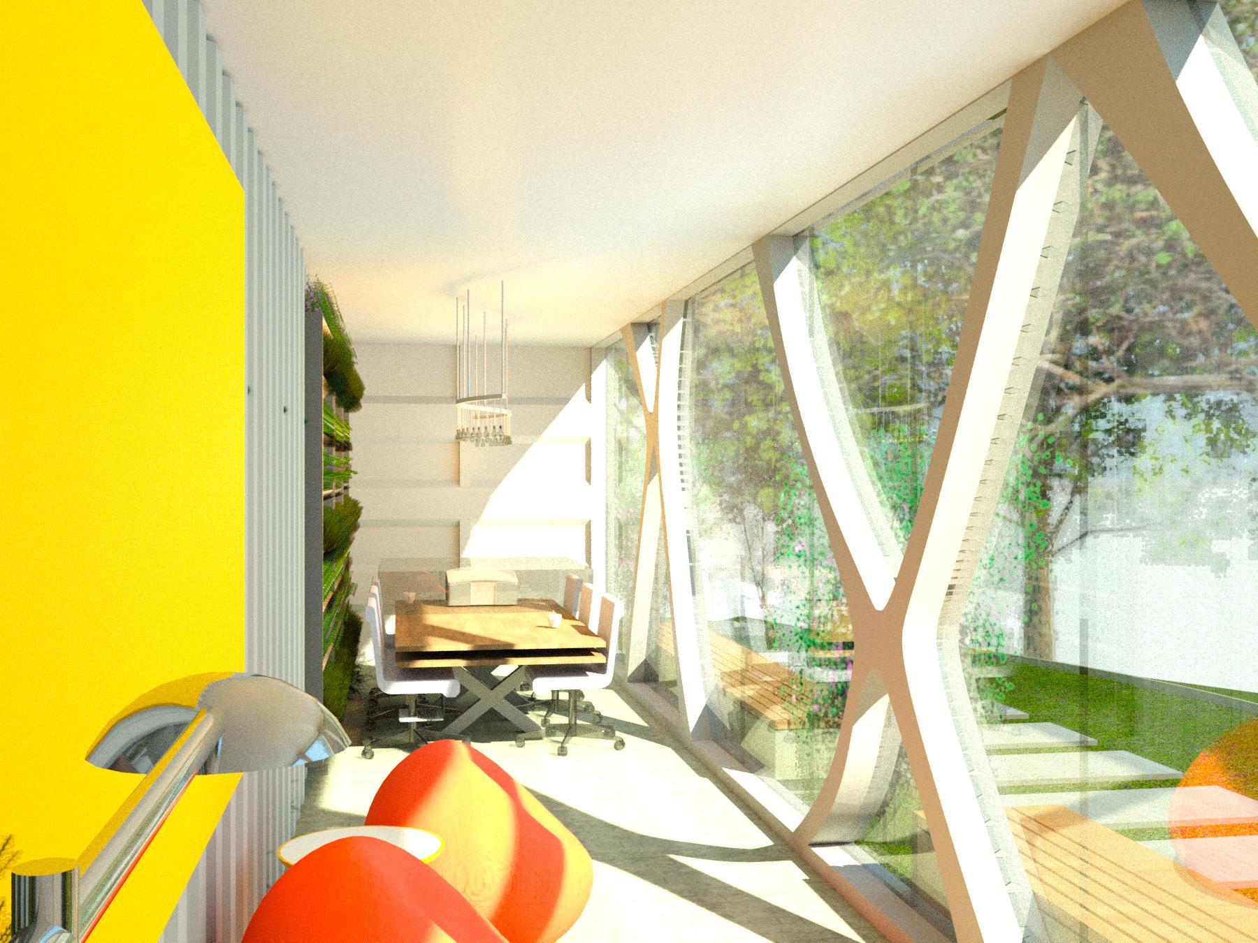
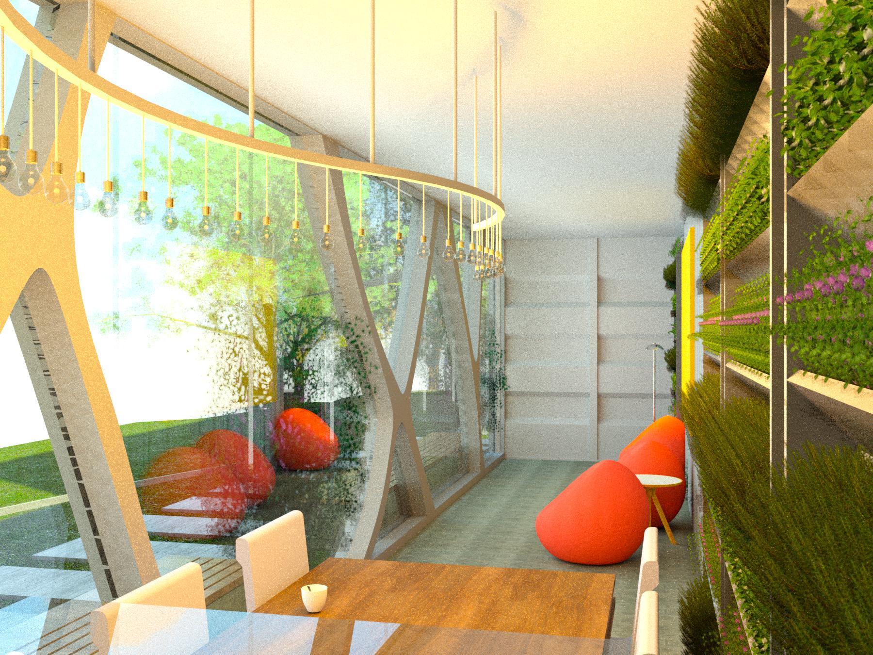

The first floor --
This floor as mentioned in my goals is welcome to anyone children, old grannies, anyone. It is meant to be a space where planning takes place, insightful conversations are held, and problems are brought to people's attention. It is meant to be a workplace and a fun place.
–Table –
The table I created separately as a family and then inputted into the project. I didn't just want to make it simple and load it from an existing Autodesk family, I wanted to put my own little spin on it. This is why you can see the legs of the table are crossed and there are two tops to the table. Giving it more useful space than regular tables (like storage, charging, etc..)
Also as you can see I added a projector. This is a crucial component of this center because it would allow for more in-depth and larger presentation, planning, conversion(zoom) and so much more.
–Coffee Table–
I put a coffee table by the bing bad chairs, giving room for drinks, papers, books food and so much more.
So this student does not end up on the bing bag chairs or the ground.
–Lighting–
For this floor in particular I wanted the lighting to be unique like the building itself because this is what people will see, this is where people will organize. This is why you can see that dynamic lighting fixture above the table. A fixture that ties into the curves of the wooden facade, giving this rectangle form a diverse element.
–Picture–
I also wanted to pull activism into this building, not only the ones who come here to fight for what they believe in but to implement these people into my design itself. So that's why I decided to put a painting of Jimi Hendrix on the first floor of this center (I am aware that you can not see it in any of my renderings but my computer would implode if I tried to render it, the 4th picture is what it would look like)Hendrix took black music and launched it onto the world stage. He took traditional Blues and R&B and experimented with them heavily, making sounds that no one had heard from a guitar before. In his short career, “he became the most influential guitar player who ever lived” tacking black music, black history, and black culture to center stage with him. (picture 4)
Interior Floor 2
The second floor--
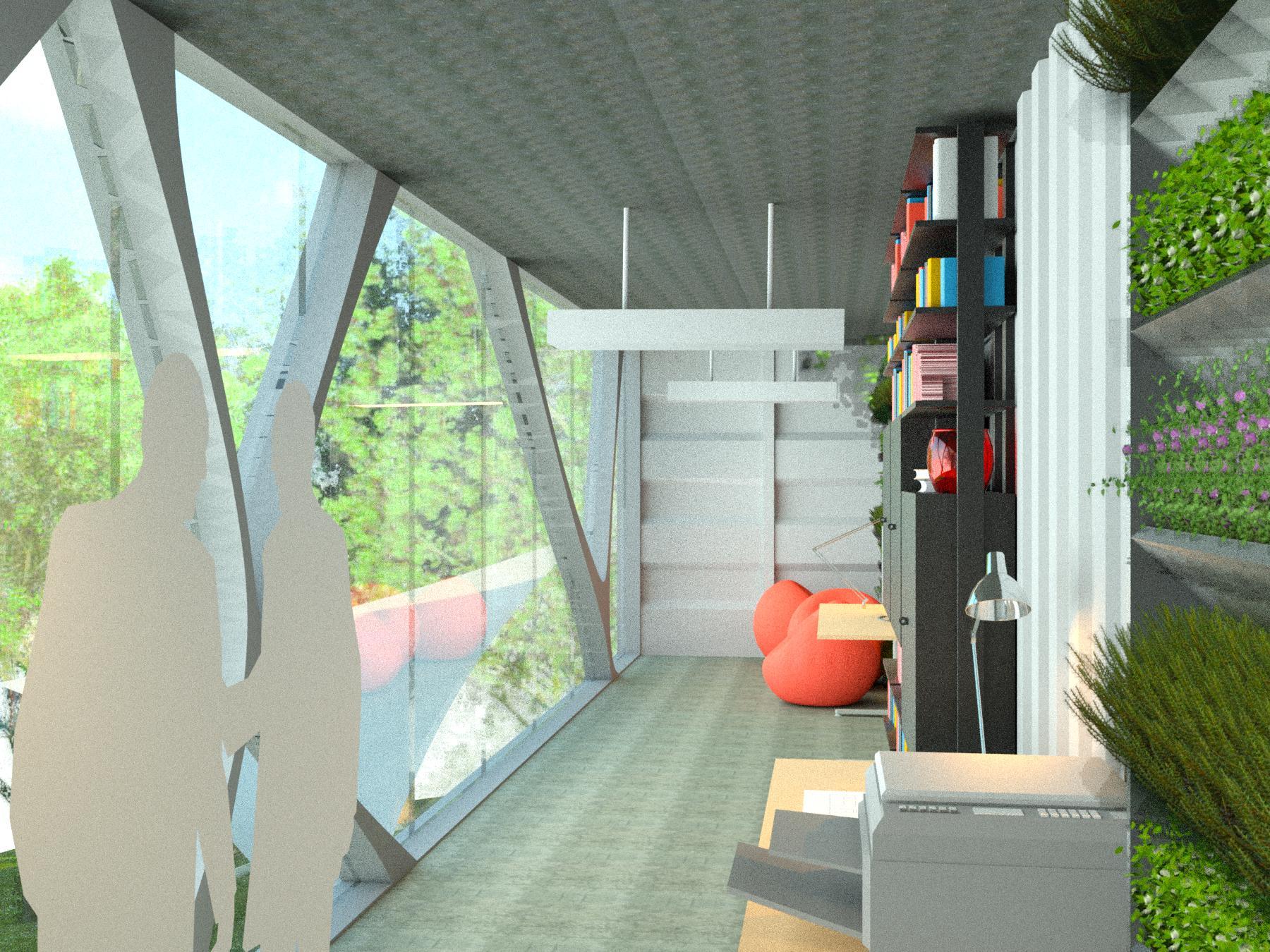
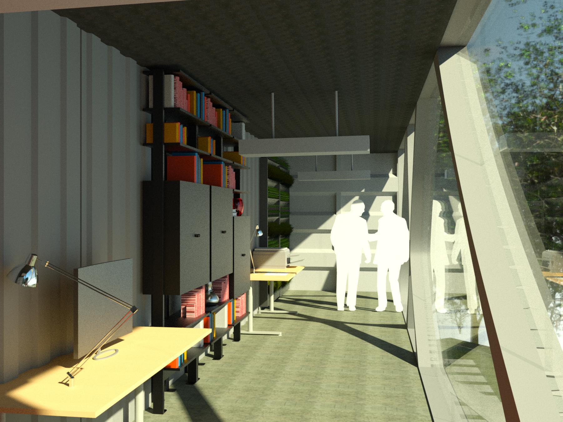
This is a floor not as open compared to the first. It is meant to be used as storage, as a place to print and copy flyers and information pamphlets, and is meant for more individual work. As you can see it still has the green walls and bing bag chairs from the first-floor along with some new elements.
--Desks--
These desks a got from an existing Autodesk family. They are meant to be used for more individual work. Like writing emails, logistical work, and writing to representatives. As you can see I added a computer and a piece of paper that I got from Revit city to give it that realistic flair.
--Printer--
I also thought it was crucial to add something people could scan and print flyers and information documents to amplify their voices and movement by paper and act as a free resource for these organizers to use.
--Lighting--
I wanted to keep the lighting simple for this floor, more tamed compared to the first. This is why you can see simple but not soo simple light fixtures that I thought fit into this center perfectly.
--Book/Storage Shelf--
I chose this book/storage shelf from Revit city because I thought it gave a unique flair and dimension to usually boring a piece of furniture. This piece of stunning furniture acts as a bookshelf and storage area where organizers can store posters, paper, and other such things they would need to spread their voice in protests and in their communities.
Bench
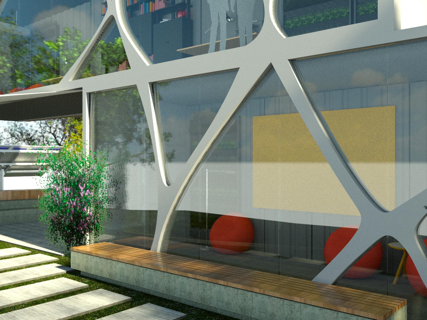
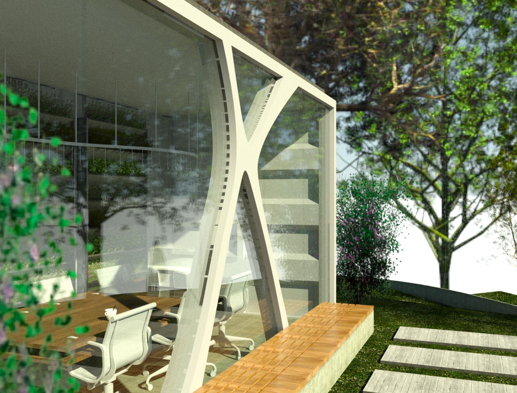
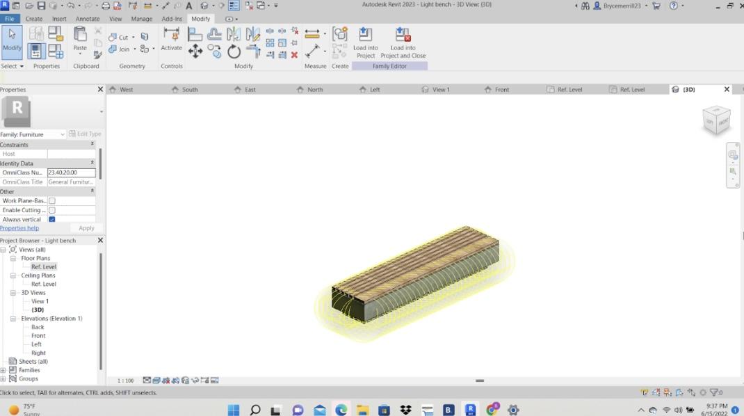
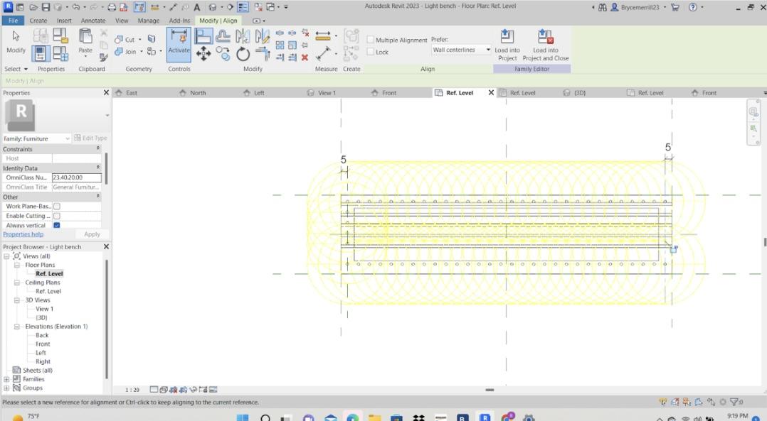
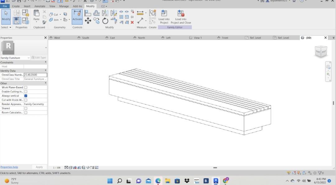
This is a bench I made, it comes to light at night with its dynamic lighting fixture at its base and ties into the center with its far from basic flare and choice of materials. (pictures 1-2)
---- Down below are the steps I took in creating this element ----
Step 1 - Metric Furnisher Family (picture 5)
First, I started with a metric furnisher family template which I used to construct this element until exporting it into the project. Next, I created reference lines to represent the width of the bench which is 60cm. Then, I use more reverence planes to demonstrate where each part of the bench is going to go and its dimension. And then I created even more reverence planes to represent the changeable length using the dimension tool. Then, using the model reference planes I started to give mass to each element along with the assigned material. Concrete for the base and the bulk of the seat part portion and then use the solid form the rectangle tool along with the copy and paste tool to make the unique wooden seating pad on the top, and assigned it the wood I used for an element like the wooden facade to tie it back into the center.
Step 2 - The lights! (picture3-4)
It was my first time ever implementing lights into a family myself, so this did present a challenge, but also a new skill set to be developed. To get the look I hoped for first, I imported a metric lighting fixture for Revit to my family but before I imported it I created a small extrusion above it making it so that instead of the light just shining everywhere it shines exclusively down, getting the ideal look I wanted. So after importing it, I need to place it around the benches base, so with the help of mainly the reference plane tool I did so and then mirrored it to the other side of the bench getting what you see in pictures 4-5
Shade Covering
Shade covering--
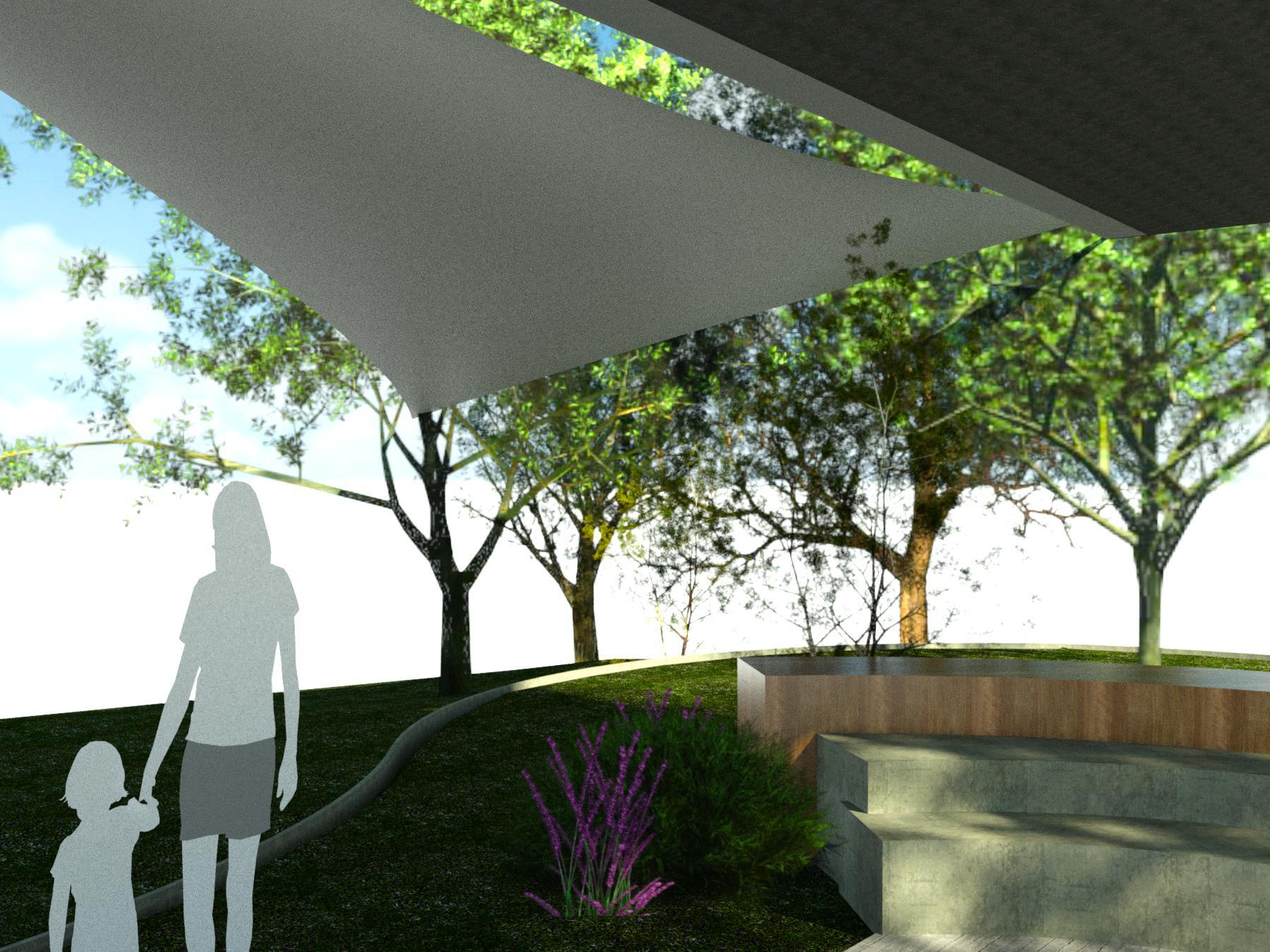
I chose this type of shade covering because one, it looks sick, and second because I know from personal experience it truly does provide a plentitude of shade throughout the day and is also very portable, following one of the goals for this project.
This design I took also lead me to use tools that I did not know existed on Revit. Presents a challenge and an opportunity for me to learn and gain new skills.
---- Down below are the steps I took in creating this element ----
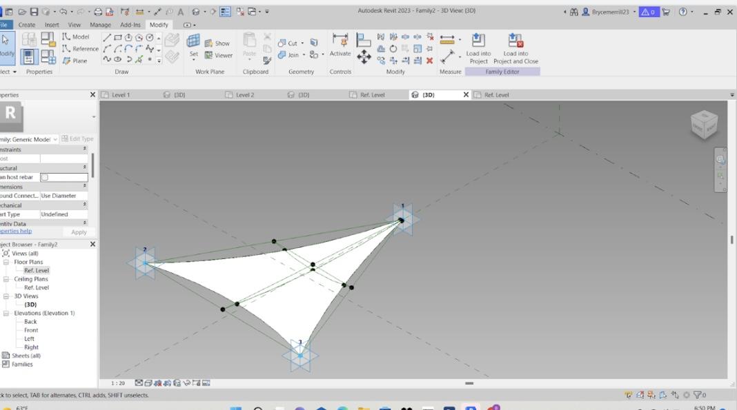
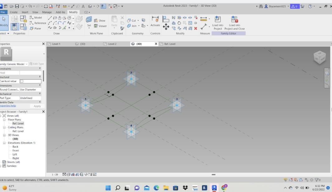
Step 1 - The Canopy Family (pictures 3-4)
First, I created this as the metric generic model adapter family so I would be able to change the dimensions of the wanted elements. Then I used the point element tool and placed the points in my desired shape, which in this project was a rectangle, and made all of them adaptive (picture 4). And then, I used the spline tool to connect these points together. Then, to get the wavy natural look desired a placed more point elements in each connector line. Then I connected these points with the spline tool as well. Then I added even more point elements to these new lines and then connected them in the shape to get the curved edges I desired. And then I selected those lines and then pressed create a solid form to get what you can see in picture 3.
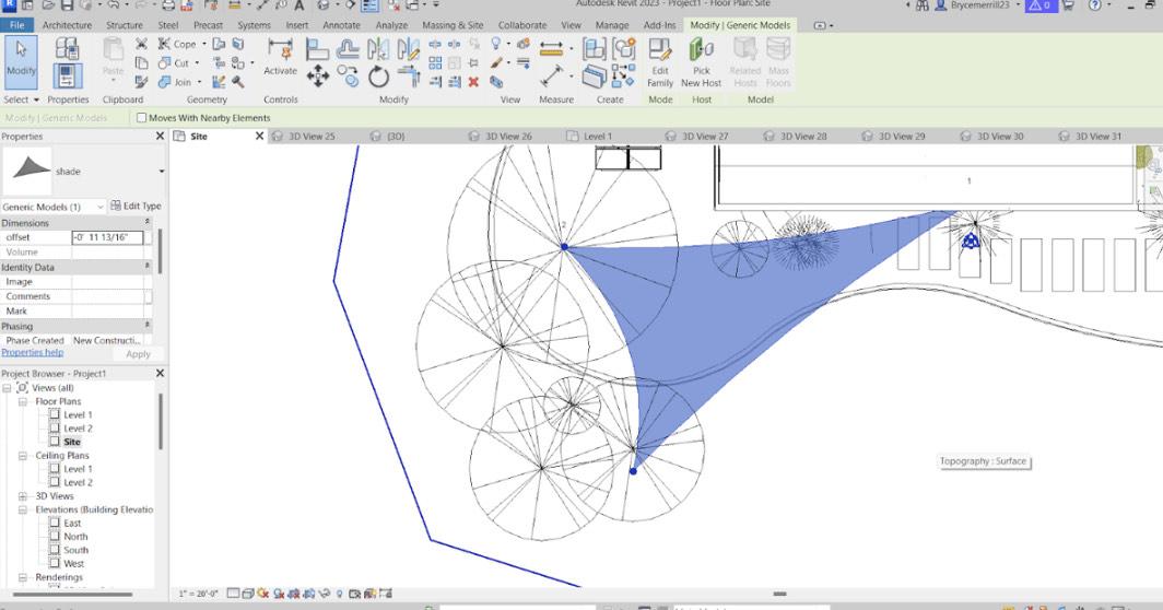
Step 2 - Exporting and Placing (pictures 1-2)
Next, I imported that canopy into my project and connected one point to the first level and the other two to nearby trees to get the almost sail-like look I wished for. This element now allows shade on the stage area for almost 24 hours a day and also extra shade to its surrounding areas for other activities.
Landscaping
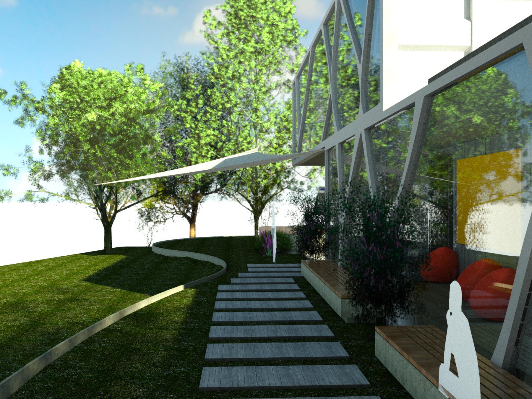
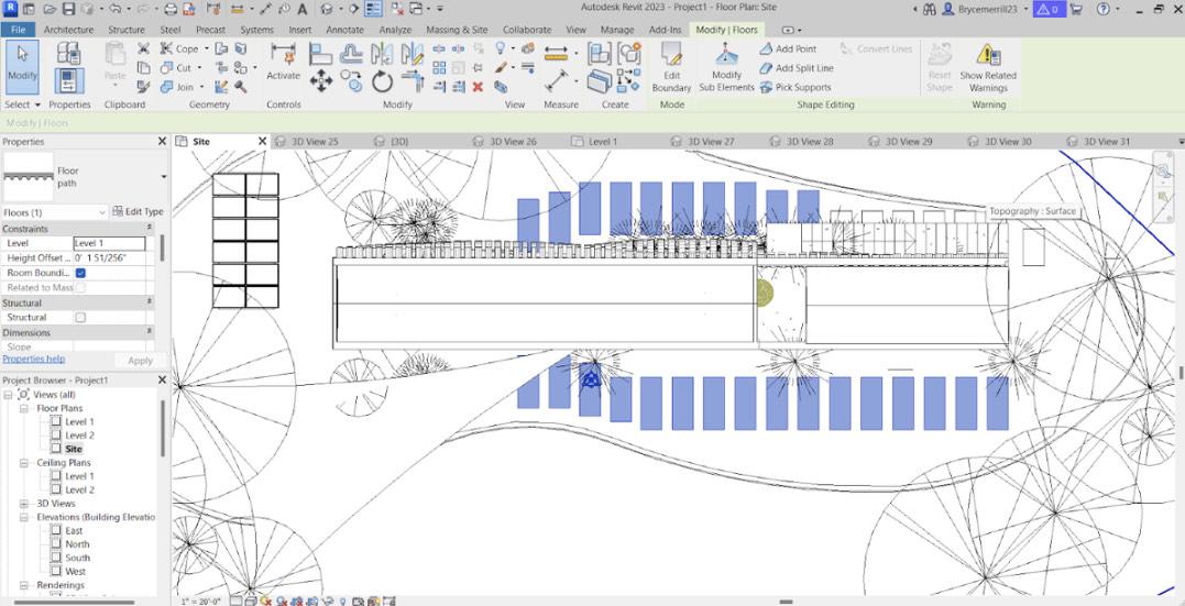
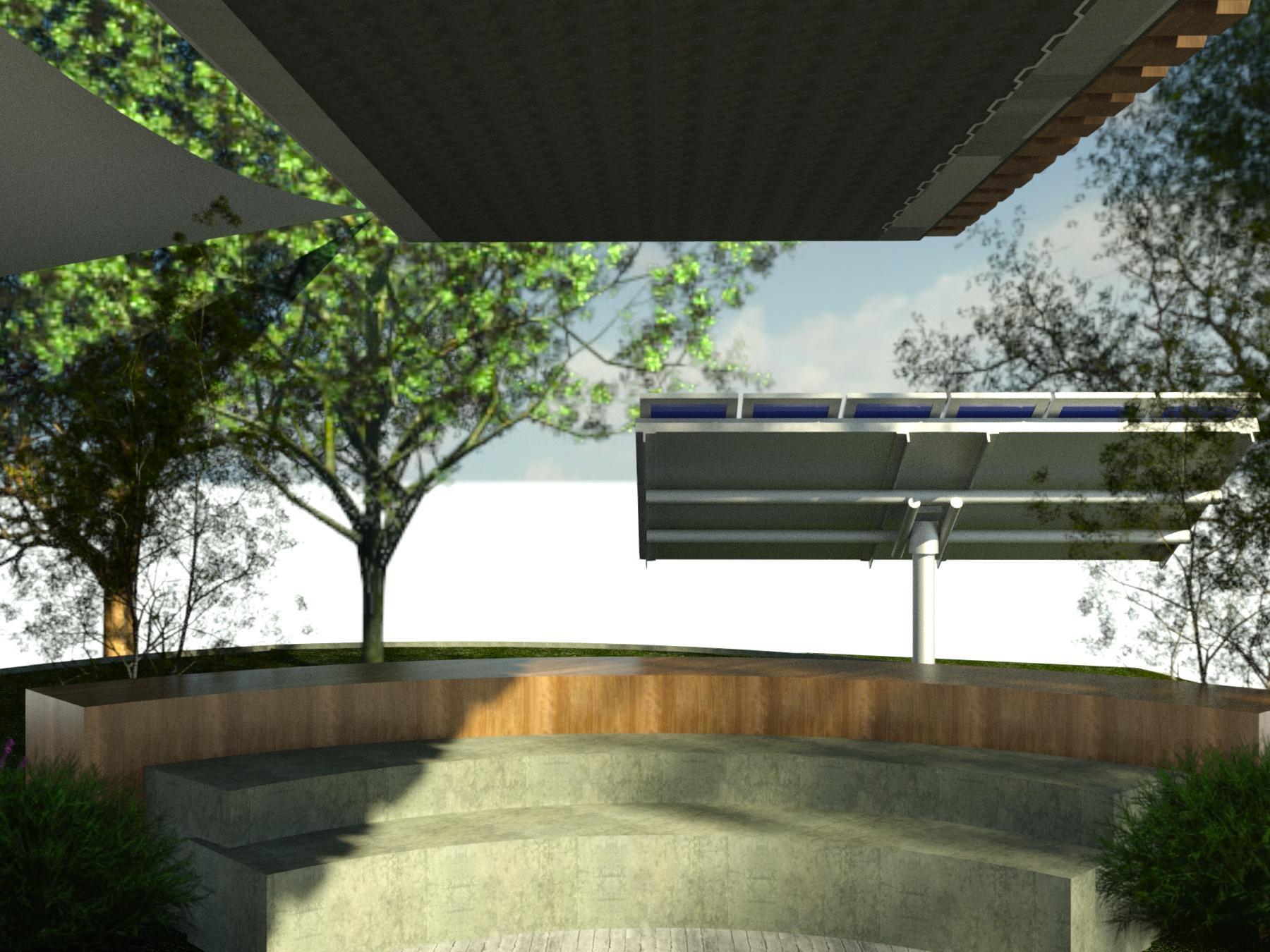
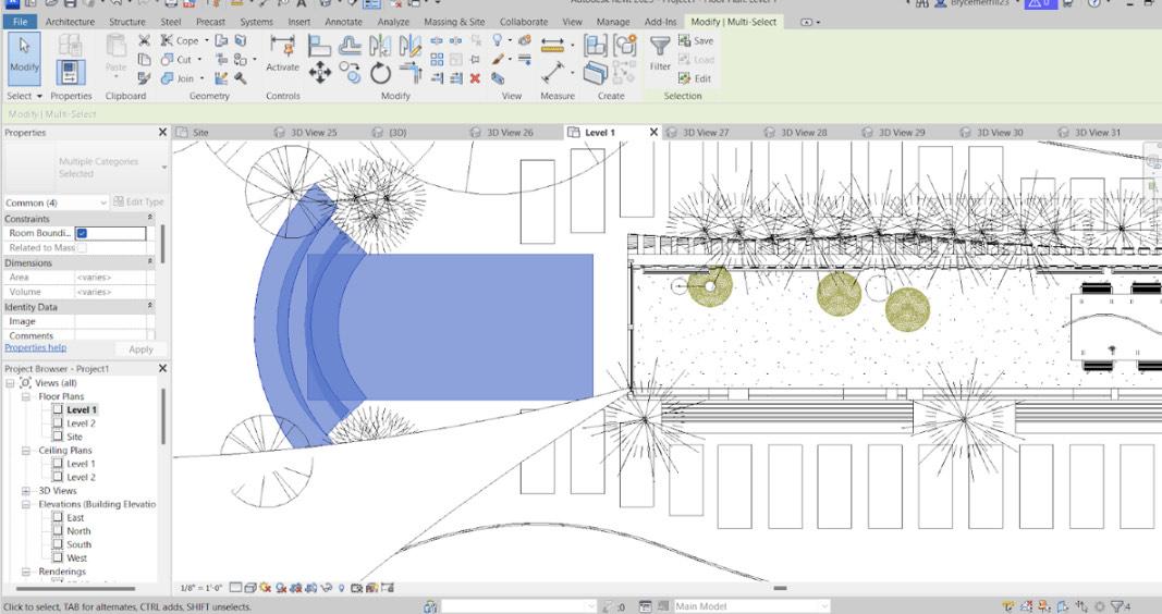
Landscaping(My goal)--
I wanted to “Integrate nature into the [ins and outs of this structure] to provide a revitalizing contrast to the harsh shape, color, and texture of buildings, and stimulate the senses with their simple color, sound, smell, and motions" (Dorward, 1990; Miller, 1997).
For the landscaping and all the outdoors, elements were focused on this idea, and the outdoors would play a huge part in this project. I place hopefully used more than the building itself, or a combination of both. I wanted the outdoors to also provide the space for an opportunity to gather, organized, and have fun. Providing shade with the shade covering, seating with the multitude of benches and fresh air and leaves coming from the trees and greenery all around the property
--greenery--
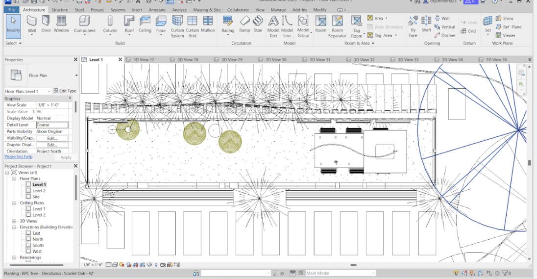
As you can see there is a plentitude of trees and plants that make this center lively but do not overpower it. I strategically placed trees around the center to give natural light to the inside of the building but at the same time give optimum shade to the outdoor spaces throughout the day. And in addition, I utilized these trees for elements such as the shade canopy.
--Steps and Stage (pictures 1-4)--
As you can see there is a walkway to allow for more efficient travel and a stage to allow for more seating and provide another space for performances, presentations, and other such things like camps. These elements were fairly simple to make.
For the walkways, I just used the floor path property and made the ideal shape, and just copied and pasted these elements around in the form that would complement the center. I also assigned this element concrete material to tie into another concrete element in this center.
And then for the stage, I just used the wall tool but made it low to be seating and then used the start-end-rubrics ark to allow for that curved shape which provides more seating and a more cooperative feeling. I also tied the material with the other elements such are the wooden facade and other concrete elements.
--Solar-- (picture 5)
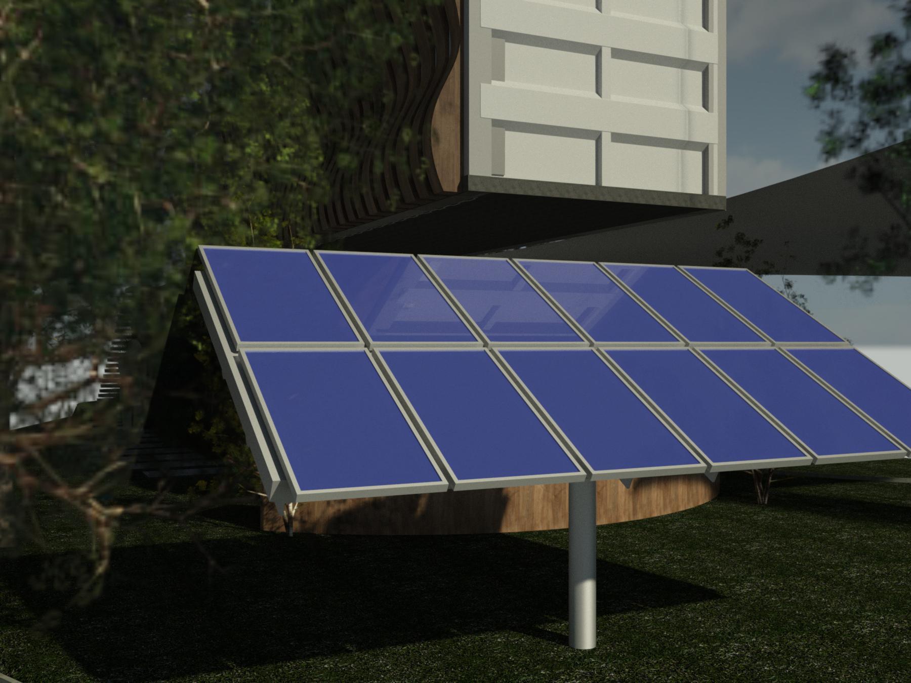
I also added a solar twelve 300-watt solar panels to the side of this center, a total of 3600 watts. I placed them in an ideal space for light at almost any time of day. This would not only power the building itself, but the excess will also go back into the community befitting the local area around this center.
Green Roof
--Green Roof --
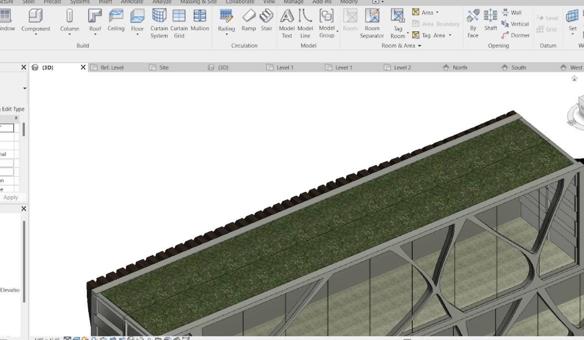
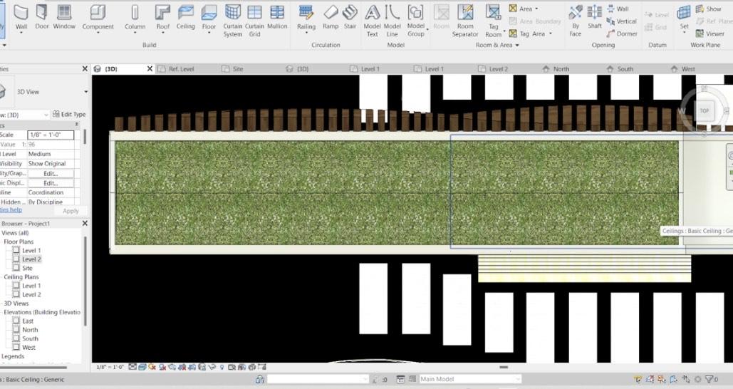
I also added a full green roof system that I feel again fits perfectly into my vision and hope for this space. This is a separate roof from the shipping container so when the time comes to reutilize it, it will be easy to dismantle (or even better keep it). Through my research, I was shocked to find how beneficial these roofs are and can be. It provides shade, removes heat from the air, provides a rainwater buffer, regulates the indoor and outdoor temperature, it saves energy, and encourages biodiversity in the surrounding city.
How I created this element (green roof)
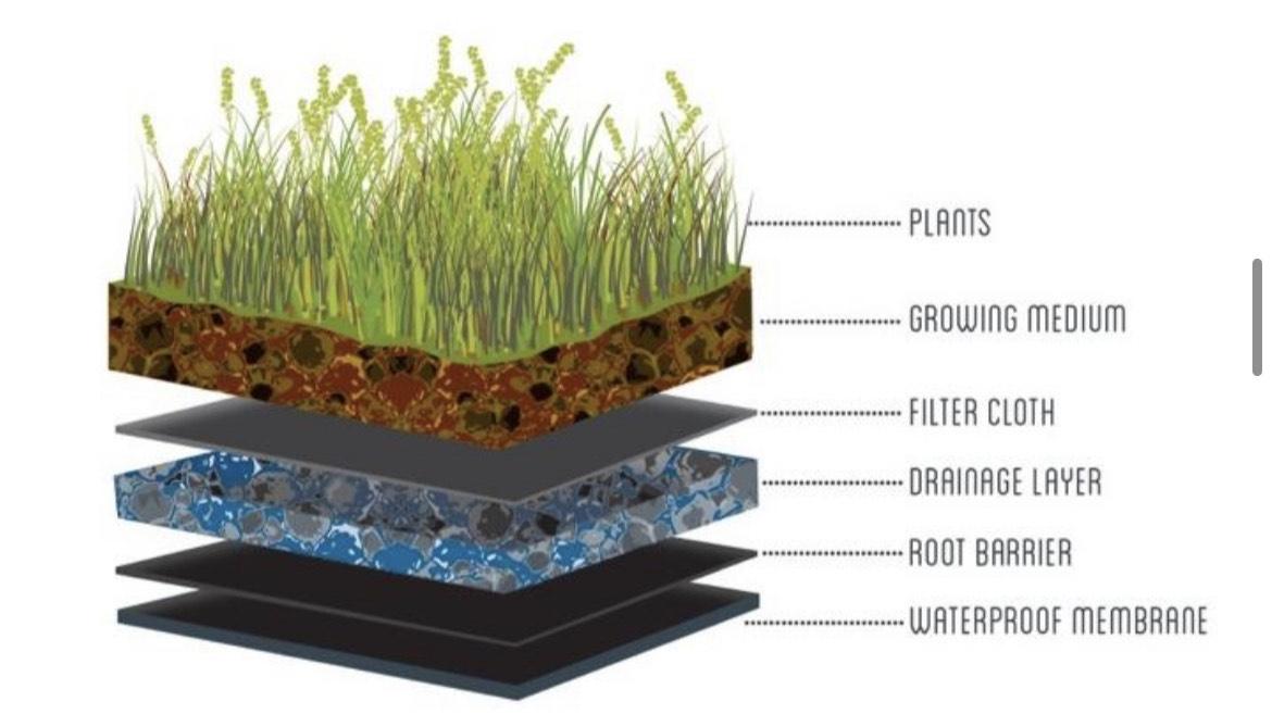
I created a growing medium(the living part) about 3-4 inches thick (the plants on this roof will most licky be something like succulents because of the amount of water they can absorb and other such benefits they have but depending on the climate this may change). Then I placed filter clothes to help drain the water but not the soil, so it is not just a soggy mess( I could not find this specific cloth in Revit, but in reality, it would be there.) Next is the drainage layer, this layer has small permutations to direct the water to the drainage system which is between one of the gaps in my wooden facade. Then I put a root barrier to prevent roots from making their way into the building. And last, to encapsulate and reinforce this all I added a strong steal based. ( I followed the diagram you can see in picture 3)
Walk Through
What I Have Learned
I initially saw this instructable as an opportunity to fund my high school Study Abroad in Spain, but it ended up being a billion things more than that. I found a passion for architecture, a hobby I disregarded because I thought I couldn't become a billionaire. But now I can't stop dreaming and thinking about it, it fills my social media, my every waking thought, it has become something that gives me a feeling of joy and excitement it's impossible to express in words, it gives me inspiration and it gives me hope something that is getting increasingly hard to find.
Through this project, I also found I need, not a need for speed;) but a need for places like this activism center. Might it be someone who has a dream of fighting for climate justice or for women's rights, this center will give them the opportunity to do that, an opportunity that could change the world.
In conclusion, I hope this center expresses all my goals and my hopes. I hope you can see the vision I had for this space as clearly as I can.
Thank you for this opportunity to be part of something like this and for giving me the reason I found one of my deepest passions,
Bryce Merrill