Casa Silvestre: a Journey in Design
by Marcos-Leon in Design > 3D Design
304 Views, 4 Favorites, 0 Comments
Casa Silvestre: a Journey in Design

Framing the Journey
A mix of styles from my eyes.
A collage of thoughts from my brain.
A Frankenstein of creations by my hand.
The Launch
In my pursuit of personal growth, I was inspired to enter the "Make it Small" Instructibles competition. My previous experience in a similar competition, where my project "Vista Fuerte" secured a runner-up position in the "Make it Resilient" category, fueled my desire to further hone my skills. My commitment to continuous improvement spans design, technical expertise, and physical modeling, and this min home project presented the perfect opportunity to advance in these areas. This endeavor resonates deeply with my personal philosophy: when faced with limitations and constraints creativity is forced to explode. With the competition guidelines thoroughly reviewed and a sense of excitement building, I eagerly embarked on the creative process.
Inspired by Place, Designed with Vision
"Casa Silvestre: A Journey in Design" emphasizes the central role of the architectural and creative process in the project. Here's a breakdown of its meaning:
- "Casa Silvestre": Rooted in the natural and authentic, this represents the small home designed with intention, inspired by diverse environments and scales.
- "A Journey": Reflects the thoughtful evolution of the project, from conception to realization. Implying that the design process is a journey of exploration, involving new discoveries, overcoming challenges, and finding solutions.
- "In Design": It emphasizes the act of creation—how the project draws inspiration from urban, suburban, and rural environments, translating these influences into various unique sketches. These sketches are then analyzed, with key elements extracted to shape the home. This suggests that the home is the result of intentional decisions, blending aesthetics, functionality, and context.
The title captures the essence of a project that isn’t just about building a home but about engaging with the creative process, drawing inspiration from diverse surroundings, and crafting a meaningful space that resonates with its environment.
Supplies
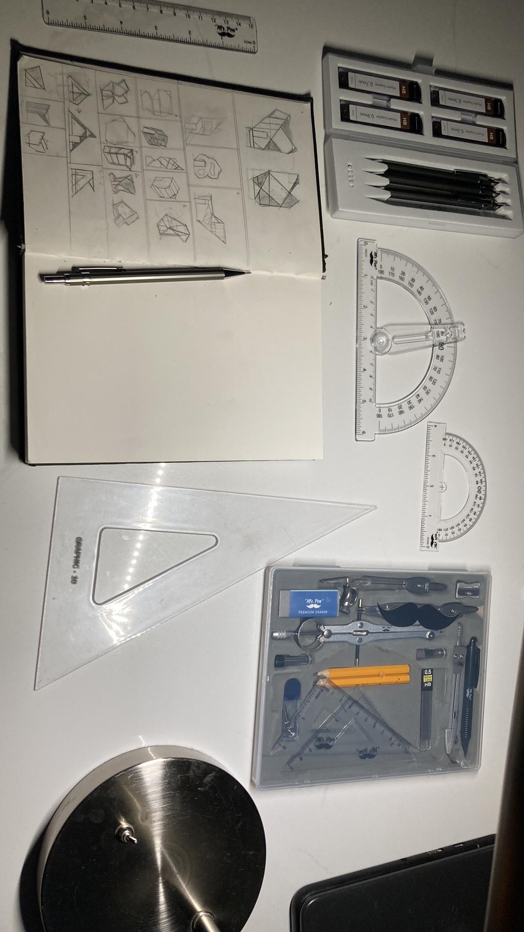
- Drafting Pencils
- Sketchbook
- Triangle
- Metal ruler
- Sketchup
- Revit
- ArchiTectures
- BimObject
- Blocksrvt’
- Adobe Illustrator
- Adobe color palette generator
- Google Docs
- Chat GPT(For writing purposes solely)
Research
Mini homes are far from a revolutionary concept—they’ve existed for many years. However, while exploring existing examples, a recurring trend became apparent. Many mini homes seemed to be literal interpretations of the term, as though a traditional house had been resized using a scale-down tool. The result was often reminiscent of a dollhouse, with standard proportions awkwardly reduced. Recognizing this, I knew my design had to stand apart from existing models.
Before diving into sketches, I reflected on a fundamental principle often used in urban planning: when horizontal expansion isn’t possible, the sky becomes the limit. This approach influenced the foundation of my design philosophy for this project.
Further research was necessary, particularly concerning size limitations. This competition is about thinking creatively within a confined space. Defining how “mini” the home should be was critical. After consulting various sources, I adhered to a maximum limit of 600 square feet, ensuring my design stayed true to the concept while maximizing its functionality.
With the parameters set, I sought inspiration to shape my vision. A trip to the countryside provided the clarity I needed. Growing up in northern Delaware exposed me to a diverse range of environments, from the metropolitan expanse of the Greater Philadelphia Area to the bustling suburbs of Wilmington, and even the tranquil Pennsylvania countryside. These interconnected regions, along with their intermediary zones, became my creative foundation.
This diverse backdrop allowed me to merge urban ingenuity with rural charm, creating a mini home design that embraces both practicality and innovation—an answer to the challenge of thinking big in a small space.
Purchases and Planning
During this period, my sole competition was myself. My objective was clear: to surpass my previous creations and continually push the boundaries of what I could achieve. This commitment to improvement required upgrading both my tools and my approach.
Objective 1: Upgrading My Tools
To streamline my design journey and enhance my workflow, I invested in the following tools:
- Drafting mechanical pencils for precision sketching.
- Colored pencils for rendering detailed concepts.
- Triangles and steel rulers for accuracy in drafting.
- Sketchbooks for capturing ideas and refining designs.
- Sandpaper for model-making adjustments.
The most significant upgrade, however, was the purchase of a Dell G15 gaming laptop. This investment allowed me to work on Revit beyond the limited hours I had access to my school's Technical Drafting and Design class. With this laptop, I planned to use my school’s Revit account and collaborate with my brother by renting his Adobe Illustrator software, further expanding my digital capabilities.
Objective 2: Refining the Physical Model
For the physical model submission, I aimed to improve upon my earlier work by creating a larger-scale model that showcased greater detail. I planned to reuse leftover materials from my previous model, making only a few additional purchases as necessary. This approach ensured both cost-effectiveness and continuity in my design evolution.
By upgrading my tools and refining my processes, I positioned myself to take my designs to the next level, meeting and exceeding the high standards I set for myself.
Sketches
Throughout the design process, sketching remained one of the most enjoyable, calming, and liberating aspects. Many of my sketches were quick five-minute exercises, often created during car or bus rides as I traveled through my local area. Others took shape amidst the tranquility of the wilderness, as I relished the warm fall weather.
Rather than replicating homes I encountered brick by brick, I focused on capturing features that stood out. If a specific element of a home caught my attention, I would make a mental note, which often surfaced later in my sketches. Observing a wide range of architectural styles, varying in complexity and form, allowed me to understand why certain design choices worked in specific contexts while others did not. This insight helped me ensure my designs achieved harmony, avoiding a patchwork or disjointed appearance.
Importantly, I didn’t limit myself to studying only the successful elements of well-designed homes. I also analyzed what made certain homes visually unappealing and explored how these designs could be improved. One recurring feature that influenced my work was the square silhouette found in many homes. While I perceived this as a drawback in terms of aesthetic appeal, I recognized its simplicity often brought functional advantages. This realization guided me to balance innovation with practicality, rather than attempting to completely deviate from established forms.
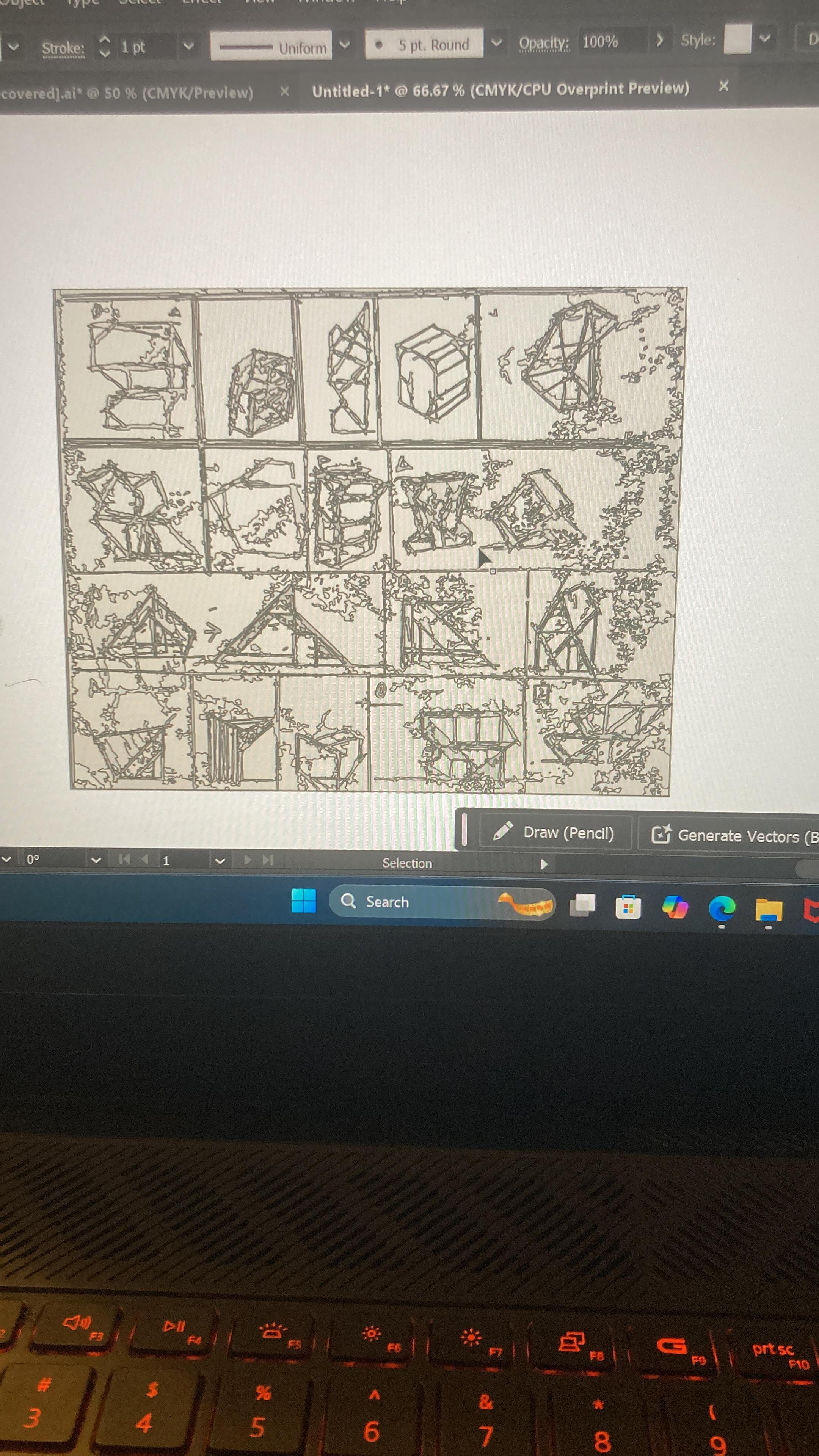
To represent the collection of sketches I created, I decided on an abstract approach. Rather than focusing on minute details or line-by-line precision, this method highlights the deeper meanings and design principles each sketch conveys. From the overall massing of the structures to the innovative interpretations of standard architectural elements, these sketches embody the key aspects I sought to experiment with.
Among the multitude of sketches I created, six stood out as pivotal in shaping a non-linear path toward the final design. Each represented a critical moment of exploration, serving as a stepping stone that guided my vision and informed the final product.
SketchUp
In my journey toward becoming a licensed architect, SketchUp has become an indispensable tool for transforming simple concepts into tangible projects. Its intuitive massing and shape-creation tools allow me to quickly convert a sketch into a 3D model. This not only helps me better understand the spatial qualities of my designs but also enables efficient adjustments that would be far more time-consuming with traditional methods.
In this particular project, SketchUp played a crucial role in bringing some of my most compelling sketches to life. For some designs, seeing them in three dimensions prompted me to reevaluate and refine my initial ideas. For others, the platform allowed me to explore details with greater depth and clarity.
Casa Silvestre began as a series of sketches but took its first three-dimensional form in SketchUp.
The initial model closely mirrored the original drawing, with only minor changes made to enhance symmetry and overall harmony between interconnecting elements. In the second the staircase was moved into a cavity within a large concrete mass, while window extrusions were tested to add depth. In the subsequent models, I revisited earlier decisions. The window extrusions were removed to maintain the building's original square silhouette, a design choice rooted in simplicity and functionality. Minor visual details were added, and privacy enhancements for the upstairs bedroom were introduced.: The last iteration in SketchUp closely resembles the final Revit model. Minor size adjustments were made to ensure the design aligned with the overall vision. Aswell as serving as a 3D modeling software Sketchup allowed me to pick materials from a vast user made library.
The concrete garden underwent multiple iterations, each aimed at finding the optimal massing solution. Inspired by the juxtaposition often seen in large Brutalist structures—where stark concrete forms are softened by dramatic greenery—I sought to recreate this contrast on a smaller, more intimate scale. While I was initially satisfied with the garden's layout, its height felt lacking in impact. To address this, I decided to sink the garden, creating a unique spatial experience that added a sense of exclusivity and depth. This adjustment not only enhanced the overall design but also reinforced the harmony between the raw concrete and the surrounding greenery.
The final use of SketchUp was to design the steel frame, one of the most prominent and striking elements of the project. Its bold structure not only served a functional purpose but also became a defining feature of the overall design, showcasing the seamless integration of form and function.
Downloads
SolidWorks
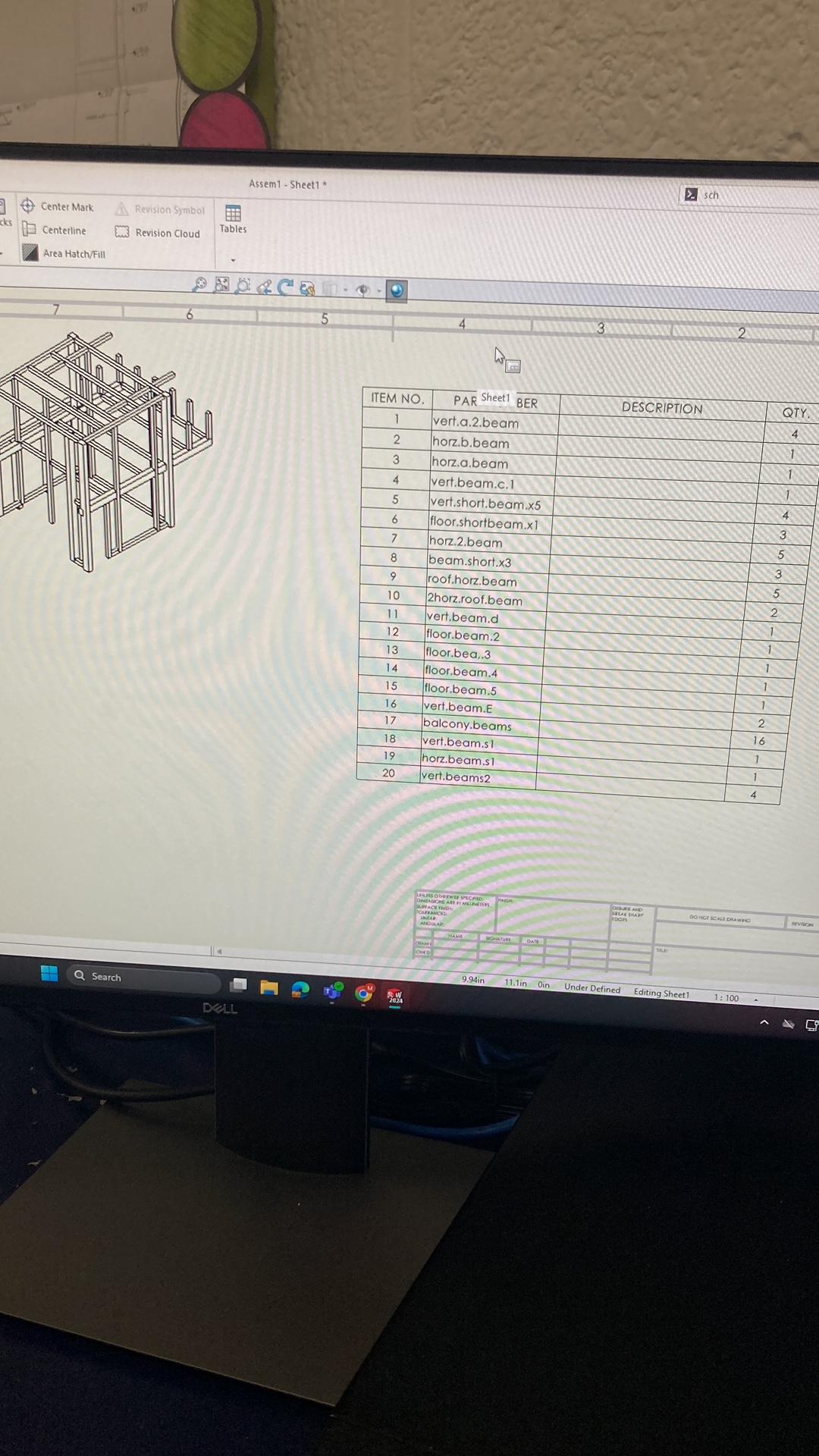
In life, we often plan meticulously, only to face unexpected challenges that force us to adapt. Unfortunately, this was the case for me during the construction of the physical model.
Originally, I intended to use SolidWorks to design the steel frame and fabricate it with a 3D printer. However, just as the project progressed, the printer began experiencing technical issues, rendering it unusable. Faced with this setback, I quickly pivoted and decided to use wood for the beams instead.
Despite this change, the SolidWorks model did not go to waste. Instead, it became an invaluable tool in refining the steel frame design. It allowed me to create uniform and standardized beams in terms of both shape and length. Once the model was finalized in SolidWorks, I transferred it to SketchUp, where I continued to refine the design. From there, the SketchUp file was exported into Revit, ultimately serving as the foundation for the final Revit model.
This experience highlighted the importance of flexibility and resourcefulness in design, turning what seemed like a setback into an opportunity for improvement and innovation.
Revit
As you may know, Revit is a Building Information Modeling (BIM) software, and from the very beginning, it was my clear choice for this project. Although I have received extensive training in various other Autodesk programs, Revit stands out to me as both the most professional and the most user-friendly. Its intuitive interface and robust capabilities make it my go-to software for projects like this, enabling me to bring complex designs to life with precision and efficiency.
The first step in creating the Revit model was importing the steel frame originally designed in SketchUp and refined in SolidWorks. To ensure accuracy and functionality, I sourced the appropriate types of steel beams online, as they were not included in the default Revit Families. After making slight modifications to their shape and size, I carefully placed them in the exact positions defined by the SketchUp model.
At this stage, I made a key design decision. Rather than replicating the SketchUp model exactly as it was, I began refining the project to make it more practical for real-world construction. This involved standardizing wall thicknesses and applying realistic textures, ensuring the design was not only visually cohesive but also feasible to build. This approach underscored the transition from conceptual design to a professional, build-ready model, emphasizing both creativity and practicality.
This is where ArchiTectures came into play and became an important figure in completing the initial vision which even tho didn’t have a specific color or material selection it did have a thought behind it. To create a building that was simple yet unique and the simple part would be enforced through the use of 3 key materials Wood, Steel, Concrete.
Here is where began to get a little bit outside my scope of knowledge and I had to begin learning. A concrete foundation was created to support the 5 main steel beams. As well as the creation of various massing objects created in Revit as a family for the Staircase concrete cavity as well as the concrete planters in the garden. The last and final unfamiliar task was the furniture all of which was imported from BimObject and Blocksrvt’. This includes but is not limited to Doors, Chairs, kitchen appliances, a bed, a sink, and a toilet.
Design With Purpose
The design can be visually divided into three main aspects: the downstairs living area, the staircase, and the upstairs space. My workflow typically begins with the largest elements and progresses to the finer details, which influenced several key decisions.
The Staircase and Indoor Balcony
The principal decision was to modify the staircase design by incorporating a lower rise and a higher run, improving both functionality and accessibility. This adjustment left a small rectangular space between the staircase and the upstairs. This presented a design challenge—a choice between prioritizing form or function. Ultimately, a balanced solution was achieved: part of the space was used for a built-in dresser, while the remaining portion was removed to create an indoor balcony. To preserve privacy in the upstairs bedroom, a wooden screen with two overlapping sections was added. This screen not only maintains airflow but also ensures the upstairs space retains its privacy and openness.
Material and Aesthetic Choices
To align with the dark, forested aesthetic of the Northeastern region, I added a dark finish to the two large concrete elements that flank the central mass. This not only creates a visual harmony with the surrounding environment but also emphasizes the minimalist and contemporary nature of the structure.
Final Render
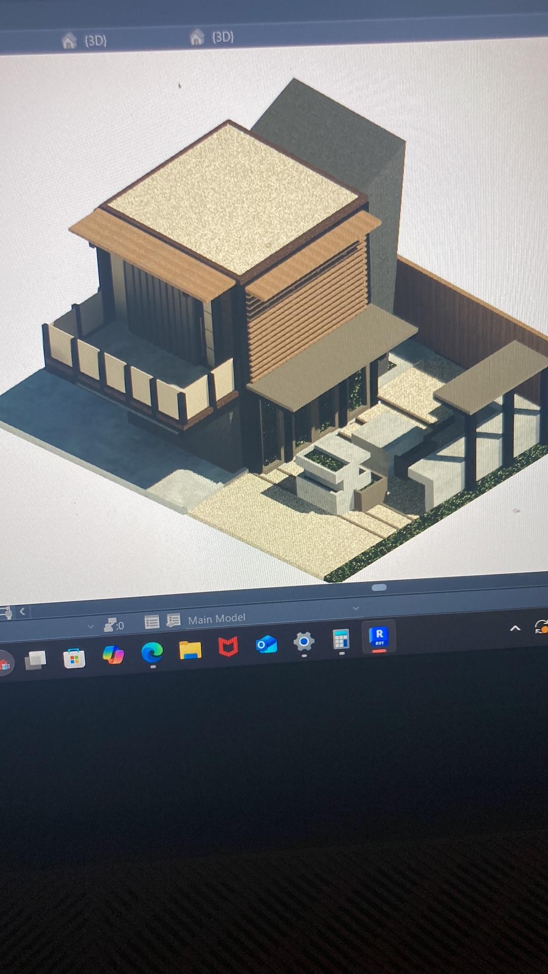
Here is Casa Silvestre
The design was inspired by the Northern Delaware region, showcasing how simplicity can evolve into something more meaningful with just a few thoughtful additions. At the core of the concept is a square mass, elevated by a steel frame. To the left, a large concrete element houses a carefully placed cavity that holds a staircase. This staircase is strategically located next to a small interior balcony, allowing the entire structure to feel unified, yet separated into two distinct parts.
Beneath the stairs, a compact yet functional bathroom makes efficient use of space. Upon reaching the upper floor, residents are greeted with a view of the surroundings—offering privacy and a sense of openness. A few more steps bring you to the outdoor balcony, which is positioned above a perfect space for parking.
Looking back through the window from the staircase, one can admire the shaded garden, a powerful yet serene feature that anchors the entire design.
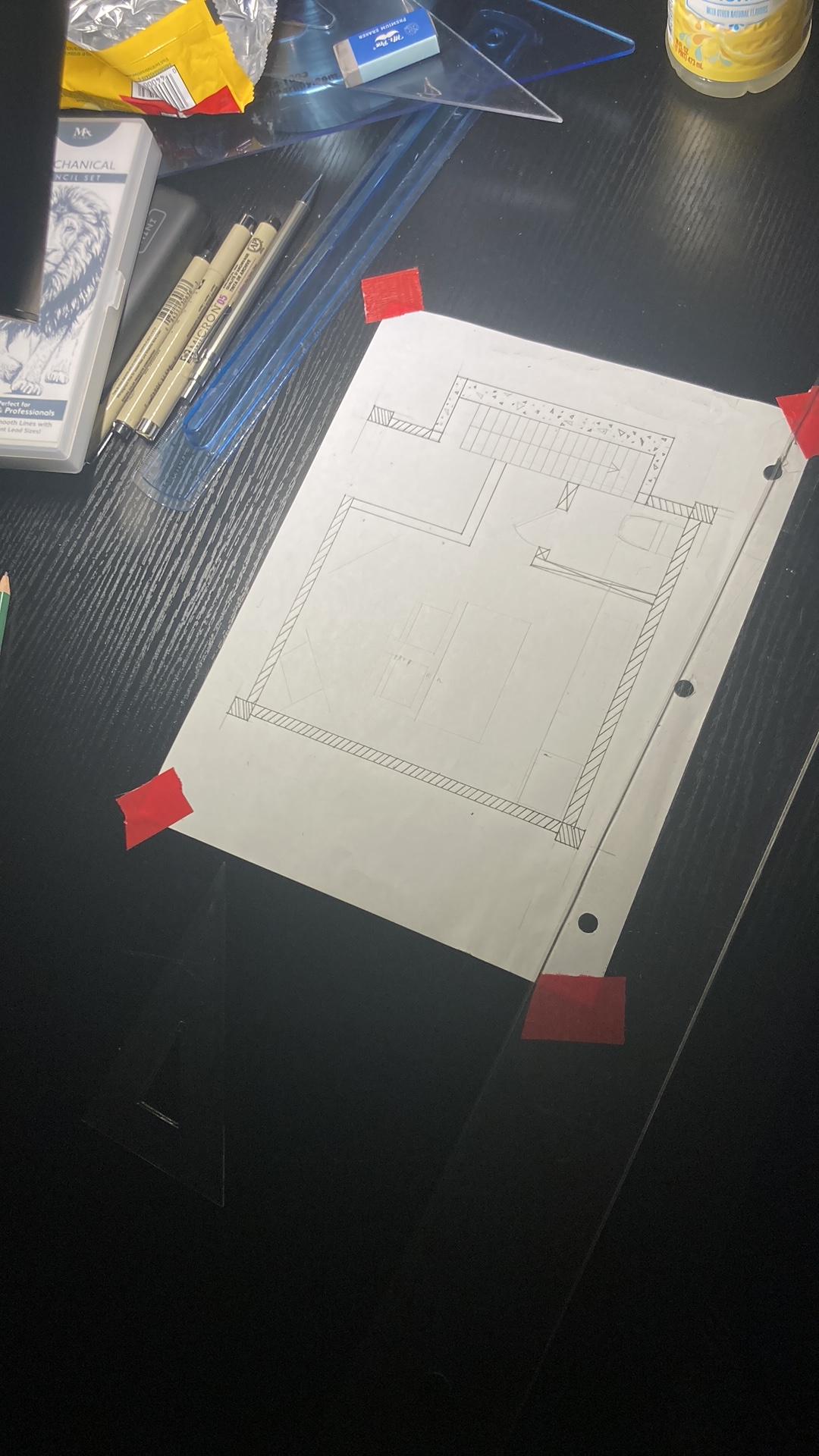
The floor plan was deliberately designed to be as simple as possible, ensuring all essential amenities were included while maintaining a sense of openness. The staircase, typically a functional element of a home, was reimagined as an aesthetically pleasing transition zone through the incorporation of an indoor balcony. This feature not only enhances visual appeal but also improves the connectivity between key spaces.The bathroom became the most constrained aspect of the design, with minimal space allocated. This decision was a calculated trade-off to prioritize the openness and connectivity that define the project. Sacrificing some bathroom space for the overall architectural success was a choice I stand by without regret. It enabled the project to achieve its broader design goals, emphasizing flow and harmony across the home.
Physical Model
This is the part with the least amount of freedom to create. As the scale is chosen and the measurements are taken there are few things that can change. Yet a plan is still required especially being one of the last parts of the project the deadline seemed to get closer and closer.
A detailed mental list of the necessary resources was compiled, carefully considering the order in which they would be required to avoid any delays due to material shortages. With this in mind, the construction plan was formulated as follows:
Given that the garden was sunken, the first step involved layering recycled cardboard, each layer cut with precision. As the layers were added, the shape of the garden gradually took form. Once this was complete, the outermost beams were constructed using cardboard, which intersected to define the silhouette of the central mass.
Next, I focused on creating the details in the front of the structure. The concrete elements were divided into two stages: the smaller garden features were created first. These would be formed and poured before the larger sections, allowing for the correction of any mistakes during the initial phase and minimizing waste.
Once the garden concrete was poured and installed, additional detailing would be added. Following this, the larger concrete elements were formed, poured, and subsequently installed. Finally, any remaining smaller details would be completed, ensuring the overall design came together seamlessly
This would be the ruff timeline of events to happen and for the most part everything did go to plan.
Objective 1: The sunken garden and connected areas were created. To save time, small details that did not depend on the concrete were completed first.
Objective 2: The four key beams were constructed and secured in place with concrete at the base, along with connected cardboard to define the structure. The front of the building was 80% detailed.
Objective 3: The garden concrete was formed and poured. Finishing details were added to the garden, including the formation of wooden covers to complement the space.
Objective 4: The large concrete sections proved to be the most challenging. With only a week remaining before submission and a winter storm approaching, I found myself facing unexpected difficulties. Forced to mix and pour the concrete in 30-degree weather, the temperature caused the water inside the mix to freeze. To make matters worse, I underestimated the weight that the cardboard could bear, resulting in the concrete staircase cavity being too large for the cardboard mold. The structure failed to hold. With daylight quickly fading, I improvised by creating a smaller form held together with hot glue and tape. After an hour of adjustment and no remaining sunlight, I remixed the concrete and poured it into the new form.
My struggles with the concrete did not finish there as I then struggled with the precast driveway and walkway this led me to yet again improvise and directly pour the concrete onto the model.
Objective 5: Final details installed.
Objective 6: The final installation of two of the roofs on the side was not made due to time limitations.
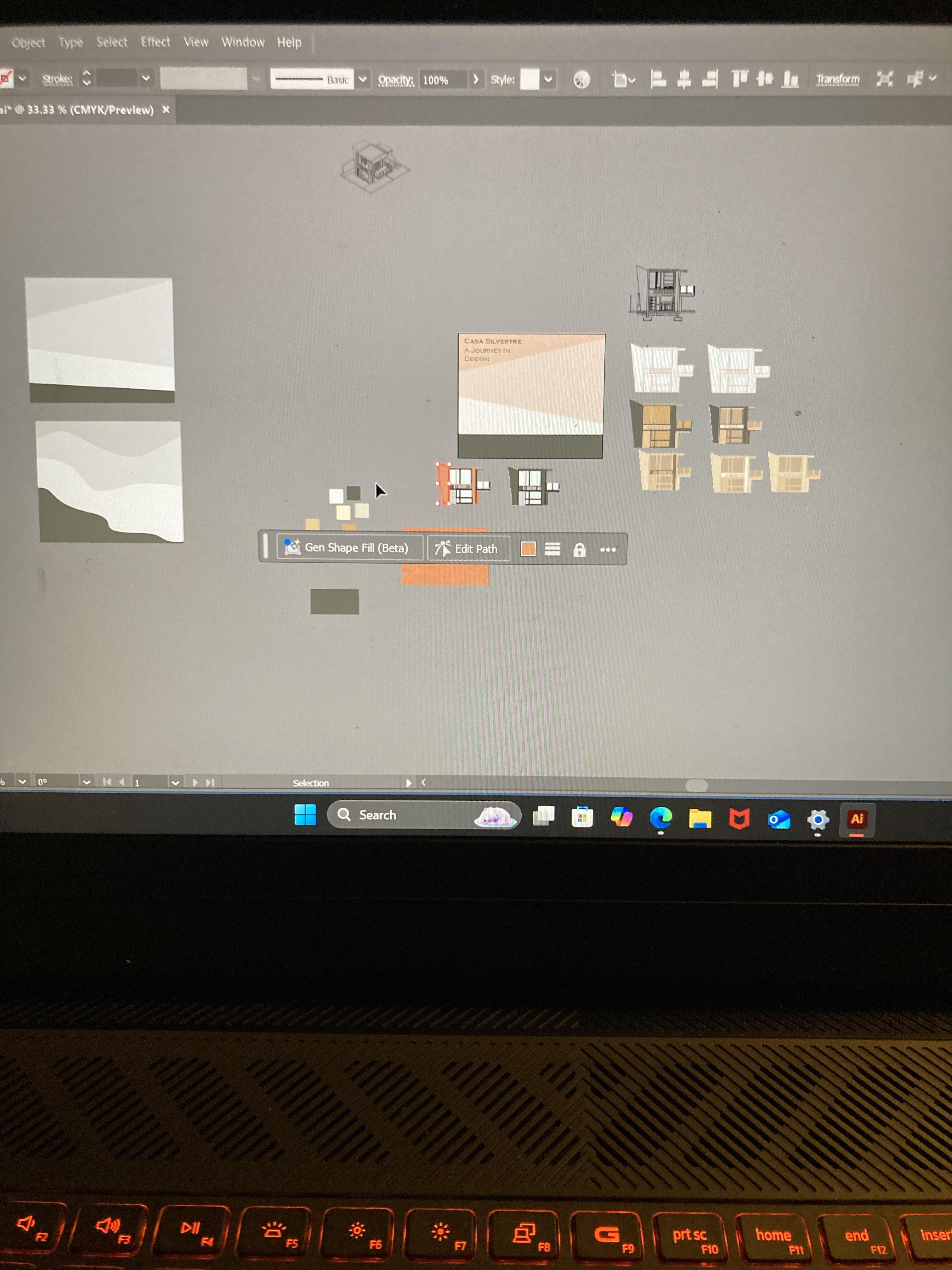
Adobe Illustrator
This project introduced me to a new software that I am confident will become an essential tool in my future endeavors. Participating in my second Instructables competition, I’ve gained a deeper appreciation for how these challenges foster growth and encourage the exploration of new techniques.
In my first competition, I was introduced to Revit and the process of creating a physical model. Since then, I’ve made significant progress in both areas. This experience further expanded my skill set, particularly with Revit, while also improving my proficiency with Illustrator. These competitions have proven to be invaluable catalysts for both personal and professional development.
The journey involved a great deal of trial and error, requiring technical research and the mastery of tools I had never encountered before. I approached the design process similarly to how I would handle an architectural project—by focusing on the largest, most prominent elements before refining the finer details. This methodology yielded strong results, and I also sought to incorporate design elements that echoed the architecture of Casa Silvestre, adding depth and character to the final product.
Lessons Learned
My time management skills have improved significantly, though there is still room for growth. Throughout this project, I occasionally encountered overlapping tasks on my to-do list, which forced me to prioritize and sometimes sacrifice certain aspects of the work.
Additionally, I realized the importance of accounting for the learning curve when planning my schedule, especially for tasks I had never tackled before. This experience highlighted the need to allocate extra time for experimentation and adaptation, ensuring smoother progress in future projects. 
Looking Back

