COVID19 Dashboard on World Map(using Python)
by Revathi_Kannan in Design > Software
2430 Views, 2 Favorites, 0 Comments
COVID19 Dashboard on World Map(using Python)
I know almost all of us know most information about COVID19.
And this instructable is about creating a bubble map, to plot the real-time data(of cases) on world map.
For more convenience, i have added the program to Github repository:
Supplies
There is no supplies required as such and we would do the entire computer program through GoogleColab Notebook. So a gmail account should be suffice to start with.
Colab Notebooks / Colaboratory is a Google research project created to help disseminate machine learning education and research. It's a Jupyter notebook environment that requires no setup to use and runs entirely in the cloud.
And NO installation required in your machine.
Understanding the Backend Process(database)
Most of every software programs fetch data from the backend and the resultant is formatted and published to the front-end. And for this particular program, we would require COVID19 real-data.
The G.W.C. Whiting School of Engineering has been publishing the COVID19 statistics through its github account:
https://github.com/CSSEGISandData
From the start till date, the COVID19 country wise statistics are published in the repository.
So we would use the .CSV formatted files of them(segmented row-wise of countries) and plot the data on the world map.
Python Packages/libraries Used in the Program
Below are the list of python packages and libraries, that we would be using. Let me give an overview of the purpose of each of them.
numpy:
NumPy is a library for the Python programming language, adding support for large, multi-dimensional arrays and matrices, along with a large collection of high-level mathematical functions to operate on these arrays.
pandas:
pandas is a software library written for the Python programming language for data manipulation and analysis.
matplotlib.pyplot:
pyplot is mainly intended for interactive plots and simple cases of programmatic plot generation
plotly.express:
Plotly Express is a new high-level Python visualization library. Simple syntax for complex charts.
folium:
folium makes it easy to visualize data that's been manipulated in Python on an interactive leaflet map.
plotly.graph_objects:
The plotly Python package exists to create, manipulate and render graphical figures (i.e. charts, plots, maps and diagrams) represented by data structures also referred to as figures.
seaborn:
Seaborn is a Python data visualization library based on matplotlib. It provides a high-level interface for drawing attractive and informative statistical graphics.
ipywidgets:
ipywidgets are interactive HTML widgets for Jupyter notebooks, JupyterLab and the IPython kernel. Notebooks come alive when interactive widgets are used.
Installing these packages are not required as we would be working this program entirely in Google Colab Notebook (lets keep it as colab throughout this instructable).
Setting Up Your Drive, to Use Colab
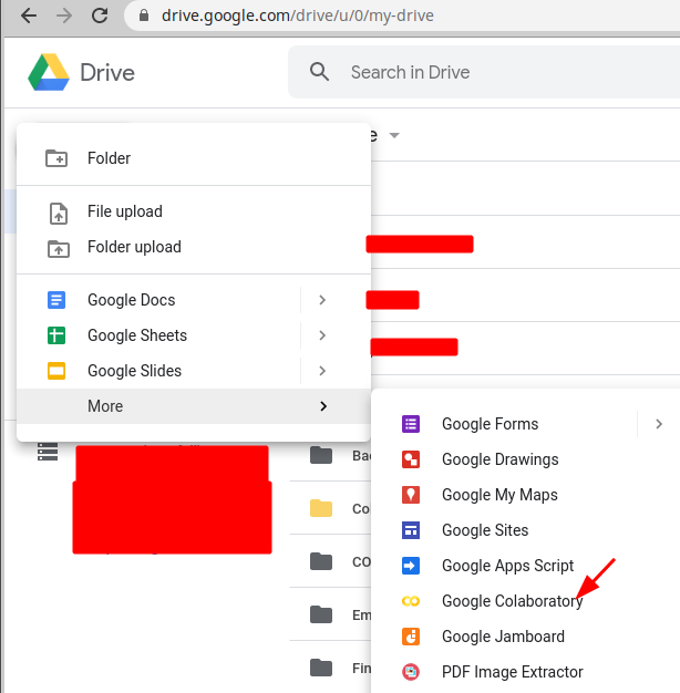
In your Drive, Create a folder for your notebooks.
Technically speaking, this step isn’t totally necessary if you want to just start working in Colab. However, since Colab is working off of your drive, it’s not a bad idea to specify the folder where you want to work. You can do that by going to your Google Drive and clicking “New” and then creating a new folder.
Then you may choose to create colabnotebook here or start to work directly work in colab and link the folder in drive, which is created for colab work.
This is a good practice, else more the colab we create it may look messy in our drive.
Overview of the Program
In this program/notebook, we would be creating the following for COVID-19:
- List of Countries by the Number of Cases
- Total Cases on a World Map
COVID-19 Dashboard | Part 1
You can use future to help to port your code from Python 2 to Python 3 today – and still have it run on Python 2.
If you already have Python 3 code, you can instead use future to offer Python 2 compatibility with almost no extra work.
future supports the standard library reorganization (PEP 3108) via one of several mechanisms, allowing most moved standard library modules to be accessed under their Python 3 names and locations in Python 2.
COVID-19 Dashboard | Part 2

The interact function (ipywidgets.interact) automatically creates user interface (UI) controls for exploring code and data interactively. It is the easiest way to get started using IPython’s widgets.
COVID-19 Dashboard | Part 3

display_html displays the HTML representations of an object. That is, it looks up registered display methods, such as _repr_html_, and calls them, displaying the result, if any.
COVID-19 Dashboard | Part 4
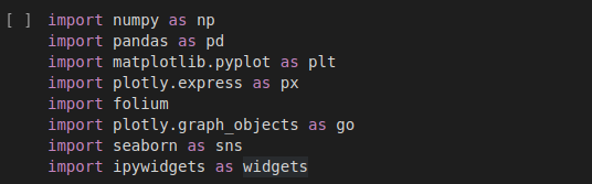
List of packages(as explained in step2) gets imported to the program.
COVID-19 Dashboard | Part 5
death_df = pd.read_csv('https://raw.githubusercontent.com/CSSEGISandData/COVID-19/master/csse_covid_19_data/csse_covid_19_time_series/time_series_covid19_deaths_global.csv')confirmed_df = pd.read_csv('https://raw.githubusercontent.com/CSSEGISandData/COVID-19/master/csse_covid_19_data/csse_covid_19_time_series/time_series_covid19_confirmed_global.csv')<br>recovered_df = pd.read_csv('https://raw.githubusercontent.com/CSSEGISandData/COVID-19/master/csse_covid_19_data/csse_covid_19_time_series/time_series_covid19_recovered_global.csv')country_df = pd.read_csv('https://raw.githubusercontent.com/CSSEGISandData/COVID-19/web-data/data/cases_country.csv')As explained in step1, reading the data as .csv file from the repository.
COVID-19 Dashboard | Part 6
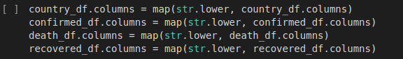
We will rename the df column names to lowercase
COVID-19 Dashboard | Part 7

We shall change the province/state to state and country/region to country
COVID-19 Dashboard | Part 8
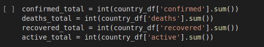
We will compute the total number of confirmed, death and recovered cases.
COVID-19 Dashboard | Part 9


We will display the total statistics in HTML format, as we imported specific libraries in step7 earlier as below:
from IPython.core.display import display, HTML
List of Countries(Top10) by the Number of Cases | COVID-19 Dashboard
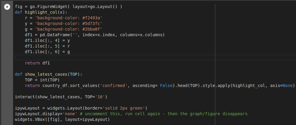
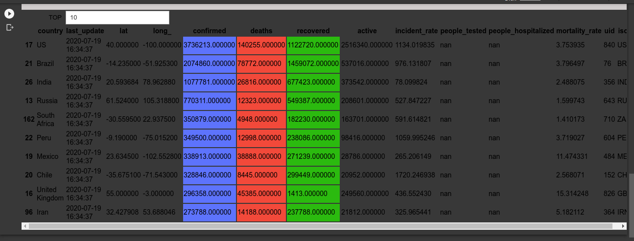
fig = go.FigureWidget( layout=go.Layout() )
FigureWidget function returns an empty FigureWidget object with default x and y axes. Jupyter interactive widgets have a layout attribute exposing a number of CSS properties that impact how widgets are laid out.
pd.DataFrame
creates dataframe using dictionary, with three colour backgrounds for the resultant to populate.
def show_latest_cases(TOP)
sorts the values by confirmed descending order.
interact(show_latest_cases, TOP='10')
The interact function (ipywidgets.interact) automatically creates user interface (UI) controls for exploring code and data interactively.
ipywLayout = widgets.Layout(border='solid 2px green')
creates a border with 2px width lines of green colour, for the resultant to display.
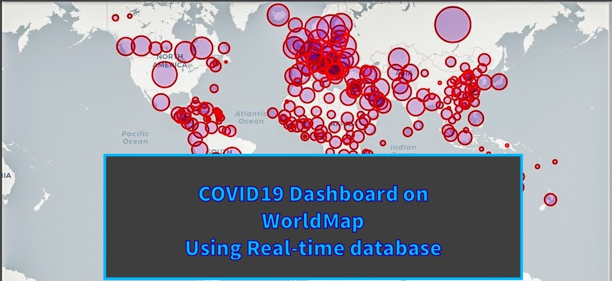
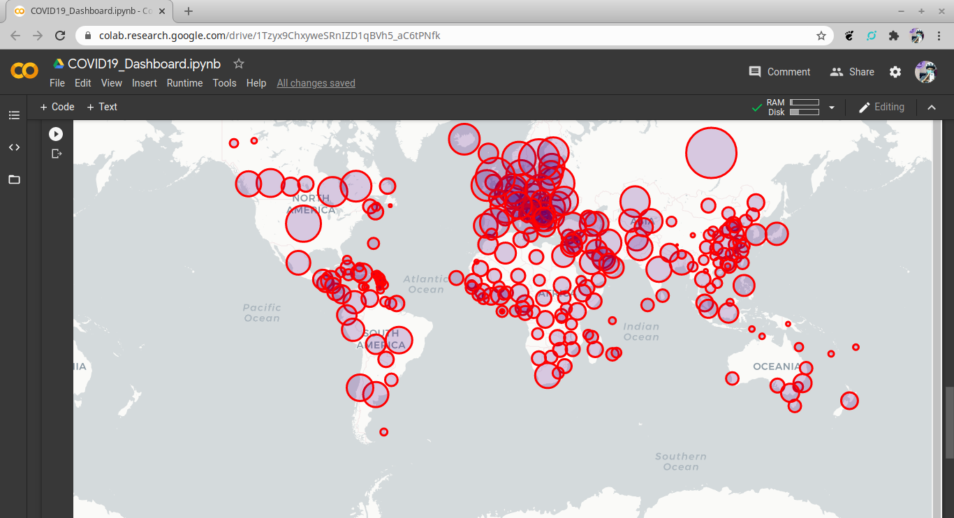
Total Cases on a World Map | COVID-19 Dashboard
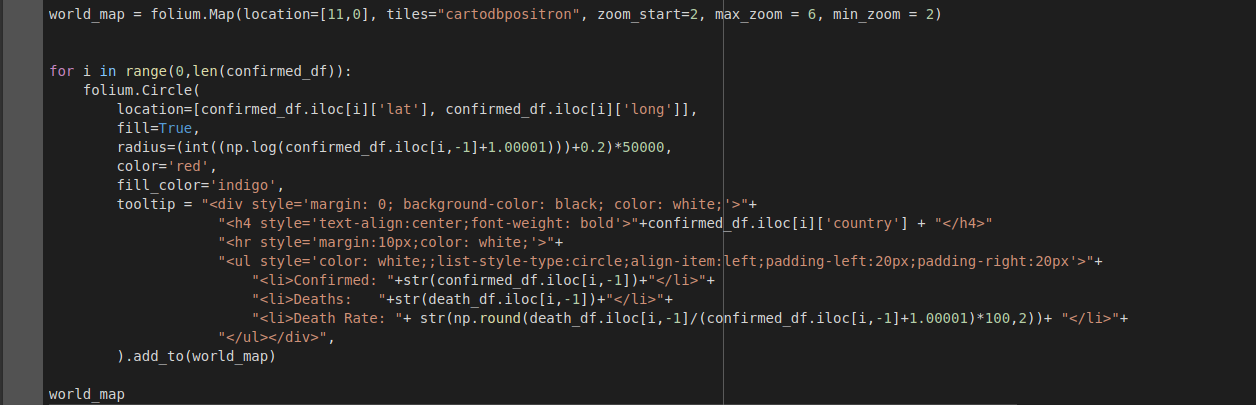
world_map = folium.Map(location=[11,0], tiles="cartodbpositron", zoom_start=2, max_zoom = 6, min_zoom = 2)
Folium is a tool that makes you look like a mapping God while all the work is done in the back end.
It's a Python wrapper for a tool called leaflet.js. We basically give it minimal instructions, JS does loads of work in the background and we get some very, very cool maps. It's great stuff. For clarity, the map is technically called a 'Leaflet Map'. The tool that let's you call them in Python is called 'Folium'.
Folium makes it easy to visualize data that’s been manipulated in Python on an interactive Leaflet map. It enables both the binding of data to a map for choropleth visualizations as well as passing Vincent/Vega visualizations as markers on the map.
for i in range(0,len(confirmed_df))
In a for loop, we will get all the confirmed cases from step9 formulation.
folium.Circle
We create a bubble map by using folium.Circle() to iteratively add circles.
location=[confirmed_df.iloc[i]['lat'], confirmed_df.iloc[i]['long']],
from the confirmed_df of confirmed cases from step5, we extract the latitude and longitude values corresponding to each location/country data.
radius=(int((np.log(confirmed_df.iloc[i,-1]+1.00001)))+0.2)*50000,
creating radius object to plot the bubble circles on the world map across the countries.
color='red',
fill_color='indigo',
making the outline of the bubble circle as red and the inner area as indigo.
and finally plotting the circles on the world_map using the tooltip object.
The Result!


Attachment shows:
- List of Countries by the Number of Cases
- Total Cases on a World Map