Building a Basic Infographic

This Instructable will show how to create an beginner Infographic.
Infographics have become more popular of the past few years and are
an effective method of conveying information to your audience in a creative
interesting manner.
Subject Matter

- Pick your subject and narrow it down.
- Determine your audience.
- Analyze your data.
- Determine what are the most important points you want your audience to remember.
I chose my subject to be Beginner Infographics because this is just a basic intro.
Infographics can be quite complex and can be time intensive.
I don't really have any data for this Infographic since it is mostly about layout
and is subjective.
The most important points here are Subject, Appearance and Data Presentation.
Infographic Appearance


Choose your headline.
Make it brief and specific. I chose Beginner Infographics so the audience knows that this is just a basic direction for creating an Infographic.
Choose your font(s).
Make sure it goes with your subject and the overall design of the graphic.
Make sure it is legible.
https://www.youtube.com/watch?v=JPvvWGKGOuA
Infographic Appearance 2

Choose Your Subheads
I want the audience to know, in my opinion, the most important aspects
of an Info-graphic is the Subject, Appearance and Date Presentation, so
I broke my Infographic down into those sections.
Infographic Appearance 3

Choose your color scheme.
What colors best represents your subject?
I chose bright lively colors to give my Infographic a less formal feel
and to make it more fun.
You shouldn’t have to look far to find some info that can
help you narrow down some color combinations.
(https://www.pinterest.com/pin/120682464994769091/)
Data Presentation

What are your most important points?
Can they be represented graphically?
What image(s) do you want your audience
to remember about your subject?
The most important points for the audience are:
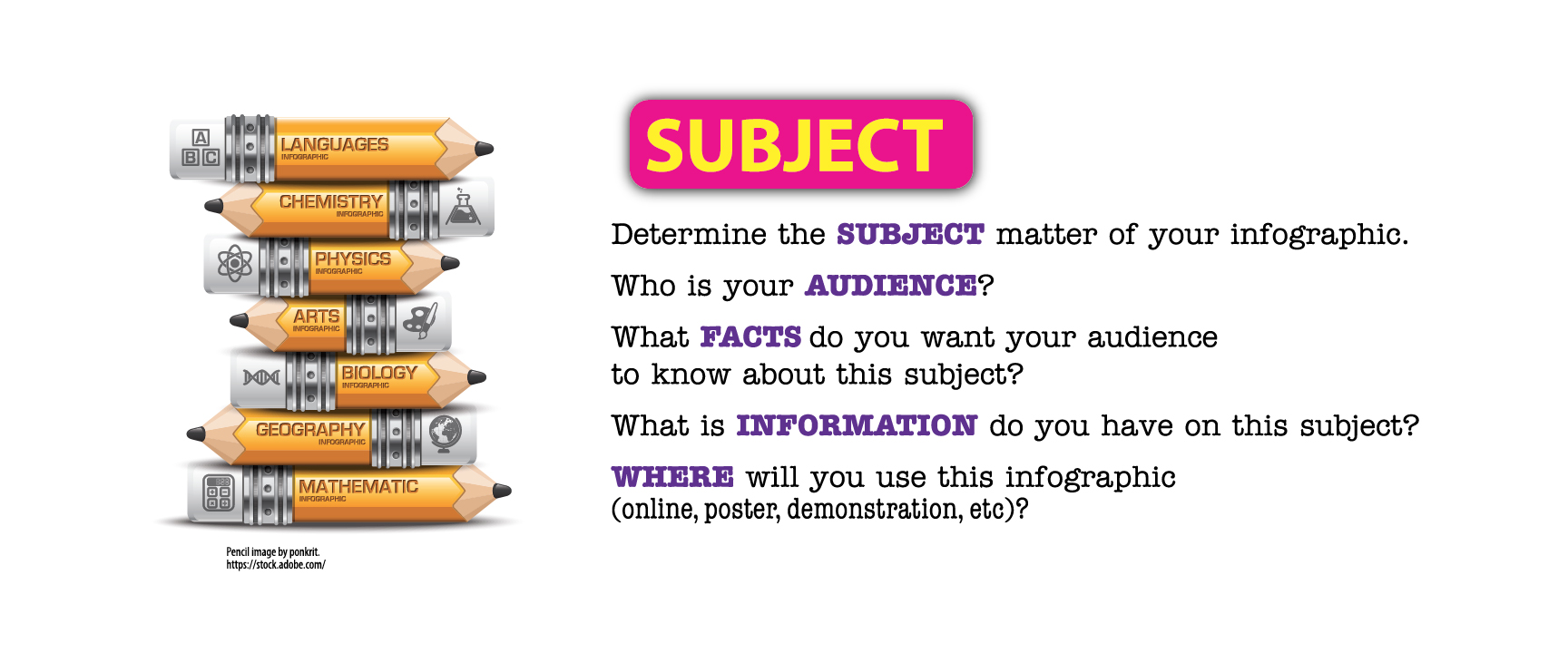
Subject - which I chose to represent with pencils calling
out different schools subjects.
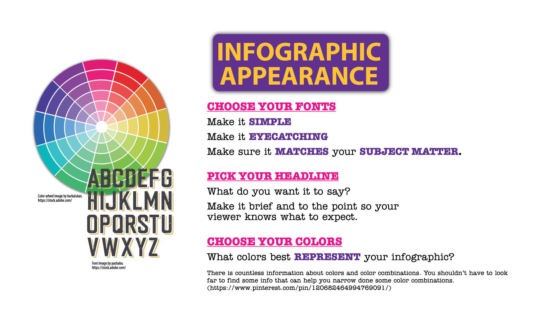
Appearance - represented by a color wheel and a typeface
to show that those are some of the more important aspects
of appearance.
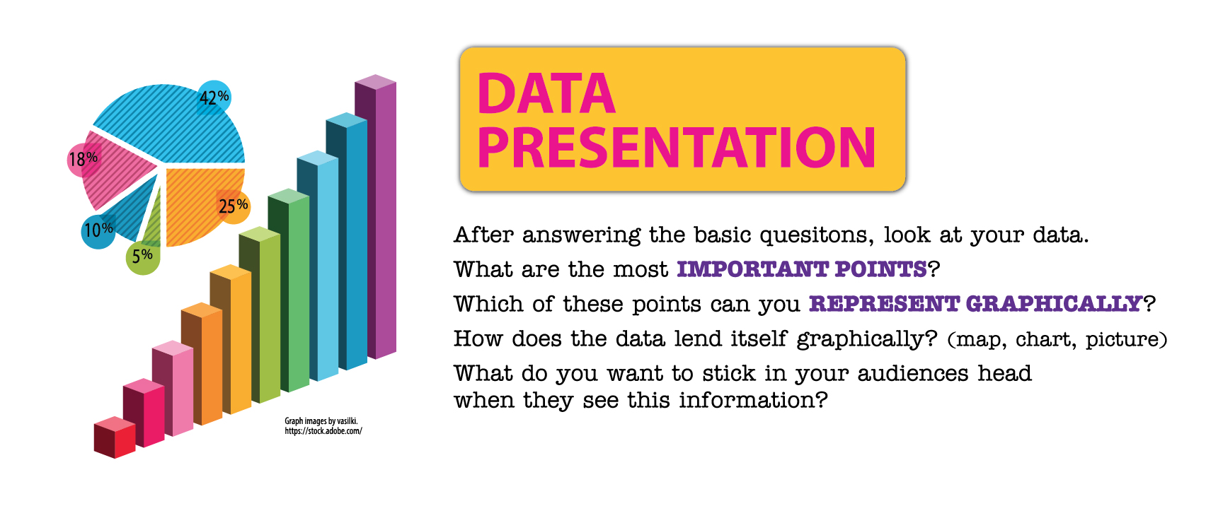
Date presentation - represented by 2 different graphs
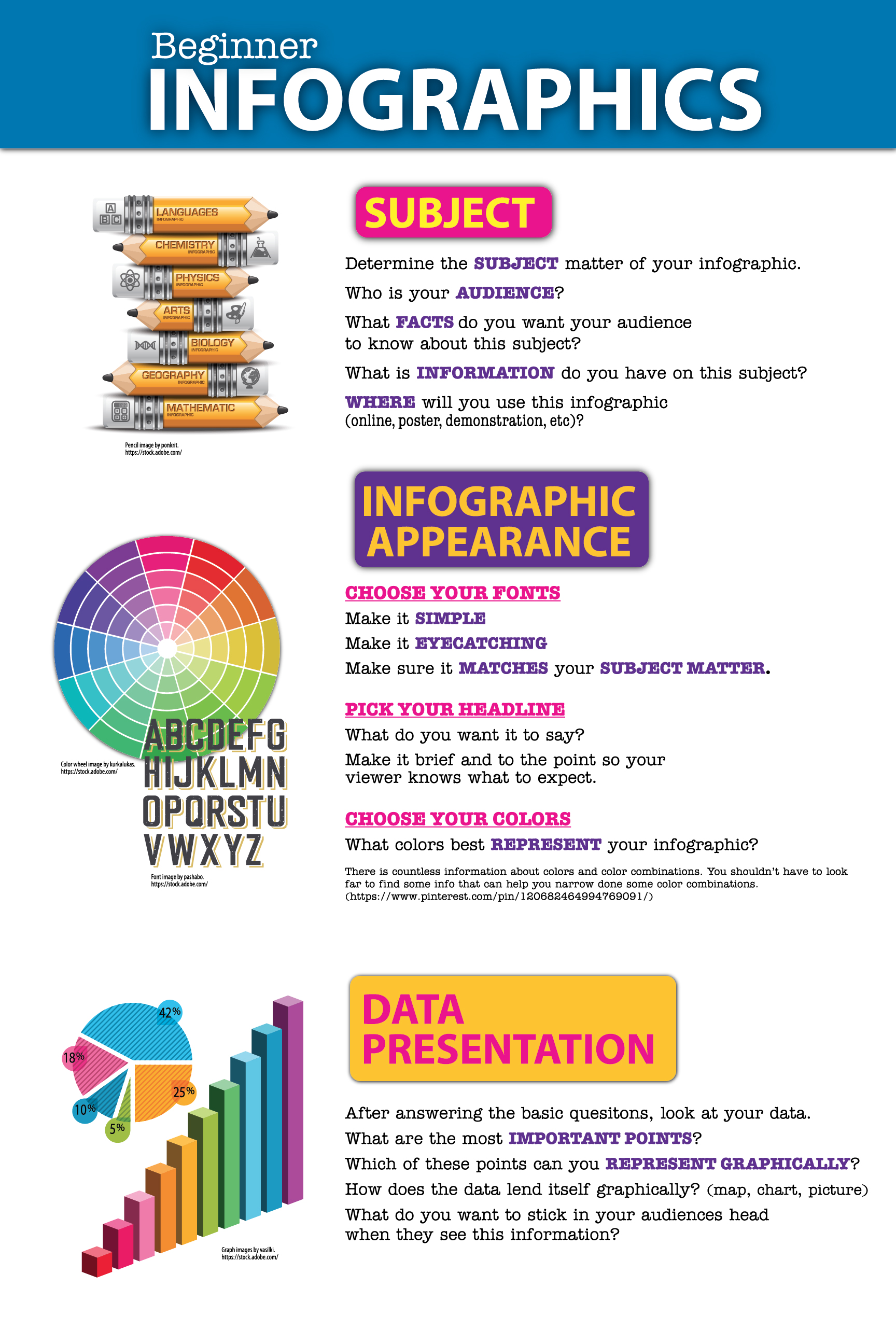
Naturally then the Infographic was organized so the Subheads
were presented with coordinating graphics.
Apply Your Graphics

Apply the graphics to coordination with information presented.
After a brief view of this Infographic the audience can determine
that the most important aspects of an Infographic are the
subject, appearance, and data.
Don't forget to cite the work if you use graphics produced by others.