Build Your Own Website With Dreamweaver
by killerjackalope in Design > Websites
174051 Views, 162 Favorites, 0 Comments
Build Your Own Website With Dreamweaver
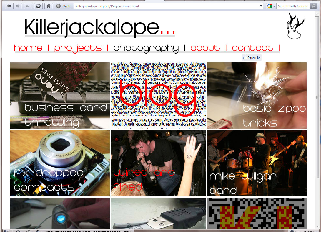
So I've previously written about this before, the old one is worth reading first, it contains instructions on photoshop and dreamweaver that this doesn't, however it misses a lot of points out compared to this one.
These days there are tonnes of services for building websites with and there are also a lot of sites and communities well suited to those not wanting to go through the effort of building an entire site from scratch.
If you just need a site to showcase your stuff then chances are you could put one together over an afternoon, for a more complex site it'll take more time.
I have since revamped my website - it's now at http://killerjackalope.com/
My actual site is here - killerjackalope.co.nr
Which is a redirect of - killerjackalope.zxq.net
gh
Tools, Materials, Skills
Tools
- A computer running
- Photoshop or your image editor of choice (you may need to download plugins to output HTML)
- Dreamweaver or your editor and FTP client of choice
- A decent internet connection
- An email address, if you don't have one I doubt you'll make it through this
- You'll likely need a camera
- Pens and paper
Materials
- Content - I'll talk on this more later but you'll certainly need to fill your site with something
- Spare space on your HDD
- Time and patience.
Basic skills
- A basic knowledge of how to use your computer, the internet
- The majority of this requires very little coding knowledge, so don't be intimidated
- A sense of design
- Knowing how to use photoshop would be nice, paint.NET or GIMP
Planning Your Site
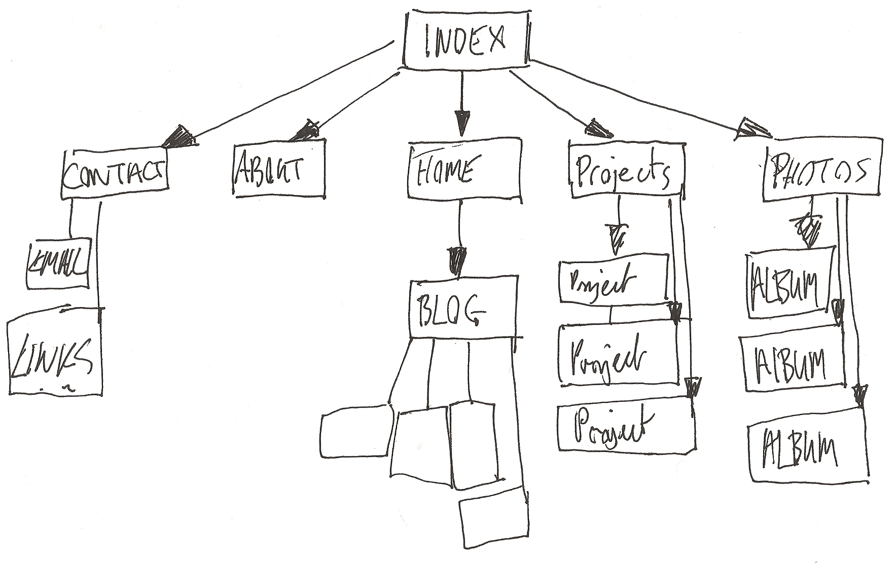
Before you start hitting the computer, looking for design cues and knocking together ideas and templates, sit down with a piece of paper, work out everything you want in your site and how you'll get to it.
My index page is the same as my home page, a personal choice, intro animations aren't me. The top level pages - Home, Projects, Photography, About, Contact are all linked in the header - You can get to these from anywhere in the site.
Coming off these are sets of pages, from projects each project has a page which can be gotten to from the projects page. (they're also linked in the sidebar of each project page but that's not relevant now)
Below the contact page I've got pages for links - simply to represent that the visitor can go somewhere from there.
This is a pretty standard and simple model, but it helps you work out what you want to put where in your site - it's also a useful way to make sure your site is easily navigable.
Don't try and draw every link in, the problem is that creates a recursive and inifinite loop that makes dreamweaver's map view wet itself, never mind your piece of paper.
Design Decisions
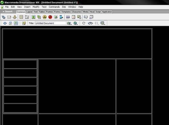
Before getting in to colours, fonts and whatnot you'll need to consider a layout.
How many columns will your site have? I went with three on the home, project and photography pages with images as links, my navigation bar is horizontal, along the bottom of the header.
You could also have a navigation menu that sits vertically along the left or right hand side like a column.
My project, blog and photography pages have two columns - a main one with content and a smaller one on the right with an advert and appropriate links, in the blog page it has recent posts down the left hand side.
The more columns and rows you have over the layout the more you risk a cluttered look, though I've went with quite a sparse and minimal design overall.
Columns and rows can be brilliant formatting tools, you can add and subtract whitespace to make your pages look better, separate blocks of text and images, certainly take the time to experiment with them, sometimes adding a little cell that creates a holding space is the perfect thing to set two piece of content apart.
Colours, Fonts and Imagery

This all depends on the kind of vibe you want your site to give off.
Fonts
I've chosen two fonts over the site, one I really like called eight-one and for the content text a simple, readable Franklin Gothic Book. Your header and nav links can have a signature font, something you like that's eyecatching and a bit different, it should still be plenty readable though.
Your content font should be clean, very readable and attractive.
At no point will you use comic sans or papyrus, just don't.
Colours
You should stick to a few main colours, they should be complementary to each other and not too garish, my choices where white, black, red and a touch of grey.
Imagery
In your header and background you can have images - well you can put them anywhere really, if you're going to have an image in your header I would suggest something abstract and interesting or something simple and representative of your site, like my ickle jackalope...
Take care with your use of images, when done right they can be really effective, multiple images in a header doesn't work often but a big image indicative of the site can work really well, background images can be used really effectively too, however image choice is important, something natty or too busy can make for a visually confusing site.
Building Your Designs.
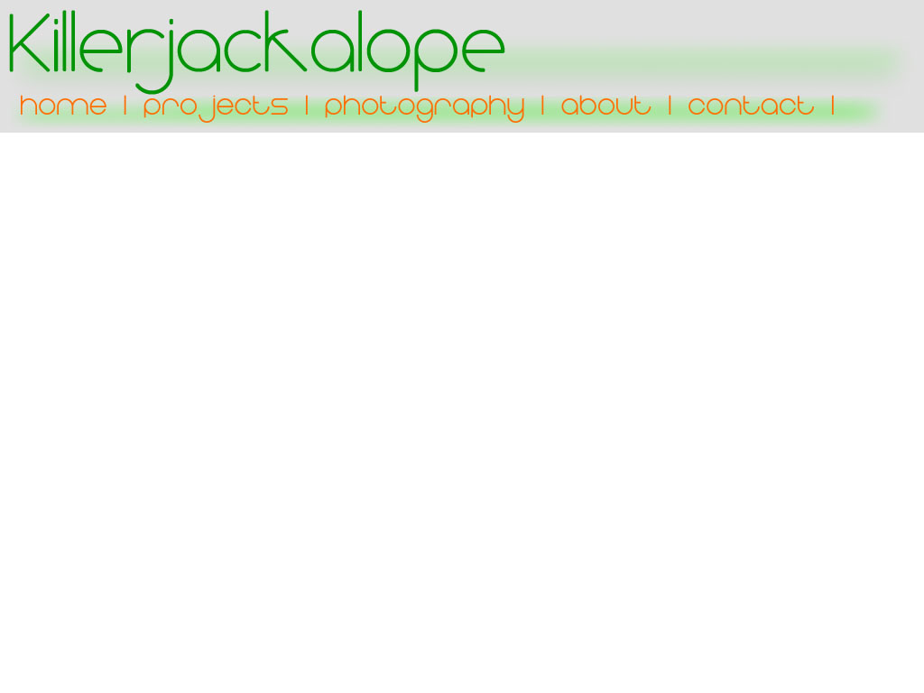
Fire up photoshop...
Start knocking together some ideas.
To do this make a new file, I use 1024 X 786 for this site, because it's 1024 pixels wide. Having the room below lets you get more of a notion of how your page might pan out.
So make a new document as wide as the site.
Fill the background with your background colour, now make a new layer and name the layer header.
Pull out the selection tool and make a box the size you reckon your header will be, as a note it shouldn't be too big, my nav bar and header come in just shy of 150px together, I'd say 200-250 would be the upper limit on these...
If your header's the same colour as your background still fill it in with the colour. That way it exists...
Title your header, choose your font from the last step, you can make this quite large - it should be readable and recognizable over someone's shoulder at the least. I'd try a few colours with the text layer before sticking to one. Place it where it looks good and link it to the header layer - we do this so that if you move one you move both, by linking layers together you can keep them in order easily. Alternatively you could use layer groups.
Building Your Designs Contd.
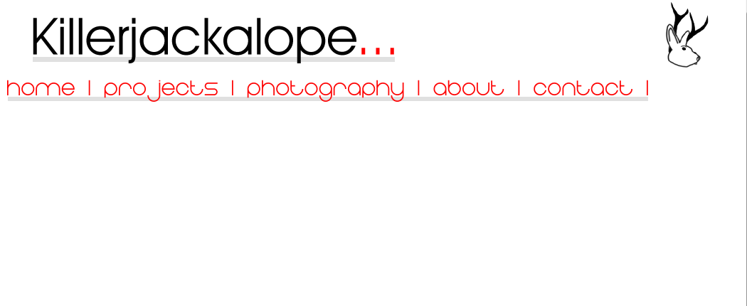
Add any images you plan to have in your header, try moving them about and test different positions - originally my jackalope was at the end of the header text, I think it ended up looking much better at the right hand side.
Now set up your nav bar, new layer, select the area you want for it - fill it in with the colour you want, now make a text layer, choose your font and write in each of your links, try different orders to see what works best, your home link should always be first on the left, unless it's in a language where writing is read right to left.
Do a little moving around, try and work out the best layout. For now save it as .PSD.
Now start over - new colour combinations, slightly different layouts and fonts, make a few different templates.
After making a few different ones, leave the computer and do something else for a while, even sleep on it - come back and choose your favourite, look for any ways it could be improved before committing...
Taking It From Photoshop to Dreamweaver
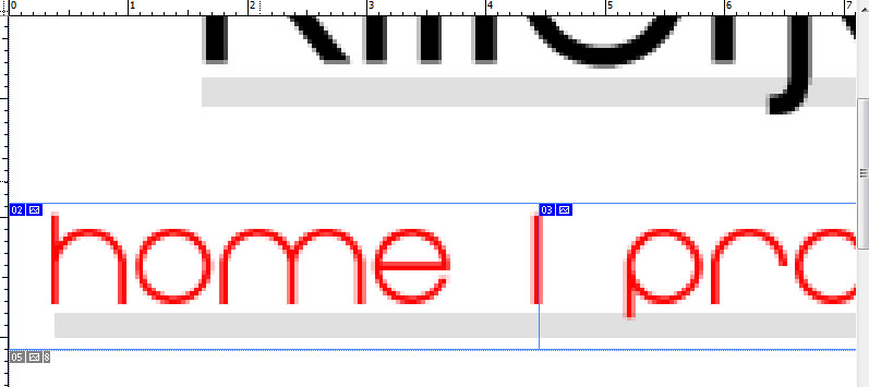
Or whichever programs you're making the jump with...
Open up your favourite template and get to work with the slice tool, make a slice that encompasses the entire header.
Now slice up your navigation bar, cut out each link as a slice, cut the ends either side too, to create a nice clean cutout - leave the big empty piece at the bottom there for now.
To export the page you'll need to go to save for web, use gif settings (size is best smaller) and when you hit save make sure to hit the dropdown to save images and HTML.
At this point you should have or make a document in my documents - name this folder "killerjackalope site" as an example, save the page in here, PS will automatically make an image folder, which is handy.
Making Your Site
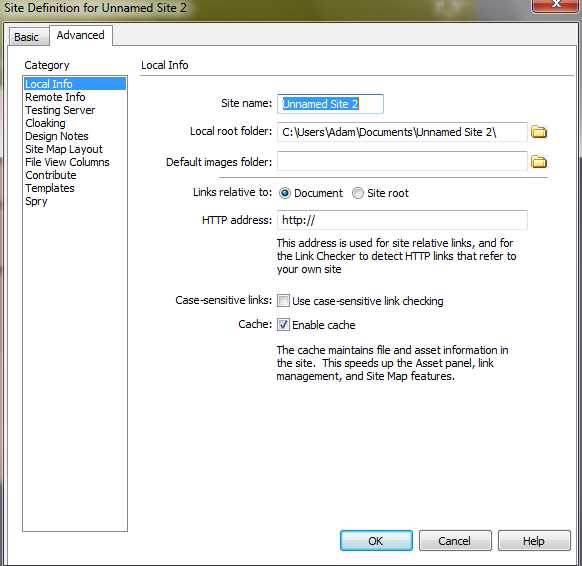
Start your chosen editing and site management program.
Now, go to site > New site, click it.
Set your local root folder to the one you made and your default images folder to the one made for your base design.
From now on, everything, every image and other file associated with pages in your site goes inside these folders, I make a folder for templates, one for pages and another called scripts for any scripts DW needs to make or any I need to add to pages.
For my individual project, blog posts and photography pages there are subfolders in the page folder.
My image folder has subfolders for project images, photography folders and a folder called inpage, which is where I keep one off images.
Your First Templates
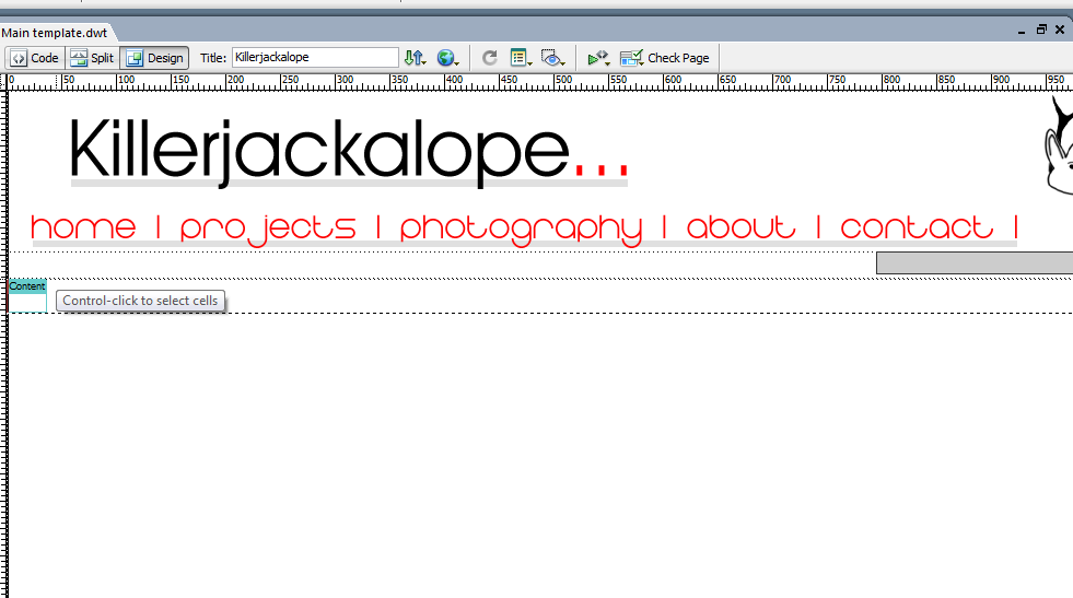
Open that base page in your editor, delete the big blank square below the header for a start.
Now for your main template I would suggest adding an editable region called content, saving it as a template and calling it at that, this is the template you can do whatever you want with.
Making some more focused templates makes sense - for example my blog template has a table in it, with a main column for content, there's an editable region there, an ad box on the right and below that links to all my recent posts, so each time I add a new one I only update my template.
I have a similar setup for projects.
For each type of template you'll need set it up before making your content pages, this will save you a lot of grief later on, you'll be able to say I need to update all my blog pages and do it with one template.
Main Pages
You should make a new file from the appropriate template for each of your main pages - don't worry about adding content yet, we just need the files to be there.
Now open the templates and link the files to the appropriate nav bar images.
Save the templates and say yes to updating pages.
On opening your pages you'll see the links have been added...
Now open the templates and link the files to the appropriate nav bar images.
Save the templates and say yes to updating pages.
On opening your pages you'll see the links have been added...
Building Up Your Pages
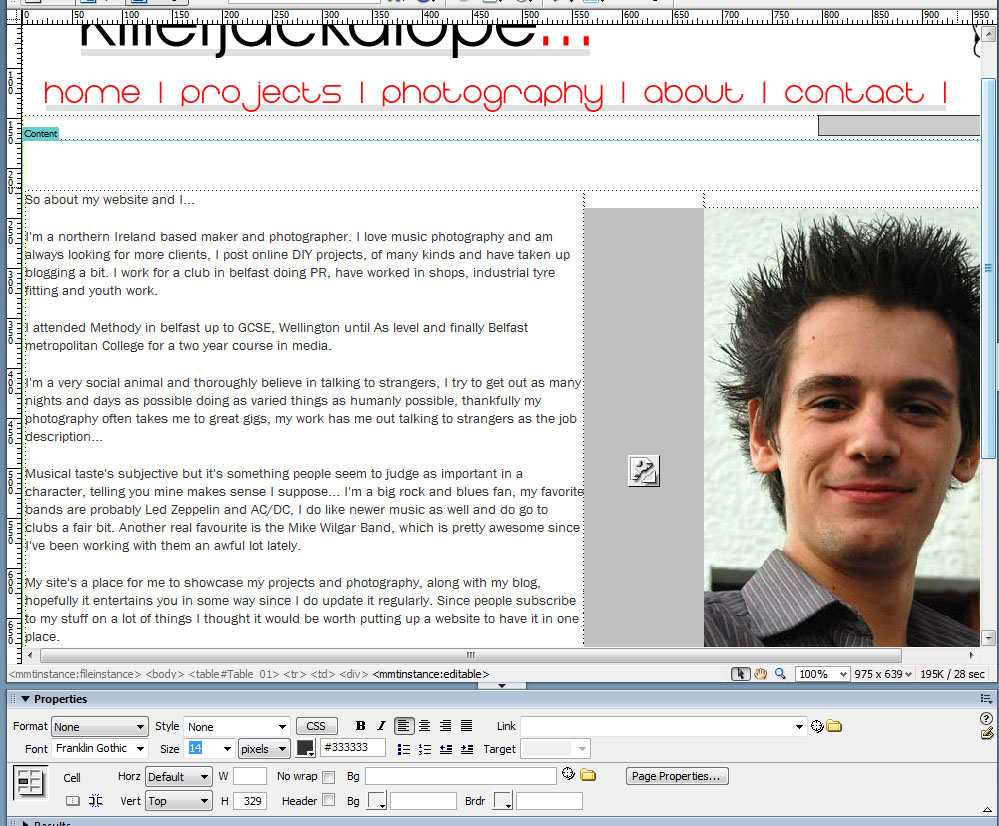
You'll need time for this, don't just throw any old rubbish in to your home page, it should be a page full of the best of your site - the most popular or interesting subjects on your site.
Here are some general content rules:
- Check your spelling
- Use paragraphs
- Break text up with appropriate images
- Link content together, if you have a page on biscuits and another on tea then link them with a line like "check out this page about tea if you want something to dunk these awesome biscuits in"
- You have use of italics, bold, subscript, superscript, everything, don't automatically resort to caps lock.
- Make your content interesting, but make it your own
Index Page

You should make an index page in your root folder, it can simply be a carbon copy of the home page or you could have an intro animation or some such.
To make a carbon copy of the home page simply open the home page, hit save as and browse to the site root, call it index and save, make sure to hit yes when it asks to update links - this saves you from having to change all the links relatively.
To make a carbon copy of the home page simply open the home page, hit save as and browse to the site root, call it index and save, make sure to hit yes when it asks to update links - this saves you from having to change all the links relatively.
Adding Images and Image Management.
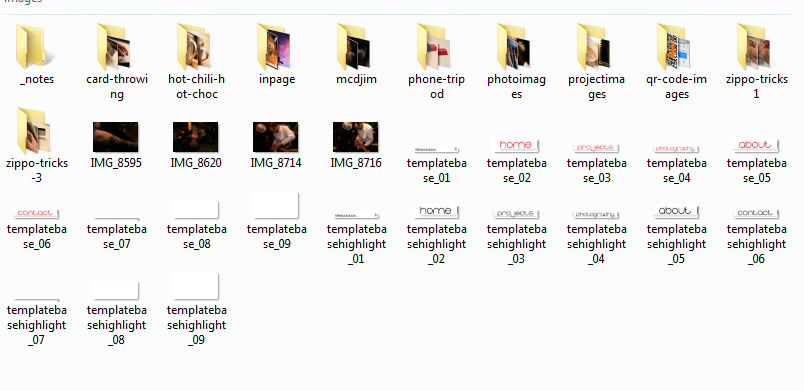
Images are a big part of a website, you should keep a handle on them.
I'd suggest downloading an image resizing tool like PIXresizer to help with this.
For my website the images are no wider than 720px, this is because my widest content columns are that wide, resizing them to this size is logical.
When you resize an image in a WYSIWYG editor almost all of them display the image at the new size but your visitors still have to download a larger file to view it, which is hard on loading times and a waste of your bandwidth.
Remember what I said before about the site folders? That's really important, anything outside it won't get zapped up to your site and you'll be left with a broken image link.
Embedding Video and Other Content
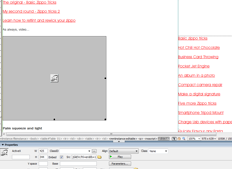
Embedding video, instructables and all content is pretty simple.
Set your cursor to where you need the video in the design view, now flip to the code view and paste in the embed code for your content.
When you go back to the design view you'll see a box where the video should be, should you wish to check it simply click on it and at the bottom in properties you'll see a box with a green arrow marked play - click that and the video should load up, it'll be rather slow inside the editor because it's not a web browser.
If you need to move the video a bit you can just drag the box in design view now that it's there.
Setting Up Hosting and FTP
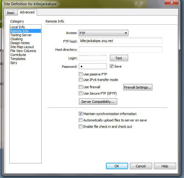
Setting up a host is pretty easy, I'm using Zymic at the moment, 110mb.com have died, which I used to use, ala my older website instructable.
Once you get your details from them, they'll be displayed somewhere in your account you can get to business.
Open the site pane and hit edit, now go to remote info and add your info in to the setup.
You'll see below the box I mean, I've blanked certain fields out but it's a pretty simple login box.
Once you get your details from them, they'll be displayed somewhere in your account you can get to business.
Open the site pane and hit edit, now go to remote info and add your info in to the setup.
You'll see below the box I mean, I've blanked certain fields out but it's a pretty simple login box.
Uploading the Site
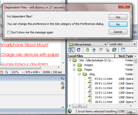
Uploading your site is relatively simple, right click the site pane or click the put button with nothing selected.
You'll get a prompt "do you wish to put the entire site?" hit yes and go for a walk or something.
When it's done about ten minutes later you'll be able to see your site on the servers, it may take longer depending on how quickly they refresh, if it's not changed after half an hour empty your web cache and try then.
Additions and Little Touches
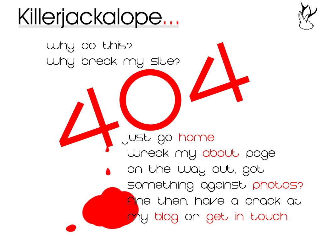
There are a lot of little things that can make a site a little bit more, you. You can also add social media plugins to your site to help advertise it, or add advertising.
- Add a custom 404 error page
- Add a facebook profile badge
- Add a facebook like button
- Add google adsense ads
These three are essentially just setting up on their site and pasting code in.
- Add a custom 404 error page
- Add a facebook profile badge
- Add a facebook like button
- Add google adsense ads
These three are essentially just setting up on their site and pasting code in.