Bridget Riley-style Op Art
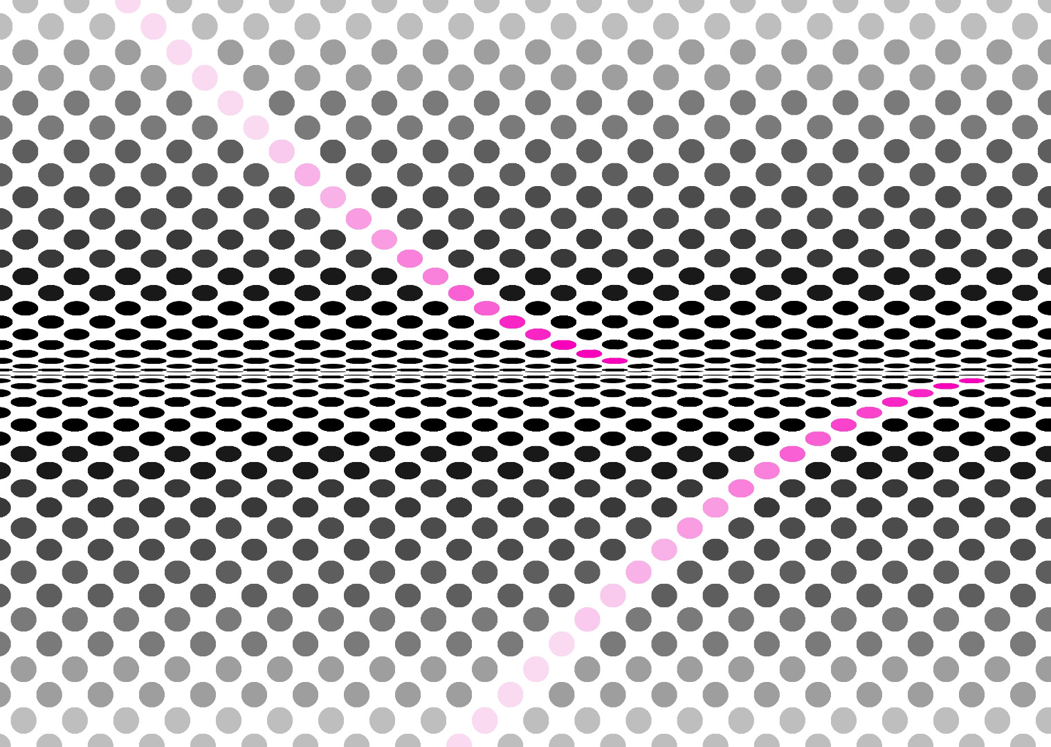
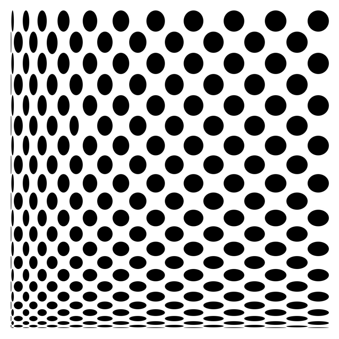
I love 1960s op art, especially Bridget Riley's monochrome works that look like black dots or squares on a curved white surface. But I can’t afford to buy her artwork so I've made my own. With a spreadsheet, a little geometry, trigonometry and a graphics package such as the Gimp (which is free) or Photoshop, so can you.
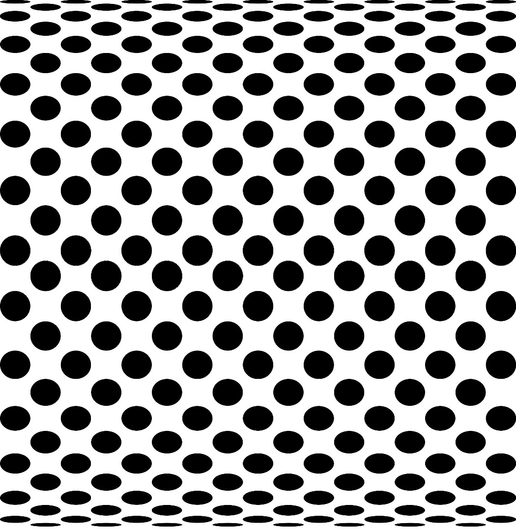
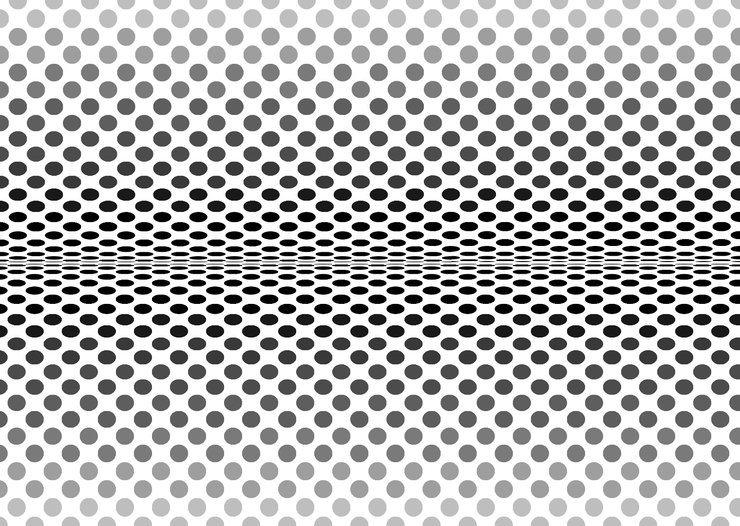
I'll walk you through how I produced an artwork that looks like two dotted cylinders next to each other (first picture), then you can experiment and create your own pictures such as the one that looks like one quarter of a dotty cushion (second picture).
The instructions for actually drawing the artwork are based on Gimp v2.6.11, you may have to tweak them if you use a different version or an alternative graphics package.
The Geometry
You can just jump to the next step if you like, where the numbers to create a dotted cylinder effect are to be found. But read on if you want to know where the expression below for Yn came from so that you can create your own, unique homage to Bridget Riley.
This type of op art relies on the fact that a geometric shape on a curved surface is distorted when we look at it. Taking a cylinder with its axis horizontal as an example, when it is viewed the width of each circular dot will look the same but their heights (i.e. the dimension perpendicular to the direction of viewing) will appear reduced, the foreshortening effect increasing the further the dot is around the cylinder. Only dots on the front half of the cylinder will be visible to the observer at all. Those on the part of the cylinder nearest to the observer will appear circular (provided that the ratio of cylinder radius to dot radius is sufficiently large), while those further away will appear progressively more elliptical, with dots close to the halfway point at either side appearing almost as lines.
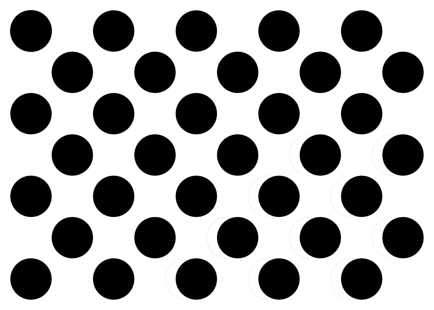
In my design, the dots are staggered in a square grid on the surface of the cylinder, with the dot diameters equal to the length of the sides of the square and a blank square between each pair of dots. See picture 1 of this step for how the surface would look if it were laid flat.
To be able to draw the ellipses in a graphics package, we need to know what the height of each one is. (The width stays the same.)
Refer to the PDF attached to this step.
For a cylinder of radius r which has N rows of dots of projected diameter d around its circumference, each one subtending an angle of Ø at the centre of the cylinder, the height of the nth dot, Yn, is given by
Yn = d x cos(nØ)
Downloads
The Spreadsheet Calculations
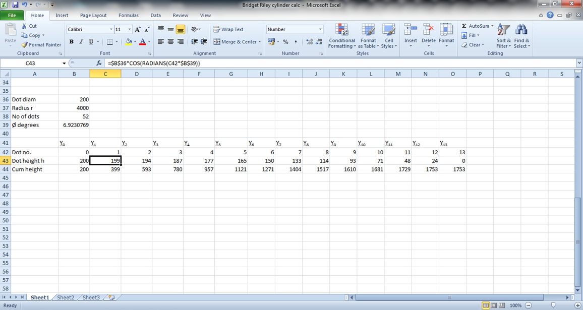
If you want to draw your own cylinder, the values you need are in the table attached to this step as a PDF. But here's how I produced them.
I drew my cylinder using these numbers:
Dot diameter d = 200 pixels
Cylinder radius r = 4,000 pixels
No. of rows of dots around cylinder = 52
Therefore Ø (angle subtended by a dot) = 360/52 = 6.92 degrees
Calculate Yn using the formula Yn = d x cos (nØ).
This means that the formula in cell C43, for example, is
=$B$36*COS(RADIANS(C42*$B$39))
because cell B36 holds the value of d, cell B39 holds Ø and cell C42 holds n.
You only need to draw a quarter of the cylinder's surface, i.e. 13 rows of dots, and you can do this by drawing just 1 dot of each size and then copying across the length of the cylinder. If you want to see half of the cylinder, you can copy the quarter when you've drawn it and flip it or mirror it. This means that the task of drawing all the ellipses is not nearly as lengthy and tedious as it looks at first.
Both the Excel screenshot and the PDF show the values of Y (which is both the ellipse height and the spacing between one row of ellipses and the next) for each of the 13 visible dots on the upper half of the cylinder. The cumulative Y is also calculated, to facilitate drawing guidelines in the next step.
Downloads
Drawing the Artwork
Open up Gimp and create a new 2,000 x 10,000 pixel image:
File, New, Image Size, set Width to 2,000 and Height to 10,000 pixels.
Make the background layer white (if it isn’t already) and then create a new layer:
Layer, New Layer, Transparency.
Work in this new layer.
In View, ensure Snap to Grid, Snap to Canvas Edges, Snap to Guides, Show Guides and Show Grid are all ticked.
Image, Configure Grid, set the spacing width to 200 pixels and the height to 10,000 pixels, zero offset. (Make sure that the chain symbol is broken, showing that the width and height are not linked.)
Now we need to put in horizontal guidelines at the spacing provided by the spreadsheet (or taken from table attached to the previous step). The first one is at 200 pixels down, the next one at 399 pixels and so on.
View, Zoom to 20% or 25%
Image, Guides, New Guide. Direction horizontal, Position 200.
Set the other 11 guides (n=1 to 11) similarly. (n=13 is on top of n=12, hence no need for 12.)
Zoom to 100% and scroll to the top left corner of the canvas.
Ellipse Select tool. Drag out a circle to fill the top left grid square - it will snap into place. With it still selected, click on Edit, Stroke Selection, line width 1 pixel, solid colour. (Make sure black is selected as the foreground colour first.)
Then Bucket Fill the circle with black.
With it still selected, click Edit, Copy, Edit, Paste.
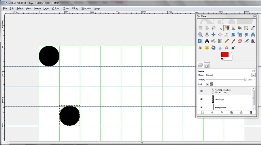
With the Move tool, drag the copied circle off the original one and place it diagonally to the right, in the second row down, with its lower edge snapped to the guide. (See the 1st screenshot - although this shows a circle in the 4th row down, where the height difference is more obvious.)
We're going to resize this circle, because ellipses on the second row, as you'll see from your spreadsheet (or the table), are still 200 pixels wide but only 199 pixels high. Leave it selected and un-anchored. Zoom in to 200%.
Select the Scale tool and click on the circle. In the dialogue box that pops up, make sure that the chain symbol is broken, showing that the width and height are not linked. Then drag the top edge of the circle down until it snaps to the guide producing an ellipse that fills the space in the grid. Click on Scale in the dialogue box to resize it.
Zoom back out. With this ellipse still selected, click Edit, Copy, Edit, Paste and repeat the process on the newly pasted ellipse, dragging it to its place in the third row against the left edge of the canvas. Resize it.
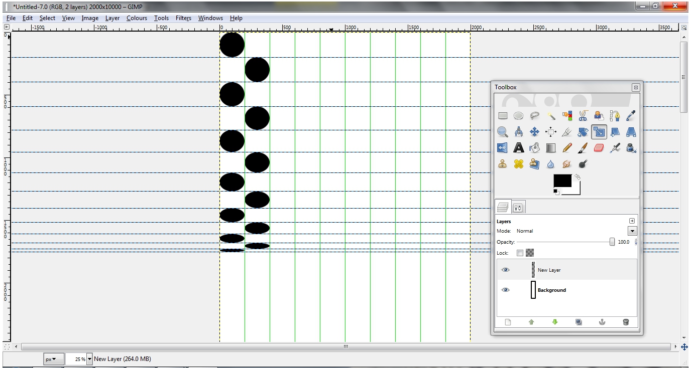
Continue until you have filled alternate spaces in the grid, two columns wide and 13 high. Finish with Layer, Anchor Layer. It should look like the 2nd screenshot.
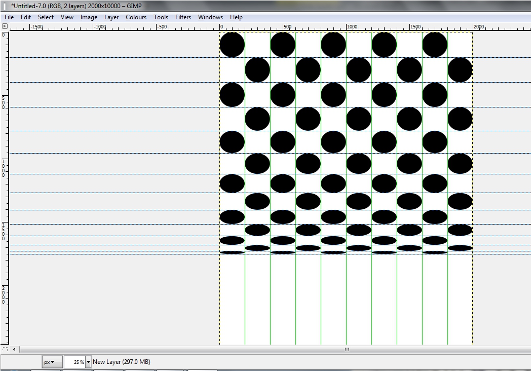
To fill the rest of the grid, choose the Rectangle select tool and draw a rectangle around the 2-column slice, letting it snap to the edges. Edit, Copy, Edit, Paste and drag the copy to the right to fill the next 2 columns.
Edit, Paste to create another copy and repeat across the canvas, finishing with Layer, Anchor Layer. You should end up with something like the 3rd screenshot.
Mirroring to Make Half a Cylinder
Use the Rectangle Select tool again to select the entire dot-filled grid.
Edit, Copy, Edit, Paste.
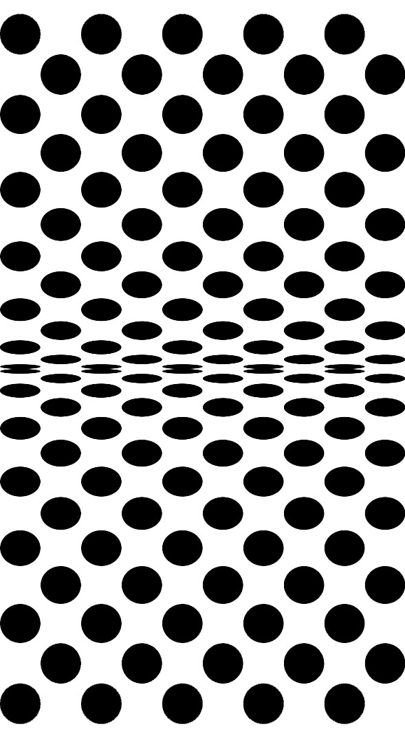
With the pasted copy still selected, select the Flip tool. Hold down the Ctrl key to toggle vertical flipping and click and drag downwards over the copy to flip it. Then use the Move tool to drag it into position. End with Layer, Anchor Layer.
Finally, View, untick Show Grid and Show Guides. Crop to size. This gives the first picture in this step.
Alternatively, position the two quarters the other way around for the 2nd picture.
Colouring

(The examples in the pictures attached to this step were produced with a greater number of dots around the cylinder and different dimensions.)
You can add interest by shading the dots from light grey at the nearest point on the cylinder to black at the far edge. Do this by using the Select by Colour tool in Gimp and then bucket filling each row of dots with a successively darker shade. This produces a result like the first picture.
Liven things up a bit by putting a bright colour in, like the pink in the second picture.
Other Ideas

You could do the same thing with squares instead of circles.
Or change the dimensions of the dots in both X and Y directions, like this version which looks like quarter of a giant dotty cushion.
Or model the effect of dots on the surface of a sphere or cone.
Or dots whirling down a drain.
Who says maths isn't useful?