Attack on Titan Inspired Scale Wall Shiganshina
by Roundpegprops in Craft > Costumes & Cosplay
19411 Views, 108 Favorites, 0 Comments
Attack on Titan Inspired Scale Wall Shiganshina
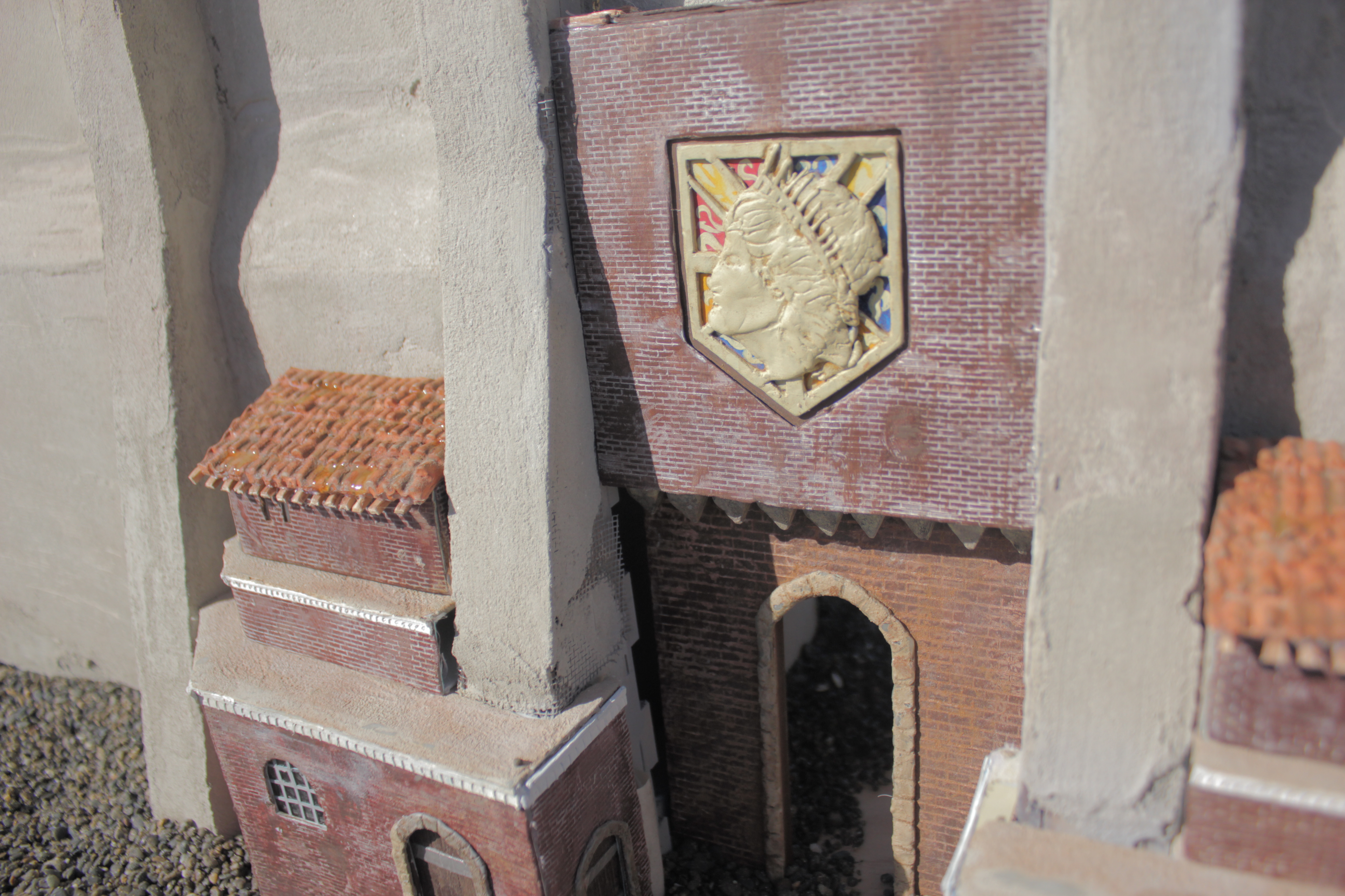
Hello again everyone!
Ook so this is part of a larger project I am working on, but the time to make something became smaller and smaller. Much like this 1/72nd scale model of Erens district from Attack on Titan.
Attack on Titan is one of my favorite animated series, the Wall is highly recognizable and important.
Materials used:
Apoxie Sculpt
Acrylic paints
Paintbrushes
Craft Knife small and Large
Cement
Mdf aka Particle Board 4.75 mm 2 1200x2400 sheets
.37 mm styrene sheets
1mm styrene sheets
Adobe Illustrator
Laser Cutter
8mm Staples/Gun
Fiber Glass window Screen mesh
Card Stock/ 210gsm
Clay
Polyester Resin
Respirator
Ear protection
Hot Glue, Hot Glue, Hot Glue, tape
Getting Source Material and Figuring Out Scale.
So with any project, getting source material is important. If your source material is based on fiction its mostly screen grabs.
The difficult thing about working with animation is that they don't really stick to their own versions of scale/guidelines. Which isnt really anyones fault. It would be extremely hard to get a team of animators to be able to stay true to scale, probably boring as well.
So with a few screengrabs a lot can be accomplished.
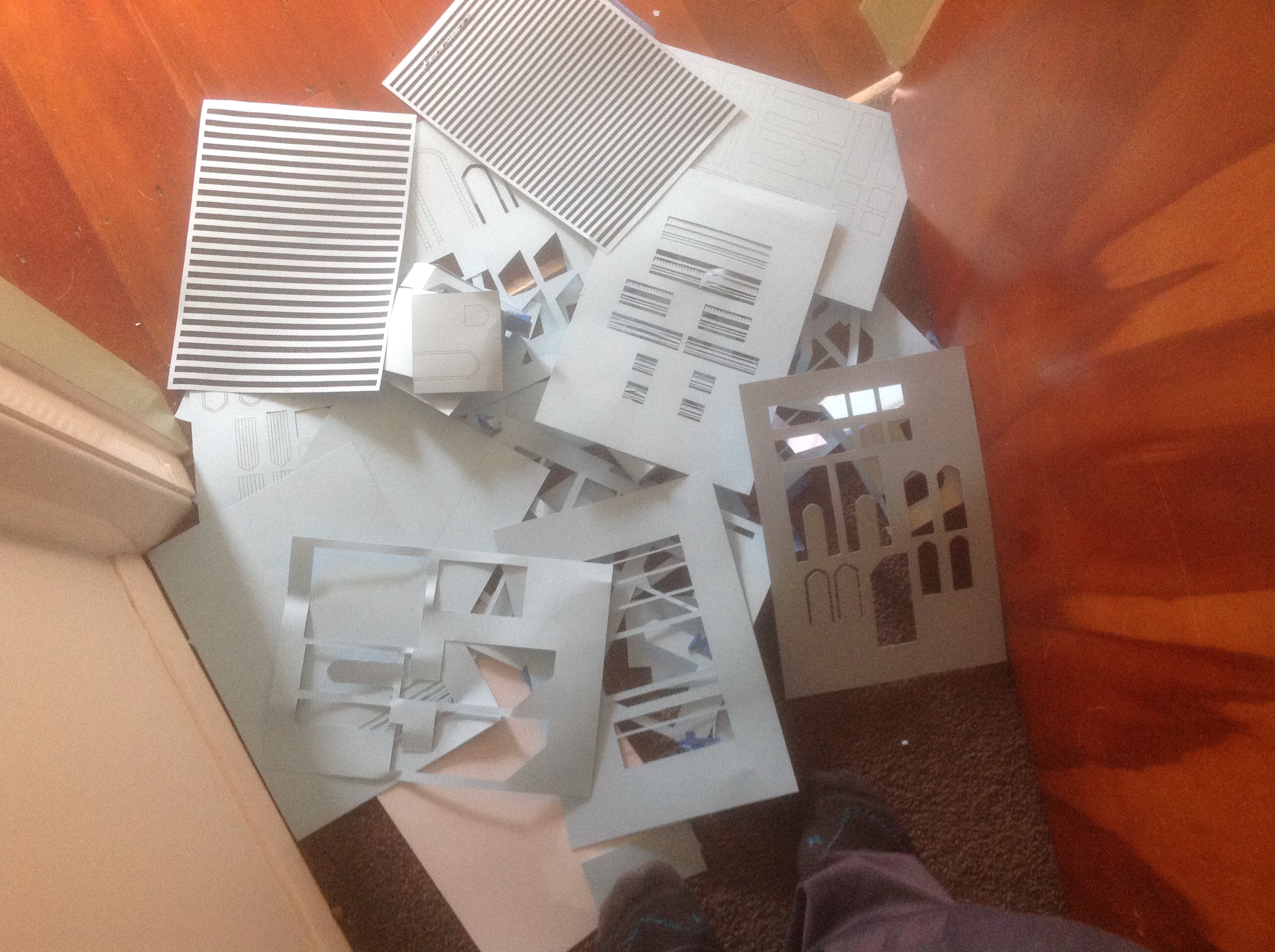
The amount of paper I have used for different versions and drafts is somewhat piling up. Remember people, RECYCLE. I will try and get a picture of all the offcuts.
Because there are some details that are different from screenshot to screenshot I've made a few decisions that I think work better with scale. I'll go into detail about the individual decisions I made later in the build.
Scaling and Drafting Wall Build and Design.
So according to the series Attack on Titan the Wall is 50 meters in height.
Using that knowledge you can start to figure out distances and size of the smaller elements, and draw them using a design program. I use Adobe Illustrator.
In staring at the screen gravbs for far too many hours I figured that the main three wall sections are smaller than the wider sections.
A lot of work in Illustrator making the sections able to slot together later for faster assembly was important.
I've gone through many drafts in Illustrator making some small/big adjustments over the course of the project and am happy where I have ended with scale/size.
On reviewing I probably could have saved a decent amount of cutting time if I had limited the number of interlocking tabs I put on the sections.
Some of the decisions I made with design are these:
Some shots in the series have a hard edge at the top of the wall, other have beveled.
I went with the beveled edges because I thought aesthetically they were nicer.
I wanted to put rail road tracks and cannons on the top of the wall but this specific wall does not have them mounted on top.
The Wall thickness varies for each wall and outcropping as well so I went with what I had thought was appropriate from when Eren and Mikasa walk through in the first episode when they are talking with Hannes.
The Height of the lower section that juts out was sort of a compromise I had to make as well. The dimensions again varied from shot to shot.
ACTIVATE LAZERZ!
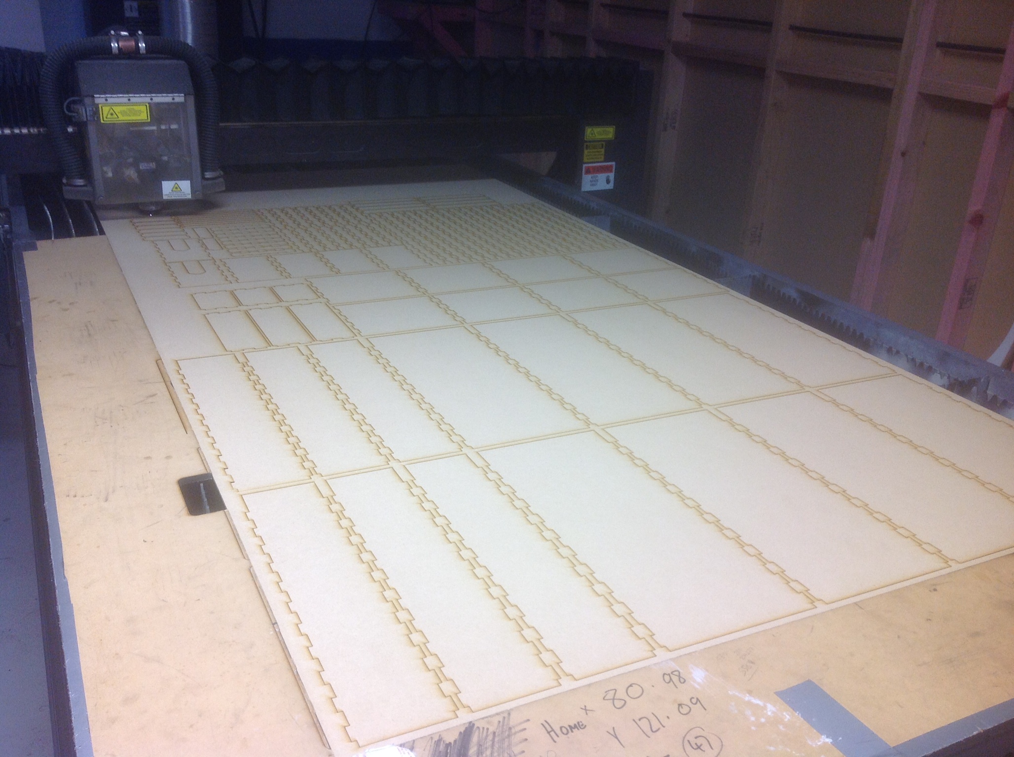
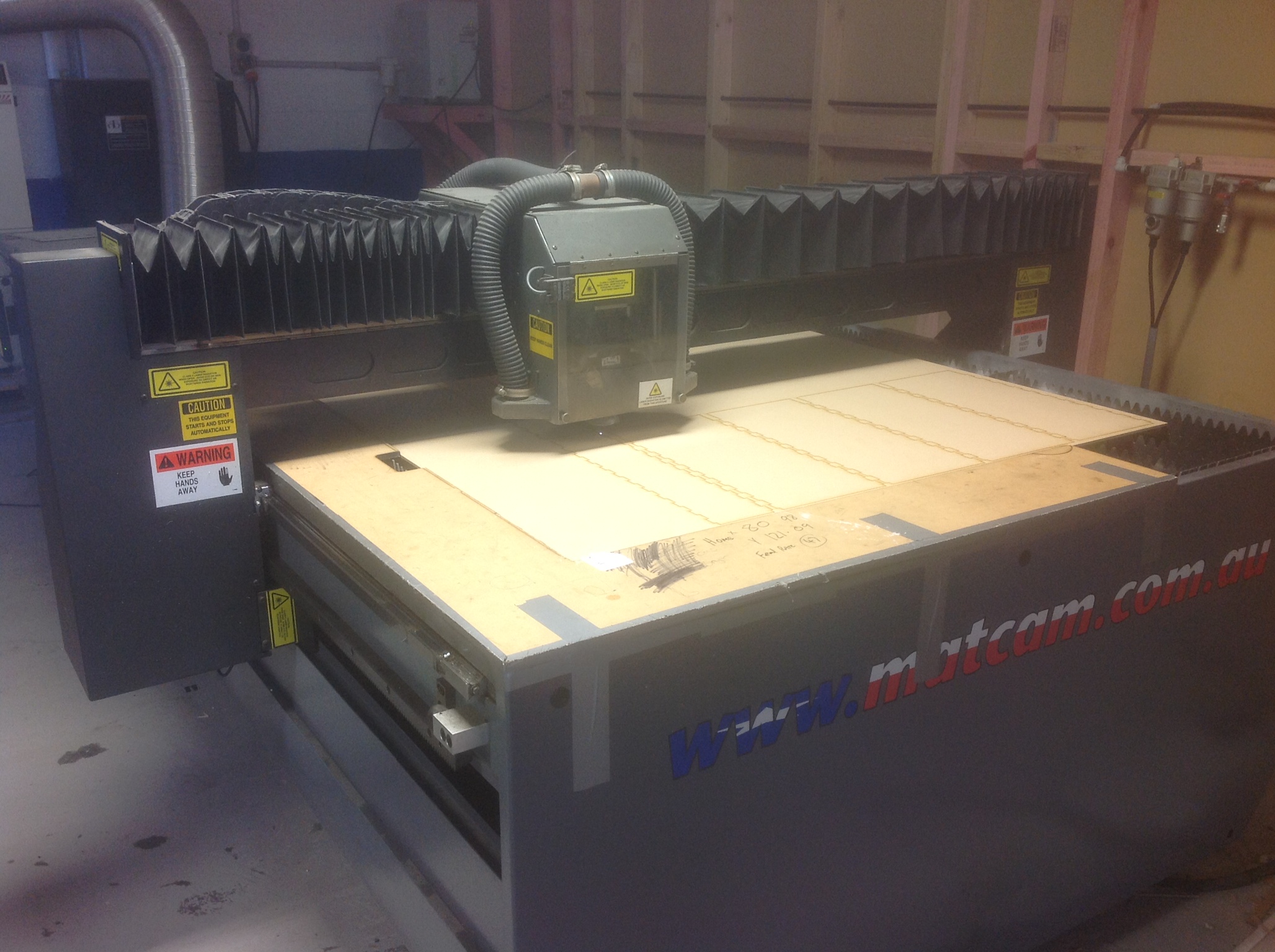
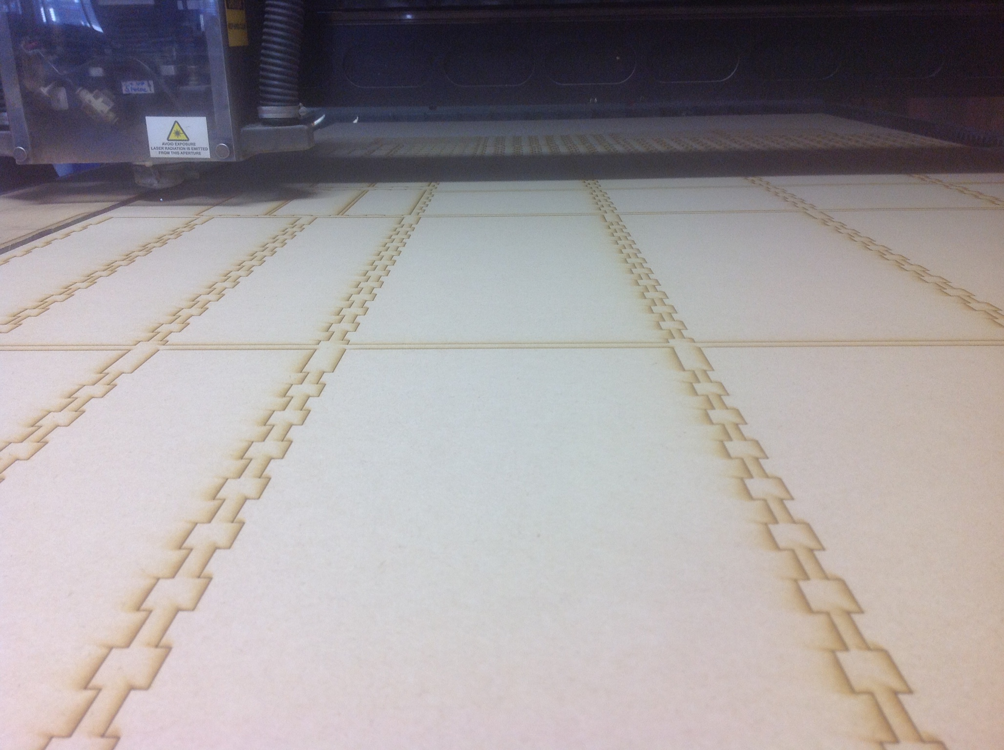
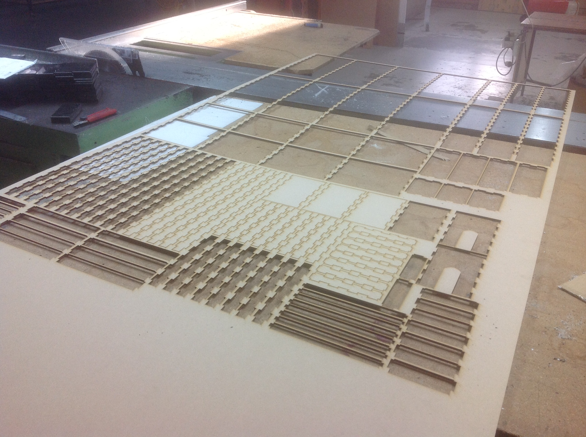
Once drafted and tested out with paper/styrene it is time to send it to your friendly neighborhood laser cutter!
It was really satisfying watching this get cut knowing that when its done I can just go home and put it together like Lego... speaking of Someone should build an Attack on Titan Lego wall! Kind of a lot of pieces though!
So the mdf/particle board is 4.75 mm which I decided is a good size/strength and not too heavy.
Be sure to incorporate the thickness of your material into the design so that the pieces slot together appropriately.
First Assembly
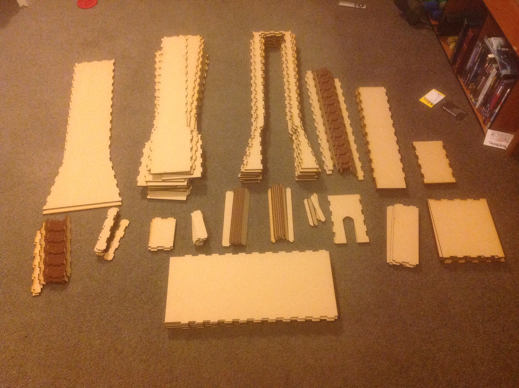
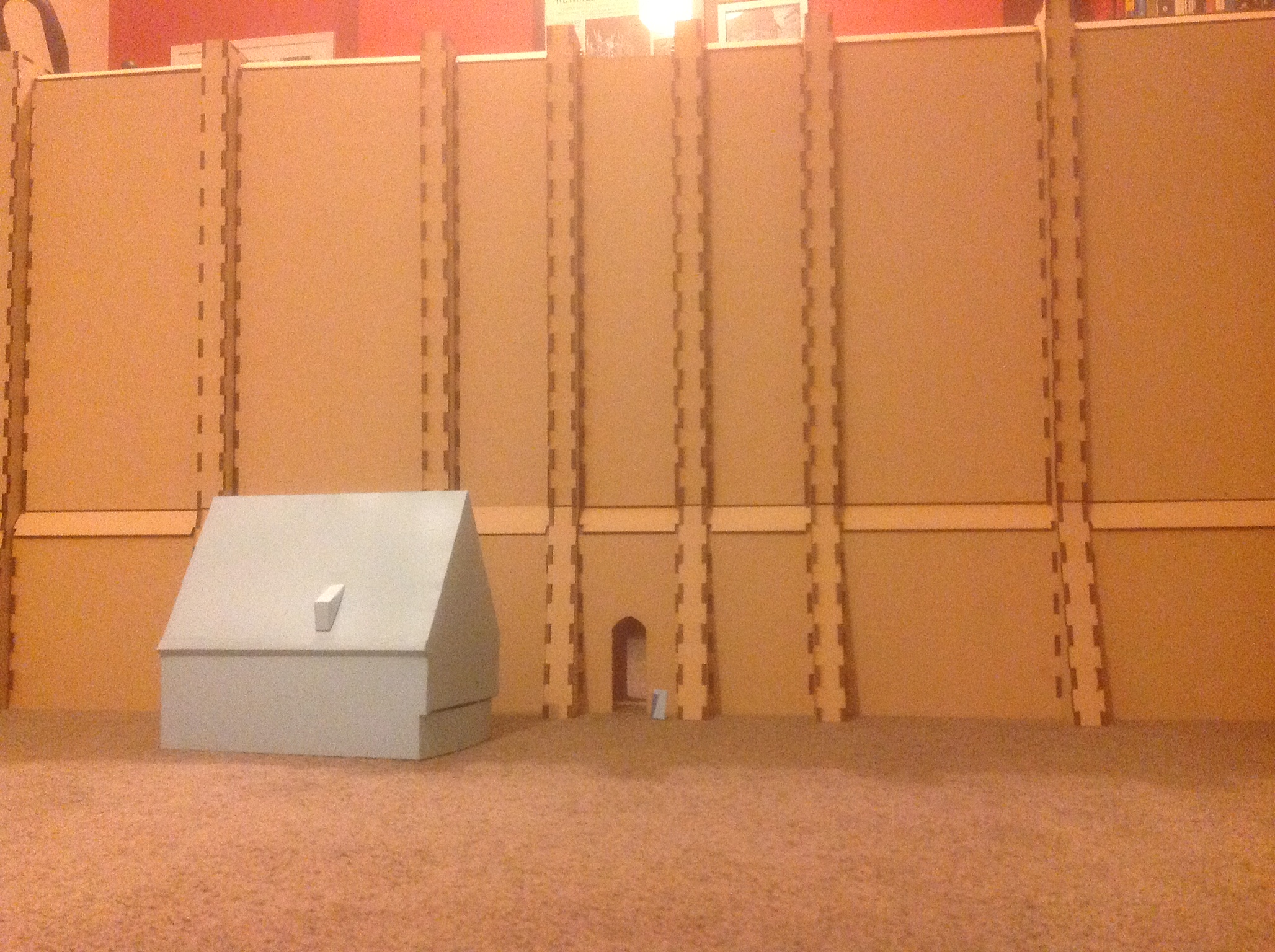
So now take that heavy pile of boards home with you and put them together!
Sorry I couldnt really take any photos of myself putting them together since I needed both hands at all times.
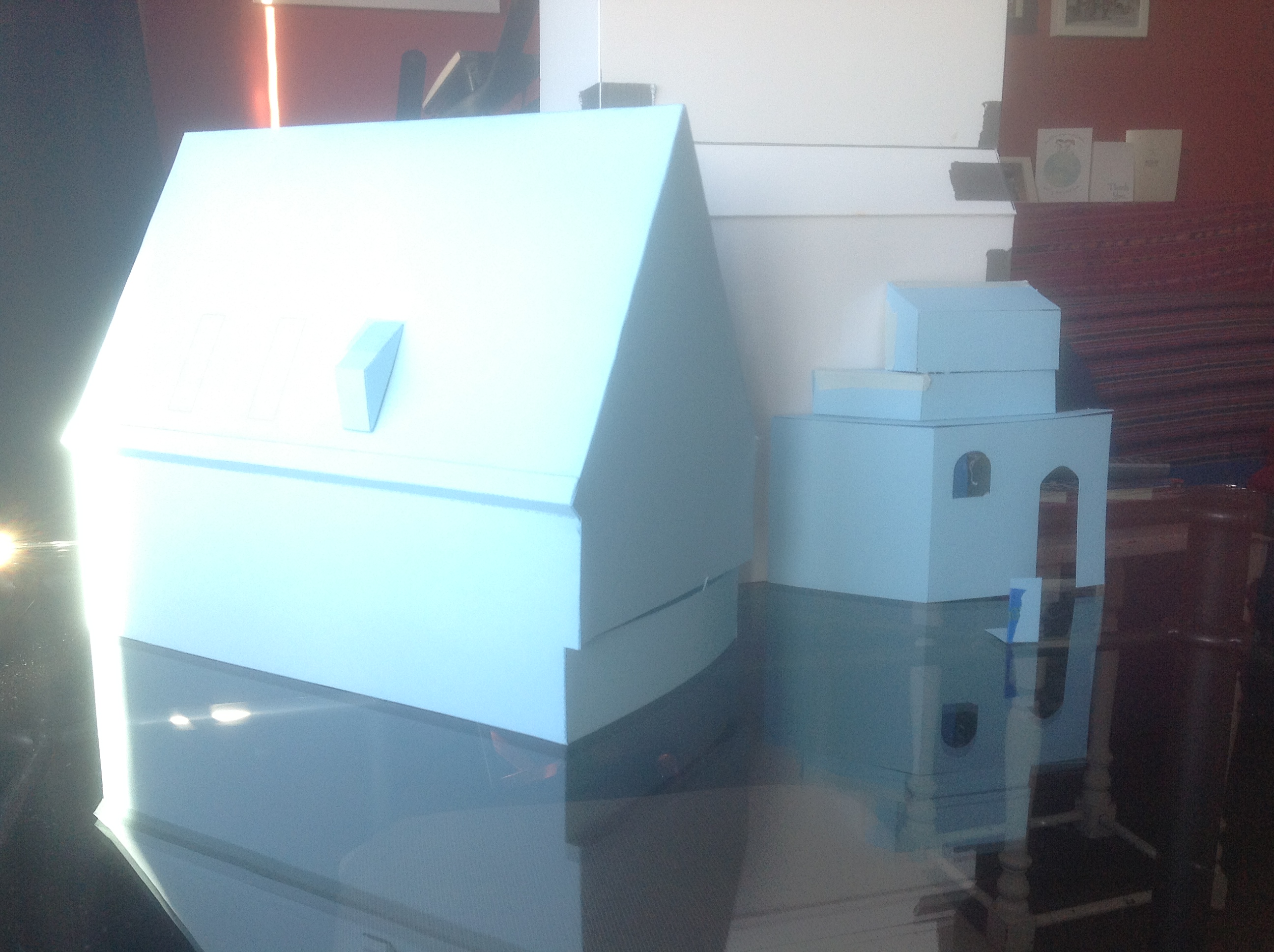
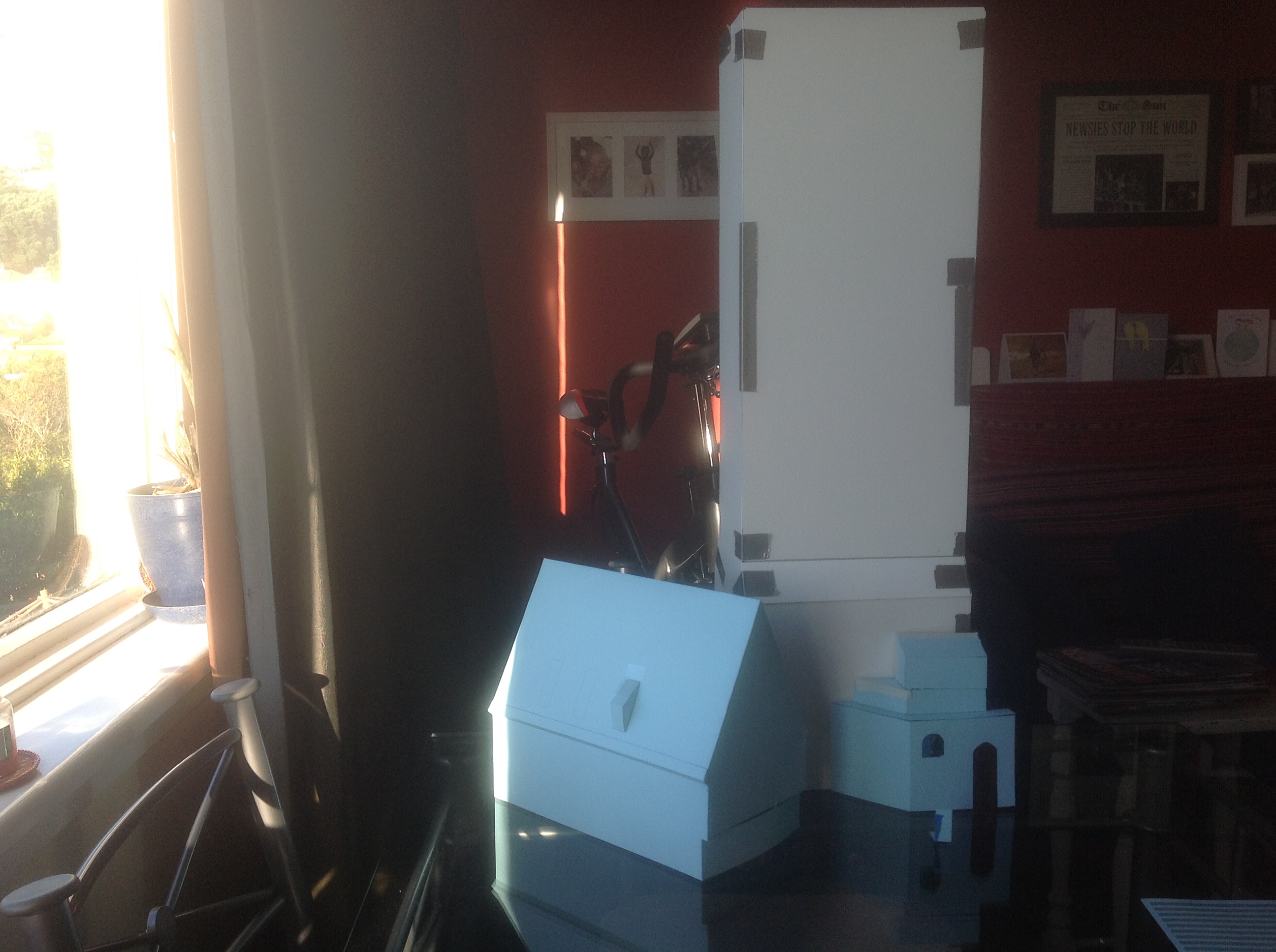
Although I had drafted everything in Illustrator I had forgotten to make the tops of the walls before I had arrived there. Which means the quick throw together top versions had a few errors that I needed to correct with a saw/chisel. Not a big deal at all, just annoying.
(The house in in the foreground is a bit of a tease... I am sorry. At a later date there may be more to come. But I wouldnt make the deadline so.... you'll have to wait.)
(Also, I apologize for the lighting on these pictures... the bulbs we have in the house arent the greatest.... pretty yellow and dull.)
Once the pieces are together I found that easiest way to make them rigged and sturdy was to staple the heck out of them.
So throw some ear protection on and staple away!
All the while singing the theme song to Attack on Titan in your head. Well mostly humming because I dont know the words. Haha.
Cover Surfaces With Mesh to Hold Concrete.
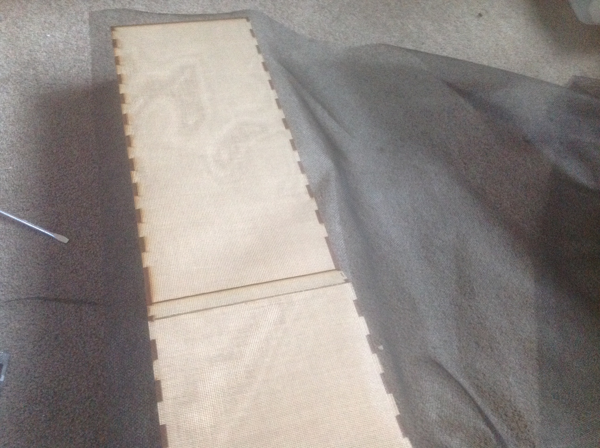
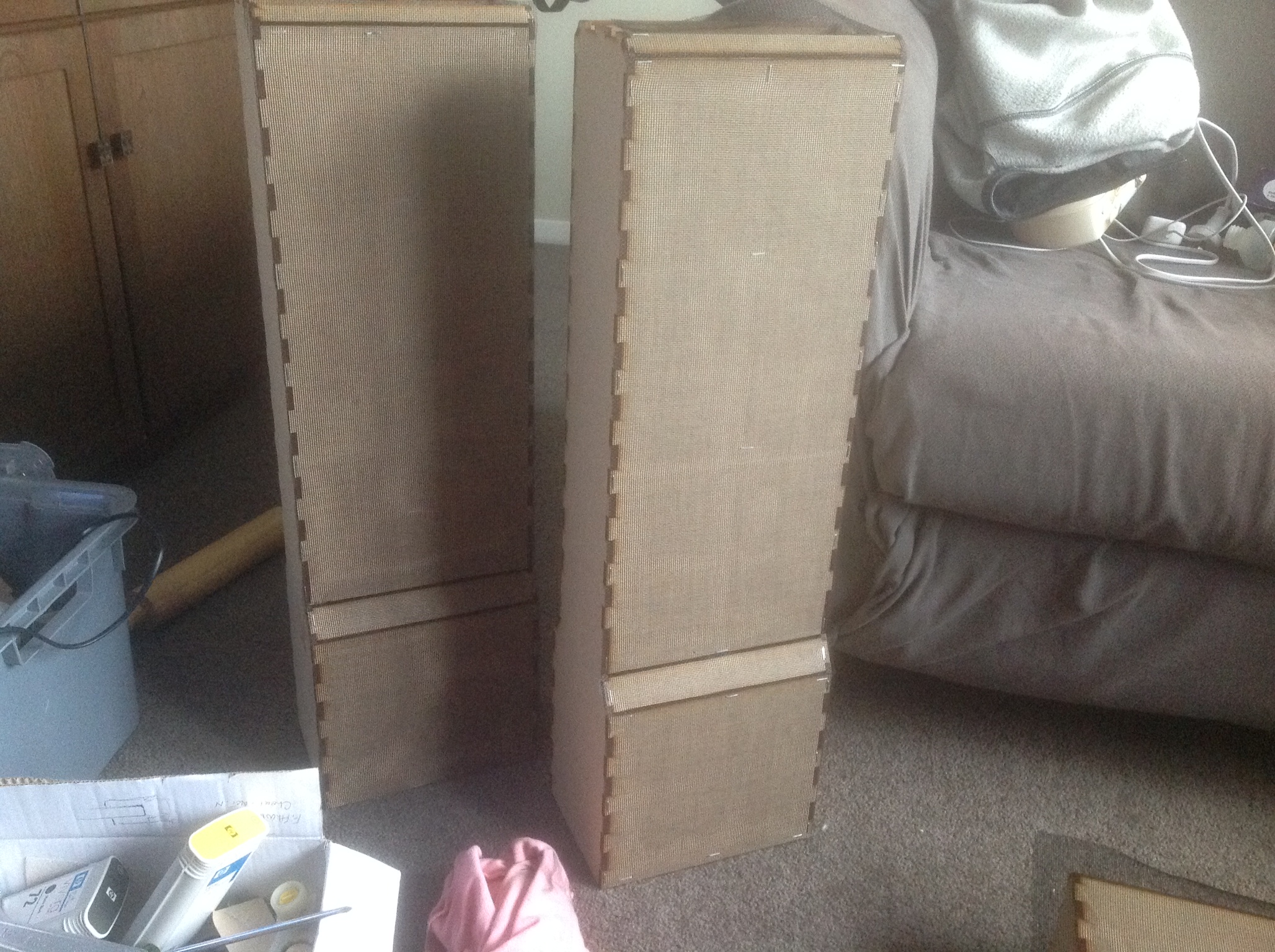
Once the pieces are together I took some mesh to cover the surfaces of the Wall to be able to grid and hold the concrete in place.
Just make sure that the mesh is tight to the surface and staple some more!
Staple placement isnt really all that important just make sure the coverage is good enough since this will be holding your concrete in place.
Just make sure that the mesh is tight to the surface and staple some more!
Staple placement isnt really all that important just make sure the coverage is good enough since this will be holding your concrete in place.
Concrete the Surfaces
.JPG)
.JPG)
.JPG)
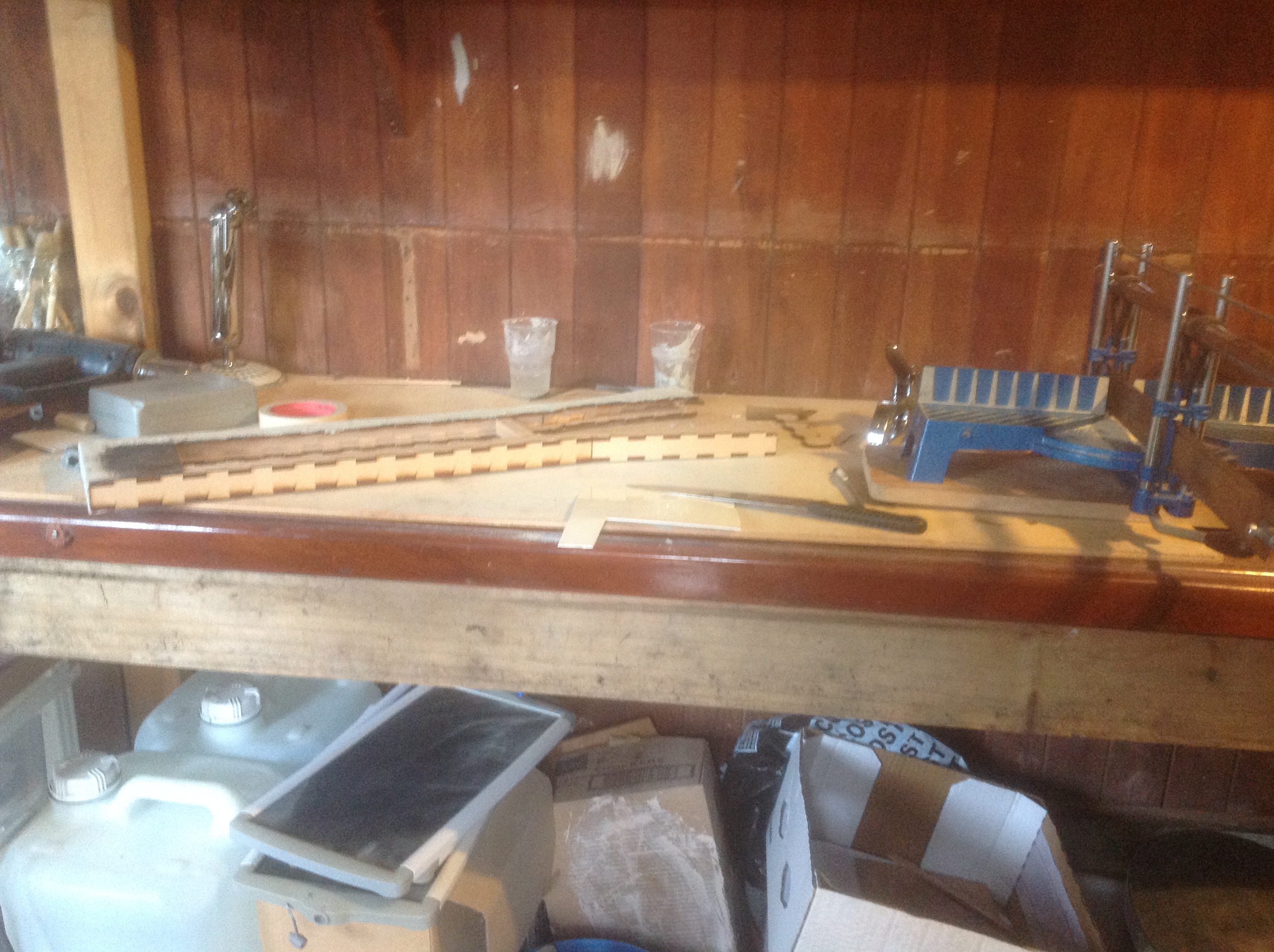
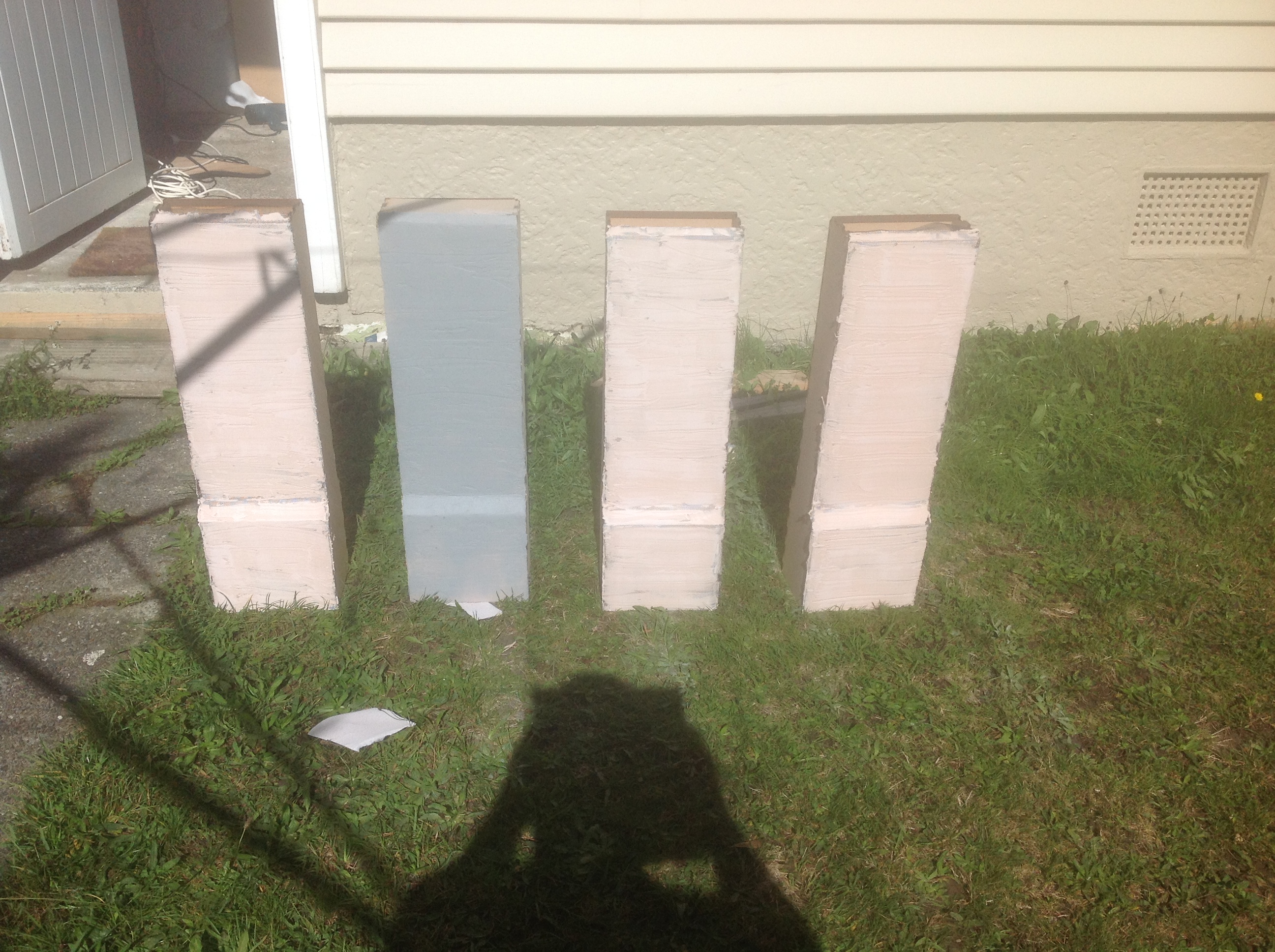
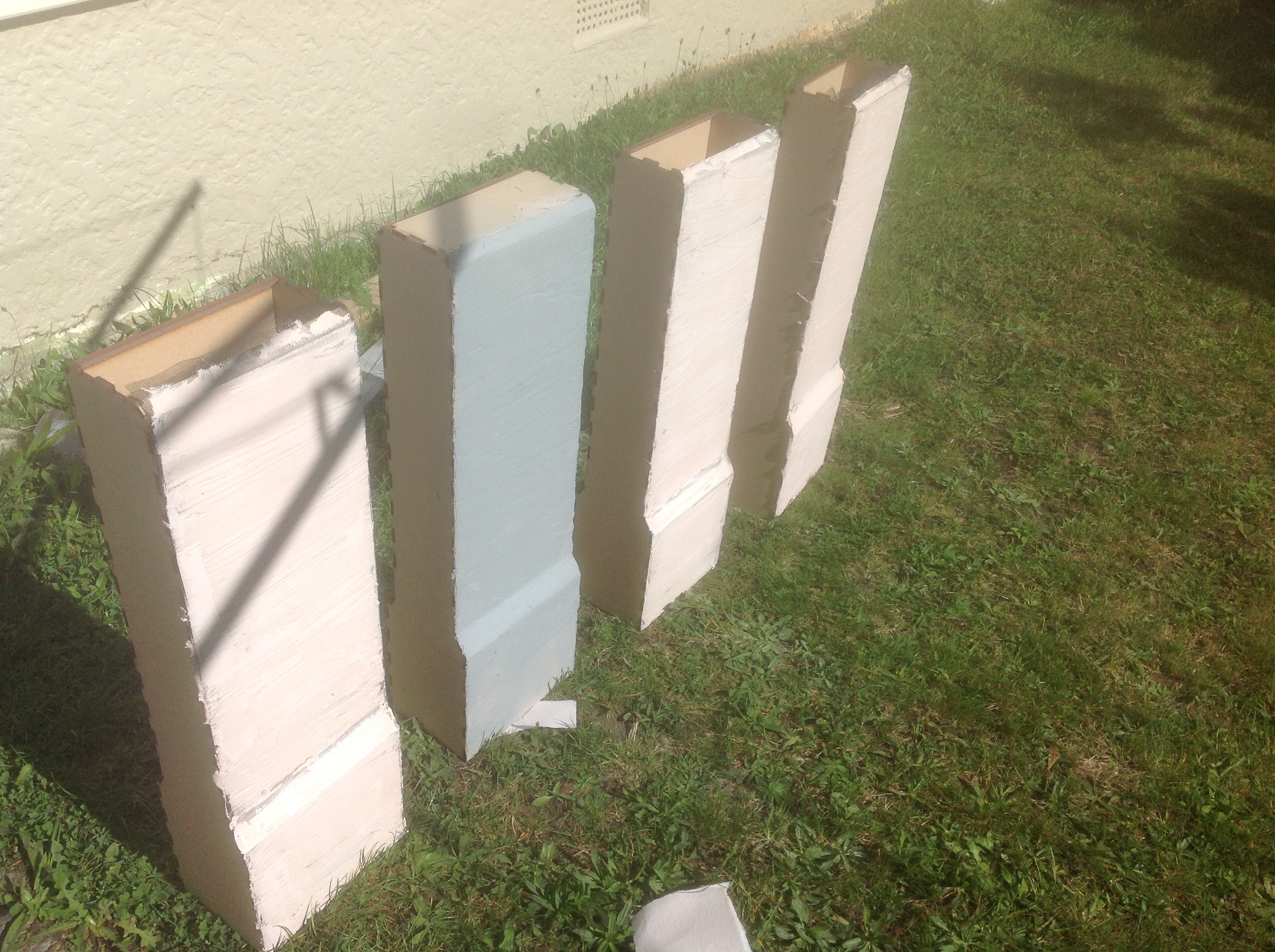
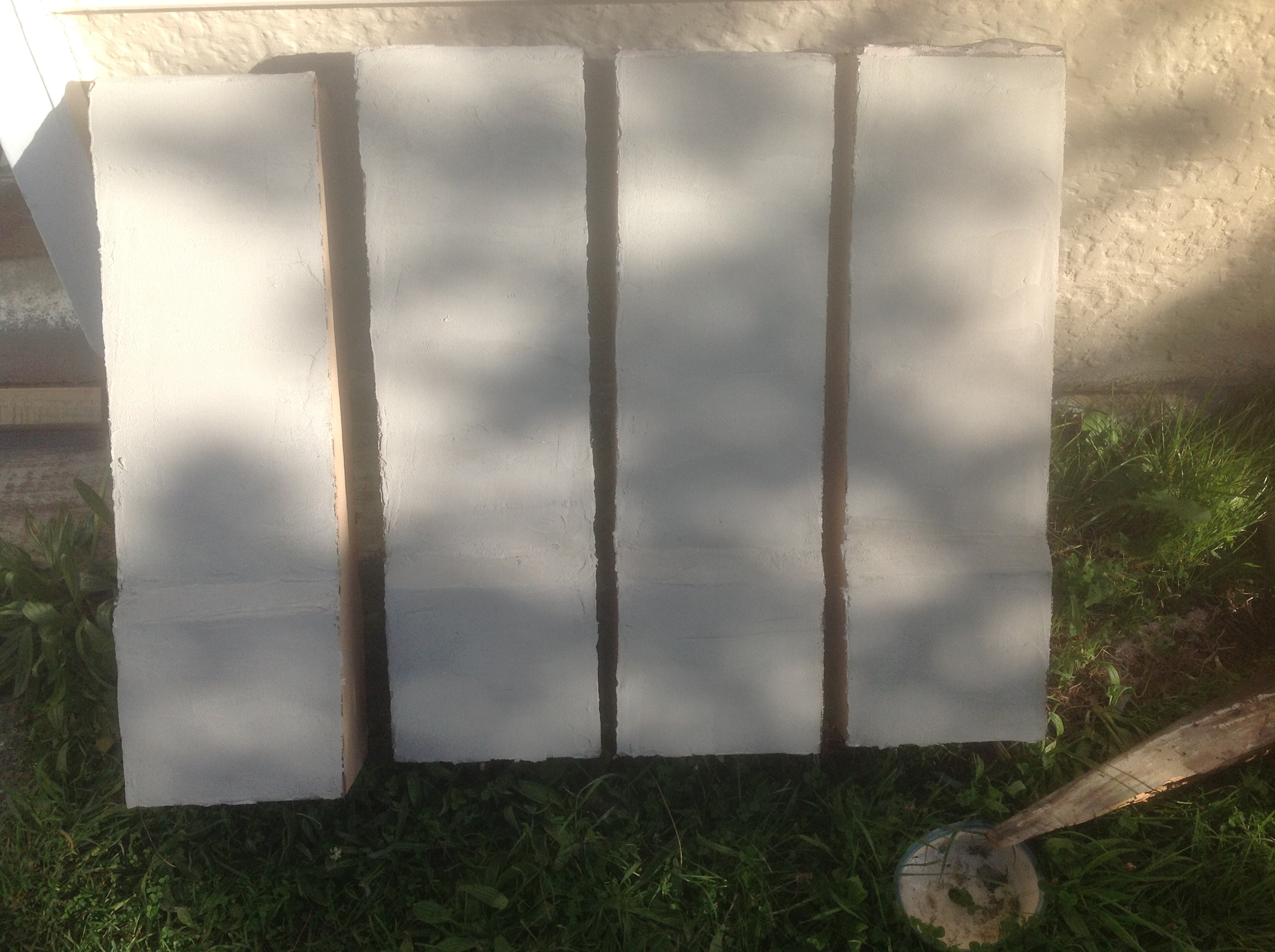
So when you're done with the mesh slap some concrete on them! Make sure to get the layers as thing as possible.
(I made the mistake of doing an initial layer with Bog/Bondo/Builders fill. Bad idea. Its easier to do a skim layer with concrete afterwards but the strength you lose isnt worth it. The Concrete can flake right off. Whoops.)
Just mix your cement and apply with any sort of scraper/credit card or tough plastic.
Break Up the Boring....

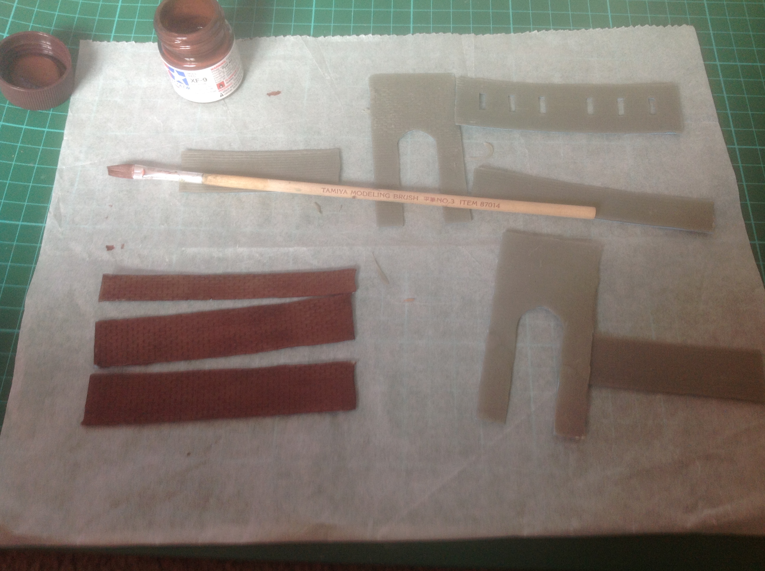
Ook so the finer details of the project were definitely the hardest.
Deciding on the size of the smaller "Gate Houses" was difficult.
In some screen grabs the door is double the size of the person, in others is just a normal door.
I went with the larger scale because it seemed more appropriate for the region in which inspired this sort of architecture.
The houses are more of a "Fachwerk" design which is fun to work with but a pain to draft because of all the small details.
The work on the gatehouses however is more classical brick work. Which anyone making a scale model will tell you is a pain.
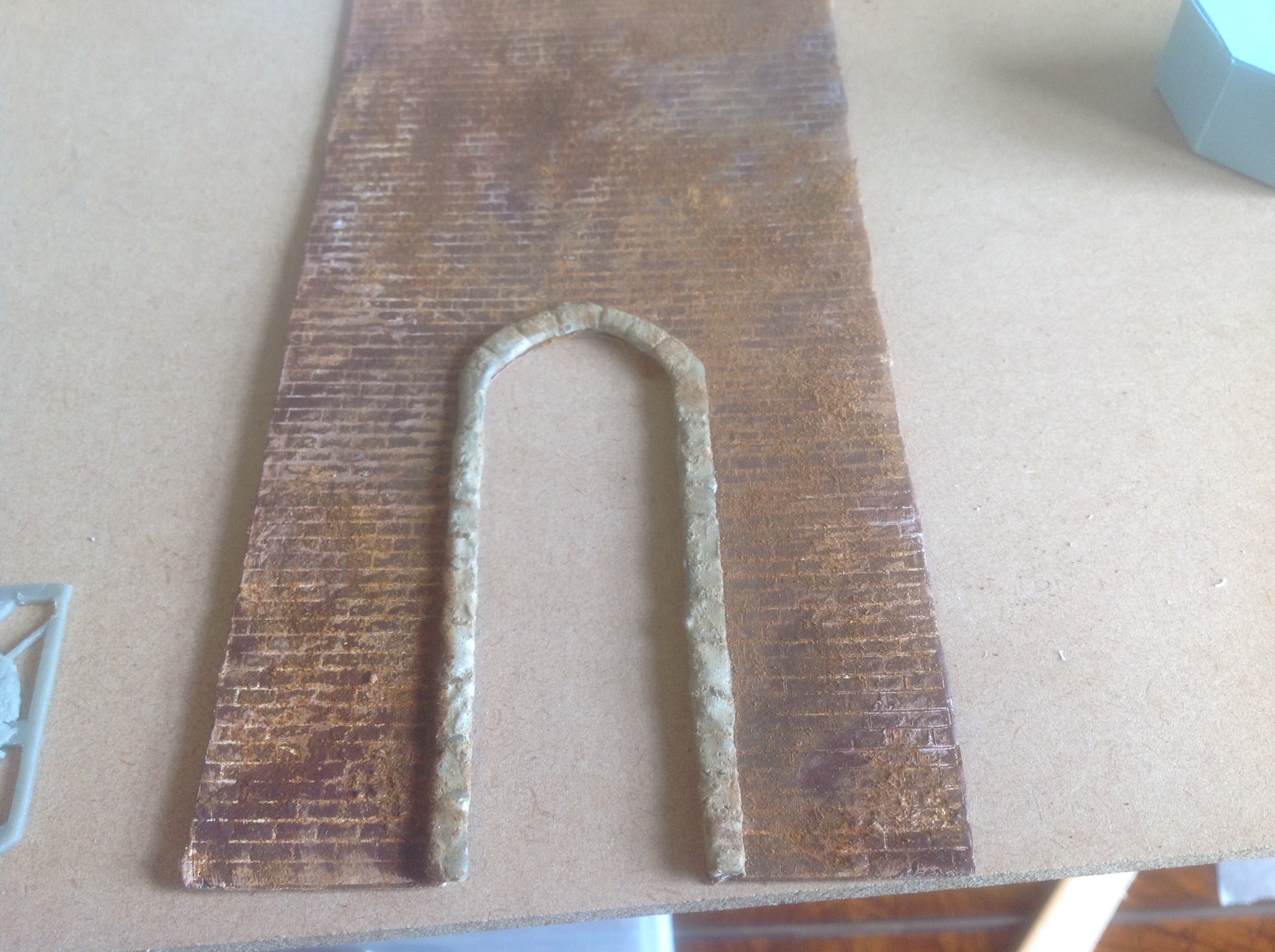
The way I made the brick grid was to take two sheets of printed cardstock. One with the lines going Vertically and one horizontally.
I then would tape one piece to the .37 mm styrene sheet and with an old blade I would score each and every small little line. After a while your eyes go blurry and your brain starts to wander to destinations you never expected and you find yourself on the edge of the abyss that is your brain.
Phew.... well anyways once thats done you've created a mold/stamp.
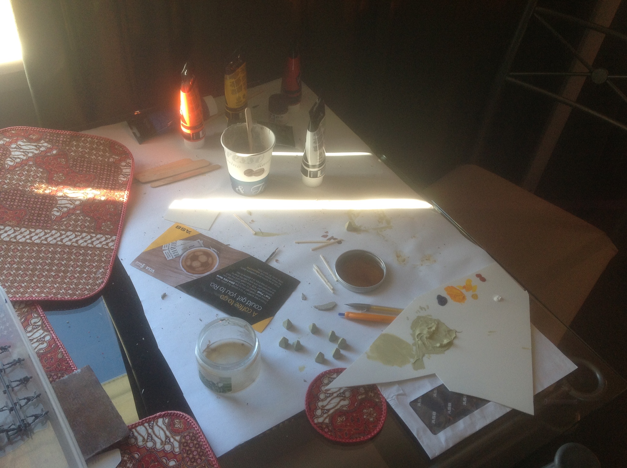
Take some Apoxie scupt which is a 2 part clay that dries hard.
Make a very thing layer as thin as you can.
Wet the surface of your "Mold" lightly with a finger dipped in water or a damp cotton cloth.
Then you take the Apoxie sculpt and press it into the etched styrene which then creates your mortar lines and indents.
Remove the Apoxie Sculpt quickly and wipe down your mold/stamp.
Let the Apoxie sculpt dry over the next few hours.
Its not perfect but thats what sells the whole scale part is that in anything there are imperfections.
You can see the brick work if you look closely but due to the gray of the Apoxie sculpt bad lighting and out of focus... you cant really tell.
Painting and Aging Gatehouse and Bricks
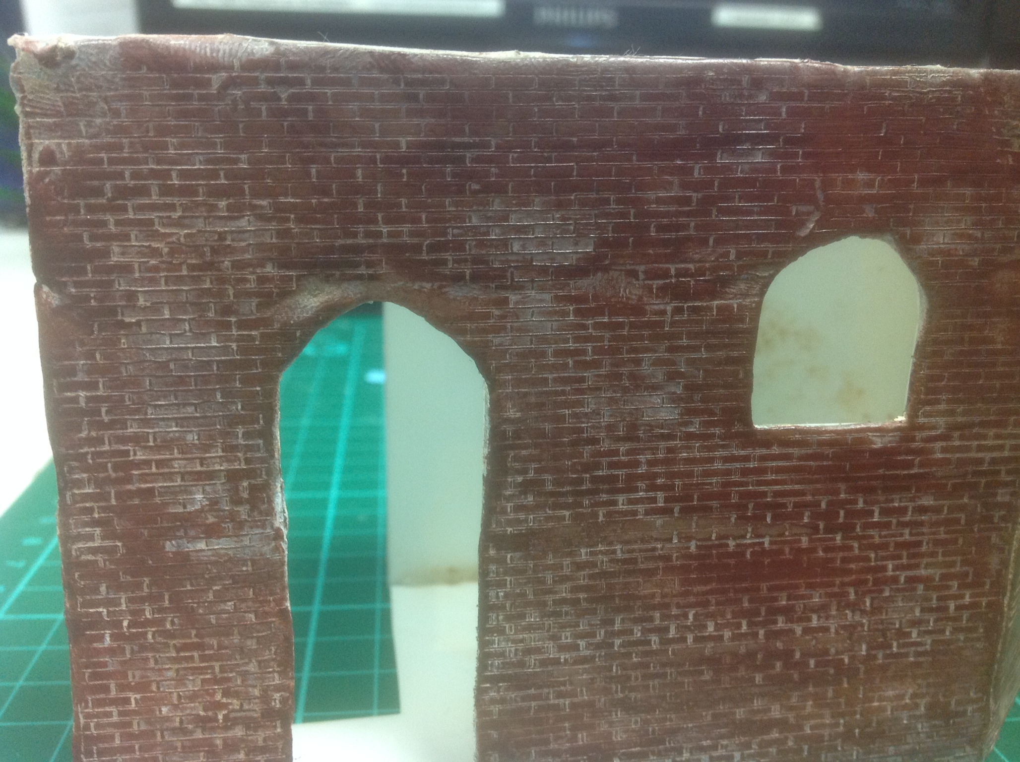
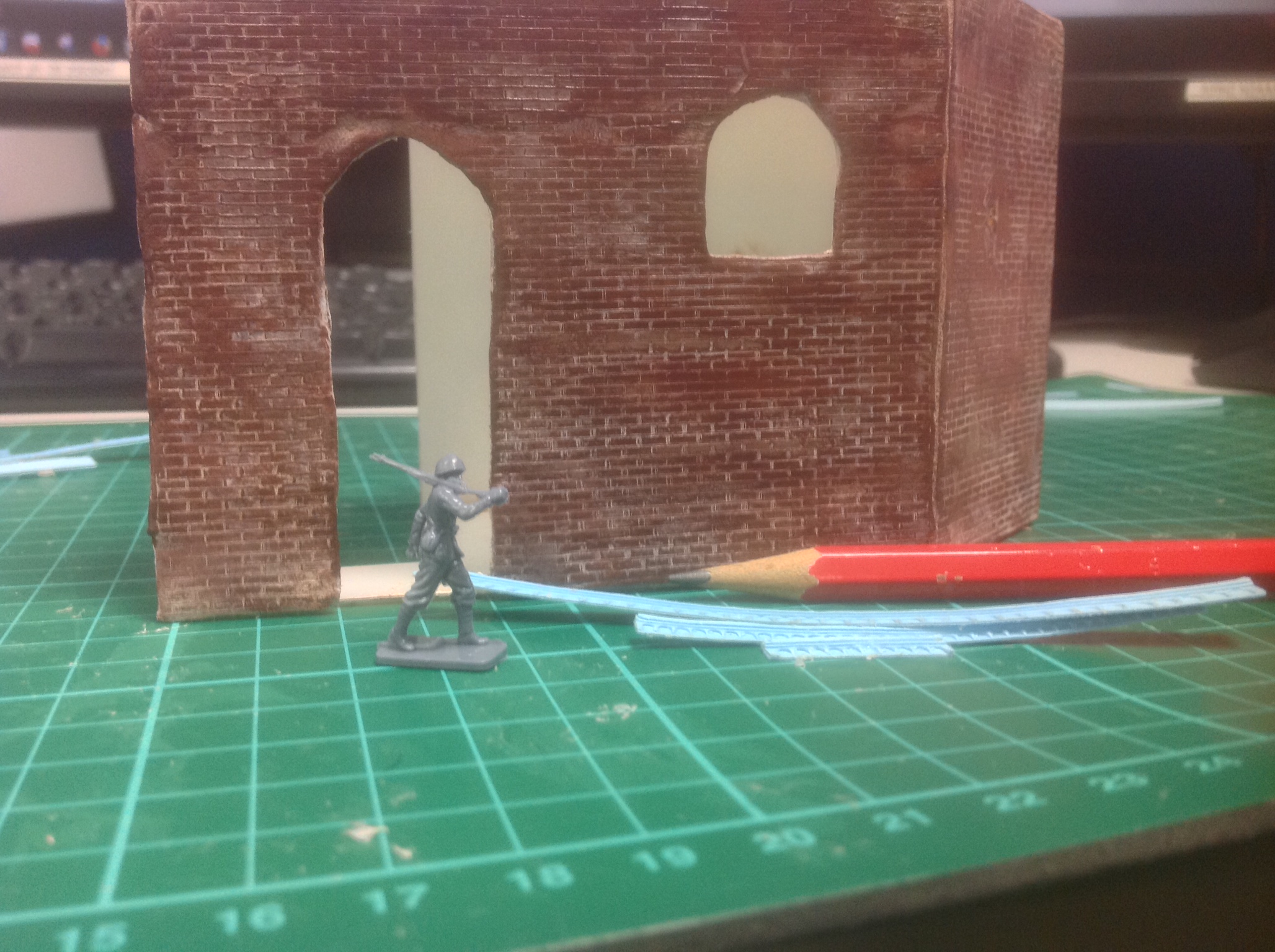
So the process I used to age and add stress to certain pieces of the project was a rather interesting and fun one.
1. Base coat of brown/hullred
2. Small amounts of white paint smeared into the mortars gaps.
3. Immediately wipe off the excess white and try and remove cloudiness before moving onto the next mortar section.
4.Go over again with a small amount of brown only brushing vertically and lightly to not effect the mortar lines.
5. Rub the whole thing down with a clean rag before dry.
6. CINNAMON- That's right I used cinnamon because when its a fine powder it serves better as scale dirt. When its wet it gives some good texture. Just take some of the good brown stuff and sprinkle it all over the whole surface and brush off excess. It also masks any artificial smells with lovely cinnamon.
7.Coffee- another good ager/distresser take the residual water from a batch of coffee and paint it all over.
8.Turmeric- This is what I used to patina, also serves as orange moss/lichen when applied.
Small Details...... They Are Fun.
Sooo......
When you decide to make something 1/72nd scale its hard to find exactly what you are looking for. Unless you want to wait a long time or pay a lot you have to make your own stuff.
Which ends up taking a while as well.
Small fun details list:
Crown Molding
Window Grids
Doors
Small stone arches
Door Hardware
Roofing Tiles
Roof beams
Some of the stuff isnt EXACTLY to scale but its close enough.
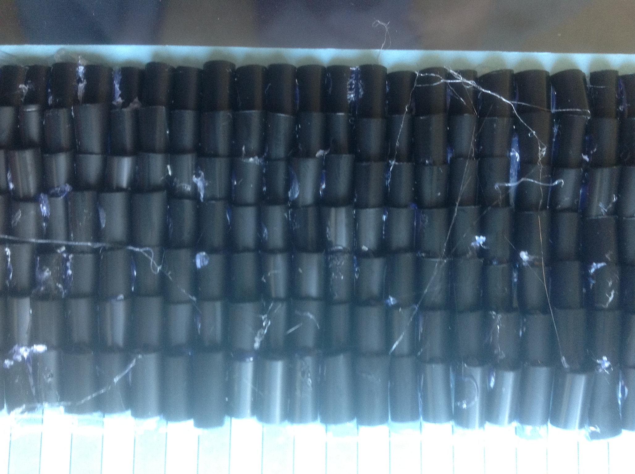
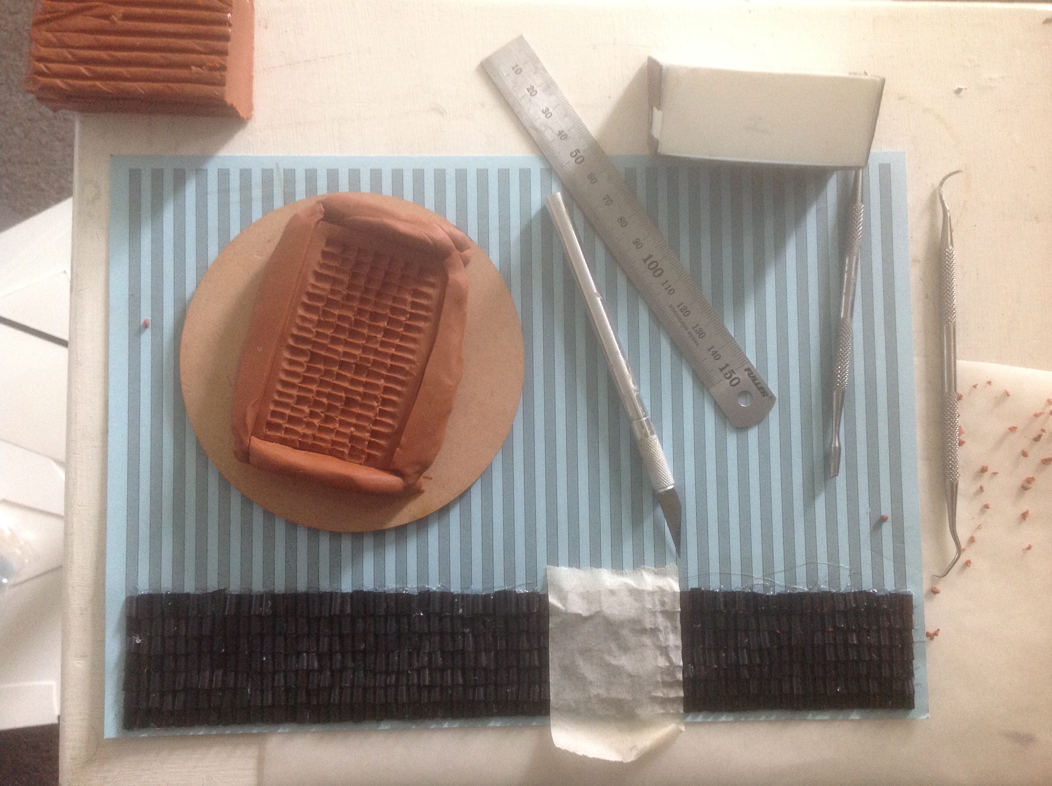
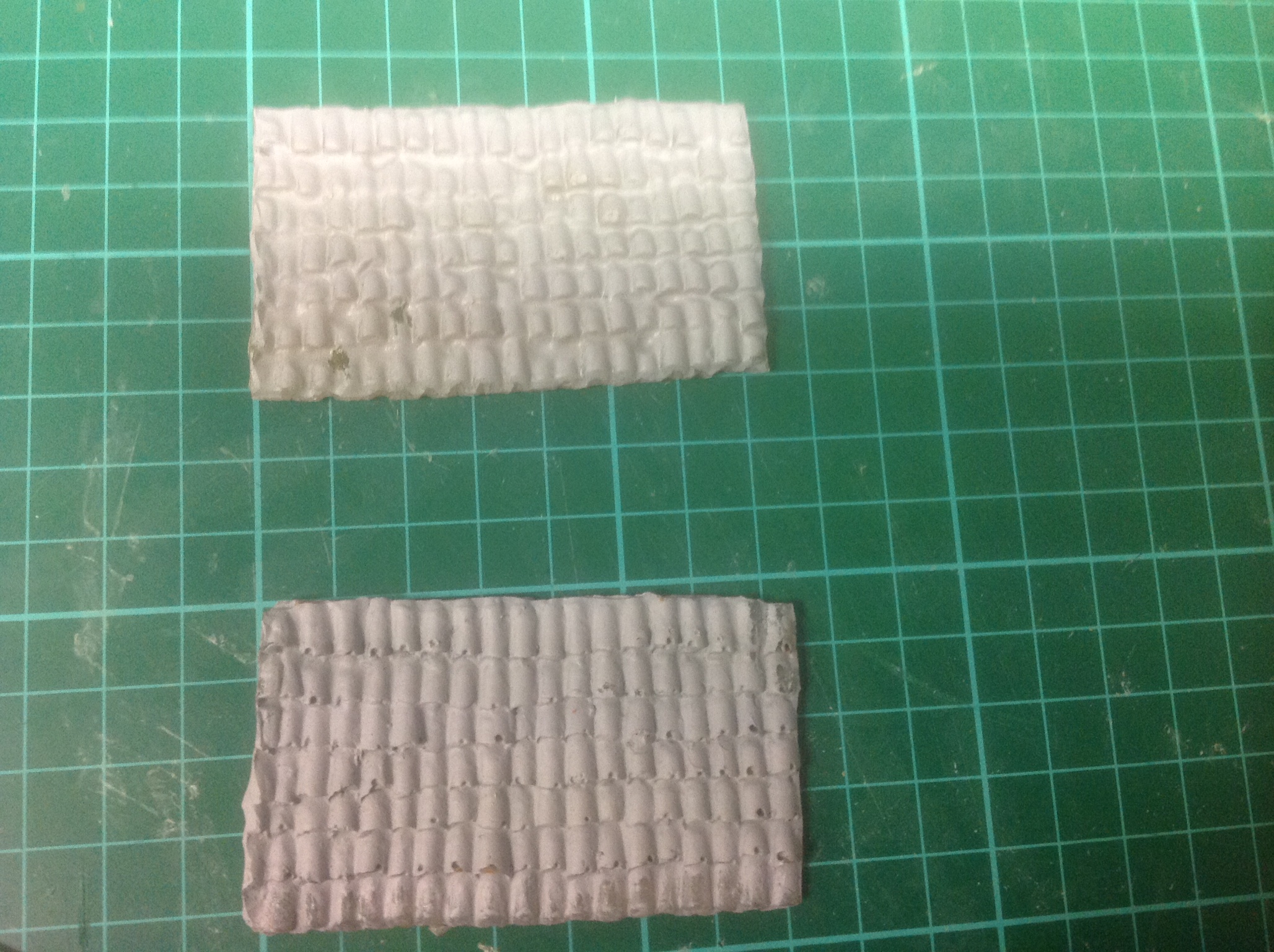
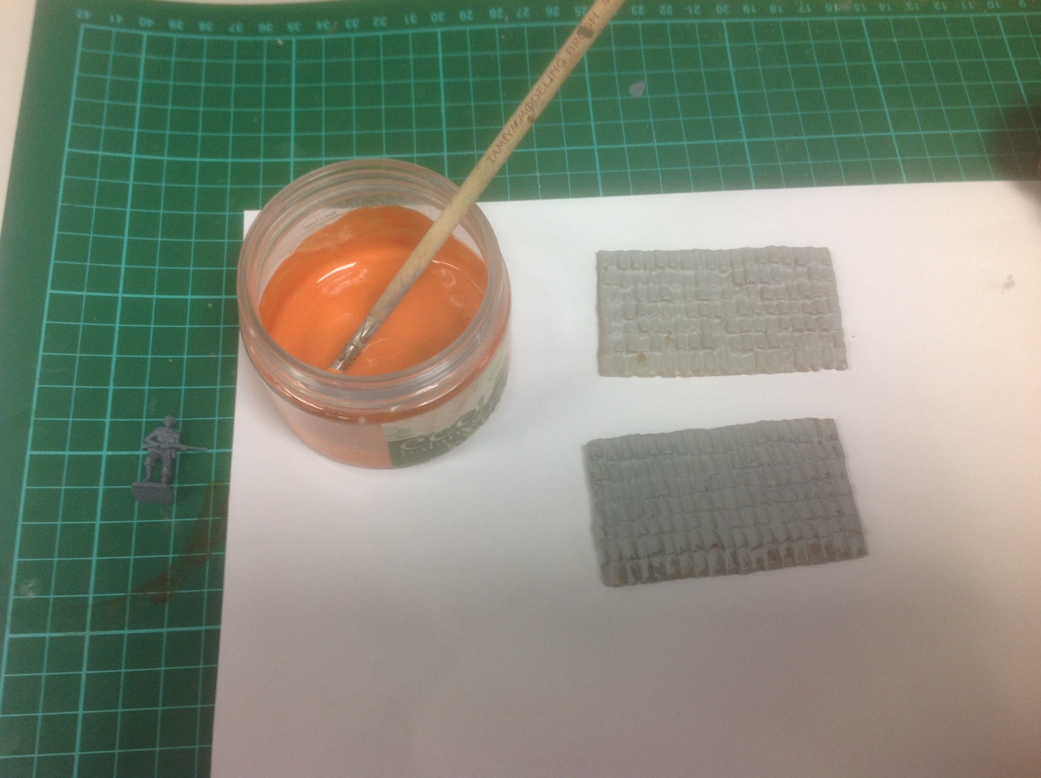
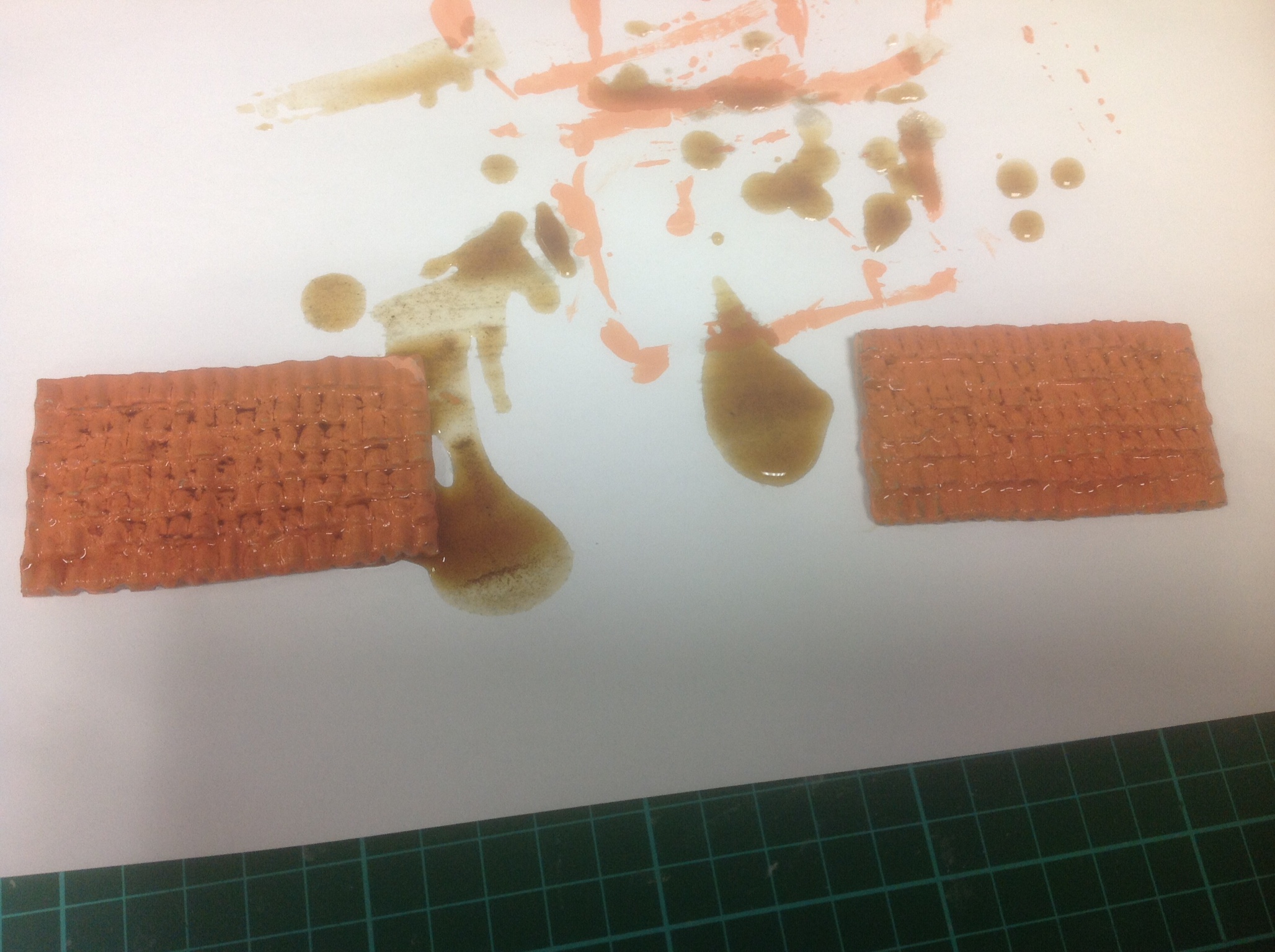
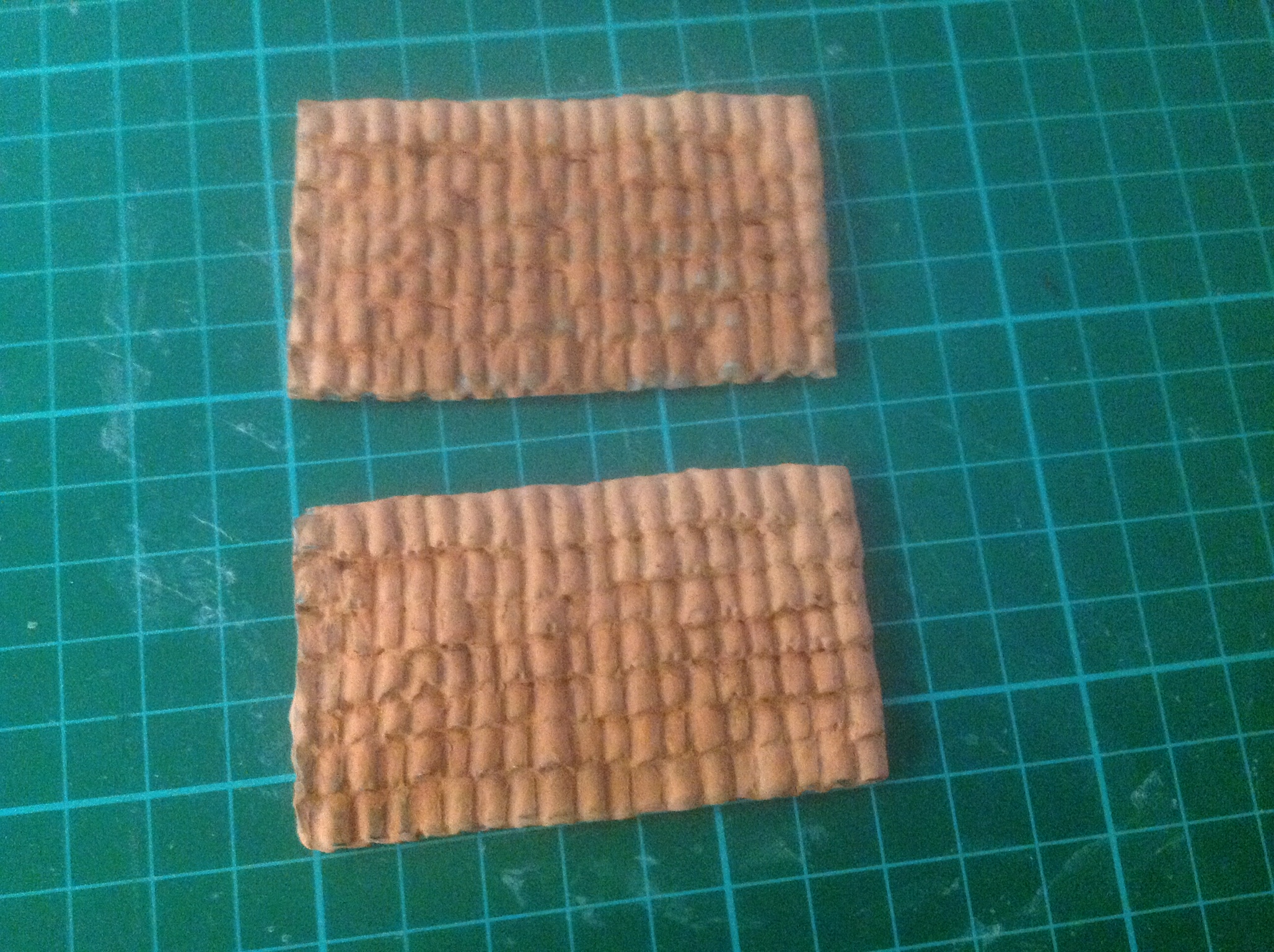
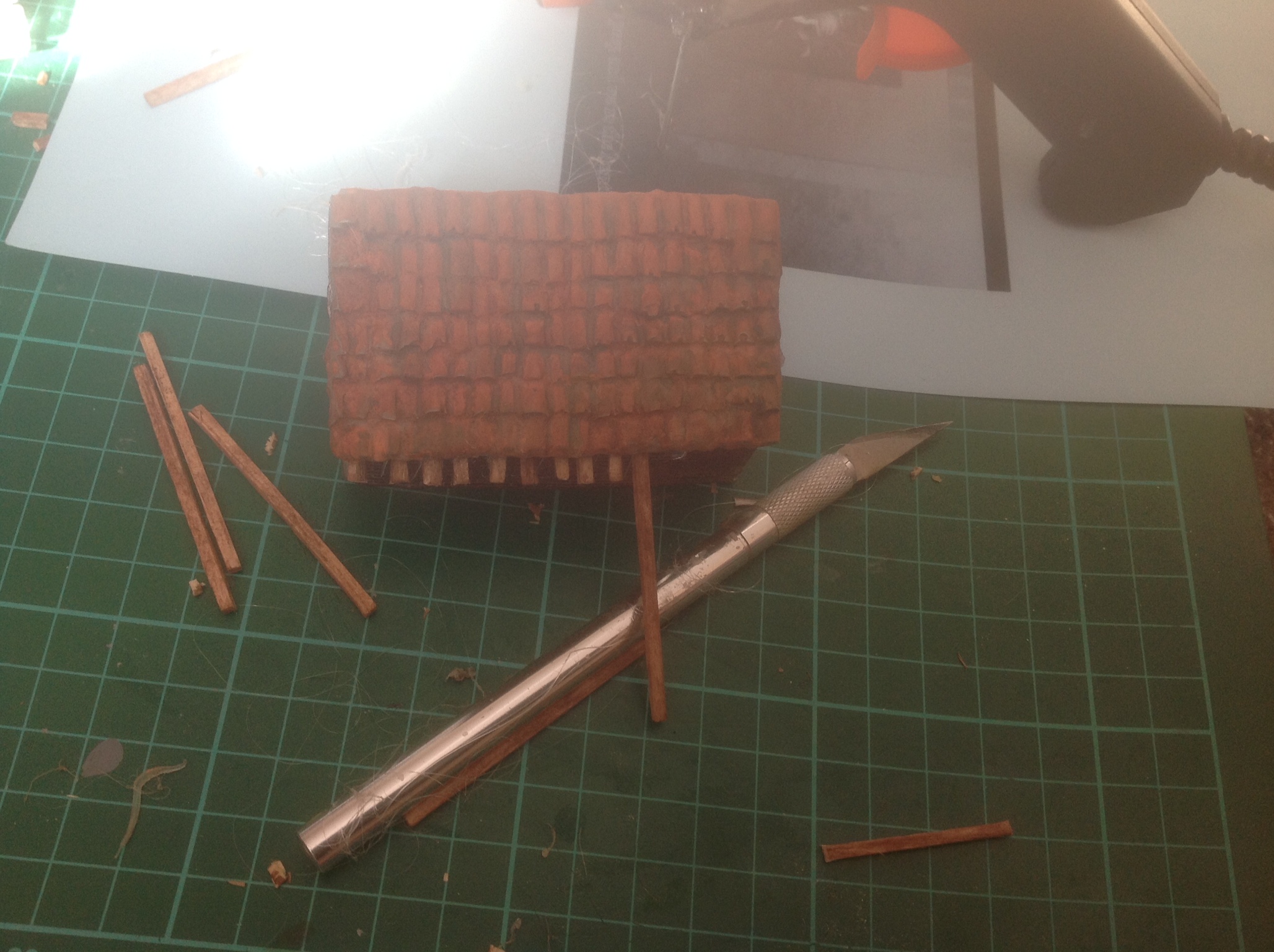
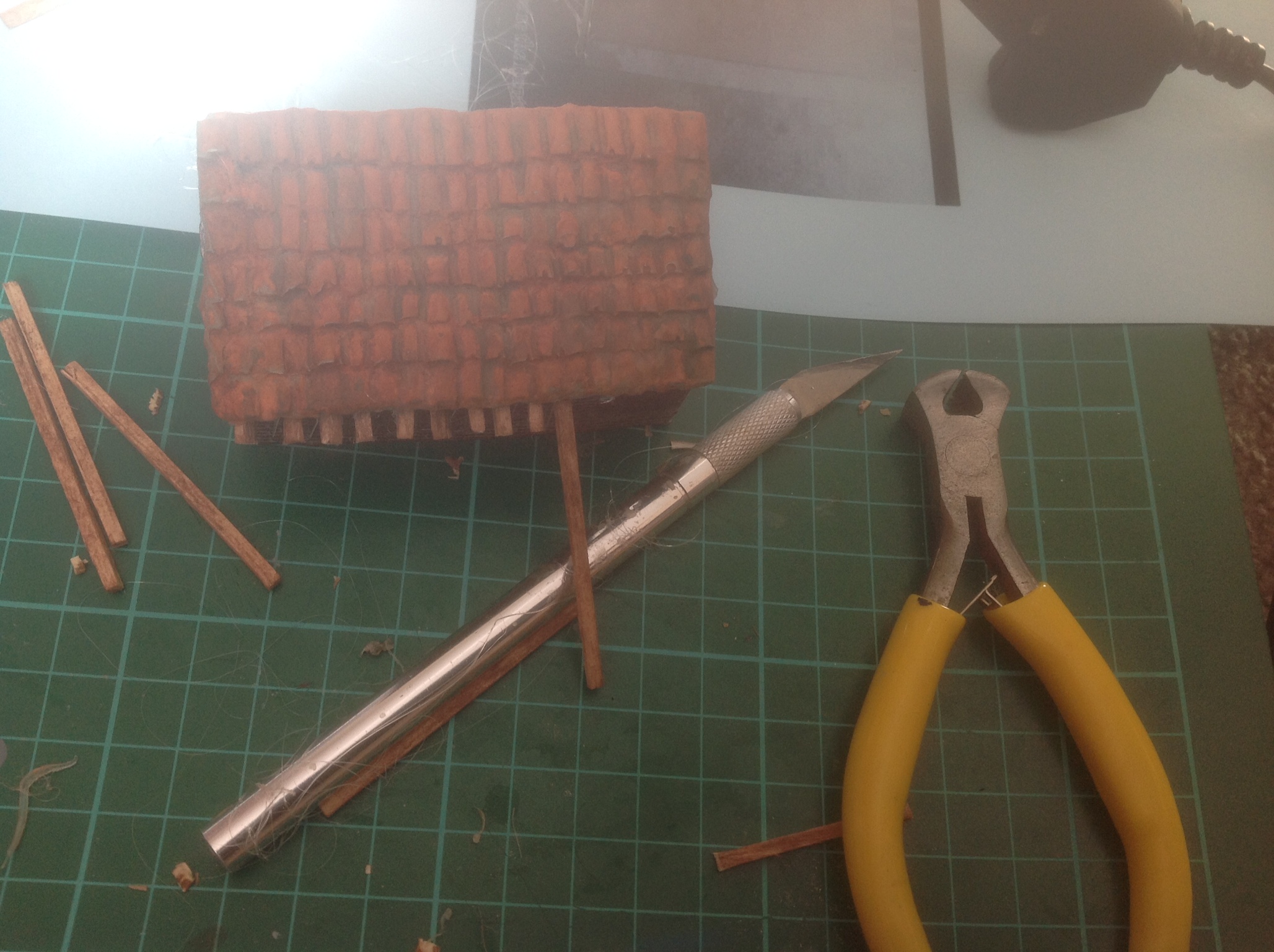
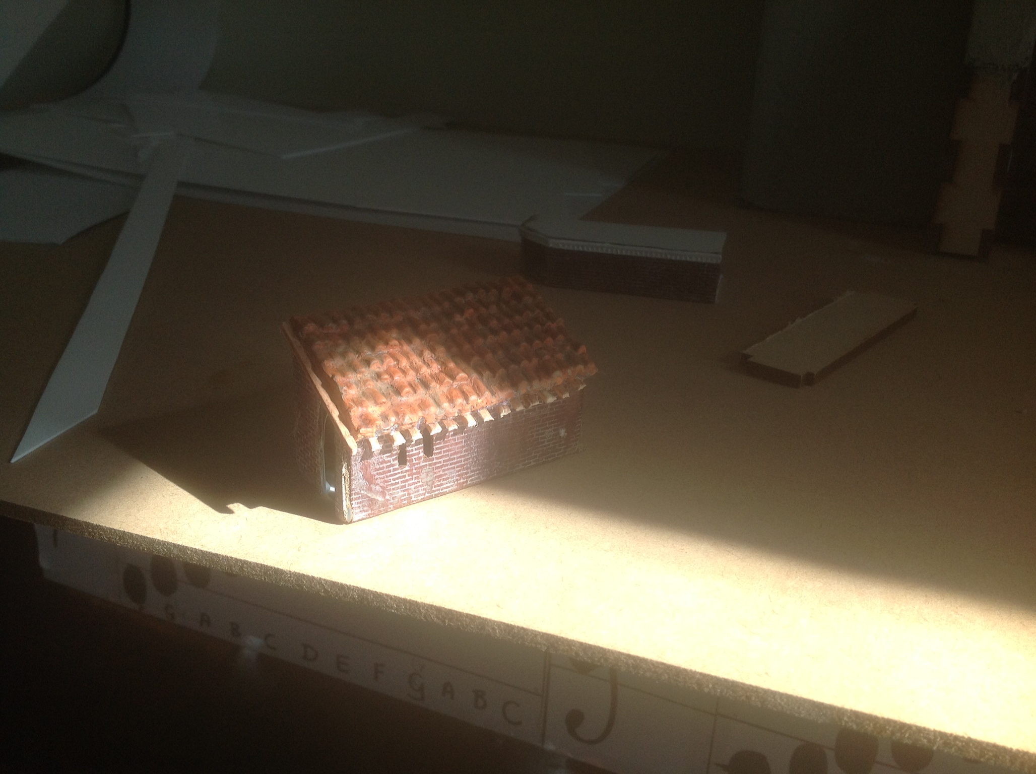
I went and bought cocktail straws to use as roofing tile substitutes. Which I realized I didnt actually need to do. But I'll put a picture in anyways on what 8 hours of gluing looks like. I used the pattern on the paper to try and keep them aligned. Was losing my mind once again by the end.
The straws are 4mm in diamter cut in half then to 7mm in length.
1/8th of an A4 sheet of paper took a LONG time.
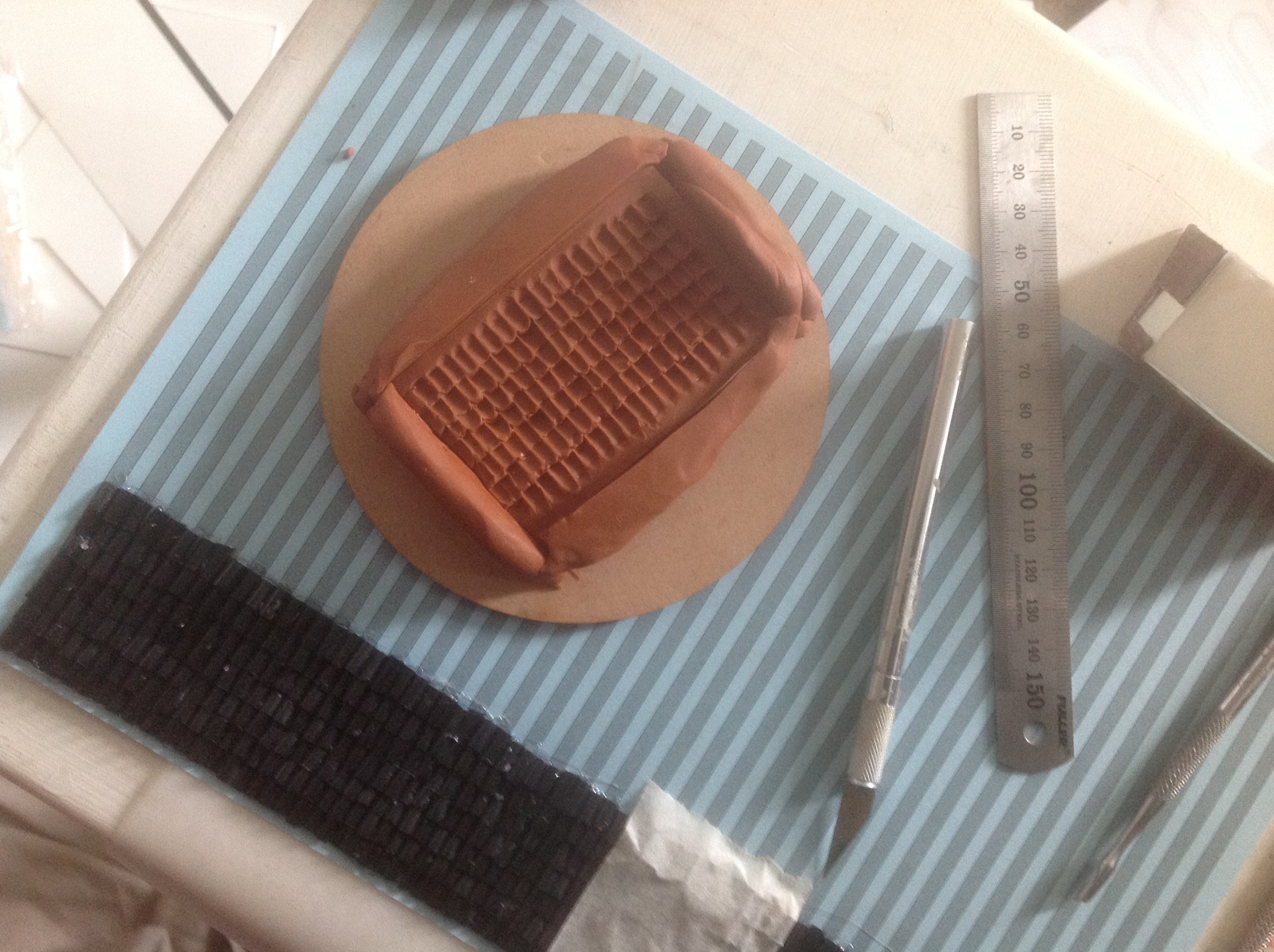
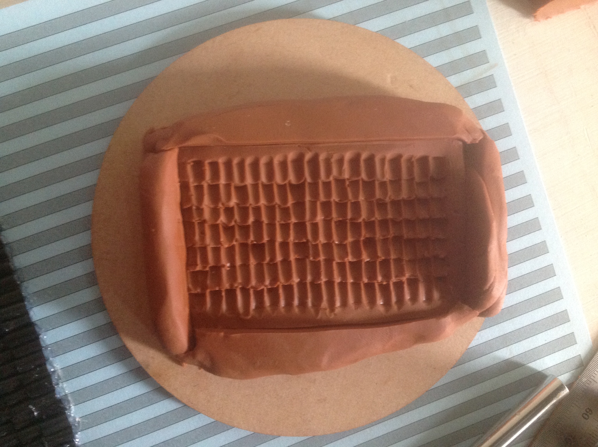
When it actually came time to making a mold/pour of the roofing tiles I found that I could just make impressions into clay and produced the same result with significantly less time.
Poured Resin into the mold and waited for it to harden, removed it, painted up with primer then started the painting/aging process.
I used match sticks for the wooden beams, I am not sure I am happy with the color but I still think they look nice.
Crown Molding
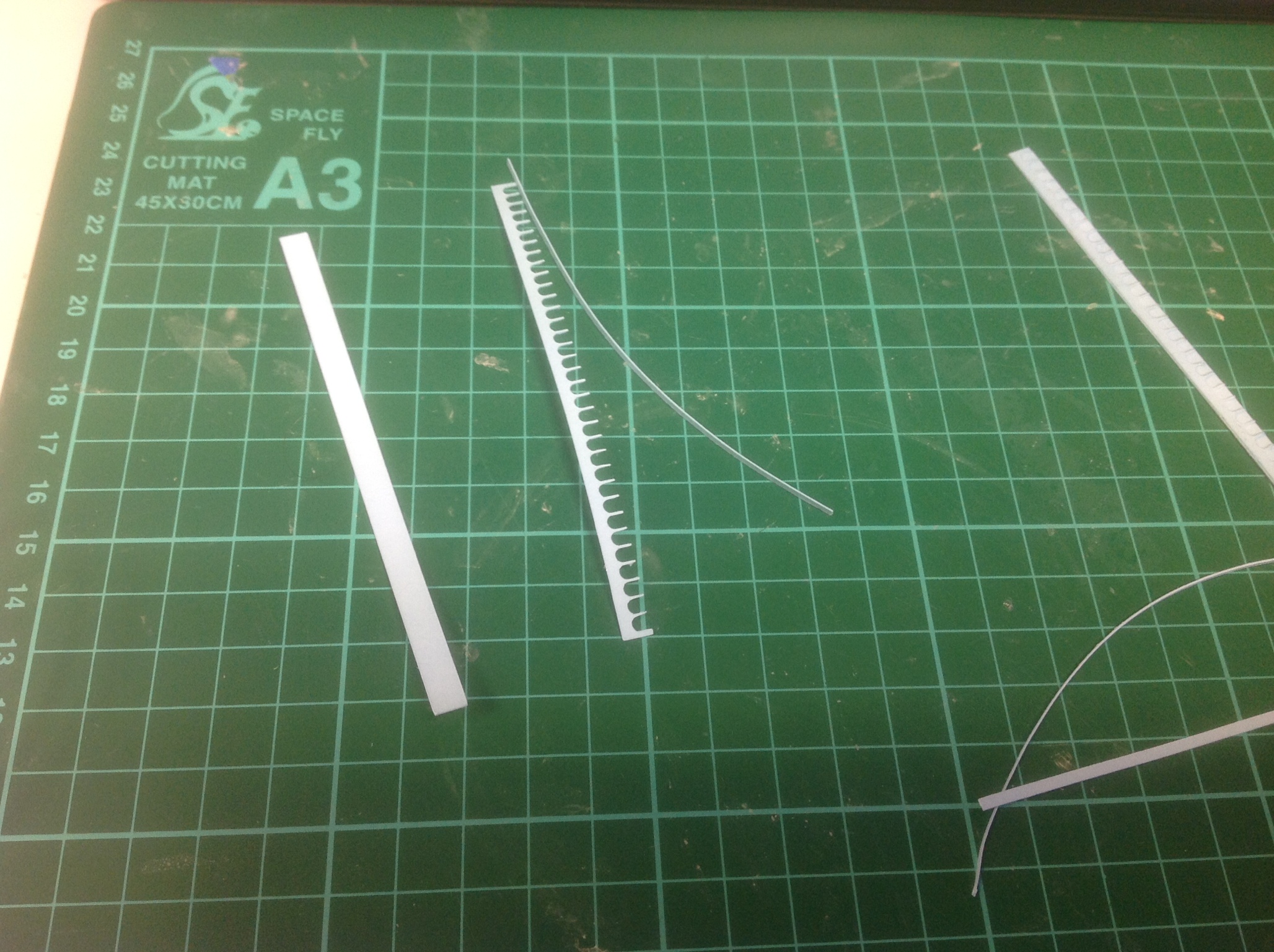
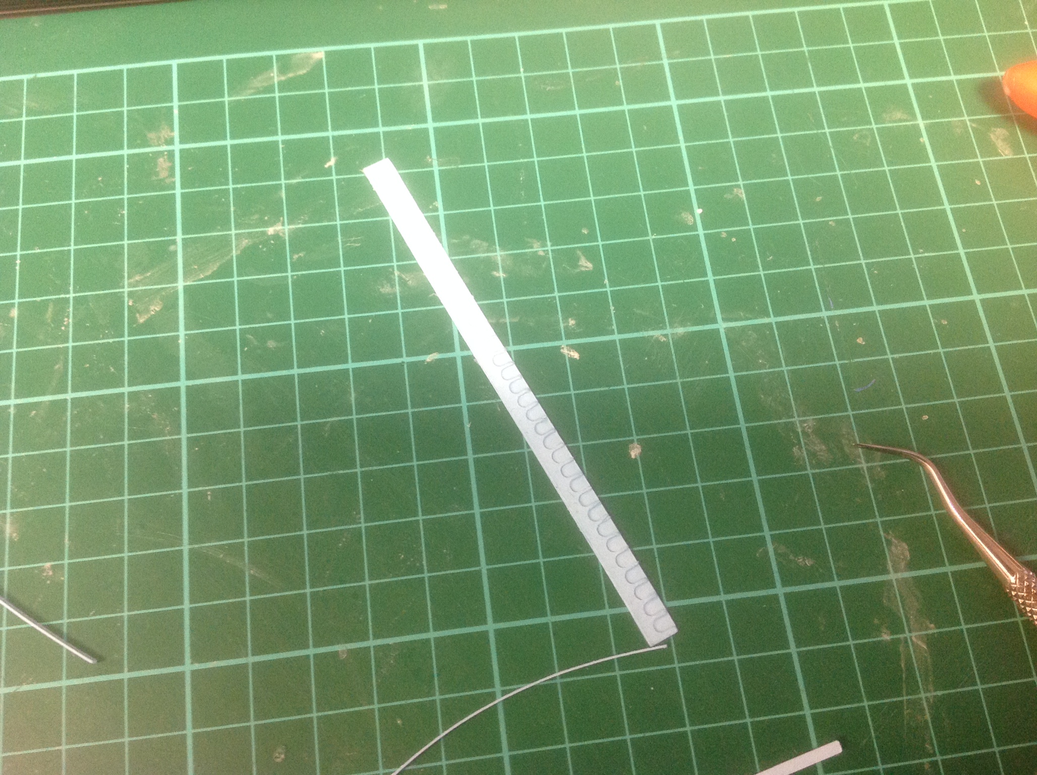
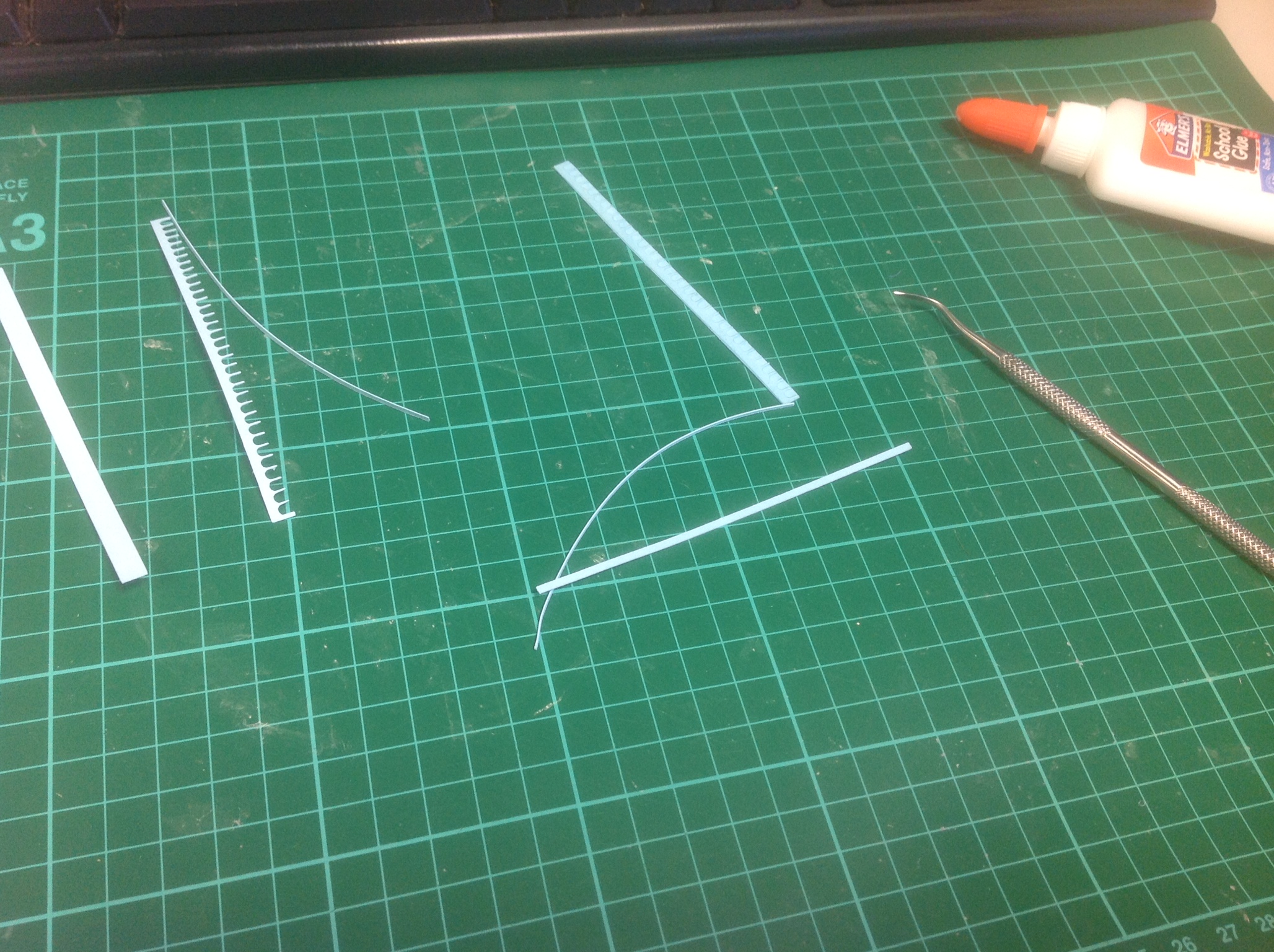
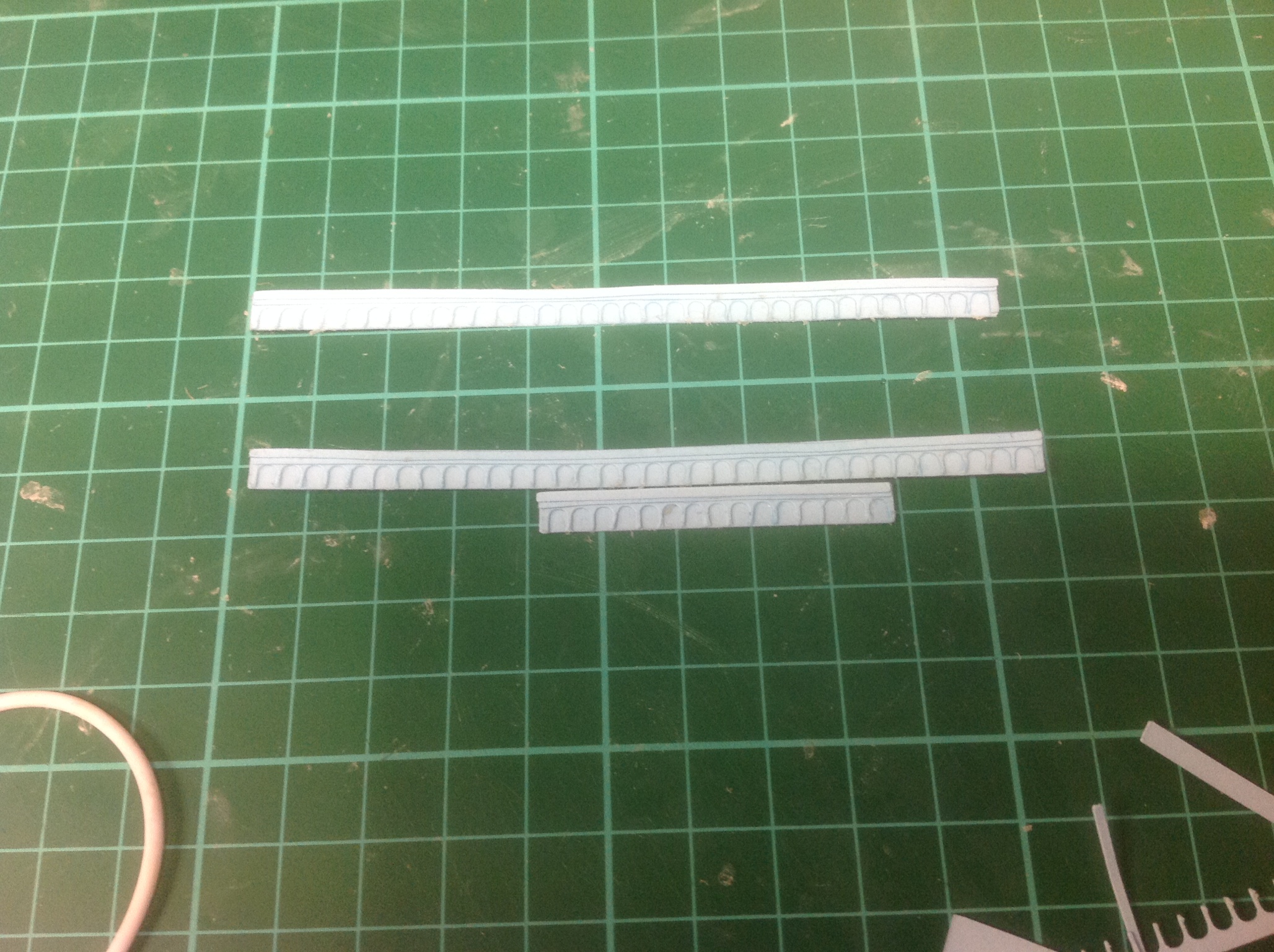
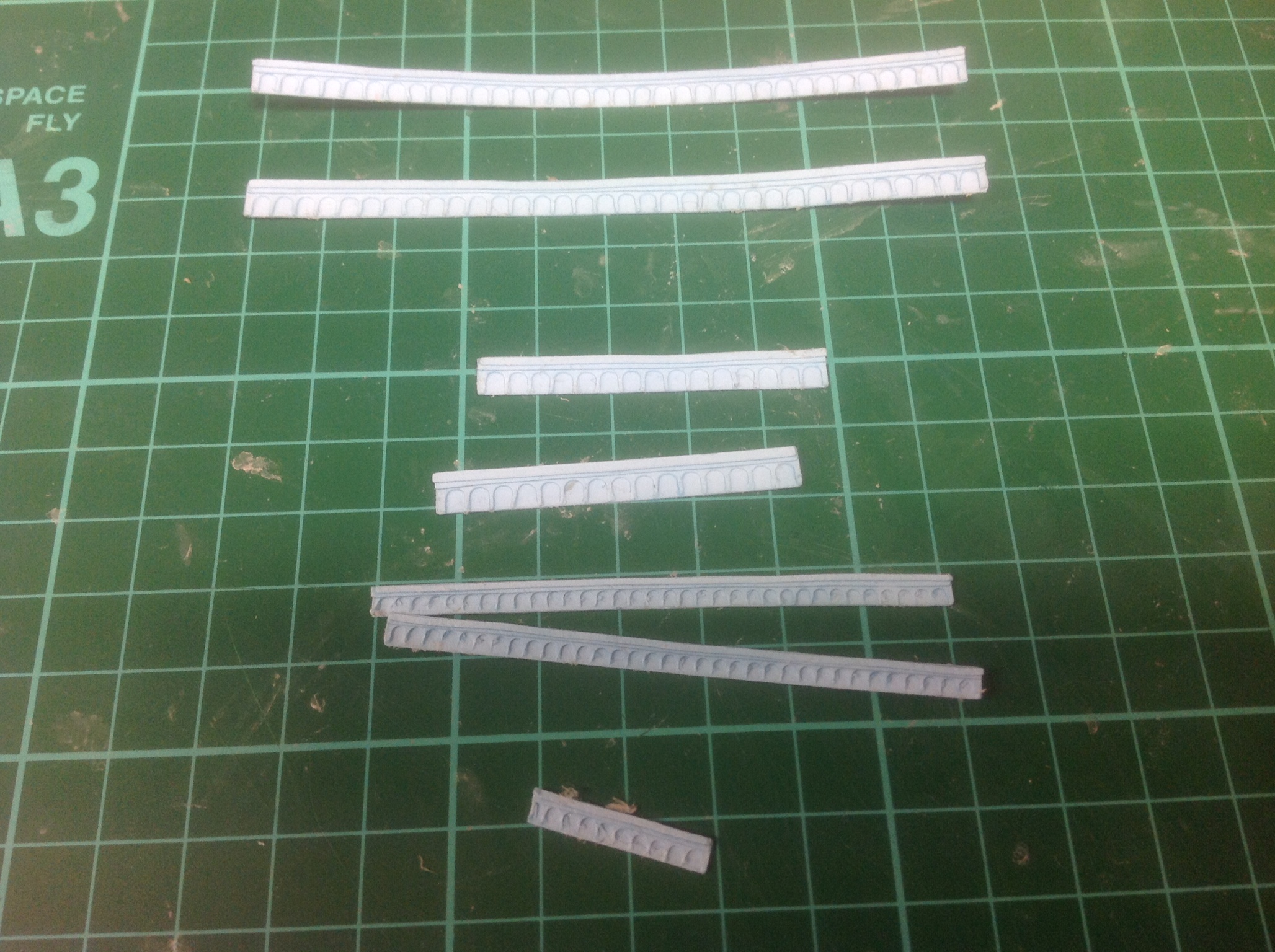
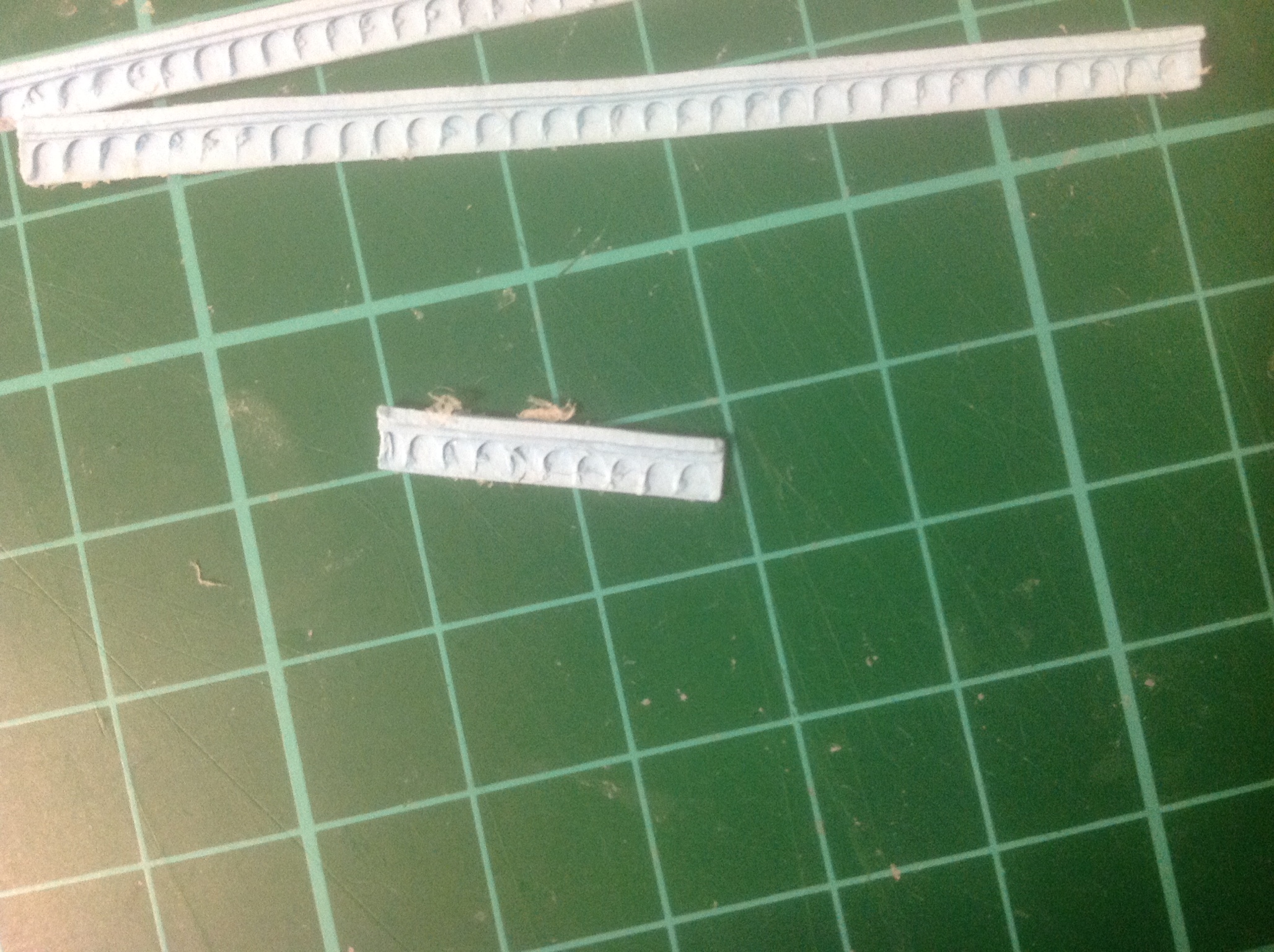
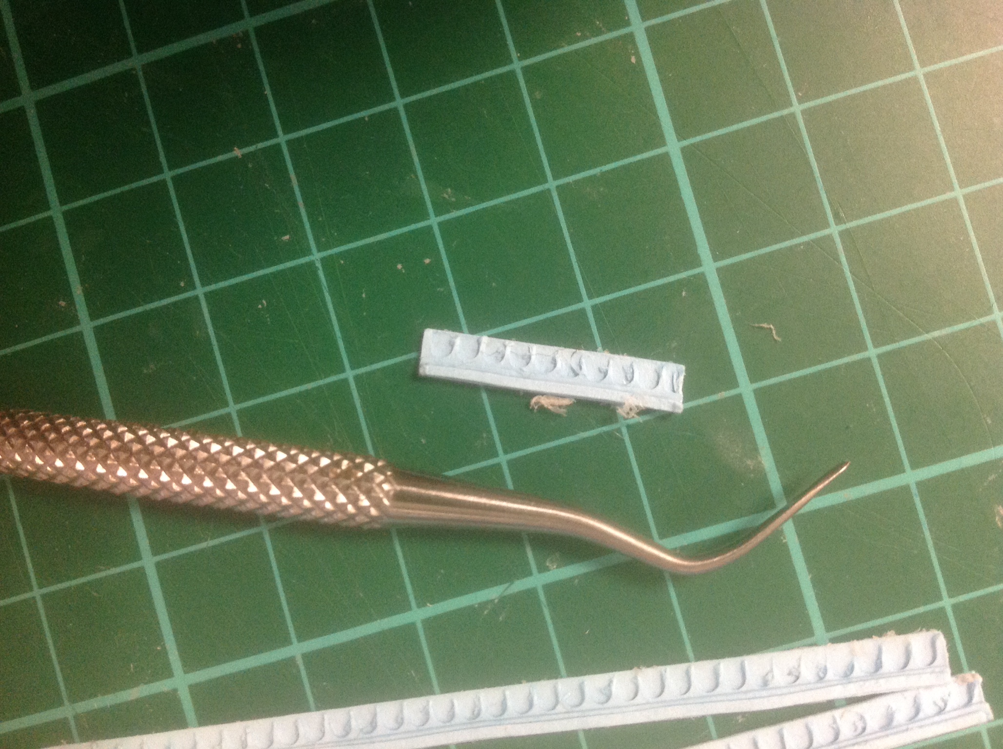
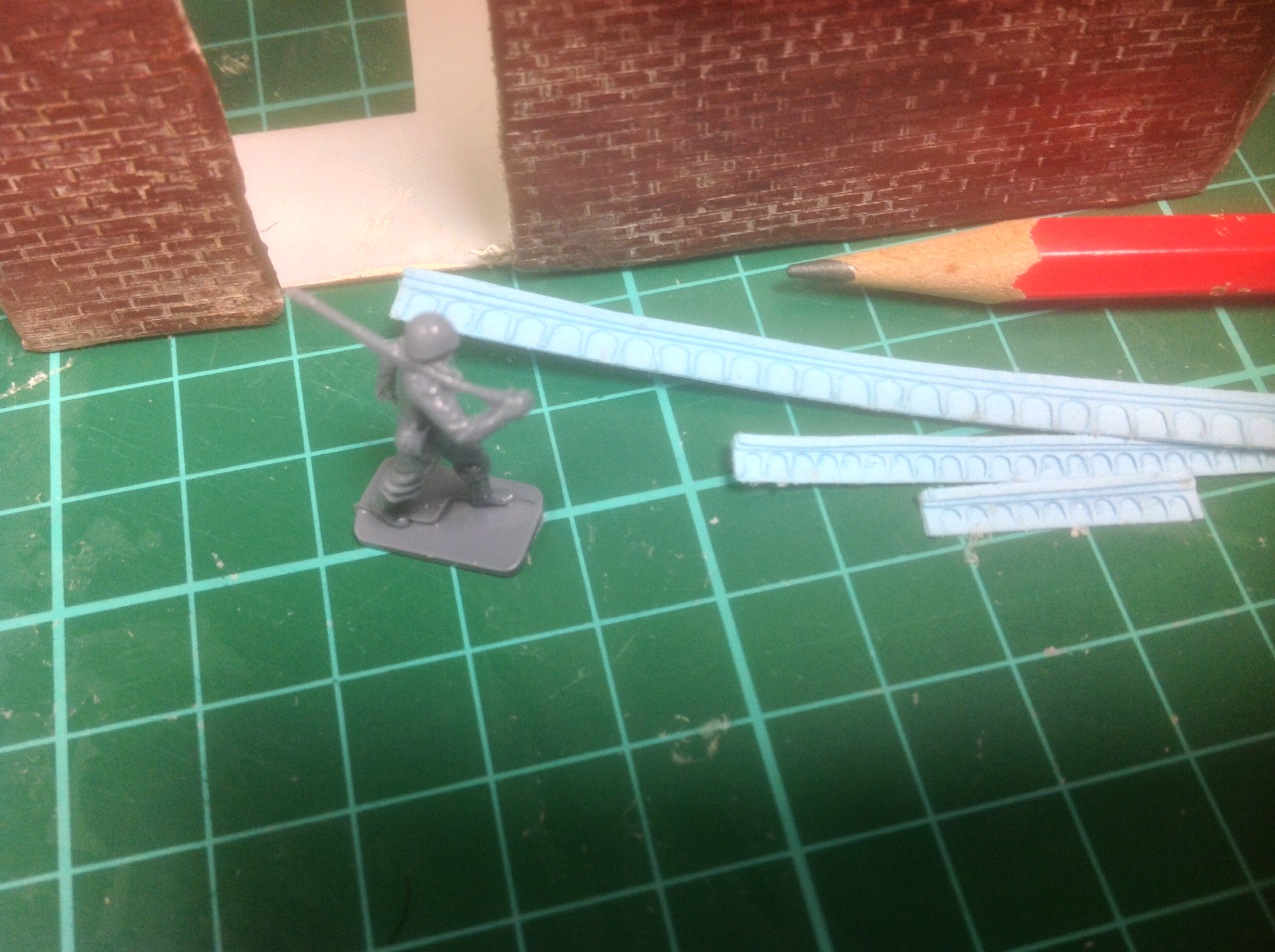
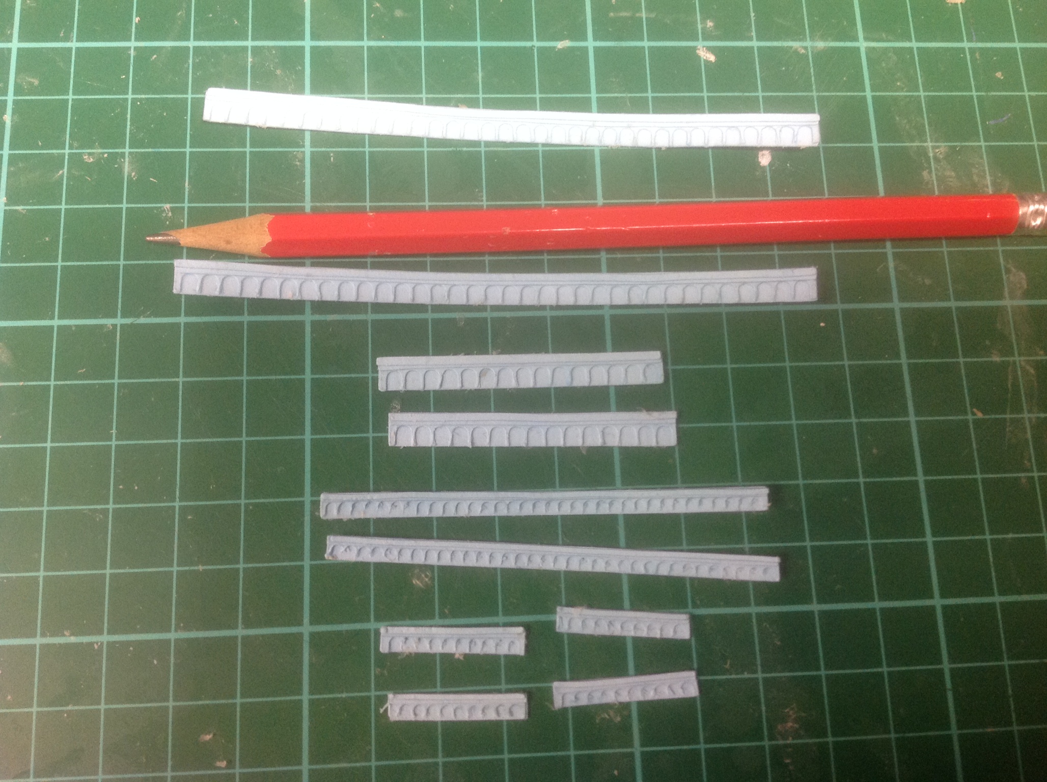
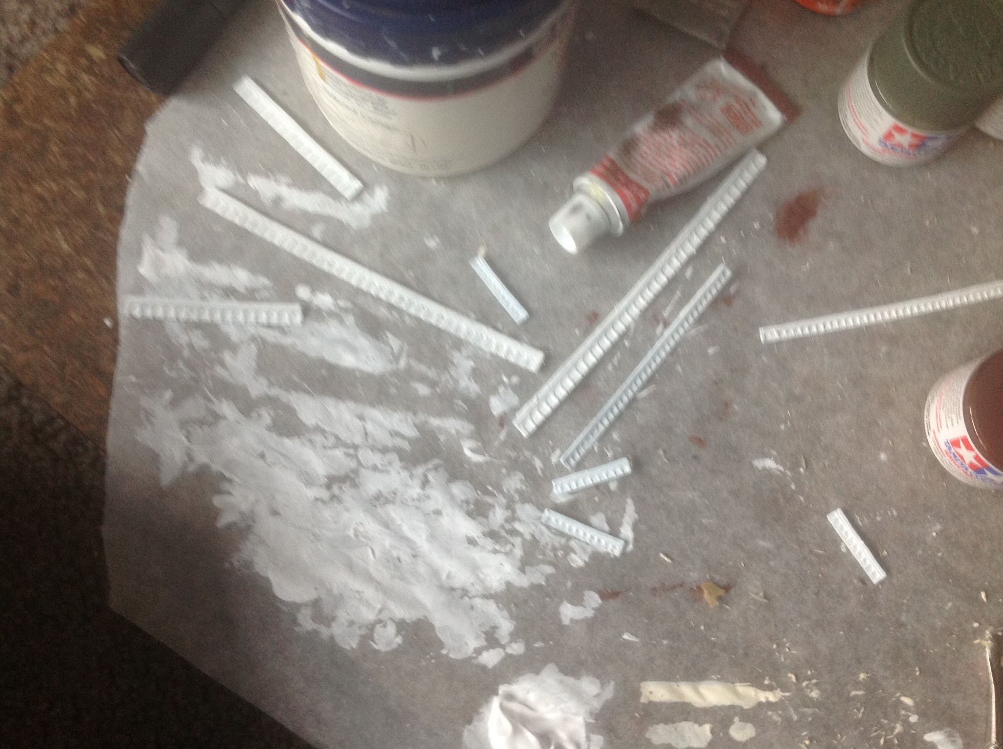
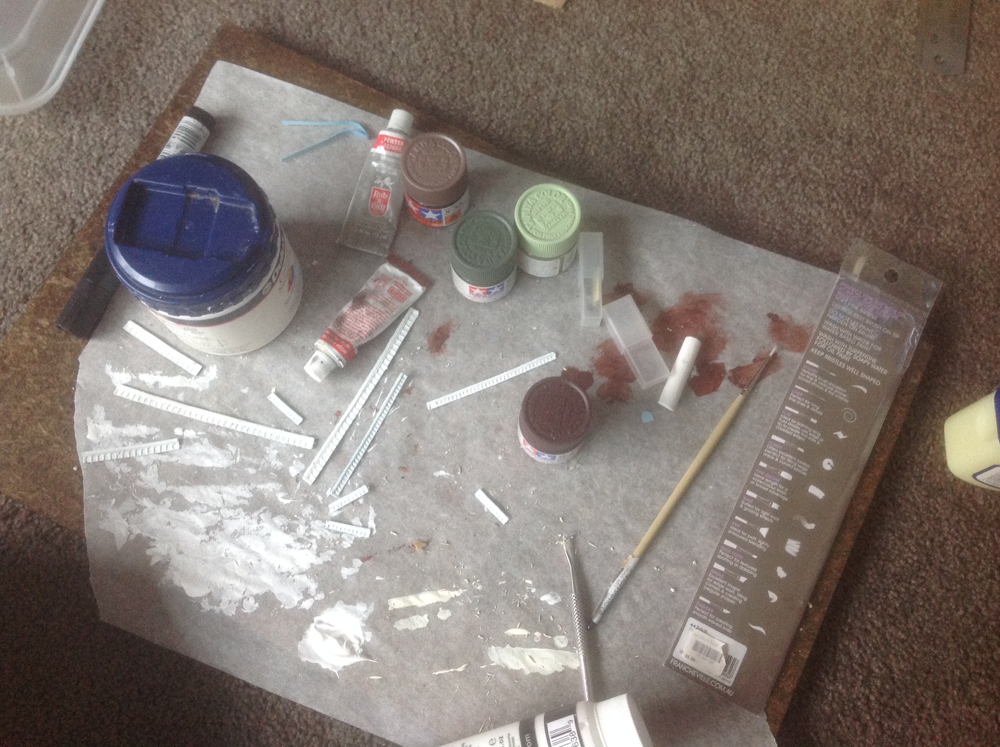
So I had to custom make the crown molding in Illustrator as well.
4 different layers to add detail and depth to each gatehouse. There were two different sizes of crown molding in this project.
This was impossibly small and difficult to cut out. Many different variations had to be tried before I found the best option.
I glued the layers of the Crown molding together then covered it with a layer of glue to try and keep the layers together and create a skin.
Then just covered with white paint and attached to the buildings on which they belong.
Assorted Parts
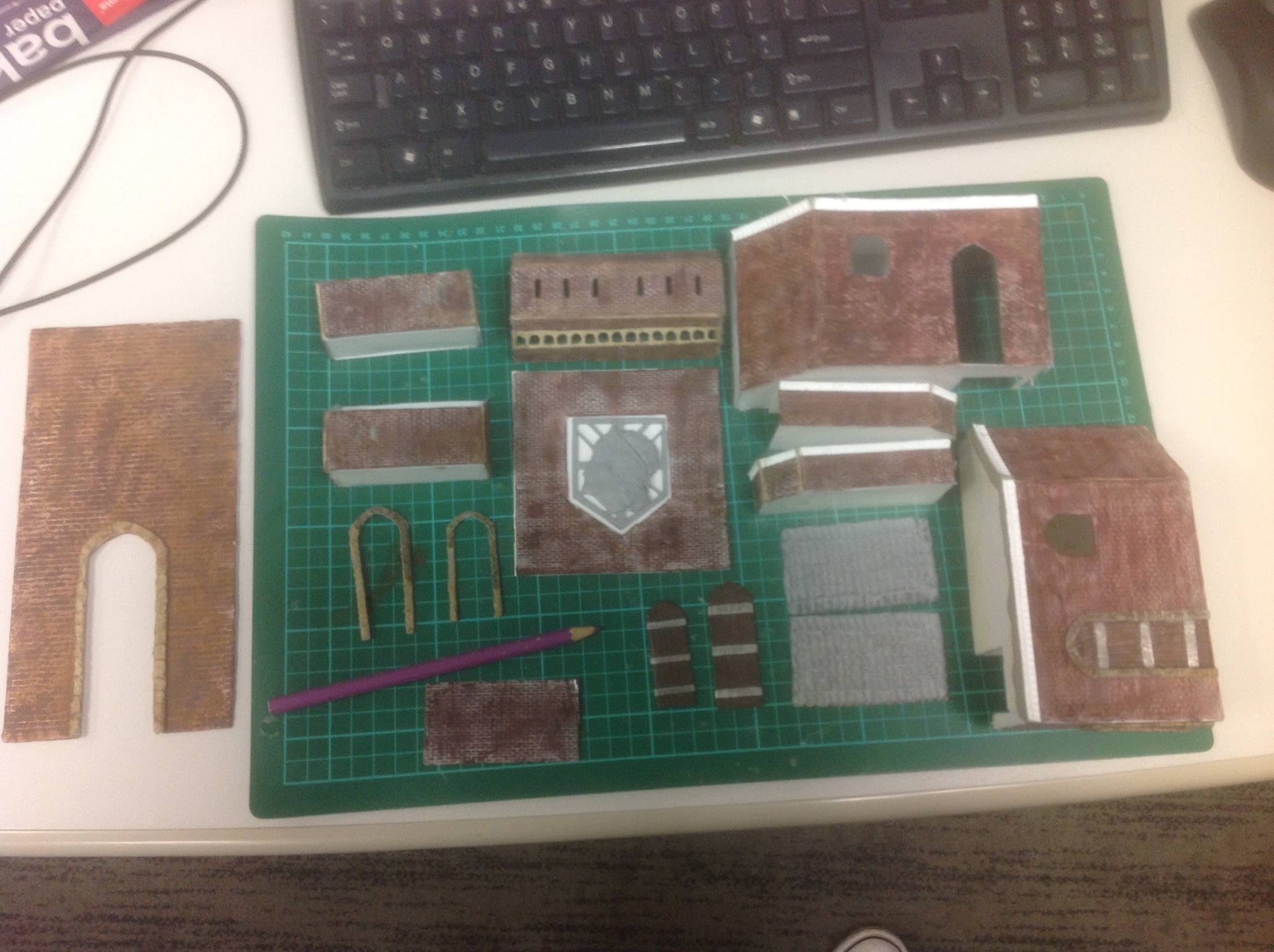
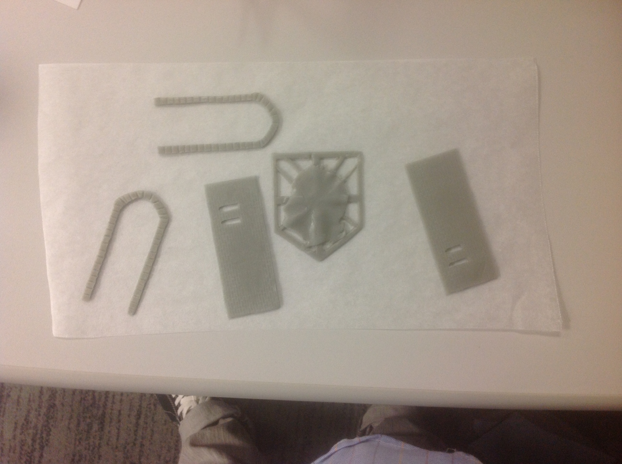
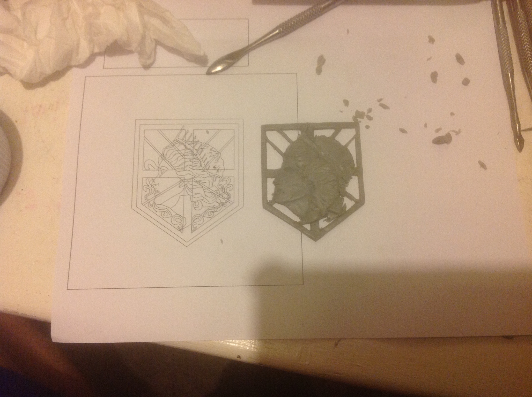
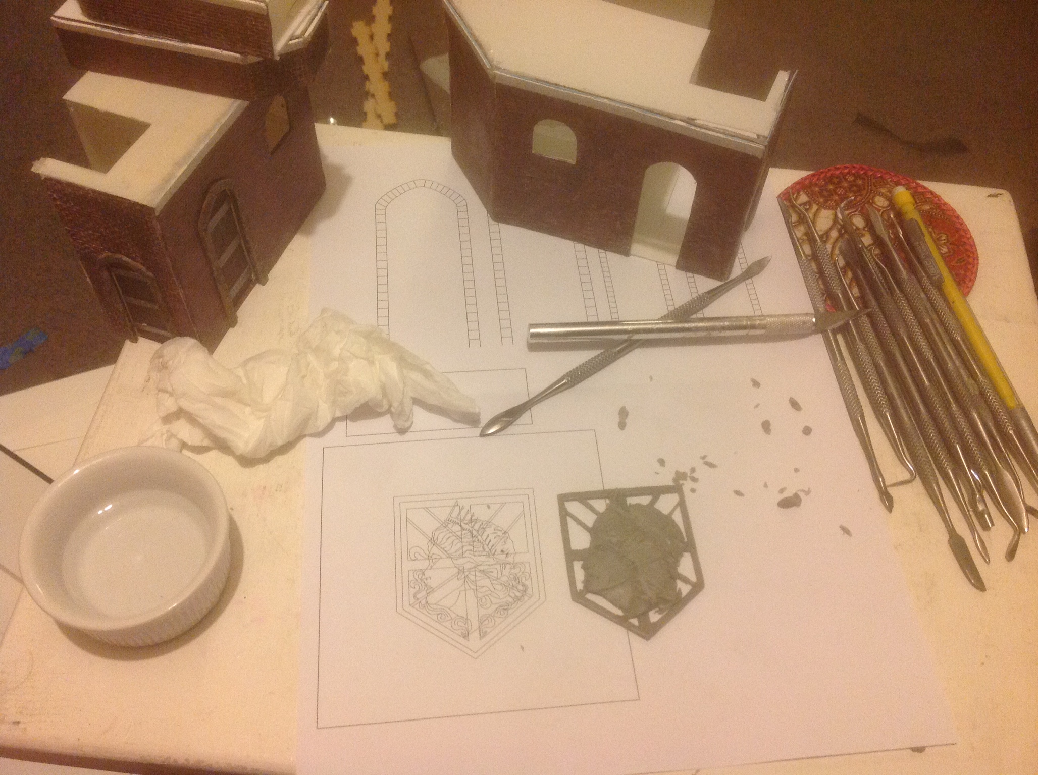
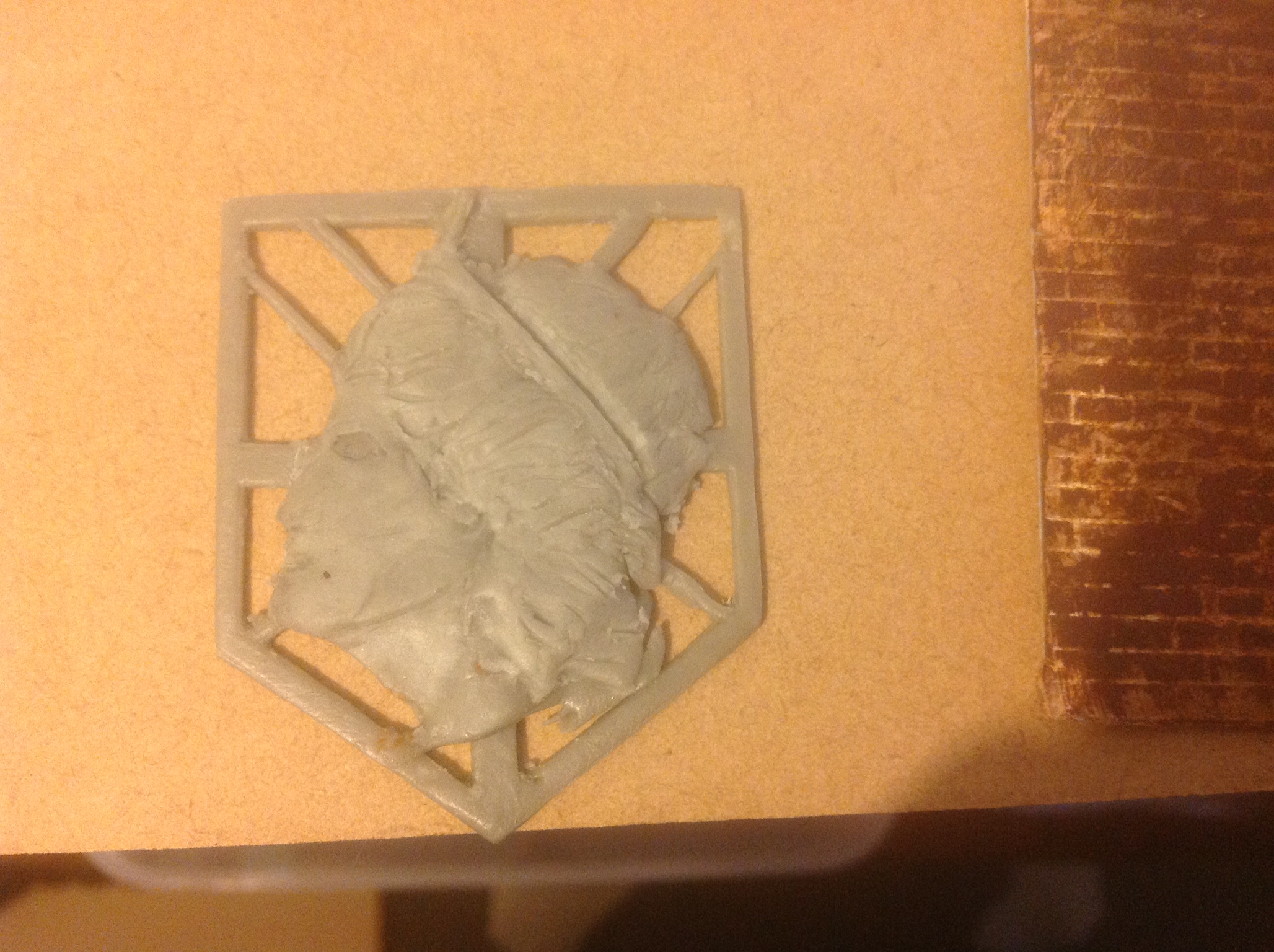
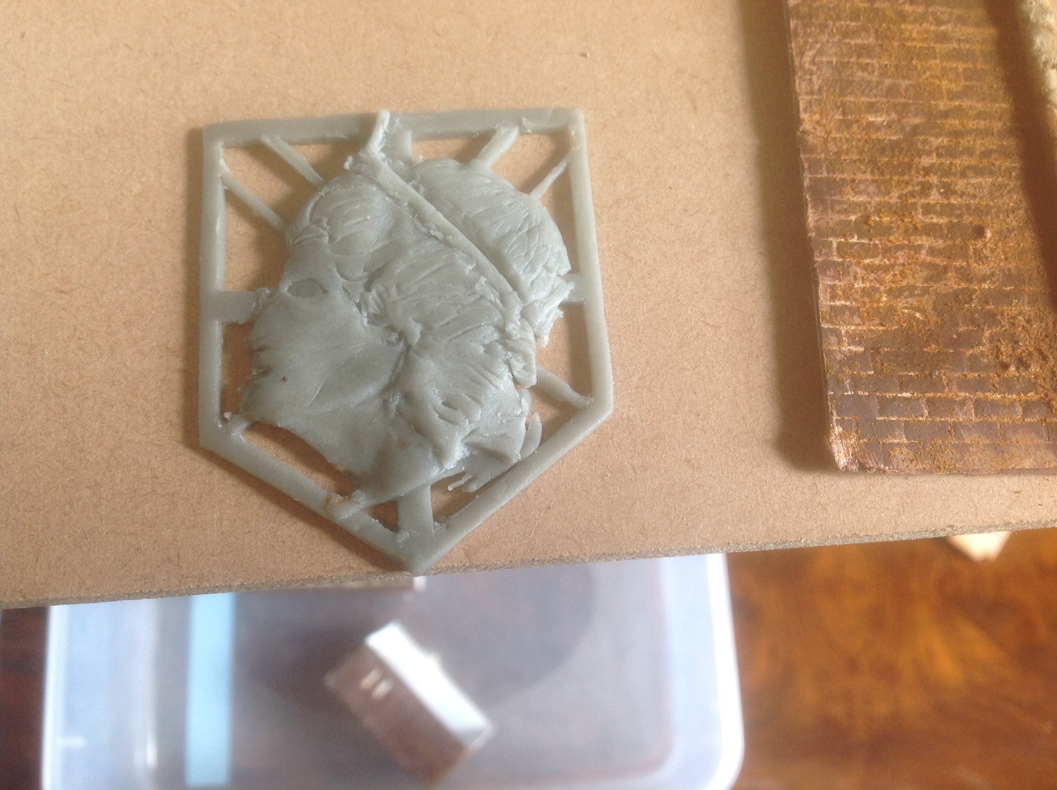
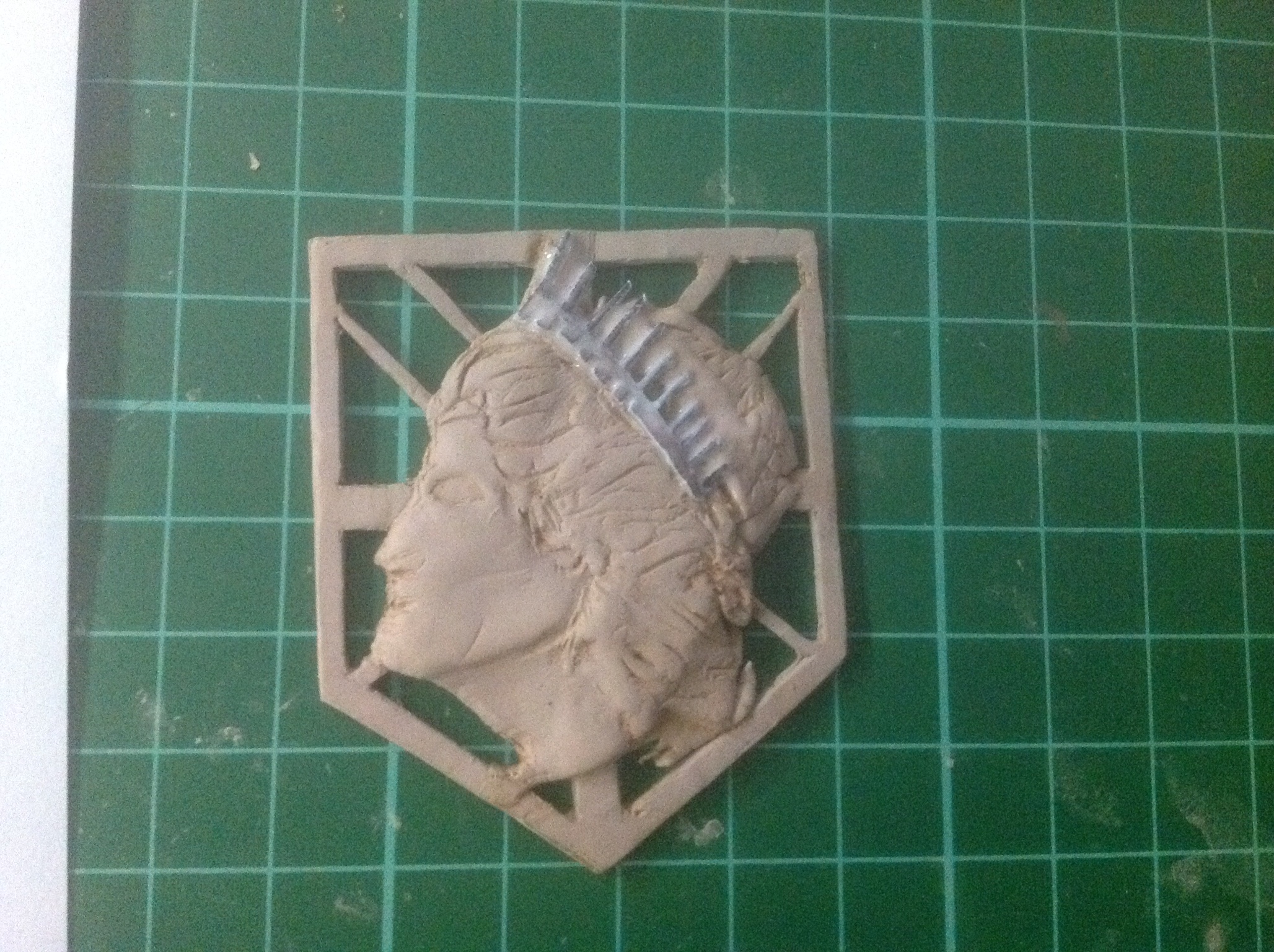
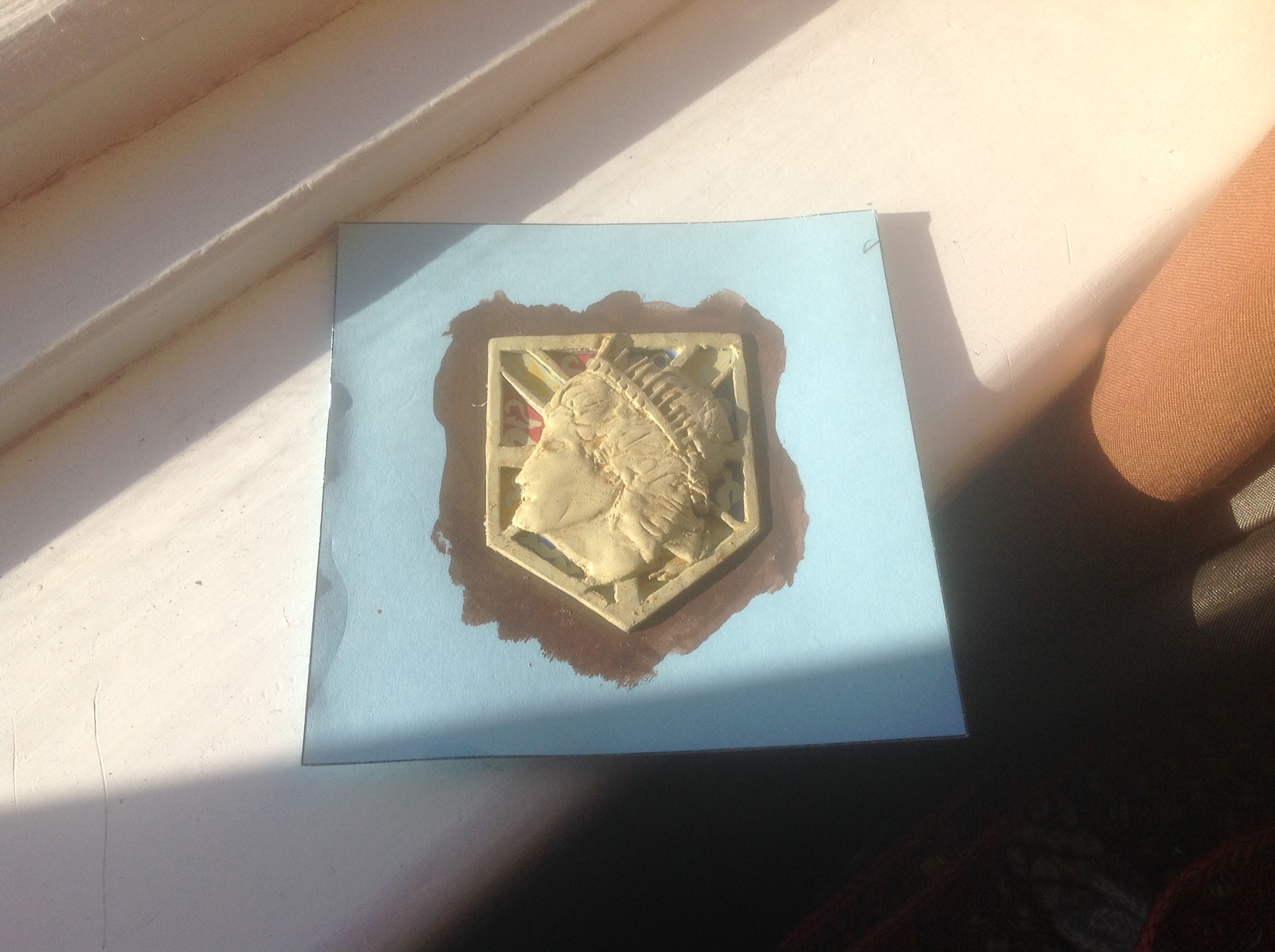
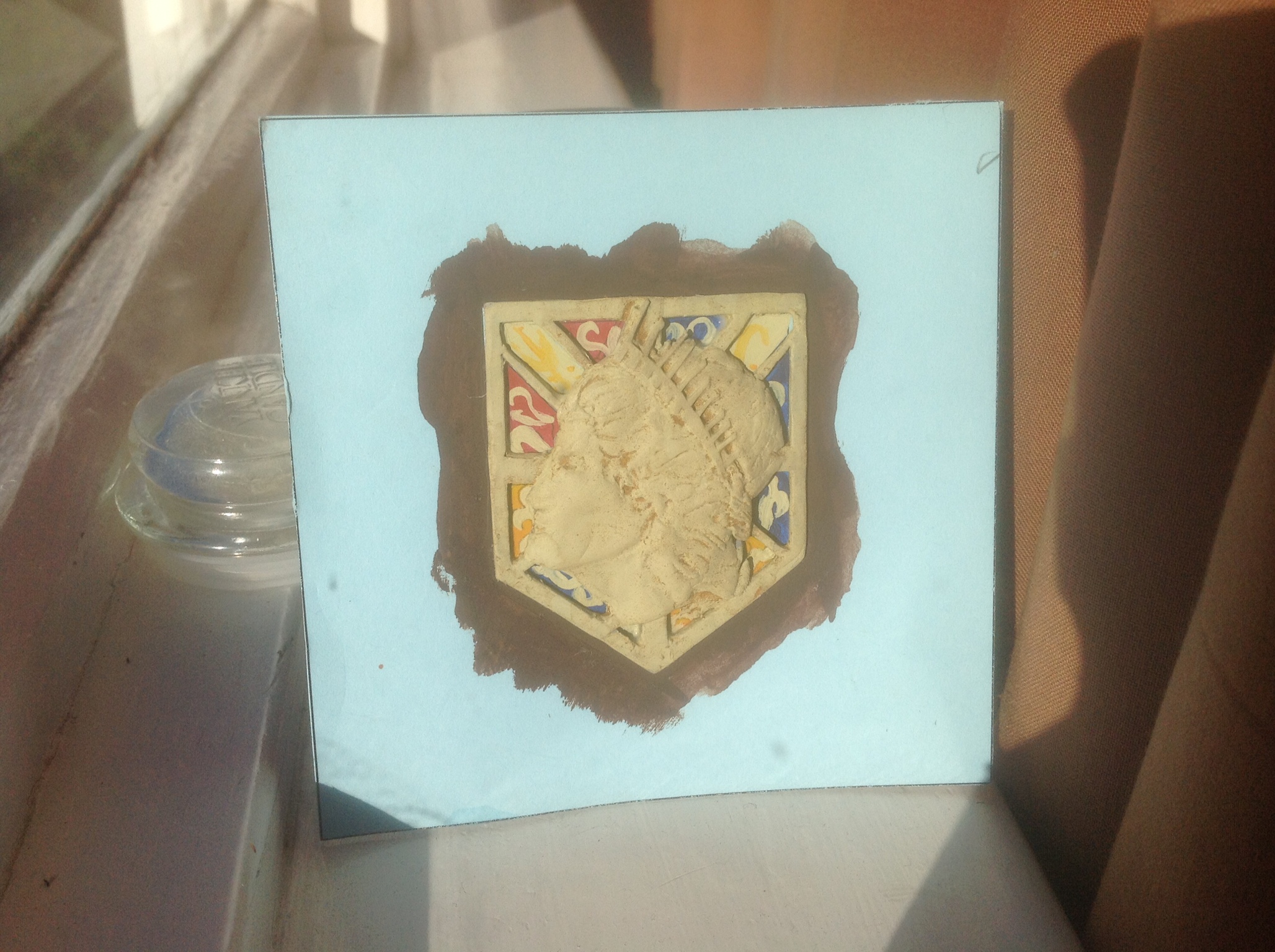
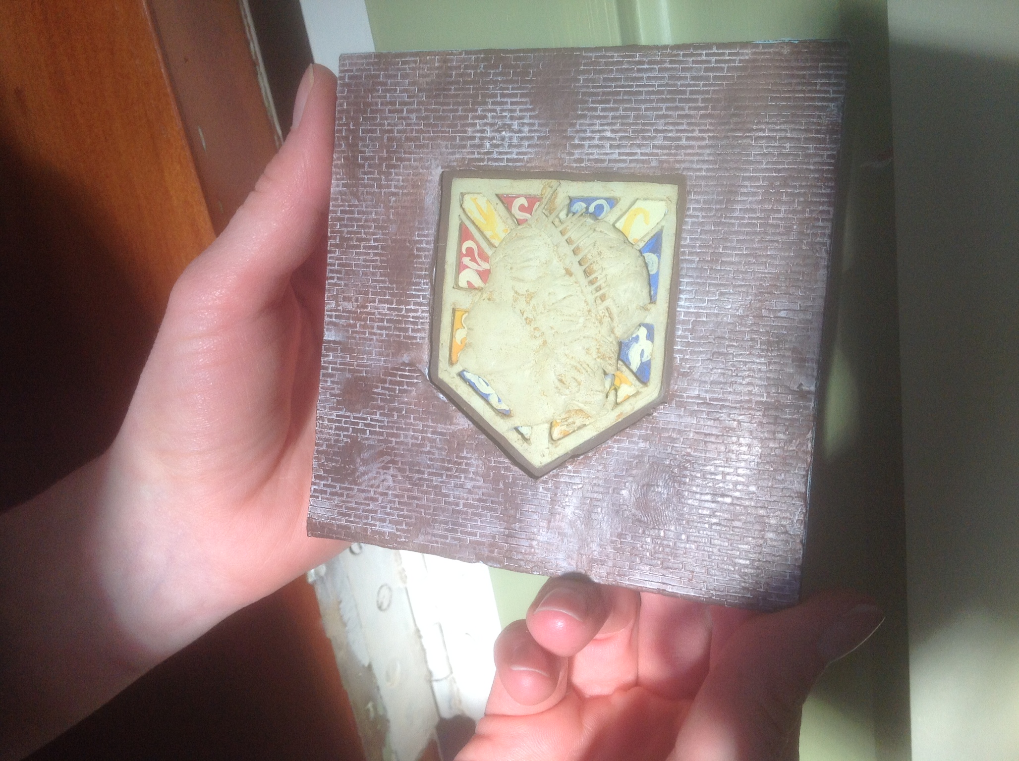
So as you can imagine the difficult part was NOT the main wall sections.
That was very simple and straight forward.
The intricate details on theses extra pieces definitely gave me some practice working with miniatures. Much to my surprise I never had to use a tweezer.
Each door was made with its own unique dents and scratches and knot marks.
The Wall Maria logo I started with a very basic foundation then added detail to it small section by section. This is the first time I had sculpted something like that and I am Happy with the way it turned out.
Same Turmeric/Coffee/Cinnamon aging technique. Used a weird green gray as a base coat for the Maria logo.
Beta Version Photo Shoot!
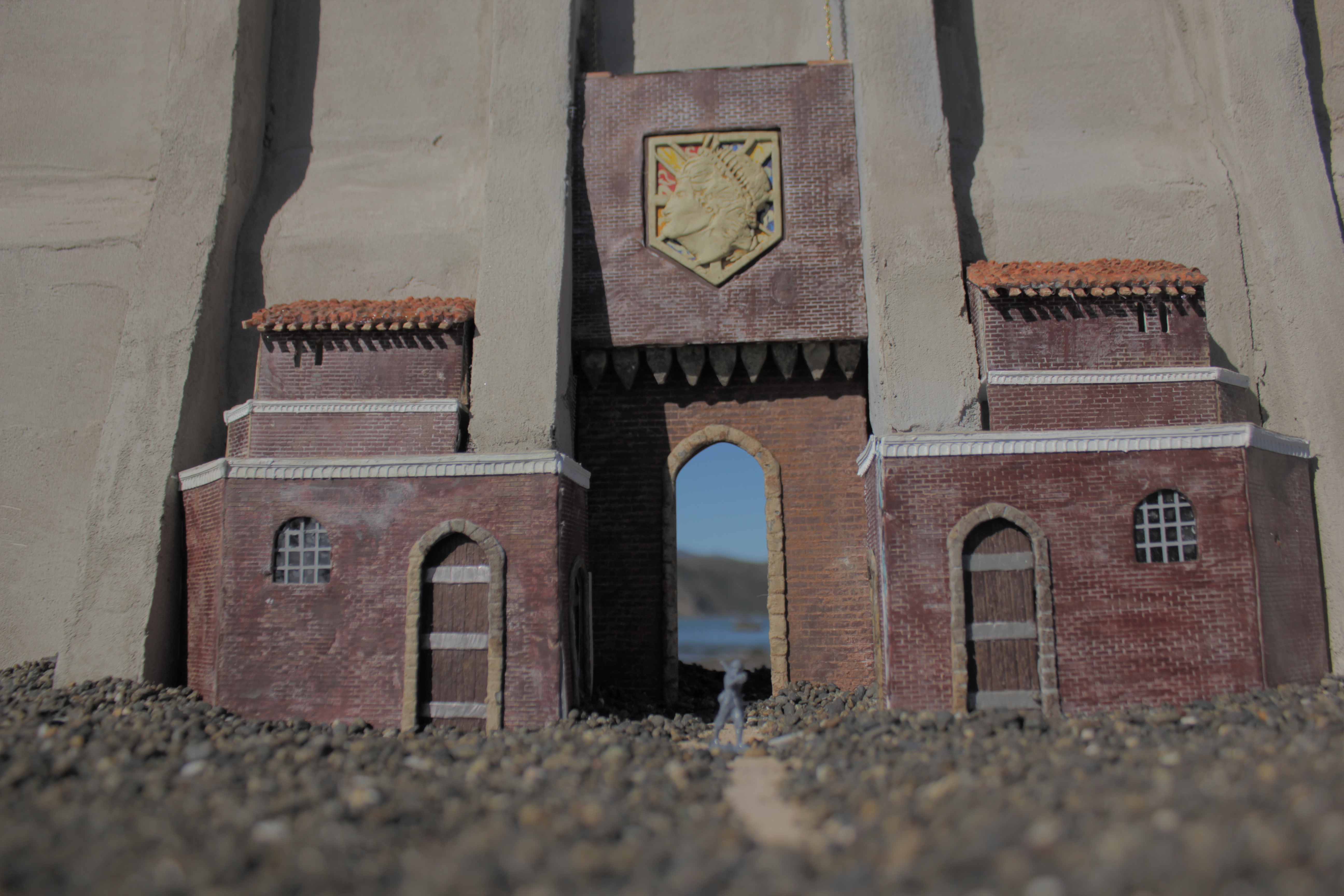
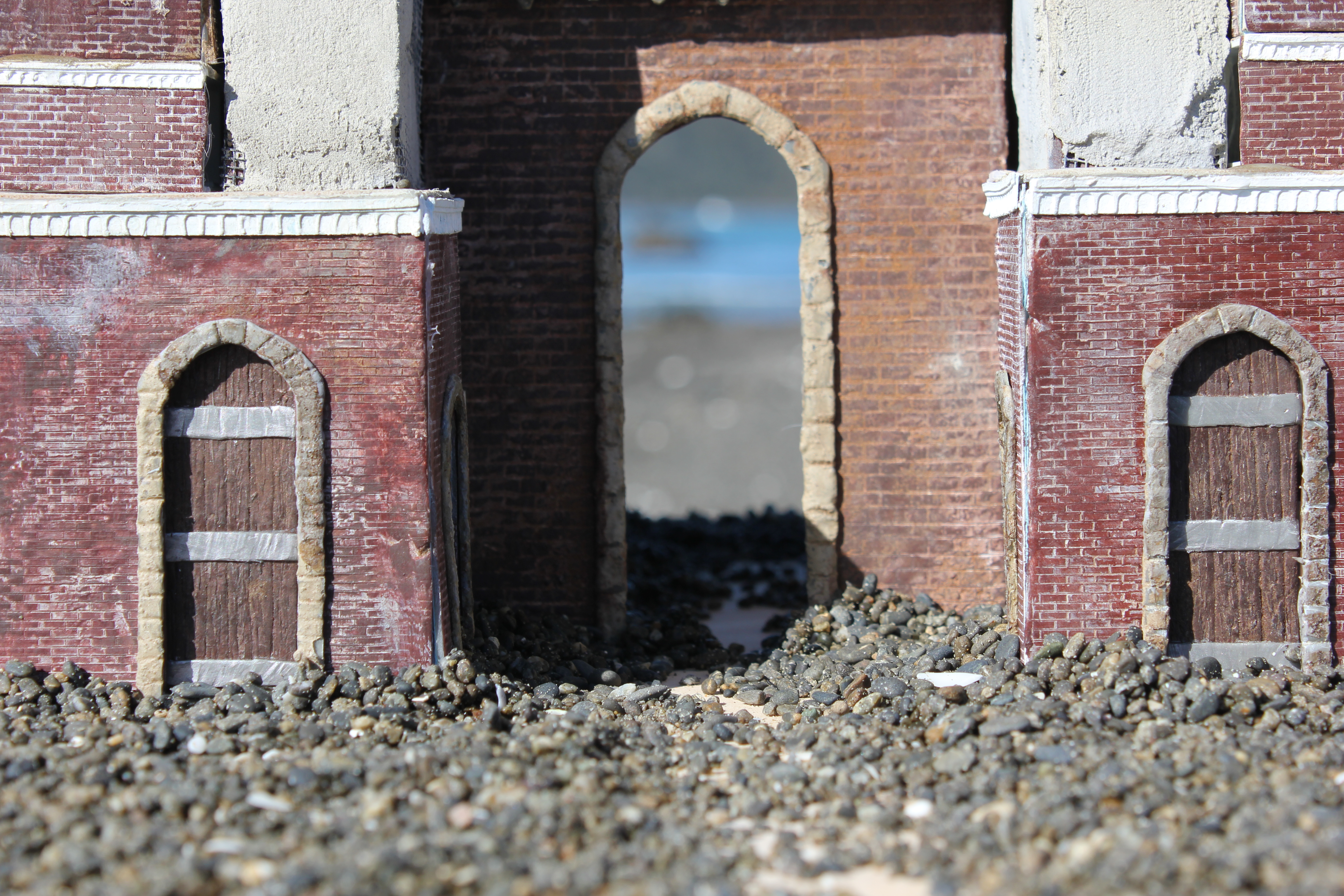
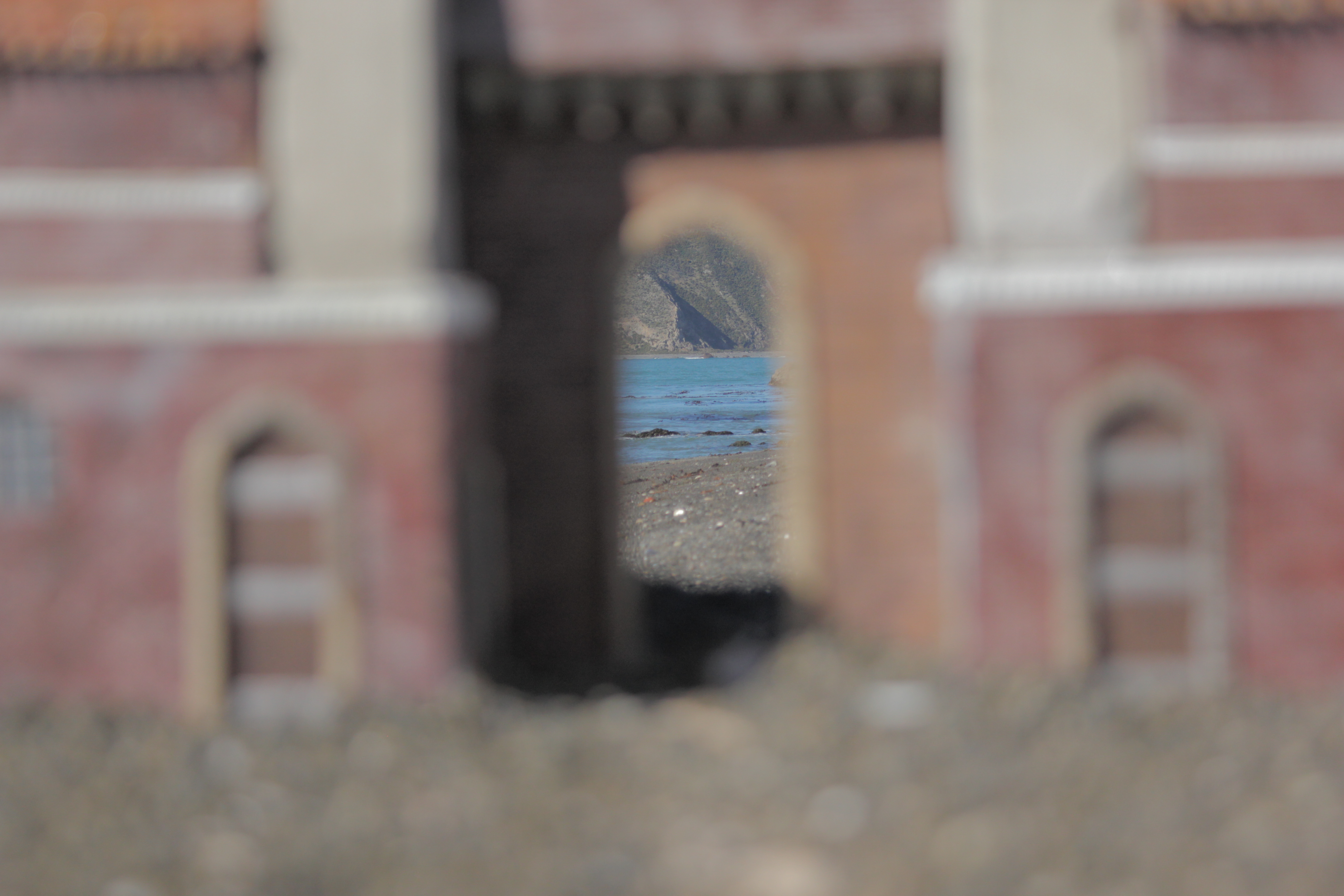
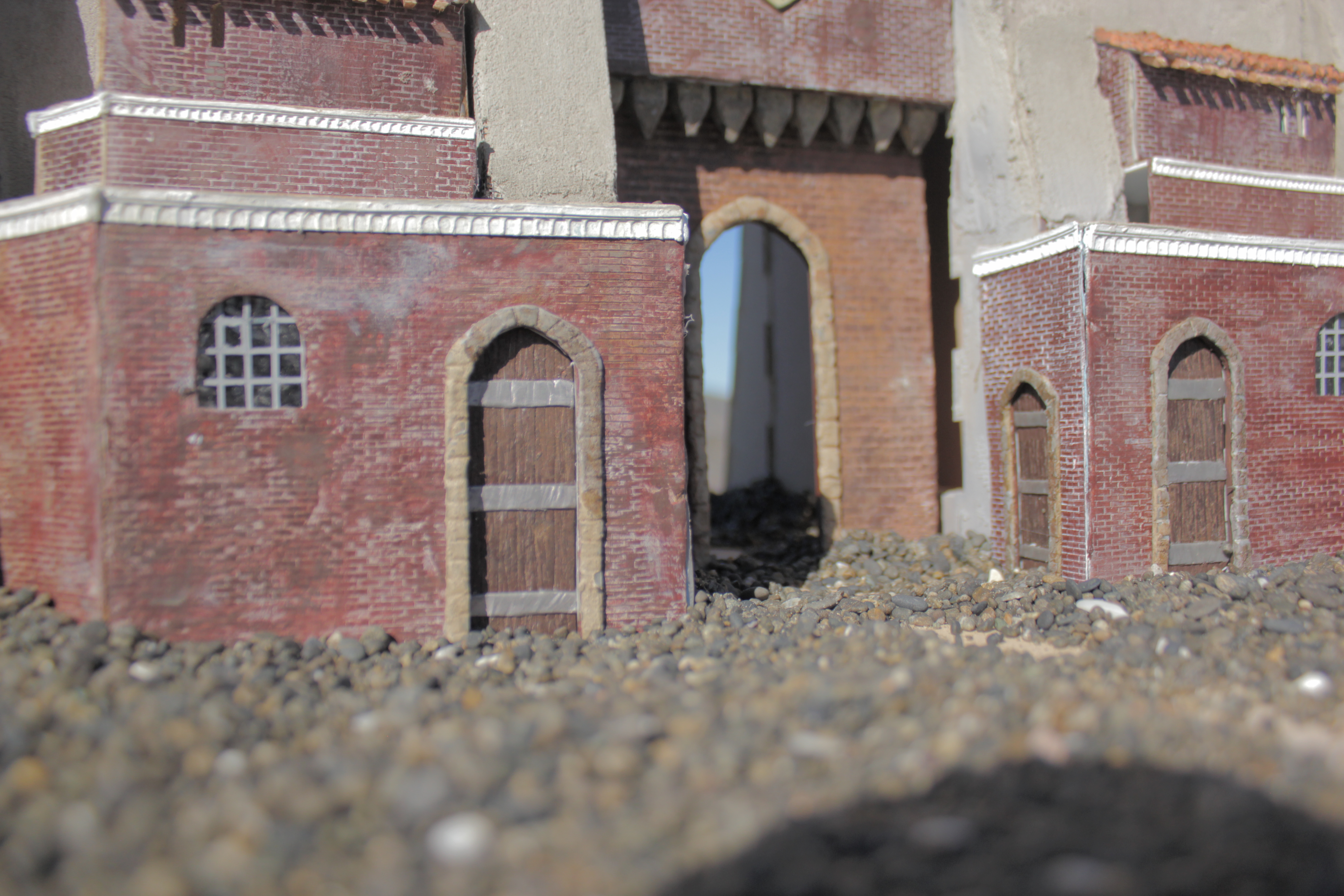
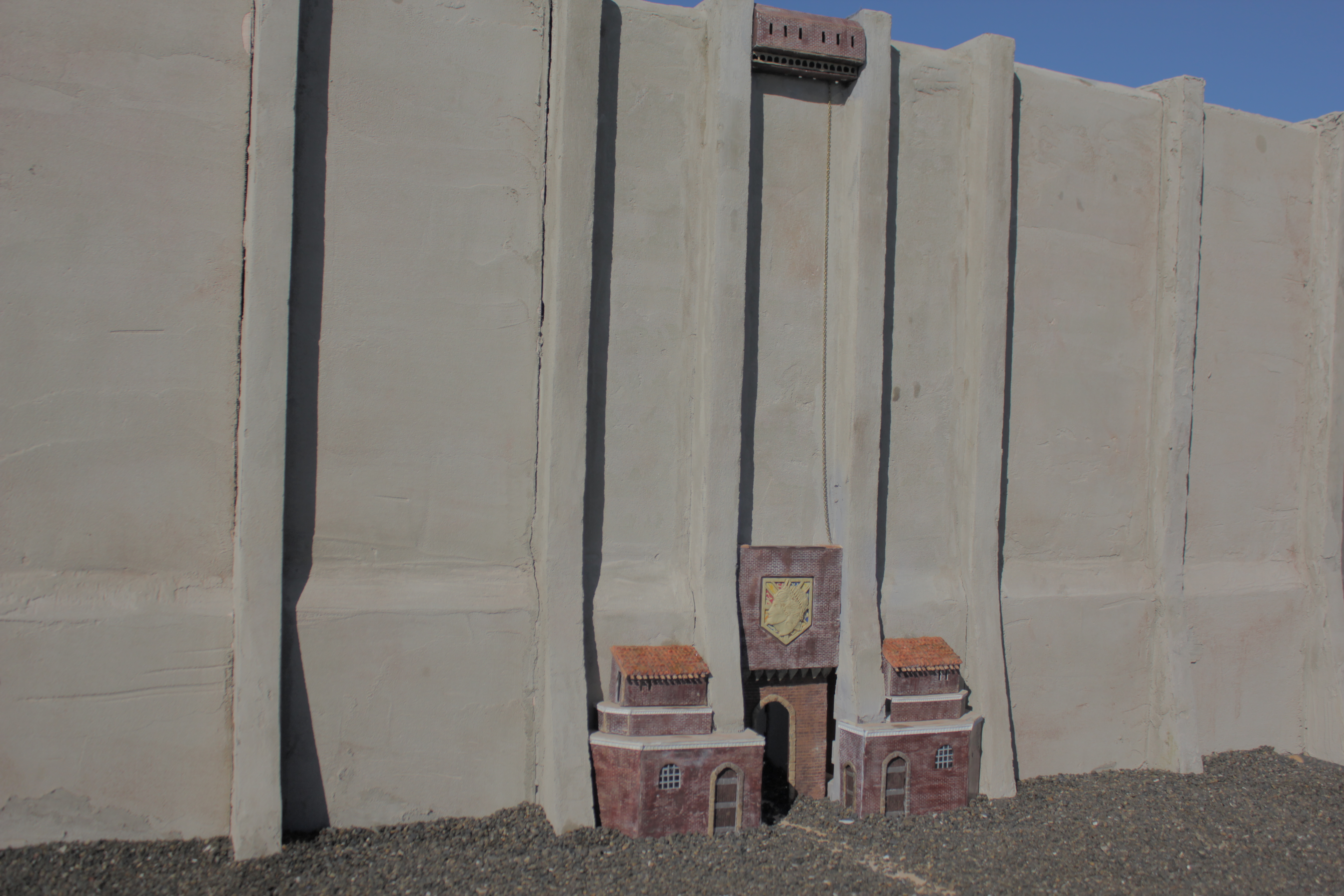
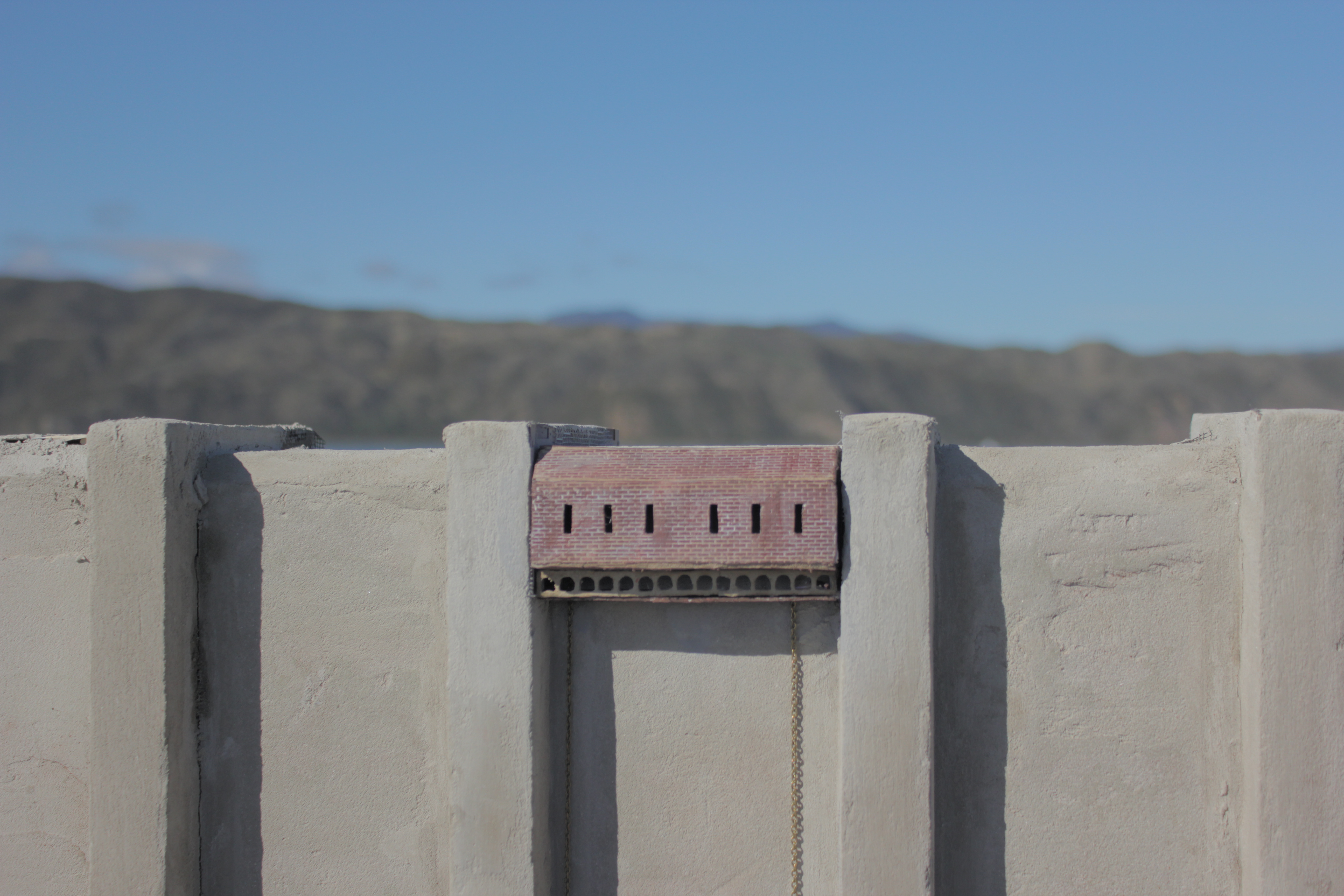

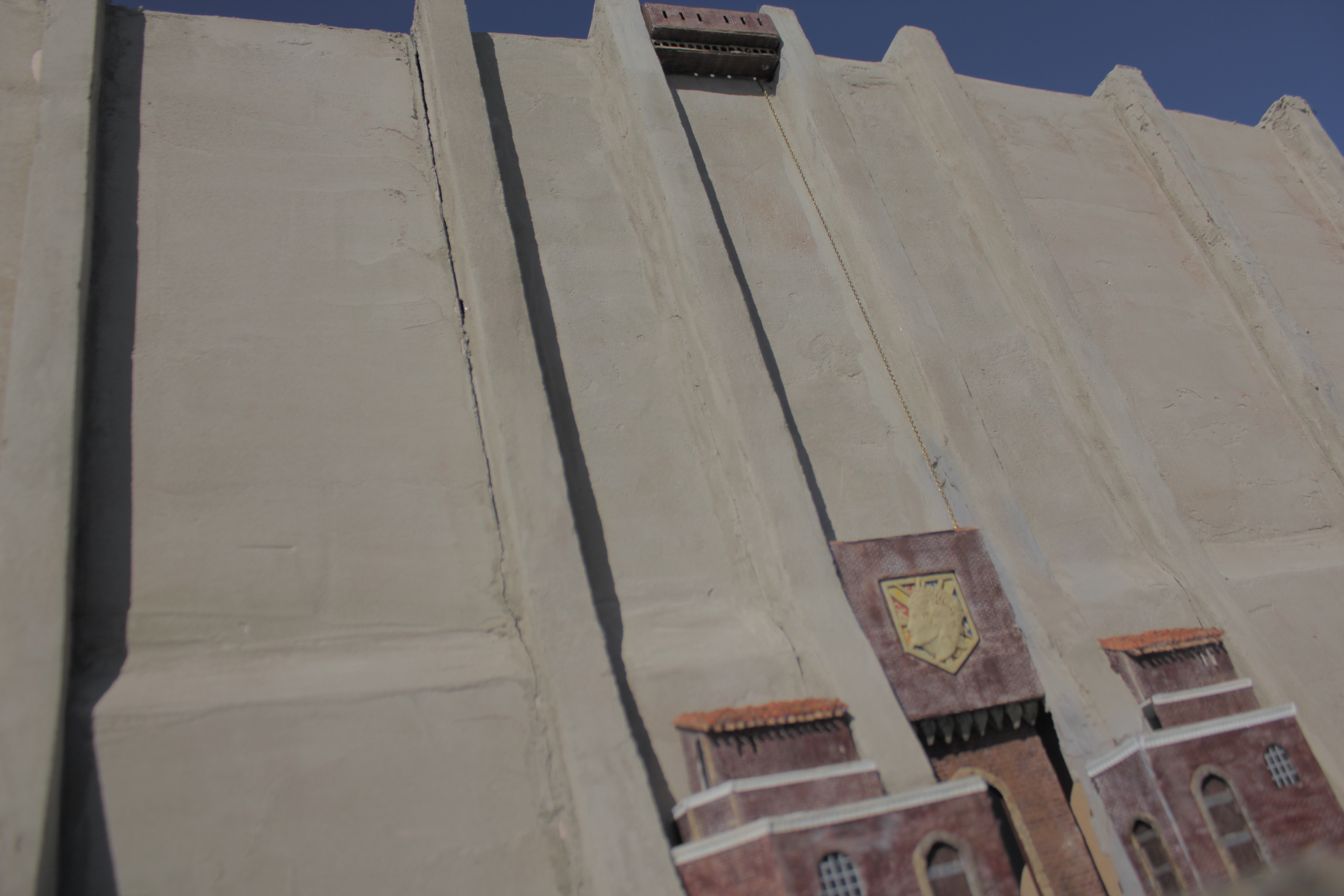
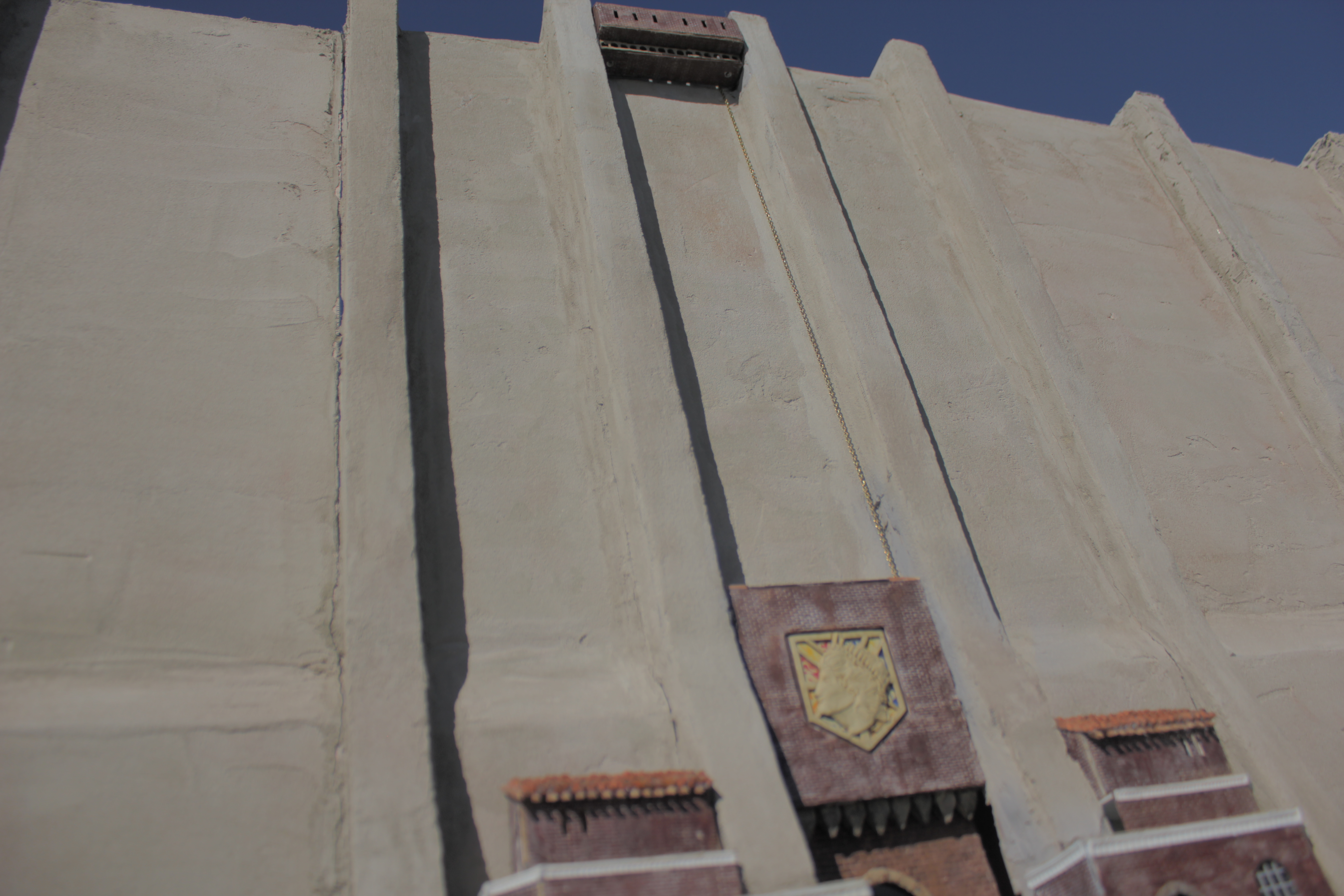
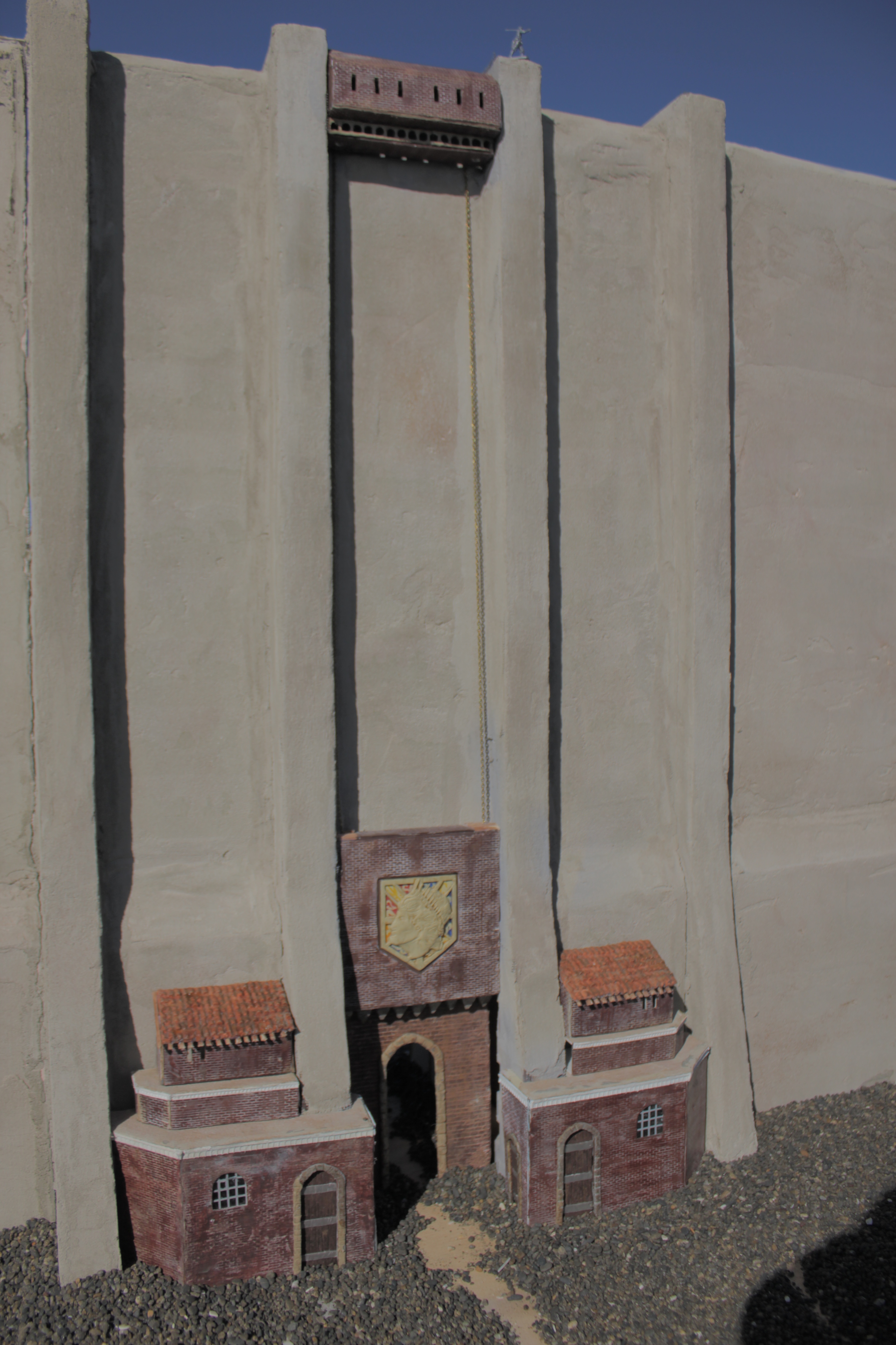
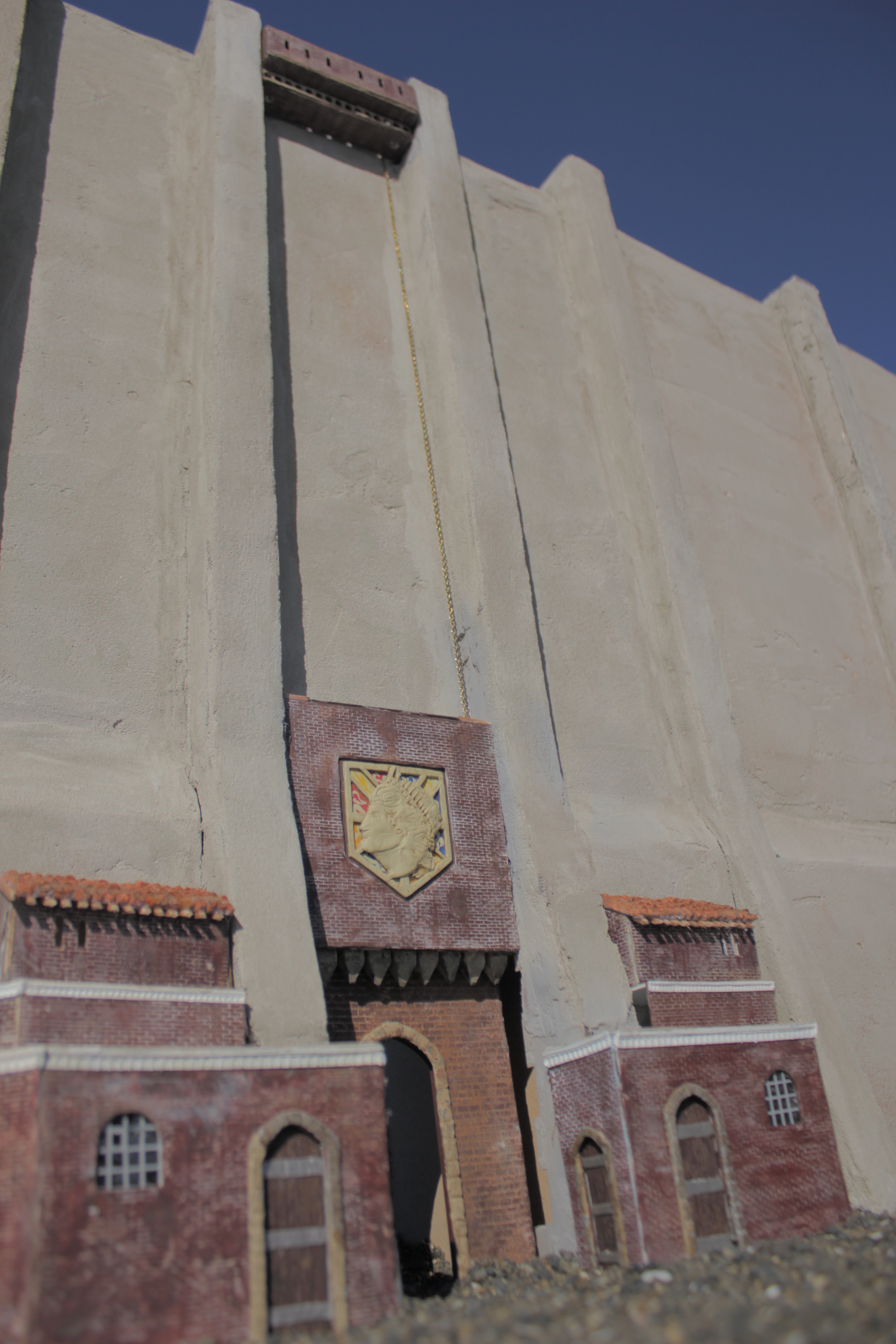
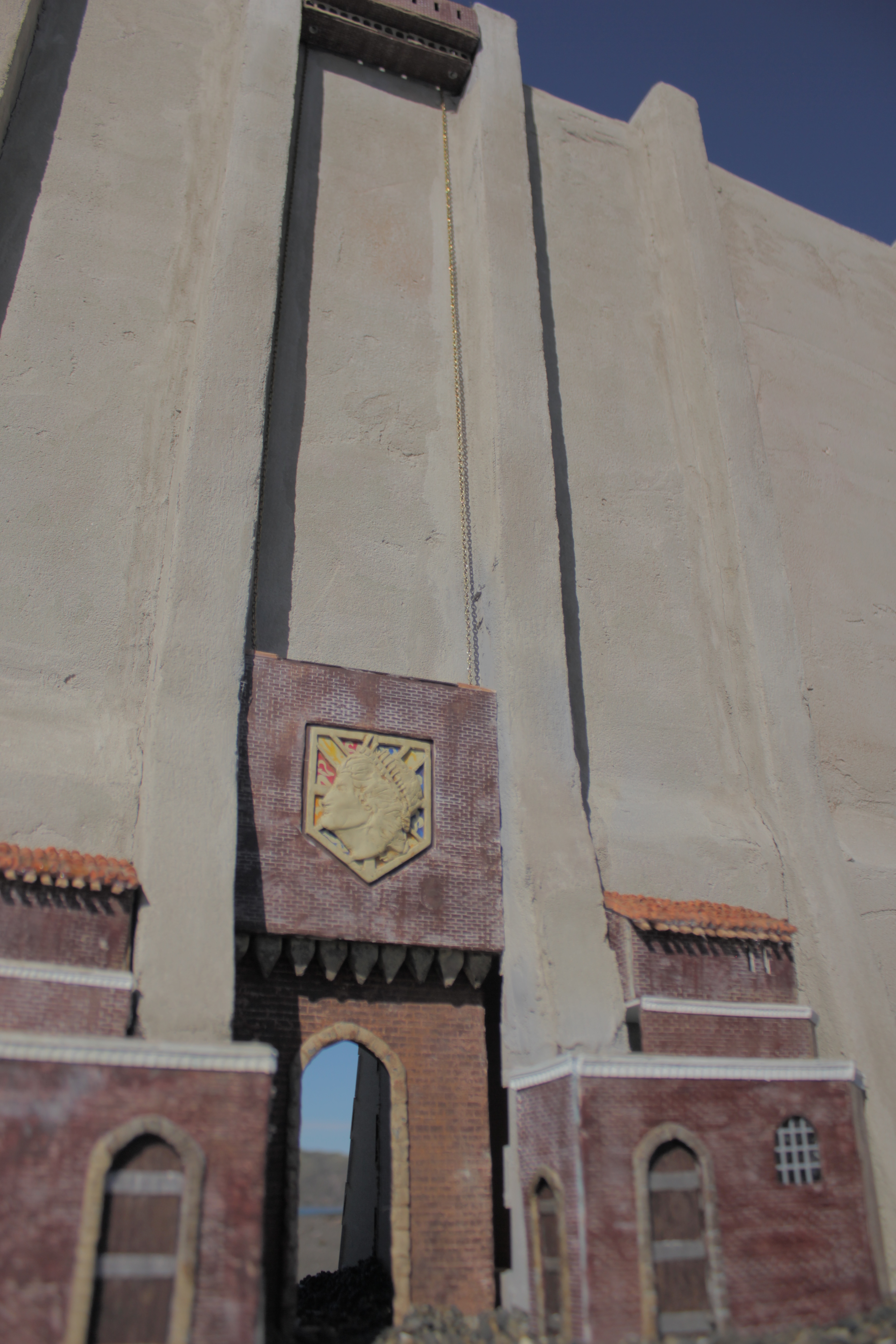
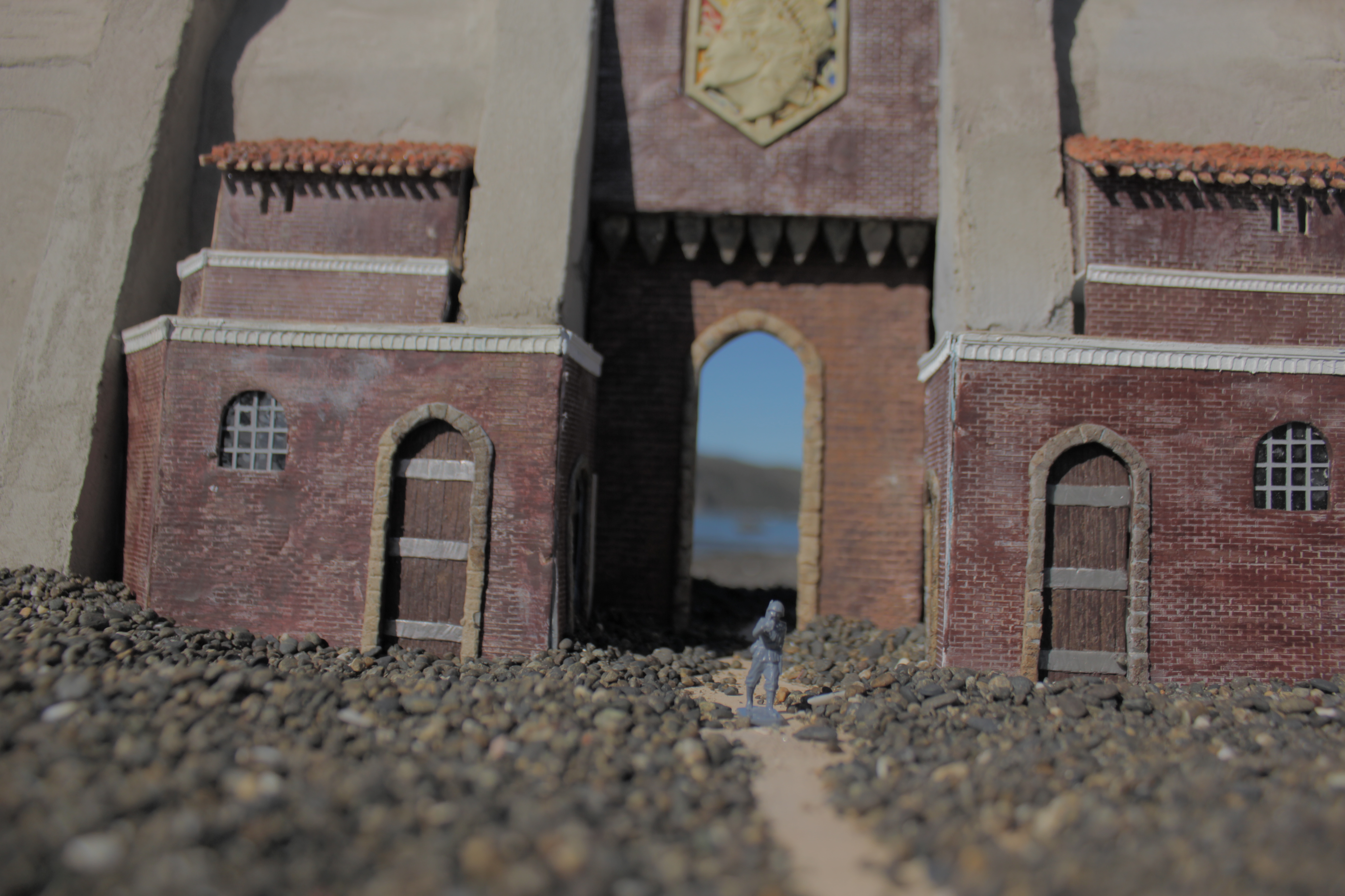
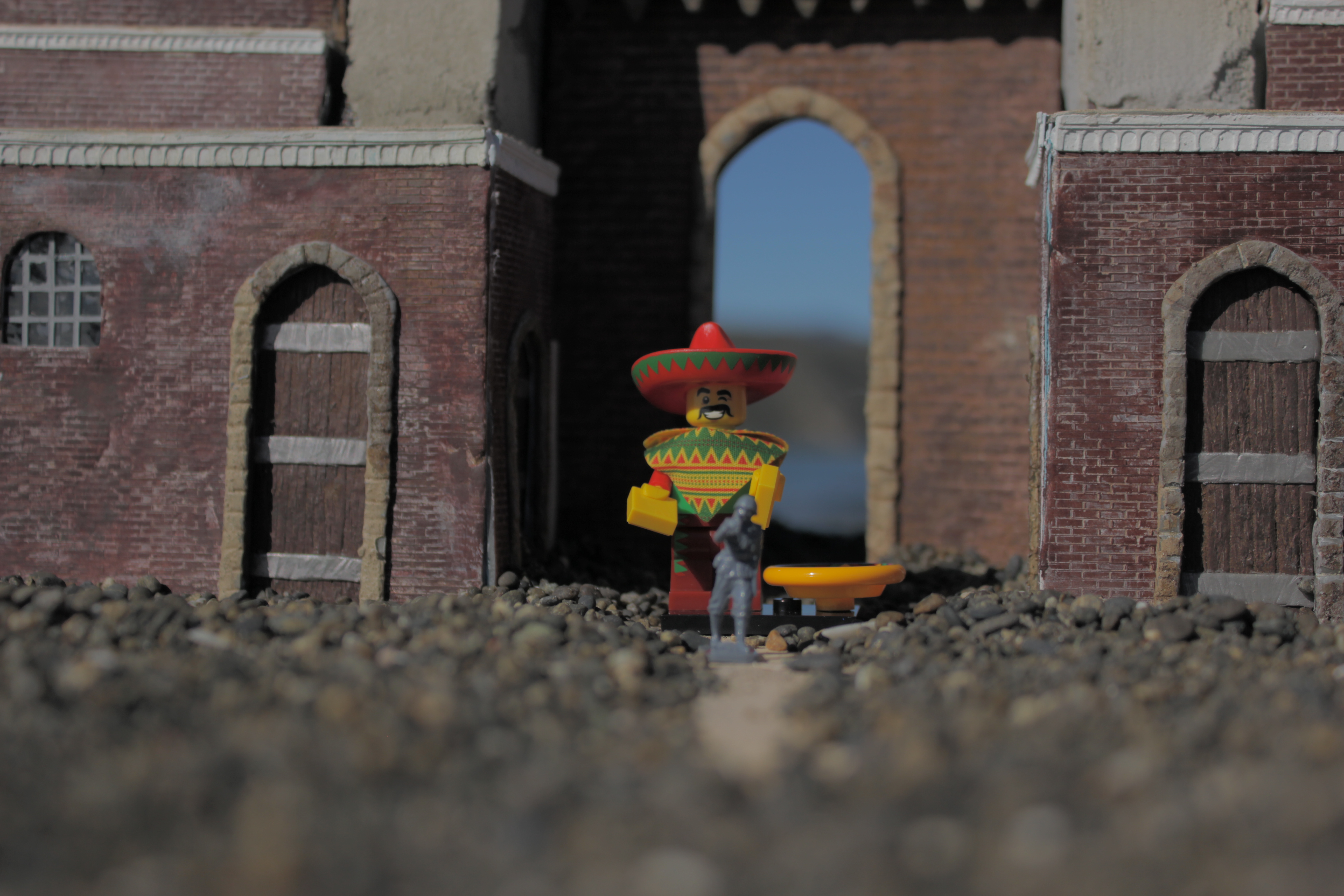
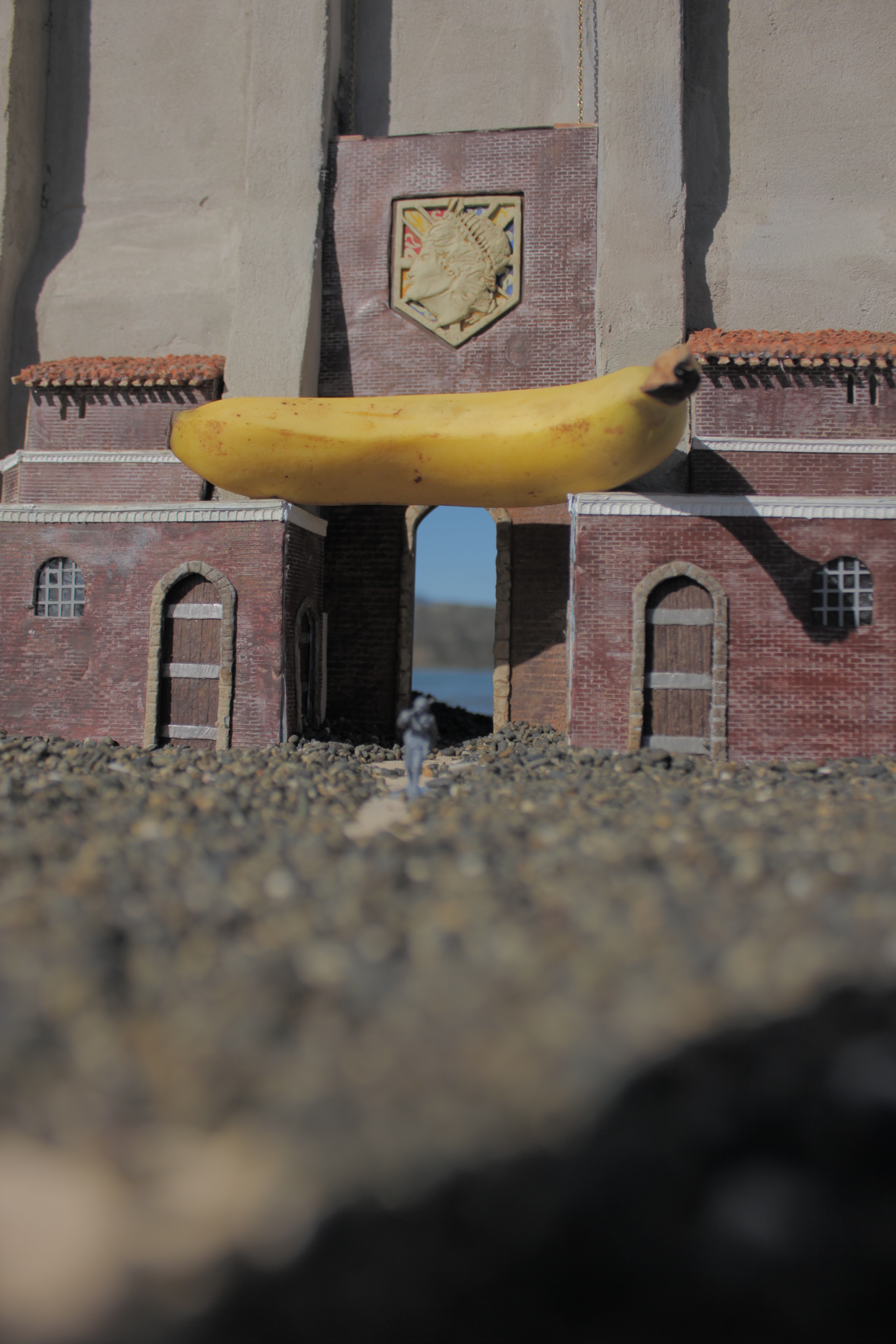
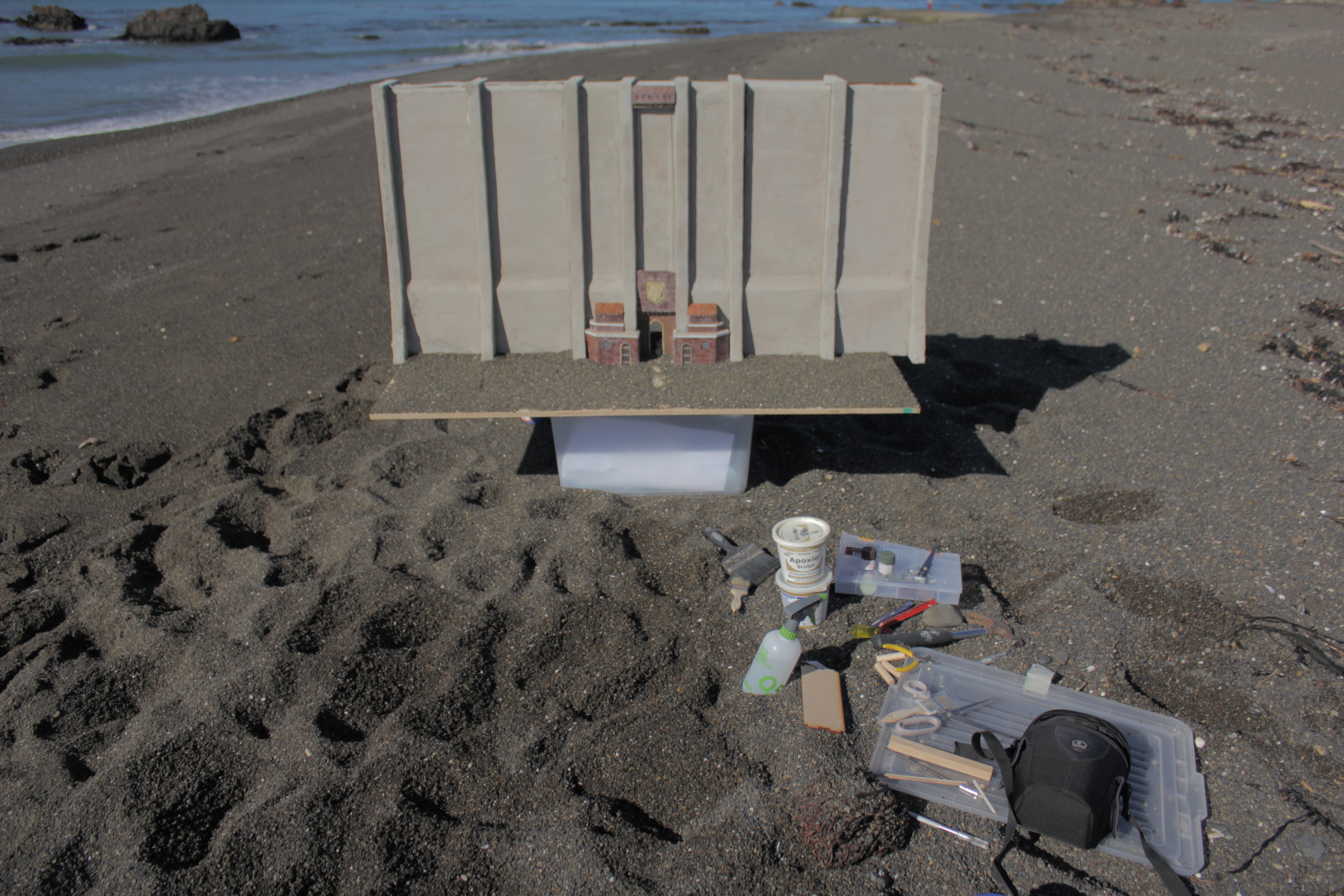
With a string of bad weather, today was a nice day so I thought I would try and take everything down to a local beach and take some pictures.
Having the setup in numerous pieces made it easy for one person to carry, granted multiple trips back to the car hoping some kid doesnt kick it over on the beach.
I would love to add some more details and fix a few things I was unhappy with.
I also need a much larger platform to put the scale model on to get some of the size/perspectives I would like.
I tried my hand at some forced perspective photography but I've learned quite a bit in the short time I did.
I hope you guys have enjoyed the build. I am trying to take more and more pictures on some of the projects I do.
Thanks again for looking! I hope to have an update to this project in the future!
I'm thinking about building Eren's house...... shh......... maybe more?
Thanks!
UND WIR SIND DIE JÄGER!
p.s. Banana for scale.