Animating Using the 12 Principles

(WARNING: This page might take some time to completely load.)
(The above video is a paraphrase of the 12 principles, which I have been granted permission to use.)
There’s a number of reasons why anyone might be interested in animation. It might be because it’s within their future career field, it’s something they love to do, or it’s due for a class next Monday. Whichever reason it may be, this guide will help you in your advancement towards becoming a better animator, thus succeeding in whatever goal you’ve set up for yourself.
There’s a lot that goes on in animation. Flow, emotions, purpose are the few examples I can present. However, I’ll go over on something that is very important and that every animator should know by heart. The 12 principles of animation is the very basics in every animated movie you’ve ever seen. From the old black and white days of Mickey Mouse Adventures and Popeye, to the modern CGI like Frozen and Tangled, the 12 principles of animation is deeply rooted in the beginning of motion pictures. The 12 principles consists of squash and stretch, anticipation, staging, straight ahead and pose to pose, follow through and overlapping, slow in and slow out, arcs, secondary action, timing, exaggeration, solid drawing, and appeal. Reviewing the principles and putting them into practice is a great way to start your ideas. To begin with, I’ll guide you in how to start a very simple animation scene called a GIF. Along the way, I’ll explain how some of the 12 principles can affect that, and lead you in a direction of what’s going to happen. After all, the author can only do so much. Let’s start with what you need the most for computer animation:
- A laptop/computer
- Either Photoshop or Flash
- Tablet/Mouse/Trackpad
Patience/Willingness to fail/Persistence Depending on what type of user you are, your computer might run smoothly in animating things. Unless you have a good amount of RAM in your system, Photoshop’s animation reel will take a few seconds to load. For Flash though, it’s something that might need a couple runs before the animation looks smooth. Also, depending on how use you are to drawing on your PC, animating might come easier to those who are use to art programs such as Paint Tool Sai, Krita, Photoshop, and even Gimp. All of which are free and accessible online.
The quality of your animation also depends on what you're drawing with. Tablet users will most likely use their tablets to draw directly onto their screen, like a Cintiq Companion or a Cintiq 12wx. Some other tablet users might also use a basic tablet that has no screen but allows pressure, such as the Bamboo Connect series or the Intuos series. Mouse users are likely to have more movements, but the pressure will be their downfall. However, do not fret as animation doesn’t always included beautiful art.
Finally, trackpad users, or those who are using the mousepad that’s on the laptop, will most likely deal with the same troubles of using a mouse, but with restrictive movement. I will mention that users who has gotten use to the trackpad, mouse, or tablet, will adjust their way of animating, so don’t let yourself down when you feel like you don’t have the perfect tools to animate. Remember, you don’t need to be rich to achieve great art.
A Good Lazy Start
Start small. Even if that doesn’t sound easy, never underestimate the simplicities of life. As one of my favorite animators said, “If you are a beginner . . . don’t try to animate something ultra hard like a mecha robot or a character fully clothed but try with something really simple . . . a ball, a square, a stickman, etc …. (I tell you this because it happens that some try too hard and then think that animation is too hard and stop. Take your time!)” (Gemin Kévin). Coming from someone who animates using an old Flipnote Studio on the DSi, he really knows his way around simple themes (and pigeons).
So let’s start with a square. A simple shape with four sides, a plain ol’ parallelogram. Go ahead and start up your computer, and open up either Photoshop, Gimp, or Flash. Let it load up, open a new file (by pressing Ctrl+N) and draw a simple square with a pencil. Already, we’ve established staging, which is one of the 12 principles.
Where Does It Happen?

So you got your square down, but then what are you going to do with that square? Don’t think about how you’re going to get there, we’ll go over that in the next few steps, but what’s really going to happen to that square? Ask yourself these questions when you want to animate something. Having an object standby, isn’t really appealing to the audience, which is why the 12 principles will help you out greatly here. In this step, the principle straight ahead lets you plan the next few steps. Since we’re only transitioning a box, there’s only two stages the box will go through (which is Point A and Point B).
Point A is where the square is sitting there, and let’s say our Point B is to move it to the right side of the screen. We could even move it to the upper left side of the screen, bounce it around, or maybe even let it shape-shift into a human being. The sky’s the limit when it comes to animating, but for the sake of simplicity, let’s move the square from the left to right.
Transfer That Parellelgram
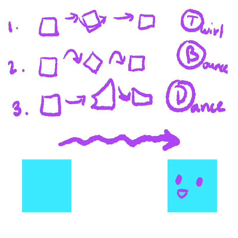
With our beginning scene and ending scene ready, let’s find a way to transport that square to Point A to Point B. Unless, of course, you happen to have no creativity juice going through your system right now (which happens). If so, it’s best to take it easy and mull it over. Generalize your ideas and then narrow it down to a few ideas that popped into your head. Here the principle of pose to pose is obvious since this principle talks about moving from one frame to another.
Mr. Gemin recommended that using the alphabet to start off ideas is a good way to find your movement. So, whenever you’re stuck in a rut and keep asking yourself, “I don’t know what to draw,” go through the alphabet and see what comes at you. Who knows? You might actually surprise yourself with an amazing idea. If you already have an idea on how to transition your square to Point B, then go ahead in the next step! If not, then let’s go ahead and use the idea of sliding our square instead.
Watch It Happen
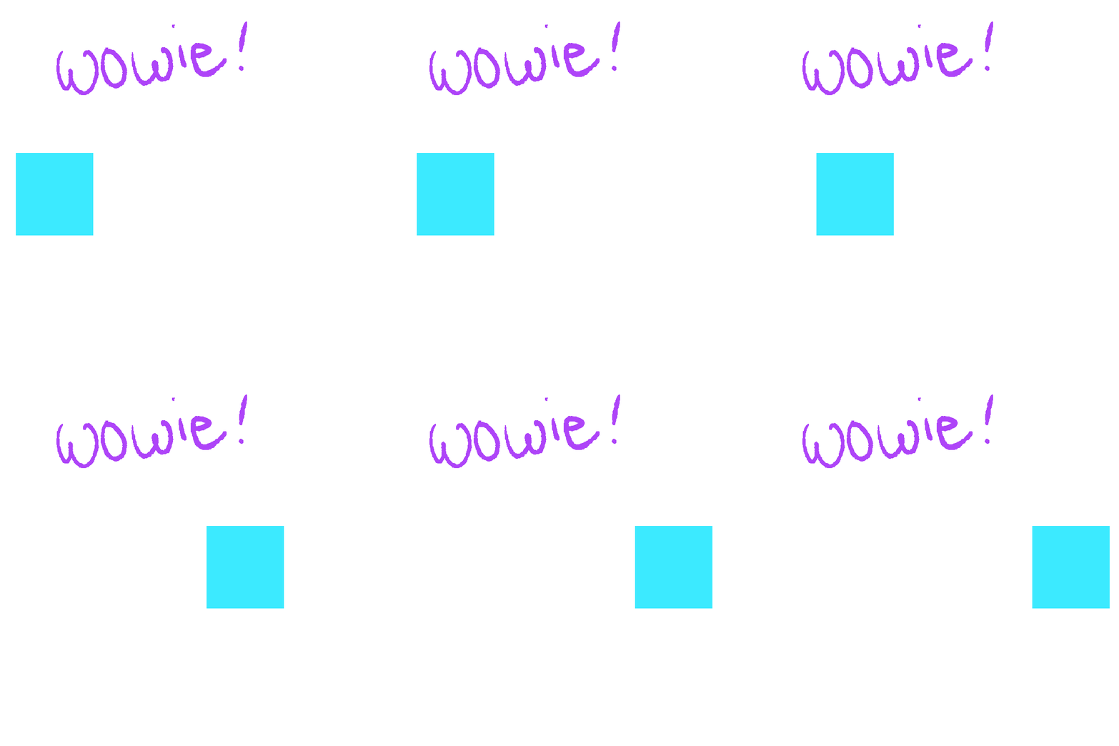
(Please click on the image to see the animation.)
In one of the 12 principles, slowing in and slowing out is a good way to transition your animation. Especially when it comes to moving from Point A to Point B, objects that move tend to slowly arrive their destination, as they are when they leave it. Timing also affects this as well. When an object is in the middle of their movement, they tend to move faster, thus fewer frames are used. However, when the object to closing in on its final destination, it’ll move slower, thus adding on more frames.
So with that being said, with your box on the left side of your screen, add a new layer.
- For Photoshop users: Go up to the upper left side, click on Layers > New > Layers
- For Gimp users: In the same area, click on Image > New Layer
- For Flash users: Click on the New Layer icon at the bottom of the timeline.
And as you add more boxes (and fewer in the middle) to your drawing, be sure to add a new layer per drawing. After finishing up those frames, press play and watch it move! Give or take, moving that square from left to right is about 5 - 10 frames or so. Maybe even less, maybe even more, however we’re not going to shoot for the moon on this simple animation. After pressing play in your program, you’ve already established your first animation!
Congratulations, but don’t think that’s just it for this one. In animation, there are a lot of ways to go with your scene. Of course, these things are not easy, but when you put in a lot of love for something you worked hard for, a lot of people will see it.
Double Checking Is a Good Idea
When you’ve finished all the frames, look through your frames and make sure they’re not overlapping each other. In case they do, look between the frames and find your mistake. If you’ve used this program before, you might’ve already solved your problem. If not, don’t worry! This is why Google was invented.
If you see no problems going through your frames, shoot the play button and see how it runs. Although, depending on your computer and software, it might lag a bit in the beginning, but give it a couple of runs so it’ll smooth things out. If it helps, there are some Instructables at the end to help you start on making GIFs (graphics interchangeable format). Be sure to save that animation just in case you need it for something.
Don't Stop at Squares!
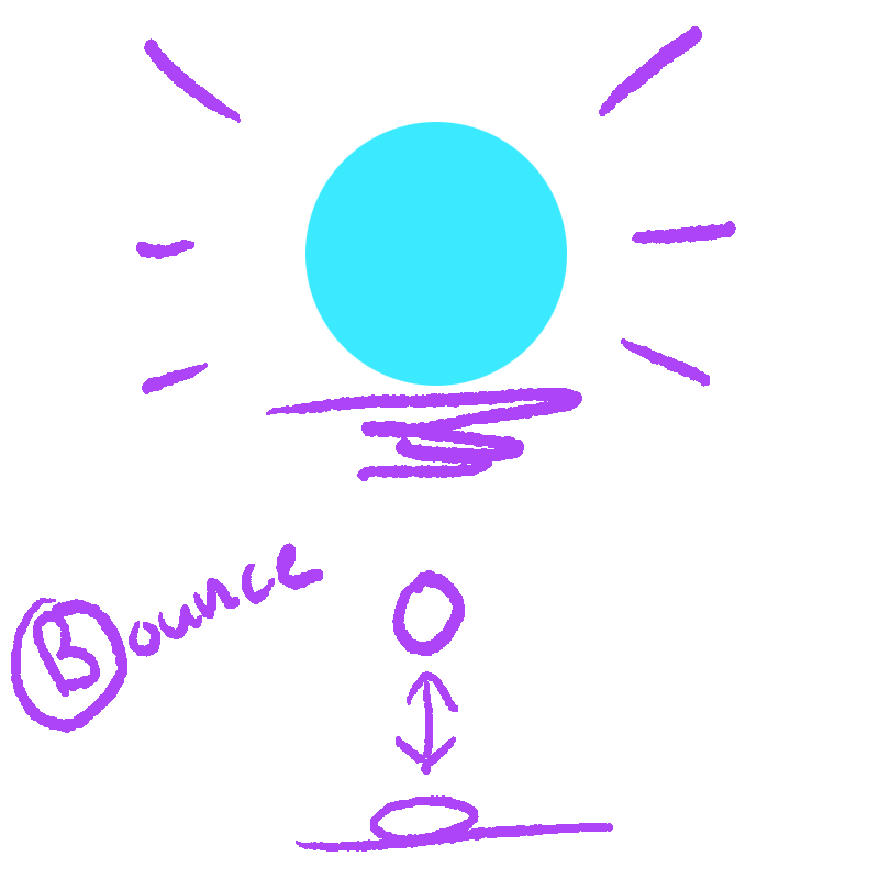
Now, don’t just stop at the square! Go forth and experiment with other shapes as well. This time, instead of our little box moving left to right, let’s use a circle this time. Just like in part one, what do you plan on doing to the circle? Make it like a ball and bounce it, or maybe shapeshift it into a bird? Maybe let it start to crack on its own before turning into a baby dragon? There’s really no limit on animation.
Just like with step one in part one, let’s start small again. Since our goal is to use a circle now, let’s learn to bounce the ball up and down. If you have any other ideas, feel free to simply follow along.
Reuse Previous Steps
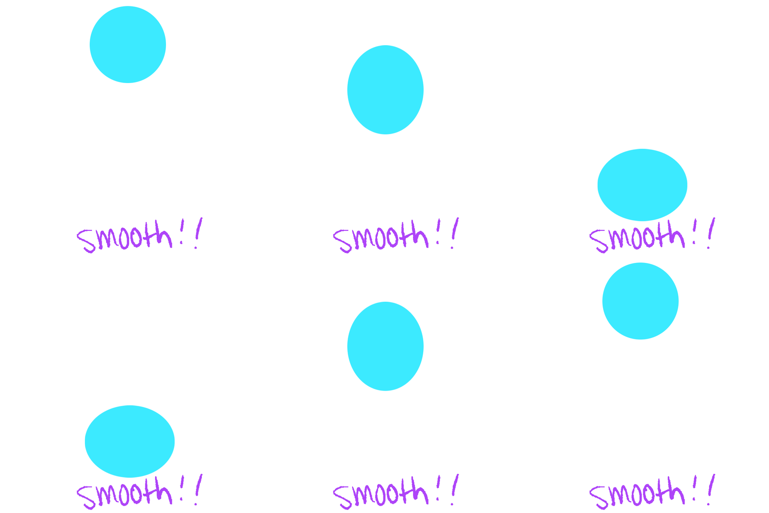
(Please click on the image to see the animation.)
You already know how to animate something in a beginning, so go ahead and start up a new project. With a new frame and a circle in the middle of your drawing, you’re ready. In one of the 12 Principles called squash and stretch.
Since we’re bouncing the ball this time, animating it will be a bit different than the cube. Just like moving from right to left, when an object moves up or down, it tends to have more frames near its beginning and end. However, instead of just having less frames in the middle, the object is stretched. Similar to before, you have your ball set up on the bottom.
As you start to move the ball forward, there will be more frames in the beginning and less in the middle. However, as you’re inching into the middle of the animation, the ball is stretched. Like a spring, the body is long and as it reaches its destination the rest of its body catches up. Another principle is applied as well when that occurs. It’s called follow through and overlapping. Abiding by the laws of physics, when an object is abruptly stopped, inertia plays their game with the other parts of the object. Nothing stops on the spot, and that goes in animation as well. When the ball that bounced stops, it’s inertia causes its whole body to squish itself flat before bouncing back into its original shape. So when you’re drawing the ball that’s reaching its destination, squish it a bit to make it seem like it came in contact with something, giving any viewer the illusion that it’s acting like a real ball.
Timing and Frames
A ball bouncing might take fewer frames than the cube, but that’s alright. Nothing it strictly applied to frames, but rather towards timing. Meaning that even if you’ve placed the frames very well and done everything correctly, it might be too short to last for a movie or even a promotional video (sometimes called a PV). It might be a problem if you’re animating a scene for a movie, since those heavily rely on timing, but since we’re only dealing with a bouncing ball, our timing is perfect. However, keep it in mind when you plan on tackling bigger projects on your own.
Also, it’s easy to get lost in animation when you’re drawing a frame and it somehow seems a bit more off than the rest of the frames. In cases like those, be sure to check the before and after frames of that drawing. It might be because it’s too far from the original point, or it’s drawn too high or out of place. If it helps, delete that frame and see how the rest of the clip plays. Then add a frame in whichever area you think might need to last a bit longer (like the beginning or ending).
Conclusion

(Please click on the image to see the animation.)
If you’ve already finished the animation, congratulations again! Continue to practice these basics as much as you want until you’re completely satisfied. However, don’t just stop there. There are multitudes on what you can do when it comes to animating. For example, switching the circle to a square, and then maybe into a triangle. Perhaps adding coloring and shading will help aid you in your goals for animating a clip.
It’s even better when you add audio to your animation, which might be made in a future guide. All of this falls under the principle called appeal. This guide was meant to cover the very basics and to mention the 12 principles of animation as it continues to influence the many ways of making movies, PVs, short films, that were made with 3D, 2D, or even stop-motion animation. I hope this has been helpful in your start in animation, because just like any other skill, this takes a lot of love, patience, and determination.