3D Maps in Excel

About a year ago a friend of mine was working on a thesis based around property trends.
In Ireland, all property sales have been recorded to a publically accessible register available to download from the Irish Price Register here. I was going to include the .csv file here but it's 53MB so if you want to use this sample data please use the link.
This contains all property sales since 2010 with the address, date of sale and value, there is some other information but this isn't relevant here.
He needed a way to break the data up to show how sales varied in both value and frequency over time. I suggested a mapping tool and to my surprise, there was one living in Excel 2016. As far as I know, this tool is only available in Excel 2016 and at that not all versions of 2016.
Enable 3D Maps
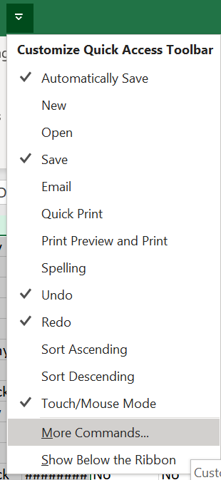
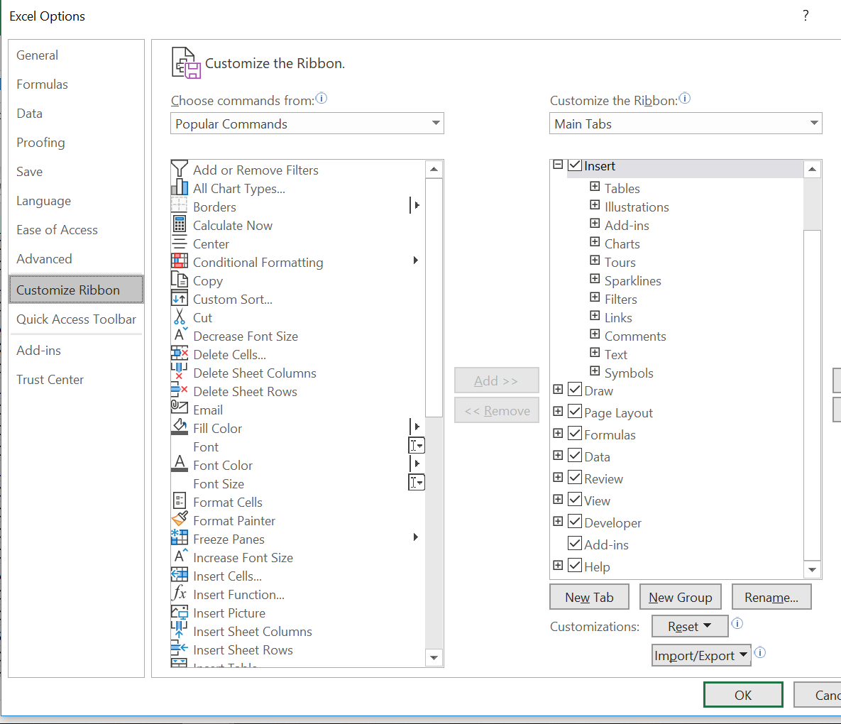

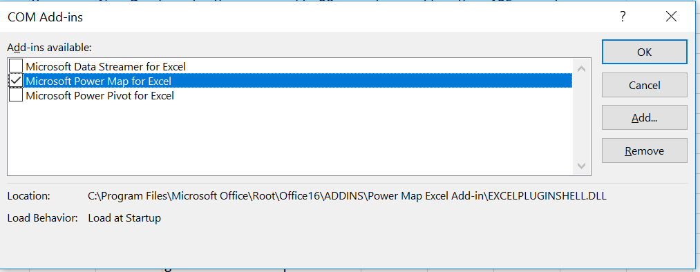
The first thing to do is to enable the feature, it's not one of the default options.
In the title bar select the quick ribbon tool
Select More Commands
In the popup select Customise Ribbon
Locate and check Developer
Click OK
On the Ribbon you now have a Developer tab
Open the Developer tab and click Com Add-ins
Check Microsoft Power Map for Excel and click OK
Restart Excel as this is launched at startup.
Import the Data

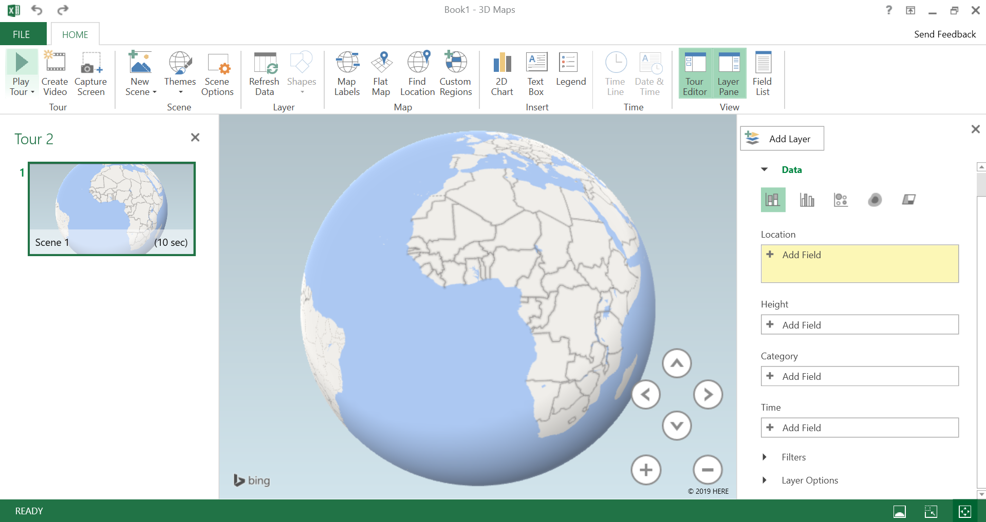
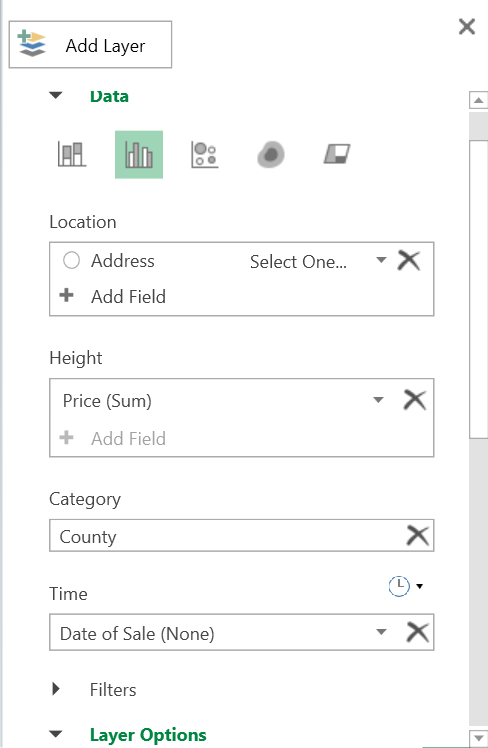
Now my sample data came in as a comma-separated variable (.csv) format, 3D maps does not like this and the button is still greyed out.
To get around this I copied the columns I wanted into a regular Excel (.xlsx) file and now the feature is available.
Select your data, you must select all rows, not highlight the columns as the 3D map tool will complain of invalid input formats due to the empty rows. Also, include the column headers here as they are important in the details step on the map.
When the editor opens there is a pane on the right to select how the data is used.
In my instance, the location is a full address, there are options for lats and longs or postcodes, etc.
height is price, this is set to no aggregate as I wanted the raw data to determine the hight of the point relative to the price
Category is not that important, I used County to allow the points for each county be a different colour, the map shows county borders but this proved useful when isolating outliers that were input incorrectly (some points for Ireland plotted in the UK & US)
Finally, time was plotted against date of sale and this allows a dynamic timeline to generate.
The plot will begin automatically, my dataset has >380K entries so it took about an hour to fully render. This, of course, will depend on your data, the processor and memory in your PC and what other applications you are running.
The Map!!!
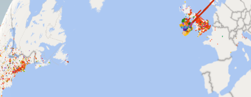
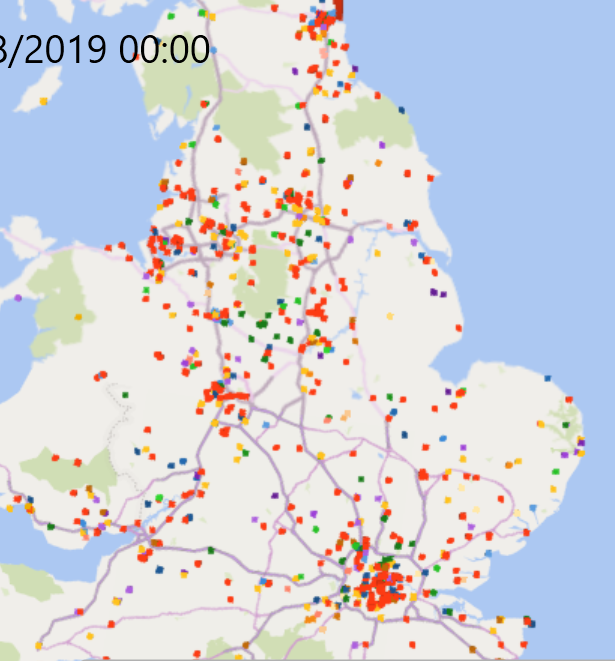
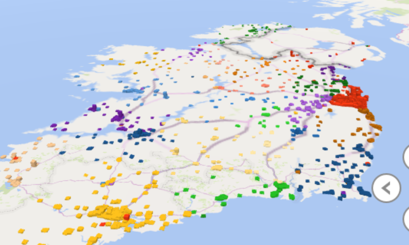
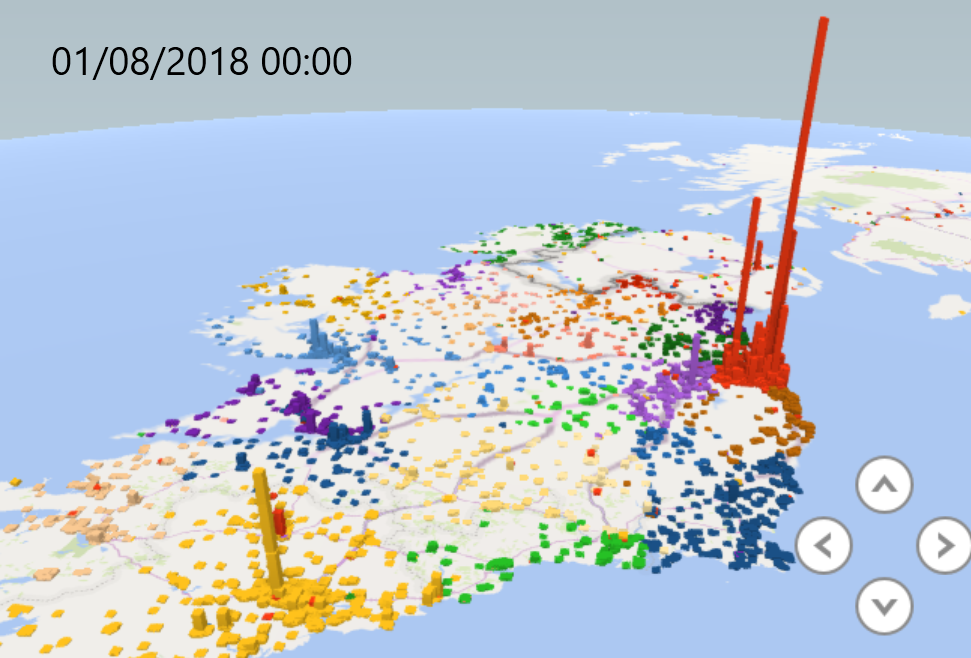
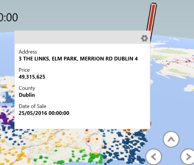
After the time has elapsed and the map is rendered you can create scenes in whatever manner you wish.
You can save views of the map for different perspectives and zoom levels, index the timeline and isolate outliers.
Have fun with changing styles, you would be amazed at how much easier it is to wrap your head around a large dataset when you can represent it on a map.
I have included some samples from my mapping, you can see the world map with outliers, a UK map where a lot of mis-mapped addresses went. Then Ireland in 2010 alone vs 2010-2018 totaled. The last image is a detail card for the most expensive property, this is the one that shows the details and the reason the column headers are important as thet produce the labels.