3D Graphic Design With Blender and Gimp
by FracturedCrystal in Craft > Digital Graphics
36927 Views, 178 Favorites, 0 Comments
3D Graphic Design With Blender and Gimp

Hello Everyone!
In this Instructable, I will walk through how to use the free software Blender for 3d graphic design. Although it appears formidable, the basics of blender are easy to master. 3D art has become a bit of a dark art, but there really is no reason why it should be.
Software used in this Instructable:
Gimp (www.gimp.org)
Blender (www.blender.org)
And that's it!
The final image is a 3d render, with post processing done in Gimp. We will first model the entire setup, then add the materials, render out our image, and finish it in Gimp. If you ever get stuck on the Blender side of things, just leave me a comment, or try searching for it in the Blender documentation: www.blender.org/manual/
Any other image editing program will work, but I am using gimp for this tutorial, just because it is free and simple. Programs like photoshop may have a slightly different work-flow, but the basics apply.
Well, so much for an introduction, let's do this!
Getting Started With Blender
First, you need to download Blender. This tutorial is a little bit tricky to do without it :)
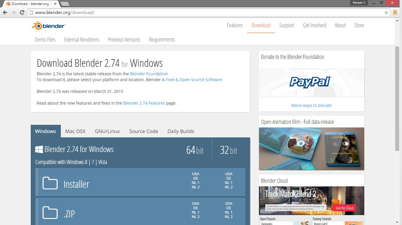
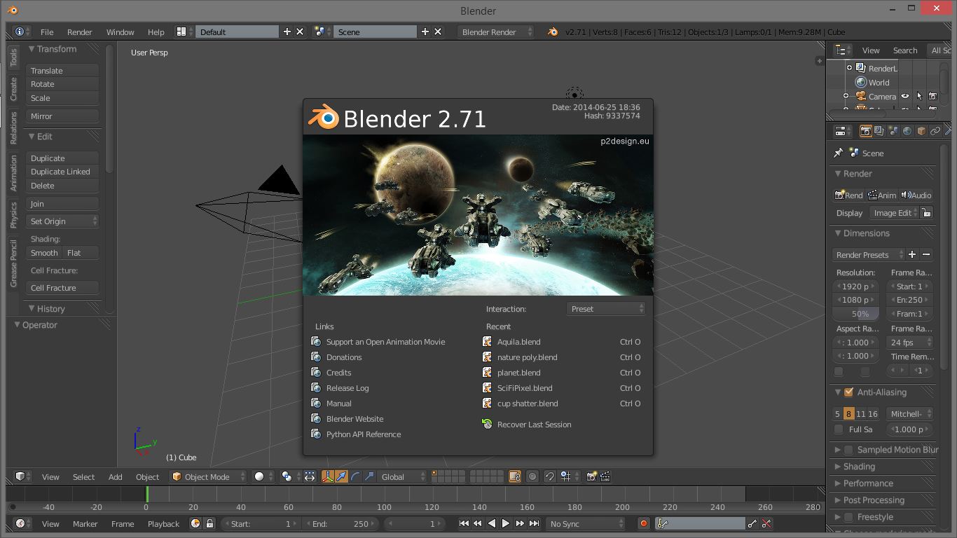
Go to www.blender.org, and download the latest edition for whatever specifications your computer has. Once you have downloaded and installed blender, start it up. Your version may have a different splash screen, I'm just a bit behind in my version :)
Click off the screen to close it, and right away, notice that all the right mouse button does is move the cross-hairs. Blender uses the middle mouse button to rotate an object, which is a bit odd, but you will get used to it.
One thing to note that is very handy when modelling: use the 1, 3, and 7 keys on the number-pad to get, respectively, the front, side, and top view. Pressing 5 on the number pad will put the view into orthographic mode, which flattens perspective, and is handy for certain parts of this tutorial.
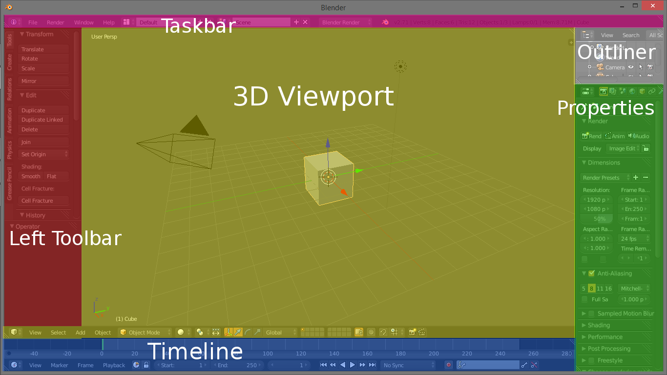
Besides navigation, note the different windows. I will keep this brief and to the action. The main area shows the 3d viewport with the default cube, the camera, and the lamp. The top (purple) is the taskbar, this will come in more later. The left is the toolbar, we won't use this all that much. The right side is the properties, which we will be using a LOT, so remember it's name. The bottom is the timeline, which is more used for animation. Finally, the little bit on the top right (white) is the outliner, which shows all the objects in the scene. This is very handy for reference.
On to the Good Stuff: Modelling the Bulb
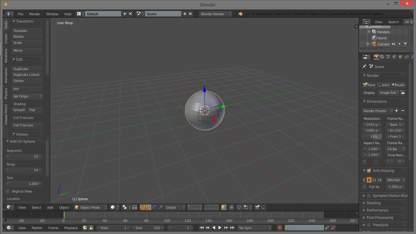
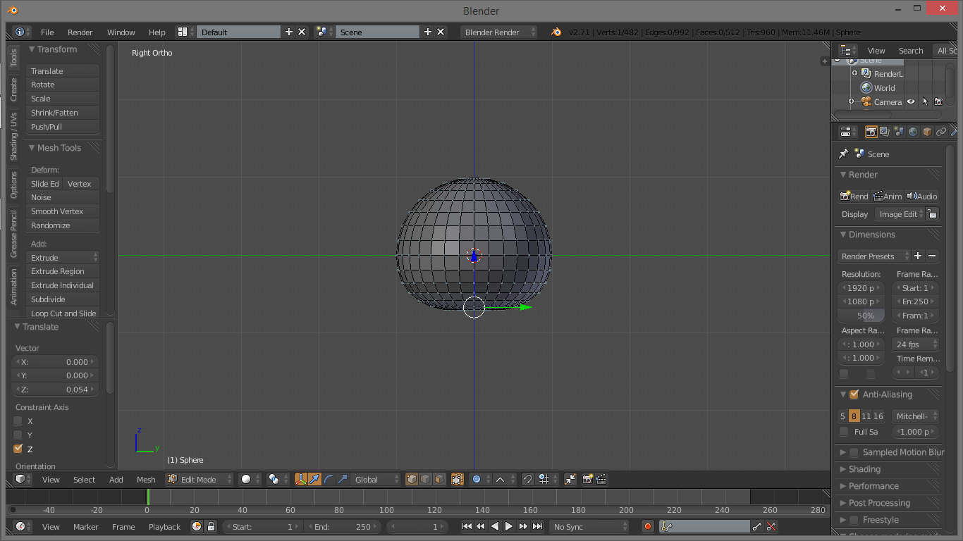
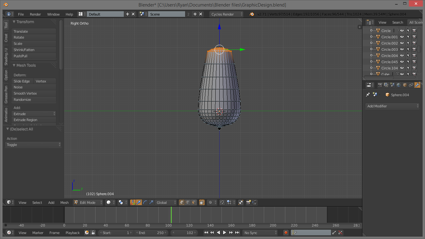
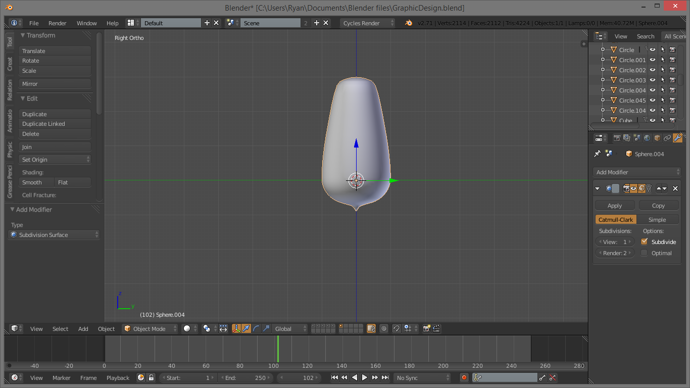
The first thing we will do is model the light-bulb itself. Select the cube by right-clicking it, and press delete or X to get rid of it. Use this method to get rid of the lamp as well, the dotted ball. Type SHIFT-A to bring up the “Add” menu, and under “MESH” at the top, select “UV Sphere”. This is the base we will modify to create the glass of the light-bulb.
Hit TAB on the keyboard to go into edit mode, where we can move the vertices around. Select the bottom by right-clicking on it. Now, press O, and watch what it does at the bottom of the 3d view. A little blue circle should appear, with a curve next to it. Select the linear curve from the drop-down, the one that looks like an upside-down V. This enables proportional editing, which allows us to influence other vertices.
This may be a good point to use the number pad buttons 3 or 1 and 5 to get an orthographic side view. It helps you see what in the world you are doing.
Now, with the bottom vertex selected, press G, and then Z. This grabs the vertex and locks it's movement to the Z axis. A little white circle will appear around the vertex, you can change the size of it by scrolling to determine which vertices are affected by moving the one. Move the bottom up a little bit to squash it, then select the top vertex and the two rings of vertices below it. Stretch this up too. A reference is handy here, I personally used this: https://media.restorationhardware.com/is/image/rhi... You can also select the bottom vertex and drag it down, but make sure to press O first to turn off "Proportional Editing" as it is called.
Once you have the basic shape of the bulb, select all the vertices by hitting A once or twice, then press SPACEBAR and type in Shade Smooth. Select the command when it appears on the drop-down. This makes our bulb look more like a smooth light-bulb than something made out of origami. Finally, on the right side, the properties menu, select the blue wrench to open the modifiers panel, and add the “Subdivision Surface” modifier. This makes the bulb even smoother.
An important note: Use CTRL-S to save. And make sure you save often. We don't want this awesome work to go down the drain.
Shaping the Bulb Socket
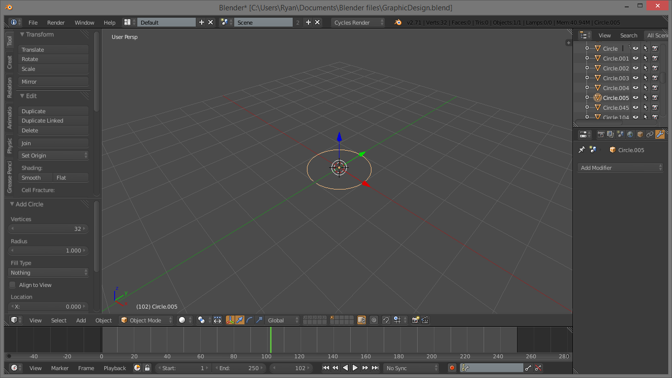
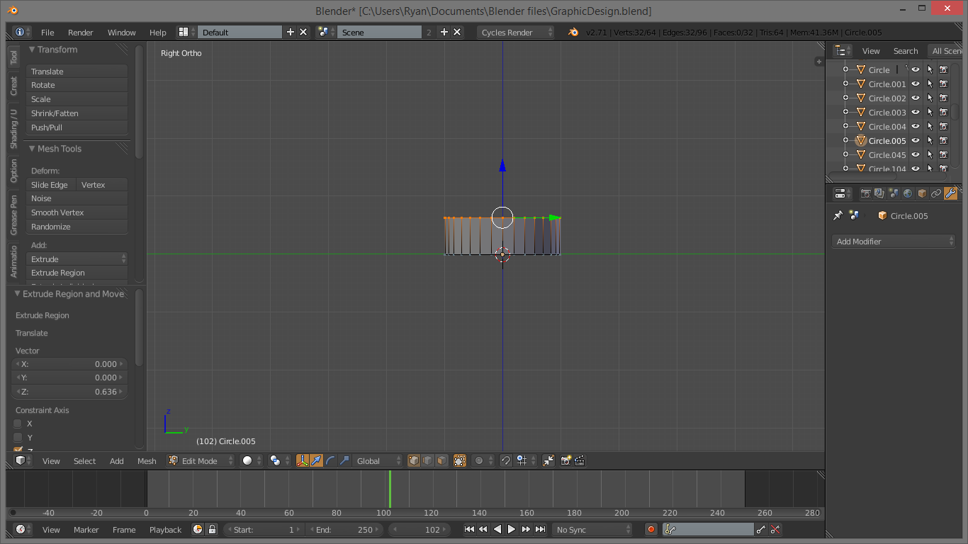
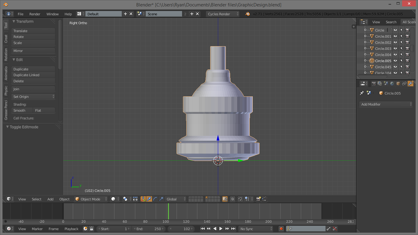
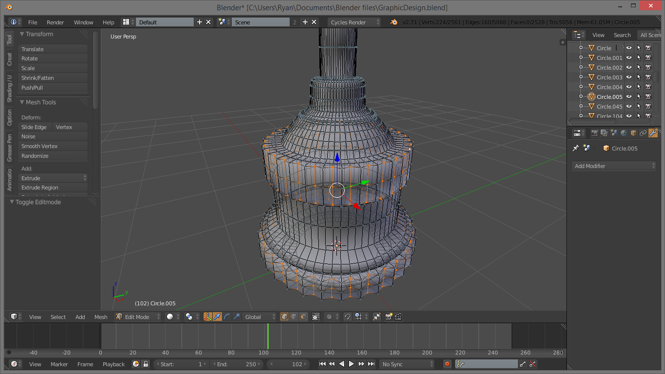
Now we need to model the holder, or socket of the bulb. Make sure you are out of edit mode, and use SHIFT-A to bring up the “Add” menu again. This time, under mesh, add a circle. This will just show up as a thin ring. Grab it and move it along the Z axis like we did when editing the bulb. Press S to scale the ring until it is the right size. Again, reference are very useful here. Now go into edit mode, and press E. This will begin to extrude the mesh, extending the vertices. Again, you will need a reference photo here to know how to scale the different parts. Repeat this step as needed, extruding and scaling, until you have a form similar to your reference. Using the number pad keys and orthographic mode, as I mentioned At this point, only model the holder, not the wire; we will address the wire later.
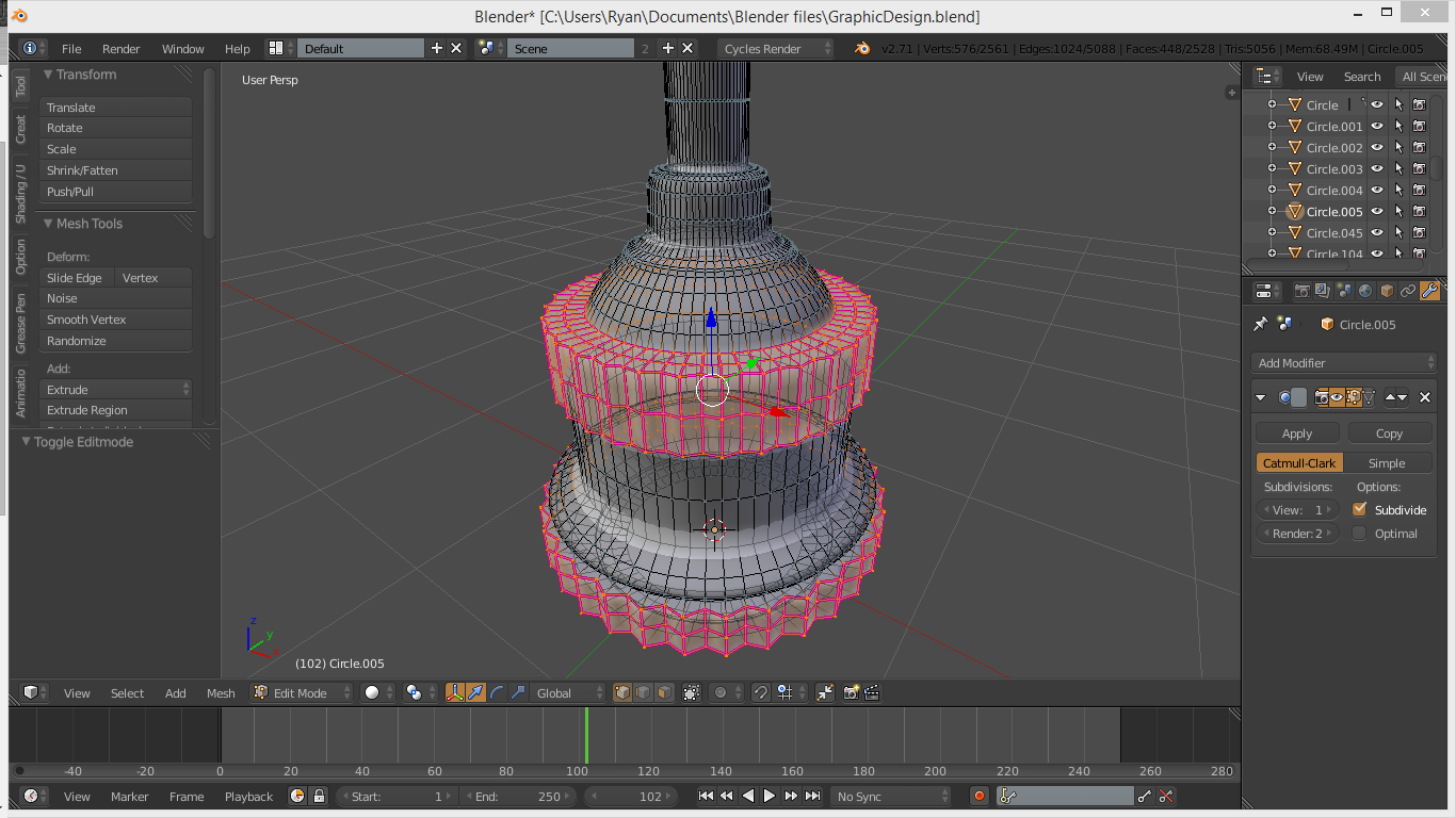
Here again we will shade it smooth, by selecting all the vertices and searching for the command with space-bar. Again, add a subdivision surface modifier (Also known as just a “Subsurf”) from the modifier panel. You will notice that many of the edges which should be sharp have become rounded and curved. To fix this, select the vertices that you want to have a sharp edge, and press SHIFT-E to crease them. Move the mouse outward until the lines become completely purple. You may want to repeat this step to ensure they are fully creased, or you may want to leave them only half-creased. At this point, it is purely personal preference.
Note: In the pictures, I have removed the bulb so you can see more clearly what I am doing. You should be modelling yours on top of the bulb.
Here again, depending on your reference and personal preference, you may want to knurl some of the edges as I did. To do this, TAB out of edit mode, and apply the Subsurf modifier by clicking the button on the modifier itself. Make sure you apply it with the detail levels at default, or you will have way too many vertices. Now that it is applied, go back into edit mode, and select the vertices that you want to bring in to make the knurl. You can select multiple vertices by holding shift and right-clicking. Once you have all of them selected, press S to scale, and then SHIFT-Z to lock the scale in the XY plane. This makes sure we will not have a wavy edge on the edges of our knurl. You may also want to crease the edges of the knurl to make it more distinctive.
Inside the Bulb: Details.
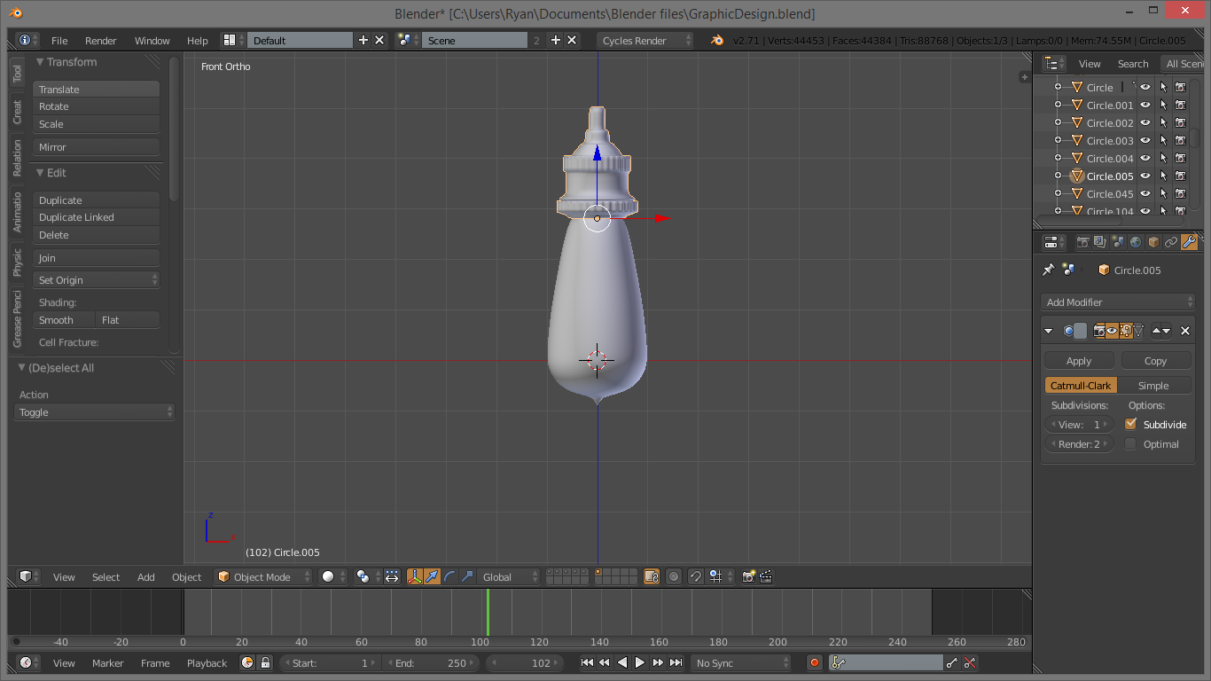
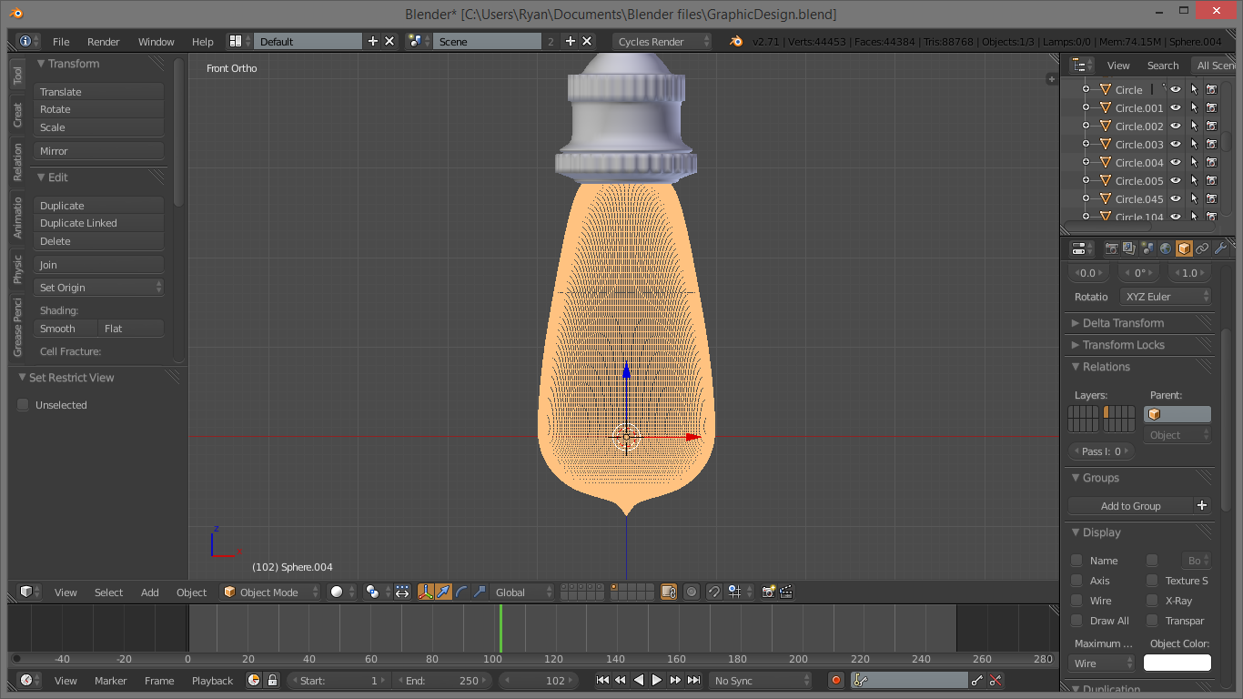
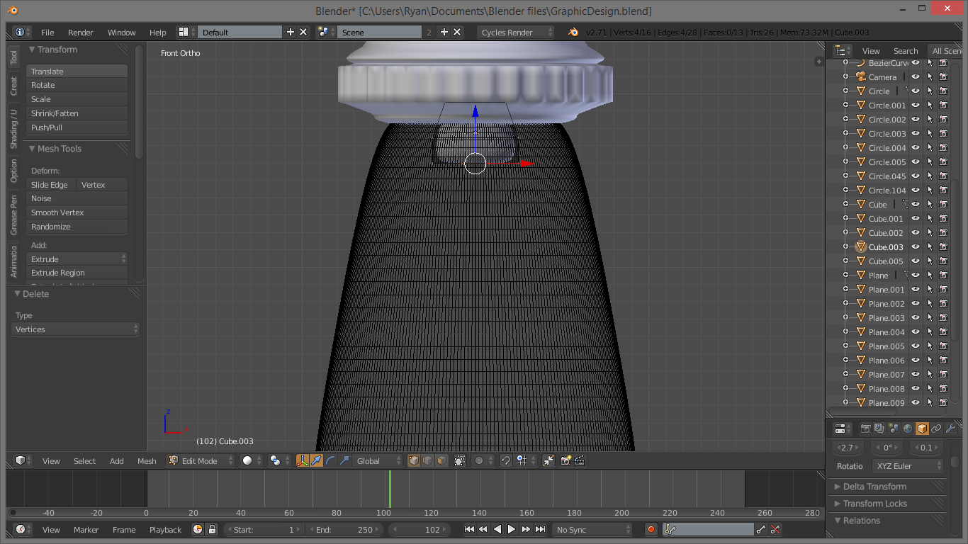
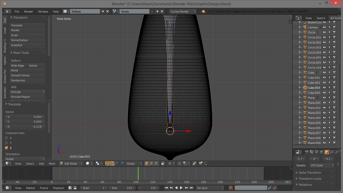
Now that the external parts of the bulb are finished, we need to create the center piece of glass and the filaments. Don't ask me what that middle piece of glass does or is called, it was just there in the reference :) . To do this though, we kind of have to see inside the bulb to see what in the world we are doing. We can do this by going under the properties panel on the right side and clicking the little tan or orange cube. Under the “Display” sub panel, change the maximum draw type to wire. Now all we can see of our bulb is the mesh itself, and it doesn't look like a solid, at least up close.
As I really have no idea how the interior of an Edison bulb works, I just followed the reference and made up what I couldn't see. This usually works in 3d modelling. :)
The first part is the glass extension in the middle. Use SHIFT-A to add a Mesh > Cube, and move it to the base of the bulb with G and Z. Hit TAB into edit mode, and scale the base of the cube down, where it attaches to the socket. Now select the vertices on the bottom side, away from the socket, and extrude them and scale them to a thin piece. Extrude this as far down as it needs to go, hit F to make a face over the end, and follow the normal Shade Smooth and Subsurf routine.
Filaments!
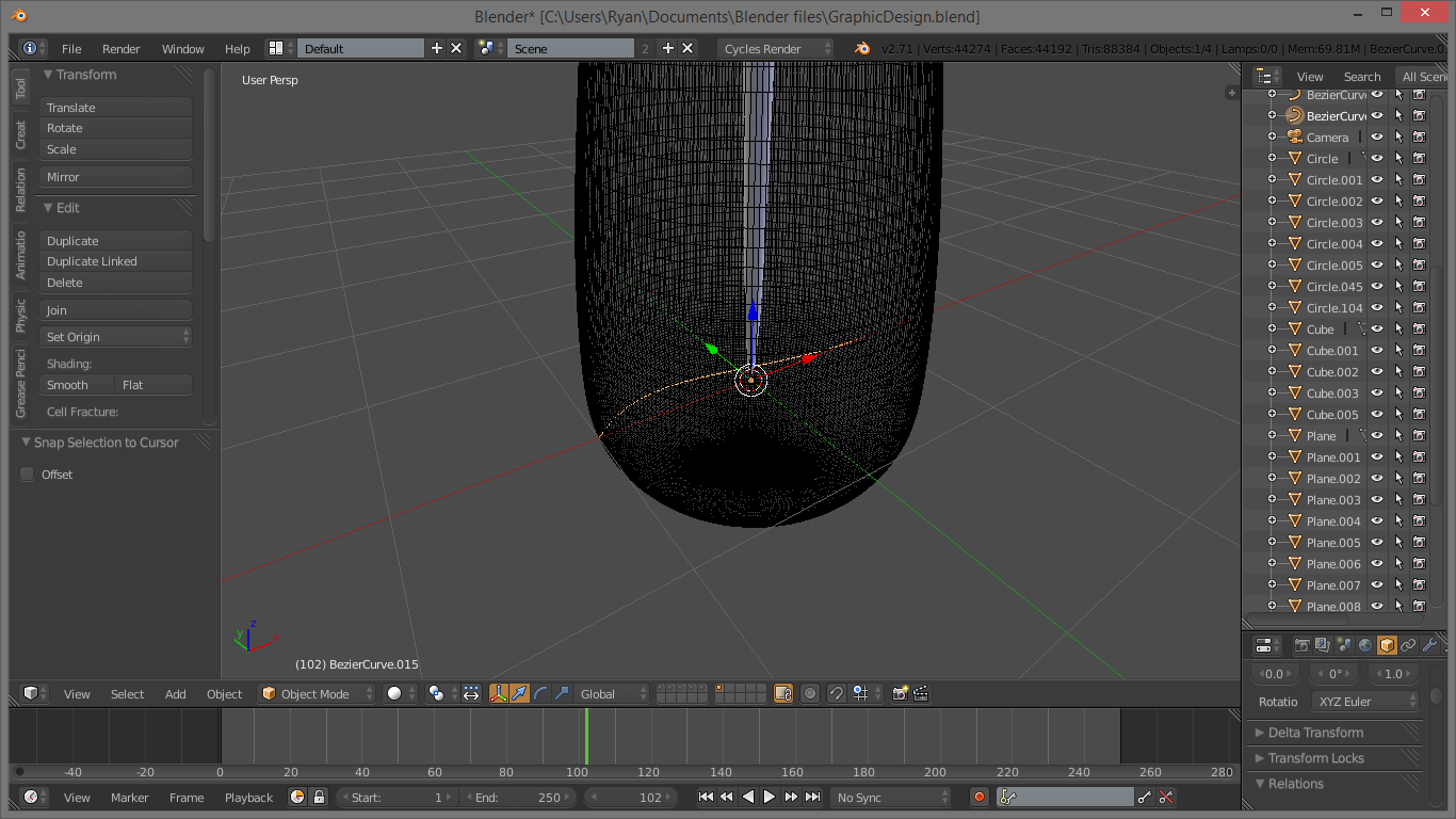
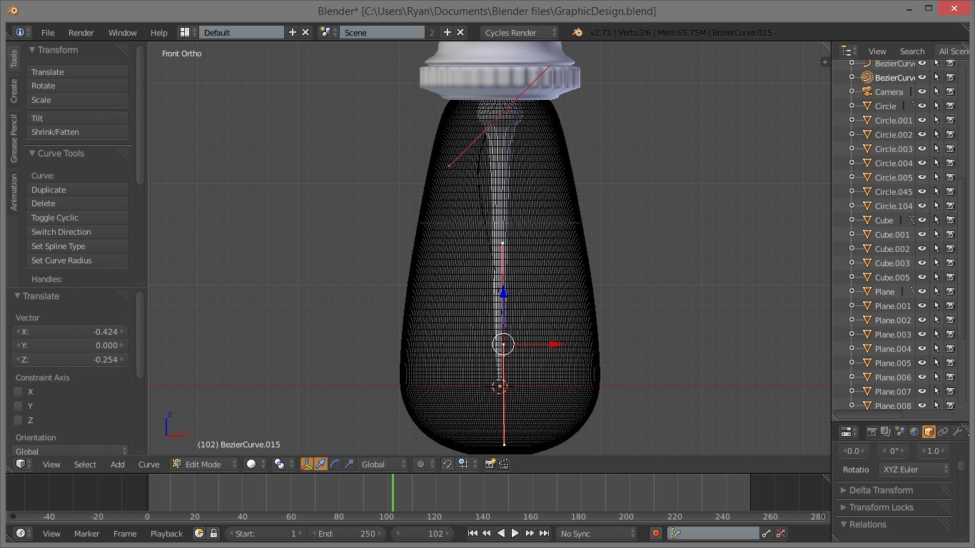
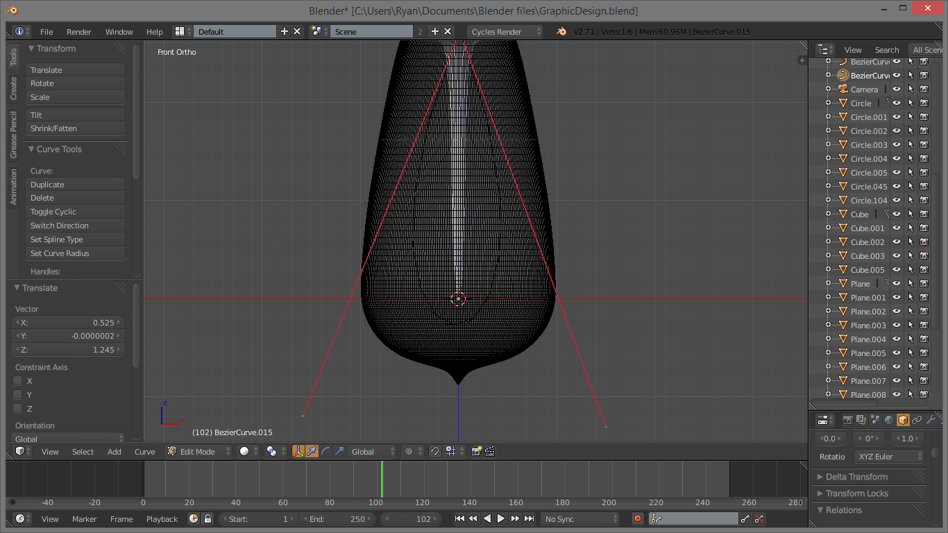
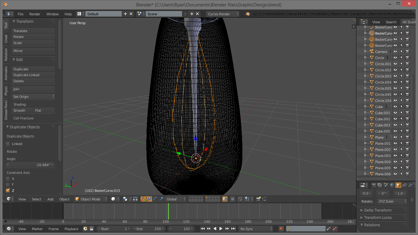
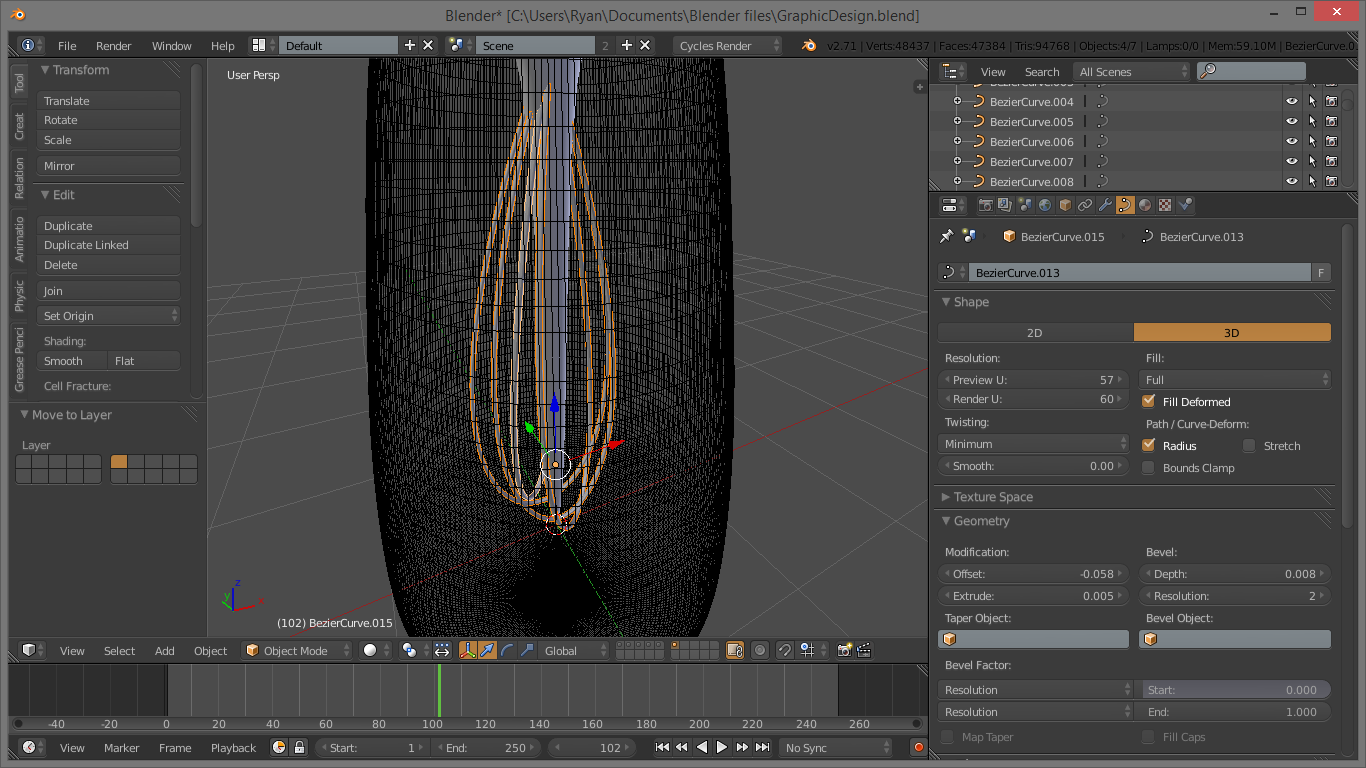
Now that we have the glass “Thing” in the middle, we need to add the wire filaments. To make this easier to model, we will use bezier curves. Use SHIFT-A to add a CURVE > Bezier. This will create a bezier curve that we can edit to use for the filaments. Drag it up to about where you want it to attach to the light-bulb, and TAB into edit mode. Blender's beziers edit like normal bezier curves, so grab the handles and tweak them around. The bottom of the filament should extend pass the middle glass piece, about halfway between it and the bottom of the bulb. You can do the entire filament with just the two handles. Selecting the vertices of the handles is done the same way as it is with a mesh. Play around with it, then when you are happy, TAB out of edit mode, and use SHIFT-D to duplicate it. Use R to rotate it, and Z to lock it on the Z axis. Spin it around until you are happy, and do this a couple of times. You may want to edit some of the filaments to give a bit of variation afterwards.
Now we have curves, but nothing solid. To fix this, go under properties with the curve selected. At the top, click the little curve icon. This looks really confusing, but we just need to do a few simple things. At the top, under Shape, change the fill type to Full. Now, under Geometry, scale up the Depth slider under bevel. Scale it up to a good size. You may also want to increase the resolution of the curve's bevel and length. To do this, crank up the Bevel resolution and the resolution slider under shape until it looks good. Use the same settings on the other filaments and it's done. Now we have filaments!
At this stage, it should be looking pretty good! You can change the max draw type of the bulb back into textured to make things look better. It should look pretty much like a baby bottle. But a really awesome one. All we need is the wire at the top now, and we are done the modelling!
The Top Wire
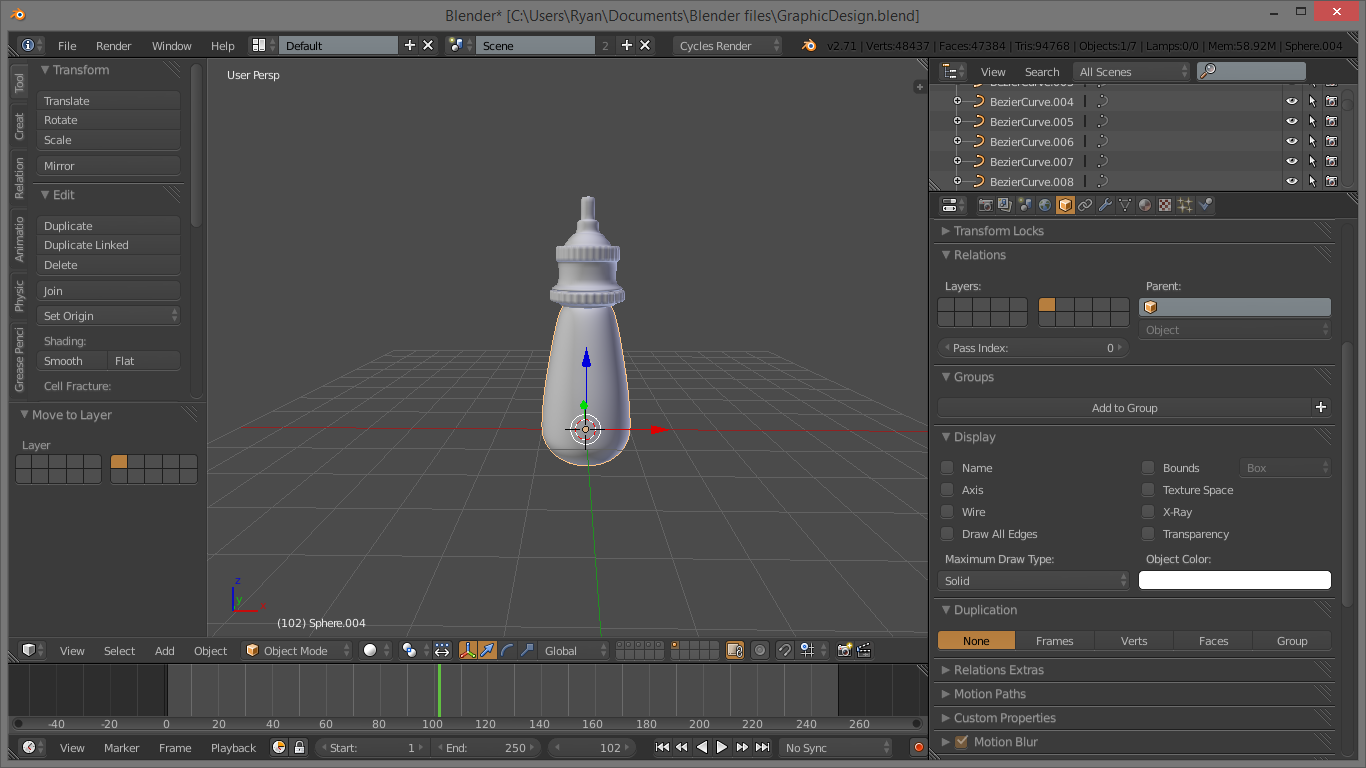
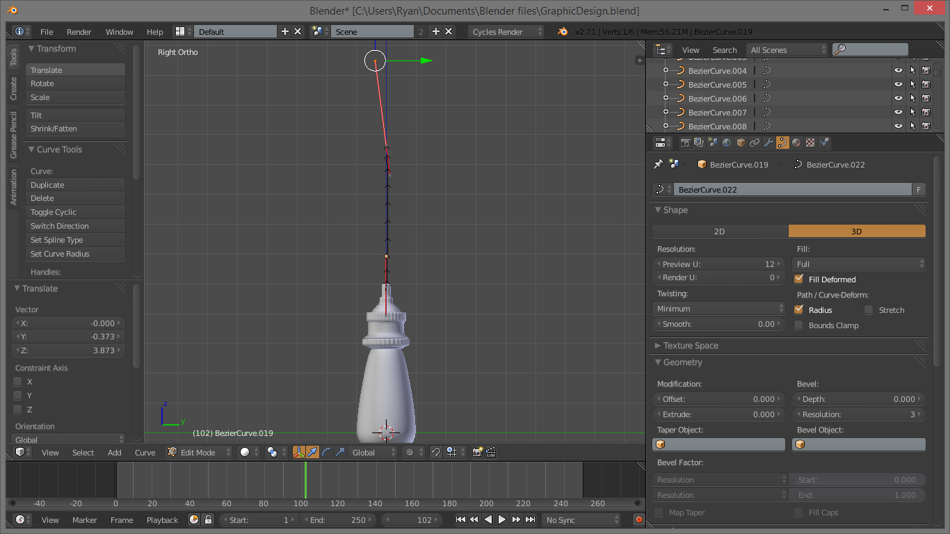
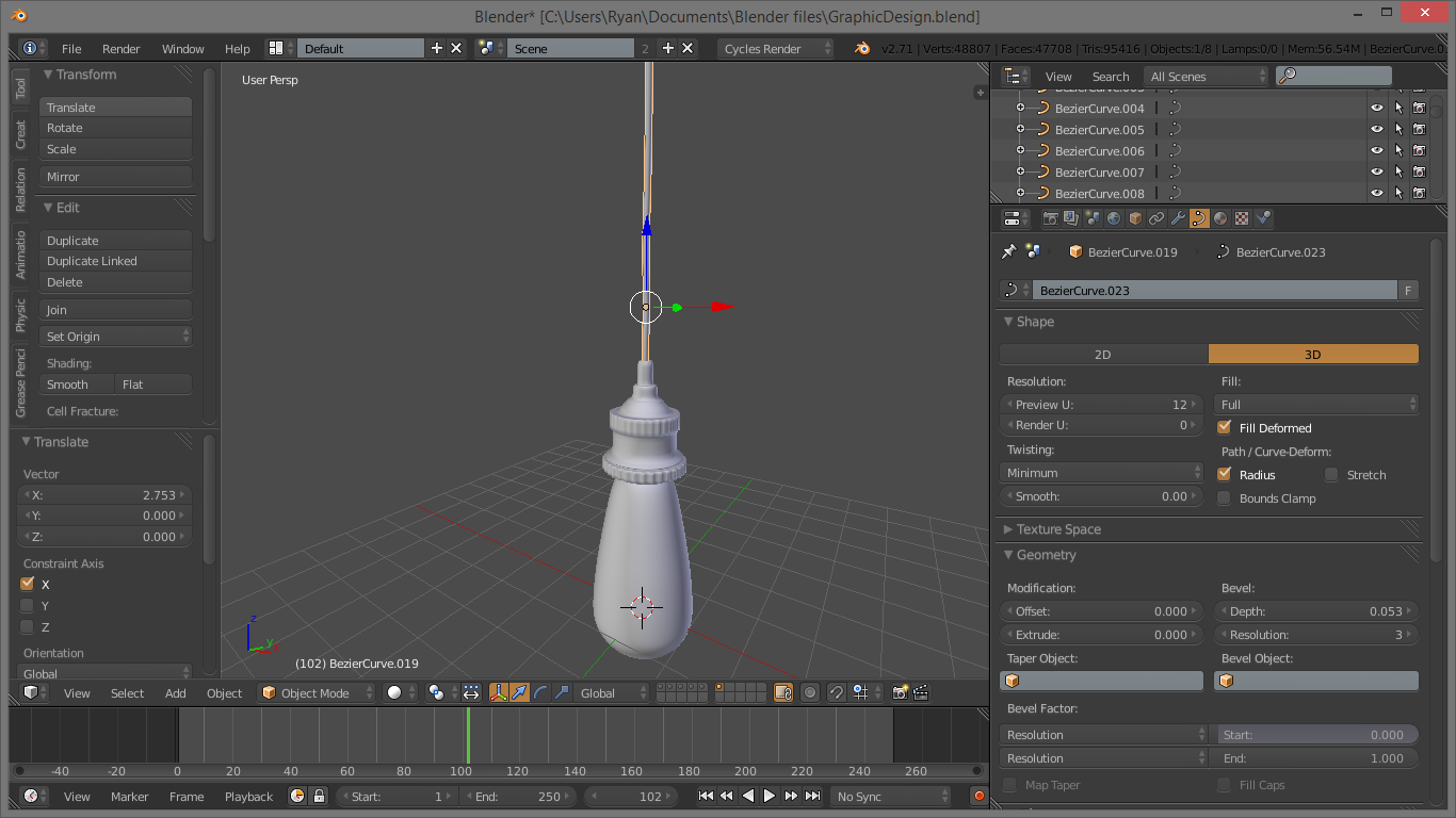
The wire at the top is just another bezier curve. Using the same process as we did for the filaments, add a wire and make it a little bit kinky, so it is not just a straight line. Increase the bevel settings until the wire is thick enough, and you are finished the lamp!
That wasn't so hard!
Going Further
At this point, we have finished the detailed modelling. Before I go into the rest of this tutorial, however, I want to note that you can take this farther than what I have done. For instance, in my project, I have added a screw to the side of my lamp, which was in the reference image. This is just one example of the "extras" you could throw in. You could try modelling different types of lamps, or add an entirely new object into the scene. You can do far more than just what is covered in this instructable.
Duplicating the Lamp
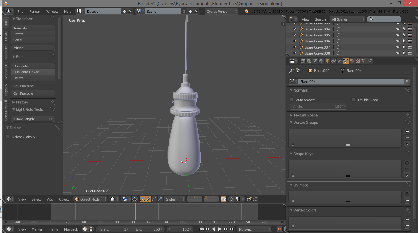
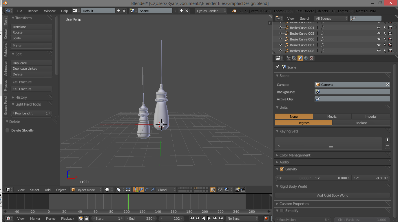
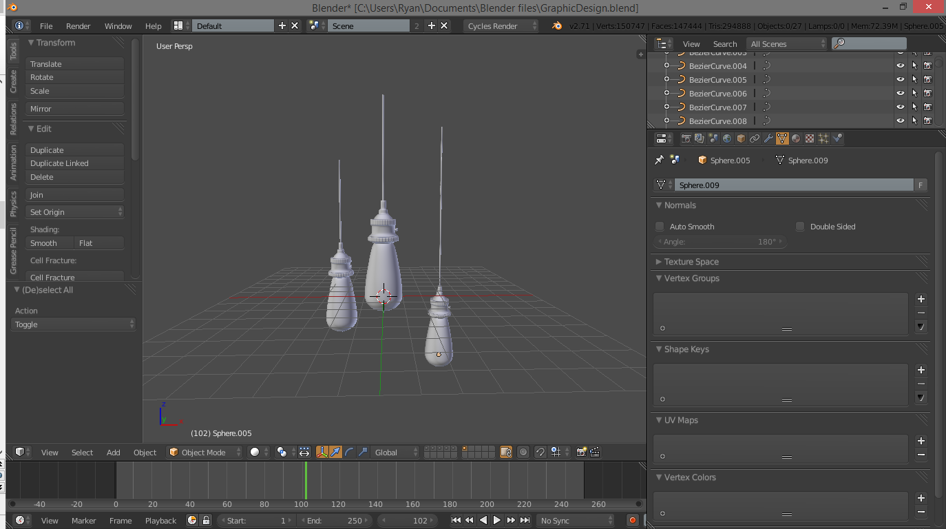
We are very nearly finished modelling now, and we have done all the tricky parts. Now make sure you are out of edit mode, and use C to select all the parts of the lamp. Just left click and hold the circle and drag it over the whole thing. Now hit SHIFT-D like we did with the filaments, and reposition the second lamp. It is a good idea to use the number-pad keys here as well as the orthographic view to line things up. Do this until you have as many other lamps in the scene as you want. It is a good idea to vary the height and depth to get some artistic variation in here :) .
Background and Camera Setup
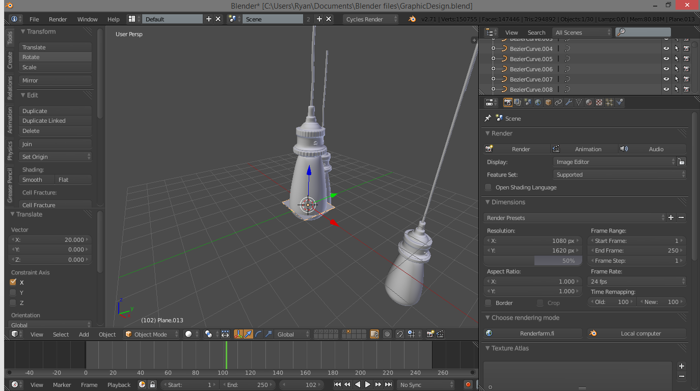
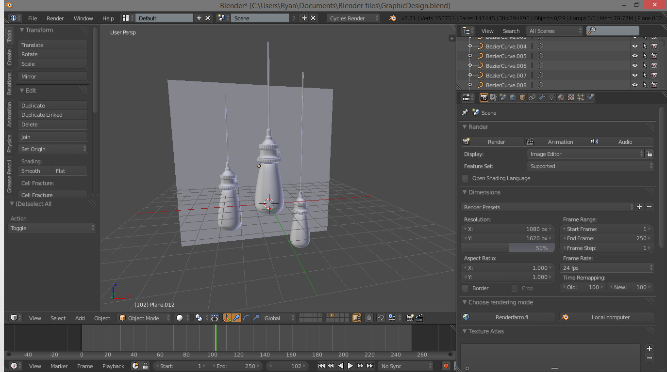
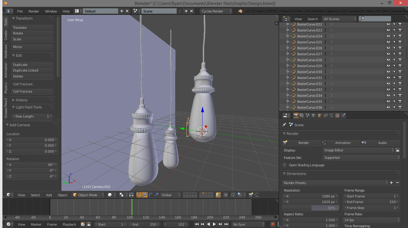
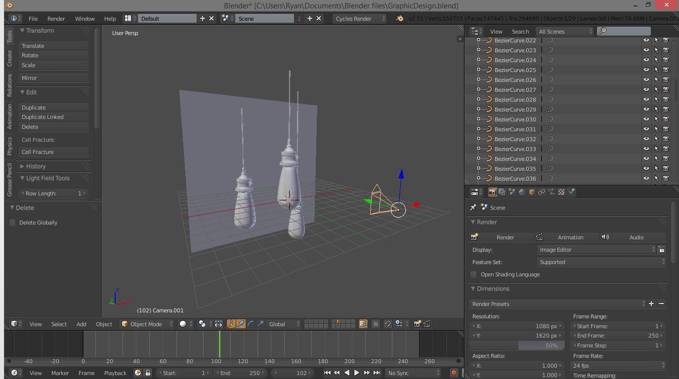
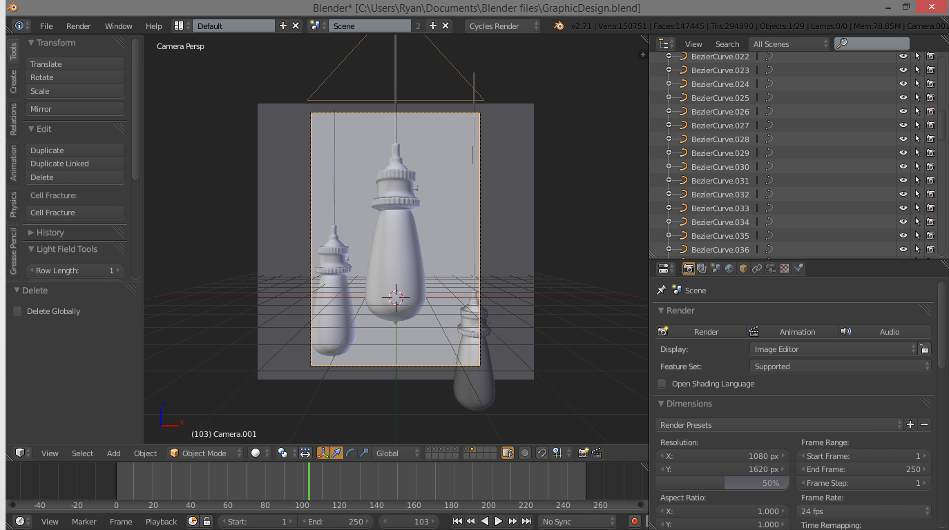
Now use SHIFT-A to add a plane, and put it behind the light bulbs. Rotate it 90 degrees and scale it so that it forms a good backdrop. At this point, we want to position the camera so we know where to put the plane. Select the camera and delete it. Press 1 on the numberpad to go into front view, and add another camera with the add menu. Rotate and drag it around until you find a good spot. I personally just moved my camera straight back and up just a bit.
At this stage, you need to decide what resolution your final images will be. Under properties, go to the little camera on the far left. Not the movie camera, the picture camera. Under "Render" you can see the current dimensions of the image. Personally, I used a camera size of 1080 x 1620. It is a good idea to have the X value greater than the Y, to give you a portrait layout, which shows more of your modelling work. You can check what the camera is seeing by pressing 0 on the number-pad. At this point, you may want to resize the plane so that it extends just to the borders of the camera.
Adding Particle Dust
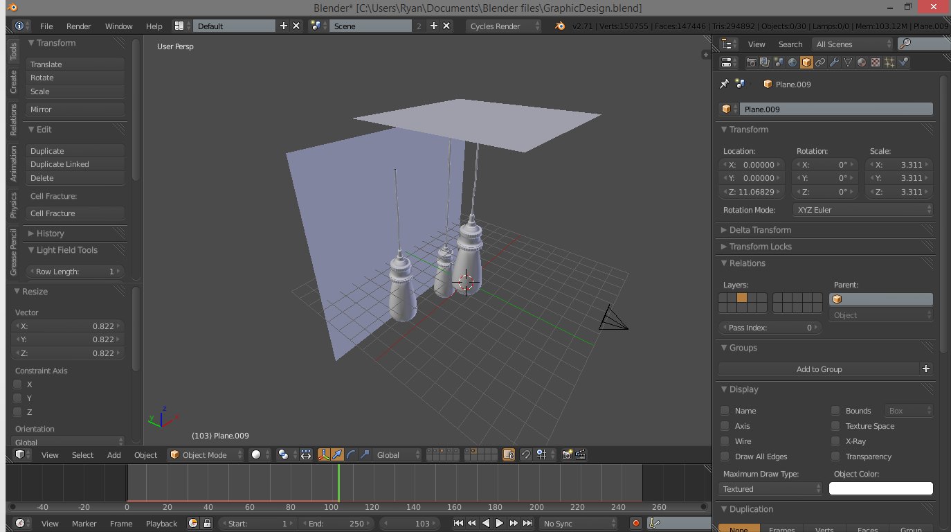
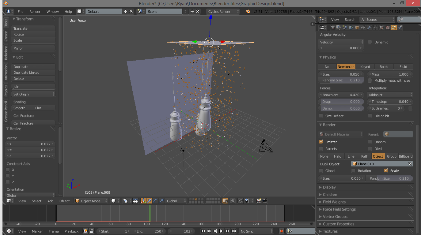
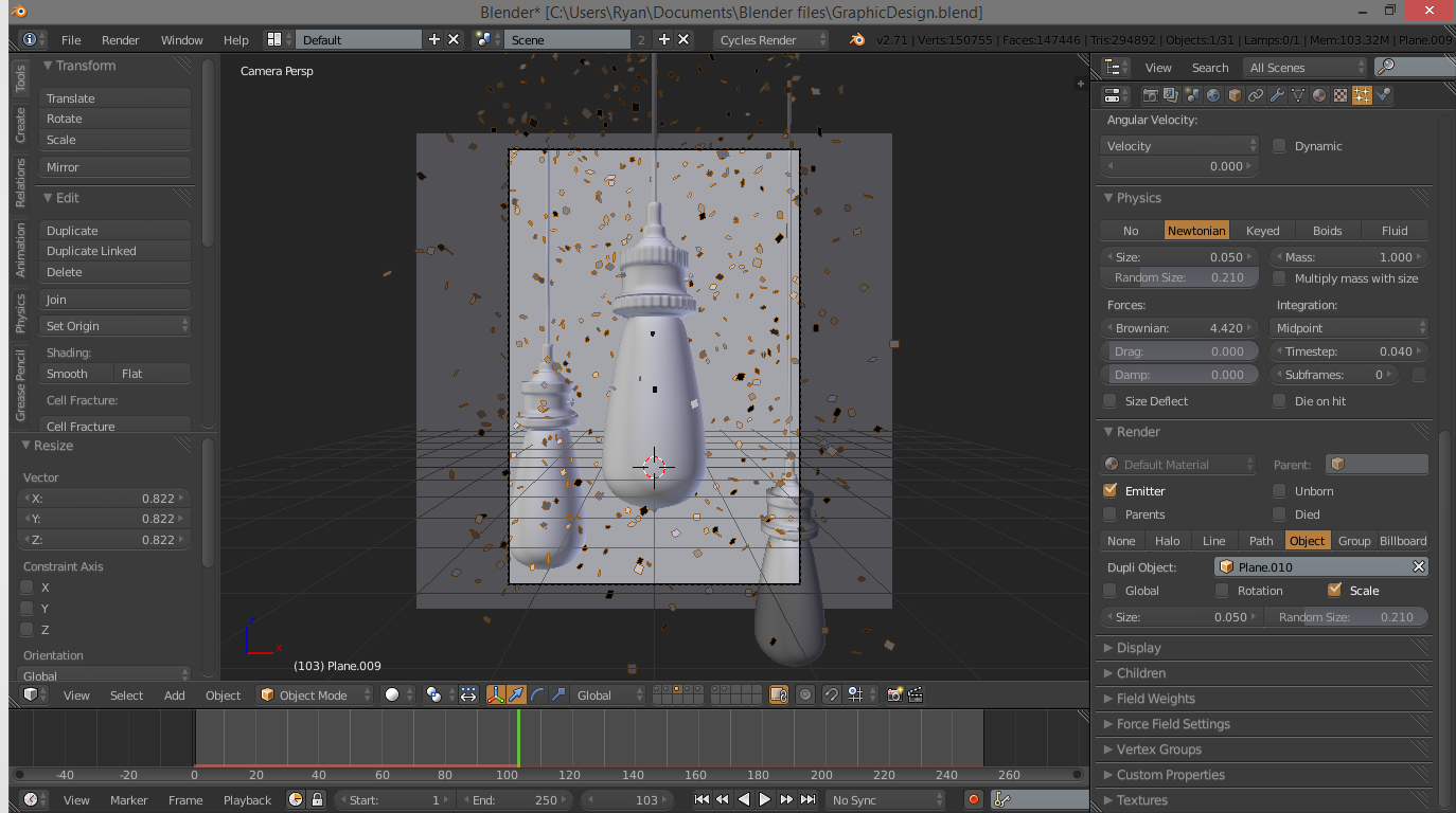
Once you have positioned the camera and the background plane, the very final thing we need to do is add some dust. This gives a lot of depth and makes the scene pop. Add a plane, scale it up until it is about as wide as your background plane, and move it above the top border of the camera's view. Under properties, go to the far right of the top tabs and click on the little sparkly. It's particle time!
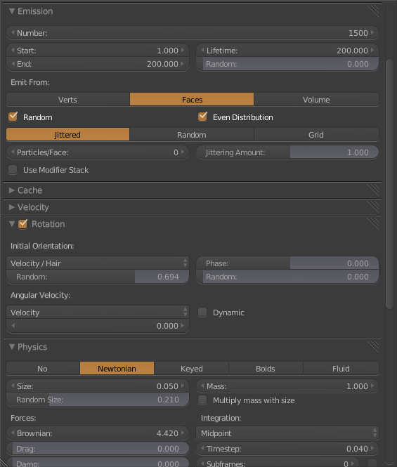
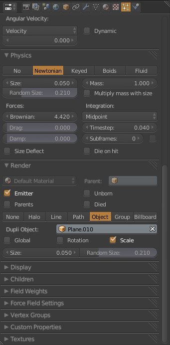
Add a new particle system to the plane. At this point, you can copy the image of my layout or follow the explanation below. Be warned: this gets a bit complicated!
Under “Emission” at the top, change the number of particles to 1500. This gives us a nice density of dust. Also change the lifetime to around 200. Now go down to the “Rotation” tab and make sure it is checked. Change the “Random” setting to around 0.7. This adds some spin to the dust motes. Now go down to the “Physics” tab, and crank up the “Random Size” a bit, I used about 0.2 for my project. Under that, crank up the “Brownian” force, I used a value of about 4.4. This adds some random motion to the particles. Down at the bottom of the screen, you will see the time-line. Press the forward play arrow, and watch all the little particles come tumbling out of our plane!
These don't look much like dust, so we need to add a texture to them. First though, we need a base for the texture. Click 2 on the top of the keyboard to jump to layer 2, and add a plane. Don't worry about scaling it, just click 1 to return to layer one. Now under the particle settings once again, go down to the render tab. Change the kind from halo to object, and on the little box that appears, click and select the plane we just added. It should be the highest numbered plane, so “Plane.002” or "Plane.003", or something along those lines.
Note: In the image, my particle object is Plane.010, this is just because I have a number of other objects in the scene that are hidden, because they are unecessary. Yours should still be Plane.002 or Plane.003.
Now we have a whole lot of falling little planes. Play the animation with the time-line arrow keys until the particles start disappearing. Jump into camera mode and ensure the particles are falling past the bottom of the camera before disappearing.
Now we are officially done modelling! In total, your scene right now should look like a bunch of baby bottles hanging from strings. With confetti. Really impressive. But don't worry, it gets better!
Starting Materials: Glass
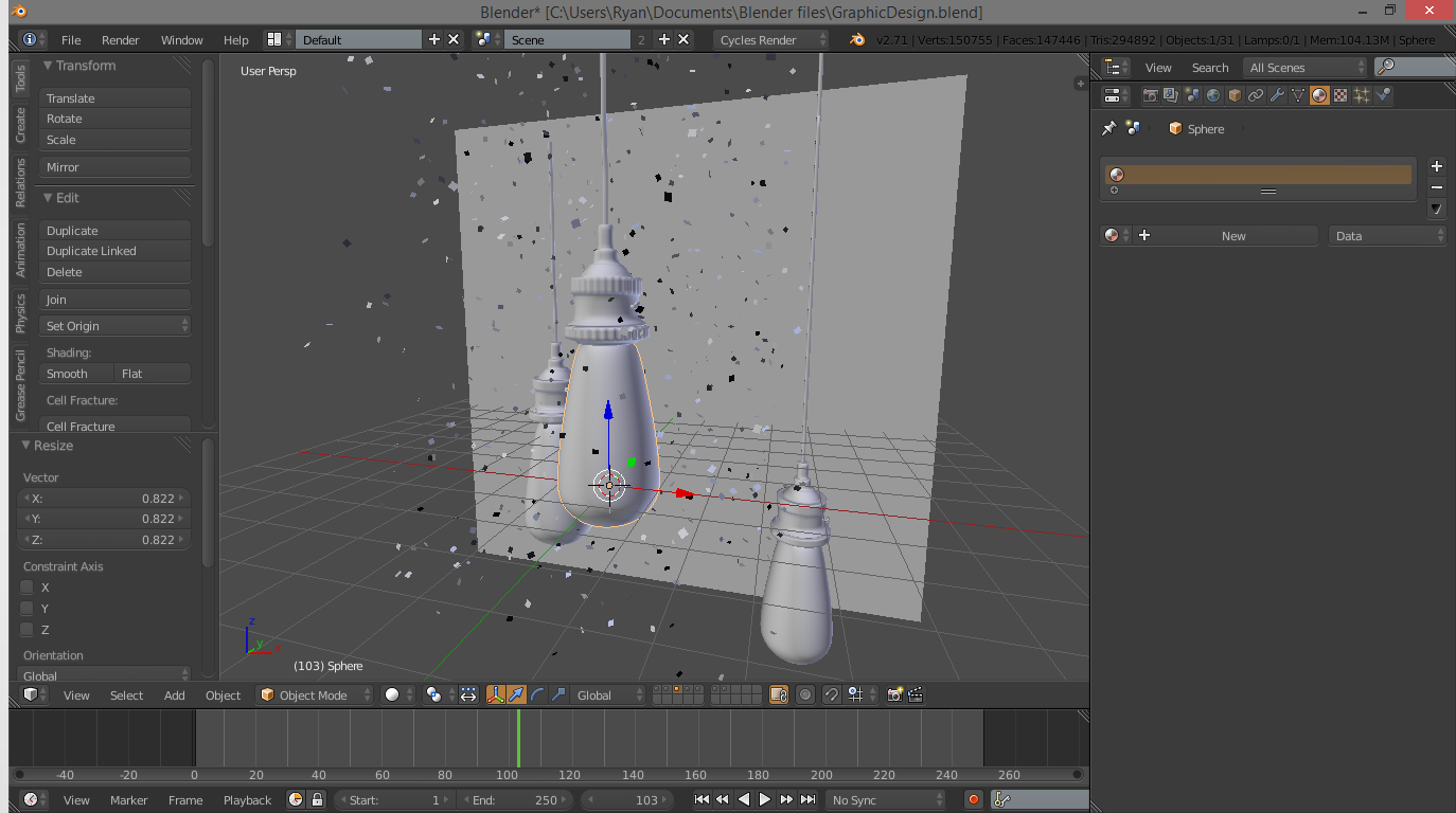
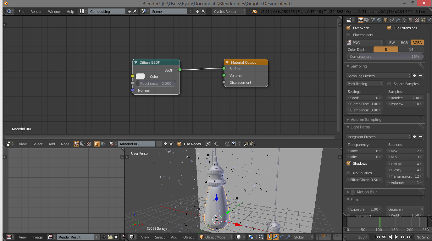
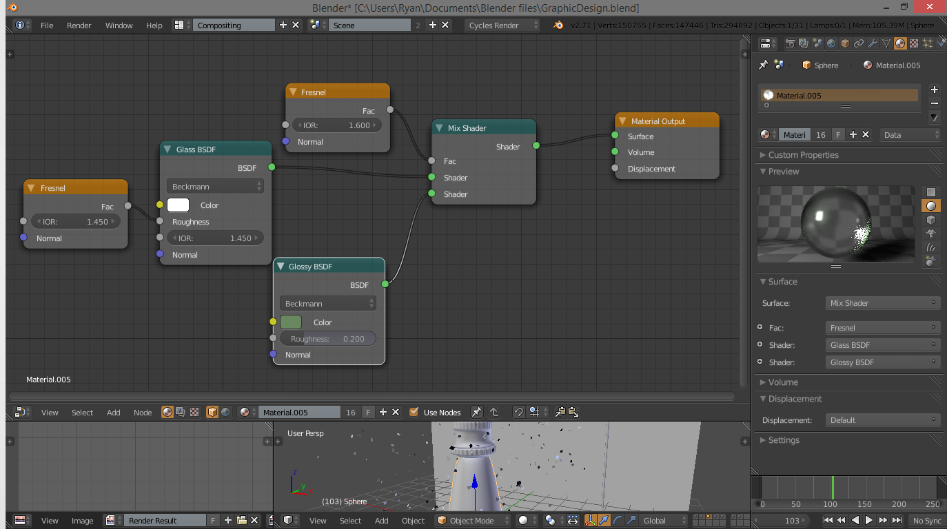
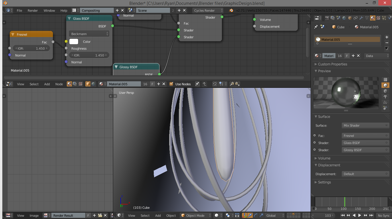
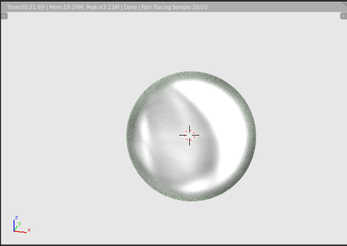
Textures are one of the most important parts of a scene. They ultimately can make or break the entire look. So we better make sure we do a good job! One caveat: the texture setups I am using here are, admittedly, very complex. This is because they have to be realistic. If you want, you can copy the layouts from the images. Or you can follow my lengthy technical explanation. It's up to you.
The first thing we will worry about is the glass texture. This is a reasonably complex setup, but not the worst. At the top of the window, change the “Blender Render” tab to “Cycles Render”. This makes the rendering process entirely different. Cycles gives you much more realistic textures, albeit at a longer setup time. But, that is what we want. I think.
Go under properties to the checkered sphere, and click +New. This adds a new material. We don't need to worry about the complicated stuff underneath, we will use a different method. Under the top bar, change the “Default” tab to “Compositing”. This changes the window layout to an easier layout for making materials. Make sure the materials tab is still selected in the properties window, and the “Preview” tab is open so we can see the sphere.
A brief explanation on Cycles:
The Cycles render engine uses ray tracing to give us photo-realistic materials. Basically, for each pixel, it shoots out a ray from the camera, and based on the math in the material setups, determines what the colour should be for that pixel. And it does this A LOT. That is why the render of the material starts out grainy and cleans up over time. If you can't see the render preview, on the materials tab, click the “Preview” tab. This gives us a render of the material on a sphere, which is a very useful reference.
To make sure we are editing the right material, ensure that the bulb is selected, you have added a material, and that the compositing window has the checkered circle and the orange cube selected. Use SHIFT-A to add nodes, or if you cannot find them in the menus, use the search function at the tope of the “Add” menu. Add the nodes shown in my setup, and hook them up as shown, with the values as shown.
Before I go any further, I want to note one thing. I hate following tutorials that do this. I don't want the setup, I WANT TO KNOW HOW IT WORKS!!! However, in this case, the “how it works” is very complex. I will give an explanation, but be warned, it is complex. You can totally skip it if you want.
For the glass material: Blender has a very nice glass shader. But it's not quite what we want. Adding the Fresnel node as a “FAC” in the roughness setting of the glass helps give some dimension to the edges. Fresnel basically affects just the edges of an object, making it useful for faking rim lighting, or in this case, glass. The mix shader combines the glass shader and a glossy with a Fresnel shader controlling how they mix. This gives the glass green edges, making it look thicker. And that's it!
Once you have created the glass shader, select the little glass finger, or protrusion, or thingamabob in the middle of the bulb. Go the materials tab, and under the drop down, select the image of the glass shader. You can rename this to “Glass” for future reference. That's done!
Filament, Metal, and Wire Shaders
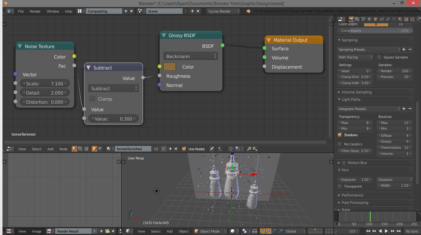
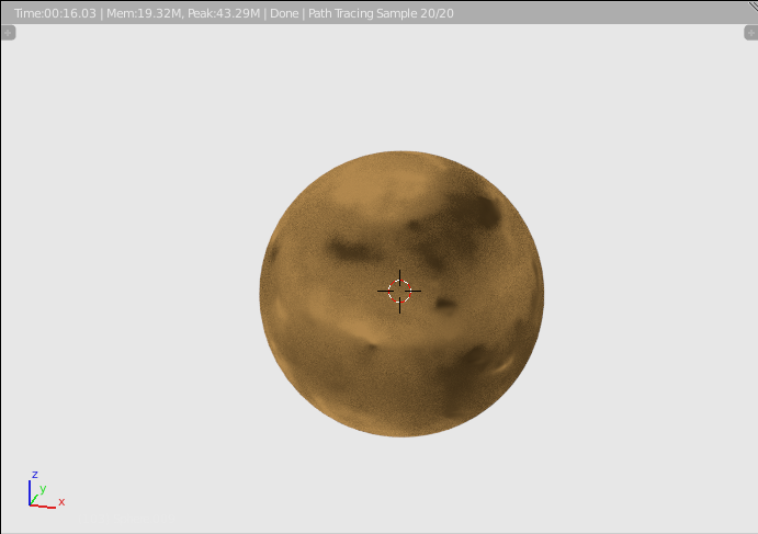
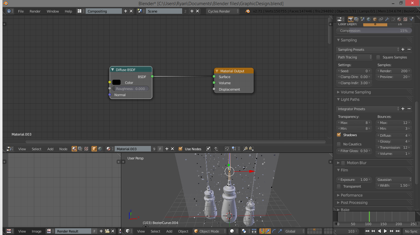
One dirty little trick: the filaments are the default shader. I didn't do anything with them. Not even assign a material. They are so close already to the colour of an unlit filament, I just didn't bother. They're pretty small too. No-one will notice. Hopefully.
One of the easier shaders is the metal shader. This gives some really spectacular results with very little work. Follow the setup in the picture, and an explanation follows:
The basis of this shader is a glossy shader. The one trick is the roughness factor. We first use a noise texture, with the adjust scale, etc. Then we add a math node and subtract from it a bit to tone down it's effect a little bit. This is hooked up to the roughness of the glossy shader, and that is it! For how simple this is, it makes the metal look both tarnished and dimpled and beat up. That wasn't so bad!
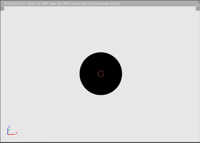
For the wire coming out of the top of the bulb, just adjust the colour of the default shader to a complete black, and we are good.
Texture Shaders: the Background
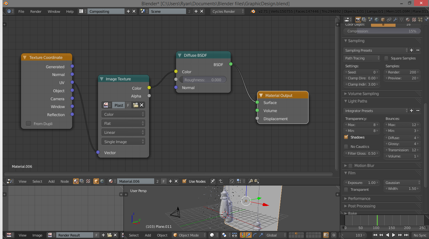
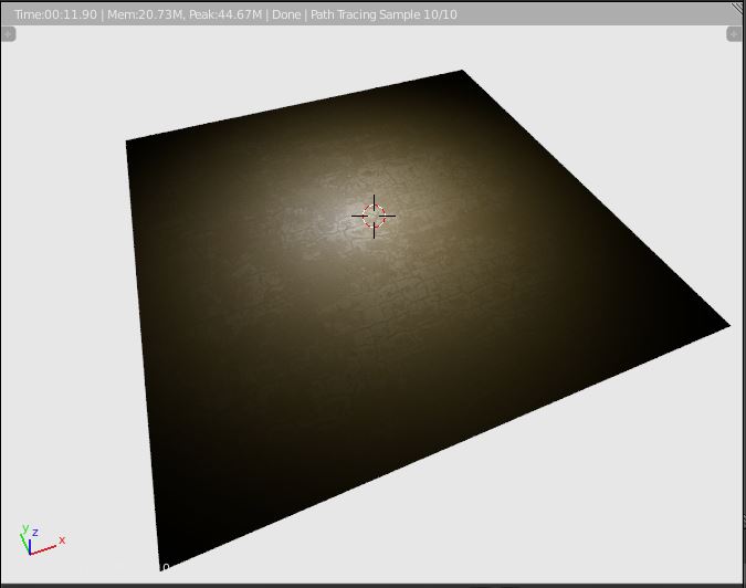
Now, to set up some texture shaders. This is a bit more complex, because we will have to take data from an image and slap it on our background and our dust. Let's start with the background.
Add a material and follow this node setup. You can download the background texture from here: http://i.imgur.com/gVsQ38l.jpg
Note: This image is my own, I used a slightly different one for the final render. However, I can't include that image due to copyright rules.
Click on the image selector in the image node in our material setup and navigate over to the plaster image in the file system. What this does is really pretty simple too. The texture co-ordinates node tells it to figure out how to slap the image on the plane, in this case, we let it figure it out, because it is pretty simple. The image node just tells it what image to project, and we plug this into the colour node of the default shader. Tada!!!
The Dust Shader
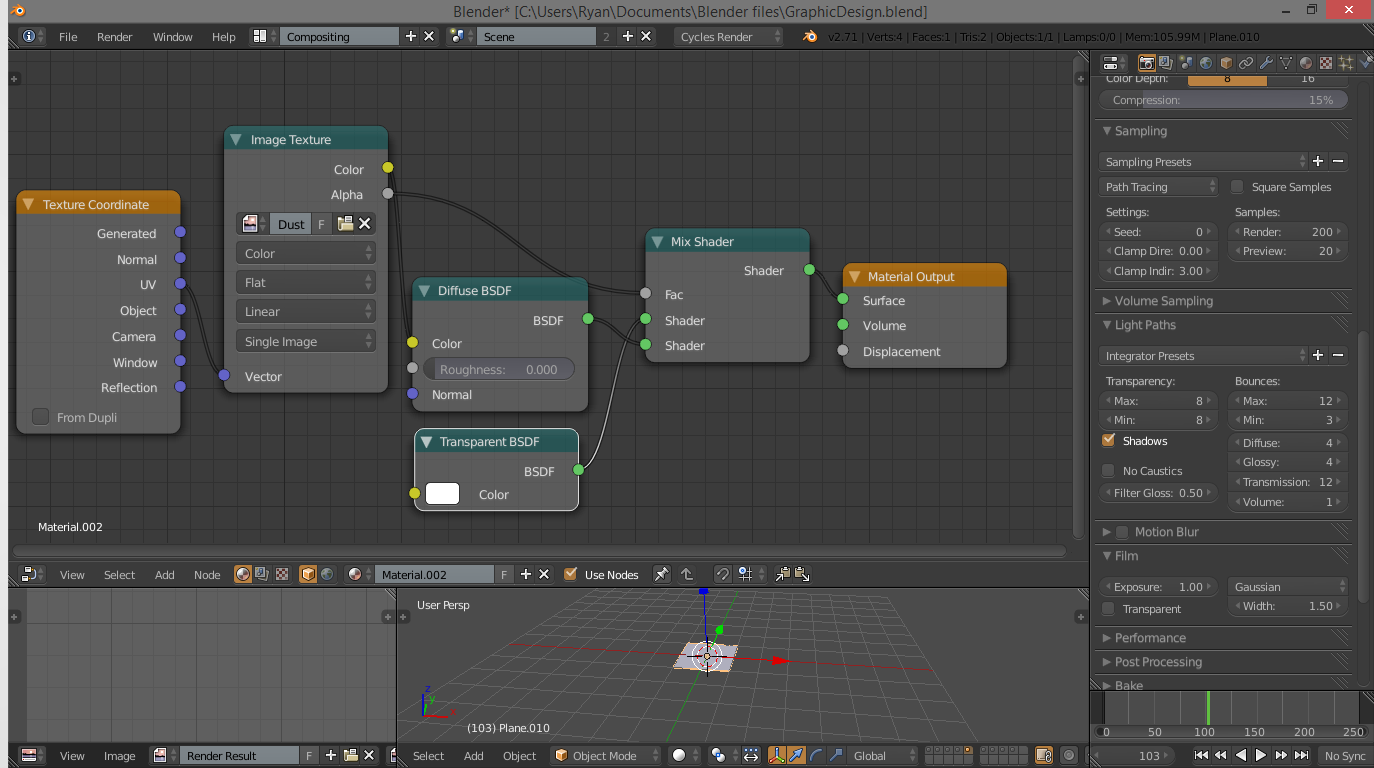
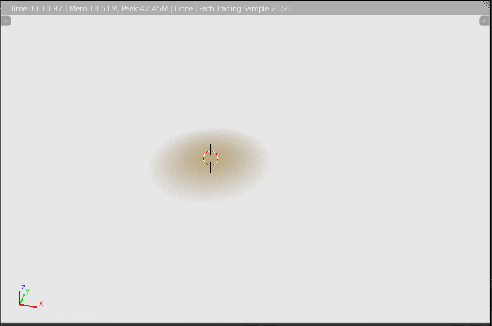
The dust is a bit trickier, but not that hard. Make sure you have the plane we are using as the object for the dust selected, then create a new material with the node setup in the picture. The first three nodes are the same as the background shader, just with a different image. The image is really just a circular transparent gradient, the image can be found here: http://imgur.com/pZAS8vs
Note: Again, this is my own image, but it is licensed under CC-BY-0, which means you may use it freely without crediting me.
The nodes we added are the mix node and the transparent node. The transparent shader gives us the fade from the centre of the dust mote to make it softer, and the amount of transparency mixed in is controlled by the image's alpha, or transparency, channel. Get that hooked up, and the material setup is finished!
Lighting and Depth of Field
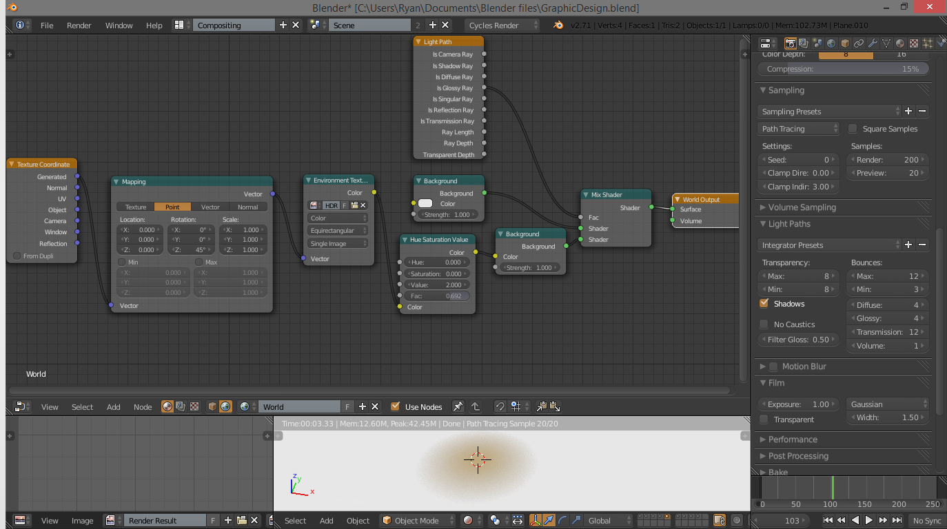
For lighting, we are going to use a method called HDR lighting. What this does is take data from a panoramic image and use it to light our scene. This results in very realistic lighting and reflections with very little work. This is another node-based shader, so under the compositing toolbar at the bottom of the compositing window, select the little world icon. This tells us we are now editing the world's shader model. Use the shader setup shown in the images, and add a HDRI panorama in the image selector. You can easily find an HDRI panorama with a google search for something along the lines of "HDRI image window". Due to the rules here on Instructables, I cannot include the one I used, but it is easy to find others.
An explanation of the setup: This setup is way more complicated, but makes sense. The "Texture Co-ordinates" node tells tells blender how to project the image, and the mapping node tells blender how to project the image. The point setting works well for panoramic images, because it is all taken from a single point in the room. The "Environment Texture" node tells Blender what image and what kind of image we are using, and the "Hue/Saturation/Value" node removes any colour from the image, so it doesn't tint our materials funny colours. The mix shader works in a more complex way. Based on the "Light Path" node, it mixes the HDR image with a white if the light ray reflects off a glossy surface. In other words, it makes glossy surfaces brighter. And that's it!
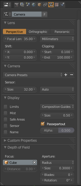
One final thing before we do the render: Depth of Field. This blurs the unfocused areas, giving us a nice environmental effect. Select the camera, and under the camera in the properties tab, expand the depth of field tab. Change the focus to whatever object your centre glass finger thing is, you can find out what it is called by selecting it and looking for it in the outliner above the properties tab. Set the “Size” of the depth of field to 0.3. You may want to use the image above for reference.
Rendering!
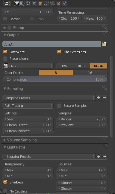
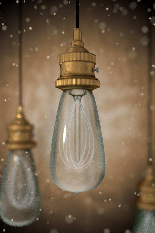
Ok, last thing, I promise. To make the render easier on your computer, go under the first tab in the properties panel, and change three things. Under sampling, change the “Clamp Indirect” under settings to 3, and change the “Render” samples to around 300. You can play with the render samples later if you wish. Finally, under the “Light Paths” tab, change “Filter Gloss” to 0.5. And that is it!
At this point, we have finished the Blender part. Now go back to the default view from the top bar, and press F12 on your computer. This will start the render. So go make yourself a cup of tea. On my Toshiba Satellite LP-750, with 8 Gigs of RAM and an A8 graphics card, it takes about 20 minutes. Which, by the way, is pretty good for a render. I have had renders up to 8 hours.
Once you have that cup of tea, or hot chocolate, or coffee, and your image is done rendering, use the little “Image” tab at the bottom to save your render wherever. Now save the scene with CTRL-S, and you can shut Blender down. YES! At this point, you should be excited. If not, become excited right now.
Starting in Gimp: Vignette
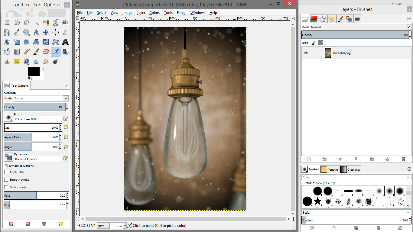
Start up gimp and open up your image in Gimp. (For those who don't know, just use the task-bar at the top). We want to add three effects: a vignette, increased contrast, and a little trick called chromatic aberration. We will start with the vignette.
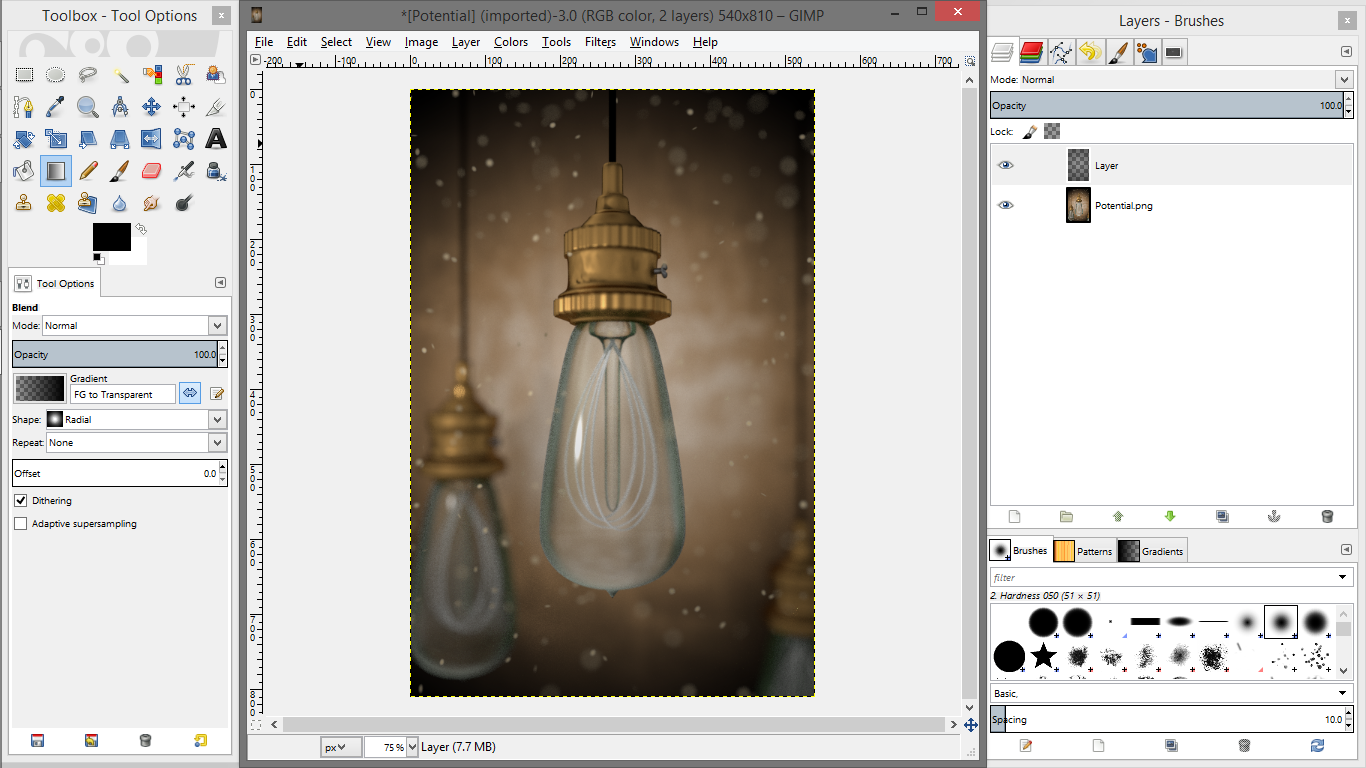
Use the layer dialogue on the right to add a new transparent layer with the “Add Layer” button. From the toolbar on the left, select the gradient icon. Change the gradient type to “FG to transparent” or something like that. Make sure the foreground (FG) colour is in fact black, you can flip colours with the little arrows at the bottom right of the coloured rectangles. You may need to flip the gradient direction around with the little arrows beside the gradient type selector, but this is easy stuff. Also make sure the gradient is set to radial, not linear.
Now, with the new transparent layer selected and the gradient tool active, put your mouse in the middle and drag it as far to one side as you can. Let go, and we should have a nice darkening towards the corners of our image. This is our vignette, which adds a bit of old-fashioned atmospheric flair to the whole piece. It helps keep the eye concentrated on the focal point in the centre. At least in theory...
Adjusting Contrast
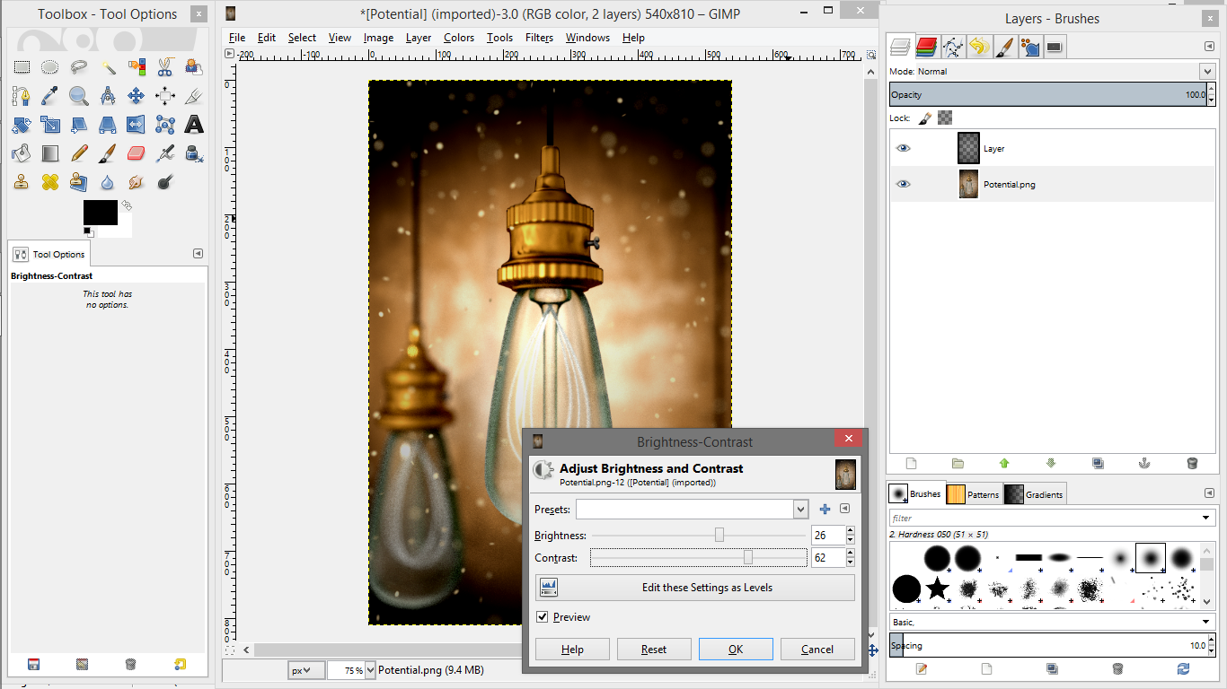
The next part is the contrast. Making sure your original image, not the vignette layer, is selected in the layers dialogue, open up the “Colour” menu at the top, and bring up “Brightness/Contrast” I increased the brightness by about a third of the distance, and really cranked the contrast. At this point though, its all up to you. This is just artistic preference at this point. So let that wild artistic beast inside of you take over. Maybe.
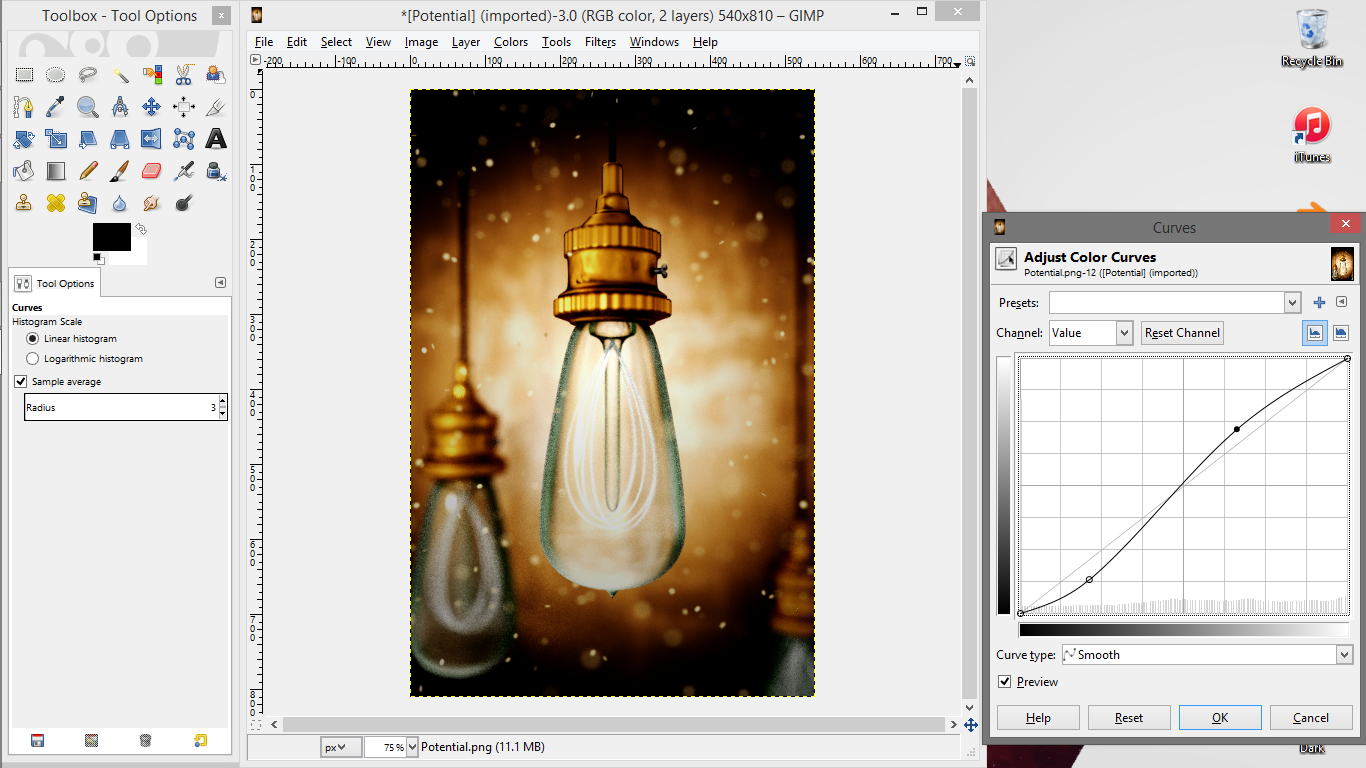
One other adjustment to the contrast I like to make is to bring up the curves window from the colours menu. This allows you to add subtle, non-uniform contrast adjustments. I typically lower the curve a bit below average at the beginning, and raise it a bit at the end. Again, its up to your artistic beast inside. :)
Chromatic Aberration
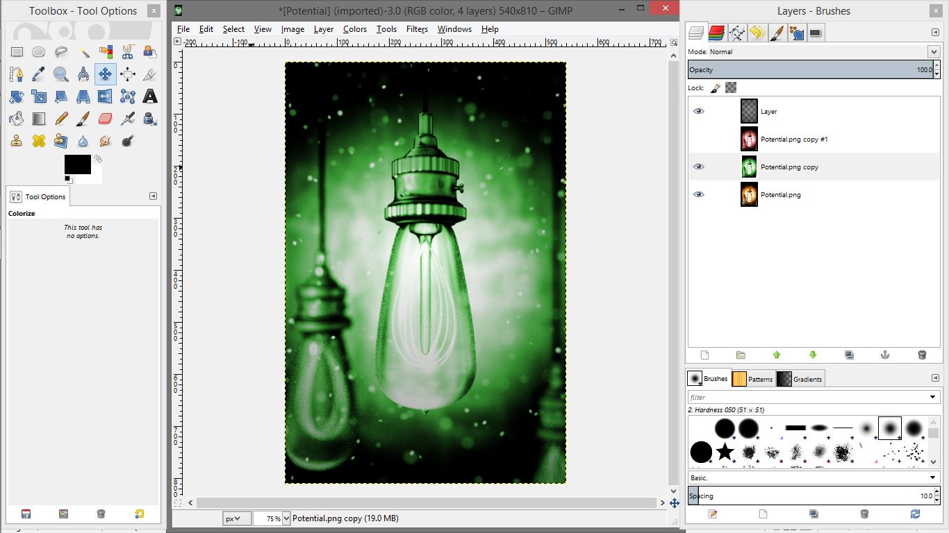
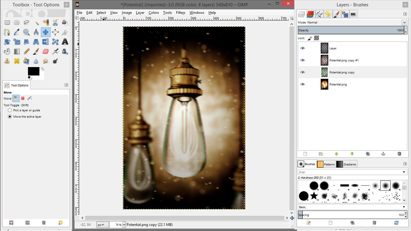
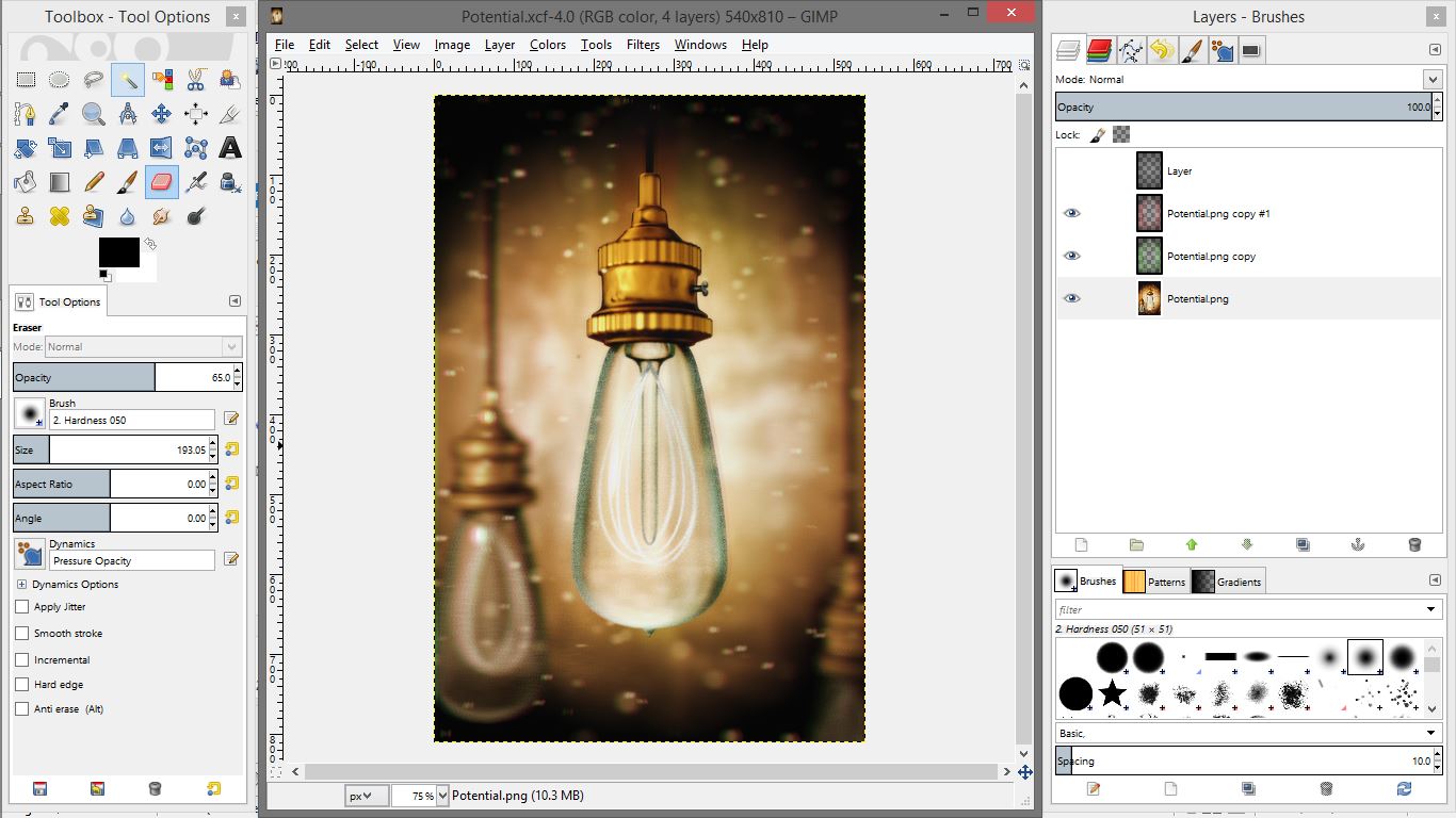
The trickiest part here is the chromatic aberration. You can skip this if you want, but I think it adds a subtle effect to the image that really adds to the vintage look. Chromatic aberration is a separation of the colours at the edge of an image. This is actually reasonable simple to accomplish, but there are a number of steps.
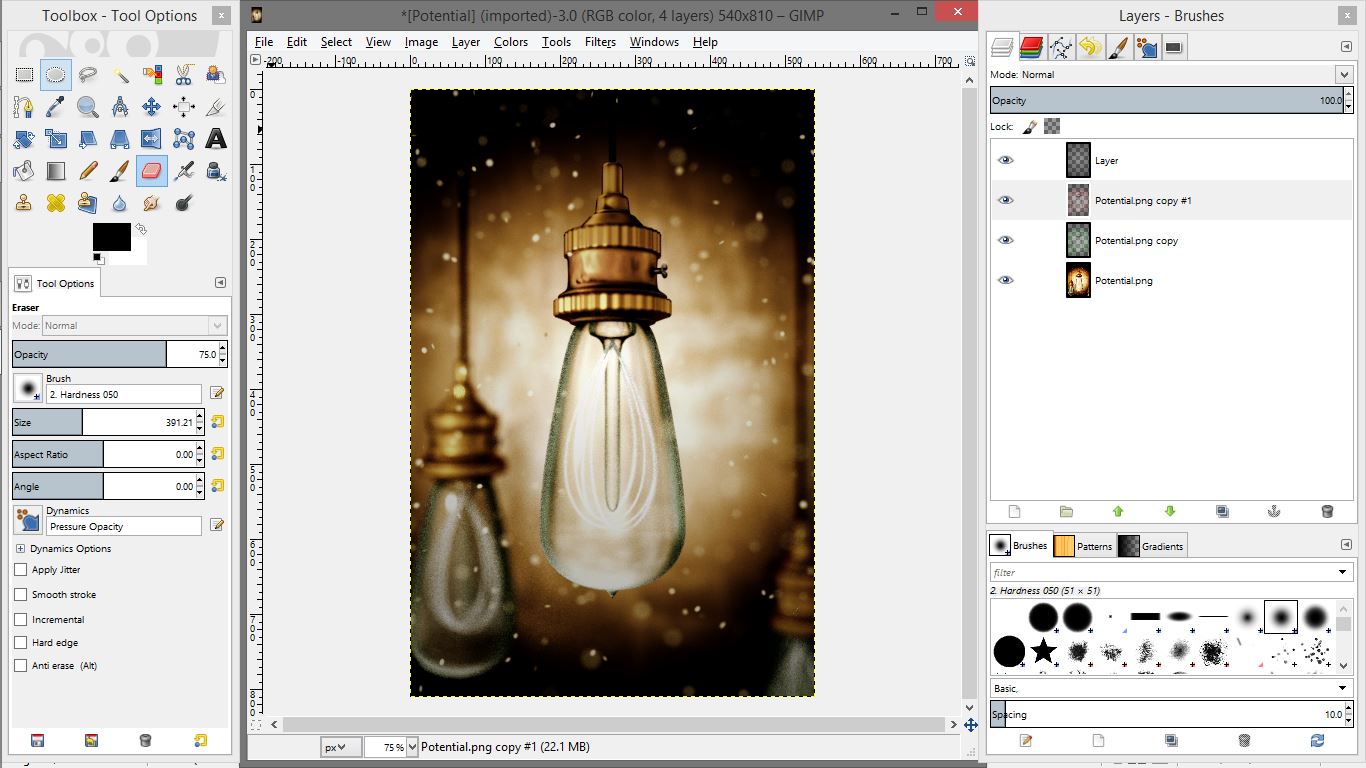
Using the layers dialogue again, duplicate the original layer twice, so you have 3 images. Select the top one, and use the colourize filter from the “Colours” menu to make it as red as possible. Now grab that eraser tool from the left, and set it's opacity to about 65%. Erase over the whole image just once. Now, select the next layer duplicate, the middle one, and use the same process to turn it as green as possible. You may want to turn off the other layers by clicking the eye beside them. This way you can see what you are doing. Again, erase over this layer once, and turn the others back on. Sure doesn't look like much, right?
Now for the fun part. Use the four way arrow tool from the left, and shift the red layer a bit to the right, and the green layer a bit to the left. Make sure you have the layer you want to move selected, and the right settings on the “move layer” tool. Turning other layers off may help, but you may also want to leave them on. Ok, so your image should officially look like something you would see with a really bad migraine. Or under other particular influences. This is because the layers are also blurring the middle of the image. To fix this, erase over the middle light bulb on both the red and the green layers. Now the main light should be clean and normal, and the rest should have a light colour separation effect, particularly on the dust particles. Now finish off the rest of that tea or coffee and grab a cookie. You are done!
Framing the Final Image
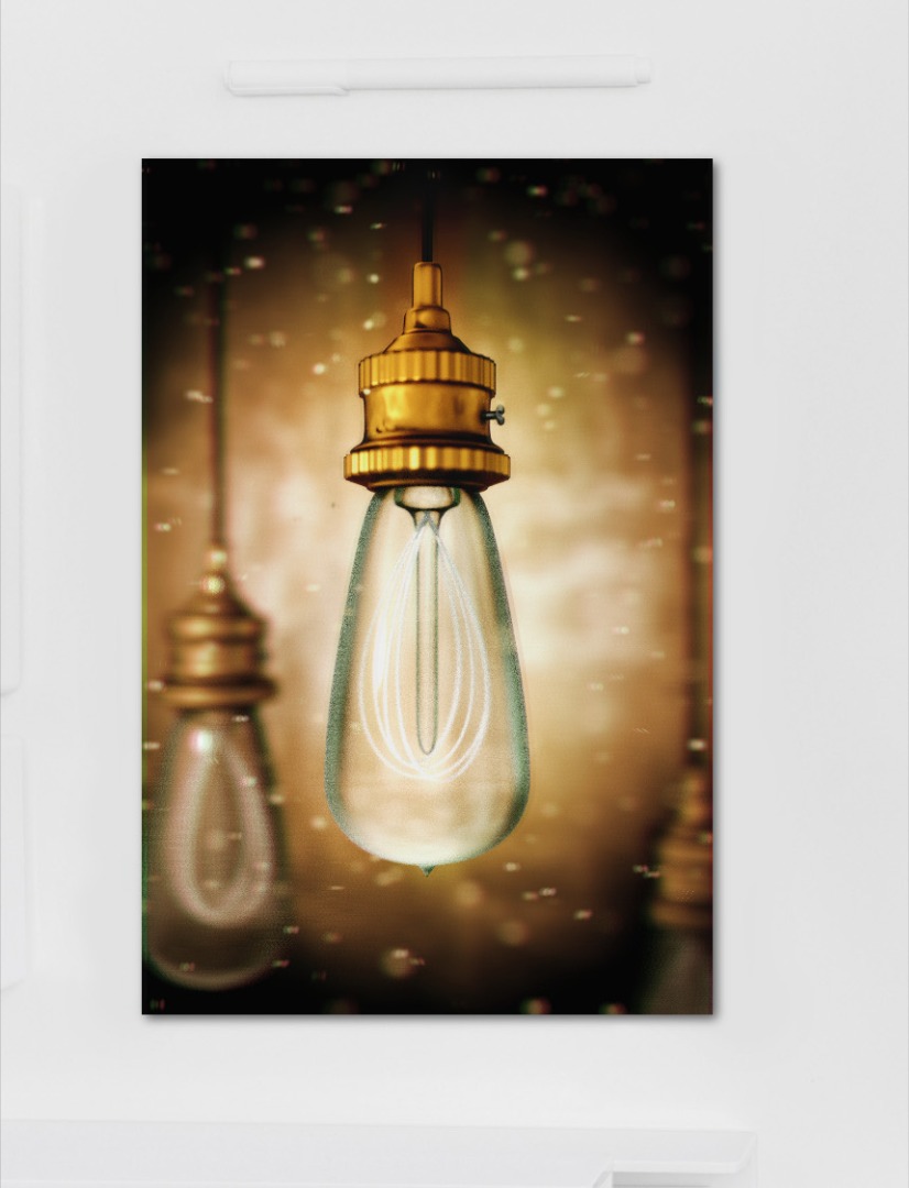
For the final, completed image, I used a frame from Creative Market, part of the 8 Clean and Contemporary Paper Mockups, which is a beautiful package of all sorts of clean backgrounds, mockups, and frames. I will not cover this in detail because it is extremely simple. I used the third image included in the pack, rotated it 90 degrees, and opened my final edited as a layer. The only fancy stuff I did was add a drop shadow to the image, and Voila!
The frame adds a nice bit of modern styling which contrasts nicely with the heavy vintage grunge of our render. The drop shadow effect makes it look like it is lying on a modern desk, giving all sorts of artistic implications :)
And you are finished!
Final Comments
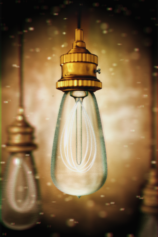

I realize this has been a very long instructable, but it goes through a lot. By now, you should know how to use the basics of Blender and Gimp, and be able to set up some basic environmental effects in Blender, as well as create materials for it's cycles engine. That's pretty impressive! I hope your inner artistic beast is sufficiently satisfied. For now.
3D art is just one method of approaching graphic design, but it is extremely powerful. To keep you going if you get stuck, here are a bunch of great references and tutorials:
Blender Docs: www.blender.org/manual/
Blender Guru: blenderguru.com
Blender Cookie: cgcookie.com/blender
I hope you have enjoyed this tutorial! If you did, please vote for me in the Graphic Design contest! :)