11 Concrete Tips to Improve Your Watercolors
by SiddharthS141 in Design > Art
8146 Views, 122 Favorites, 0 Comments
11 Concrete Tips to Improve Your Watercolors
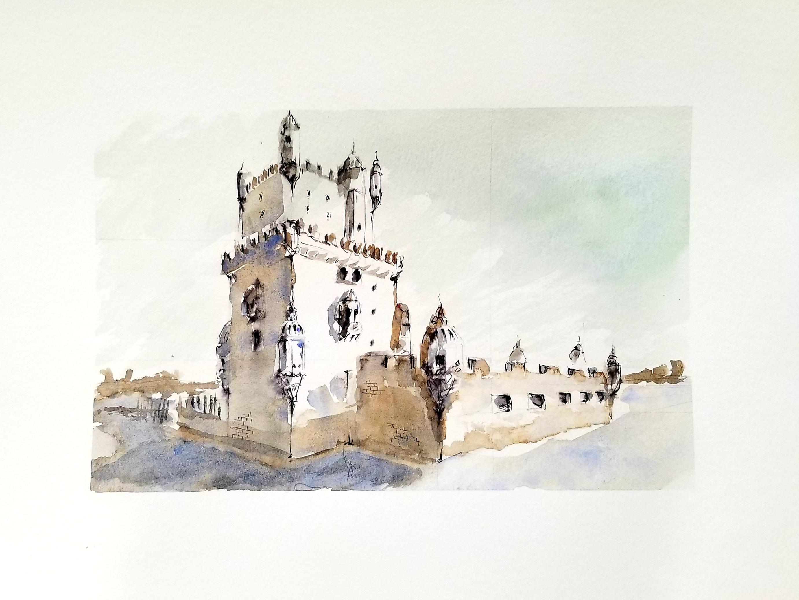
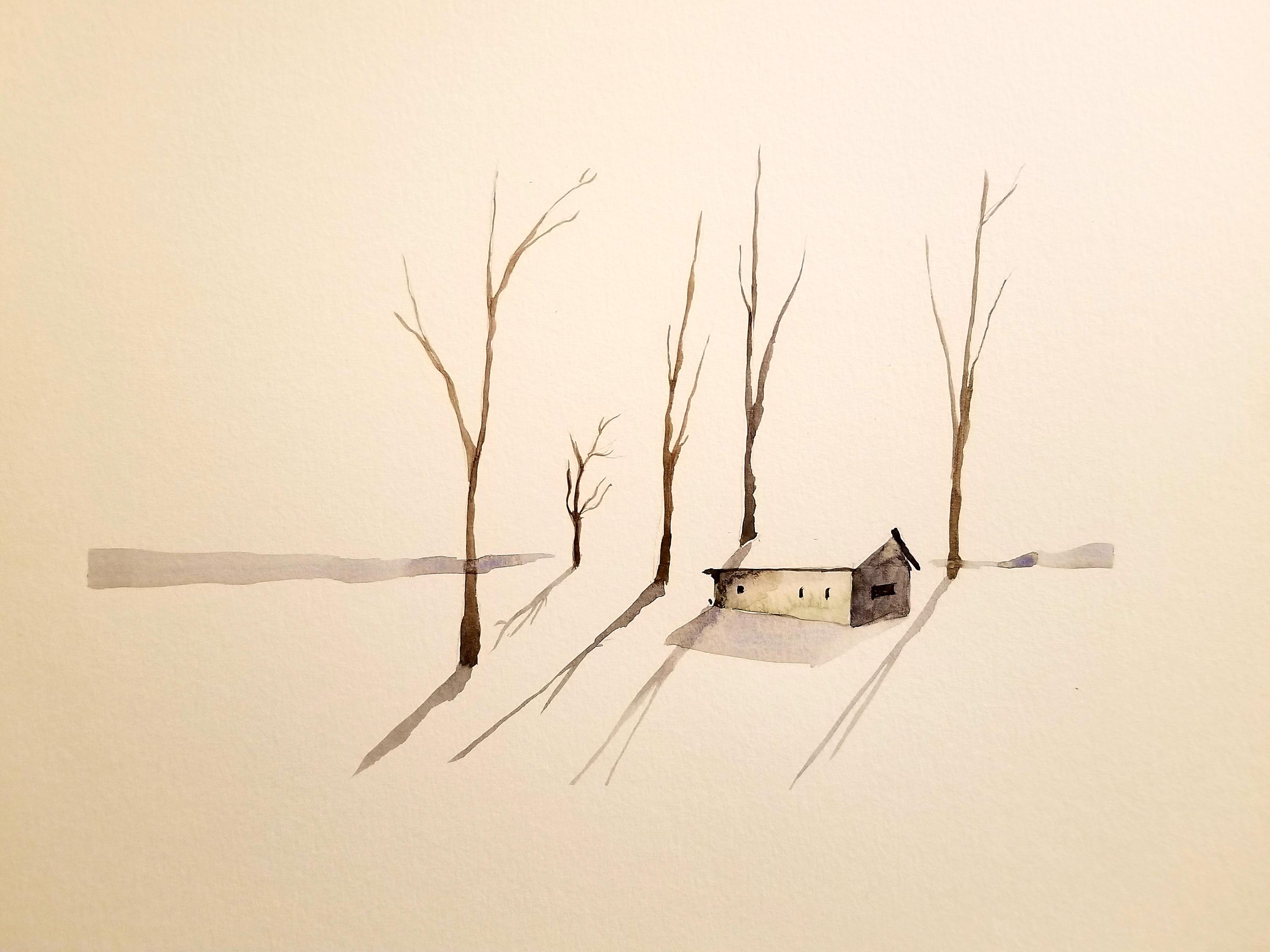
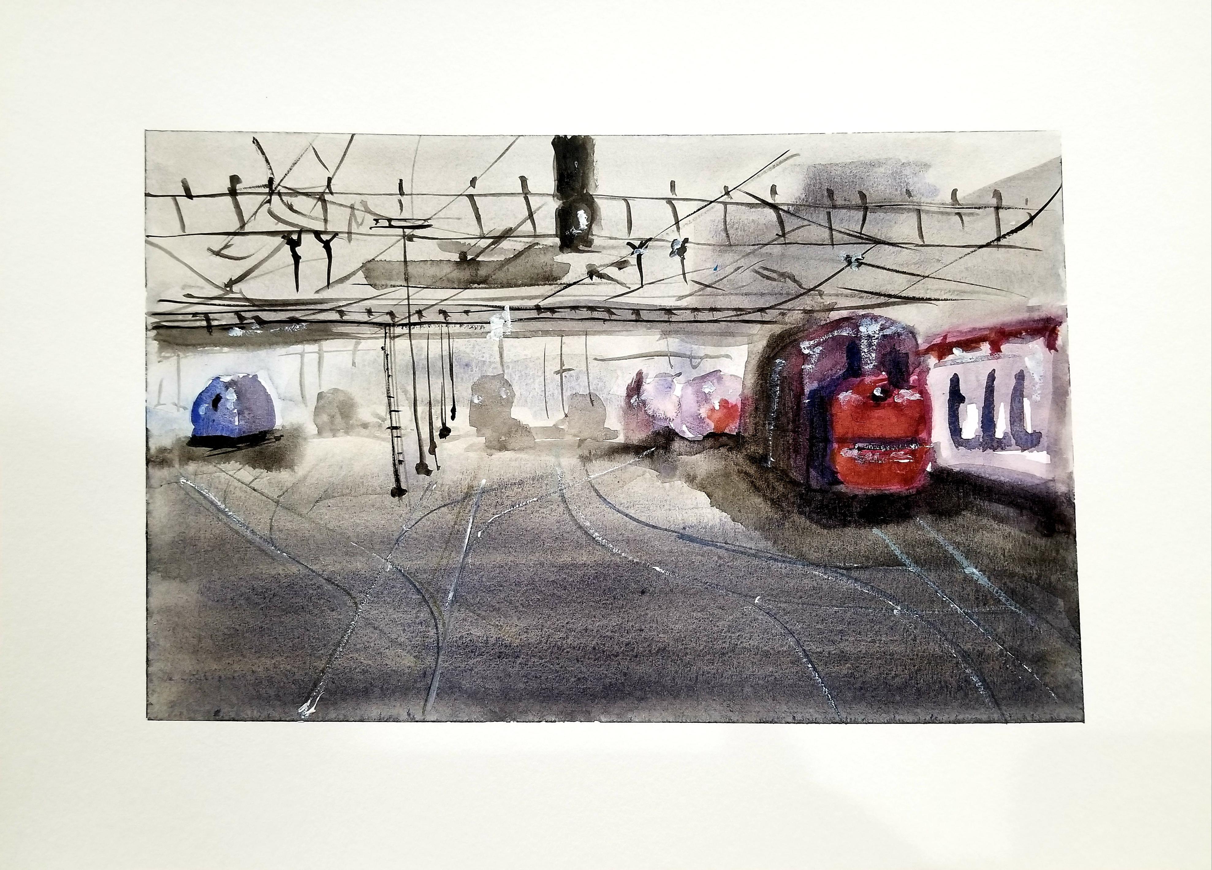
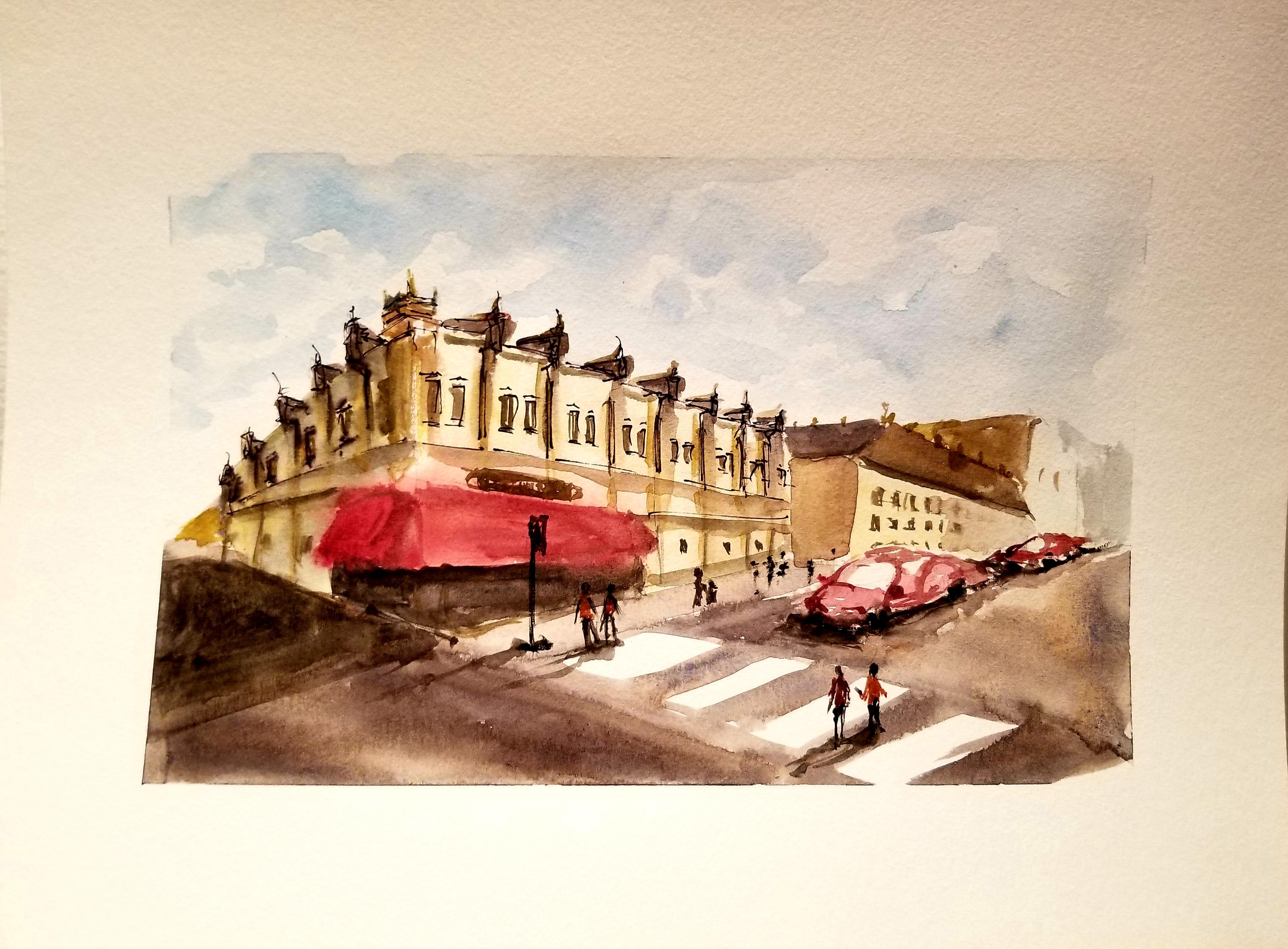
I am NOT an expert watercolor painter. I have NOT trained for years, studying the masters, built an impressive portfolio, etc. I have been painting seriously since April. I get really frustrated by painting advice where they go over techniques like “wet-on-wet painting” (I will not be going over techniques in this instructable), and then tell you to practice and not be afraid of messing up.
In my heart, I know they are right, but I need something more tangible to look out for. In this instructable, I want to share some of the concrete considerations I have when planning and executing the visual elements of a watercolor painting, and how you can watch out for them yourself!
Supplies
I had intended this for anyone that is looking for tips to improve their watercolor composition. The basics you need are:
- A fine-tipped brush for detail work
- A wide-tipped brush for sweeping strokes
- Watercolor paints (I do not expect the “best quality” or whatever. I personally buy cheaper sets at local crafts stores, so anything works here)
- A cup for dirty water (cleaning your brush)
- A cup for clean water (for use with paint)
- A rag, paper, or something to wipe and dry your brush on
- A thin black felt tip pen or sharpie (optional)
The Rule of Thirds – Detail and Contrast at Focal Points
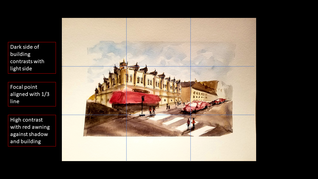
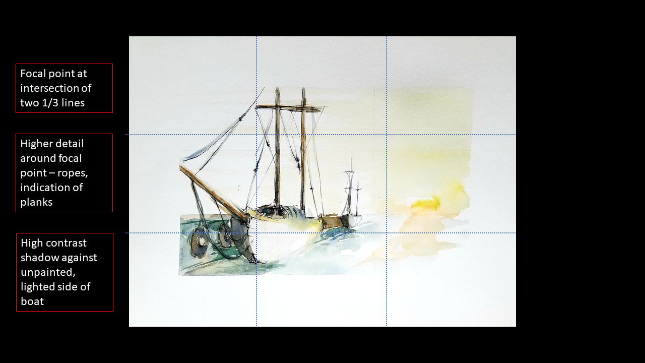
This is a pretty common rule when working with composing a scene. You see this in photography as well as painting. Basically, you divide your rectangular canvas into 9 equal parts: dividing the width and height into thirds with lines. The key is that you put the focal point of your art on these lines or at the intersection of these lines. Make sure you pick only one line or point; adding too many focal points can clutter your work.
You can distinguish a focal point in a couple ways:
1. You can add more detailed objects at these points (add finer details with a thin pen or by capturing more features of an object like texture or surface design)
2. You can add much more contrast (light and dark or contrasting colors next to each other) at these points
3. You can put the main object of your painting at this point.
Use Strong Perspective
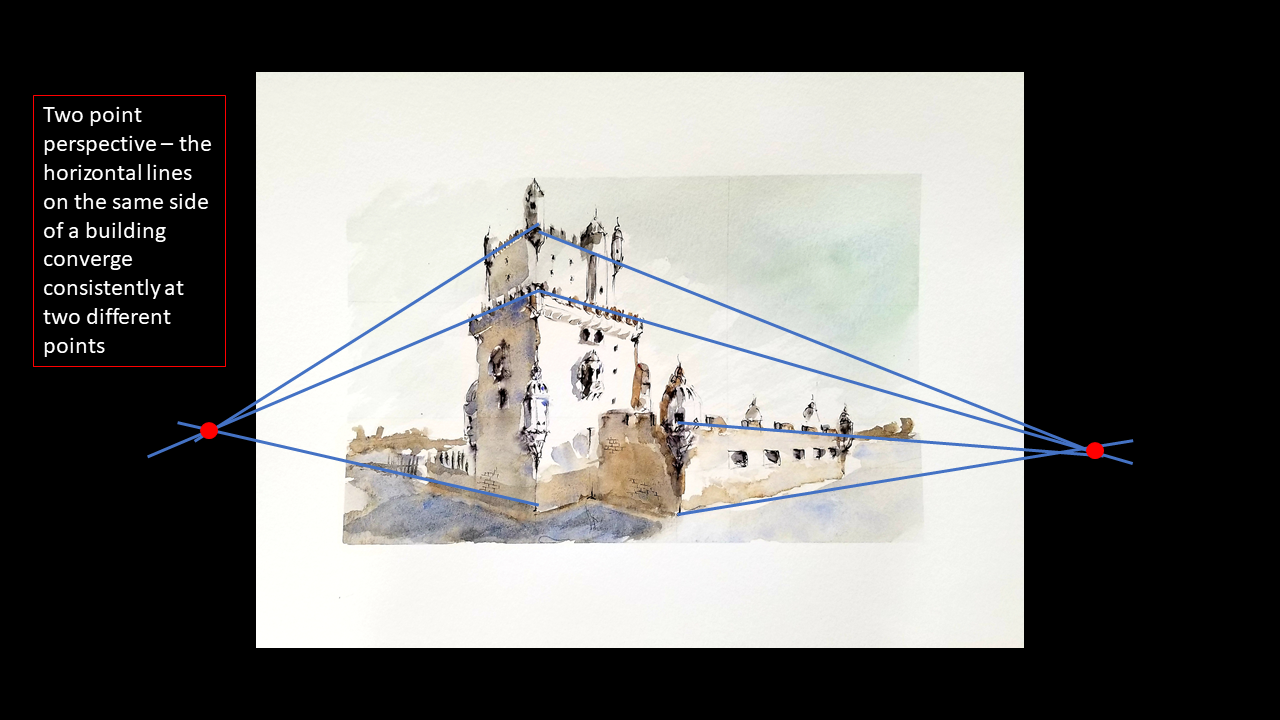
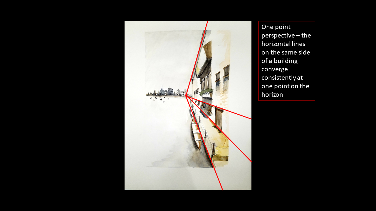
You may have learned about one-point or two-point perspective for street scenes. You pick one or two vanishing points on a horizon and make all the edges on your buildings converge on those points. The common example is that of railroad tracks – though we know they are parallel, in the distance they appear to merge.
Paying attention to consistent perspective and employing dramatic perspective can really give your works depth and a realism that is difficult to achieve with flat drawings.
Use Asymmetric Compositions
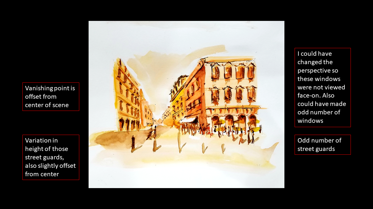
This tip complements the rule of thirds recommendation.
In general, do not make your compositions symmetrical. If you are painting a house, don’t put it in the center of the page. If you are painting trees, paint an odd number of trees. Make the spacing between the trees non-uniform and do not distribute them evenly across the page. Uniformity, symmetry and patterning will be your enemy in creating a realistic and interesting composition.
This becomes tricky when you are painting something that has a pattern, like windows on a building or a line of houses. My recommendation would be to choose a perspective that makes the windows or line of houses diminish toward the vanishing point (don’t paint them flat and forward).
Leave Whitespace
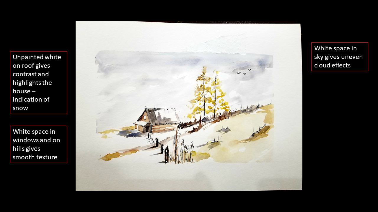
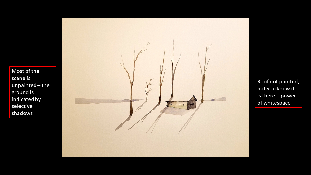
This is probably the easiest thing you can do to add a professional touch to a painting: selectively leave things unpainted. The simplest way to implement this is by adding a border to your paintings. I use a generous border by running masking tape along the four edges and peeling it off when I have finished my painting. The white border frames and focuses the viewer’s gaze on the contents of the painting.
Another place to add white space is when there is an object in direct light, or the brightest part of the scene. Even though it usually has a color, you may be better off leaving that portion unpainted. Leaving something unpainted is an effective way of creating contrast. I tend to use this technique a lot around my focal point. I also use this to break up large washes of color to add some character and drama to the composition.
Layer Paint Deliberately
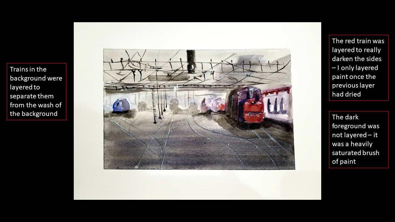
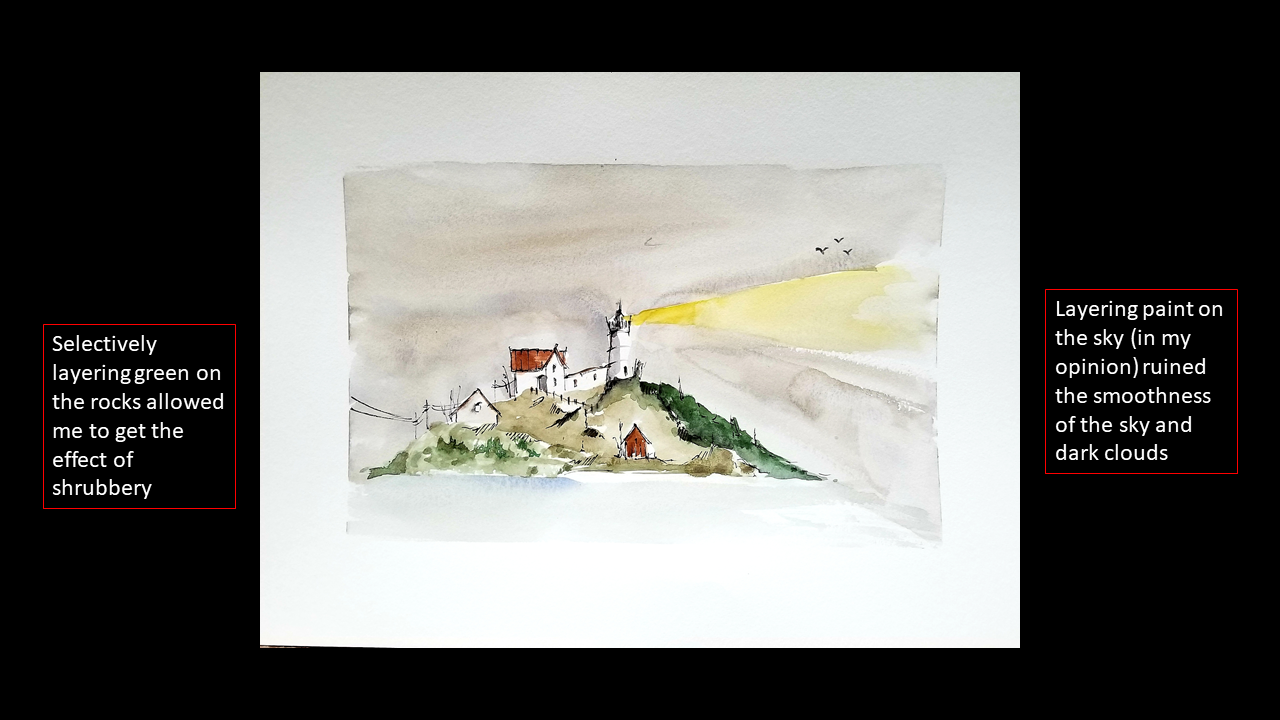
Layering paint can get confusing with watercolor because it does not behave like acrylic or oil-you expect multiple layers to increase the darkness or saturation of a color, but sometimes the color can lift, become blotchy or react in a different, unpredictable way. To get around this, I recommend not layering paint until you have given the watercolor adequate time to dry. If you are impatient like me, you can use a hair dryer to speed up the process.
Personally, I try to never layer paint, unless I am adding minute accents. To elaborate, I do not layer two washes of color on top of each other. If I know I want a region to be more saturated with color, I load more pigment onto the brush with a bit less water to concentrate the color.
Never Use the Raw Color
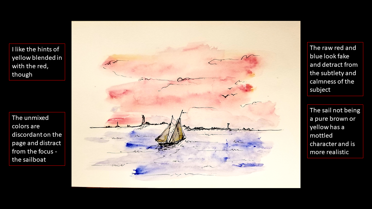
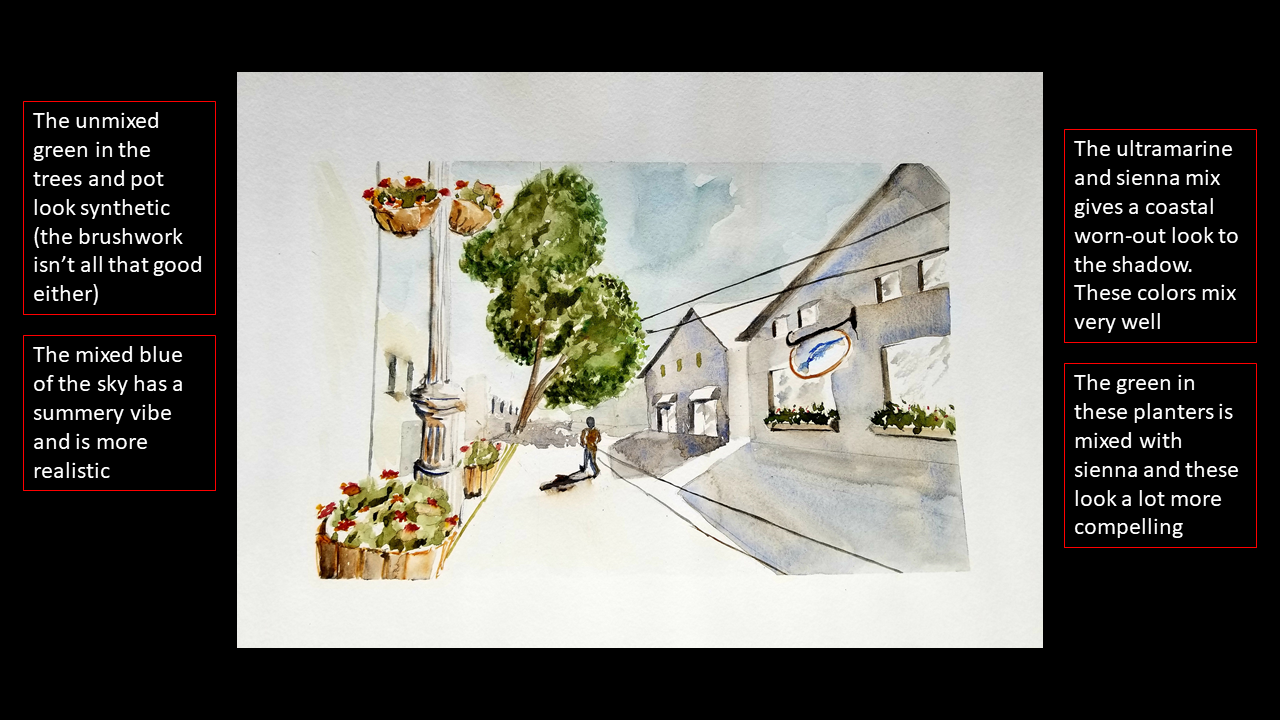
Your watercolor set comes with a plethora of colors. My set has 12 colors. I almost never use the raw unmixed paint. My only rare exception is if I use white paint. I would recommend, though, if you want white in your composition, you are better off leaving that part of the canvas unpainted to get the purest white.
I just find that the raw colors seem synthetic and lack the visual interest that a mix does. I tend to mix cool colors with warm colors to neutralize the artificial nature of the raw pigment.
One of my favorite mixes is ultramarine blue, or similar dark blue, with burnt sienna, or a similar rusty brown. You can tailor this mix very well to your use case: equal parts of each color make a brisk, misty gray that is a great color for shadows. Adding more sienna warms up the color, and I find it works well as house sidings, rocks, tree bark, natural browns. Adding varying amounts of blue to the mix is great for water, glass, roads, sky and fog.
Simplify the Color Palette
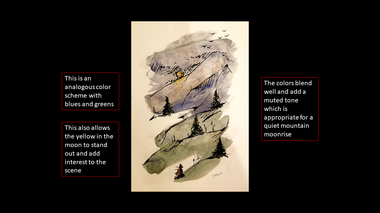
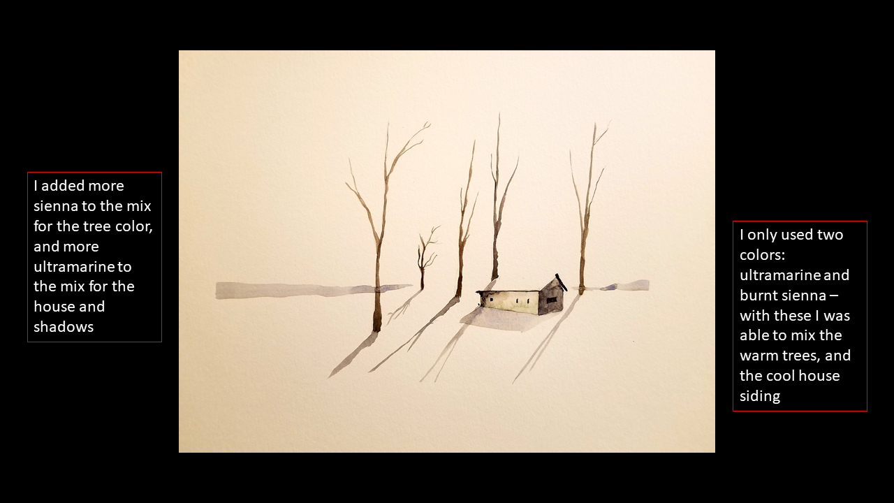
In other words, pick as few tubes of color from your set as you can. I use about 4 tubes regularly: ultramarine blue, burnt sienna, cadmium yellow and viridian green. Sometimes I add alizarin crimson in there, but that’s really only for dramatic color splashes (following Tip #1).
With these, I can mix a large variety of colors.
Quick notes regarding picking colors for your composition:
1. I would recommend against picking complimentary colors (opposites on the color wheel) – it creates a dissonant palette.
2. Use “split-complimentary” or colors that are almost, but not quite complimentary
3. Use “analogous colors” or colors that are all cool / warm
4. I try to keep large washes or regions of color as neutral as possible (grays, browns, light yellows) This allows for using more vibrant colors as contrast for focal points.
Shadows and the Darkest Points in the Composition
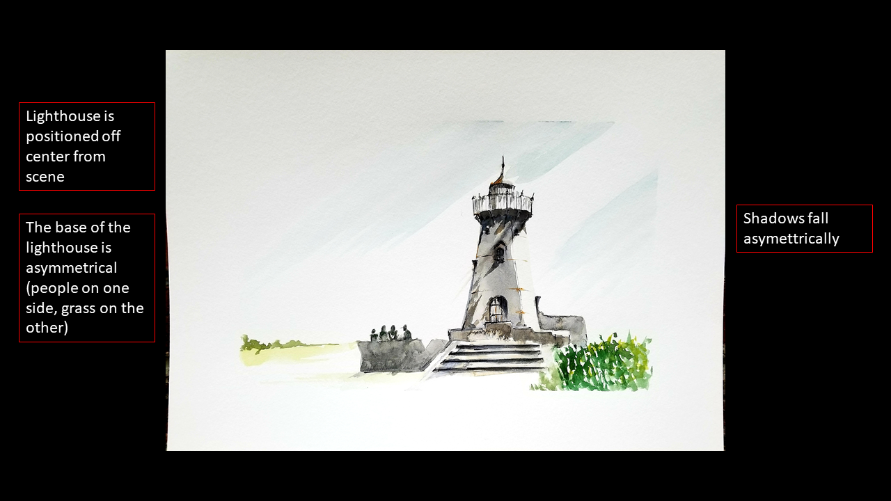
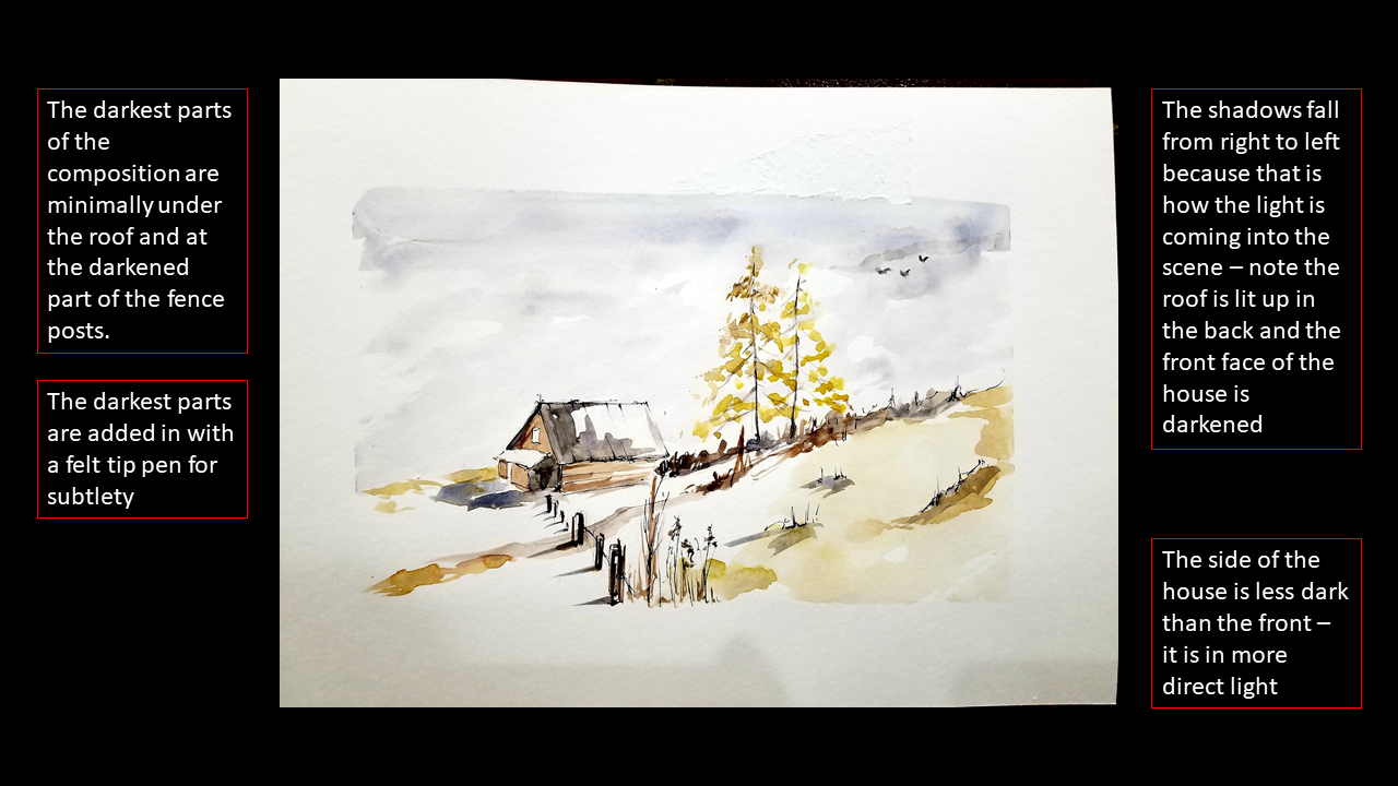
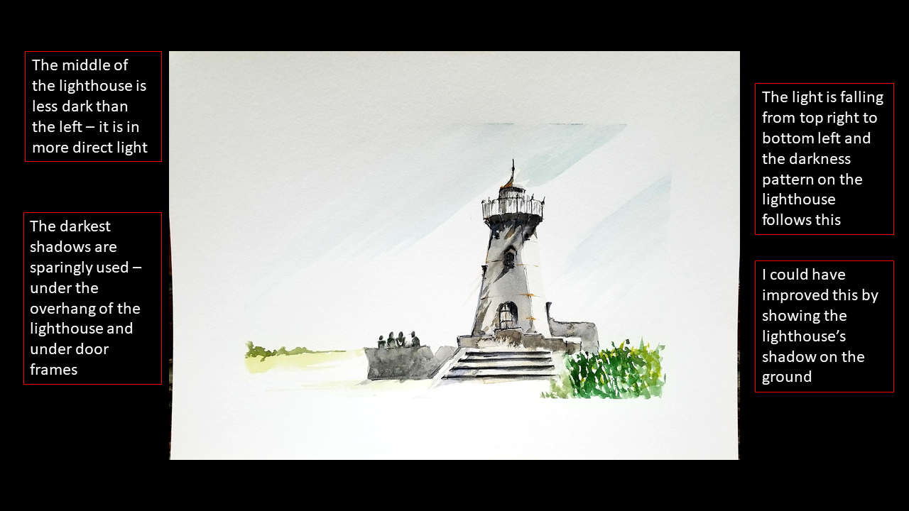
Shadows are really important because they add realism and depth to your works. In the same way we use whitespace for highlights in a scene, shadows and dark areas can make an image pop. For the darkest parts of my scenes, I will either use a thin black felt-tip pen or a thin brush with heavily saturated paint. The important thing to remember is that shadows follow a perspective of their own: you pick a direction for the light to come in and see how it intersects with objects. The length and darkness of a shadow is dependent on the direction of light. Also, the different faces of an object are different brightness, with the brightest face, obviously being the one in direct light.
Blur and Lighten Things in the Distance
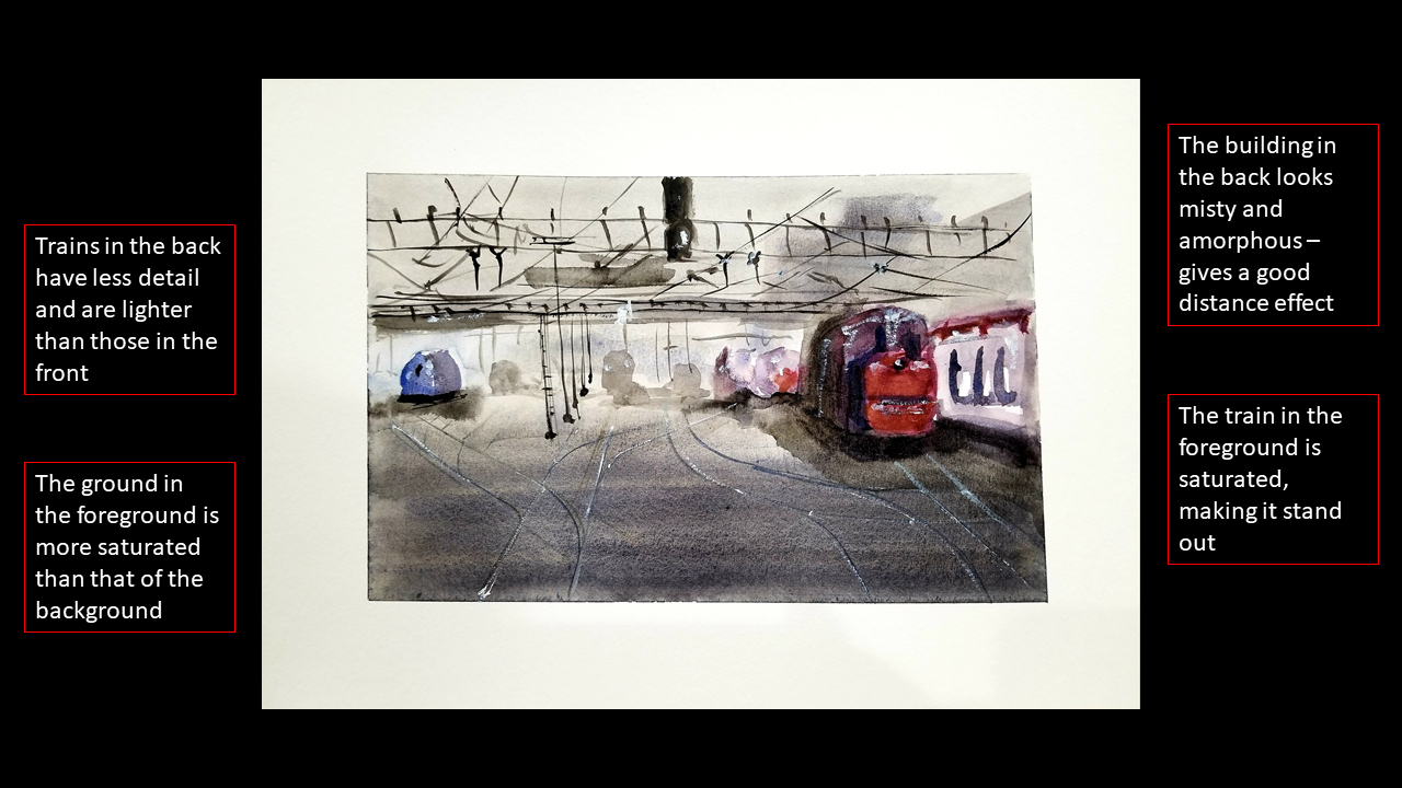
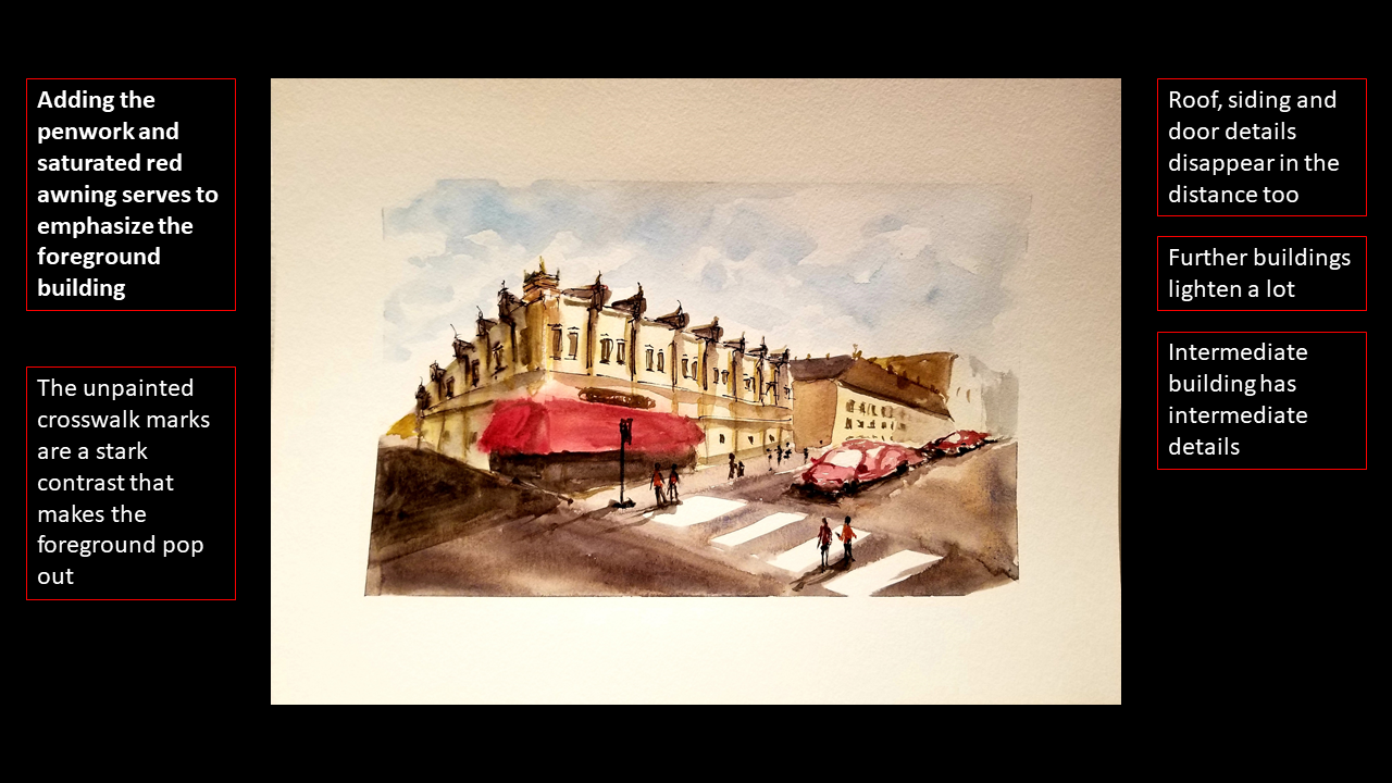
As you have probably seen, things in the distance are blurred. This isn’t groundbreaking, but the common mistake people (including myself) make is we tend to make things in the background the same saturation as those in the foreground. Foreground objects tend to be sharper and more vibrant. Background objects should be lighter, closer to the colors of the wash and should have minimal details.
Some tricks to accomplish this would be to reduce the object to a single, simple shape. Another trick would be to use a thicker brush than you think you need for a background object so that it becomes harder to add minute details. The last trick would be to use one color and add shading by saturating parts of the shape with more color, rather than darker color – this gives the effect of distance blurring and paleness. This effect is called Aerial Perspective.
Plan Out Your Painting
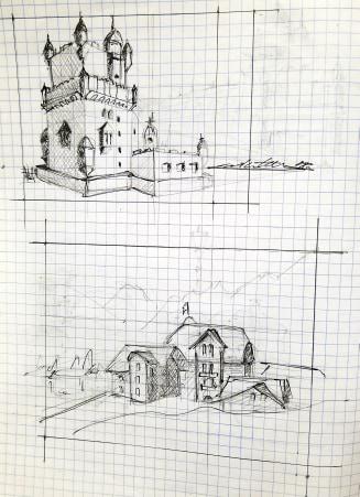
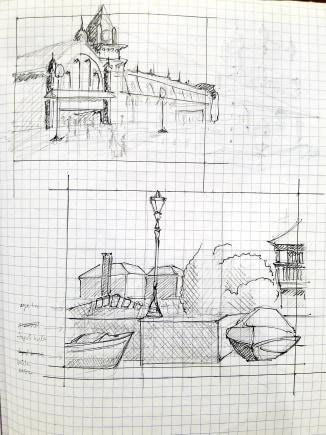
This is probably the hardest step because:
1. You’re like me: you’re lazy and hate planning things
2. You’re like me and when you decide to actually plan something, you go into too much detail.
I find that watercolor plans should only take about 5, maybe 10 minutes max. I tend to use a pencil and a black pen. I try not to erase my planning sketches too much. If you find yourself really needing to erase a planning sketch, you are better off starting a new sketch. In my plan, I define:
1. Large shapes: the focus of my pieces and maybe where I want some larger objects to be, along with any landscape features like hills or sidewalks, etc.
2. Shading and shadows: I decide where the light is coming in from (Tip #8) and I roughly shade each shape accordingly. I use the black pen to mark the darkest shadows in a scene.
3. Perspective: I mark my vanishing points and make sure all my buildings, roads, etc converge on those
4. Rule of thirds and focal points: I make sure my dominant foreground objects lie on a 1/3 line or the intersection of two lines. I also think about how I can incorporate contrast and detail there.
If you find this taking too long, I encourage you to really cap this at 10 minutes as it means you are adding too much detail to your planning sketch.
How to Objectively Critique Your Work
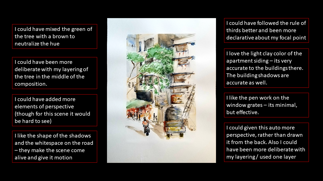
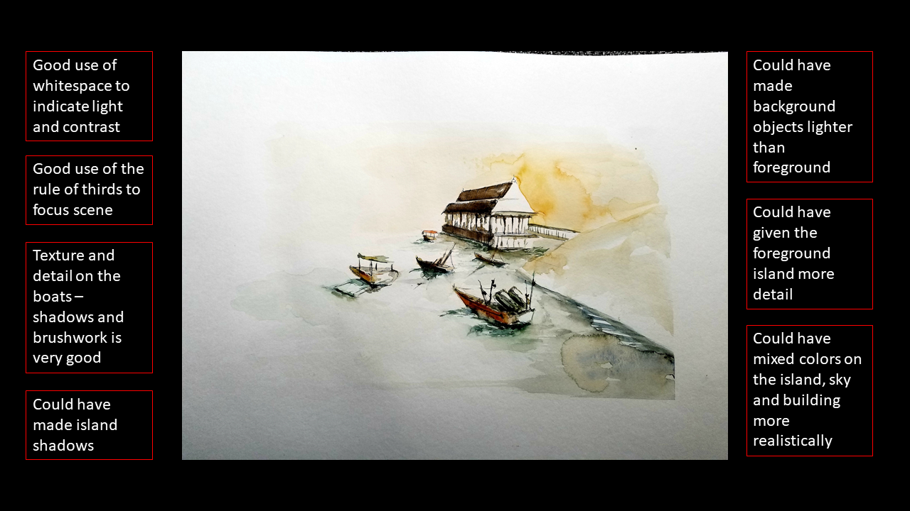
You don’t need to know and use all the painting jargon to objectively critique your work. You just need to be able to critically think about what is good and bad about your painting. Chances are, if you show your painting to someone else, they will know what the subject matter is (assuming it’s not abstract). This means the painting has positive qualities as you were able to capture the essence of your subjects enough to convey them to another person.
So why do you still hate your painting? Good question; let’s dig a little deeper.
Rather than focusing on the fact that you hate your work, try and ask yourself what were your expectations, and why are they falling short?
Is the painting not realistic enough? What could you change to make it more realistic?
Are the brushstrokes not clean? Are the colors too dissonant? Is it lacking perspective? There are so many ways you can be more specific about what you do not like about your painting and execution. When those tutorials say, “practice makes perfect,” they are also assuming that you are learning what you can from each painting.
Also, do not focus on just the negatives! Commend yourself for things you did do well in the painting: “I used the rule of thirds very well here.” “I paid close attention to lights and shadows and it shows.” “My brushwork was confident.” Noting these lets you understand what to carry forward into your next painting.
Once you have these noted, in your next painting plan you can incorporate them and keep them in the back of your mind when executing.
Wrap Up
Thanks for reading through this instructable. I hope you gained a nugget or two from it! Let me know any thoughts and feedback in the comments!