10 Steps to Your Own Logo in Inkscape (free) and Using Creative Market for Dummies Like Me
by babybayrs in Design > Digital Graphics
52372 Views, 113 Favorites, 0 Comments
10 Steps to Your Own Logo in Inkscape (free) and Using Creative Market for Dummies Like Me



Hi,
Sorry for the long title. I have a few confessions too. First, my drawing and designing skills are not even equivalent of a finger painter. Second, I don't make money, so I always have to make things that can be bought, including website logo graphic. Third, I don't have professional illustrator software or input tablet, not even a mouse, just a laptop with a touch pad (don't even know that's the right technical name). That brings up my fourth confession: I'm almost computer illiterate. I get things done on computer if I need to, such as writing Instructables, uploading photos and Youtube videos but I don't understand a thing how computer works, keep forgetting how to upload Youtube videos, etc.
With that said, if you're a graphic designer, If I haven't lost you yet, except for voting or not voting this Instructable for the Graphic Design Contest, maybe checking out my cooking Instructables is a better thing to do. As far as graphic design is concerned, If you're a dummy and cheap-y like me, I intend to show you what I have learned very recently: How to design a logo (text, graphic, or text and graphic) in Inkscape (free) and using Creative Market.
I'm teaching myself Inkscape with the book: Inkscape: Guide to a Vector Drawing Program (4th Edition).
I checked out Creative Market (I highly recommend). If not for this contest, I didn't know it exists. I signed up for its blog (I highly recommend again). I downloaded a free font called Baystyle typeface by Ekloff and used it in the cover photo of this Instructable ( "A logo" is Baystyle typeface). It's my first time since digital age to download a typeface to my computer. I can't believe it worked.
Without further delay, hope you'll learn the following things quickly out of this Instructable:
1. Download Inkscape for the right system bit of your computer.
2. Start Inkscape.
3. Set the drawing size.
4. Set up a Grid to guide drawing objects.
5. Edit text: font, size, color, letter/words horizontal and vertical spacing, letter/words oritention and rotation.
6. Import and trace image to use in your design.
7. Edit path (drawing).
8. Put text on path.
9. Flow text in a shape.
10. Save and export your design.
You can either follow each step exactly or be brave and follow my steps but use your ideas, before you know it, you may have designed your dreamed logo. If I can do it, you can do it.
Download Inkscape
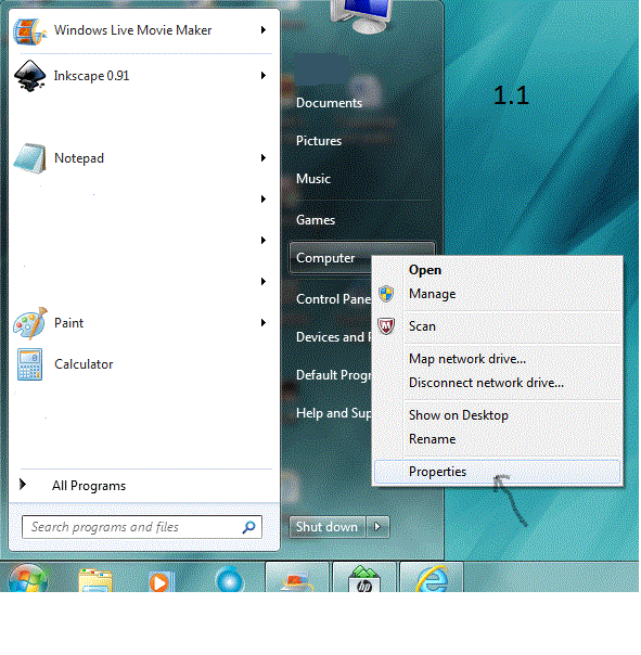
1.1 Find out the system type of your computer: Click Start of your computer, right click Computer, click Properties, in the properties window, in System section, after System type, it says 64-bit operating system or 32-bit operating system.
1.2 Download Inkscape for your computer bit system: Go to https://inkscape.org/en/download/, click 64bit: installer (msi) if your computer is windows 64 bit, click save to download Inkscape to your computer, double-click the installer on your computer when done downloading to install and following the installation wizard to complete installation.
Start Inkscape
Double click Inkscape on desktop or click Inkscape in Start to start it.
Tip: It may take a few seconds for anything to happen. Recently I downloaded some stuff to my computer, it started to take very long for Inkscape to start. After I removed them, the time for Inkscape to start shortened significantly.
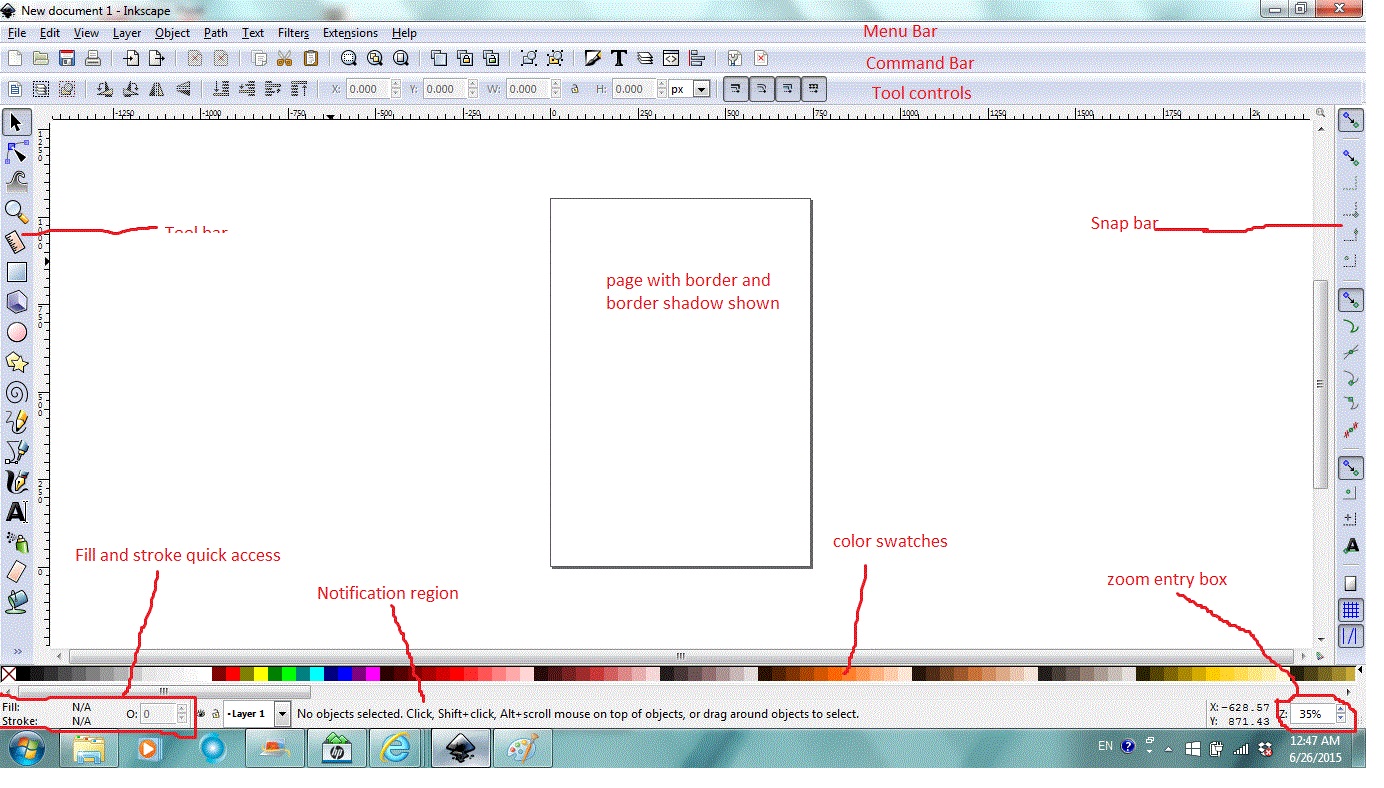
A quick glance of Inkscape window, places that are frequently used are:
On the top: menu bar, command bar, tool controls (specific to which tool is in use)
On the left: tool bar (the arrows at the bottom mean there are more tools than space available to display them)
On the right: snap bar
Center: Page ( Useful for setting an output region)
Bottom: Color Palette/swatches, (Fill and stroke) Style indicator, Notification region (very useful), Zoom (helpful to know)
Set the Drawing Size
Logo sizes vary. What is the right logo size? Here is a visual reference of logo sizes: http://www.sky-valley-web-design.ca/logo-sizes.htm.
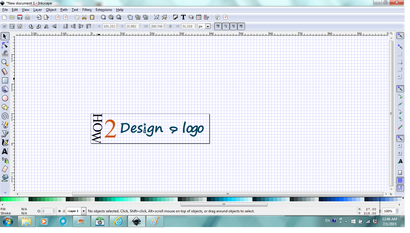
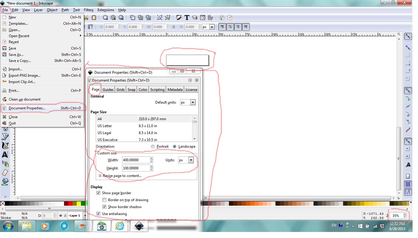
For a text only logo with "How 2 design a logo" on it, I think 400 by 100 seems fine. To do that in Inkscape, click File, find Document properties in the file dialog, click Document properties, in Document properties window/dialog, under Page tab, in Custom size section, set Units in px, place cursor at the end of Withdth and Height entries, use backspace, delete the default values and enter 400 for Withdth and 100 for Height, Enter after each entry. Inkscape automatically adds decimal points after your manual entry. Make sure in Display section, Show page border is checked.
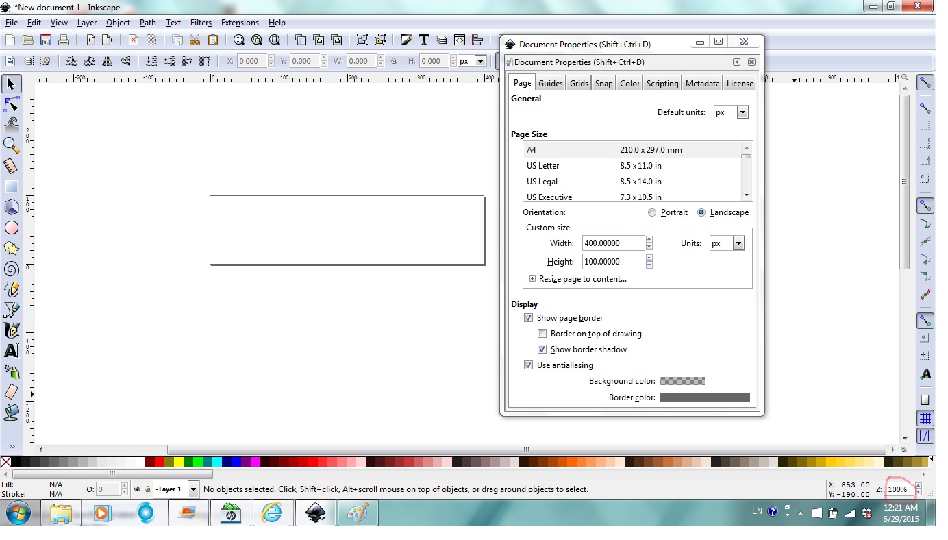
Notice page size changing to your settings? If your page size seems strangely small or large, Zoom (lower right corner) may be small or large, place cursor at the end of zoom entry box, use backspace to delete the default zoom level and enter 100 or whatever zoom level you want and Enter to make your entry take effect as shown in second photo.
Set Up a Grid to Guide Drawing Objects
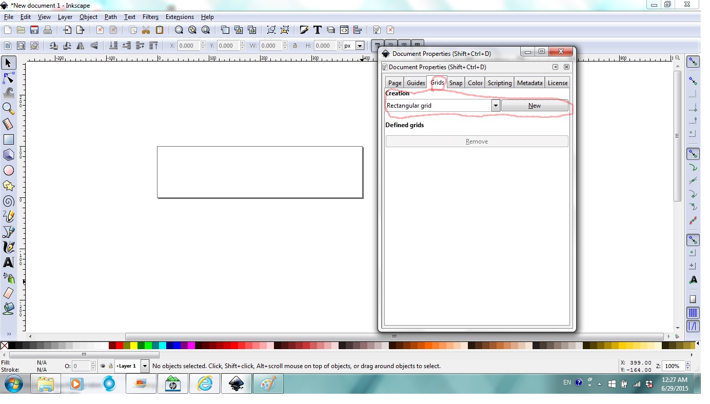
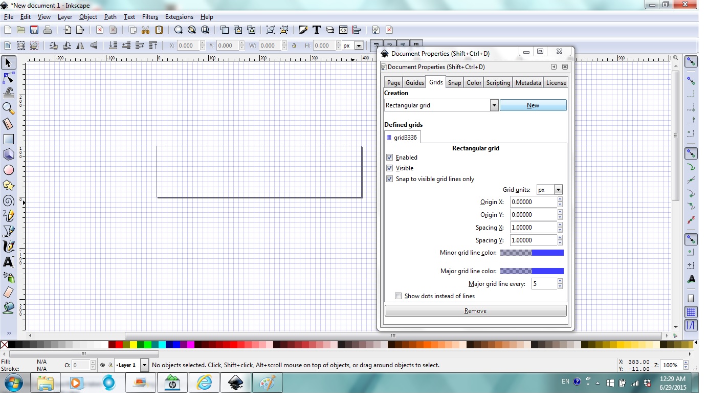
In the still opened (If you closed it, you can go to file, then document properties to open it again) Document properties window/dialog, under Grids tab, in Creation section, choose Rectangular grid, click New. Make sure Enabled, Visible, Snap to visible grid lines only are checked.
Edit Text
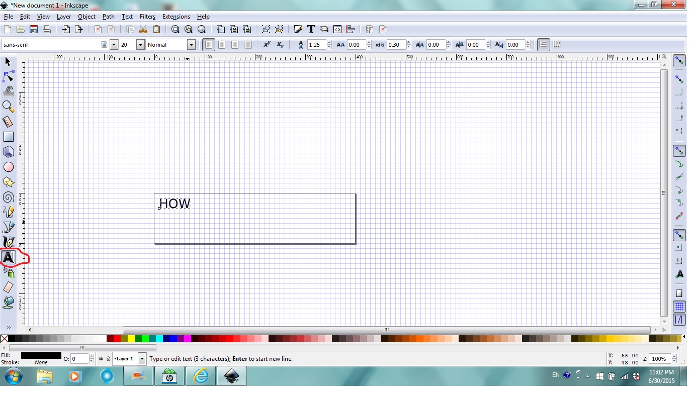

Click Text Tool in the tool bar (left side, with letter A), click anywhere in the page and type "HOW" or whatever you want to (1st picture).
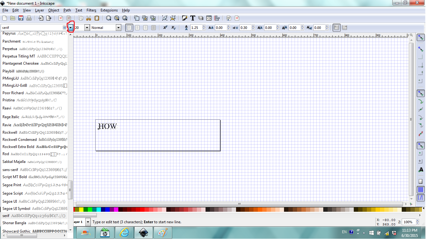
To change text font, click on the arrow to the right of the font box, then click the down arrow key on your keyboard to go through the fonts available in your computer and notice the font changing? Stop at the font you like or keep pushing the arrow key to go over the fonts again and again. I stopped at serif (2nd picture).
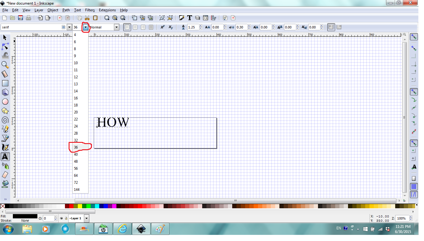
To change text size, click on the arrow to the right of the size box, then examine the current grids the text occupies and choose the new size for the text. I chose 36 (3rd picture).
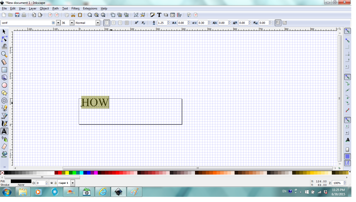
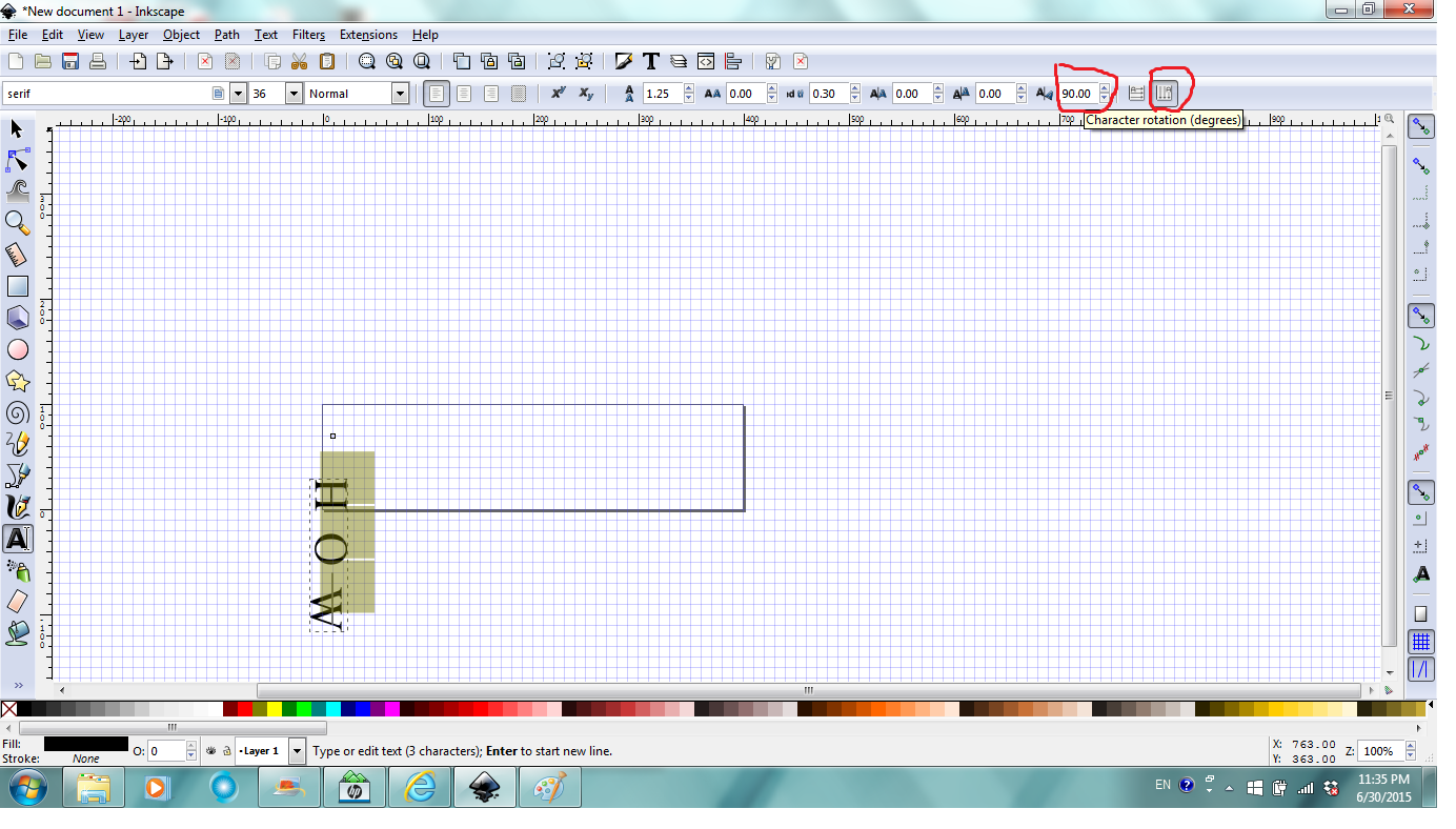
To change text direction and rotation (any degree), first you have to select the text by click in front of the text and drag over the text just like how you usually select in other programs (4th picture), then click on vertical text to set text vertical and then enter a rotation value to rotate the text (5th picture). I set vertical text and then rotate 90 degrees.
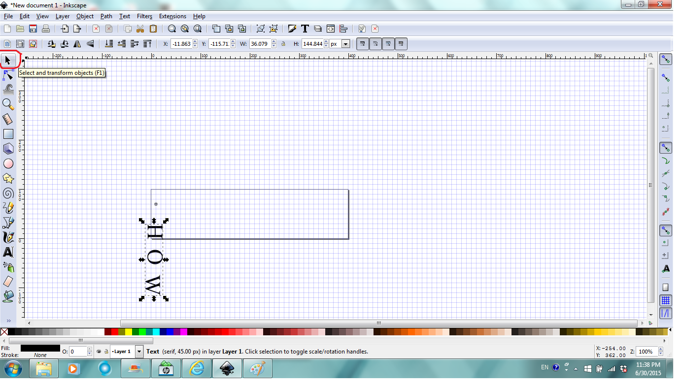
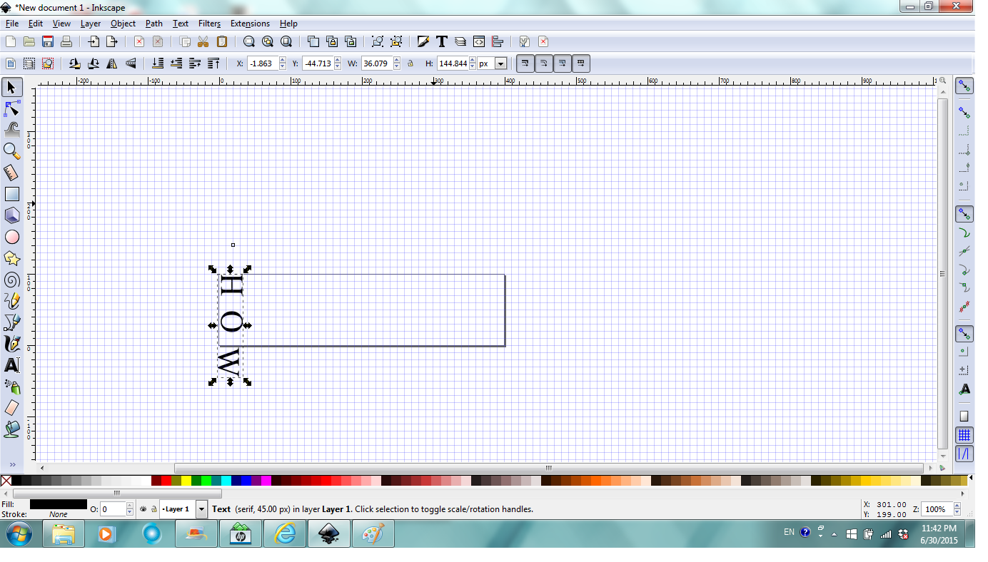
Next, click the select and transform objects tool to select the text as an object so you can move, scale etc. (6th picture). When mouse is over the selected text object, when you see the moveable sign (cross with four arrows), you can click and drag to move the text object (7th picture). I moved the text object so letter H is at the beginning of the page.
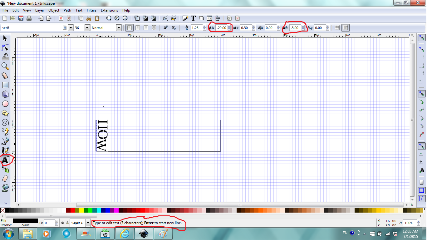
To reduce the spacing before "O" and "W", click the Text Tool, then select the text, set the letter spacing and vertical shift to negative values to shift the 3 letters together (8th picture). You may need to try a few values to set it look just right. If you don't like what you did, you can always undo (click edit in the menu bar, then choose to undo previous steps).
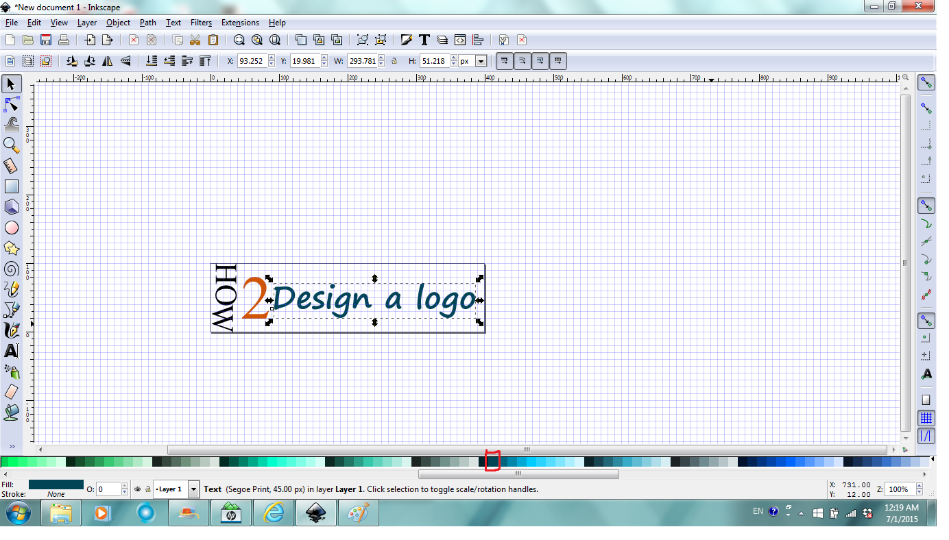
Repeat the above steps to enter and edit remaining text elements. To change font color, while the text is selected, click on any color swatch will do (9th picture).
You can set different font for individual letters/words, rotate letters/words, change horizontal and vertical spacing, etc (Letter "i" in word "design" was set to jokeman font, word "a" was rotated 60 degrees and then adjusted vertical spacing). (10th picture).
If text only logo is what you want and you're done with your logo design, you can go to step 10 of this Instructable for reference to save and export your design.
Import and Trace Image to Use in Your Design
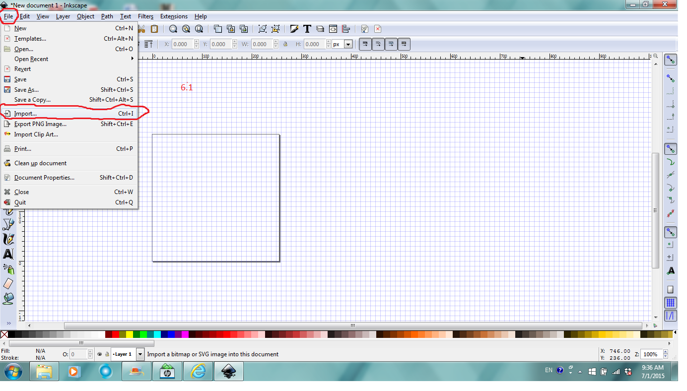
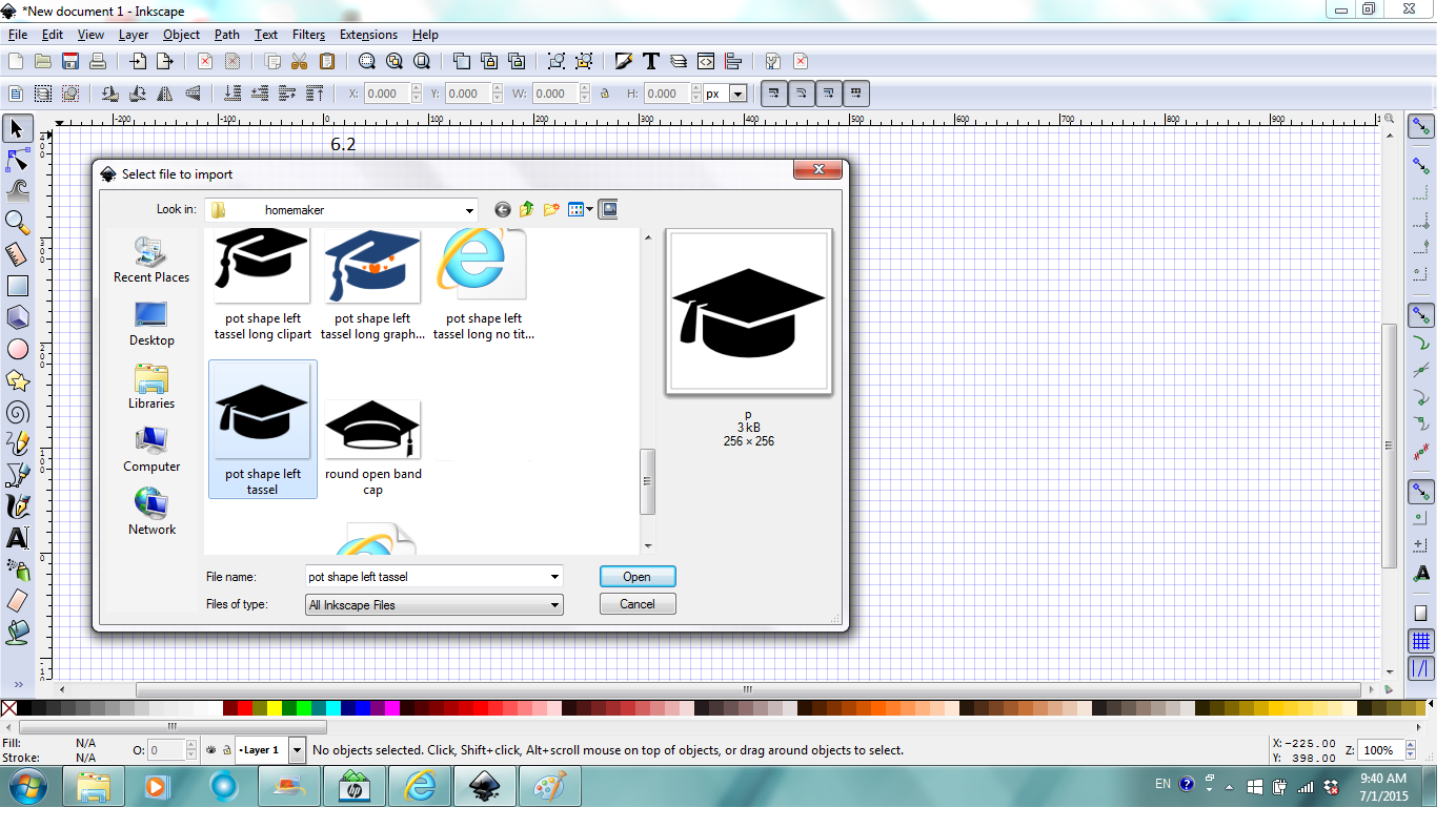
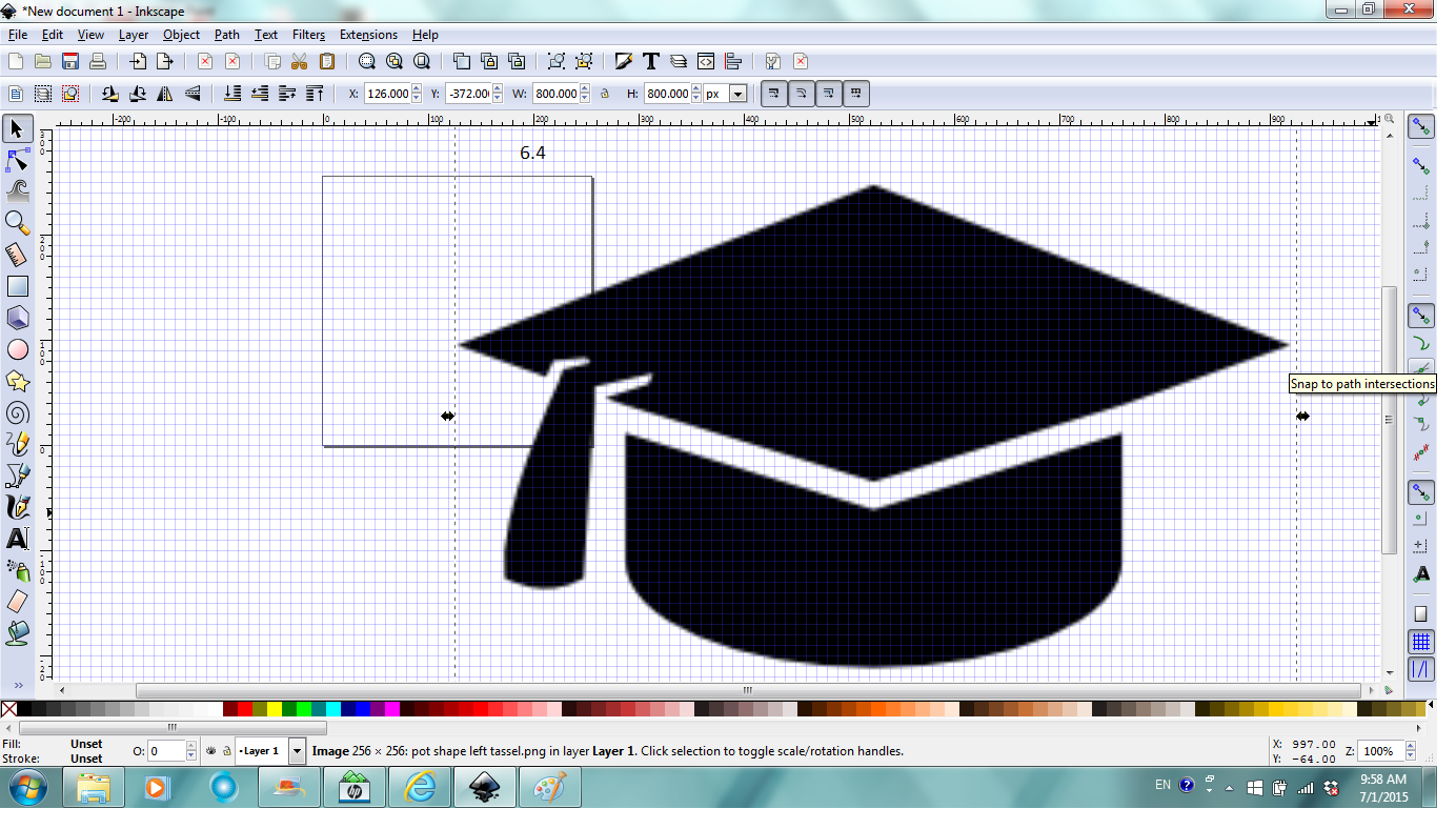
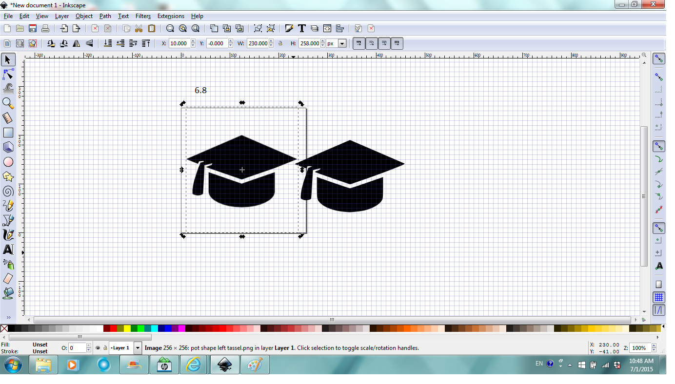
By now I can draw a little in Inkscape but it's faster to use a photo for demonstration and sometimes you do want to use an image in your design. To do that, follow the previous steps 1-4 and set the page to 256 by 256 px. Click File, then Import (fig. 6.1), select the file to import, click open (fig. 6.2).
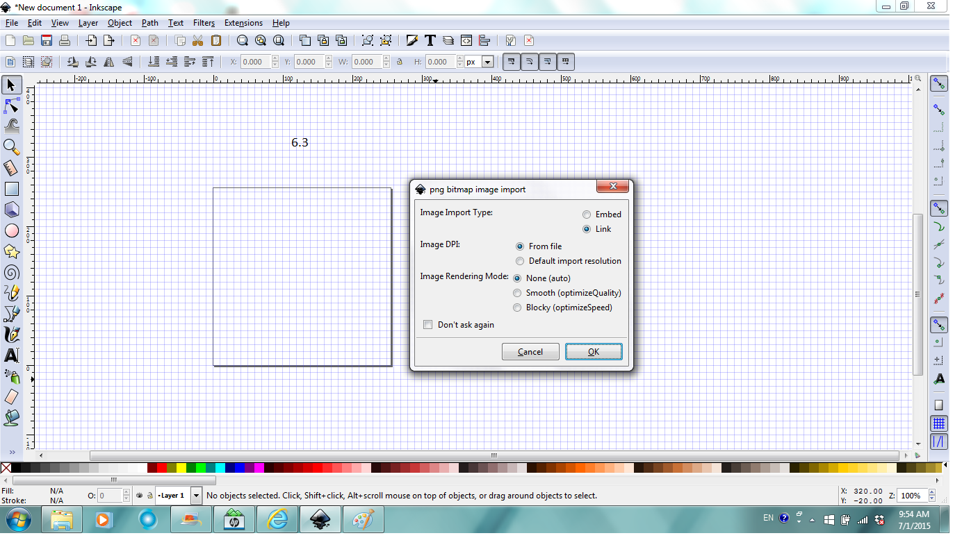
In the Import window/dialog, check "link", "From file", "None". If you place mouse over the options, explanation for the options are displayed and you can kind of understand what each option means (fig. 6.3). Then click open. Fig 6.4 shows how it may look like after you opened the file to import and it's automatically selected.
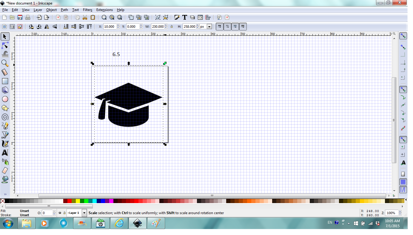
To scale and move the image to page, place mouse over one of the corner arrows and it turns green, click and drag to resize. Place mouse over the image pointer changes to cross with four arrows, click and drag to relocate the image to the page. Pay attention to the notification region with guide to what to do. (Fig. 6.5)
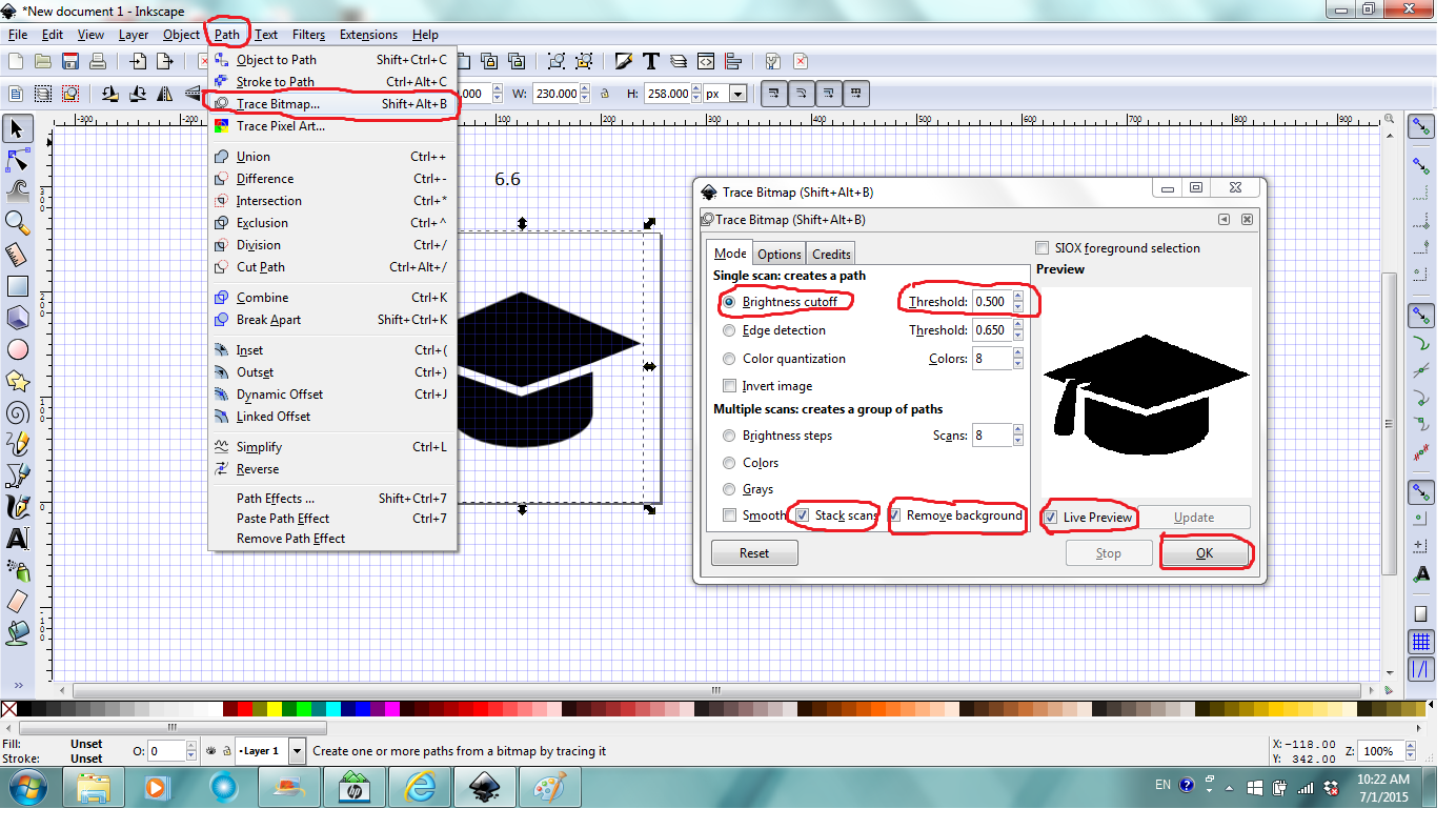
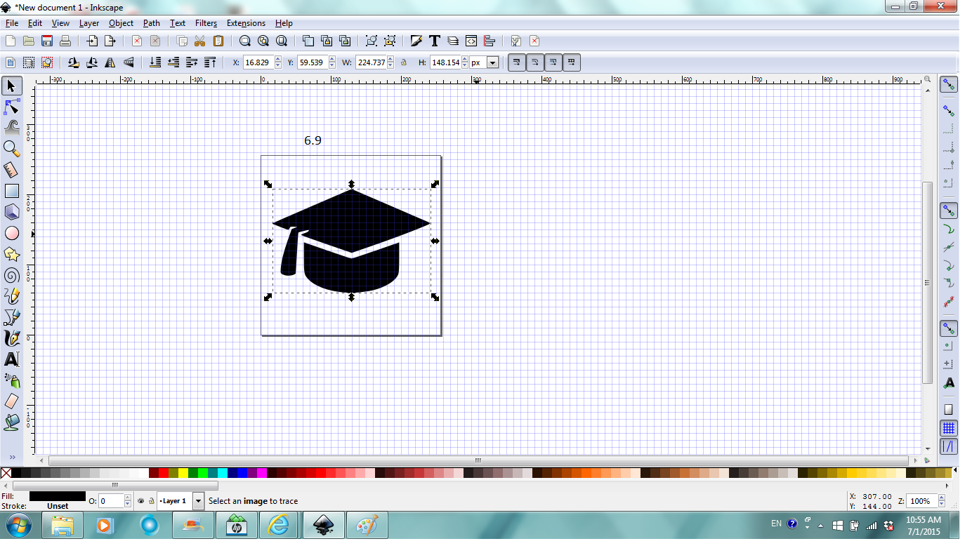
Next is when the magic happens. With the image selected (must for magic to happen), click Path in Menu bar, click Trace Bitmap to bring up the dialog. In the dialog, check Live Preview, in the Mode tab, check Brightness cutoff for this image, play around with the threshold to get the best traced image. Check Stack scans and Remove background in the Mode tab. At last, click OK. Again once mouse is over each option category, an explanation of the option is displayed and you can undo any previous steps (Fig. 6.6). In the book, it explains in detail the difference each option gives.
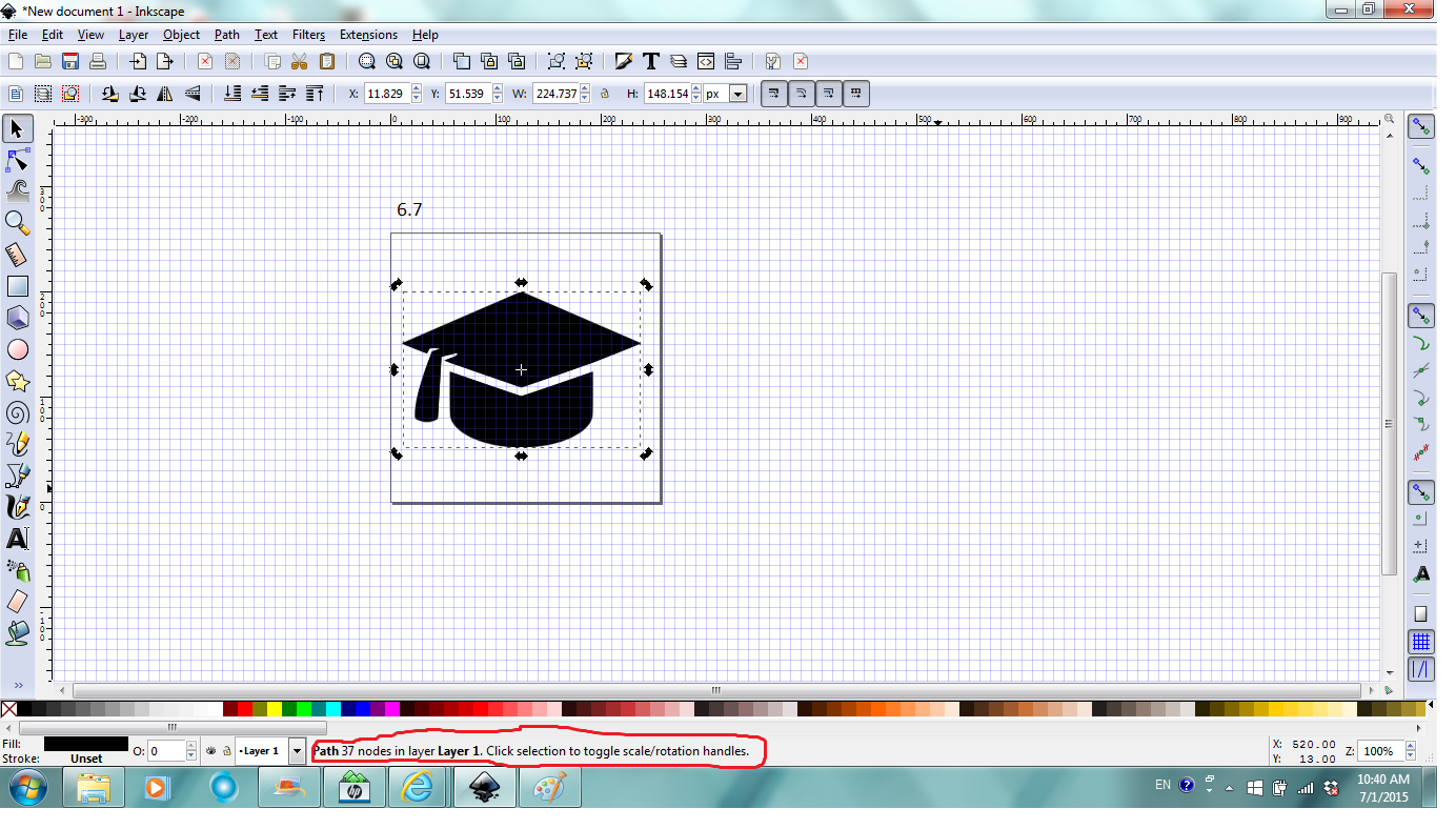
After that, you can close the trace bitmap dialog/window. Notice the newly generated path object is selected and the notification region says Path of 37 nodes (yours could be a different number depends on the image and tracing options) (Fig. 6.7).
Click and drag to move the newly generated path object to reveal the original image (Fig. 6.8).
Select and delete the original image since it's not necessary anymore for this project. Select and move the path object to the center of the page. Now it's ready for manipulation (Fig. 6.9).
Edit Path (drawing)
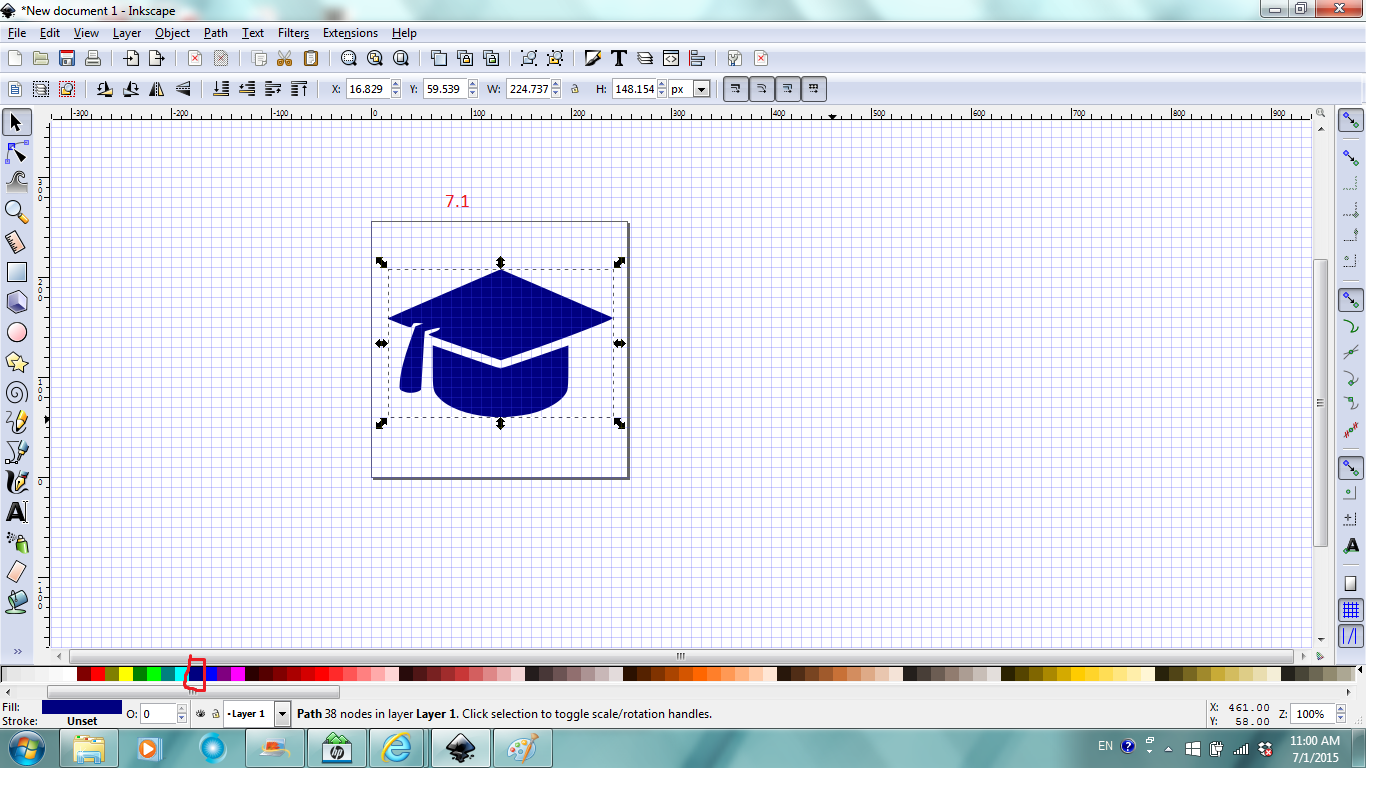


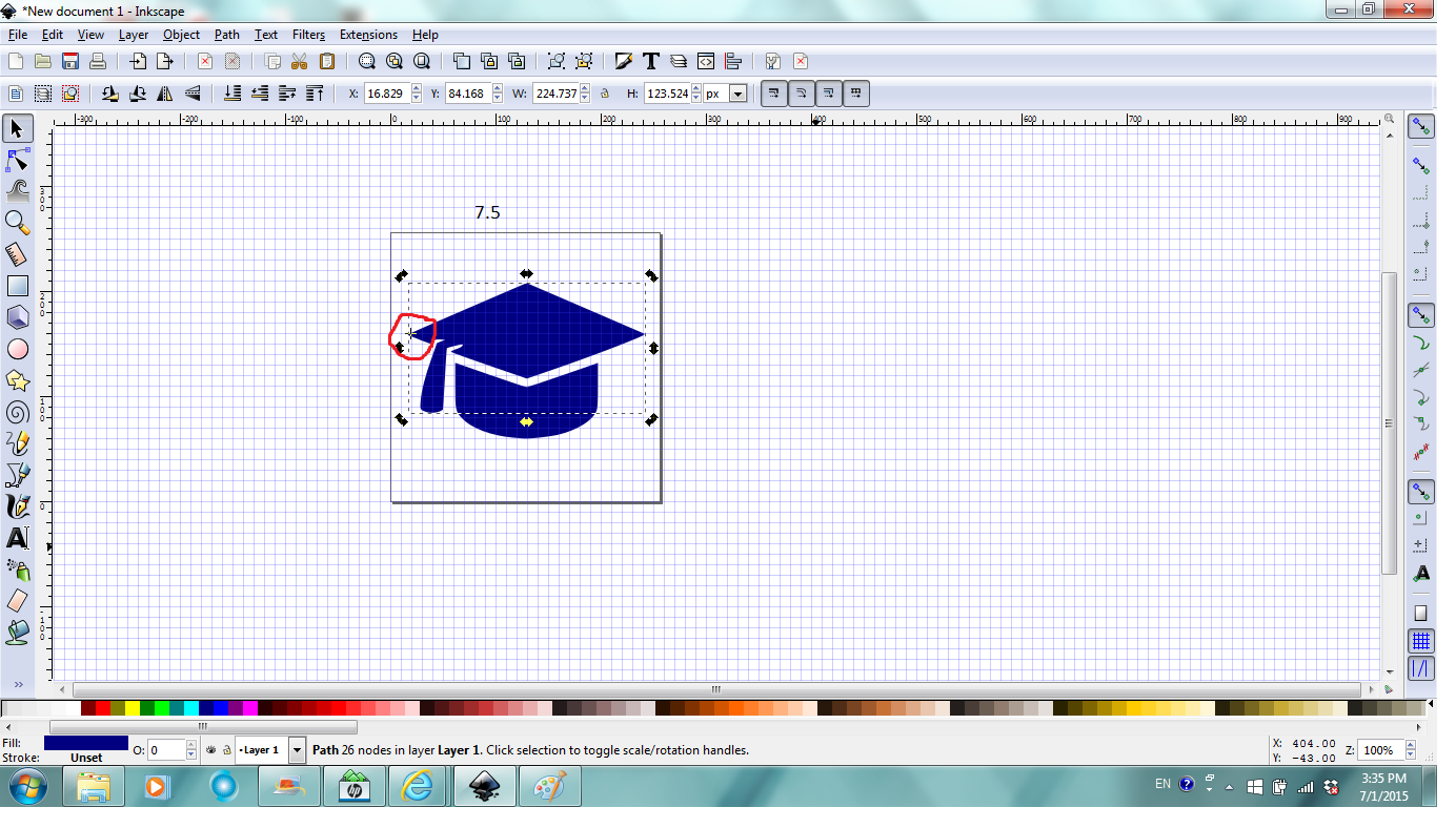

With the path object selected, click on any color swatch to change its color (Fig. 7.1).
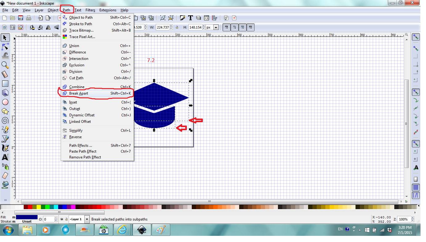
With the path object selected, click Path, then Break apart (Fig.7.2). Notice it breaks into two paths. For a computer illiterate like me. it feels like magic. Now we can manipulate only one of the paths.
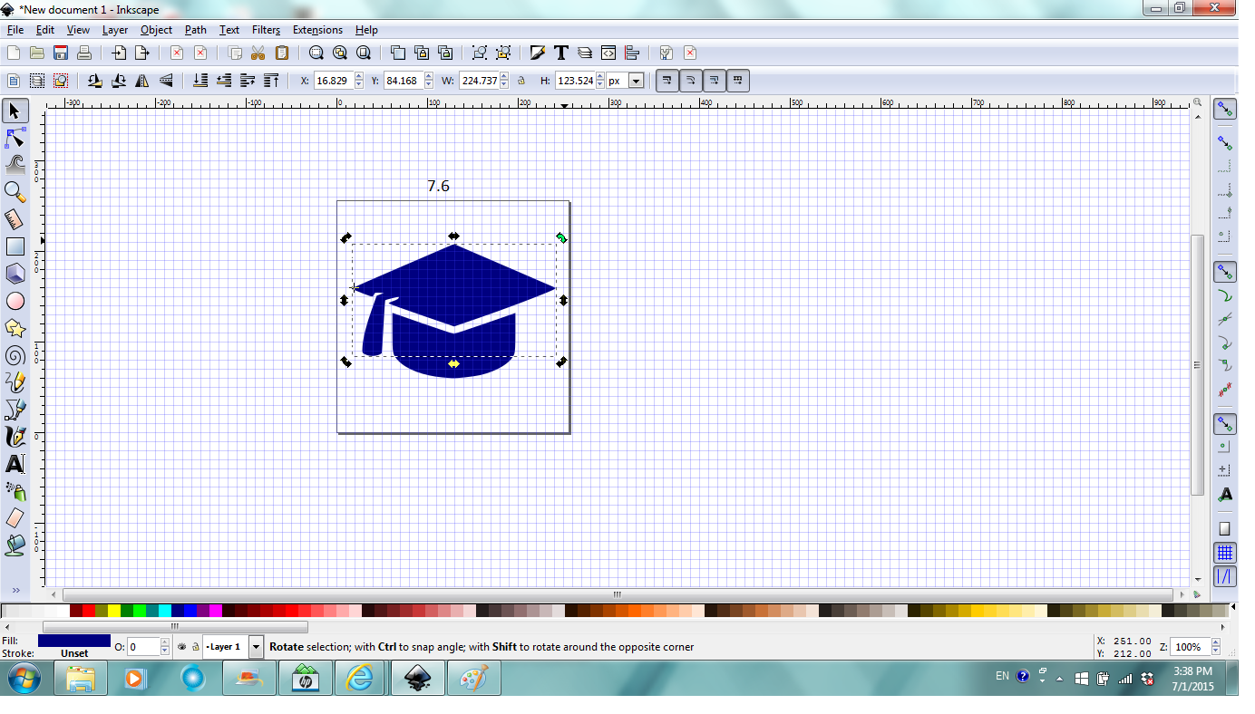
For this project, click anywhere outside the page area to deselect both, then click the top path to select (Fig.7.3). Click on it again the selection has a cross in the center (rotation point) (Fig. 7.4). Click and drag to move the rotation center to the left corner of the top (Fig.7.5).
Place mouse over the top right corner arrow and it turns green (Fig.7.6). Click and drag the arrow upward to tilt the top. You can also click and drag on the path to move it down and to the left a little after tilting (Fig.7.7).
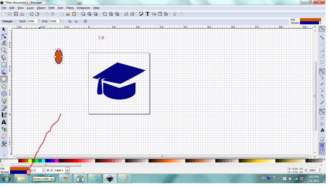
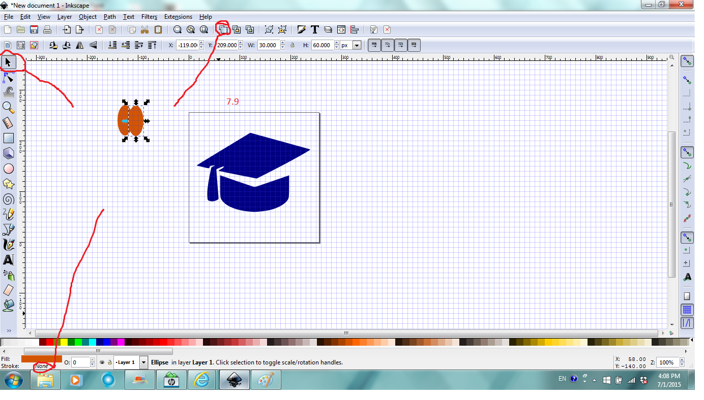
Now to add hearts to the cap, click anywhere outside the page to deselect the path, click the Circle tool, click and drag anywhere in canvas to draw an eclipse, change its color to orange red, right click on the "number" in stroke indicator (located at bottom left corner, mine is 2, yours maybe different) (Fig. 7.8). Click Remove to remove the outline on the eclipse. Notice the stroke indicator says none now. While the eclipse is selected, click Duplcate in Command bar to duplicate (It's on top of the original, you see only one), click select tool and move the top one to the right a nudge (Fig. 7.9).
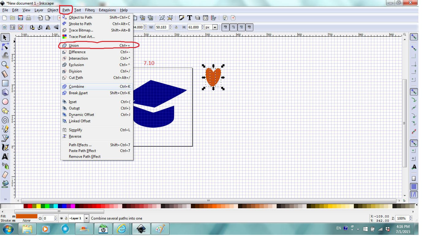
Use skills learned in previous steps, tilt the two eclipse to form a heart shape. Select both (click to select one and then Shift +Click to select the other one), click Path, then Union to form one heart (Fig. 7.10).
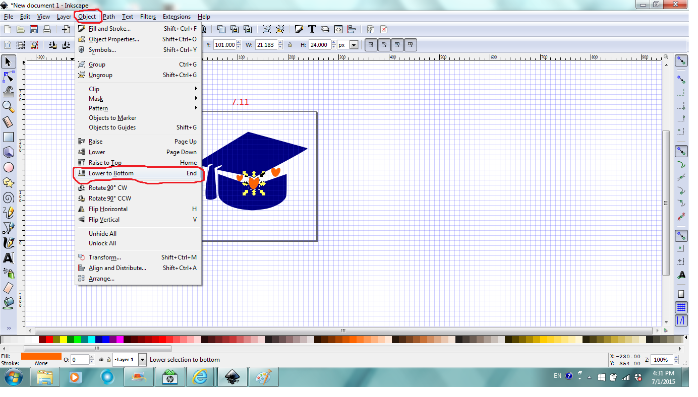
Use skills learned in previous steps, duplicate two more hearts, scale them to different sizes, move them to the cap. Select the big heart, click Object, and then Lower to bottom to place heart in the cap (Fig. 7.11).
After that, if that's the design you want, you can go to step 10 for reference to save and export your design.
Put Text on Path
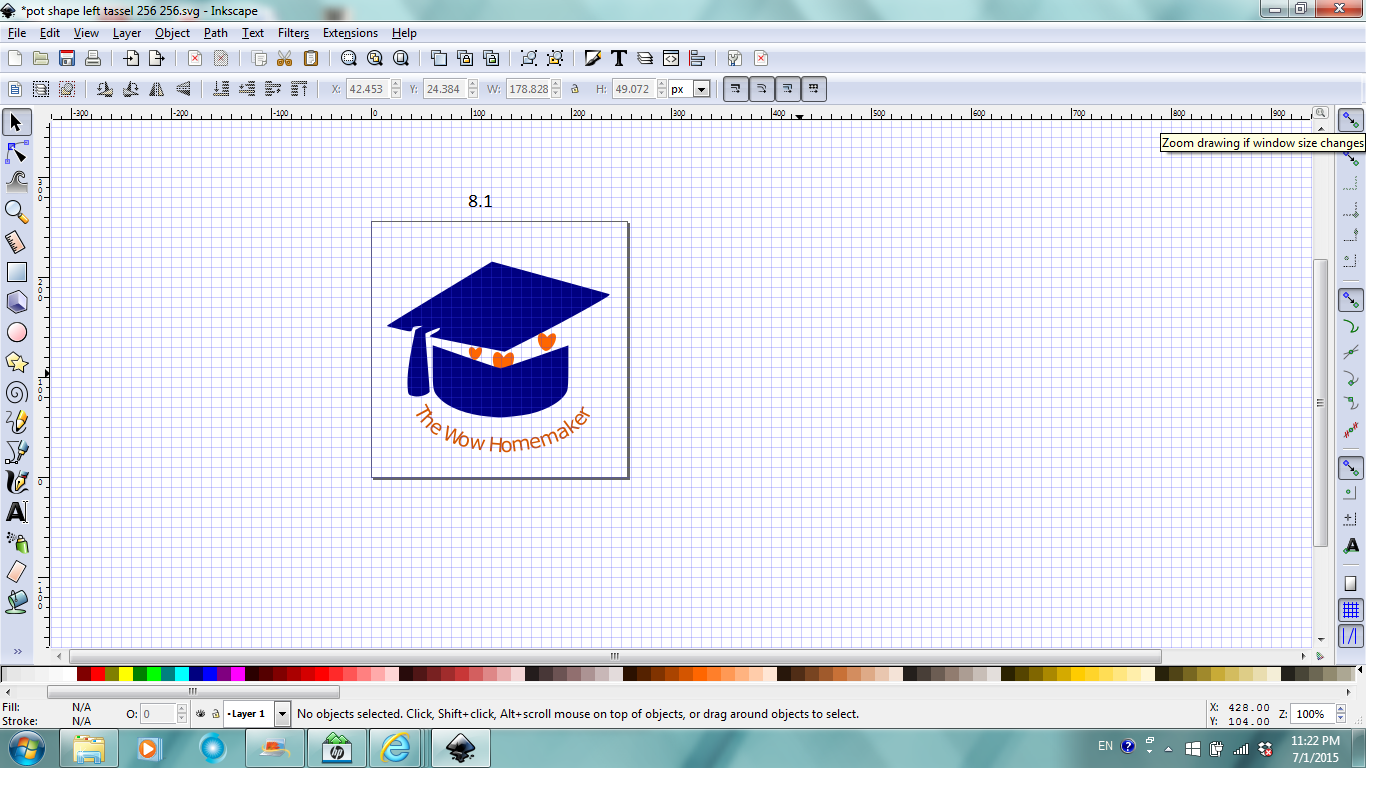
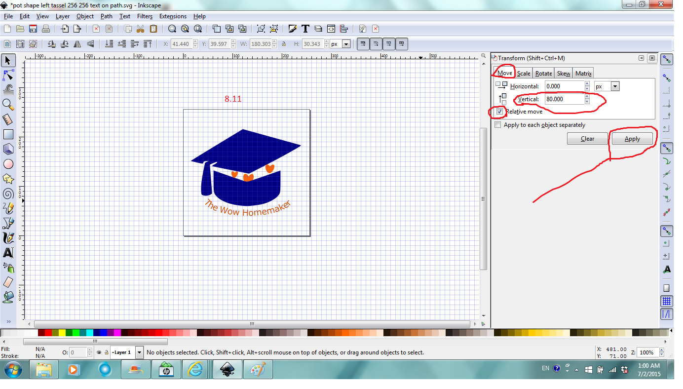
To create something as Fig. 8.1, it involves creating a path, enter text, put text on path and then remove the path stroke.
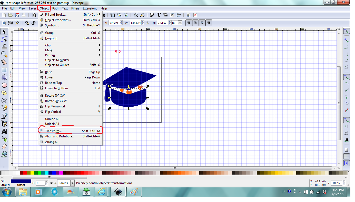
To create a path curved as the bottom of the cap, it's better to duplicate the shape of the bottom. So select the bottom path, duplicate it, then click Object in Command bar, then Transform to precisely control objects' transformations (Fig. 8.2).
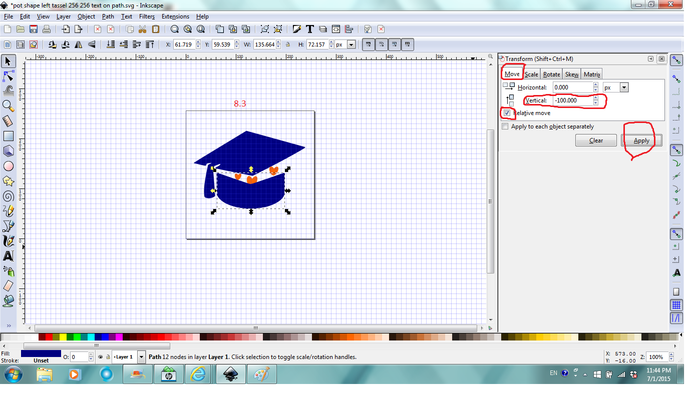
In the Transform window/dialog, under Move tab, enter -100 px for vertical, make sure Relative move is checked, then Apply to move the duplicated path down 100 px to be manipulated (Fig.8.3).
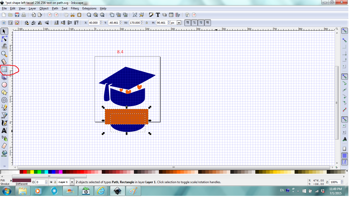
Click the Box tool, click and drag to draw a rectangle over the top of the moved down path, and then have both selected (Fig. 8.4).
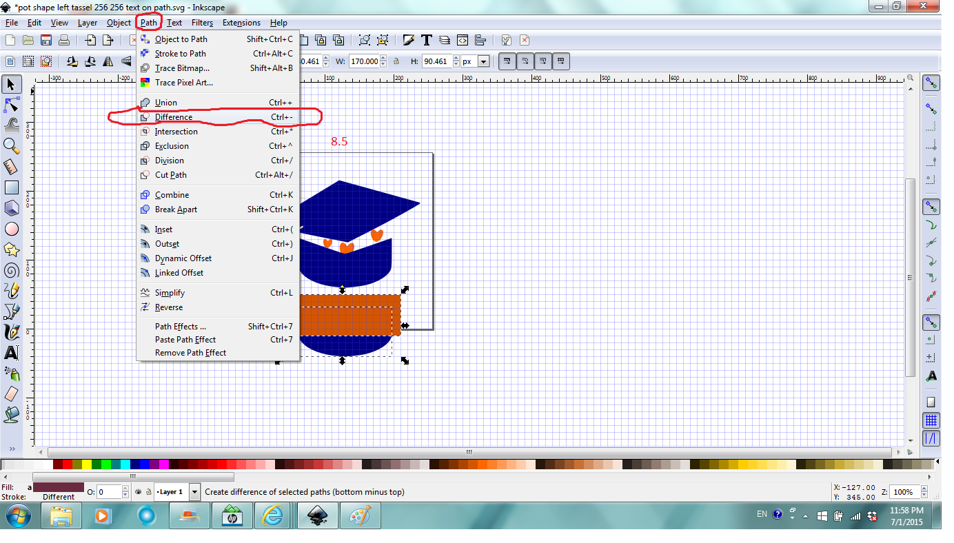
Next magic happens again. Click Path, and then Difference to remove the top part of the path (Fig. 8.5).
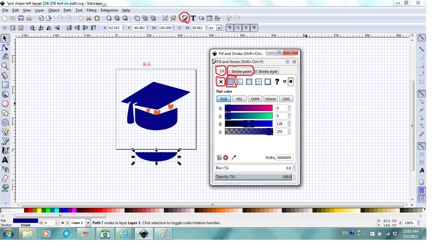
Next click Fill and Stroke in Command bar, in the dialog/window, under Fill tab, click the X which will make the moon shape seemingly disappear, Don't panic. Next click the Stroke paint tab, and then the square with solid fill under it which will make the outline of the moon shape appear (Fig. 8.6).
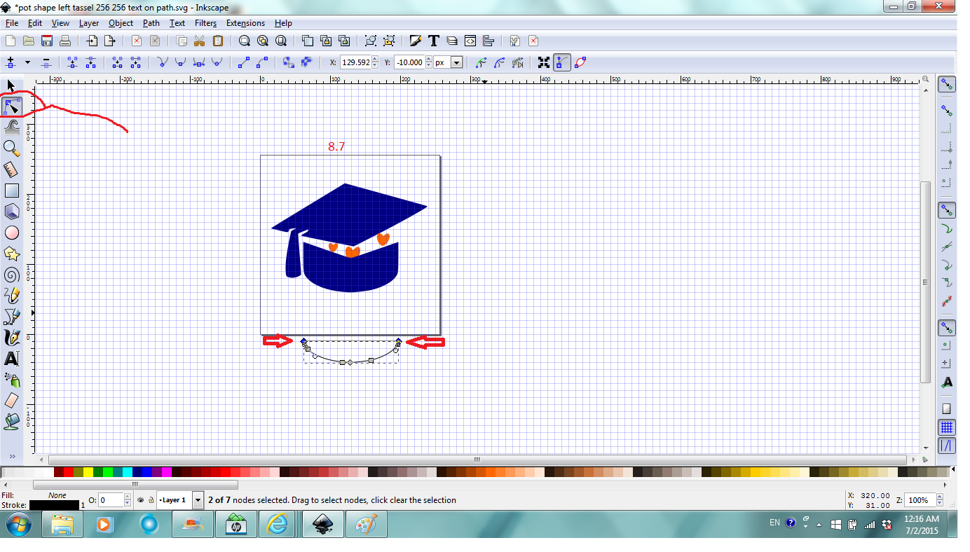
Now you can close the Fill and Stroke window/dialog. Click Edit paths by nodes tool, click to select one node at the tip of the moon shape, Shift and click to select the other node at the other tip of the moon shape at the same time (Fig.8.7).
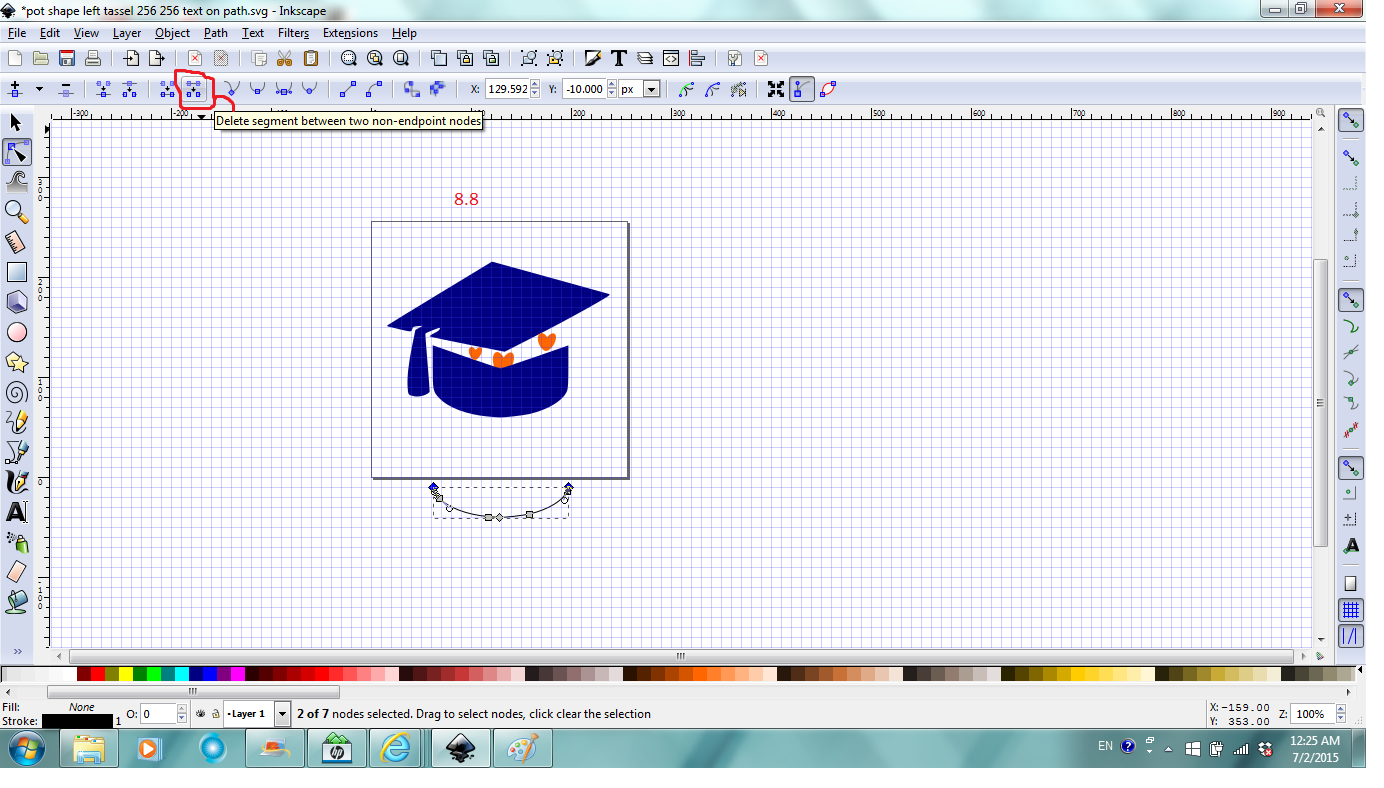
Next click Delete segment between two non-endpoints nodes in Tool Control bar which will make the closed path to an open path (Fig. 8.8).
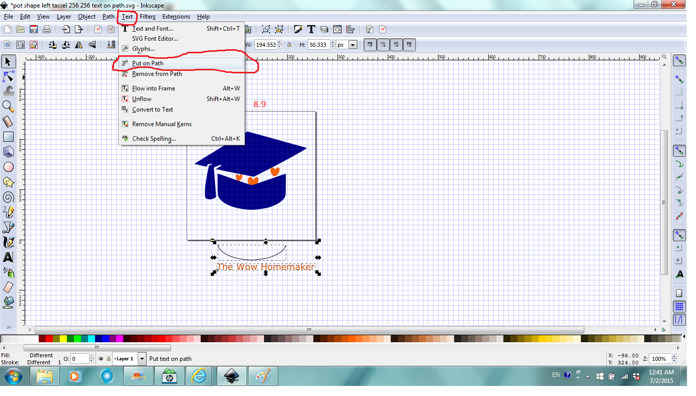
Now use skills learnt in previous steps, type the text, "The Wow Homemaker" for example, set its color to orange red, set font size to close to the size of the curve, (I set it at 14), select the text object and the open path (curve) at the same time, click Text, and then Put on path (Fig.8.9).
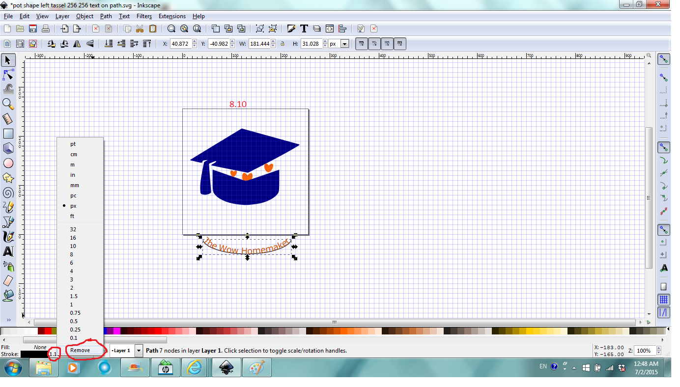
Use skills learned in previous steps to adjust the spacing among letters and/or words, use Shift+D+click to select path to stretch it to accommodate all the text. Then with the path selected, right click the Stroke width number, click Remove (Fig.8.10) which makes the curve disappear but the text retains curved shape.
Now select and move the text up old fashion way or use Transform to move it up precisely vertically (Fig.8.11).
If you're done with your logo design, you can go to step 10 for reference to save and export your design.
Flow Text in a Shape

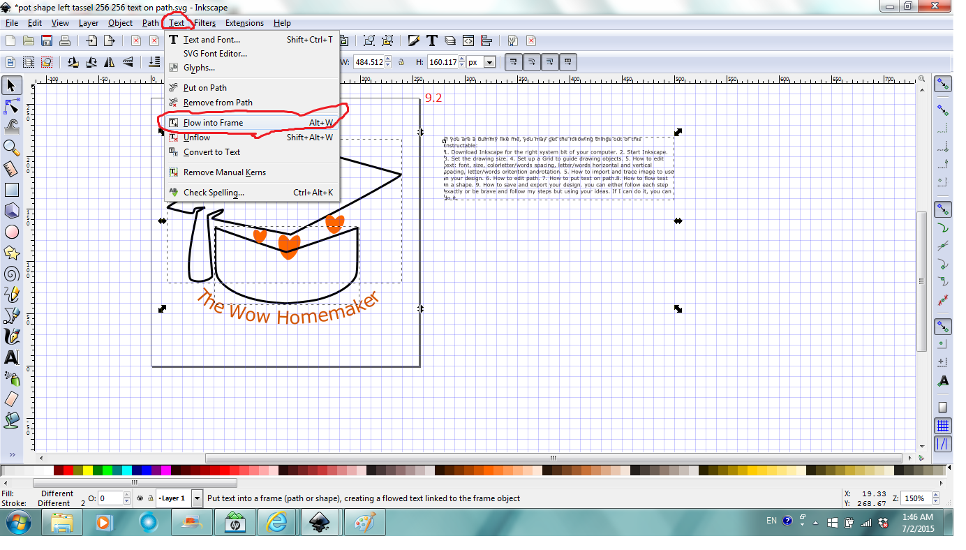
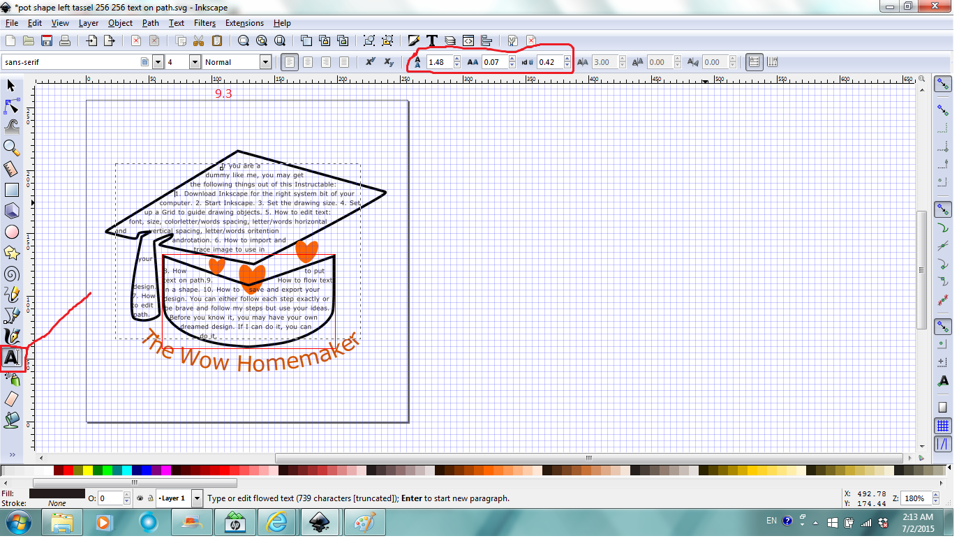
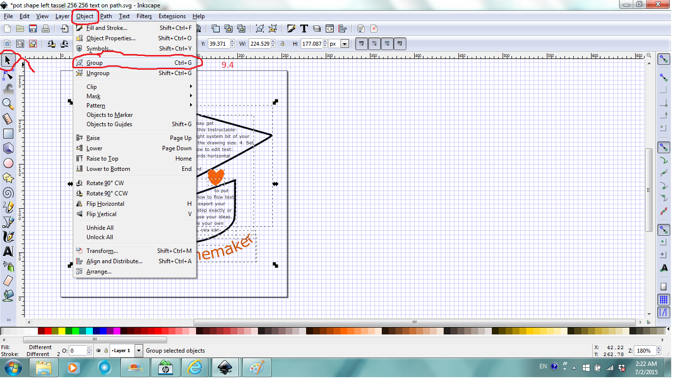
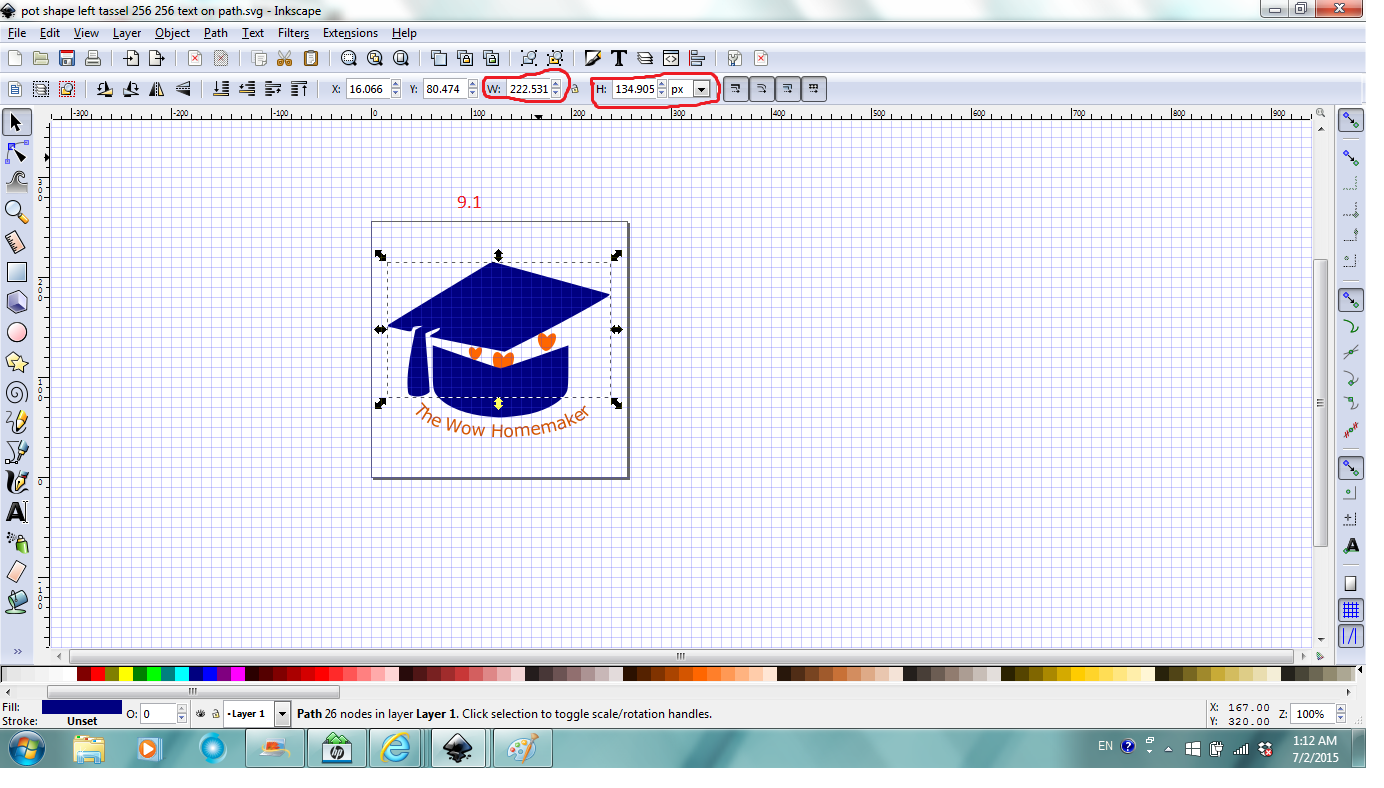
To flow text in a shape and have text fill the shape, I learned that it's better to know the dimension of the shape to estimate how much text it can hold. Select the shape, Tool Control shows the width and height info of the selection (Fig. 9.1).
Use skills learned in previous steps to remove fill and add stroke for the paths. Click Text Tool, Click and drag a box of approximate size of the shape to flow text in anywhere on canvas, type the text in the box, change the font size and color if necessary. Select the text object, the bottom path and then the top path (when text is flowed in multiple shapes, it flows first to the last selected shape), click Text, and then Flow into frame (Fig.9.2).
With the Text Tool selected, you can click in the text and then adjust spacing, type more text or delete to have a better distribution of the text in the frame (Fig.9.3).
Click anywhere outside the drawing to exit the Text Tool. Click Select Tool, click and drag a box that includes everything in the drawing (notification region should say how many objects are selected). Click Objects, and then Group to group objects to one group. This is the last thing what I do before save and export the file and call it a day (9.4).
Save and Export Your Design
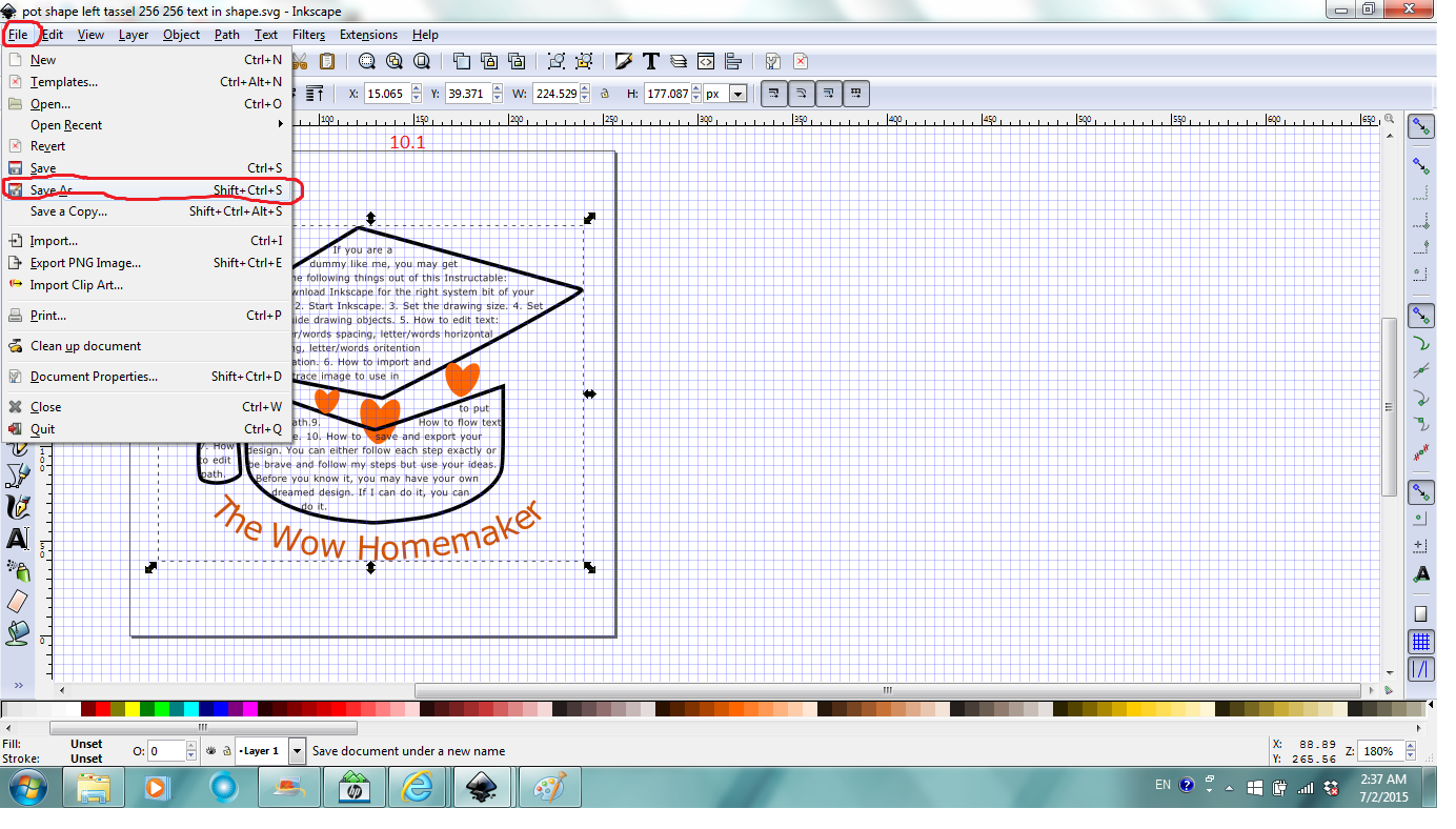

It's always a good idea to save your design in SVG format in Inkscape so you can edit it later if you need to and you're at an advanced point not scratch. Click file, then Save as, in the pop up window, Select Save in folder, give a file name and Save (Fig.10.1).
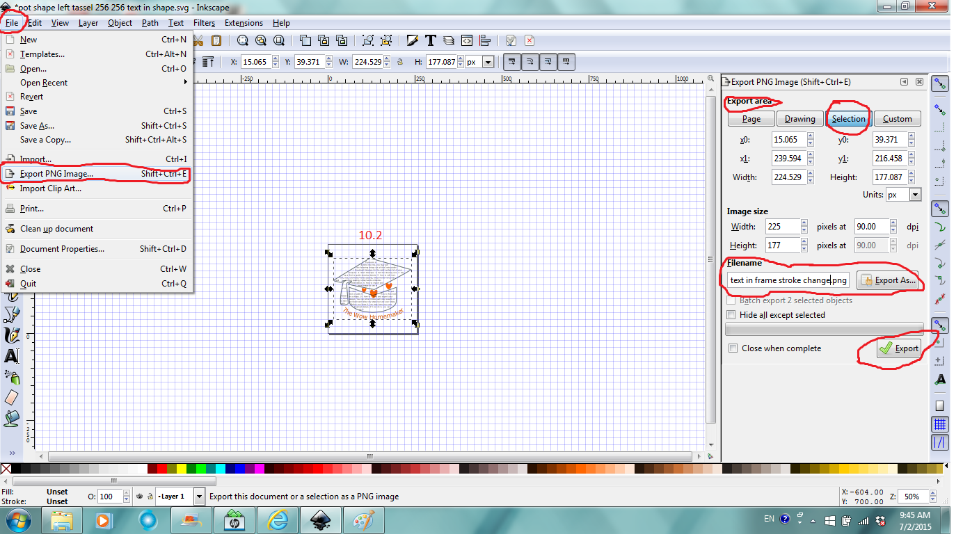
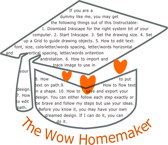
It's also important to export your design to use in other programs or on the web which not always supports SVG file. To export your design, select your design, click File, and then Export PNG Image, in the dialog, choose Selection under Export area (page and drawing may include the space around the design I think. You can play around with the options to see), make sure under Filename to the left of Export As it is in the folder and given filename you want, and then click Export (10.2).
Viola! You just designed your own logo from scratch to complete!
I hope this Instructable help you learn the basic techniques of using Inkscape to design a graphic in a short time. If it is helpful, please vote it for the Graphic Design Contest. Thanks.